Twin is a library that empowers developers to build better apps by blending the powers of Tailwind CSS along with CSS-in-JS. This article examines Twin to understand how it works and provides a tutorial for using it in a React app.

If you’re not familiar with it already, Tailwind is a utility-based CSS library used for creating custom designs. Tailwind inherits most of its characteristics from Atomic CSS, an approach to element styling that offers single-purpose class names.
Tailwind differs from its alternatives like Bootstrap and Bulma in that it provides only the raw essentials needed for styling pages and components, as opposed to a default theme with predefined components.
For example, to style a card with Bulma’s default theme, simply add class = 'card' to an element like a div. Tailwind, on the other hand, requires you to be more specific in defining styles. Tailwind provides classes such as bg-white to give an element a white background color, or px-4 for a padding of four on the x-axis.
As a result, a card designed using Tailwind’s utility classes will be similar to the following:
<div class="max-w-xs rounded overflow-hidden shadow-lg my-2">
  <div class="px-6 py-4">
    <div class="font-bold text-xl mb-2">The Coldest Sunset</div>
    <p class="text-grey-darker text-base">
      Lorem ipsum dolor sit amet, consectetur adipisicing elit. Voluptatibus quia, nulla! Maiores et perferendis eaque, exercitationem praesentium nihil.
    </p>
  </div>
</div>
CSS-in-JS is a pattern for writing component-scoped CSS using JavaScript. It’s important to note that CSS-in-JS is not a framework, but rather an authoring tool that allows you to implement different libraries.
Twin allows you to style frontend components using Tailwind classes, then compiles them into any supported CSS-in-JS library. When Babel runs over your JavaScript or Typescript files, Twin converts the classes into CSS objects before passing them to your chosen CSS-in-JS library, thereby erasing the need for an extra client bundle.
My favorite styling option is using the tw prop as an alternative to the default className prop that ships with React for passing Tailwind styles to an element.
Instead of styling a button with a blue background like this:
const Button = () => <button className ="bg-blue-200"> Click Me </button>
You could write it this way:
const Button = () => <button tw="bg-blue-200"> Click Me </button>
Twin also enables you write conditional styles in a more expressive way by giving you the option of nesting the tw import within a CSS prop that accepts logic:
    const ConditionalInput = ({ hasError }) => (
    <input css={[tw`border p-4`, hasError && tw`border-red-700`]} />
  );
  const [errorPresent, setErrorPresent] = useState(true);

  //in render
  <div tw="m-3 flex flex-col">
        <ConditionalInput hasError={errorPresent} />
        <button
          tw="bg-green-500 mt-3 p-2 text-white "
          onClick={() => setErrorPresent(!errorPresent)}
        >
          {" "}
          Toggle Error Present
        </button>
  </div>
In addition to styling elements using the tw prop Twin provides, you can create elements by adding the tw import at the top of your file, just as you would with styled-components:
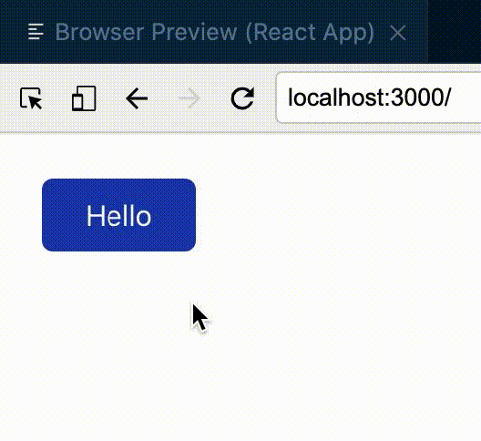
import tw from "twin.macro";

const PrimaryButton = tw.button`bg-blue-800 text-white px-6 py-2 m-6 rounded-md hover:bg-blue-600`;

function App() {
  return (
   <PrimaryButton> Hello </PrimaryButton>
  );
}
export default App;
As a developer, you are bound to be in situations where you want to reuse existing components but add a little extra styling. Twin takes this into consideration by allowing you to clone existing components as well as specify additional styling to be applied to the new components:
import tw from "twin.macro";

const PrimaryButton = tw.button`bg-blue-800 text-white px-6 py-2 m-6 rounded-md hover:bg-blue-600`;
const OtherButton = tw(PrimaryButton)`bg-purple-600 hover:bg-purple-200`;

function App() {
  return (
   <PrimaryButton> Hello </PrimaryButton>
   <OtherButton> Other Button</OtherButton>
  );
}
export default App;
bg-pink without adding a specific shade to an element, Twin gives you an alert similar to this: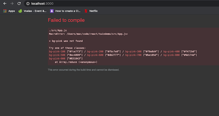
Although you can harness the power of Twin with other frameworks such as Gatsby, Next.js, and, more recently, React Native, this example is focused on using Twin in a React application.
To follow this tutorial, you should have a React development environment. We’ll use the following:
First, create a fresh installation of React by running:
npx create react app twindemo
Once your React boilerplate has been generated, move into the folder using the cd command and install the twin.macro package by running:
yarn add tailwindcss twin.macro
Next, install Emotion:
yarn add @emotion/core @emotion/styled @emotion/react
Once Emotion is installed, generate a tailwind.config.js file by running:
npm tailwindcss init --full
Now add a babelMacros key in your project’s package.json file:
 "babelMacros": {
    "twin": {
      "config": "tailwind.config.js"
    }
  }
Next, import the base Tailwind stylesheet in your app’s index.js file with:
import "tailwindcss/dist/base.min.css";
Tip: Since React 17, it is recommended you add
/** @jsxImportSource @emotion/react **/at the top of yourJSXfiles to import and use thetwprop that Twin provides.
Once you do this, your App.js file should contain code in this format:
/** @jsxImportSource @emotion/react */
import tw from "twin.macro";
function App() {
  return (
        ...
  );
}
export default App;
Let’s see Twin in action by replicating this section from TailwindCSS’s official site.
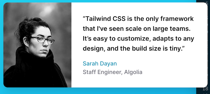
The original snippet looks like this:
<figure class="md:flex bg-gray-100 rounded-xl p-8 md:p-0">
  <img class="w-32 h-32 md:w-48 md:h-auto md:rounded-none rounded-full mx-auto" src="/sarah-dayan.jpg" alt="" width="384" height="512">
  <div class="pt-6 md:p-8 text-center md:text-left space-y-4">
    <blockquote>
      <p class="text-lg font-semibold">
        “Tailwind CSS is the only framework that I've seen scale
        on large teams. It’s easy to customize, adapts to any design,
        and the build size is tiny.”
      </p>
    </blockquote>
    <figcaption class="font-medium">
      <div class="text-cyan-600">
        Sarah Dayan
      </div>
      <div class="text-gray-500">
        Staff Engineer, Algolia
      </div>
    </figcaption>
  </div>
</figure>
If we were to implement this using Twin, the snippet would look like this:
/** @jsxImportSource @emotion/react */
import tw from "twin.macro";

function DemoTestimonial() {
  return (
    <div tw="md:flex m-12 bg-gray-100 rounded-xl p-8 md:p-0">
      <img
        tw="w-32 h-32 md:w-48 md:h-auto md:rounded-none rounded-full mx-auto"
        src="https://tailwindcss.com/_next/static/media/sarah-dayan.a8ff3f1095a58085a82e3bb6aab12eb2.jpg"
        alt=""
        width="384"
        height="512"
      />
      <div tw="pt-6 md:p-8 text-center md:text-left space-y-4">
        <blockquote>
          <p tw="text-lg font-semibold">
            “Tailwind CSS is the only framework that I've seen scale on large
            teams. It’s easy to customize, adapts to any design, and the build
            size is tiny.”
          </p>
        </blockquote>
        <div tw="font-medium">
          <div tw="text-blue-600">Sarah Dayan</div>
          <div tw="text-gray-500">Staff Engineer, Algolia</div>
        </div>
      </div>
    </div>
  );
}
function App() {
  return (
        <DemoTestimonial/>
  );
}
export default App;
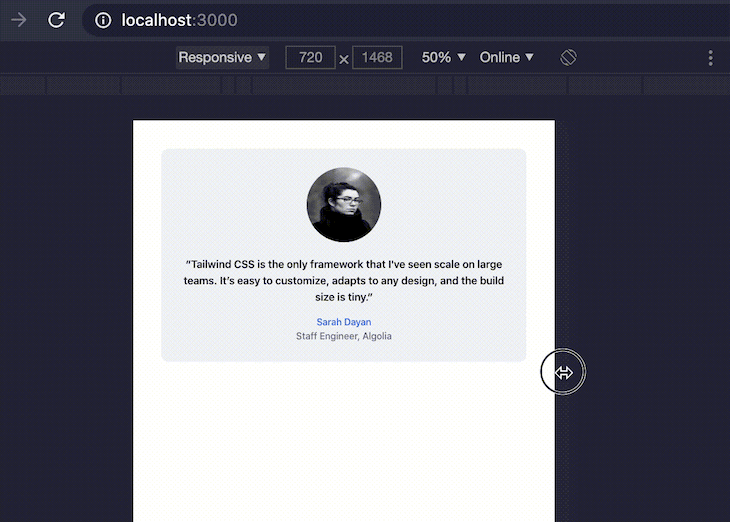
If we preview the result in the browser, you get a fully responsive replica of the original snippet, only now we’re using Twin in our app.
babel-plugin-twinIf you want Babel to import the tw prop in your JavaScript files automatically, you can make use of the babel-plugin-twin package. This package removes the need to add import "twin.macro" to the top of your files every time you want to access the utility classes Twin provides through Tailwind.
To do this, open up your fresh React project and set up Twin using the steps shown above. Once your setup is complete, install the babel-plugin-twin package using your favorite package management tool using either of the commands below:
npm i -D babel-plugin-twin
# or
yarn add babel-plugin-twin -D
Next, register the babel-plugin-twin package as a plugin in your babel.config.js file. It is important that you register babel-plugin-twin before babel-plugin-macros to avoid issues when running a build of your app. Your babel.config.js file should look like this after you add the package to the plugins array:
module.exports = {
// ...
  plugins: [
    "[babel-plugin-twin", {debug: true}], //if you want to get debugging feedback
    "babel-plugin-macros",
    // ...
  ],
};
In this article, we dove into understanding styled-components and why they’re needed before taking a look at Twin and how to use it in a React application.
You can find the examples highlighted in this article on this GitHub repository. Don’t forget to check out the official Twin documentation on GitHub to learn more about this fantastic package.
Install LogRocket via npm or script tag. LogRocket.init() must be called client-side, not
server-side
$ npm i --save logrocket

// Code:

import LogRocket from 'logrocket';
LogRocket.init('app/id');
// Add to your HTML:

<script src="https://cdn.lr-ingest.com/LogRocket.min.js"></script>
<script>window.LogRocket && window.LogRocket.init('app/id');</script>
Hey there, want to help make our blog better?
Join LogRocket’s Content Advisory Board. You’ll help inform the type of content we create and get access to exclusive meetups, social accreditation, and swag.
Sign up now
Not sure if low-code is right for your next project? This guide breaks down when to use it, when to avoid it, and how to make the right call.

Compare Firebase Studio, Lovable, and Replit for AI-powered app building. Find the best tool for your project needs.

Discover how to use Gemini CLI, Google’s new open-source AI agent that brings Gemini directly to your terminal.

This article explores several proven patterns for writing safer, cleaner, and more readable code in React and TypeScript.


2 Replies to "Intro to Twin: Combining the best of Tailwind and CSS-in-JS"
Can you share resources for using twin with react-natibe
I’m not sure about the mention of “babel-plugin-macros” in this article. Is it required for “babel-plugin-twin” to work or is it mentioned only so that people that already use “babel-plugin-macros” can avoid issues with “babel-plugin-twin”?