lh and rlh in CSS
The Replay is a weekly newsletter for dev and engineering leaders.
Delivered once a week, it's your curated guide to the most important conversations around frontend dev, emerging AI tools, and the state of modern software.
Every element you see on a page has some sort of length. The length specifications not only describes how wide or narrow things are, but they also describe the distance between elements. CSS is responsible for defining these values in web pages.
The notion of distance or length is used in several CSS properties, width, height, margin, padding, border-width, and font-size. A length needs to have a unit and there are a few different ways of describing a certain length value:
// This will set height of the element relative to 1% of the height of the viewport
height: 100vh;
// This will set height of the element relative to the element's line height
    height: 1lh;
// This will set the height of an element as 20 pixel size of the screen
    height: 20px;
If you have been a web developer for a while, chances are you are familiar and comfortable with more traditional absolute or length based units. However, there are new font-relative length units being developed as part of CSS’s level 4 spec like lh and rlh. In this article, we are going to learn more about these two new font relative length units, see some practical examples of their usage, and see how they can help us as web developers to better style our websites.
lh and rlh units?Both of these units belong to the font-relative length units category. Which essentially refers to font metrics of the current element or the root element.
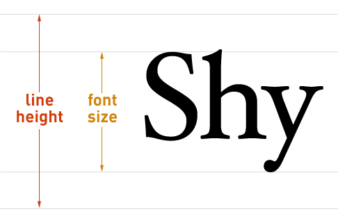
1lh is set as the length of the element’s line height. Basically, this relative unit will compute the line height of the current element that it is being applied to. This is done by converting the normal length of the first available font to an absolute length. The illustration shown below can show us what counts as a font’s line height.
Note that the first available font can be one of the font families listed under font-family, or a user agent’s default font if no font is provided.
rlh is similar in definition to lh, but its computed line height is based on the root element which is the <html>. rlh to lh is like rem to em, which are used for defining font sizes on web pages.
One thing to consider is the context where these units are used. If they are used outside the context of the element such as in a media query or document, these units will refer to the initial values of font and line height properties on the page. But if they are directly used on an element, the internal calculations of the unit will first be based on the font of the element or the parent of the element at hand, and only if that is not provided the calculations will default back to the initial font and line height values.
These two news units are still in development as part of CSS new spec and therefore a lot of possible edge cases and real use cases have still not formed. But to get an idea of how these two can help us, we will look at a code example from Šime Vidas.
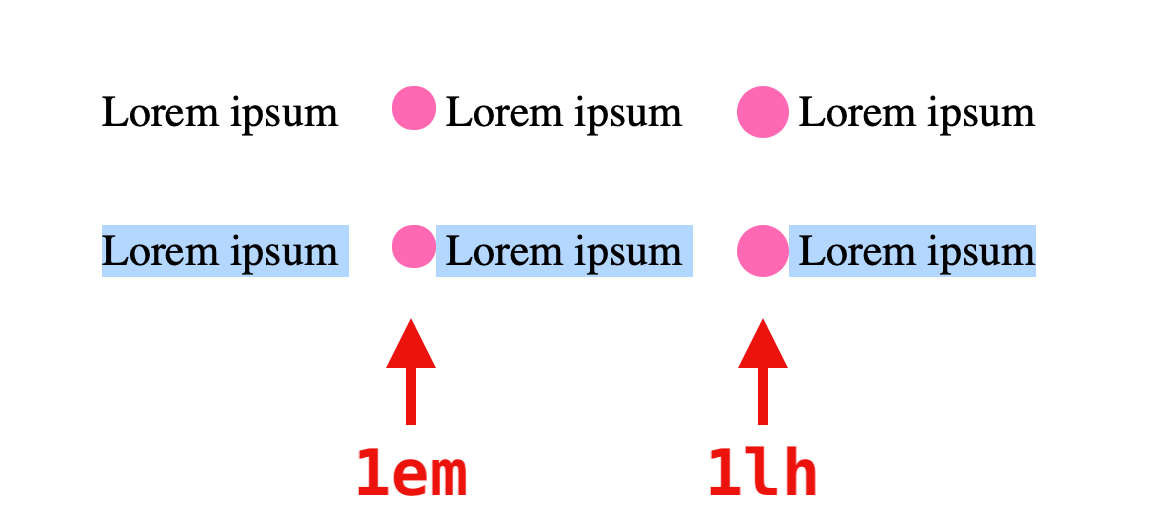
In the HTML code block below, we are defining paragraph sections with span elements nested inside them, which act as the placeholder for an inline icon next to a text. One of these span elements are applying a height based on em while the other one is utilizing lh unit:
// HTML

<p>
  Lorem ipsum
  <span class="em"></span>
  Lorem ipsum
  <span class="lh"></span>
  Lorem ipsum
</p>

<p>
  Lorem ipsum
  <span class="em"></span>
  Lorem ipsum
  <span class="lh"></span>
  Lorem ipsum
</p>
// CSS

body {
  font-size: 1.35rem;
}

p {
  margin: 2em;
}

span {
  background: hotpink;
  border-radius: 50%;
  display: inline-block;
  vertical-align: top;
  margin-left: 1em;
}

.em {
  width: 1em;
  height: 1em;
}

.lh {
  width: 1lh;
  height: 1lh;
}
One of the use cases for these new units lh and rlh is the ability to vertically centering inline-block elements. As you can see in the below screenshot, the lh unit does a much better job at vertically aligning the icon, compared to em unit.
Besides the lack of browser support which we will get to later, there seem to be few concerns when it comes to using these two new units.
As noted in the feature’s draft spec, the developer cannot set the actual number of lines while applying the lh or rlh unit. These units are just utils for setting the height based on an internal calculation of an ideal empty line. What this means is that the content of the element can affect the actual lines without the developer having control over it. However, there are features such as max-lines that can be used in such a context.
Additionally, we should not rely on 1lh matching the exact line height of the element as one part of the line can be rendered in a certain font or text size which would have an impact on the element’s line height and therefore lh unit.
Currently, none of the browsers support this feature, as it is still in the experimental mode.
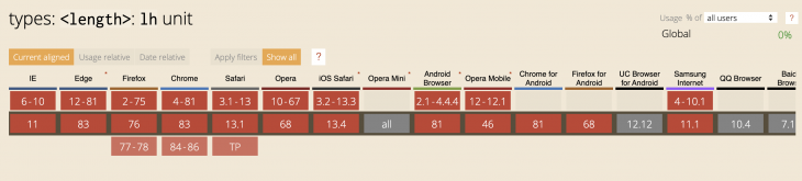
As of June 2020, it seems like Safari Technology Preview (v105) is the only browser that has claimed support for this feature, but it appears that their implementation is broken.
Also as of now, none of the browsers have also passed the functionality tests for this feature. You can check the update of Test1, Test2, and Test3 to stay in the loop. Based on these, it seems wise to keep an eye on the discussions on Bugzilla and Webkit and treat this feature experimentally without considering using it in production anytime soon.
We have learned the basic definition and usage of two new font-relative length units — lh and rlh. As we have seen, these units are still in experimental mode and we are not sure about potential roadblocks that might affect their full implementation in browsers.
The computed line height that these two units refer to can be dependent on other properties in different browsers. If you change the theme of a select option in a combo box, the related <select>’s line height will be affected in both Webkit and Blink.
So in the meantime, you can keep an eye on the gradual adaptation of these two features here and you can join and participate in discussions around them here.
As web frontends get increasingly complex, resource-greedy features demand more and more from the browser. If you’re interested in monitoring and tracking client-side CPU usage, memory usage, and more for all of your users in production, try LogRocket.

LogRocket lets you replay user sessions, eliminating guesswork around why bugs happen by showing exactly what users experienced. It captures console logs, errors, network requests, and pixel-perfect DOM recordings — compatible with all frameworks.
LogRocket's Galileo AI watches sessions for you, instantly identifying and explaining user struggles with automated monitoring of your entire product experience.
Modernize how you debug web and mobile apps — start monitoring for free.

Write agent-friendly API documentation with OpenAPI, clear schemas, workflow guidance, and llms.txt for safer AI automation.

Local AI proxy tutorial for detecting, masking, and rehydrating PII before prompts reach cloud LLMs.

Learn how Graph RAG uses connected knowledge structures to improve retrieval beyond simple text similarity.
Learn how sibling-index() enables clean, JavaScript-free stagger animations using native CSS.
Hey there, want to help make our blog better?
Join LogRocket’s Content Advisory Board. You’ll help inform the type of content we create and get access to exclusive meetups, social accreditation, and swag.
Sign up now

 Learn more →
