The scroll-select box is a great tool for frontend developers to improve the user experience of their applications.

Need a way for users to pick stuff from a list? Just use the normal <select> dropdown element. You know the little box that expands into a list of choices, doesn’t take much space, and has its built-in keyboard navigation? Yeah, that one!
But now let’s say we have a long list of options (maybe a long list of birth years) to choose from. Sure, there’s keyboard navigation. But let’s be real; who’s going to click through hundreds of options? Most folks (especially me) are just gonna scroll.
So we are left with one option; to scroll and select. This isn’t bad, but what if we make it interesting by making the option automatically select itself as you scroll through it?
Instead of the traditional “scroll, stop, click”, you’d just scroll until you see what you want, and boom, it’s selected. Simple change, but it makes the whole experience feel more fluid and, honestly, kind of fun.
Here’s an example of what I’m referring to: the scroll-select box, aka scroll-to-select form control:
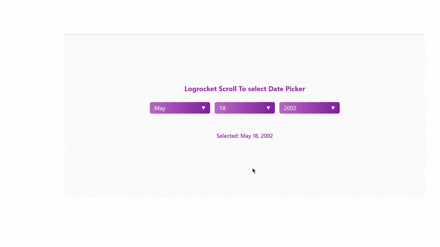
That up there is exactly what we’re going to build today: a scrollable date picker that mimics the iOS style, but with the exemption of the <select>element. In place of that, we will use mostly CSS and JavaScript to build our scroll-to-select form, only because it’s more customizable.
Before diving into the code, let’s understand the key concepts we’ll be using to create our scroll-select box:
The scroll snap CSS property allows us to create smooth scrolling experiences by defining “snap points” where the viewport will stop after a user finishes scrolling. For my fellow TikTok binge-watchers, that is what happens whenever we scroll past a video. Although it becomes more beautiful when it’s a bit slow, TikTok’s own is quite fast (understandable for its use case).
The Intersection Observer API is more like an eye that watches which options come into view. Technically, it lets us detect when elements enter or leave the viewport. We’ll use this to determine which option should be selected as the user scrolls.
Its implementations look like this:
const observer = new IntersectionObserver((entries) => {
    entries.forEach(entry => {
      if (entry.isIntersecting) {
        // Hey, this option is visible, do somehting to it!
        selectOption(entry.target);
      }
    });
  });
In this article, CSS custom properties will be used to maintain consistent styles throughout the application. In case this is new to you, it’s like a simple design system that has a variable and takes style properties. All we need to do is change the property of the variable, and every other property in our application automatically updates. It’s great for robust styles.
The rest of our core elements are styles and logic that you are free to customize to your taste. Let’s set up our HTML structure, link style sheet, and script.
We will use a simple structure where we have each selector (month, day, and year) following the same pattern:
<!DOCTYPE html>
<html lang="en">
<head>
    <meta charset="UTF-8">
    <meta name="viewport" content="width=device-width, initial-scale=1.0">
    <title>Scroll-to-select-form by Logrocket</title>
    <link rel="stylesheet" href="styles.css">
</head>
<body>
    <h1>Logrocket Scroll To select Date Picker</h1>
    <div class="date-picker-container">
        <!-- Month Selector -->
        <div class="custom-select" id="monthSelect">
            <div class="select-display">Month</div>
            <div class="options-selector"></div>
        </div>

        <!-- Day Selector -->
        <div class="custom-select" id="daySelect">
            <div class="select-display">Day</div>
            <div class="options-selector"></div>
        </div>

        <!-- Year Selector -->
        <div class="custom-select" id="yearSelect">
            <div class="select-display">Year</div>
            <div class="options-selector"></div>
        </div>
    </div>
    <div class="selected-date" id="selectedDate">Select a date</div>

    <script src="script.js"></script>
</body>
</html>
Rather than using the <select> elements above, we’re using custom divs. Later on, this will help us create those scrollable options with JavaScript. The .select-display shows the current selection, while .options-selector will contain our scrollable options. We will look at the styling next.
Let’s set up our base styles and declare our CSS variable for our scroll-select box:
/* Root variables with color scheme */
:root {
    --primary-color: #9c27b0;  /* Purple */
    --secondary-color: #e1bee7;
    --gradient-start: #ba68c8;
    --gradient-end: #7b1fa2;
    --container-width: 210px;
    --item-height: 40px;
    --spacing: 10px;
}

/* Reset default styles */
* {
    margin: 0;
    padding: 0;
    box-sizing: border-box;
}

/* Base layout styles */
body {
    min-height: 100vh;
    display: flex;
    flex-direction: column;
    align-items: center;
    justify-content: center;
    gap: 2rem;
    font-family: system-ui, -apple-system, sans-serif;
    -webkit-user-select: none;
    user-select: none;
    background-color: #fafafa;
}

h1 {
    font-size: 1.5rem;
    color: var(--primary-color);
}


/* Date picker container */
.date-picker-container {
    display: flex;
    gap: 1rem;
    align-items: flex-start;
}
The code above sets up the stage for our form. In the body,we centered our content using the CSS layout system Flexbox, with a light gray background. In our h1, we styled the header with the purple color defined in our variables above.
In our.date-picker-container, we created a horizontal layout for the three dropdowns, (month, day, and year).
The -webkit-user-select: none property gives us the native application feel by preventing text selection during scrolling. If these basic technical words don’t drive the point home, all the code does is pick our color, size everything just right, and ensure it all sits nicely centered on the page.
Going further for the styles, we will want to create those visible buttons for our month/day/year selectors:
/* Custom select styles */
.custom-select {
    position: relative;
    width: var(--container-width);
}

/* Selected value display */
.select-display {
    width: 100%;
    height: var(--item-height);
    padding: 0 1rem;
    background: linear-gradient(to right, var(--gradient-start), var(--gradient-end));
    color: white;
    border-radius: 6px;
    display: flex;
    align-items: center;
    justify-content: space-between;
    cursor: pointer;
    font-size: 1.25rem;
    box-shadow: 0 2px 5px rgba(156, 39, 176, 0.2);
}
In the code above we have attached a relative position to .custom-select. This is important because it helps position the dropdown menu that appears below when clicked.
When a user sees “January”, “15th”, or “2025”, the .select-display handles the styling. The buttons have a purple gradient, white text, and a small shadow that makes them appear to “float”.
Whenever our form is open – i.e. a user clicks either date, year, or month – we want to attach a downward arrow (▼) to each of these buttons, making it rotate 180°.
But why is this here, you may ask? Whenever the month/day/year is clicked as the options are displayed, the arrow toggles 180° — indicating either an open or closed state:
.select-display::after {
    content: '▼';
    font-size: 0.8em;
    transition: transform 0.3s ease;
}

.custom-select.open .select-display::after {
    transform: rotate(180deg);
}
In the code above the transition makes the rotation smooth rather than instant. One may ask: how will CSS make this rotation interactive? In reality, CSS wouldn’t do that; JavaScript would. For the sake of better understanding, we want to finish everything concerning CSS before we go to Javascript.
We will go ahead and style our dropdown container below:
/* Options dropdown */
.options-selector {
    position: absolute;
    top: calc(var(--item-height) + var(--spacing));
    width: 100%;
    height: calc(var(--item-height) * 7 + var(--spacing) * 6);
    overflow-y: auto;
    scroll-snap-type: y mandatory;
    overscroll-behavior-y: none;
    border-radius: 8px;
    box-shadow: 0 4px 12px rgba(0, 0, 0, 0.1);
    padding: var(--spacing);
    background: white;

    /* Hide scrollbar for different browsers */
    &::-webkit-scrollbar {
        display: none;
    }
    -ms-overflow-style: none;
    scrollbar-width: none;

    /* Animation states */
    opacity: 0;
    visibility: hidden;
    transform: translateY(-10px);
    transition: all 0.3s ease;
    z-index: 100;
}

.custom-select.open .options-selector {
    opacity: 1;
    visibility: visible;
    transform: translateY(0);
}
This is where it gets more entertaining. We’re using position: absolute so our dropdown floats over other content. The height calculation is meant to show exactly seven items at once. I’ve found this to be my sweet spot for usability.
As mentioned earlier, scroll-snap-type: y mandatory is used to create that satisfying snap effect you feel when scrolling through options on your phone.
The overscroll-behavior-y: none is just good manners; it stops the whole page from scrolling when you get to the end of our options.
We will want that smooth fade of the dropdown. That’s where the animation comes in. The opacity, visibility, transform is responsible for the slick fade in/out when we toggle our dropdown.
For the individual options, we want them to look clickable and respond with styles when selected:
/* Option items */
.option-item {
    display: flex;
    align-items: center;
    justify-content: center;
    height: var(--item-height);
    margin-bottom: var(--spacing);
    background: linear-gradient(to right, var(--gradient-start), var(--gradient-end));
    border-radius: 6px;
    color: white;
    font-size: 1.25rem;
    scroll-snap-align: start; //explained below
    transition: background-color 0.3s ease;
    cursor: pointer;
}

.option-item:last-child {
    margin-bottom: calc(var(--item-height) * 6);
}
In the code above, we gave each option a nice gradient background and transitions. The flexbox keeps everything perfectly aligned. This is usually a good practice for any type of code.
The transition property is what gives us that smooth color change when you scroll or select an option and for the .option-item:last-child. This property adds an extra space after the last option in the dropdown.
When an option is snapped into place in our demo, it changes color and scale by around 7%. Let’s fix that below with a few styles:
.option-item.selected {
    background: var(--primary-color);

    transform: scale(1.08);
    transition: all 0.3s ease;
}
Below, I singled out the scroll-snap-align property because of its importance:
scroll-snap-align: start;
The scroll-snap-align property tells the browser where each option should snap when scrolling. Setting it to start means each option will align with the top of our container, creating that precise scrolling effect. Without this, our scroll-snap-type: y mandatory wouldn’t know where to snap to. They work together as a team to create that scrolling experience.
For our .selected-date font, we want to simply add a little margin on top, give it our primary color, and generally make it look nice:
/* Selected date display */
.selected-date {
    margin-top: 2rem;
    color: var(--primary-color);
    font-size: 1.2rem;
    font-weight: 500;
}
This is what our application looks like:
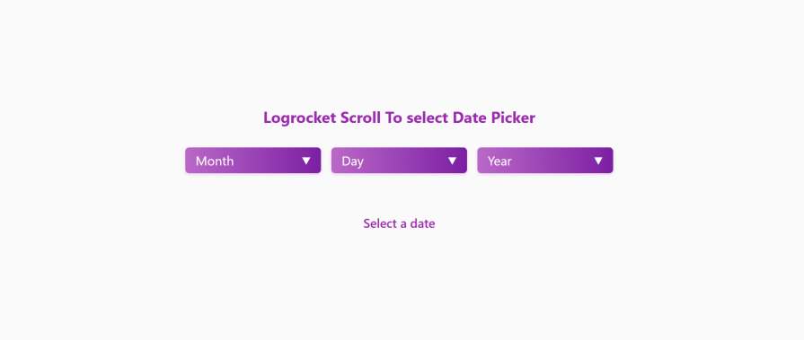
It is not very interactive now, because we have not yet introduced JavaScript. That’s it for styling; let’s jump into the really fun part of the scroll-select box project.
In this section, we will make our application interactive with JavaScript. For a start, we will need a list of months, and our year data. Let’s say for this example, we will also want the user not to be younger than 18, or older than 34.
This is just a personal choice depicting a real implementation. Let’s get that done with the code below:
const months = [
    'January', 'February', 'March', 'April', 'May', 'June',
    'July', 'August', 'September', 'October', 'November', 'December'
];
const startYear = 1990;
const endYear = 2007;
In the code above we have been able to set foundational data for the date picker application. The months array contains all 12 months.
The startYear and endYear define a range from which users can select their age range. We will use these constants to populate the dropdown options and validate date selections.
When a user clicks on any option (like “March” or “2014”), we want to update the state of the .select-display to the selected options:
function selectOption(option, container) {
    const display = container.querySelector('.select-display');
    display.textContent = option.textContent;
    document.querySelectorAll(`#${container.id} .option-item`).forEach(opt =>
        opt.classList.remove('selected'));
    option.classList.add('selected');
    updateSelectedDate();
}
In the code above after updating the .select-display, the .selected class now gets added to your choice, which triggers that scale animation.
Amidst all this, the code is cleaned up by removing the selected class from any previously picked options. At the end of the function, it calls a new function updateSelectedDate().
This function will be created below. All it does is update the selected-date at the bottom of your screen as seen in the demo above.
The createOptions function is used to build all the option boxes you see:
function createOptions(container, items, type) {
    const selector = container.querySelector('.options-selector');
    const display = container.querySelector('.select-display');

    items.forEach(item => {
        const option = document.createElement('div');
        option.className = 'option-item';
        option.textContent = item;

        option.addEventListener('click', () => {
            selectOption(option, container);
            container.classList.remove('open');
        });

        selector.appendChild(option);
    });
}
The function above takes three parameters which are container, items, and type.
These parameters define:
container – Which dropdown to populate (monthSelect, daySelect, yearSelect)
items – The values to display (months, days 1-31, years 1990-2025)
type – Dropdown identifier (month, day, year)
The function takes these data and transforms them into clickable options inside each dropdown. It creates a new div with the option-item class, which was earlier styled in the CSS above. It also sets up a basic click handler that selects the option and closes the dropdown.
This function works with initializeSelectors()below, which, when called, needs the date displayed. So let’s go ahead and create the initializeSelectors() function:
function initializeSelectors() {
    createOptions(monthSelect, months, 'month');
    createOptions(daySelect, Array.from({length: 31}, (_, i) => i + 1), 'day');
    createOptions(yearSelect, Array.from({length: endYear - startYear + 1}, (_, i) => startYear + i), 'year');
}
The code above creates the month options using our months array. It then generates the day options from one to 31.
There are many ways to increment a number, but I found this array trick enticing. It simply creates an array with 31 empty slots. The second argument takes each index which is i (starting at 0) and increments it by one. It also does the same for the years. Interesting right?
At the end of the createOptions() and the InitializeSelector() transforms this:
<div class="options-selector"></div>
…into a scrollable list of options that inherit our CSS styles with the snap-scrolling behavior.
Up to this point, we have been able to create and handle our options. Now let’s take it a step further by handling the dropdown.
The setupDropdownHandlers() function toggles the clicked dropdowns using the open class:
function setupDropdownHandlers() {
    document.querySelectorAll('.custom-select').forEach(select => {
        const display = select.querySelector('.select-display');

        display.addEventListener('click', (e) => {
            e.stopPropagation();
            // Close all other dropdowns
            document.querySelectorAll('.custom-select').forEach(s => {
                if (s !== select) s.classList.remove('open');
            });
            select.classList.toggle('open');
        });
    });
}
This connects to your CSS where .custom-select.open triggers the dropdown’s visibility through:
.custom-select.open .options-selector {
    opacity: 1;
    visibility: visible;
    transform: translateY(0);
}
It also prevents the click from affecting other elements (stopPropagation). For a better user experience, it closes any other open dropdowns by removing their open class.
Now when we click either month, year, or day, we have a scrollable dropdown, where we can select from our options:
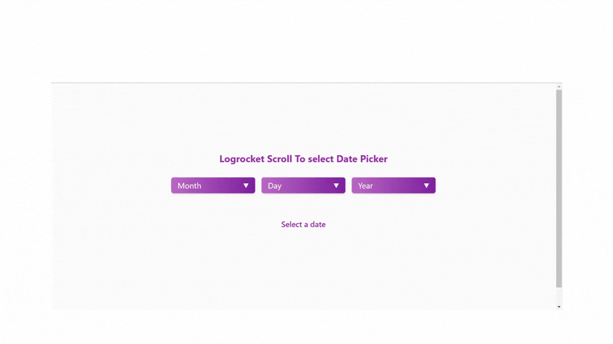
If you noticed when we clicked outside, the dropdown didn’t close. That’s important for the user experience. We’ll handle that right away:
// Close dropdowns when clicking outside
function clickHandler() {
    document.addEventListener('click', () => {
        document.querySelectorAll('.custom-select').forEach(select =>
            select.classList.remove('open'));
    });

    // Prevent closing when clicking inside dropdown
    document.querySelectorAll('.options-selector').forEach(selector => {
        selector.addEventListener('click', (e) => e.stopPropagation());
    });
}
The clickHandler() enables the dropdown closure when clicked outside. I made this function smart enough to keep dropdowns open when clicking inside them:
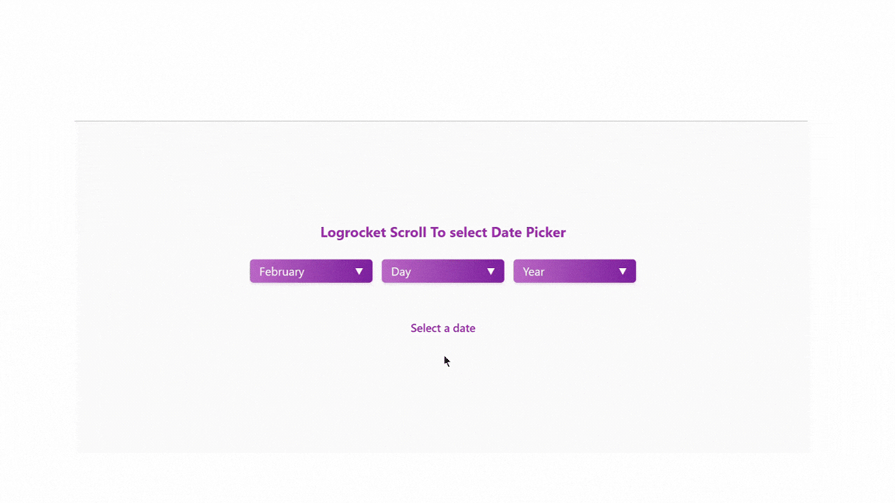
You’ll also notice that the selected date below is not updated when we select a date:

Let’s quickly fix that, so it updates synonymously whenever the selectOption() function is called. We’ll create the function we called in the selectOption() above:
function updateSelectedDate() {
    const month = monthSelect.querySelector('.select-display').textContent;
    const day = daySelect.querySelector('.select-display').textContent;
    const year = yearSelect.querySelector('.select-display').textContent;

    if (month !== 'Month' && day !== 'Day' && year !== 'Year') {
        selectedDate.textContent = `Selected: ${month} ${day}, ${year}`;
    }
}
Now we see that the date updates after we make our selection. Also, you’ll notice that when you scroll, nothing happens. You have to click an option to select a date, which is no different from a regular selector form. To fix that, we will be using the Intersection Observer API.
We will create a function called setupIntersectionObservers(). This function is where we write our most important scroll-to-select form feature logic:
function setupIntersectionObservers() {
    document.querySelectorAll('.options-selector').forEach(selector => {
        const container = selector.closest('.custom-select');
        const observer = new IntersectionObserver(
            (entries) => {
                entries.forEach(entry => {
                    if (entry.isIntersecting) {
                        const option = entry.target;
                        selectOption(option, container);
                    }
                });
            },
            {
                root: selector,
                rootMargin: '-5% 0px -94% 0px',
                threshold: 0
            }
        );

        selector.querySelectorAll('.option-item').forEach(option =>
            observer.observe(option));
    });
}
In the code above we have used the Intersection Observer API, which helps us keep an eye on each element as they enter and exit a defined viewport area.
In our code, we created an observer for each dropdown’s options in the container. This observer is configured with specific margins (rootMargin: '-5% 0px -94% 0px')that create a detection area at the top of the dropdown.
When an option scrolls into this area, isIntersecting becomes true, triggering the selection of that option. This creates the snap effect as you scroll through options.
Each option element (day, month, or year) gets observed individually through observer.observe(option). When an option enters the area, selectOption() function (which was declared above) is called to update the display and maintain the selected state.
The observer continuously monitors the scroll position, making selections feel smooth and natural as users scroll through the date options.
This is tied directly to the CSS scroll-snap behavior defined earlier; they work together to create a polished scrolling experience. The negative margins in rootMargin ensure only one option can be “intersecting” at a time, preventing multiple simultaneous selections.
Here’s what our scroll-select box looks like now:
This has been a long read, but trust me when I say I have tried to make this as short as possible. Even if it was a little bit hectic for you, at least you’ve added to your previous knowledge of operating with selects. Now that you have these extra insights, you’re ready to implement a scroll-select box in your project.
For additional reading, check out our posts on JavaScript scroll-snap events and creating custom <select> dropdown with CSS.
A big thank you for hanging on this far; here is the codepen for this article. Keep coding!

A guide for using JWT authentication to prevent basic security issues while understanding the shortcomings of JWTs.

Discover how to build, render, and automate product demo videos with Remotion, replacing traditional screen recordings with reusable React code.

Chrome’s Modern Web Guidance embeds modern web platform skills into AI coding agents, helping them choose native HTML, CSS, and browser APIs over legacy patterns.

Learn how to use Fallow to analyze AI-generated code, detect dead code, duplicate logic, and complexity issues, and integrate automated code quality checks into your AI-assisted development workflow.
Would you be interested in joining LogRocket's developer community?
Join LogRocket’s Content Advisory Board. You’ll help inform the type of content we create and get access to exclusive meetups, social accreditation, and swag.
Sign up now

 Learn more →
