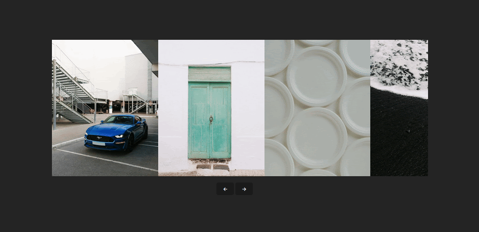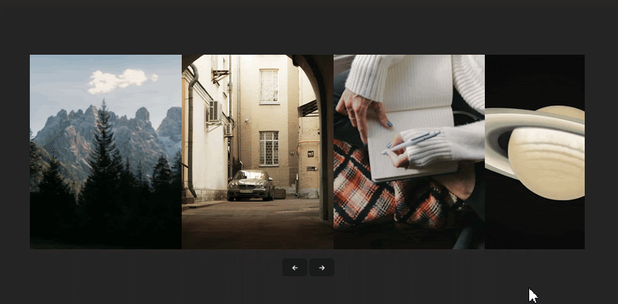
Carousels are a great way of preserving space in a user interface. They let you render a list of content that would essentially take up a significant portion of the user interface in a scrollable container, either vertically or horizontally, without taking up excessive screen real estate.

While carousels come in various styles and types, building one from scratch can be time-consuming and complex. In this article, I’ll show you how to simplify the process using React Snap Carousel – a library specifically designed to make implementing carousels in React applications quick and easy.
The Replay is a weekly newsletter for dev and engineering leaders.
Delivered once a week, it's your curated guide to the most important conversations around frontend dev, emerging AI tools, and the state of modern software.
To get started with React Snap Carousel, begin by installing the package using the following command:
npm i react-snap-carousel
Once the installation is complete, you can integrate it into your components. Below is a basic example of how to use the package:
import { useSnapCarousel } from 'react-snap-carousel';

 const items = Array.from({ length: 20 }).map((_, i) => ({
   id: i,
   src: https://picsum.photos/500?idx=${i}
}));

export const Carousel = () => {

   const { scrollRef, next, prev} = useSnapCarousel();

   return (
       <div>
           <div ref={scrollRef} style={{ display: 'flex', overflow: 'auto' }}>
               {items.map((item, i) => (
                   <div key={i} >
                       <img src={item.src}/>
                   </div>
               ))}
           </div>
           <button onClick={()=>prev()}>Previous</button>
           <button onClick={()=>next()}>Next</button>
       </div>
   );
}
From the example, you can see that React Snap Carousel doesn’t expose a pre-built component like many other carousel libraries. Typically, such components would act as a Swiss Army Knife that manages the state and functionalities of the package under the hood.
The reason for this approach is that React snap carousel is headless. This means it doesn’t come with pre-built or styled-components out of the box. Instead, it exposes a single useSnapCarousel function that offers granular control over the state management and functionality necessary to create a carousel.
This way, you have the freedom to completely customize the visual design and styling to your specific needs.
For brevity, we’ll refer to React Snap Carousel as “RSC” throughout this article.
useSnapCarousel APIThe useSnapCarousel function is a custom React hook that exposes several states that can be used to manage carousel elements such as slides, scroll behavior, and interactions. These states include:
pages: This is an array that represents all the pages or groups of items in the carouselscrollRef: This is a ref object that is attached to the scrollable container element of the carouselgotTo: This function scrolls the carousel directly to a specified page or slide indexprev: A function that scrolls to the previous slide index of the carouselnext: A function that scrolls to the next slide index of the carouselrefresh: A function that recalculates and refreshes the state of the carousel (e.g., dimensions, scroll positions, snapping points)hasPrevPage: A boolean value that indicates whether there is a previous page available to scroll tohasNextPage: Similar to hasPrevPage, the boolean indicates whether there is a next page available to scroll toactivePageIndex: The index of the currently active pagesnapPointIndexes: An array of indexes that represents the snap points for the carousel itemsThe list might seem overwhelming at first glance but don’t worry. You only need a subset of these — scrollRef, next, prev, and refresh — to create a fully functional carousel, as demonstrated in the previous section.
To give you a better understanding of how these functions work together, we’ll use them step by step to build a complete carousel component.
The first step in creating a carousel is preparing the data to be displayed. In the earlier example, we used static data generation with the Array.from() method:
 const items = Array.from({ length: 20 }).map((_, i) => ({
   id: i,
   src: https://picsum.photos/500?idx=${i}
}));
However, in real-world applications, you’ll likely fetch data asynchronously and render the carousel once the data is available. To demonstrate this, we’ll use the Unsplash API — an open-source image API — to fetch a list of random images for our carousel.
Start by creating a new component in your React project. If you don’t have a React project set up yet, check out our guide on setting up a React project with Vite.
This component will hold the logic for our carousel. However, to keep the component clean and separate logic we’ll also create a useFetch hook to handle fetching the images.
Create a useFetch hook by adding a new file at src/hooks/useFetch.js and add the following code:
import React from 'react';

export const useFetch = (url) => {
  const [data, setData] = React.useState();

  React.useEffect(() => {
    const fetchData = async () => {
      try {
        const response = await fetch(url);
        if (!response.ok) {
          throw new Error(`Response status: ${response.status}`);
        }

        const result = await response.json();
        setData(result);
      } catch (error) {
        console.error(error.message);
      }
    };
    fetchData();
  }, [url]);
  return { data };
};
After creating the useFetch hook, return to your Carousel component. Import the hook and pass the Unsplash API endpoint as an argument. Then, destructure the data state from the hook’s return values:
import { useFetch } from '../hooks/useFetch';

const Carousel = () => {
  const url = `https://api.unsplash.com/photos/random?client_id=${import.meta.env.VITE_API_KEY}&count=10`;

  const { data, isLoading, error } = useFetch(url);

  if (isLoading) return <div>Loading...</div>;
  if (error) return <div>Error: {error}</div>;

  return (
    <div>
      ...
    </div>
  );
};
Note: replace the VITE_API_KEY environment variable with your Unsplash API access key.
If everything goes as expected, logging the data state should output the fetched images to your terminal.

With the data ready, you can start building the carousel. First, import the useSnapCarousel hook and destructure the necessary states as follows:
import { useFetch } from '../hooks/useFetch';
import { useSnapCarousel } from 'react-snap-carousel';

const Carousel = () => {
  const {
    scrollRef,
    pages,
    goTo,
    prev,
    next,
    activePageIndex,
    hasPrevPage,
    hasNextPage,
    snapPointIndexes,
    refresh
  } = useSnapCarousel();

  ...

  return (
    <div>
      ...
    </div>
  );
};
To display carousel items, we need a scrollable container where the items will be rendered. We’ll attach the scrollRef object from RSC to this container to enable scrolling functionality:
    <div>
      <ul ref={scrollRef}>
        {data?.map((item, i) => (
          <img
            src={item.urls.small}
            width="250"
            height="250"
            alt={item.alt_description}
          />
        ))}
      </ul>
    </div>
Here, we’re also mapping through the fetched images and rendering them within the container.
Remember, RSC is headless, and it doesn’t provide default styles, so we’ll need to define the CSS to make the carousel look and appear as intended.
Add the following CSS to style the container and items. You can include it at the top level of the Carousel component or in a separate CSS file (e.g., Carousel.css) and import it:
const styles = {
   container: {
       position: 'relative',
       display: 'flex',
       overflow: 'auto',
       scrollSnapType: 'x mandatory',
       scrollBehavior: 'smooth',
   },
   item: {
       width: '350px',
       height: '450px',
       listStyleType: 'none',
       flexShrink: 0,
   },
   img: {
       width: '100%',
       height: '100%',
       objectFit: 'cover',
   },
   buttonDisabled: {opacity: 0.3},
   activeIndex: {opacity: 0.3},
   controls: {
       display: 'flex',
       justifyContent: 'center',
       alignItems: 'center',
       margin: '10px',
   },
   itemSnapPoint: {
       scrollSnapAlign: 'start',
   },
};
The other carousel components aren’t added yet, so we can’t see the style effects yet, but we can preemptively resize and horizontally arrange the items by passing the container and item properties to the style attribute on the ul and li elements, respectively:
      <ul style={styles.container} ref={scrollRef}>
        {data?.map((item, i) => (
          <li key={item.id} style={styles.item}>
        ...
          </li>
        ))}
      </ul>
At this stage, you’ll see this:

Keep in mind that the carousel tiles might vary in size due to different image dimensions. We can address this with CSS styling, similar to the example above. Specifically, we’ll target the item and img selectors:
item: {
   width: '350px',
   height: '450px',
   listStyleType: 'none',
   flexShrink: 0,
},
img: {
   width: '100%',
   height: '100%',
   objectFit: 'cover',
},
These rules will ensure that each tile or item on the carousel will have a consistent appearance, regardless of its original image size.
For the next step, we’ll add controls to the carousel using the next and prev functions. Insert the following code below the container element:
<button onClick={()=>prev()}>{String.fromCharCode(8592)}</button>
<button onClick={()=>next()}>{String.fromCharCode(8594)}</button>
Either function will get called depending on which button is clicked. The String.fromCharCode() static methods will render arrow icons using the sequence of Unicode code provided.
Earlier, I mentioned that only the RSC states we’ve used so far are required to create a basic carousel. However, if you test the controls in the browser at this point, they won’t work as expected.

This issue often arises from asynchronous data fetching or large image sizes, which cause delays in data loading. In this example, the images are large, so loading takes time, even though it’s barely noticeable. As a result, RSC waits until all data is loaded, leaving the controls inactive during the delay.
Thankfully, we can fix this by using the refresh function to update the carousel states once the data fully loads and make the controls interactive.
Add a useEffect declaration to the Carousel component. Inside it, call the refresh function. Include the data and scrollRef states in the dependency array:
useEffect(() => {
   refresh();
}, [data, scrollRef]);
Now, if you go back to the browser and interact with the carousel it should function properly.

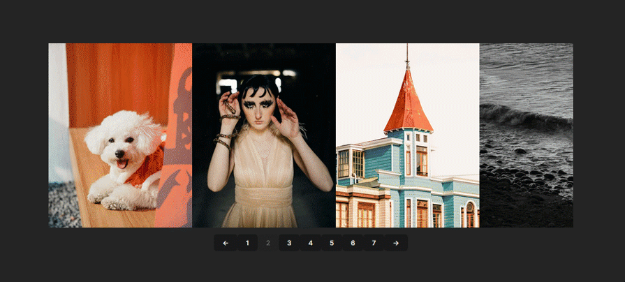
Since we know the pages array holds the number of items in the carousel, we can use it to create a pagination to navigate between different pages of items.
We’ll insert the pagination between the prev and next buttons inside the controls wrapper:
<div style={styles.controls}>
   <button onClick={() => prev()}>{String.fromCharCode(8592)}</button>
   <div>
       {pages.map((_, i) => (
           <button key={i}>{i + 1}</button>
       ))}
   </div>
   <button onClick={()=>next()}>{String.fromCharCode(8594)}</button>
</div>
To make each pagination number interactive and enable scroll to its respective carousel item, add a click event to the numbers using the goTo function:
<div style={styles.controls}>
    ...

       {pages.map((_, i) => (
           <button key={i} onClick={() => goTo(i)}>{i + 1}</button>
       ))}

    ...
</div>
When a pagination number is clicked, its index is passed as an argument to the goTo function. This index determines the slide to scroll to.

Next, we’ll use the hasPrevPage and hasNextPage states to check if the carousel is at the beginning or end of its content then disable the prev or next buttons accordingly:
<button
   onClick={() => prev()}
   disabled={!hasPrevPage}
   style={!hasPrevPage ? styles.buttonDisabled : {}}
>
   ...
</button>

<button
   onClick={() => next()}
   disabled={!hasNextPage}
   style={!hasNextPage ? styles.buttonDisabled : {}}
>
   ...
</button>
The buttonDisabled style property will likewise reduce the opacity of the buttons making it obvious that the button is disabled when either of the states returns a truthy value.
Similarly, we’ll use the activePageIndex state to determine the currently visible page and conditionally style it to highlight the active page’s indicator:
<div>
   {pages.map((_, i) => (
       <button
           key={i}
           onClick={() => goTo(i)}
           style={activePageIndex === i ? styles.activeIndex : {}}
       >
           {i + 1}
       </button>
   ))}
</div>
The activeIndex style property also reduces the active page’s indicator opacity.
Last on the list is snapPointIndexes. We don’t have to do much with this one, as it only stores the indexes of items on the carousel that act as snap points (predefined positions on the carousel where the scrolling behavior stops or snaps).
However, we can use these indexes to create additional effects like conditionally rendering elements or components, dynamic highlighting, and custom navigation indicators amongst other things.
But in our code all we need the snapPointIndexes state for is to set the snap behavior of individual items within the scrollable container like so:
{data?.map((item, i) => (
   <li
       key={`${item.id}-${i}`}
       style={{
           ...styles.item,
           ...(snapPointIndexes.has(i) ? styles.itemSnapPoint : {})
       }}
   >
    ...
   </li>
))}
Here’s the rule for the itemSnapPoint selector:
itemSnapPoint: {
   scrollSnapAlign: 'start',
},
The scrollSnapAlign: ‘start’ rule specifies that the item’s starting edge (left edge, for horizontal scrolling) should align with the snap point of the container when the snapping occurs.
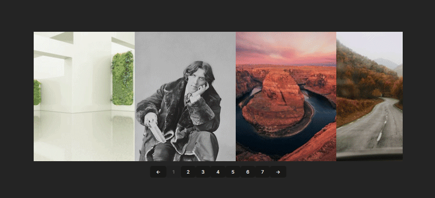
With this setup, you now have a carousel with fully functional controls and pagination. Next, we’ll look into extending the functionality and adding infinite scroll.
The concept of infinite scrolling involves making the carousel appear in a seamless loop through its items. Unfortunately, RSC doesn’t inherently support infinite scroll out of the box. So implementing the feature would require a bit of custom handling.
The general idea to custom handle this functionality would be to cycle through the content and control scroll behavior. Here’s a step-by-step approach to how we’re going to achieve this:
prev and next functions. This way we can create custom logic for our implementationFirst, we’ll remove the following items from our code:
hasPrevPage and hasNextPage functionsdisabled attributes on the control buttonsThis is because we want the controls to remain active, even when the user reaches the start or end of the carousel. That way, they can attempt scrolling beyond the last item.
After removing these items, we can proceed with implementing the custom handlers:
const handleNext = useCallback(() => {
   if (activePageIndex === pages.length - 1) {
       goTo(0);
   } else {
       next();
   }
}, [activePageIndex, pages.length, goTo, next]);

const handlePrev = useCallback(() => {
   if (activePageIndex === 0) {
       goTo(pages.length - 1);
   } else {
       prev();
   }
}, [activePageIndex, pages.length, goTo, prev]);
As you can see, we’re not entirely getting rid of the prev and next functions. Instead, we’re using the activePageIndex, pages, and goTo functions to determine if the carousel is at the beginning or end. If so, we’ll smoothly scroll back to the opposite end. Otherwise, we’ll call the prev or next function as usual.
Finally, we’ll attach these custom handlers to the onClick event of the control buttons:
<div style={styles.controls}>
   <button onClick={handlePrev}>
       ...
   </button>
    ...
   <button onClick={handleNext}>
       ...
   </button>
</div>
With that, we’ve successfully created the illusion of infinite scrolling on our carousel despite the limitations.

Here’s the complete code for the Carousel component:
import {useSnapCarousel} from 'react-snap-carousel';
import {useFetch} from "../hooks/useFetch.js";
import {useEffect, useCallback} from "react";

export const Carousel_test = () => {
   const url = `https://api.unsplash.com/photos/random?client_id=${
       import.meta.env.VITE_API_KEY
   }&count=20`;

   const {data, isLoading, error} = useFetch(url);

   const {
       scrollRef,
       pages,
       goTo,
       prev,
       next,
       activePageIndex,
       snapPointIndexes,
       refresh,
   } = useSnapCarousel();

   const handleNext = useCallback(() => {
       if (activePageIndex === pages.length - 1) {
           goTo(0);
       } else {
           next();
       }
   }, [activePageIndex, pages.length, goTo, next]);

   const handlePrev = useCallback(() => {
       if (activePageIndex === 0) {
           goTo(pages.length - 1);
       } else {
           prev();
       }
   }, [activePageIndex, pages.length, goTo, prev]);

   useEffect(() => {
       refresh();
   }, [data, scrollRef]);

   if (isLoading) return <div>Loading...</div>;
   if (error) return <div>Error: {error}</div>;

   return (
       <div>
           <ul style={styles.container} ref={scrollRef}>
               {data?.map((item, i) => (
                   <li
                       key={`${item.id}-${i}`}
                       style={{
                           ...styles.item,
                           ...(snapPointIndexes.has(i) ? styles.itemSnapPoint : {})
                       }}
                   >
                       <img
                           style={styles.img}
                           src={item.urls.small}
                           alt={item.alt_description}
                       />
                   </li>
               ))}
           </ul>
           <div style={styles.controls}>
               <button onClick={handlePrev}>
                   {String.fromCharCode(8592)}
               </button>
               <div>
                   {pages.map((_, i) => (
                       <button
                           key={i}
                           onClick={() => goTo(i)}
                           style={activePageIndex === i ? styles.activeIndex : {}}
                       >
                           {i + 1}
                       </button>
                   ))}
               </div>
               <button onClick={handleNext}>
                   {String.fromCharCode(8594)}
               </button>
           </div>
       </div>
   );
};

const styles = {
   container: {
       position: 'relative',
       display: 'flex',
       overflow: 'auto',
       scrollSnapType: 'x mandatory',
       scrollBehavior: 'smooth',
   },
   item: {
       width: '350px',
       height: '450px',
       listStyleType: 'none',
       flexShrink: 0,
   },
   img: {
       width: '100%',
       height: '100%',
       objectFit: 'cover',
   },
   buttonDisabled: {opacity: 0.3},
   activeIndex: {opacity: 0.3},
   controls: {
       display: 'flex',
       justifyContent: 'center',
       alignItems: 'center',
       margin: '10px',
   },
   itemSnapPoint: {
       scrollSnapAlign: 'start',
   },
};
The React Scroll Carousel package is no doubt an excellent choice for creating flexible and customizable carousels. And given its headless nature, gives you the freedom to tailor the design of your carousel to your specific needs.
While the package has its limitations, as we’ve seen in the article, the idea of extending its functionality isn’t far-fetched and can be achieved with solid JavaScript and React knowledge.
Install LogRocket via npm or script tag. LogRocket.init() must be called client-side, not
server-side
$ npm i --save logrocket

// Code:

import LogRocket from 'logrocket';
LogRocket.init('app/id');
// Add to your HTML:

<script src="https://cdn.lr-ingest.com/LogRocket.min.js"></script>
<script>window.LogRocket && window.LogRocket.init('app/id');</script>

Learn how inline props break React.memo, trigger unnecessary re-renders, and hurt React performance — plus how to fix them.

This article showcases a curated list of open source mobile applications for Flutter that will make your development learning journey faster.

Discover what’s new in The Replay, LogRocket’s newsletter for dev and engineering leaders, in the April 1st issue.

This post walks through a complete six-step image optimization strategy for React apps, demonstrating how the right combination of compression, CDN delivery, modern formats, and caching can slash LCP from 8.8 seconds to just 1.22 seconds.
Hey there, want to help make our blog better?
Join LogRocket’s Content Advisory Board. You’ll help inform the type of content we create and get access to exclusive meetups, social accreditation, and swag.
Sign up now