When my team redesigned our online order form, it wasn’t just an incremental update — it was a full rework that fundamentally changed how customers interacted with the platform. And the decision was not made lightly. Endless support tickets and frustrated customers had made it clear that the order form was costing us both revenue and retention. After two rounds of smaller optimizations failed, we decided to scrap the old design and start from scratch.
The result was a solution rooted in real customer feedback, behavioral psychology, and best practices in user experience. Most importantly, the outcome exceeded expectations: related support tickets dropped by more than 95 percent.
Our first attempt focused on trimming unnecessary fields. Irrelevant inputs were deleted or merged in the hope of making the form feel less overwhelming. While this reduced friction slightly, the improvement was marginal: support tickets dropped by only about five percent.
The second attempt was more ambitious. We added some tooltips, FAQ links, and discount incentives to compensate for frustrations. Initially, customers tried using the info icons, but they quickly grew tired of them and reverted to contacting support directly. Once again, the outcome was disappointing, with only another five percent reduction in tickets.
Both experiments made one thing painfully clear: incremental adjustments were not enough. The underlying design was broken.
As new services were added to the platform, the order form ballooned in size and complexity. Departments were at odds: Sales wanted to capture additional revenue, while Support struggled with a flood of confused users.
It became obvious that patching the existing form would only make the problem worse. The only viable path forward was to burn it down and rebuild from the ground up, guided by customer insights and theoretical research.
The redesign of our order form started not in design software, but in the support inbox. Customers weren’t complaining about system errors — they were confused. They were unsure about which options to choose, what certain fields meant, or how to complete the process. Support tickets piled up with messages like “I don’t understand what I’m supposed to do here,” or “Can you walk me through this?” These weren’t failures of technology, but failures of clarity.
Instead of just reacting to individual complaints, we studied established theories from psychology and UX design. Each principle suggested a way to reduce cognitive load, simplify decisions, and make the form more intuitive. The result was nine targeted changes, each one tied to a category of support tickets that practically disappeared once the redesign was launched.
We started by applying the Zeigarnik effect, which suggests that people are more motivated to complete a task once they’ve already started it.
Looking at our order form, the initial impression was overwhelming. Users didn’t abandon the process because it was too long, but because it was intimidating to even begin. Support tickets reflected this, with feedback like: “As soon as I saw a long form, I didn’t know where to start and was instantly frustrated.”
To translate this theory into action, we created a compact preview form showing only the most essential fields upfront:
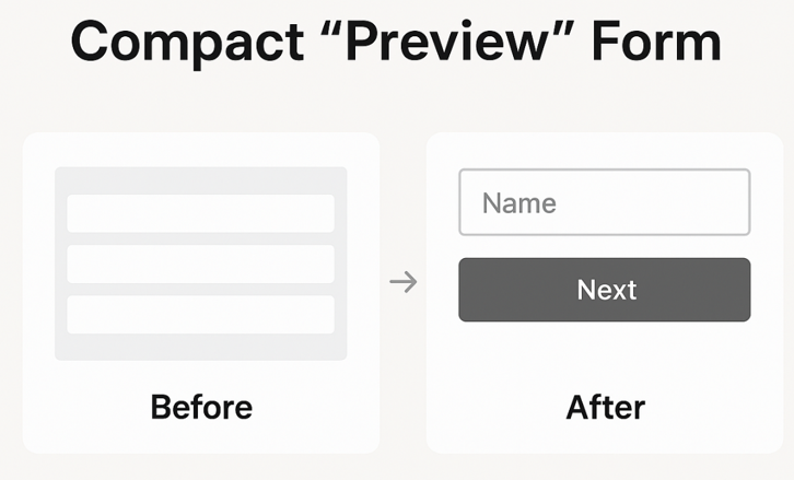
Once customers entered information, the momentum from starting encouraged them to continue. A further progressive disclosure of the order form was done using the multiple steps set up. The progress bar was visible to all users, so that with each step completed, they were more likely to finish the order process completely.
Dual coding theory shows that people learn better when information is delivered both visually and verbally.
Our old text-heavy instructions weren’t connecting, particularly for first-time users. Support tickets often said: “I don’t understand the steps. Could you show me?” But walking each user through completing the form wasn’t sustainable for our Support team.
Embedding a short two-minute video walkthrough directly in the form gave users simultaneous visual and verbal cues:
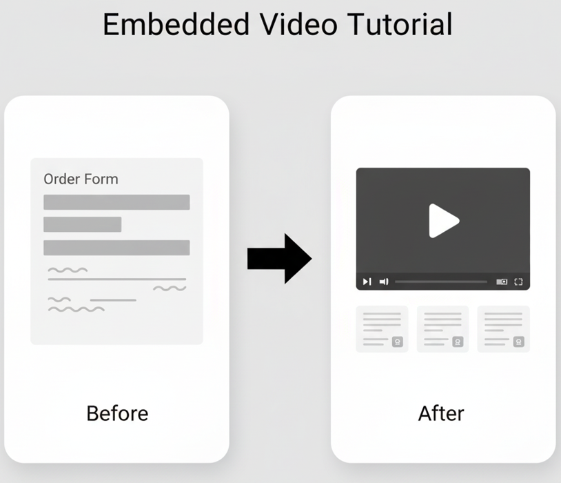
This better equipped users to be able to complete the form on their own, without guidance from our Support staff.
Hick’s Law highlights that decision-making slows as the number or complexity of options increases. On our previous form, dropdowns with vague labels forced users to scroll and parse each option, which is a mentally taxing process. Support feedback included: “The dropdowns are confusing, I don’t know which service to pick.”
Applying this insight, we redesigned these inputs into card-based selections with icons, short descriptions, and clickable buttons:
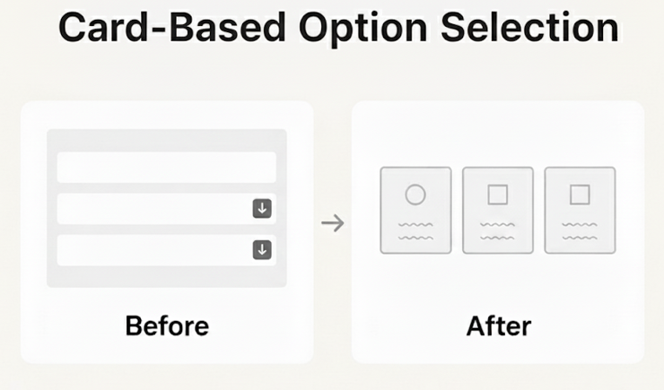
This made options tangible and easier to understand, allowing users to choose quickly and confidently.
Affordances in UX design help users understand how interface elements should be used. Blank input fields on the old form provided no guidance, causing errors in the email, name, and address fields. Support tickets frequently noted: “I wasn’t sure what format to use for my email and kept getting it wrong.”
We added placeholder text like “Enter your email address ([email protected]),” signaling proper input format:
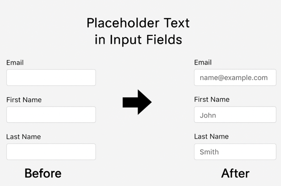
This small, seemingly minor change gave users more confidence in their inputs and reduced errors in the form.
Besides placeholder text that showed users what their inputs should look like, we also added validation logic to prompt them when they made a mistake in the email field. This aligned with Nielsen’s usability heuristics, which emphasize error prevention over error correction.
Previously, invalid emails slipped through, creating downstream support issues. Users reported: “I entered my email, but the confirmation never came. What did I do wrong?”
Applying this principle, we implemented real-time email validation that checks for missing “@” symbols or periods before submission:
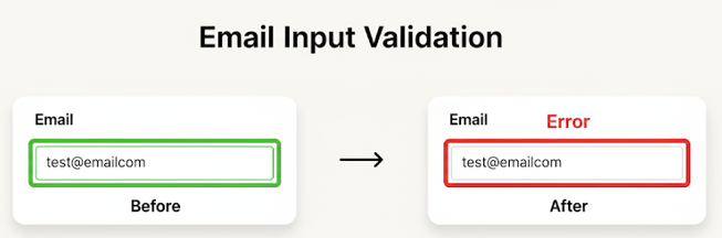
This way, users receive instant feedback, reducing errors and sparing support staff from tedious follow-ups.
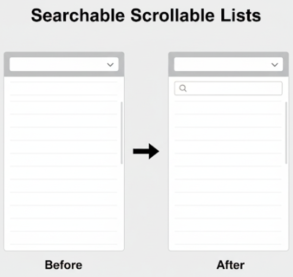
Information foraging theory shows that users seek the fastest path to their target information. Long, static dropdowns buried options in irrelevant choices, slowing the process. Support tickets highlighted: “I spent ages scrolling through the list and still couldn’t find something that I needed.”
Guided by this principle, we created scrollable lists with integrated search filters, allowing users to find their service in seconds:
Interaction design emphasizes constraints, which reduce errors by guiding user input. Our old numeric fields left users uncertain — should they type 1 for just ordering a service overall, or some kind of number of end products? What if they just need a fraction of what is offered? Support tickets often said: “I wasn’t sure if I could enter fractions or whole numbers, and then I worried I’d get it wrong.”
We redesigned this field with increment/decrement buttons plus a manual input option:
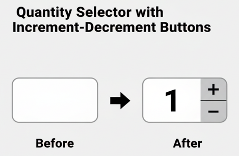
This constrained input in a natural way while keeping flexibility. This error prevention technique was designed to address the issue of confusion by providing a preview of expectations, thereby making the order process smoother.
Fitts’s Law tells us that larger, more obvious targets are faster and easier to interact with. Previously, add-ons were buried in dense lists, reducing both usability and revenue. Support feedback included: “I didn’t even notice the add-ons, so I missed things I actually wanted.”
We introduced large, clickable “Add to Order” buttons that change color when selected, improving visibility and interaction speed:
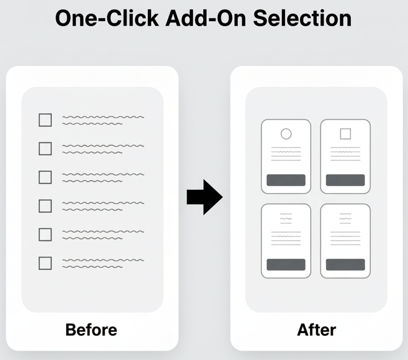
This served the dual purpose of letting users know the option was there and making it easier for them to select what they wanted.
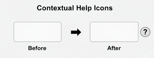
We applied the UX design principle of progressive disclosure to show information only when necessary. Our old form buried explanations at the bottom or in external FAQs.
Users often reported: “I had to scroll to the bottom or open a different page to understand this field.” By adding small “?” or “i” icons next to relevant fields, we provided on-demand guidance exactly where it was needed, improving clarity without cluttering the form:
Reducing cognitive load in this way made the form easier to understand and use, meaning users no longer had to reach out to Support for clarity on what a field meant or what kind of input was needed.
The redesign delivered measurable improvements across multiple dimensions. By connecting theory to user behavior and support feedback, each change produced clear results:
| Feature / Theory | Key support issue addressed | Result/impact |
|---|---|---|
| Compact preview form (Zeigarnik effect) | Intimidating long form; “I didn’t know where to start” | Reduced abandonment rates; users are more likely to begin and complete orders |
| Embedded video tutorial (dual coding) | Confusion with text instructions; “I don’t understand the steps” | Fewer “how do I?” tickets; first-time users navigated the form faster |
| Card-based option selection (Hick’s Law) | Dropdowns were confusing; “I don’t know which service to pick” | Faster, more confident decision-making; fewer selection errors |
| Placeholder text (affordances) | Input errors; “I wasn’t sure what format to use” | Reduced basic mistakes in emails, names, addresses |
| Email input validation (error prevention) | Invalid submissions; “Confirmation never came” | Instant feedback prevented errors; reduced downstream support workload |
| Searchable scrollable lists (information foraging) | Long dropdowns; “I couldn’t find what I needed” | Users found options in seconds; fewer selection-related tickets |
| Quantity selector with buttons (input constraints) | Confusion on numeric input; “I didn’t know if I could enter fractions” | Clear guidance reduced errors and hesitation; smoother checkout |
| One-click add-on selection (Fitts’s Law) | Hidden add-ons; “I didn’t notice extras” | Improved upsell rates; users were more likely to select optional items |
| Contextual help icons (progressive disclosure) | Buried instructions; “I had to scroll to the bottom” | On-demand guidance reduced confusion; the form was cleaner and easier to follow |
Besides the impact we saw from each change, we also saw overall improvements in form use and user experience:
Completely redesigning the form also gave us two forward-looking benefits:
The journey taught us an important truth: sometimes it’s better to start fresh than to endlessly patch a flawed design. Incremental improvements can only go so far if the underlying structure is broken.
Here are three key questions to help decide whether to scrap and rebuild:
The redesign of our order form demonstrates that bold, theory-driven changes grounded in real user feedback can dramatically improve both customer experience and operational efficiency.
Incremental fixes alone were insufficient — support tickets continued to pile up, users were frustrated, and the form itself became increasingly complex as the platform grew. By starting fresh, we were able to tackle the root causes of confusion rather than the symptoms.
Our bold step to rebuild rather than patch turned a frustrating, high-support-cost process into a frictionless, scalable experience. Support tickets fell by 95 percent, customer confidence increased, and revenue opportunities expanded. This approach proves that starting with user insights, validating with behavioral theory, and measuring impact rigorously is the most effective path to long-term UX success.

LogRocket's Galileo AI watches sessions and understands user feedback for you, automating the most time-intensive parts of your job and giving you more time to focus on great design.
See how design choices, interactions, and issues affect your users — get a demo of LogRocket today.
Multimodal UX goes beyond designing for screens. Learn how context-aware systems, progressive modality, failover modes, and accessibility-first design create better digital product experiences.
Learn how context-aware mode prioritization and seamless transitions improve multimodal UX and reduce mode confusion.

Research is becoming more democratized, product cycles are accelerating, and AI is transforming synthesis and ResearchOps. Here are the three trends shaping UX research in 2026.

Voice support is not the same as multimodal UX. Here’s how to design systems with true mode continuity and context-aware interactions.

 Learn more →
