Transitions in mobile applications provide design continuity. This continuity is provided by connecting common elements from one view to the next while navigating in the app.

The Replay is a weekly newsletter for dev and engineering leaders.
Delivered once a week, it's your curated guide to the most important conversations around frontend dev, emerging AI tools, and the state of modern software.
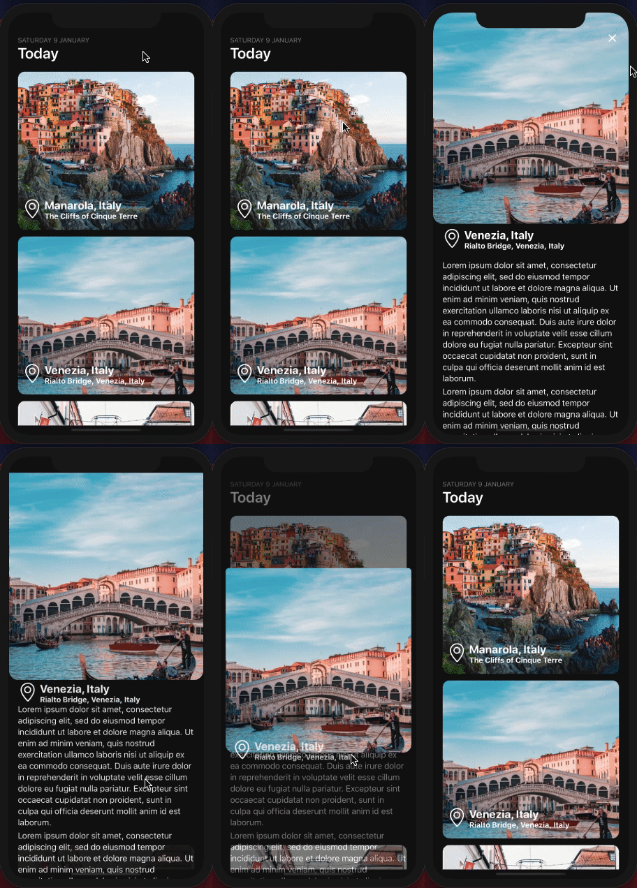
Transitions between different views or activities involve enter and exit transitions that animate the entire view hierarchies independent of each other. There are times when two different views in continuity have common elements. Providing a way to transition these common elements from one view to the second view and back, emphasizes the continuity between transitions. The nature of these transitions maintain focus for the end-users on the content and provides a seamless experience. A Shared Element Transition determines how two different views share one or more elements to maintain the focus and experience.
Before you begin, please make sure to have the following installed on a local environment:
Do note that to demonstrate I’ll be using an iOS simulator. If you prefer to use an Android device or an emulator, the code snippets shared in this post will run the same.
To get started, let’s create a new React Native project using expo-cli. From a terminal window, execute the command below and then navigate inside the newly created project directory. After navigating, install the libraries that are required in order to create Shared Element Transitions. Let’s use react-navigation from one screen to another using a stack navigation pattern.
To install the React Navigation library, please take a look at the following instructions from the official documentation. These dependencies change with time:
npx expo init shared-element-transitions
cd shared-element-transitions
yarn add @react-navigation/native react-native-animatable
expo install react-native-gesture-handler react-native-reanimated react-native-screens react-native-safe-area-context @react-native-community/masked-view
yarn add react-native-shared-element react-navigation-shared-element@next
After installing these libraries, let’s check out how to run the Expo app. From the terminal, run the yarn start command to trigger a build for the Expo app. Then depending on the simulator or the device, please select the correct option from the terminal prompt. For example, to run this app in its initial state on an iOS simulator, pressi.
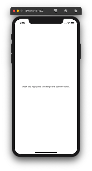
Here is how the output on an iOS simulator is shown:

This output verifies that the Expo app is up and running.
The transition in this example app is going to be between a home screen and a details screen. The home screen is going to be a scrollable list of images and some data. I am going to use a set of the mock data array. You are free to use whatever data you might want to try out. Without bothering about the data set, you can use the mock data. Create a new directory called config/ and inside it create a new file called data.js with the following array and objects:
export const data = [
  {
    id: '1',
    title: 'Manarola, Italy',
    description: 'The Cliffs of Cinque Terre',
    image_url:
      'https://images.unsplash.com/photo-1516483638261-f4dbaf036963?ixid=MXwxMjA3fDB8MHxwaG90by1wYWdlfHx8fGVufDB8fHw%3D&ixlib=rb-1.2.1&auto=format&fit=crop&w=633&q=80',
    iconName: 'location-pin'
  },
  {
    id: '2',
    title: 'Venezia, Italy',
    description: 'Rialto Bridge, Venezia, Italy',
    image_url:
      'https://images.unsplash.com/photo-1523906834658-6e24ef2386f9?ixlib=rb-1.2.1&ixid=MXwxMjA3fDB8MHxwaG90by1wYWdlfHx8fGVufDB8fHw%3D&auto=format&fit=crop&w=630&q=80',
    iconName: 'location-pin'
  },
  {
    id: '3',
    title: 'Prague, Czechia',
    description: 'Tram in Prague',
    image_url:
      'https://images.unsplash.com/photo-1513805959324-96eb66ca8713?ixid=MXwxMjA3fDB8MHxwaG90by1wYWdlfHx8fGVufDB8fHw%3D&ixlib=rb-1.2.1&auto=format&fit=crop&w=634&q=80',
    iconName: 'location-pin'
  }
];
After that create a new directory called screens/ where the two app screens are going to live. Create a file inside it called HomeScreen.js and import the following statements:
import React from 'react';
import {
  ScrollView,
  Text,
  View,
  TouchableOpacity,
  Image,
  Dimensions
} from 'react-native';
import { StatusBar } from 'expo-status-bar';
import { SimpleLineIcons } from '@expo/vector-icons';
import { data } from '../config/data';
Using the Dimensions API from React Native, let’s define the initial width and height of the image component. In the code snippet below, I am calculating both the width and the height using the width of the screen:
const { width } = Dimensions.get('screen');
const ITEM_WIDTH = width * 0.9;
const ITEM_HEIGHT = ITEM_WIDTH * 0.9;
The HomeScree component is going to be a functional React component that accepts one prop called navigation. The navigation prop will allow the navigation from the Home screen to the DetailScreen. In any React Native app, the React Navigation library provides a context that further gives access to the navigation object as a prop automatically. The prop contains various functions that dispatch navigation actions:
export default function HomeScreen({ navigation }) {
  return (
    <View style={{ flex: 1, backgroundColor: '#0f0f0f' }}>
      <StatusBar hidden />
      {/* Header */}
      <View style={{ marginTop: 50, marginBottom: 20, paddingHorizontal: 20 }}>
        <Text style={{ color: '#888', textTransform: 'uppercase' }}>
          Saturday 9 January
        </Text>
        <Text style={{ color: '#fff', fontSize: 32, fontWeight: '600' }}>
          Today
        </Text>
      </View>
  )
}
This functional component is going to render the header stating some dummy information to display and beneath it, a ScrollView to scroll through a list of images. Each image displays an icon and some information regarding what the image is about. This image and the text on it will play a huge role later when a transition is going to happen between the home and detail screen. Inside the ScrollView component, let’s render the mock data using JavaScript’s map() method. If you are injecting data from a REST API that is hosted somewhere and you are not sure about the number of items in that particular data set, please use a FlatList component from React Native instead of ScrollView:
return (
  {/* Scrollable content */}
<View style={{ flex: 1, paddingBottom: 20 }}>
  <ScrollView
    indicatorStyle='white'
    contentContainerStyle={{ alignItems: 'center' }}
  >
    {data.map(item => (
      <View key={item.id}>
        <TouchableOpacity
          activeOpacity={0.8}
          style={{ marginBottom: 14 }}
          onPress={() => navigation.navigate('DetailScreen', { item })}
        >
          <Image
            style={{
              borderRadius: 14,
              width: ITEM_WIDTH,
              height: ITEM_HEIGHT
            }}
            source={{ uri: item.image_url }}
            resizeMode='cover'
          />
          <View
            style={{
              position: 'absolute',
              bottom: 20,
              left: 10
            }}
          >
            <View style={{ flexDirection: 'row' }}>
              <SimpleLineIcons size={40} color='white' name={item.iconName} />
              <View style={{ flexDirection: 'column', paddingLeft: 6 }}>
                <Text
                  style={{
                    color: 'white',
                    fontSize: 24,
                    fontWeight: 'bold',
                    lineHeight: 28
                  }}
                >
                  {item.title}
                </Text>
                <Text
                  style={{
                    color: 'white',
                    fontSize: 16,
                    fontWeight: 'bold',
                    lineHeight: 18
                  }}
                >
                  {item.description}
                </Text>
              </View>
            </View>
          </View>
        </TouchableOpacity>
      </View>
    ))}
  </ScrollView>
</View>);
The DetailScreen component is going to render the details for each image that is part of the scroll list on the home screen. On this screen, an image is shown with a back navigation button that is positioned on the top of the screen. It receives the data in form of an item object that is destructured using route.params from React Navigation library. Beneath the image, it is going to show the title that will be shared with the home screen and some dummy text.
Create a new file called DetailScreen.js inside the screens/ directory and add the following code snippet:
import React, { useRef } from 'react';
import {
StyleSheet,
Text,
View,
ScrollView,
Image,
Dimensions
} from 'react-native';
import { SimpleLineIcons, MaterialCommunityIcons } from '@expo/vector-icons';
const { height } = Dimensions.get('window');
const ITEM_HEIGHT = height * 0.5;
const DetailScreen = ({ navigation, route }) => {
const { item } = route.params;
return (
<View style={{ flex: 1, backgroundColor: '#0f0f0f' }}>
<Image
source={{ uri: item.image_url }}
style={{
width: '100%',
height: ITEM_HEIGHT,
borderBottomLeftRadius: 20,
borderBottomRightRadius: 20
}}
resizeMode='cover'
/>
<MaterialCommunityIcons
name='close'
size={28}
color='#fff'
style={{
position: 'absolute',
top: 40,
right: 20,
zIndex: 2
}}
onPress={() => {
navigation.goBack();
}}
/>
<View
style={{ flexDirection: 'row', marginTop: 10, paddingHorizontal: 20 }}
>
<SimpleLineIcons size={40} color='white' name={item.iconName} />
<View style={{ flexDirection: 'column', paddingLeft: 6 }}>
<Text
style={{
color: 'white',
fontSize: 24,
fontWeight: 'bold',
lineHeight: 28
}}
>
{item.title}
</Text>
<Text
style={{
color: 'white',
fontSize: 16,
fontWeight: 'bold',
lineHeight: 18
}}
>
{item.description}
</Text>
</View>
</View>
<ScrollView
indicatorStyle='white'
style={{
paddingHorizontal: 20,
backgroundColor: '#0f0f0f'
}}
contentContainerStyle={{ paddingVertical: 20 }}
>
<Text
style={{
fontSize: 18,
color: '#fff',
lineHeight: 24,
marginBottom: 4
}}
>
Lorem ipsum dolor sit amet, consectetur adipiscing elit, sed do
eiusmod tempor incididunt ut labore et dolore magna aliqua. Ut enim ad
minim veniam, quis nostrud exercitation ullamco laboris nisi ut
aliquip ex ea commodo consequat. Duis aute irure dolor in
reprehenderit in voluptate velit esse cillum dolore eu fugiat nulla
pariatur. Excepteur sint occaecat cupidatat non proident, sunt in
culpa qui officia deserunt mollit anim id est laborum.
</Text>
</ScrollView>
</View>
);
};
export default DetailScreen;
To navigate from the home screen to the detail screen and back, the app needs to have a navigation flow. This is going to be provided by createSharedElementStackNavigator method from react-navigation-shared-element module. It contains the React Navigation library for react-native-shared-element. This method allows us to create a stack-navigator which is the initial process of sharing elements between two separate screens. It wraps each route with the shared element and detects route changes to trigger the transitions. The process of defining the navigation flow using this method is similar to React Navigation’s stack-navigator module.
Create a new directory called navigation/ and inside it create a new file called RootNavigator.js. Import the following statements and create an instance called Stack of the createSharedElementStackNavigator method. Then define the root navigator:
import * as React from 'react';
import { NavigationContainer } from '@react-navigation/native';
import { createSharedElementStackNavigator } from 'react-navigation-shared-element';
import HomeScreen from '../screens/HomeScreen';
import DetailScreen from '../screens/DetailScreen';
const Stack = createSharedElementStackNavigator();
export default function RootNavigator() {
  return (
    <NavigationContainer>
      <Stack.Navigator headerMode='none' initialRouteName='HomeScreen'>
        <Stack.Screen name='HomeScreen' component={HomeScreen} />
        <Stack.Screen name='DetailScreen' component={DetailScreen} />
      </Stack.Navigator>
    </NavigationContainer>
  );
}
To see it in action, modify the App.js file as shown below:
import React from 'react';
import RootNavigator from './navigation/RootNavigator';
export default function App() {
  return <RootNavigator />;
}
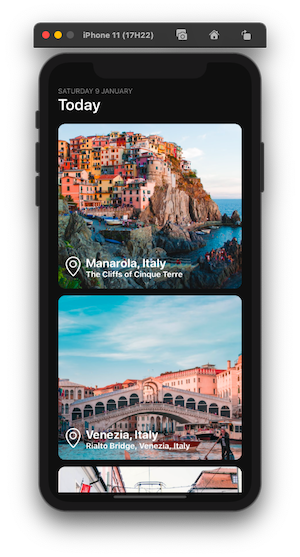
Here is the result after this step in the iOS simulator:

The image component is going to be responsible for supporting a seamless back and forth transition between home and detail screen. This transition should happen from the scroll grid to the detail screen and back to the relevant image. To make this happen, wrap the Image component with <SharedElement> and provide a unique id to it in the HomeScreen.
Also, make sure to import the <SharedElement> component from the react-navigation-shared-element module:
import { SharedElement } from 'react-navigation-shared-element';
// Wrap the image component as
return (
  // ...
  <SharedElement id={`item.${item.id}.image_url`}>
    <Image
      style={{
        borderRadius: 14,
        width: ITEM_WIDTH,
        height: ITEM_HEIGHT
      }}
      source={{ uri: item.image_url }}
      resizeMode='cover'
    />
  </SharedElement>
);
The <SharedElement> component accepts a prop called id that is the shared ID between the two screens. The child it is wrapped around is the actual component where the transition happens.
To enable the Shared Element Transitions, the above process has to be followed in DetailScreen:
import { SharedElement } from 'react-navigation-shared-element';
// Wrap the image component as
return (
  // ...
  <SharedElement id={`item.${item.id}.image_url`}>
    <Image
      source={{ uri: item.image_url }}
      style={{
        width: '100%',
        height: ITEM_HEIGHT,
        borderBottomLeftRadius: 20,
        borderBottomRightRadius: 20
      }}
      resizeMode='cover'
    />
  </SharedElement>
);
To animate the transition between the home and the detail screens, define a sharedElements configuration in the DetailScreen component. This will map the transition of the Image component between the two screens.
Before the export statement in DetailScreen.js add the code snippet:
DetailScreen.sharedElements = route => {
  const { item } = route.params;
  return [
    {
      id: `item.${item.id}.image_url`,
      animation: 'move',
      resize: 'clip'
    }
  ];
};
The config object above triggers the transition effects on shared elements between screens based on the unique ID shared between those two screens. This is done by defining a property called id.
The property animation determines how the animation is going to happen when navigating between two screens. For example, in the above code snippet, the animation has a value called move. It is also the default value of this property. There are other values available such as fade, fade-in, and fade-out. The property resize is the behavior that determines the shape and size of the element should be modified or not. For example, in the above snippet, the value clip adds a transition effect which is similar to a text reveal effect.
Here is the output after this step:

In the above example, please note that when the transition happens, the screen slides from left to right in between. To modify this behavior to apply transition effects of the shared elements, let’s add an options configuration object to the DetailScreen. In the root navigator file, add the following configuration:
const options = {
  headerBackTitleVisible: false,
  cardStyleInterpolator: ({ current: { progress } }) => {
    return {
      cardStyle: {
        opacity: progress
      }
    };
  }
};
// Then add it to the DetailScreen
return (
  <Stack.Screen
    name='DetailScreen'
    component={DetailScreen}
    options={() => options}
  />
);
The cardStyleInterpolator function specifies the interpolated styles for different parts of a card. It allows us to customize the transitions when navigating between two screens. It receives a property value called current.progress that represents the animated node progress value of the current screen. Applying this value to the property opacity changes the animated node to the value of animation defined in the shared element config object. Its cardStyle property applies the style on the view that is representing the card.
In the previous demonstration, you can see that the transition on the image component is seamless but other components shared such as the location pin icon, the title and the description of the item between two screens is not.
To resolve this, let’s map them using <SharedElement> component. First, in the home screen, modify the following components:
return (
  // Icon
  <SharedElement id={`item.${item.id}.iconName`}>
    <SimpleLineIcons size={40} color='white' name={item.iconName} />
  </SharedElement>
  //Title
  <SharedElement id={`item.${item.id}.title`}>
  <Text
    style={{
      color: 'white',
      fontSize: 24,
      fontWeight: 'bold',
      lineHeight: 28
    }}
  >
    {item.title}
  </Text>
</SharedElement>
  // Description
  <SharedElement id={`item.${item.id}.description`}>
  <Text
    style={{
      color: 'white',
      fontSize: 16,
      fontWeight: 'bold',
      lineHeight: 18
    }}
  >
    {item.description}
  </Text>
</SharedElement>
);
Similarly, modify the following elements in DetailScreen.js file:
// Icon
<SharedElement id={`item.${item.id}.iconName`}>
  <SimpleLineIcons size={40} color='white' name={item.iconName} />
</SharedElement>
// Title
<SharedElement id={`item.${item.id}.title`}>
  <Text
    style={{
      color: 'white',
      fontSize: 24,
      fontWeight: 'bold',
      lineHeight: 28
    }}
  >
    {item.title}
  </Text>
</SharedElement>
// Description
<SharedElement id={`item.${item.id}.description`}>
  <Text
    style={{
      color: 'white',
      fontSize: 16,
      fontWeight: 'bold',
      lineHeight: 18
    }}
  >
    {item.description}
  </Text>
</SharedElement>
Then add the configuration:
DetailScreen.sharedElements = route => {
  const { item } = route.params;
  return [
    {
      id: `item.${item.id}.image_url`,
      animation: 'move',
      resize: 'clip'
    },
    {
      id: `item.${item.id}.title`,
      animation: 'fade',
      resize: 'clip'
    },
    {
      id: `item.${item.id}.description`,
      animation: 'fade',
      resize: 'clip'
    },
    {
      id: `item.${item.id}.iconName`,
      animation: 'move',
      resize: 'clip'
    }
  ];
};
Here is the output after this step:

Shared Element Transitions are a great way to support a smooth end-user experience but it can become tricky when dealing with elements that need to be loaded before or after the transition happens. For example, in the previous demonstration, the back button renders before the transition happens. To control its behavior, let’s animate it using the React Native Animatable library.
Import it inside the DetailScreen.js file:
import * as Animatable from 'react-native-animatable';
The close button icon is going to be wrapped inside the <Animatable.View>. This component has a prop called delay that delays the animation. Using a prop called duration you can control the amount of time the animation will run. Values to both of these props are provided in milliseconds. Using a ref value, the fadeOut animation is applied on the icon. This animation method is asynchronous and thus, you can use the promise to navigate back to the home screen after the animation has successfully run. The argument passed to this animation method is in milliseconds:
const DetailScreen = ({ navigation, route }) => {
  const buttonRef = React.useRef();
  return (
    <Animatable.View
      ref={buttonRef}
      animation='fadeIn'
      duration={600}
      delay={300}
      style={[StyleSheet.absoluteFillObject]}
    >
      <MaterialCommunityIcons
        name='close'
        size={28}
        color='#fff'
        style={{
          position: 'absolute',
          top: 40,
          right: 20,
          zIndex: 2
        }}
        onPress={() => {
          buttonRef.current.fadeOut(100).then(() => {
            navigation.goBack();
          });
        }}
      />
    </Animatable.View>
  );
};
Here is the final output:

I hope you had fun reading this tutorial. Sharing elements in between screens in React Native using React Navigation shared element module makes both the process of development and end-user experience smooth. I would recommend you to check out the official documentation here for more information. The source code is available at this GitHub repo.

LogRocket's Galileo AI watches sessions for you and and surfaces the technical and usability issues holding back your React Native apps.
LogRocket also helps you increase conversion rates and product usage by showing you exactly how users are interacting with your app. LogRocket's product analytics features surface the reasons why users don't complete a particular flow or don't adopt a new feature.
Start proactively monitoring your React Native apps — try LogRocket for free.

AI-generated tests can speed up React testing, but they also create hidden risks. Here’s what broke in a real app.re

Why the future of DX might come from the web platform itself, not more tools or frameworks.

A hands-on test of Claude Code Review across real PRs, breaking down what it flagged, what slipped through, and how the pipeline actually performs in practice.

CSS art once made frontend feel playful and accessible. Here’s why it faded as the web became more practical and prestige-driven.
Would you be interested in joining LogRocket's developer community?
Join LogRocket’s Content Advisory Board. You’ll help inform the type of content we create and get access to exclusive meetups, social accreditation, and swag.
Sign up now