Countdown timers are a popular feature on many websites, enhancing functionality for events, sales, and user engagement. While JavaScript is commonly used for dynamic behavior on the web, it is also possible to create a functional and visually appealing countdown timer using only CSS.

In this tutorial, we will explore both approaches, starting with a basic JavaScript countdown timer and then moving on to a CSS-only countdown timer. At the end, we will compare the performance of both approaches using Chrome DevTools and discuss each of their pros and cons.
We’ll start by creating a simple countdown timer that updates every second. The timer will include a start and pause button to control its operation.
Before we create the JavaScript countdown timer, we need to create a directory to store the applications we will build throughout this tutorial.
Open a terminal window, navigate to a directory suitable for your project, and use the following command to create a directory named countdown-timer:
mkdir countdown-timer
Then, navigate to this directory:
cd countdown-timer
Create two subdirectories named javascript-countdown and css-only-countdown, and inside each subdirectory, create a subdirectory named public:
mkdir javascript-countdown && mkdir javascript-countdown/public
mkdir css-only-countdown && mkdir css-only-countdown/public
Next, navigate to the javascript-countdown subdirectory, initialize a new node project with default settings, and install the express package:
cd javascript-countdown
npm init -y
npm install express
Open your favorite text editor, create a file named server.js, and add the following code to it:
const express = require('express');
const app = express();
const port = 3001

app.use(express.static('public'));
app.listen(port, () => {
  console.log(`Javascript countdown app server started on port ${port}`);
});
The code above creates an express server that will be used to serve the JavaScript countdown application in port 3001.
Still in your text editor, create the following files in the public subdirectory located inside the javascript-countdown directory:
index.html for the HTML codestyles.css for the CSS codeindex.js for the JavaScript codeAdd the following code to index.html:
<!DOCTYPE html>
<html lang="en">
<head>
  <meta charset="UTF-8">
  <meta name="viewport" content="width=device-width, initial-scale=1.0">
  <link rel="stylesheet" href="styles.css">
  <title>Javascript Countdown Timer</title>
</head>

<body>
  <div class="container">
    <div class="controls">
      <button id="startBtn">Start</button>
      <button id="pauseBtn">Pause</button>
    </div>
    <div class="countdown-container">
      <div class="countdown"></div>
    </div>
  </div>
  <script src="index.js"></script>
</body>

</html>
This HTML file sets up a basic structure with a container holding control buttons and a countdown display area.
Next, we’ll add JavaScript to manage the countdown logic. Add the following code to index.js:
window.addEventListener("load", () => {
  const startBtn = document.getElementById('startBtn');
  const pauseBtn = document.getElementById('pauseBtn');
  const countdownView = document.getElementsByClassName('countdown')[0];

  let totalTime = 10;
  let timeLeft;
  let countDownIntervalID;
  let isPaused = false;

  pauseBtn.style.display = 'none';
});
In this block of code, we initialize the startBtn, pauseBtn, and countdownView elements by their respective IDs and classes. We also set some initial variables: totalTime, timeLeft, countDownIntervalID, and isPaused. Additionally, we set the pause button to hide initially.
Now, let’s add event listeners for the start and pause buttons:
startBtn.addEventListener('click', startOrStopTimer);
pauseBtn.addEventListener('click', pauseOrResumeTimer);
These lines attach click event listeners to the start and pause buttons. The functions startOrStopTimer and pauseOrResumeTimer are defined later to handle the button clicks.
Add the following code to define the startOrStopTimer function:
function startOrStopTimer() {
  startBtn.innerHTML = startBtn.innerHTML === 'Start' ? 'Stop' : 'Start';
  if (countDownIntervalID === undefined && !isPaused) {
    timeLeft = totalTime;
    startTimer();
    pauseBtn.style.display = 'inline';
  } else {
    stopTimer();
    countdownView.innerHTML = '';
    pauseBtn.style.display = 'none';
    isPaused = false;
    pauseBtn.innerHTML = 'Pause';
  }
}
In this function, we toggle the start button text between Start and Stop. If the countdown is not running and not paused, we initialize timeLeft to totalTime and start the timer. Otherwise, we stop the timer and reset the view.
Now, define the startTimer function:
function startTimer() {
  countDownIntervalID = setInterval(() => {
    countdownView.innerHTML = timeLeft;

    if (timeLeft === 0) {
      stopTimer();
      startBtn.innerHTML = 'Start';
      pauseBtn.style.display = 'none';
      countdownView.innerHTML = '';
    } else {
      timeLeft = timeLeft - 1;
    }
  }, 1000);
}
This function sets an interval to update the countdown every second. If timeLeft reaches zero, we stop the timer, reset the start button text, and hide the pause button.
Next, add the stopTimer function:
function stopTimer() {
  if (countDownIntervalID !== undefined) {
    clearInterval(countDownIntervalID);
    countDownIntervalID = undefined;
  }
}
This function clears the countdown interval and resets countDownIntervalID. Finally, add the pauseOrResumeTimer function:
function pauseOrResumeTimer() {
  isPaused = !isPaused;
  pauseBtn.innerHTML = isPaused ? 'Resume' : 'Pause';

  if (countDownIntervalID !== undefined) {
    stopTimer();
  } else {
    startTimer();
  }
}
In this function, we toggle the pause state and button text between Pause and Resume. If the countdown is running, we stop the timer; otherwise, we start it again.
Now, let’s style the countdown timer using CSS. Add the following code to styles.css:
body {
  background-color: black;
  font-family: Arial, sans-serif;
  height: 100%;
}

.container {
  display: flex;
  flex-direction: column;
  justify-content: center;
  align-items: center;
}

.controls {
  width: 20%;
  margin-top: 10%;
  display: flex;
  justify-content: space-between;
  flex-direction: row;
  flex-wrap: wrap;
}

.countdown-container {
  position: relative;
  width: 20vw;
  height: 20vw;
  margin-top: 2%;
  border: 0.4em solid #9b51e0;
}

button {
  font-size: 1.5em;
  border: none;
  padding: 0.3em;
  background-color: #9b51e0;
  border-radius: 0.4em;
  color: white;
}

.countdown {
  position: relative;
  width: 100%;
  height: 100%;
  list-style: none;
  padding: 0;
  margin: 0;
  display: flex;
  justify-content: center;
  align-items: center;
  font-size: 5em;
  color: #9b51e0;
}
This CSS defines styles for the countdown timer interface. The body background is set to black, and we use Arial as the primary font. The .container class is styled to center its contents and provide spacing between elements. The .controls class styles the buttons for starting and pausing the timer, ensuring they are evenly spaced and responsive. The .countdown-container class defines the size and appearance of the countdown display, including a border and margin.
Go back to your terminal and run the following command to start serving the JavaScript countdown application:
node server.js
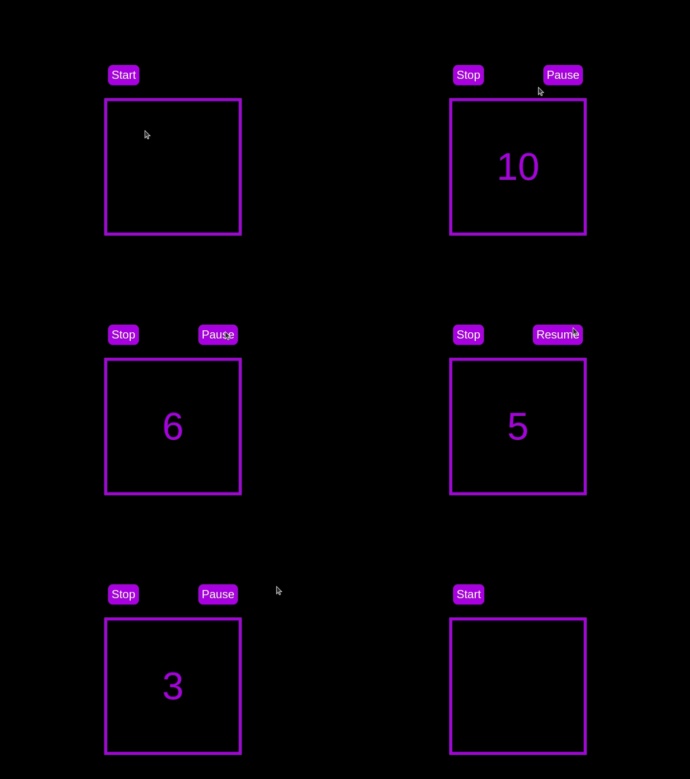
Open a new tab in your browser, navigate to http://localhost:3001, and you should see something similar to the following:

Test out the countdown timer and once you are done, terminate the server application and move to the next step.
To enhance the user experience of our countdown timer, let’s add a circular progress indicator to give the user a visual representation of the time remaining.
First, we need to modify our HTML code to include the circular progress element. In index.html, we add a span element with a class of circular-progress inside the countdown-container div. This span element will be used to create the circular progress indicator:
<div class="countdown-container">
  <span class="circular-progress"></span>
  <div class="countdown"></div>
</div>
Next, we need to define the CSS for the circular progress indicator. In styles.css, we add the following code:
.countdown-container {
  ...
  /* border : 0.4em solid #9b51e0; */
}
.circular-progress {
  width: 20vw;
  height: 20vw;
  border-radius: 50%;
  display: flex;
  justify-content: center;
  align-items: center;
  position: absolute;
  transition: 0.5s;
  background-color: #13171f;
}

.circular-progress::before {
  width: 18.5vw;
  height: 18.5vw;
  content: "";
  position: absolute;
  border-radius: 50%;
  background-color: black;
}
This code first removes the border from the countdown-container div, then sets the dimensions and shape of the circular progress indicator, as well as its position and background color. We also add a ::before pseudo-element to create the inner circle of the progress indicator.
Now we need to add the JavaScript code to animate the circular progress indicator.
Add the following code in the variables initialization block:
const circularProgressEl = document.getElementsByClassName("circular-progress")[0];
let circularProgress;
let circularProgressIntervalID;
This code initializes the circularProgressEl variable to target the circular progress element and creates two new variables, circularProgress and circularProgressIntervalID, that will be used to animate the progress indicator.
Add the following code below the pauseOrResumeTimer() function:
function startCircularProgressAnimation() {
  let start = totalTime - timeLeft;
  let degreesPerSecond = 360 / totalTime;
  let degreesPerInterval = degreesPerSecond / 20;
  circularProgress = degreesPerSecond * start;

  circularProgressIntervalID = setInterval(() => {
    if (Math.round(circularProgress) === 360) {
      clearInterval(circularProgressIntervalID);
    } else {
      circularProgress = circularProgress + degreesPerInterval;
      circularProgressEl.style.background = `conic-gradient(#9b51e0 ${circularProgress}deg, #13171f 0deg)`;
    }
  }, 50);
}
This code defines the startCircularProgressAnimation function, which calculates the starting point and degree of rotation for the circular progress indicator, and sets up an interval to animate the progress indicator.
Add the following code below the startCircularProgressAnimation:
function resumeCircularProgressAnimation() {
  startCircularProgressAnimation();
}

function pauseCircularProgressAnimation() {
  clearInterval(circularProgressIntervalID);
}

function stopCircularProgressAnimation() {
  clearInterval(circularProgressIntervalID);
  circularProgressEl.style.background = `conic-gradient(#9b51e0 0deg, #13171f 0deg)`;
}
This code defines the resumeCircularProgressAnimation, pauseCircularProgressAnimation, and stopCircularProgressAnimation functions, which are used to start, pause, and stop the circular progress animation.
Finally, we need to modify the startOrStopTimer and pauseOrResumeTimer functions to start and stop the circular progress animation along with the timer:
function startOrStopTimer() {
  // ...
  if (countDownIntervalID === undefined && !isPaused) {
    // ...
    startCircularProgressAnimation();
  } else {
    // ...
    stopCircularProgressAnimation();
  }
}

function pauseOrResumeTimer() {
  // ...
  if (countDownIntervalID !== undefined) {
    stopTimer();
    pauseCircularProgressAnimation();
  } else {
    startTimer();
    resumeCircularProgressAnimation();
  }
}
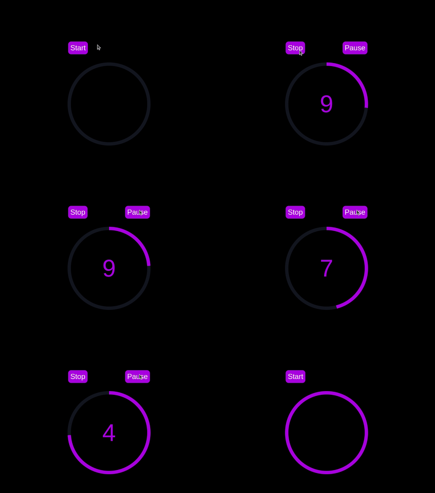
With these modifications, our countdown timer now includes a circular progress indicator that animates along with the timer.
Return to your terminal and run the following command to start serving the JavaScript countdown application:
node server.js
Go back to the tab in your browser where you visited the http://localhost:3001 URL, refresh the page, and you should see something similar to the following:

In this section, we’ll dive into creating a countdown timer that updates every second and is made using only CSS. Our timer will be simple yet functional, featuring start and pause buttons to control its operation.
Navigate to the css-only-countdown subdirectory, initialize a new node project, and install the express package:
cd ../css-only-countdown
npm init -y
npm install express
Then, return to your text editor, create a file named server.js, and add the following code to it:
const express = require('express');
const app = express();
const port = 3002
app.use(express.static('public'));

app.listen(port, () => {
  console.log(`Css-only countdown app server started on port ${port}`);
});
The code above creates an express server that will be used to serve the JavaScript countdown application in port 3002.
Still in your text editor, create the following files in the public subdirectory:
index.html for the HTML codestyles.css for the CSS codeAdd the following code to the index.html file:
<!DOCTYPE html>
<html lang="en">
<head>
  <meta charset="UTF-8">
  <meta name="viewport" content="width=device-width, initial-scale=1.0">
  <link rel="stylesheet" href="styles.css">
  <title>CSS Countdown Timer</title>
</head>
<body>
  <div class="container">
    <div class="controls">
      <input type="checkbox" id="startBtn" class="checkbox-wrapper">
      <label for="startBtn" id="startLabel">
        <span>Stop</span>
        <span>Start</span>
      </label>
      <input type="checkbox" id="pauseBtn" class="checkbox-wrapper">
      <label for="pauseBtn" id="pauseLabel">
        <span>Resume</span>
        <span>Pause</span>
      </label>
      <div class="countdown-container">
        <ul class="countdown">
          <li>10</li>
          <li>9</li>
          <li>8</li>
          <li>7</li>
          <li>6</li>
          <li>5</li>
          <li>4</li>
          <li>3</li>
          <li>2</li>
          <li>1</li>
        </ul>
      </div>
    </div>
  </div>
</body>
</html>
This code sets up the basic structure of our countdown timer. It includes a container div that holds the controls for starting and pausing the timer, as well as the countdown display itself. The controls div contains two checkboxes with labels that will serve as our start and pause buttons. These buttons toggle their respective states using CSS, thanks to the checkbox hack.
The countdown-container div holds an unordered list (ul) of list items (li) representing the countdown numbers from 10 to one. These numbers will be displayed one by one as the timer counts down.
Now, let’s style the countdown timer using CSS. Add the following code to styles.css:
body {
  background-color: black;
  font-family: Arial, sans-serif;
  height: 100%;
}

.container {
  display: flex;
  flex-direction: column;
  justify-content: center;
  align-items: center;
}

.controls {
  width: 20%;
  margin-top: 10%;
  display: flex;
  justify-content: space-between;
  flex-direction: row;
  flex-wrap: wrap;
}

.countdown-container {
  position: relative;
  width: 20vw;
  height: 20vw;
  margin-top: 12%;
  border : 0.4em solid #9b51e0;
}

#startLabel span {
  display: none;
}

label {
  cursor: pointer;
  font-size: 1.5em;
  padding: 0.3em;
  background-color: #9b51e0;
  border-radius: 0.4em;
  color: white;
}

#startBtn:checked~#startLabel span:nth-child(1) {
  display: inline;
}

#startBtn:not(:checked)~#startLabel span:nth-child(2) {
  display: inline;
}

#startBtn:not(:checked)~#pauseLabel,
#pauseBtn {
  display: none;
}

#pauseLabel span {
  display: none;
}

#pauseBtn:checked~#pauseLabel span:nth-child(1) {
  display: inline;
}

#pauseBtn:not(:checked)~#pauseLabel span:nth-child(2) {
  display: inline;
}

.checkbox-wrapper {
  display: none;
}
In this CSS file, we start by setting some basic styles for the body and container. The body has a black background and uses the Arial font. The container is centered using flexbox and has a margin to push it down from the top of the viewport.
The controls div is styled to be responsive and to ensure that the buttons are spaced out evenly. The countdown-container div is styled with a border, which will later be replaced by the circular progress indicator.
We use the checkbox hack to toggle the visibility of the labels for the start and pause buttons. Depending on whether the checkboxes are checked or not, different spans within the labels are displayed. This allows the labels to show different text (Start or Stop, Pause or Resume) based on the state of the checkboxes.
Now, add the following code to the bottom of the styles.css file:
.countdown {
  position: relative;
  width: 100%;
  height: 100%;
  list-style: none;
  padding: 0;
  margin: 0;
  display: flex;
  justify-content: center;
  align-items: center;
  font-size: 5em;
  color: #9b51e0;
}

.countdown li {
  position: absolute;
  opacity: 0;
  transition: opacity 1s linear;
}

#startBtn:checked~.countdown-container .countdown li:nth-child(1) {
  animation-delay: 0s;
}

#startBtn:checked~.countdown-container .countdown li:nth-child(2) {
  animation-delay: 1s;
}

#startBtn:checked~.countdown-container .countdown li:nth-child(3) {
  animation-delay: 2s;
}

#startBtn:checked~.countdown-container .countdown li:nth-child(4) {
  animation-delay: 3s;
}

#startBtn:checked~.countdown-container .countdown li:nth-child(5) {
  animation-delay: 4s;
}

#startBtn:checked~.countdown-container .countdown li:nth-child(6) {
  animation-delay: 5s;
}

#startBtn:checked~.countdown-container .countdown li:nth-child(7) {
  animation-delay: 6s;
}

#startBtn:checked~.countdown-container .countdown li:nth-child(8) {
  animation-delay: 7s;
}

#startBtn:checked~.countdown-container .countdown li:nth-child(9) {
  animation-delay: 8s;
}

#startBtn:checked~.countdown-container .countdown li:nth-child(10) {
  animation-delay: 9s;
}

@keyframes countdownAnimation {
  0%,
  10% {
    opacity: 1;
  }
  11%,
  100% {
    opacity: 0;
  }
}

#startBtn:checked~.countdown-container .countdown li {
  animation: countdownAnimation 10s steps(10) forwards;
}

#pauseBtn:checked~.countdown-container .countdown li {
  animation-play-state: paused;
}
With this code, we style the countdown list. The countdown class is positioned absolutely within the countdown-container, and its list items are initially hidden with opacity: 0.
We then use keyframes and the animation property to create the countdown effect. The list items are displayed one by one with a delay using the animation-delay property. The countdownAnimation keyframes control the visibility of each list item, making them visible for a short period before hiding them again.
We also pause the animation when the pause button is checked, using the animation-play-state property.
Go back to your terminal and run the following command to start serving the CSS-only countdown application:
node server.js
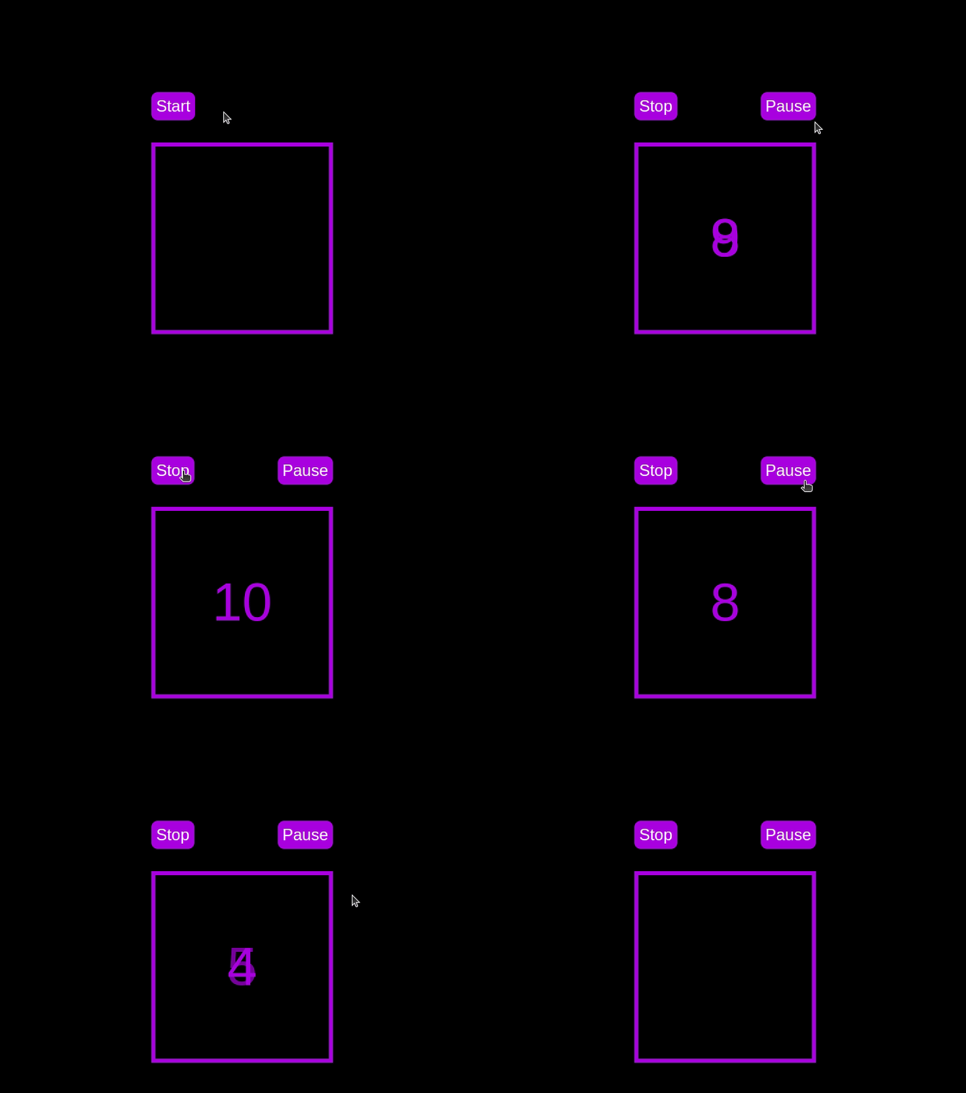
Open a new tab in your browser, navigate to http://localhost:3002 URL, and you should see something similar to the following:

Test out the countdown timer and once you are done, terminate the server application and move to the next step.
To make the countdown timer more visually appealing, we can add a circular progress indicator that shows the remaining time. To do this, we will modify the HTML and CSS code as follows:
First, replace the countdown-container div in the index.html file with the following code:
<div class="countdown-container">
  <span class="circular-progress">
  </span>
  <ul class="countdown">
    <li>10</li>
    <li>9</li>
    <li>8</li>
    <li>7</li>
    <li>6</li>
    <li>5</li>
    <li>4</li>
    <li>3</li>
    <li>2</li>
    <li>1</li>
  </ul>
</div>
In this code, we add a span element with a class of circular-progress inside the countdown-container div.
Next, add the following code to the styles.css file:
.countdown-container {
  ...
  /* border : 0.4em solid #9b51e0; */
}

.circular-progress {
  width: 20vw;
  height: 20vw;
  border-radius: 50%;
  display: flex;
  justify-content: center;
  align-items: center;
  position: absolute;
  transition: 0.5s;
  background: conic-gradient(#9b51e0 var(--angle), #13171f 0deg);
}

.circular-progress::before {
  width: 18.5vw;
  height: 18.5vw;
  content: "";
  position: absolute;
  border-radius: 50%;
  background-color: black;
}

@keyframes circularProgressAnimation {
  to {
    --angle: 360deg;
  }
}

@property --angle {
  syntax: "<angle>";
  initial-value: 0deg;
  inherits: false;
}

#startBtn:checked~.countdown-container .circular-progress {
  opacity: 1;
  animation: circularProgressAnimation 10s linear;
}

#pauseBtn:checked~.countdown-container .circular-progress {
  animation-play-state: paused;
}
In this code, we first remove the border from the countdown-container div, and then add styles for the circular-progress class. The circular progress indicator is a span element that is absolutely positioned within the countdown-container. It uses a conic gradient to create the circular progress effect.
We also define a keyframe animation, circularProgressAnimation, that animates the progress indicator from 0 to 360 degrees over the duration of the countdown. The --angle CSS property is used to control the angle of the gradient.
Finally, we use the checkbox hack to start and pause the circular progress animation along with the countdown numbers. The animation is applied to the circular-progress span when the start button is checked and paused when the pause button is checked.
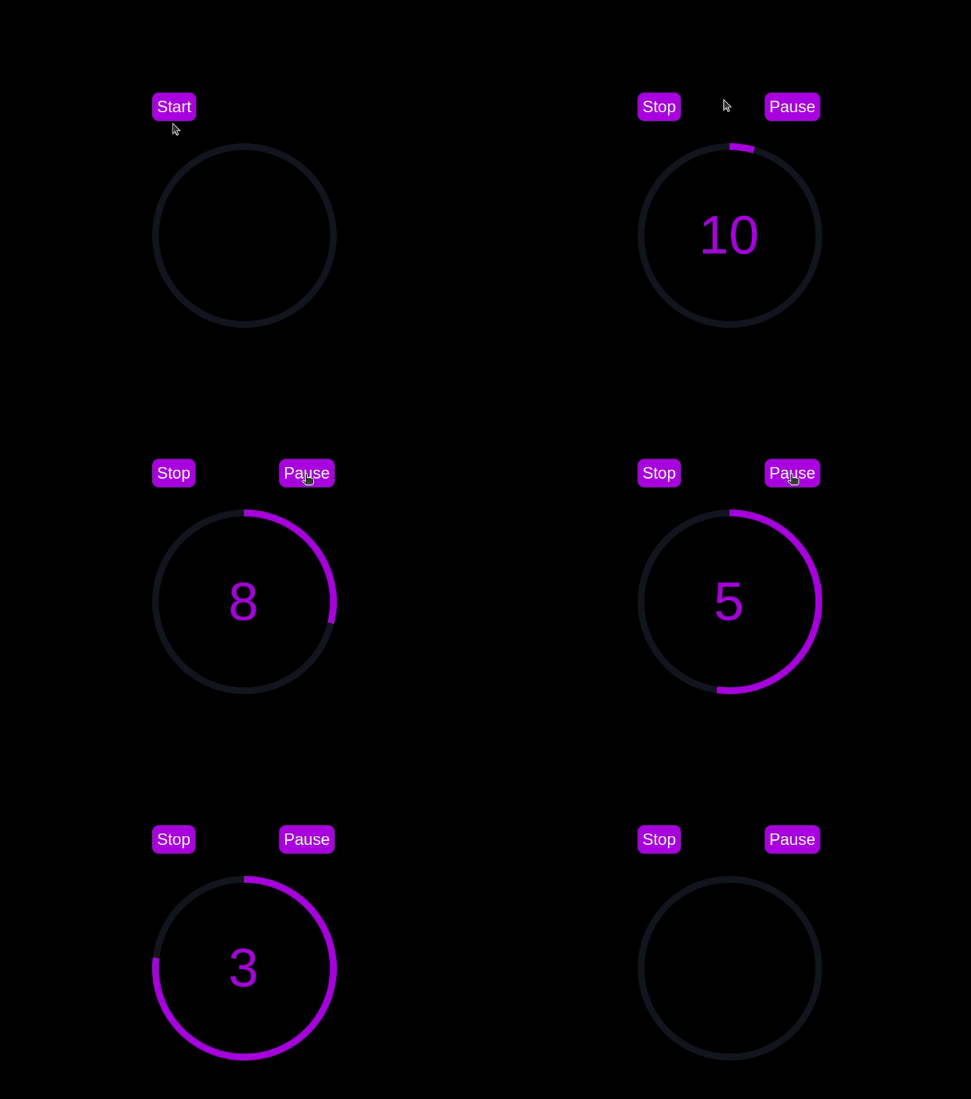
With these modifications, our countdown timer now includes a circular progress indicator that animates along with the timer.
Go back to your terminal and run the following command to start serving the CSS-only countdown application:
node server.js
Return to the tab in your browser where you visited the http://localhost:3002 URL, refresh the page, and you should see something similar to the following:

Now that we have implemented both the CSS-only and JavaScript countdown timers, let’s compare their performance using Chrome DevTools.
To get started, open the Chrome browser and navigate to the webpage containing the countdown timers. Right-click anywhere on the page and select Inspect to open Chrome DevTools.
In the DevTools window, click on the Network tab and then refresh both the JavaScript and CSS-only countdown pages. This tab allows you to monitor all network requests made by the page, including HTML, CSS, JavaScript, and other resources:

By analyzing the requests, you can determine how many resources are being loaded, their sizes, and the overall impact on page load time:
| CSS-only countdown timer | JavaScript countdown timer | |
|---|---|---|
| Number of requests | 2 | 3 |
| Total size | 4.5 KB | 4.7 KB |
| Page load | 24 ms | 27 ms |
From these results, we can see that the CSS-only countdown timer requires fewer requests and has a slightly smaller total size compared to the JavaScript countdown timer. This leads to a marginally faster page load time for the CSS-only version, making it more efficient in terms of initial loading.
Now, in the DevTools window, navigate to the Performance tab and initiate a recording session by clicking on the Record button. To evaluate the JavaScript countdown timer, click on the Start button located on its respective page and allow the timer to run its course. Once the timer has stopped, cease the recording in the Performance tab.
Do this process for both the JS and CSS-only countdown pages to gather performance data for each implementation. The Performance tab offers a comprehensive analysis of your page’s runtime performance, encompassing scripting, rendering, and painting times. By analyzing these metrics, you can pinpoint areas that may require optimization to enhance the performance of your web application:
| CSS-only countdown timer | JavaScript countdown timer | |
|---|---|---|
| Scripting | 2 ms | 49 ms |
| Rendering | 510 ms | 103 ms |
| Painting | 275 ms | 55 ms |
Interpreting these results, we observe that the scripting time for the CSS-only countdown timer is significantly lower than for the JavaScript countdown timer, indicating minimal execution overhead. However, the CSS-only countdown timer has higher rendering and painting times. This is because CSS animations can sometimes require more effort from the browser to render, especially for complex styles or transitions.
In contrast, the JavaScript countdown timer shows higher scripting time due to the logic involved in updating the countdown, but it benefits from lower rendering and painting times. This suggests that while JavaScript adds some overhead in terms of script execution, it can be more efficient in terms of updating the DOM and rendering changes.
Overall, the CSS-only countdown timer is more efficient for scenarios where minimizing script execution time is critical, whereas the JavaScript timer may perform better in cases where rendering and painting times are the primary concern.
Having explored both the CSS-only and JavaScript countdown timers, let’s weigh their advantages and disadvantages to determine which approach best suits your needs.
The CSS-only countdown timer leverages pure CSS to achieve the countdown effect, providing a lightweight and straightforward solution.
Its pros include the following:
Cons to this approach include:
The JavaScript countdown timer, on the other hand, uses JavaScript to manage the countdown logic and DOM updates. This approach offers greater control and flexibility.
Pros of this approach include:
Cons include:
The CSS-only timer is lightweight and easy to understand, making it a good choice for simple countdowns with minimal scripting. However, it may struggle with more complex animations and interactive features. On the other hand, the JavaScript timer offers greater control and flexibility, allowing for more dynamic interactions. This comes at the cost of higher scripting overhead and increased complexity.
Ultimately, the choice between the two approaches depends on the specific needs of your project and the trade-offs you are willing to accept.
In this tutorial, we explored two methods for creating a countdown timer: using JavaScript and using only CSS. We started with a basic JavaScript countdown timer, adding functionality and styling to make it user-friendly and visually appealing. Then, we implemented a CSS-only countdown timer, showcasing the power of CSS for creating simple yet effective animations.
Whether you choose the CSS-only approach for its simplicity or the JavaScript approach for its flexibility, you now have the tools and knowledge to implement a countdown timer that suits your project’s needs.
As web frontends get increasingly complex, resource-greedy features demand more and more from the browser. If you’re interested in monitoring and tracking client-side CPU usage, memory usage, and more for all of your users in production, try LogRocket.

LogRocket lets you replay user sessions, eliminating guesswork around why bugs happen by showing exactly what users experienced. It captures console logs, errors, network requests, and pixel-perfect DOM recordings — compatible with all frameworks.
LogRocket's Galileo AI watches sessions for you, instantly identifying and explaining user struggles with automated monitoring of your entire product experience.
Modernize how you debug web and mobile apps — start monitoring for free.
Would you be interested in joining LogRocket's developer community?
Join LogRocket’s Content Advisory Board. You’ll help inform the type of content we create and get access to exclusive meetups, social accreditation, and swag.
Sign up now
This guide walks you through creating a web UI for an AI agent that browses, clicks, and extracts info from websites powered by Stagehand and Gemini.

This guide explores how to use Anthropic’s Claude 4 models, including Opus 4 and Sonnet 4, to build AI-powered applications.

Which AI frontend dev tool reigns supreme in July 2025? Check out our power rankings and use our interactive comparison tool to find out.

Learn how OpenAPI can automate API client generation to save time, reduce bugs, and streamline how your frontend app talks to backend APIs.