Editor’s note: This CSS double borders tutorial was last updated on 3 April 2023 to add information about what differentiates borders vs. outlines in CSS, as well as a section comparing the inset vs. onset CSS properties.

An element’s border can be set using the border shortcut property in CSS. Additionally, we can use CSS border properties to define the style, width, and color of an element’s border.
There are three CSS border properties that may be changed: border-color, border-style, and border-width. border-style and border-width specify the color and width of a border; border-style specifies whether a border should be solid, dashed, double, or have some other styling.
In this article, we’ll review six different CSS methods for creating a double-border effect on a webpage element.
Jump ahead:
border-style propertyoutline propertybox-shadow propertybackground-clip propertylinear-gradient() functionborder vs. CSS outlineoutset and CSS insetThe Replay is a weekly newsletter for dev and engineering leaders.
Delivered once a week, it's your curated guide to the most important conversations around frontend dev, emerging AI tools, and the state of modern software.
To get started, let’s create six example boxes that we can use to illustrate each CSS method covered in this article.
First, create an HTML file called index.html and paste in the following code:
<!DOCTYPE html>
<html lang="en">
<head>
  <meta charset="UTF-8">
  <meta http-equiv="X-UA-Compatible" content="IE=edge">
  <meta name="viewport" content="width=device-width, initial-scale=1.0">
  <link rel="stylesheet" href="./style.css" />
  <title>Document</title>
</head>
<body>


  <div class="box-1"> <h2>box 1</h2> <p>(border-style)</p> </div>
  <div class="box-2"> <h2>box 2</h2> <p>(outline)</p> </div>
  <div class="box-3"> <h2>box 3</h2> <p>(pseudo property)</p> </div>
  <div class="box-4"> <h2>box 4</h2> <p>(box-shadow)</p> </div>
  <div class="box-5"> <h2>box 5</h2> <p>(background-clip)</p></div>
  <div class="box-6"> <h2>box 6</h2> <p>(linear-gradient())</p></div>
</body>
</html>
Then, create a style.css file and write the following:
*{
  padding: 0;
  margin: 0;
  box-sizing: border-box;
}

body{
  display: flex;
  justify-content: flex-start;
  gap: 25px;
  padding: 15px;
}
div{
  width: 350px;
  height: 350px;
  display: flex;
  flex-direction: column;
  justify-content: center;
  align-items: center;
}

.box-1{
  background-color: green;
}

.box-2{
  background-color: rebeccapurple;
}

.box-3{
  background-color: brown;
}

.box-4{
  background-color: yellow;
}

.box-5 {
  background-color: violet;
}
.box-6{
  background-color: aqua;
}
The above code creates several <div> boxes of width and height 350px, each of which is styled with a different background color according to its class name.
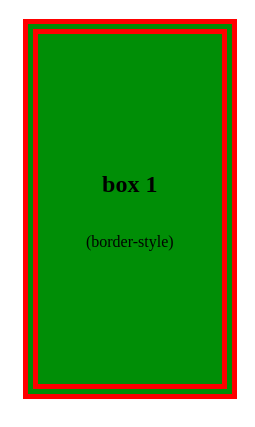
border-style propertyFor the first illustration, let’s use the box-1 element. Using the border-style property with a double keyword value is a conventional method for creating a double line in CSS:
.box-1{
  background-color: green;
  border-width: 15px;
  border-color: red;
  border-style: double;
}
The border-style CSS property allows us to set the line style of an element on all four sides of the box. This property can be assigned several keyword values.
To create a double border, the double keyword value is used. This automatically creates padding between the two border lines. We can also use border-[left/right/top/bottom] to create a double-border style on a specific side of an element.
Here’s our double-border example using the CSS border-style property:
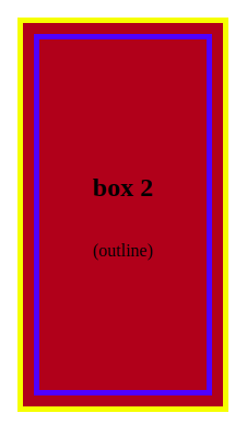
outline propertyNext, let’s take a look at the outline property. Outlines and borders are similar, but outlines don’t occupy any space because they are drawn outside of the element’s content. Also, borders offer more styling options. For example, each border line may be styled with different colors of your choosing.
To achieve a double-border effect with the outline property, we need to use a single border and an outline. However, unlike the border-style property, the outline property does not automatically create a space between itself and the border. To add a space between the outline and the border, we’ll need to use the outline-offset property:
.box-2{
  background-color: brown;
  border: 5px solid yellow;
  outline: 5px solid blue;
  outline-offset: -20px;
}
As shown in the code above, the outline-offset property can be used to adjust the outline inward (e.g., set a negative value, such as -20px) or outward (e.g., set a positive value, such as 5px).
The output from this example will look like the image shown below. Here, we used a negative outline-offset to adjust the blue outline inward, making the yellow border appear to be an exterior, double border:
We’ll discuss the outline property in more detail in a later section that will compare it to the border property.
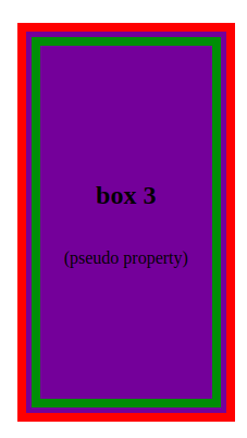
Now, let’s look at creating a double border with the CSS pseudo-element. We’ll give the box-3 element its own border and relative positioning. Then, we’ll use the ::before pseudo-element to add a secondary border:
box-3{
  background-color: rebeccapurple;
  position: relative;
  border: 8px solid red;
}

.box-3::before{
  content: " ";
  position: absolute;
  top: 5px;
  left: 5px;
  right: 5px;
  bottom: 5px;
  border: 8px solid green;
}
Here, we used a border property to create a red exterior border above the box. We set the green interior border with absolute positioning, and inset it using the top, left, bottom, and right values. These inset values adjust the spacing between the two borders.
Here’s our double-border example using the CSS pseudo-element keyword:
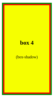
box-shadow propertyNext, let’s create a double border with the box-shadow property. By utilizing two comma-separated shadows, setting the offset and blur settings to zero, and giving each shadow the proper size, a box shadow can be made to look like a double border:
.box-4{
  background-color: yellow;
  box-shadow:
  0 0 0 5px red,
  0 0 0 10px green;
}
In this example, the second (green) shadow is twice as large as the first (red) shadow, but they appear to be the same size because they overlap.
The output from this box-shadow property example looks like this:
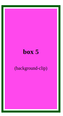
background-clip propertyNow, let’s use the background-clip property to create a double-border effect on the box-5 element:
.box-5{
    border: 7px solid rgb(36, 85, 7);
  padding: 5px;
  background-clip: content-box;
  background-color: violet;
}
Here, the CSS background-clip property is used to cause the box element’s background to stop before the padding. This creates spacing around the content-box, giving the appearance of a white border. In this way, the regular border of an element can somewhat resemble a double border.
Here’s our double-border example using the CSS background-clip property:
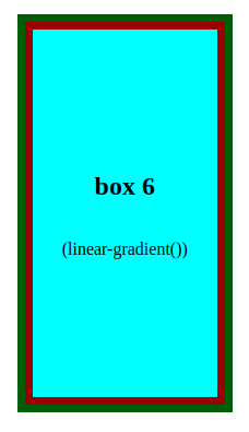
linear-gradient() functionAs a last example, let’s create a double border using the linear-gradient() function. This function can be used to produce a gradual transition between two or more colors along a straight line.
The keyword to makes up the starting point of the gradient line. It specifies the direction (left, right, top, or bottom) of the gradient. The order of the side keywords does not matter. If unspecified, the default is to bottom.
We can also use angles to indicate the directions. The values to top, to bottom, to left, and to right correspond to the angles 0deg, 180deg, 270deg, and 90deg, respectively.
In this example, we first give the box-6 element a border width of 7px and a green color. Then, we set the linear gradient on the background property for each side:
.box-6{
  border: 7px solid rgb(36, 85, 7);
  background: linear-gradient(to top, #8f0404 7px, transparent 1px), /* bottom border */
  linear-gradient(to bottom, #8f0404 7px, transparent 1px),  /* top border */
  linear-gradient(to left, #8f0404 7px, transparent 1px),  /* right border */
  linear-gradient(to right, #8f0404 7px, transparent 1px);  /* left border */
  background-color: aqua;
}
Here, the gradient moves from red (with a width 7px) to transparent. The width of the transparent gradient must be less than the specified color, to eliminate any fade effect.
The output from this linear-gradient() function example looks like this:
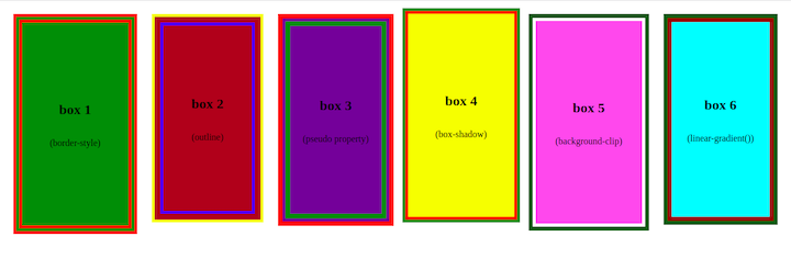
If we run the code in the browser, we’ll get the below result. Here we can see all of the CSS double-border styling methods side-by-side:
The most common cause of a border not rendering after setting the CSS shorthand border property is that the border style was not specified. The CSS border-style property must be defined for the border to render, however, the border-width and border-color property values can be left blank.
border vs. CSS outlineCSS border and CSS outline are two stylistic features that are frequently used in web development. Both of these properties enable web developers to add visual modifications to HTML elements, but their functions are different. It is important to understand their differences and use them appropriately depending on the design needs.
The main differences between CSS border and CSS outline are:
border is a part of the element’s box model, while outline is notborder can affect the layout of other elements, while outline does notborder is used to visually separate components, whereas outline is used to provide visual emphasis or suggest concentrationoutline does not have to be rectangular, but they usually areoutset and CSS insetCSS outset is a style that produces a three-dimensional, rising effect on the element’s outer border. It gives the element an illusion of emerging from the web page or screen. The border appears to be thicker on the outside of the element. You can use the border-style: outset property value in your CSS code to implement the CSS outset style.
Consider the following example:
Add a new div element in the index.html file as below:
/* ..... */
<div class="box-outset"> <h2>box outset</h2> <p>(outset)</p> </div>
Add the following style to the CSS file:
.box-outset{
    border-width: 0.5rem;
    border-color: green;
    border-style: outset;
    outline: 0.5rem outset khaki;
    background-color: brown;
}
With the above style set to the box-outset element, the output should look like this:

CSS inset is a border style that adds a three-dimensional, pressed effect to the element’s inner border. It gives the element the appearance of being pushed into the page or screen. The border appears to be thicker towards the inside of the element. You can use the border-style: inset property value in your CSS code to implement the CSS inset style.
Consider the following example:
Add a new div element in the index.html file as below:
/* ..... */
<div class="box-inset"> <h2>box inset</h2> <p>(inset)</p> </div>
In the CSS file, add the following:
.box-inset{
    background-color: green;
    border-width: 7px;
    border-color: violet;
    border-style: inset;
    outline: 0.5rem inset rgb(126, 5, 1);
}
With the above style set to the box-inset element, the output should look like this:

In this article, we demonstrated how to set the border style for a webpage element using the border properties. The border-style property determines whether a border should be solid, dashed, double, or have some other styling.
We explored a number of alternatives to the conventional border-style: double method for creating a double border, such as using the outline, box-shadow, and background-clip properties, pseudo-element keyword, and the linear-gradient function.
As web frontends get increasingly complex, resource-greedy features demand more and more from the browser. If you’re interested in monitoring and tracking client-side CPU usage, memory usage, and more for all of your users in production, try LogRocket.

LogRocket lets you replay user sessions, eliminating guesswork around why bugs happen by showing exactly what users experienced. It captures console logs, errors, network requests, and pixel-perfect DOM recordings — compatible with all frameworks.
LogRocket's Galileo AI watches sessions for you, instantly identifying and explaining user struggles with automated monitoring of your entire product experience.
Modernize how you debug web and mobile apps — start monitoring for free.

Every time you explain your team’s coding standards to Claude, you are doing work that should be reusable. The same […]

Learn how to move beyond one-shot prompting in Claude with structured workflows for AI-assisted coding, debugging, PR reviews, documentation, testing, and automation.

Learn how to build advanced Next.js forms with rule engines, client-side previews, Server Actions, and server-validated form logic.

AI is reshaping engineering teams emotionally as well as technically. A CTO shares insights on fear, trust, burnout, identity, and leading through AI change.
Would you be interested in joining LogRocket's developer community?
Join LogRocket’s Content Advisory Board. You’ll help inform the type of content we create and get access to exclusive meetups, social accreditation, and swag.
Sign up now

 Learn more →
