Editor’s note: This post was updated in March 2026 by Elijah Asoula to include Base UI and add updated examples and use cases to make the comparison more actionable.

Using React component libraries is a popular way to quickly build React applications. Components from these libraries offer several advantages. First, they follow accessibility guidelines such as WAI-ARIA, ensuring that applications are usable by everyone. Second, they come with built-in styling and design so developers can focus on other aspects of their applications. Third, many include pre-defined behaviors — for example, an autocomplete component that filters options based on user input — which saves time and effort compared to building from scratch.
React component libraries are also typically optimized for performance. Because they are maintained by large communities or organizations, they receive regular updates and follow efficient coding practices. Examples include Material UI, Chakra UI, and React Bootstrap.
However, these libraries leave limited room for customization. You can usually tweak styles, but you cannot fundamentally change the underlying design system. A developer may want the accessibility and functionality benefits of a component library while still implementing a completely custom design system.
Headless (unstyled) component libraries were created to fill this gap. A headless component library provides fully functional components without imposing styling. With headless components, developers are responsible for styling them however they see fit.
Tailwind Labs’ Headless UI is one of the most popular headless libraries in the React ecosystem. While it works well for many projects, it is not always the best choice for every use case. This article explores several alternatives for unstyled components, including Radix Primitives, React Aria, Ark UI, and Base UI.
The Replay is a weekly newsletter for dev and engineering leaders.
Delivered once a week, it's your curated guide to the most important conversations around frontend dev, emerging AI tools, and the state of modern software.
To follow along with this guide, you should have a basic understanding of HTML, CSS, JavaScript, and React.
Headless UI is an unstyled React component library developed by Tailwind Labs, the creators of Tailwind CSS. The library is designed to integrate particularly well with Tailwind CSS, as noted in its documentation. It is also one of the most widely adopted headless libraries, with around 28K GitHub stars and millions of weekly npm downloads.
However, Headless UI is limited in the number of unstyled components it provides. At the time of writing, it offers 16 primary components. The other libraries covered in this article provide significantly more components for broader use cases. Additionally, some of these alternatives include utility components and helper functions that Headless UI does not offer.
Let’s explore these alternatives.
Radix Primitives is a library of unstyled React components built by the team behind Radix UI, a UI library with fully styled and customizable components. According to its website, the Node.js, Vercel, and Supabase teams use Radix Primitives. The project has approximately 18K stars on GitHub.
You can style Radix Primitives components using any styling solution, including CSS, Tailwind CSS, or CSS-in-JS. The components also support server-side rendering. Radix provides comprehensive documentation for each primitive, explaining usage patterns and composition strategies.
The following steps demonstrate how to install and use Radix Primitives. In this example, we’ll import a dialog component and style it using vanilla CSS.
First, create a React project using your preferred framework, or open an existing project.
Next, install the Radix primitive you need. Radix publishes each component as a separate package. For this example, install the Dialog component:
npm install @radix-ui/react-dialog
Now, create a file to import and customize the unstyled component:
// RadixDialog.jsx

import * as Dialog from '@radix-ui/react-dialog';
import './radix.style.css';

function RadixDialog() {
  return (
    <Dialog.Root>
      <Dialog.Trigger className='btn primary-btn'>
        Radix Dialog
      </Dialog.Trigger>

      <Dialog.Portal>
        <Dialog.Overlay className='dialog-overlay' />

        <Dialog.Content className='dialog-content'>
          <Dialog.Title className='dialog-title'>
            Confirm Deletion
          </Dialog.Title>

          <Dialog.Description className='dialog-body'>
            Are you sure you want to permanently delete this file?
          </Dialog.Description>

          <div className='bottom-btns'>
            <Dialog.Close className='btn'>Cancel</Dialog.Close>
            <Dialog.Close className='btn red-btn'>Delete Forever</Dialog.Close>
          </div>
        </Dialog.Content>
      </Dialog.Portal>
    </Dialog.Root>
  );
}

export default RadixDialog;
Next, add styling:
/* radix.style.css */

.btn {
  padding: 0.5rem 1.2rem;
  border-radius: 0.2rem;
  border: none;
  cursor: pointer;
}

.primary-btn {
  background-color: #1e64e7;
  color: white;
  box-shadow: rgba(0, 0, 0, 0.2) 0px 2px 10px;
}

.red-btn {
  background-color: #d32f2f;
  color: #ffffff;
  box-shadow: rgba(0, 0, 0, 0.2) 0px 2px 10px;
}

.dialog-overlay {
  background-color: rgba(0, 0, 0, 0.4);
  position: fixed;
  inset: 0;
  animation: overlayAnimation 200ms cubic-bezier(0.19, 1, 0.22, 1);
}

.dialog-content {
  background-color: white;
  position: fixed;
  border-radius: 0.2rem;
  top: 50%;
  left: 50%;
  translate: -50% -50%;
  width: 90vw;
  max-width: 450px;
  padding: 2.5rem;
  box-shadow: rgba(50, 50, 93, 0.25) 0px 2px 5px -1px,
    rgba(0, 0, 0, 0.3) 0px 1px 3px -1px;
}

.dialog-title {
  font-size: 1.1rem;
  padding-bottom: 0.5rem;
  border-bottom: 3px solid #dfdddd;
  margin-bottom: 1rem;
}

.dialog-body {
  margin-bottom: 3rem;
}

.bottom-btns {
  display: flex;
  justify-content: flex-end;
}

.bottom-btns .btn:last-child {
  display: inline-block;
  margin-left: 1rem;
}

@keyframes overlayAnimation {
  from {
    opacity: 0;
  }
  to {
    opacity: 1;
  }
}
Finally, export and render the component in the DOM.
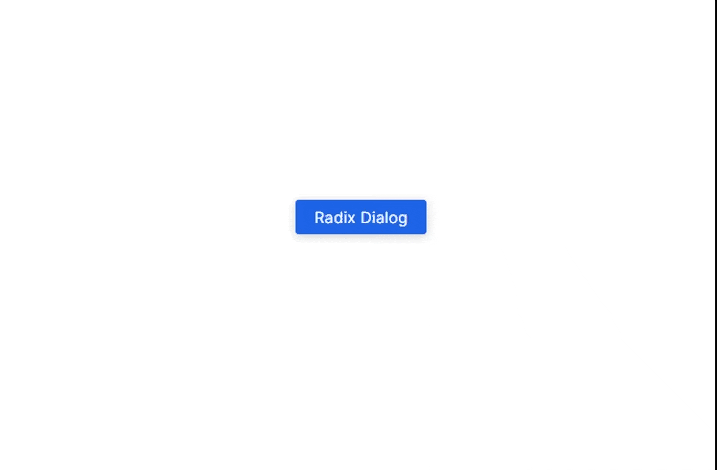
Here is the UI demo of the dialog component we styled above:
Like every headless library covered in this guide, Radix Primitives has both advantages and tradeoffs.
Pros
asChild prop that lets developers change the default DOM element of a Radix component — a pattern known as composition.Cons
React Aria is a library of unstyled components released by Adobe as part of its React UI collection, React Spectrum. While Adobe does not maintain a separate repository exclusively for React Aria, the React Spectrum repository has over 14K GitHub stars at the time of writing. Its npm package, react-aria-components, receives thousands of weekly downloads.
React Aria allows developers to style components using any preferred styling method. It also supports incremental adoption through React Aria hooks, enabling fine-grained control over component behavior.
In this example, we’ll build another dialog box using React Aria, styled similarly to the Radix example.
First, create a new React application or open an existing project. Then install the component package:
npm install react-aria-components
Next, import the required components to construct a dialog:
// AriaDialog.jsx

import {
  Button,
  Dialog,
  DialogTrigger,
  Heading,
  Modal,
  ModalOverlay
} from 'react-aria-components';

import './aria.style.css';

function AriaDialog() {
  return (
    <DialogTrigger>
      <Button className='btn primary-btn'>
        React Aria Dialog
      </Button>

      <ModalOverlay isDismissable>
        <Modal>
          <Dialog>
            {({ close }) => (
              <>
                <Heading slot='title'>
                  Confirm Deletion
                </Heading>

                <p className='dialog-body'>
                  Are you sure you want to permanently delete this file?
                </p>

                <div className='bottom-btns'>
                  <Button className='btn' onPress={close}>
                    Cancel
                  </Button>

                  <Button className='btn red-btn' onPress={close}>
                    Delete Forever
                  </Button>
                </div>
              </>
            )}
          </Dialog>
        </Modal>
      </ModalOverlay>
    </DialogTrigger>
  );
}

export default AriaDialog;
Now, add styling. React Aria provides built-in class names such as .react-aria-Button, which you can use directly in CSS. You can also override them with custom classes like .btn in this example:
/* aria.style.css */

.btn {
  padding: 0.5rem 1.2rem;
  border-radius: 0.2rem;
  border: none;
  cursor: pointer;
}

.primary-btn {
  background-color: #1e64e7;
  color: white;
  box-shadow: rgba(0, 0, 0, 0.2) 0px 2px 10px;
}

.red-btn {
  background-color: #d32f2f;
  color: #ffffff;
  box-shadow: rgba(0, 0, 0, 0.2) 0px 2px 10px;
}

.react-aria-ModalOverlay {
  background-color: rgba(0, 0, 0, 0.4);
  position: fixed;
  inset: 0;
  animation: overlayAnimation 200ms cubic-bezier(0.19, 1, 0.22, 1);
  display: flex;
  justify-content: center;
  align-items: center;
}

.react-aria-Dialog {
  background-color: white;
  border-radius: 0.2rem;
  width: 90vw;
  max-width: 450px;
  padding: 2.5rem;
  box-shadow: rgba(50, 50, 93, 0.25) 0px 2px 5px -1px,
              rgba(0, 0, 0, 0.3) 0px 1px 3px -1px;
  outline: none;
}

.react-aria-Dialog .react-aria-Heading {
  font-size: 1.1rem;
  padding-bottom: 0.5rem;
  border-bottom: 3px solid #dfdddd;
  margin-bottom: 1rem;
}

.dialog-body {
  margin-bottom: 3rem;
}

.bottom-btns {
  display: flex;
  justify-content: flex-end;
}

.bottom-btns .btn:last-child {
  display: inline-block;
  margin-left: 1rem;
}

@keyframes overlayAnimation {
  from {
    opacity: 0;
  }
  to {
    opacity: 1;
  }
}
Finally, export and render the component in the DOM.
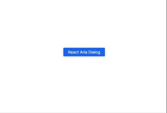
Here is the output of the dialog box in this example:
Pros
Cons
close function and explicitly wiring it to buttons.Button, Dialog, DialogTrigger, Heading, Modal, and ModalOverlay together to build a dialog. This structure can feel complex at first.Ark UI is a library of unstyled components that work across React, Vue, and Solid. It is developed by Chakra Systems, the team behind Chakra UI. The project has gained steady adoption, with around 4.9K stars on GitHub and thousands of weekly npm downloads.
Like Radix Primitives and React Aria, Ark UI allows you to style headless components using any method you prefer, including CSS, Tailwind CSS, Panda CSS, or Styled Components. One of its distinguishing features is multi-framework support.
In this example, we’ll build another dialog box using Ark UI and style it with vanilla CSS.
First, create a new React project or open an existing one. Then install Ark UI for React:
npm install @ark-ui/react
Next, import and use the unstyled components. Below is the anatomy of a dialog in Ark UI:
// ArkDialog.jsx

import { Dialog, Portal } from '@ark-ui/react';
import './ark.style.css';

function ArkDialog() {
  return (
    <Dialog.Root>
      <Dialog.Trigger className='btn primary-btn'>
        Ark UI Dialog
      </Dialog.Trigger>

      <Portal>
        <Dialog.Backdrop />

        <Dialog.Positioner>
          <Dialog.Content>
            <Dialog.Title>
              Confirm Deletion
            </Dialog.Title>

            <Dialog.Description>
              Are you sure you want to permanently delete this file?
            </Dialog.Description>

            <div className='bottom-btns'>
              <Dialog.CloseTrigger className='btn'>
                Cancel
              </Dialog.CloseTrigger>

              <Dialog.CloseTrigger className='btn red-btn'>
                Delete Forever
              </Dialog.CloseTrigger>
            </div>
          </Dialog.Content>
        </Dialog.Positioner>
      </Portal>
    </Dialog.Root>
  );
}

export default ArkDialog;
Now, style the component using your preferred method. Here is a vanilla CSS example:
/* ark.style.css */

.btn {
  padding: 0.5rem 1.2rem;
  border-radius: 0.2rem;
  border: none;
  cursor: pointer;
}

.primary-btn {
  background-color: #1e64e7;
  color: white;
  box-shadow: rgba(0, 0, 0, 0.2) 0px 2px 10px;
}

.red-btn {
  background-color: #d32f2f;
  color: #ffffff;
  box-shadow: rgba(0, 0, 0, 0.2) 0px 2px 10px;
}

[data-scope="dialog"][data-part="backdrop"] {
  background-color: rgba(0, 0, 0, 0.4);
  position: fixed;
  inset: 0;
  animation: backdropAnimation 200ms cubic-bezier(0.19, 1, 0.22, 1);
}

[data-scope="dialog"][data-part="positioner"] {
  position: fixed;
  top: 50%;
  left: 50%;
  translate: -50% -50%;
  width: 90vw;
  max-width: 450px;
}

[data-scope="dialog"][data-part="content"] {
  background-color: white;
  padding: 2.5rem;
  border-radius: 0.2rem;
  box-shadow: rgba(50, 50, 93, 0.25) 0px 2px 5px -1px,
              rgba(0, 0, 0, 0.3) 0px 1px 3px -1px;
}

[data-scope="dialog"][data-part="title"] {
  font-size: 1.1rem;
  padding-bottom: 0.5rem;
  border-bottom: 3px solid #dfdddd;
  margin-bottom: 1rem;
}

[data-scope="dialog"][data-part="description"] {
  margin-bottom: 3rem;
}

.bottom-btns {
  display: flex;
  justify-content: flex-end;
}

.bottom-btns .btn:last-child {
  display: inline-block;
  margin-left: 1rem;
}

@keyframes backdropAnimation {
  from {
    opacity: 0;
  }
  to {
    opacity: 1;
  }
}
Finally, export and render the component. Below is the output of the example:

Pros
asChild prop, similar to Radix Primitives.Cons
data-scope and data-part attributes, which may feel unfamiliar at first.For example, styling a specific part of the dialog can look like this:
[data-scope="dialog"][data-part="positioner"] {
  position: fixed;
  top: 50%;
  left: 50%;
  translate: -50% -50%;
  width: 90vw;
  max-width: 450px;
}
Developers who prefer a more familiar workflow can assign custom class names using className and target those instead:
.primary-btn {
  background-color: #1e64e7;
  color: white;
  box-shadow: rgba(0, 0, 0, 0.2) 0px 2px 10px;
}
This approach preserves Ark UI’s headless behavior while allowing conventional CSS styling.
Base UI is a library of unstyled React components built by contributors from Radix, Floating UI, and the Material UI team. While it follows the same headless philosophy as the other libraries discussed in this article, Base UI places a stronger emphasis on stable APIs that are well-suited for building long-term custom design systems. At the time of writing, Base UI has more than 8.1K stars on its GitHub repository and is actively maintained with regular releases.
Like the other headless libraries in this guide, Base UI components can be styled using CSS, Tailwind CSS, or CSS-in-JS. The documentation also includes guidance on advanced patterns such as controlled dialogs and detached triggers.
Unlike Radix Primitives, which publishes each component separately, Base UI ships all components in a single tree-shakable package. This makes installation straightforward.
First, create a new React project or open an existing one. Then install Base UI:
npm i @base-ui/react
Next, create a file and import the Dialog component. In this example, we’ll build another dialog box:
// BaseDialog.jsx

import { Dialog } from '@base-ui/react/dialog';
import './base.style.css';

function BaseDialog() {
  return (
    <Dialog.Root>
      <Dialog.Trigger className='btn primary-btn'>
        Base UI Dialog
      </Dialog.Trigger>

      <Dialog.Portal>
        <Dialog.Backdrop className='dialog-overlay' />

        <Dialog.Popup className='dialog-content'>
          <Dialog.Title className='dialog-title'>
            Confirm Deletion
          </Dialog.Title>

          <Dialog.Description className='dialog-body'>
            Are you sure you want to permanently delete this file?
          </Dialog.Description>

          <div className='bottom-btns'>
            <Dialog.Close className='btn'>
              Cancel
            </Dialog.Close>

            <Dialog.Close className='btn red-btn'>
              Delete Forever
            </Dialog.Close>
          </div>
        </Dialog.Popup>
      </Dialog.Portal>
    </Dialog.Root>
  );
}

export default BaseDialog;
Now, add styling:
/* base.style.css */

.btn {
  padding: 0.5rem 1.2rem;
  border-radius: 0.2rem;
  border: none;
  cursor: pointer;
}

.primary-btn {
  background-color: #1e64e7;
  color: white;
  box-shadow: rgba(0, 0, 0, 0.2) 0px 2px 10px;
}

.red-btn {
  background-color: #d32f2f;
  color: #ffffff;
  box-shadow: rgba(0, 0, 0, 0.2) 0px 2px 10px;
}

.dialog-overlay {
  background-color: rgba(0, 0, 0, 0.4);
  position: fixed;
  inset: 0;
  animation: overlayAnimation 200ms cubic-bezier(0.19, 1, 0.22, 1);
}

.dialog-content {
  background-color: white;
  position: fixed;
  border-radius: 0.2rem;
  top: 50%;
  left: 50%;
  translate: -50% -50%;
  width: 90vw;
  max-width: 450px;
  padding: 2.5rem;
  box-shadow: rgba(50, 50, 93, 0.25) 0px 2px 5px -1px,
              rgba(0, 0, 0, 0.3) 0px 1px 3px -1px;
}

.dialog-title {
  font-size: 1.1rem;
  padding-bottom: 0.5rem;
  border-bottom: 3px solid #dfdddd;
  margin-bottom: 1rem;
}

.dialog-body {
  margin-bottom: 3rem;
}

.bottom-btns {
  display: flex;
  justify-content: flex-end;
}

.bottom-btns .btn:last-child {
  display: inline-block;
  margin-left: 1rem;
}

@keyframes overlayAnimation {
  from {
    opacity: 0;
  }
  to {
    opacity: 1;
  }
}
Finally, import and render the component in your application:
import './App.css';
import BaseDialog from './BaseDialog';

function App() {
  return (
    <>
      <BaseDialog />
    </>
  );
}

export default App;
And you should see output similar to the example below:

Pros
Cons
To provide a clearer overview of how these headless UI libraries compare across API design, styling flexibility, composition model, and intended use cases, the table below highlights the key differences between Radix Primitives, React Aria, Ark UI, and Base UI.
| Dimension | Radix Primitives | React Aria | Ark UI | Base UI |
|---|---|---|---|---|
| Primary goal | Polished primitives for app UIs | Accessibility-first primitives | Cross-framework state-driven primitives | Foundation for custom design systems |
| Mental model | Component anatomy and composition | Hooks with explicit state | State machines and parts | Low-level primitives meant to be wrapped |
| Typical usage | Used directly in application code | Composed per component | Assembled from parts | Extended into internal components |
| Styling approach | className, asChild |
Built-in classes with overrides | data-part / data-scope with className |
className and wrapper components |
| Ease of styling | Easy and familiar | Easy once conventions are understood | Moderate, unconventional at first | Easy, but assumes design ownership |
| Composition flexibility | High | Very high | High | Very high |
| Accessibility transparency | Mostly abstracted | Very explicit | Abstracted via state | Abstracted but predictable |
| Learning curve | Moderate | Steep | Moderate to steep | Moderate |
| Best suited for | Product teams building applications | Accessibility-critical applications | Multi-framework design systems | Teams building custom design systems |
| Framework support | React | React | React, Vue, Solid | React |
This comparison demonstrates that while these libraries often provide similar component coverage, they differ significantly in how components are composed, styled, and extended.
Choosing the right headless UI library ultimately depends on your project goals, team preferences, and long-term maintenance strategy. The following quick guide can help narrow down your options:
The best choice depends less on feature parity and more on how well a library’s design philosophy aligns with your team’s workflow and architectural goals.
This guide explored why developers may look beyond Tailwind Labs’ Headless UI library when choosing unstyled component libraries. We examined several strong alternatives, including Radix Primitives, React Aria, Ark UI, and Base UI.
The frontend ecosystem continues to adopt headless UI libraries because many teams want more control over how components behave and how they are styled. Having multiple headless options available is beneficial, as different projects have different architectural and design needs.
Install LogRocket via npm or script tag. LogRocket.init() must be called client-side, not
server-side
$ npm i --save logrocket

// Code:

import LogRocket from 'logrocket';
LogRocket.init('app/id');
// Add to your HTML:

<script src="https://cdn.lr-ingest.com/LogRocket.min.js"></script>
<script>window.LogRocket && window.LogRocket.init('app/id');</script>

Understand best practices for structuring Node.js projects, such as separating roles using folder structures and practicing modular code.

How senior engineers run TypeScript effectively at scale in modern codebases.

Discover what’s new in The Replay, LogRocket’s newsletter for dev and engineering leaders, in the March 18th issue.

A CTO outlines his case for how leaders should prioritize complex thinking over framework knowledge when hiring engineers for the AI era.
Would you be interested in joining LogRocket's developer community?
Join LogRocket’s Content Advisory Board. You’ll help inform the type of content we create and get access to exclusive meetups, social accreditation, and swag.
Sign up now

 Learn more →

2 Replies to "Headless UI alternatives: Radix Primitives vs. React Aria vs. Ark UI vs. Base UI"
> such as Base UI (from the Material UI team)
This is confusing. The link points to “MUI Base”. But this project has a successor now: Base UI, https://base-ui.com/.
Thanks for noticing this. Should be all set now