CollectionView in Xamarin.Forms
Hello, thanks for being here! 🧡
It’s time to learn about Xamarin, and in this case, we’ll learn about CollectionView in Xamarin.Forms. If you are just starting with Xamarin.Forms, it’s possible that you may ask yourself about something like, “How can I create a list for my app?” 🧐
If so, you are in the right place, and you’ll learn how to implement this step by step.
Here’s what we’ll cover:
CollectionView?CollectionViewCollectionViewCollectionView
Ready? Let’s start!
CollectionView?A CollectionView a graphical control that allows us to present a list of data. Its predecessor was ListView, but CollectionView offers significant improvements in performance and flexibility for displaying data in our applications.
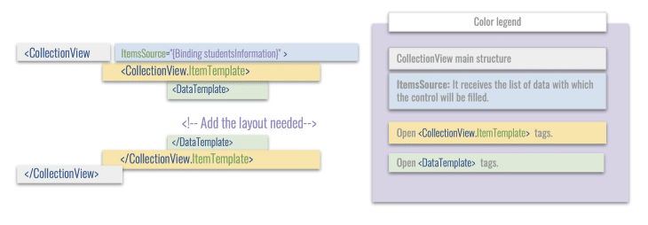
CollectionViewBelow is the graphical structure of how we can use the CollectionView and each of the elements that make it up.
CollectionViewNow let’s create an example in which a data scenario is presented to display the data in a CollectionView. Let’s analyze the following case.
It’s required to present a dataset of the students a the Universidad Latina de America (UNLA). The following data must be presented: name, last name, and telephone number.
Let’s start by creating the student class and adding the attributes indicated above:
public class Students
    {
        public string Name      { get; set; }
        public string LastName  { get; set; }
        public string Telephone { get; set; }
    }
Now, we are going to create the student ViewModel, where we will fill it using mockup data to later be able to present it in our CollectionView.
public class StudentsViewModel
{
    public ObservableCollection<Students> students { get; set; }

    public StudentsViewModel()
    {
        students = new ObservableCollection<Students>
        {
            new Students { Name="Marie" , LastName="Moodle" , Telephone="(809) 445-5555" },
            new Students { Name="Josue" , LastName="Roque"  , Telephone="(829) 333-4444" },
            new Students { Name="Enrique" , LastName="Castle" , Telephone="(849) 325-7777" },
            new Students { Name="Maritza" , LastName="Them" , Telephone="(809) 676-2222" }
        };
    }
}
Finally, we will create a CollectionView, where we will reflect the data structure worked on in the previous steps. Add the BindingContext with the ViewModel above:
BindingContext = new ViewModels.StudentsViewModel();
Now, we’ll build the CollectionView in our XAML.
<CollectionView ItemsSource="{Binding students}"
                HeightRequest="200">
    <CollectionView.ItemTemplate>
          <DataTemplate>
            <Grid RowDefinitions="Auto,Auto,Auto">
                <Label Grid.Row="0" Text="{Binding Name}"/>
                <Label Grid.Row="0" Text="{Binding LastName}"/>
                <Label Grid.Row="0" Text="{Binding Telephone}"/>
            </Grid>
          </DataTemplate>
    </CollectionView.ItemTemplate>
</CollectionView>
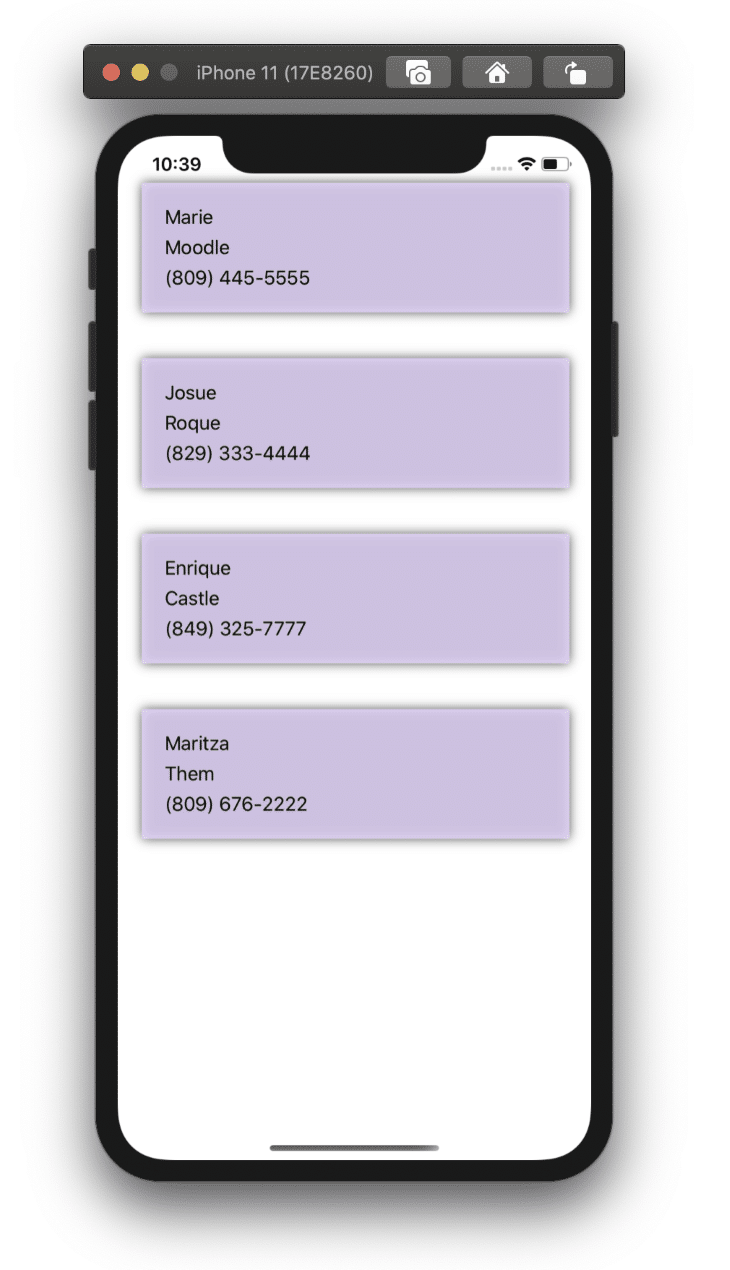
The result:
CollectionViewIn addition to the above demonstration, we have many properties that make life easier for us with this control, such as pull-to-refresh, EmptyView, and the ItemsLayout.
It’s important to keep the user informed about what is happening with our information. For this reason, I love the IsRefreshing property. It allows handling a bool value, and upon scrolling down, it shows a graphic indicator that refers to loading a process in its list.
As a better complement to this property, you can pass a Command with which you will indicate exactly the desired action when the pull-to-refresh is triggered.
<RefreshView IsRefreshing="{Binding IsRefreshing}"
             Command="{Binding RefreshCommand}">
    <CollectionView ItemsSource="{Binding Students}">
         <!-- Add the layout needed-->
    </CollectionView>
</RefreshView>
EmptyViewContinuing with the importance of keeping the user informed, don’t forget to let them know when the information is unavailable to display. We can do accomplish this with the EmptyView property. It accepts a string as a value. You can send a text, such as, “There are no available students.”
<CollectionView ItemsSource="{Binding EmptyMonkeys}"
                EmptyView="No items to display" />
ItemsLayoutOne of the major differences from ListView is that CollectionView can handle the orientation that we want our list to have. In this case, by default, we get Vertical, but we have the option to also change the orientation to Horizontal.
Let’s see how to do it!
There are two ways to accomplish this, so you must take into account two factors: the orientation and the amount of data that we want our to list show by rows or columns.
CollectionView, add the property ItemsLayout, followed by the number indicated above.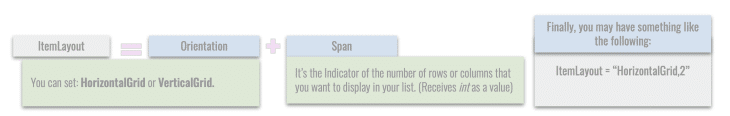
Code implementation:
<CollectionView ItemsSource="{Binding Monkeys}"
                ItemsLayout="VerticalList">
   <!-- Add the layout needed-->
</CollectionView>
GridItemsLayout with the following structure: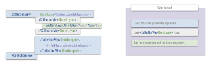
Here’s the code implementation:
<CollectionView ItemsSource="{Binding Students}">
    <CollectionView.ItemsLayout>
        <GridItemsLayout Orientation="Vertical"  Span="2" />
    </CollectionView.ItemsLayout>
      <CollectionView.ItemTemplate>
     <!-- Add the structure explained above-->
      </CollectionView.ItemTemplate>
</CollectionView>
Thank you very much for reading my article. I hope you like it and you find it super useful! You will see how magical this super control is to manage lists. See you next time! 🙋♀️
Install LogRocket via npm or script tag. LogRocket.init() must be called client-side, not
server-side
$ npm i --save logrocket

// Code:

import LogRocket from 'logrocket';
LogRocket.init('app/id');
// Add to your HTML:

<script src="https://cdn.lr-ingest.com/LogRocket.min.js"></script>
<script>window.LogRocket && window.LogRocket.init('app/id');</script>

Learn how to protect full-stack projects from NPM supply chain attacks with a practical security checklist.

Explore 15 essential MCP servers for web developers to enhance AI workflows with tools, data, and automation.

Learn how contrast-color() automatically picks accessible text colors using native CSS, without JavaScript.

Learn how to build a harness-style AI workflow using Claude Code with specialized Dev, QE, and Ops subagents, gated handoffs, MCP telemetry, and LEARNING.md.
Hey there, want to help make our blog better?
Join LogRocket’s Content Advisory Board. You’ll help inform the type of content we create and get access to exclusive meetups, social accreditation, and swag.
Sign up now

 Learn more →
