In web development, creating interactive and engaging user interfaces is crucial for retaining user attention. Sliders are a popular way to showcase content in a dynamic, visually appealing format while maximizing space.

With a variety of slider libraries available, selecting one that balances performance, responsiveness, and functionality can be a challenge.
In this article, we’ll dive into Swiper.js, a powerful and flexible slider library. We’ll walk through how to install and configure it, explore its core features, and demonstrate how to integrate it with frameworks like React and Vue for seamless UI development.
The Replay is a weekly newsletter for dev and engineering leaders.
Delivered once a week, it's your curated guide to the most important conversations around frontend dev, emerging AI tools, and the state of modern software.
Swiper.js is a modern, flexible JavaScript library that enables developers to easily integrate touch-enabled sliders with smooth animations and seamless interactions into their websites and web applications. Designed with a mobile-first approach, Swiper.js ensures flawless performance on both mobile and desktop devices, supporting gestures such as swiping, scrolling, and pinch-to-zoom.
As a free and open-source library with over 40k stars on GitHub and contributions from 300+ developers, Swiper.js is regularly updated to stay ahead of evolving web standards. It also boasts a modular plugin system and works seamlessly with popular frameworks like React, Vue, and Svelte, making it a go-to choice for developers seeking dynamic, user-friendly experiences.
Key features include:
Creating a slider from scratch can take a lot of time, especially when dealing with different browsers or touch gestures. Swiper.js streamlines this process by providing:
Before we explore Swiper.js features, let’s install and set up the library. You can add Swiper.js to your project in several ways: using a CDN, downloading it locally, or installing it with npm.
To quickly use Swiper.js without installing anything, you can add it through a CDN. Just include the following <link> and <script> tags in your HTML file:
<link
  rel="stylesheet"
  href="https://cdn.jsdelivr.net/npm/swiper@11/swiper-bundle.min.css"
/>

<script src="https://cdn.jsdelivr.net/npm/swiper@11/swiper-bundle.min.js"></script>
If you use ES modules in the browser, there is also a CDN version available for that:
<script type="module">
  import Swiper from 'https://cdn.jsdelivr.net/npm/swiper@11/swiper-bundle.min.mjs'

  const swiper = new Swiper(...)
</script>
If you prefer to use the Swiper files on your computer, you can download them from here.
npmFor better project organization and management, you can install Swiper.js using npm:
npm install swiper
This method is great for using Swiper.js in frameworks such as React, Vue, or Next.js. Now you can import it into your JavaScript file like this:
// import Swiper JS
import Swiper from 'swiper';
// import Swiper styles
import 'swiper/css';

const swiper = new Swiper(...);
Swiper only exports the core version by default, which does not include extra features like navigation and pagination. To use these features, you need to import them from swiper/modules and set them up:
// core version + navigation, pagination modules:

import Swiper from 'swiper';
import { Navigation, Pagination } from 'swiper/modules';

// import Swiper and modules styles
import 'swiper/swiper.min.css';
import 'swiper/modules/navigation.min.css';
import 'swiper/modules/pagination.min.css';


// init Swiper:
const swiper = new Swiper('.swiper', {
  // configure Swiper to use modules
  modules: [Navigation, Pagination],
  ...
});
If you want to use Swiper with all features included, you should import it from swiper/bundle:
// import Swiper bundle with all modules installed
import Swiper from 'swiper/bundle';

// import styles bundle
import 'swiper/swiper-bundle.min.css';

// init Swiper:
const swiper = new Swiper(...);
After installing Swiper.js, start by creating your HTML structure and then initialize it in JavaScript. Create a container with slides inside:
<div class="swiper">
  <!-- Additional required wrapper -->
  <div class="swiper-wrapper">
    <div class="swiper-slide">Slide 1</div>
    <div class="swiper-slide">Slide 2</div>
    <div class="swiper-slide">Slide 3</div>
  </div>
</div>
After you set up the HTML structure, initialize Swiper in your script:
// Initialize Swiper
const swiper = new Swiper('.swiper', {
  // Swiper options
});
The Swiper object accepts two parameters:
.swiper) for that elementSwiper has an array of parameters that can be passed into its configuration options; visit its docs to view these.
Now we have the basic setup for your Swiper slider by following the steps. Here’s what our setup looks like with some added CSS styles: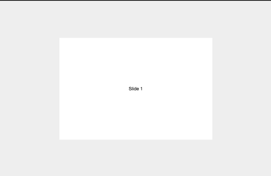
  html,
  body {
    position: relative;
    width: 100%;
    height: 100%;
  }

  body {
    background: #eee;
    font-family: Helvetica Neue, Helvetica, Arial, sans-serif;
    font-size: 14px;
    color: #000;
    margin: 0;
    padding: 0;
    display: flex;
    justify-content: center;
    align-items: center;
  }

  .swiper {
    width: 600px;
    height: 400px;
  }

  .swiper-slide {
    text-align: center;
    font-size: 18px;
    background: #fff;
    display: flex;
    justify-content: center;
    align-items: center;
  }

  .swiper-slide img {
    display: block;
    width: 100%;
    height: 100%;
    object-fit: cover;
  }
As we move along, we’ll demo some of the configuration options.
Swiper.js is a powerful touch slider library that can be customized easily. This section will cover:
Swiper provides a variety of styles to easily customize your sliders, available in multiple formats such as CSS, Less, and SCSS for easy integration. Here’s an overview of the available styles:
swiper-bundle.css — Includes all Swiper styles, including modules like Navigation and Paginationswiper-bundle.min.css — A minified version of the full bundleswiper/css — Contains core Swiper styles and all module-specific stylesswiper/less — Includes core Swiper Less styles and all module-specific stylesswiper/less/bundle — Includes all Swiper Less styles, including modules like Navigation, Pagination, and moreswiper/scss — Contains core Swiper SCSS styles and all module-specific stylesswiper/scss/bundle — Includes all Swiper SCSS styles, including modules like Navigation, Pagination, and othersSwiper allows you to import only the styles you need for specific features, enhancing both performance and customization. For example, you can import swiper/css/navigation to include only the styles for Navigation.
This modular approach ensures you’re not loading unnecessary styles, keeping your project lightweight. Check out the Swiper style documentation for more style options.
Swiper provides a set of methods and properties to control and customize its behavior in real time. These allow you to interact with the slider, navigate through slides, update settings, or even remove the instance when needed. Here are some key examples:
slideNext() — Moves to the next slideslidePrev() — Moves to the previous slideswiper.slideTo(index, speed, runCallbacks) — Jumps to a specific slide by its indexswiper.update() — Updates the Swiper instance to accommodate layout changesswiper.destroy(deleteInstance, cleanStyles) — Destroys the Swiper instance, with options to delete it and clean up stylesconst swiper = new Swiper('.swiper', {
// Configuration options
});// Move to the next slide
swiper.slideNext();// Move to the third slide (index 2)
swiper.slideTo(2);
swiper.activeIndex — The index of the current slideswiper.isBeginning — Checks if the slider is at the first slideswiper.previousIndex — The index of the previous slide (can be set to a specific number)swiper.allowSlideNext — Controls the ability to slide to the next slide (true/false)swiper.allowSlidePrev — Controls the ability to slide to the previous slide (true/false)swiper.el — The HTML element of the slider containerswiper.width — The width of the slider containerswiper.height — The height of the slider containerswiper.swipeDirection — Specifies the sliding direction, either prev or nextconsole.log(swiper.activeIndex); // Logs the current slide indexFor a full list of methods and properties, visit the Swiper Methods and Properties documentation.
Swiper.js offers several events that enable you to interact with the slider and respond to user actions. These events are useful for adding custom features, like tracking activity or updating content dynamically. Common events include:
init — Triggered when Swiper initializesslideChange — Fires when the active slide changesreachBeginning — Triggered when the first slide is reachedreachEnd — Fires when the last slide is reachedYou can listen to events using the on method during Swiper initialization:
const swiper = new Swiper('.swiper', {
  on: {
    init: function () {
      console.log('Swiper initialized!');
    },
    slideChange: function () {
      console.log('Slide changed to:', this.activeIndex);
    },
  },
});
Alternatively, you can use event listeners:
const swiper = new Swiper(".swiper", {
  // ...
});

swiper.on('reachEnd', function () {
  console.log('Reached the end of the slider!');
});
For a complete list of events, refer to the Swiper Events documentation.
Swiper.js offers several features that enhance the user experience and make sliders more interactive. In this section, we’ll cover important Swiper modules like navigation controls, pagination, scrollbars, lazy loading, autoplay, and more. These modules allow for easy customization and dynamic functionality, giving you full control over your sliders.
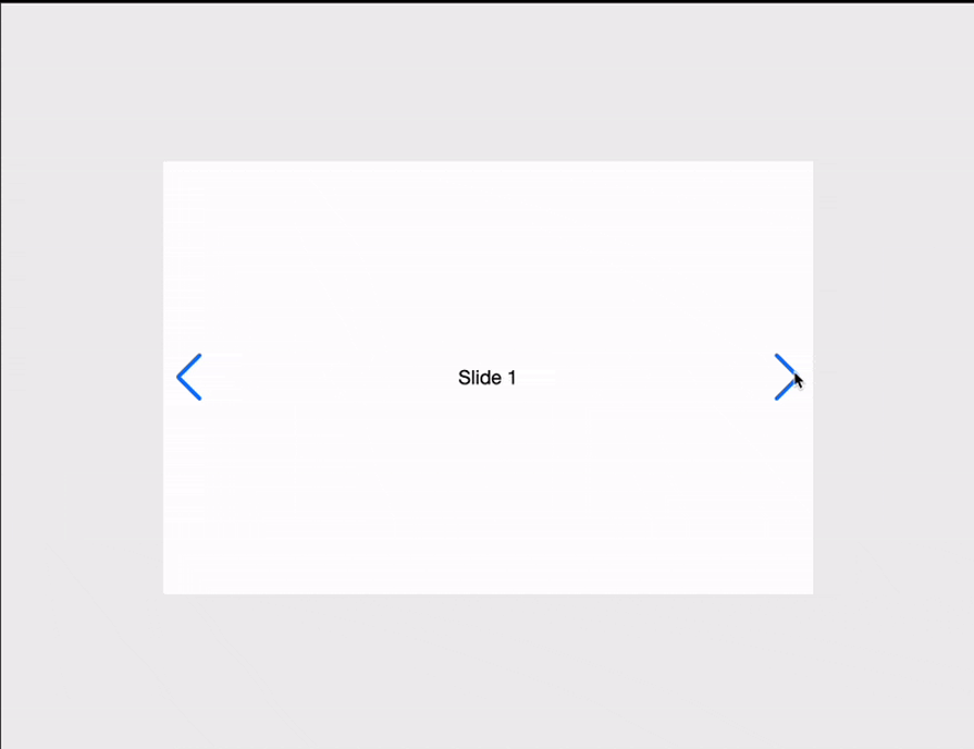
Swiper includes built-in navigation buttons that allow users to navigate between slides. You can customize these buttons using the following parameters:
prevEl — A string representing the CSS selector or HTML element for the “previous” buttonnextEl — A string representing the CSS selector or HTML element for the “next” buttonTo enable navigation, ensure your HTML includes the corresponding button elements:
<div class="swiper">
  <div class="swiper-wrapper">
    <div class="swiper-slide">Slide 1</div>
    <div class="swiper-slide">Slide 2</div>
    <div class="swiper-slide">Slide 3</div>
  </div>

  <!-- Navigation Buttons -->
  <div class="swiper-button-next"></div>
  <div class="swiper-button-prev"></div>
</div>
Then, enable navigation in your Swiper configuration:
import Swiper from 'swiper';
import { Navigation } from 'swiper/modules';
import 'swiper/swiper.min.css';
import 'swiper/modules/navigation.min.css';

const swiper = new Swiper('.swiper', {
  modules: [Navigation],
  navigation: {           // Adds next/prev buttons
    nextEl: '.swiper-button-next',
    prevEl: '.swiper-button-prev',
  },
});

// Alternative

const swiper = new Swiper('.swiper', {
  modules: [Navigation],
});
swiper.nextEl = '.swiper-button-next';
swiper.prevEl = '.swiper-button-prev';
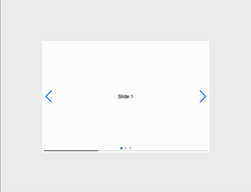
In the code above, we use the navigation.prevEl and navigation.nextEl parameters to target the .swiper-button-prev and .swiper-button-next classes in the HTML template. This setup links the Swiper instance with the appropriate navigation buttons. Here’s an example:
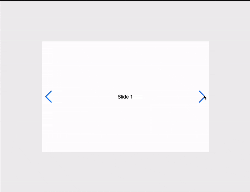
You can style the navigation buttons with CSS or use custom elements instead. For more navigation options, visit Swiper navigation modules.
Pagination in Swiper.js helps users track their current slide and navigate directly to specific slides. You can customize pagination using these options:
bullets— An array of HTML elements representing pagination bullets. Access a specific slide’s bullet using swiper.pagination.bullets[1]el— This option holds the HTML element for the pagination container.To use pagination, include a container for it, like so:
<div class="swiper">
  <div class="swiper-wrapper">
    <div class="swiper-slide">Slide 1</div>
    <div class="swiper-slide">Slide 2</div>
    <div class="swiper-slide">Slide 3</div>
  </div>

  <!-- Pagination -->
  <div class="swiper-pagination"></div>
</div>
Then set up the pagination option:
import Swiper from 'swiper';
import { Navigation, Pagination } from 'swiper/modules';
import 'swiper/swiper.min.css';
import 'swiper/modules/pagination.min.css';

const swiper = new Swiper('.swiper', {
  modules: [Pagination, Navigation],
  // Other parameters
  pagination: {  // Enables pagination
    el: '.swiper-pagination',
    clickable: true,
    type: 'bullets', // 'bullets' or 'fraction'
  },
});
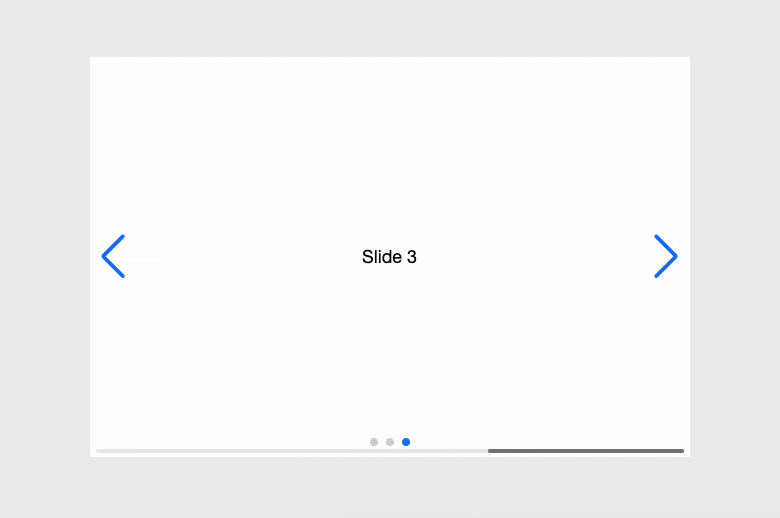
In this setup, pagination.el targets the .swiper-pagination element in the HTML. Setting clickable: true allows users to navigate slides by clicking pagination bullets. The type option can be set to bullets for dot indicators or fraction to display a format like “1/5”:
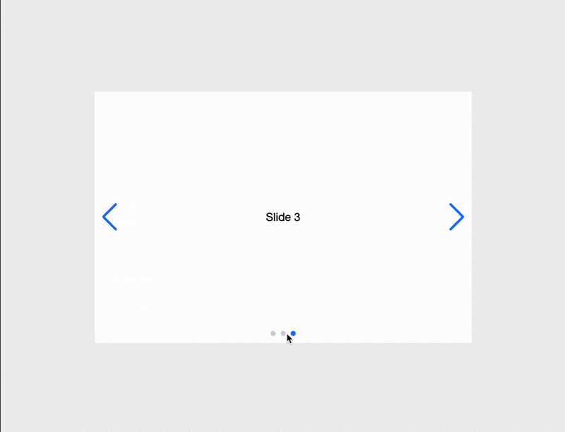
For more pagination options, visit the Swiper pagination modules page.
Lazy loading ensures that images are only loaded when they are about to appear on the screen, improving the initial load time and performance of our application. To use lazy loading in Swiper.js, we need to set loading="lazy" on images and add an animated preloader element swiper-lazy-preloader. The animated preloader adds a spinner to the slide.
Let’s see lazy loading in action:
<div class="swiper">
  <div class="swiper-wrapper">
    <!-- Lazy-loaded image -->
    <div class="swiper-slide">
      <img src="https://images.unsplash.com/vector-1739283864562-fea5e6376d2e?q=80&w=2146&auto=format&fit=crop&ixlib=rb-4.0.3&ixid=M3wxMjA3fDB8MHxwaG90by1wYWdlfHx8fGVufDB8fHx8fA%3D%3D" loading="lazy" />
      <div class="swiper-lazy-preloader"></div>
    </div>

    <!-- Lazy-loaded image with srcset for different resolutions -->
    <div class="swiper-slide">
      <img
        src="https://images.unsplash.com/vector-1738426079979-a92c2f584fc5?q=80&w=1800&auto=format&fit=crop&ixlib=rb-4.0.3&ixid=M3wxMjA3fDB8MHxwaG90by1wYWdlfHx8fGVufDB8fHx8fA%3D%3D"
        loading="lazy"
      />
      <div class="swiper-lazy-preloader"></div>
    </div>
  </div>
</div>
Here’s the demo:

For more lazy loading options, visit Swiper lazy loading modules.
A scrollbar helps users navigate by providing a draggable handle, allowing them to browse through slides more easily. In Swiper, you can customize the scrollbar settings. Some options Swiper offers include:
dragEl— Holds the element for the draggable scrollbar handleel— Holds the element for the scrollbar containerTo set it up, add a container for the scrollbar:
<div class="swiper">
  <div class="swiper-wrapper">
    <!-- Slides -->
  </div>
  <!-- Scrollbar -->
  <div class="swiper-scrollbar"></div>
</div>
Now, enable the scrollbar parameter:
const swiper = new Swiper('.swiper', {
  // Other parameters
  scrollbar: {     // Enables manual scrolling
    el: '.swiper-scrollbar',
    draggable: true,
  },
});
The scrollbar.el parameter targets the .swiper-scrollbar element in the HTML. Setting draggable to true allows users to drag the scrollbar handle to navigate through slides. For more scrollbar options, visit the documentation on Swiper scrollbar modules:
Looping makes the slider move continuously, while autoplay automatically transitions slides after a set delay. Swiper allows you to customize both features. Some options include:
loop — Enables looping (default is false)delay — Sets the time (in milliseconds) between slide transitions; autoplay is off if not setdisableOnInteraction — Stops autoplay after user interactions (like swipes), but restarts after each interactionTo configure loop and autoplay:
const swiper = new Swiper('.swiper', {
  // Other parameters
  loop: true,
  autoplay: {
    delay: 3000, // Time in milliseconds between transitions
    disableOnInteraction: false,
  },
});
Setting loop to true allows the slides to loop continuously. The autoplay setting manages automatic slide changes, where delay defines the time between changes. Setting disableOnInteraction to false keeps autoplay running even after users interact with the slides:
Swiper.js works well with modern JavaScript frameworks like React, Vue, and Angular. This section will show you how to use Swiper effectively in React and Vue applications.
To add Swiper to a React project, first install the swiper package. You can do this using npm:
npm install swiper
After installation, import and use Swiper components in your React app.
In React, there are two main components: Swiper and SwiperSlide. The Swiper component acts as the main container for the slider, while SwiperSlide represents each individual slide that holds the content. Here’s a basic example:
import React from 'react';
import { Swiper, SwiperSlide } from "swiper/react";
import "swiper/css";

export default () => {
  return (
    <Swiper>
      <SwiperSlide>Content 1</SwiperSlide>
      <SwiperSlide>Content 2</SwiperSlide>
      <SwiperSlide>Content 3</SwiperSlide>
      <SwiperSlide>Content 4</SwiperSlide>
    </Swiper>
  );
};
To add more features like navigation and pagination, install, import, and set up the necessary modules:
import { Navigation, Pagination } from 'swiper/modules';
import { Swiper, SwiperSlide } from 'swiper/react';

// Import required styles
import 'swiper/css';
import 'swiper/css/navigation';
import 'swiper/css/pagination';

export default () => {
  return (
    <Swiper
      modules={[Navigation, Pagination]}
      navigation
      pagination={{ clickable: true }}
    >
      <SwiperSlide>Slide 1</SwiperSlide>
      {/* ... */}
    </Swiper>
  );
};
Swiper has React-specific features that improve its use in React projects.
The main Swiper component serves as the container for your slideshow, supporting standard Swiper options and React-specific properties for enhanced functionality:
<Swiper
  tag="section"               // Define a custom HTML element (default: 'div')
  onSwiper={(swiper) => {    // Access the Swiper instance immediately after initialization
    console.log('Swiper instance:', swiper);
    // Store the instance in a ref or state if needed
  }}
  // Event handling with proper TypeScript support
  onSlideChange={(swiper) => {
    const activeIndex = swiper.activeIndex;
    console.log(`Slide changed to index ${activeIndex}`);
  }}
>
  {/* Slides go here */}
</Swiper>
The SwiperSlide component does more than just wrap slides. It also allows you to customize each slide and see their state:
<SwiperSlide
  tag="div"                  // Customize the slide element type
  zoom={true}               // Enable zoom functionality for this slide
  virtualIndex={5}          // Required only for virtual slides
>
  {/* Slide content */}
</SwiperSlide>
Another key feature is the option to show content based on a slide’s state. Check it out below:
  <div
    style={{
      display: "flex",
      justifyContent: "center",
      alignItems: "center",
      height: "100vh",
    }}
  >
    <Swiper
      slidesPerView={3}
      loop={true}
      watchSlidesProgress={true}
      modules={[Navigation, Pagination]}
      navigation
      pagination={{ clickable: true }}
      style={{ width: "60%", padding: "20px" }}
    >
      {[...Array(5)].map((_, index) => (
        <SwiperSlide key={index}>
          {({ isActive, isPrev, isNext, isVisible, isDuplicate }) => (
            <div
              style={{
                padding: "20px",
                border: "2px solid",
                borderColor: isActive
                  ? "blue"
                  : isPrev
                  ? "green"
                  : isNext
                  ? "purple"
                  : "gray",
                opacity: isVisible ? 1 : 0.5,
                backgroundColor: isDuplicate ? "#f8d7da" : "#e9ecef",
                textAlign: "center",
                fontSize: "18px",
              }}
            >
              <p>Slide {index + 1}</p>
              <p>{isActive && "Active"}</p>
              <p>{isPrev && "Previous"}</p>
              <p>{isNext && "Next"}</p>
              <p>{isVisible && "Visible"}</p>
              <p>{isDuplicate && "Duplicate"}</p>
            </div>
          )}
        </SwiperSlide>
      ))}
    </Swiper>
  </div>

Swiper provides helpful hooks to control and respond to the slideshow from any part of the component.
The useSwiper hook lets you access the Swiper instance from anywhere in the Swiper component:
// SlideController.jsx
import { useSwiper } from 'swiper/react';

function SlideController() {
  const swiper = useSwiper();

  return (
    <div className="controls">
      <button onClick={() => swiper.slidePrev()}>Previous</button>
      <button onClick={() => swiper.slideNext()}>Next</button>
    </div>
  );
}
The useSwiperSlide hook gives slide state information to any component within a slide:
// SlideIndicator.jsx
import { useSwiperSlide } from 'swiper/react';

function SlideIndicator() {
  const slide = useSwiperSlide();

  return (
    <div className={`indicator ${slide.isActive ? 'active' : ''}`}>
      {slide.isActive ? 'Active Slide' : 'Inactive Slide'}
    </div>
  );
}
To install Swiper in a Vue project, use npm:
npm install swiper
Similar to React, Swiper for Vue offers the same components, modules, props, and event listeners. Here’s a basic setup:
<script setup>
import { Swiper, SwiperSlide } from "swiper/vue";
import "swiper/css";
</script>

<template>
  <Swiper>
    <SwiperSlide>Slide 1</SwiperSlide>
    <SwiperSlide>Slide 2</SwiperSlide>
    <SwiperSlide>Slide 3</SwiperSlide>
    <SwiperSlide>Slide 4</SwiperSlide>
  </Swiper>
</template>
To use navigation, pagination, and scrollbars in Vue, import and configure the necessary modules:
<template>
  <swiper
    :modules="[Navigation, Pagination]"
    navigation
    :pagination="{ clickable: true }"
  >
    <!-- Slides -->
  </swiper>
</template>

<script>
import { Navigation, Pagination } from 'swiper/modules';
import { Swiper, SwiperSlide } from 'swiper/vue';

export default {
  components: {
    Swiper,
    SwiperSlide,
  },
  setup() {
    return {
      modules: [Navigation, Pagination],
    };
  },
};
</script>
Swiper in Vue supports standard Swiper parameters as props and events handling syntax. Some useful props include:
<template>
  <Swiper
     :slides-per-view="3"
    :space-between="50"
    @slideChange="onSlideChange"
  >
    <SwiperSlide>Slide 1</SwiperSlide>
    <SwiperSlide>Slide 2</SwiperSlide>
  </Swiper>
</template>

<script setup>
const onSlideChange = () => {
  console.log("Slide changed!");
};
</script>
Swiper Vue.js components are set to be deprecated in future versions of Swiper. For new projects, it’s recommended to use Swiper Element instead. However, the current implementation remains fully functional for existing applications.
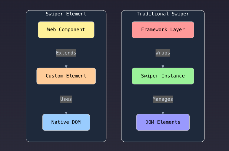
Swiper Element is a version of the Swiper designed for web components. It allows you to create sliders and carousels using standard web technology.
There are two ways to include the Swiper Element in your project. Either by using CDN or npm:
Using npm:
// Install
$ npm install swiper

// Register Swiper custom elements
import { register } from 'swiper/element/bundle';
register();
Using CDN:
<script src="https://cdn.jsdelivr.net/npm/swiper@11/swiper-element-bundle.min.js"></script>
With this option, it will be automatically registered, no need to call register()
When you install Swiper Element and call register() or add a script tag, there are two web components (custom elements) at your disposal: <swiper-container> and <swiper-slide>. These components enable you to specify all parameters and the Swiper slide element:
<swiper-container pagination="true" navigation="true">
  <swiper-slide>Slide 1</swiper-slide>
  <swiper-slide>Slide 2</swiper-slide>
  <swiper-slide>Slide 3</swiper-slide>
</swiper-container>
Using Swiper Element in React can be challenging since React doesn’t fully support custom elements. To configure parameters, use attributes on the element or directly assign properties. Complex setups require specific initialization steps, as standard React prop syntax won’t work for all settings:
Event handling works differently in Swiper Element. Standard React event formats on[Event] won’t work. Instead, use addEventListener or manage events via the on parameter object during setup.
Here’s how to use the Swiper element in React:
import { useRef } from 'react';
import { register } from 'swiper/element/bundle';

register();

export function ReactElement() {
  const swiperElRef = useRef(null);

  useEffect(() => {
    // Handle events...
    swiperElRef.current.addEventListener("swiperprogress", (e) => {
          const [swiper, progress] = e.detail;
          console.log(progress);
    });
  }, []);

  return (
    <swiper-container ref={swiperElRef}>
      {/* Slides */}
    </swiper-container>
  );
}
Vue fully supports web components. You can pass attributes as props and listen for custom events:
<template>
  <swiper-container
    :slides-per-view="3"
    @swiperslidechange="onSlideChange"
  >
    {/* Slides */}
  </swiper-container>
</template>

<script>
  import { register } from 'swiper/element/bundle';

  register();

  export default function () {
    setup() {

      const onSlideChange = (e) => {
        console.log('slide changed')
      }

      return {
        onSlideChange,
      };
    }
  }
</script>
Swiper.js is a powerful and flexible JavaScript library for creating touch-friendly sliders. In this article, we covered its installation methods—CDN, direct download, and npm—along with key features like navigation, pagination, lazy loading, scrollbars, and autoplay.
We also explored its integration with frameworks like React and Vue, highlighting essential components and methods. Additionally, we introduced Swiper Element, a modern alternative designed for web applications.
With its extensive customization options, performance optimizations, and broad framework support, Swiper is a top choice for building dynamic, interactive sliders. Check out its documentation to unlock its full potential.

TSRX adds first-class control flow, conditional hooks, and scoped styles to React via a TypeScript compiler extension — no new framework required.

Learn how to build a full React Native auth system using Better Auth and Expo — with email/password login, Google OAuth, session persistence, and protected routes.

Compare the top AI development tools and models of June 2026. View updated rankings, feature breakdowns, and find the best fit for you.

Learn how Bloom filters reduce database lookups for username availability checks while preserving correctness at scale.
Hey there, want to help make our blog better?
Join LogRocket’s Content Advisory Board. You’ll help inform the type of content we create and get access to exclusive meetups, social accreditation, and swag.
Sign up now

 Learn more →
