Editor’s note: This article was last updated by Adebiyi Adedotun on 30 January 2024 to cover the use of props in React Select, such as onFocus and onBlur. It also includes the process for creating new options using React Select’s Creatable component. Additionally, guidance on styling React Select components using props like style and classNames is now provided.
React Select is an open source select control created by Jed Watson with and for React. It was inspired by the shortcomings of the native HTML select control. It offers well-designed and battle-tested components and APIs that help you build powerful yet customizable select components. Some of the features include:
In this article, we’ll explore some of the fundamental features of React Select (v5) and build a couple of examples to guide you through React Select’s setup and implementation. If you’re using an older version, you should upgrade using the v3, v4, and v5 upgrade guide or v2 upgrade guide. You can also check out our video tutorial on React Select.
React Select works with any React framework. To install the react-select package, run either one of the following commands in your terminal:
npm install react-select
# OR
yarn add react-select
# OR
pnpm install react-select
Using React Select is as easy as adding the canonical Select component and passing it some vital props such as options, onChange, and defaultValue:
import Select from "react-select";
import { useState } from "react";

const options = [
  { value: "blues", label: "Blues" },
  { value: "rock", label: "Rock" },
  { value: "jazz", label: "Jazz" },
  { value: "orchestra", label: "Orchestra" },
];

export default function App() {
  const [selectedOption, setSelectedOption] = useState(null);
  // with TypeScript, ... useState<{value: string; label: string;} | null>(null)

  return (
    <div>
      <Select
        defaultValue={selectedOption}
        onChange={setSelectedOption}
        options={options}
      />
    </div>
  );
}
In the code snippet above, the select options are defined as music genres and passed into the Select component as props. defaultValue and onChange are wired to the stateful value selectedOption and its updater function, setSelectedOption. The result is a simple Select component:

Props are essential to how React Select works. They are also essential to customizing it. Apart from the three we passed with our first example, some other common props you can pass to the Select component include:
placeholder: Defines the text displayed in the text inputclassName: Sets a className attribute on the outer or root componentclassNamePrefix: If provided, all inner components will be given a prefixed className attributeautoFocus: Focuses the control when it is mountedisMulti: Supports multiple selected optionsnoOptionsMessage: Text to display when there are no options foundmenuIsOpen: Opens the dropdown menu by defaultisLoading: Useful for async operations. For example, to indicate a loading state during a search<Select
{...props}
placeholder="Select music genre"
className="adebiyi"
classNamePrefix="logrocket"
autoFocus
isMulti
noOptionsMessage={({ inputValue }) => `No result found for "${inputValue}"`}
/>
React Select can be configured to allow multiple options to be selected in a single Select component. This can be achieved by toggling on the isMulti prop on the Select component:
import Select, { MultiValue } from "react-select";
import { useState } from "react";

const options = [
    { value: "blues", label: "Blues" },
    { value: "rock", label: "Rock" },
    { value: "jazz", label: "Jazz" },
    { value: "orchestra", label: "Orchestra" },
  ];

export default function App() {
  // We now have multiple options. Basically, an array of options.
  const [selectedOptions, setSelectedOptions] = useState<MultiValue<{
    value: string;
    label: string;
  }> | null>(null);

  return (
    <div>
      <Select
        defaultValue={selectedOptions}
        onChange={setSelectedOptions}
        options={options}
        isMulti
      />
    </div>
  );
}

React Select’s options props can be static and preselected as shown in previous examples. They can also be dynamic and asynchronous, that is, generated on demand from an API or a database query. For this use case, React Select offers the Async component from react-select/async:
import Async from "react-select/async";

const musicGenres = [
  { value: "blues", label: "Blues" },
  { value: "rock", label: "Rock" },
  { value: "jazz", label: "Jazz" },
  { value: "orchestra", label: "Orchestra" },
];

function filterMusicGenre(inputValue) {
  return musicGenres.filter((musicGenre) => {
    const regex = new RegExp(inputValue, "gi");
    return musicGenre.label.match(regex);
  });
}

export default function App() {
  return (
    <Async
      loadOptions={(inputValue, callback) =>
        setTimeout(() => callback(filterMusicGenre(inputValue)), 1000)
      }
    />
  );
}
The Async component extends the Select component with asynchronous features like loading state.
The loadOptions prop is an async function or a promise (hence, the setTimeout ) that exposes the search text (input value) and a callback that is automatically called once the input value changes. You can also use Select props on Async as long as it is contextual to do so. For example, to get the selected option, you’d run the following code:
export default function App() {
  const [selectedOption, setSelectedOption] = useState(null);

  return (
    <>
      {/* This renders the selectedOption. You can log it to the console instead */}
      <div style={{ marginBlockEnd: "1rem", display: "flex" }}>
        <span>Selected option:</span>
        <pre> {JSON.stringify(selectedOption)} </pre>
      </div>
      <Async
        loadOptions={(inputValue, callback) =>
          setTimeout(() => callback(filterMusicGenre(inputValue)), 1000)
        }
        onChange={setSelectedOption} // This is wired to state
        isMulti
      />
    </>
  );
}
The Async component includes provision for helpful props like:
cacheOptions: Caching fetched optionsdefaultOptions: Set default options before the remote options are loadedAnother component that may come in handy is the Fixed Options component, which makes it possible to have fixed options.
Creatable componentTypically, there is a dead end when there are no options after a search. However, you can choose to let users create a new option. For this use case, React Select offers the Creatable component for static options and AsyncCreatable components for dynamic options.
Using Creatable is the same as using Select:
import Creatable from "react-select/creatable";
import { useState } from "react";

const musicGenres = [
  { value: "blues", label: "Blues" },
  { value: "rock", label: "Rock" },
  { value: "jazz", label: "Jazz" },
  { value: "orchestra", label: "Orchestra" },
];

export default function App() {
  const [selectedOption, setSelectedOption] = useState(null);

  return (
    <>
      <div style={{ marginBlockEnd: "1rem", display: "flex" }}>
        <span>Selected option:</span>
        <pre> {JSON.stringify(selectedOption)} </pre>
      </div>
      <Creatable options={musicGenres} onChange={setSelectedOption} isMulti />
    </>
  );
}

And using AsyncCreatable is the same as using Async:
import AsyncCreatable from "react-select/async-creatable";
import { useState } from "react";

const musicGenres = [
  { value: "blues", label: "Blues" },
  { value: "rock", label: "Rock" },
  { value: "jazz", label: "Jazz" },
  { value: "orchestra", label: "Orchestra" },
];

function filterMusicGenre(inputValue) {
  return musicGenres.filter((musicGenre) => {
    const regex = new RegExp(inputValue, "gi");
    return musicGenre.label.match(regex);
  });
}

export default function App() {
  const [selectedOption, setSelectedOption] = useState(null);
  return (
    <>
      <AsyncCreatable
        loadOptions={(inputValue, callback) =>
          setTimeout(() => callback(filterMusicGenre(inputValue)), 1000)
        }
        onChange={setSelectedOption}
        isMulti
        isClearable
      />
    </>
  );
}

React Select also exposes several events to manage your select components (Select, Async, etc.). You’ve seen onChange and autoFocus. Some others include:
onBluronMenuOpenonMenuCloseonInputChangeonMenuScrollToBottomonMenuScrollToTopThese events are describable by name and are fairly straightforward to understand. For example, you could use onBlur to validate the select component. Additionally, if you have a long list of options, you can detect when the menu is scrolled to the bottom or top using onMenuScrollToBottom and onMenuScrollToTop.
Each of these events will expose the event to the callback function as in the case of onBlur in the code snippet below:
<Select
  {...props}
  onMenuOpen={() => console.log("Menu is open")}
  onMenuClose={() => console.log("Menu is close")}
  onBlur={(e) => console.log(e)}
  onMenuScrollToBottom={() =>
    console.log("Menu was scrolled to the bottom.")
  }
/>
The Select component is composed of other child components, each with base styles that can be extended or overridden distinctly. These are components like control, placeholder, options, noOptionsMessage, etc:

There are three APIs for styling these components: the styles prop, the classNames prop, and the classNamePrefix prop.
styles propYou can pass an object of callback functions to the styles prop. Each callback function represents a child component of Select, and automatically exposes the corresponding base or default styling and state.
N.B., You don’t have to expressly name the function arguments “defaultStyles” and “state.”
import Select from "react-select";
import { useState } from "react";

const options = [
  { value: "blues", label: "Blues" },
  { value: "rock", label: "Rock" },
  { value: "jazz", label: "Jazz" },
  { value: "orchestra", label: "Orchestra" },
];

const customStyles = {
  option: (defaultStyles, state) => ({
    // You can log the defaultStyles and state for inspection
    // You don't need to spread the defaultStyles
    ...defaultStyles,
    color: state.isSelected ? "#212529" : "#fff",
    backgroundColor: state.isSelected ? "#a0a0a0" : "#212529",
  }),

  control: (defaultStyles) => ({
    ...defaultStyles,
    // Notice how these are all CSS properties
    backgroundColor: "#212529",
    padding: "10px",
    border: "none",
    boxShadow: "none",
  }),
  singleValue: (defaultStyles) => ({ ...defaultStyles, color: "#fff" }),
};

export default function App() {
  const [selectedOption, setSelectedOption] = useState(null);

  return (
    <div>
      <Select
        defaultValue={selectedOption}
        onChange={setSelectedOption}
        options={options}
        styles={customStyles}
      />
    </div>
  );
}
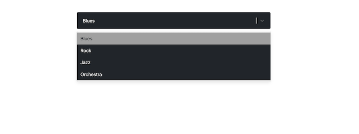
In the code below, the Select component has been styled to have a dark appearance through the control, option, and singleValue child components. The result is this:

classNames propWith the classNames props, you can add class names to each child component like so:
<Select
  {...props}
  classNames={{
    control: (state) =>
      `border ${state.isFocused ? "border-red-800" : "border-red-400"}`,
    option: () => "menu-item",
  }}
/>
In the code snippet above, the control component’s border is styled with respective class names based on the isFocused state of the Select component. This is typically how you’d use Tailwind CSS with React Select.
classNamePrefix propWhile the className prop is used to apply a class name on the root element of the Select component, the classNamePrefix is used to namespace every child components:
<Select
  defaultValue={selectedOption}
  onChange={setSelectedOption}
  options={options}
  className="for-root-component"
  classNamePrefix="for-child-components"
/>
The code snippet above, with className and classNamePrefix, will generate a DOM structure similar to this:
<div class="for-root-component react-select-container">
  <div class="for-child-components__control">
    <div class="for-child-components__value-container">...</div>
    <div class="for-child-components__indicators">...</div>
  </div>
  <div class="for-child-components__menu">
    <div class="for-child-components__menu-list">
      <div class="for-child-components__option">...</div>
    </div>
  </div>
</div>
You can then target each distinct class name property for styling, for example, in a .css file.
unstyled propIf you need to completely restyle the Select component, you can apply the unstyled prop to strip it clean to only the essentials, like so:
<Select
  {...props}
  unstyled
/>
Then you can use one of the three styling APIs mentioned above to restyle Select.
Select propsIf you use either one of the styles or classNames APIs, you can get access to any custom prop you pass to the Select component through the state argument, like so:
<Select
  {...props}
  customProps={true} // You can pass a custom prop...
  styles={{
    control: (defaultStyles, state) => {
      // ...then access the props through `selectProps`
      // You can use it to style the component
      console.log(state.selectProps["customProps"]);
      return {
        ...defaultStyles,
        color: state.isSelected ? "#212529" : "#fff",
        backgroundColor: state.isSelected ? "#a0a0a0" : "#212529",
      };
    },
  }}
/>
Effectively styling the
Selectrequires that you know the component(s) you intend to style and choose one of the styling API above to achieve your goal. If you break a component down for your bare metal needs, let cx and custom Components be your styling guide.
React Select is a tested and trusted select component that has about 27K GitHub stars and since its initial release in 2014, it has evolved through five versions. It is supported by Jed Watson along with his company, Thinkmill, the community, and Atlassian.
In this article, we’ve explored some common use cases for the React Select component. We also learned how to get started with React Select and extend some of its predefined components to suit our needs.
Install LogRocket via npm or script tag. LogRocket.init() must be called client-side, not
server-side
$ npm i --save logrocket

// Code:

import LogRocket from 'logrocket';
LogRocket.init('app/id');
// Add to your HTML:

<script src="https://cdn.lr-ingest.com/LogRocket.min.js"></script>
<script>window.LogRocket && window.LogRocket.init('app/id');</script>
Would you be interested in joining LogRocket's developer community?
Join LogRocket’s Content Advisory Board. You’ll help inform the type of content we create and get access to exclusive meetups, social accreditation, and swag.
Sign up now
Add to your JavaScript knowledge of shortcuts by mastering the ternary operator, so you can write cleaner code that your fellow developers will love.

Learn how to efficiently bundle your TypeScript package with tsup. This guide covers setup, custom output extensions, and best practices for optimized, production-ready builds.

Learn the fundamentals of React’s high-order components and play with some code samples to help you understand how it works.

Learn about the dependency inversion principle (DIP), its importance, and how to implement it across multiple programming languages.
4 Replies to "Getting started with React Select"
How do you get the value out of react-select? I’ve set up a working react-select async component that pulls data from an external api and populates the component with the suggestions. That is working great. However, getting the value from the component is proving rather tricky…
I have a ‘submit’ button that (when clicked on) pulls the stored data to be dynamically added to a table on another portion of my site. However, every time I click on the submit button, react-select automatically clears the stored input (in react state) and it comes back as an empty string. Soo frustrating!
Wish you had covered this is your write up!
Hi, maybe you have an example of how to use ‘react-select’ with server-side rendering? I’m trying to upgrade react (and other components) to the latest version, and everything works well except this ‘react-select’ component: when I use it with server-side rendering there is an error:
‘ReferenceError: window is not defined’
Seems like I have some wrong configuration in webpack or something wrong in a component where I use ‘react-select’; I did some investigation and I found out that in my generated ‘server.js’ it uses code from ‘react-select-*.browser.*.js’, but probably it should use code ‘from react-select-*.prod.js’?
Thanks in advance
If i create a custom component .it always rerenders.how can i stop it?
If your useEffect is updating your state, and your state var is in the useEffect [] array, the state update will trigger a rerender, and the rerender will update your state which will cause a rerender which … repeat endlessly. Take your state var out of your useEffect [] array. That should help.