In this tutorial, we’ll demonstrate how to create a modal bottom sheet in Flutter with practical examples.

Here’s what we’ll cover:
showModalBottomSheet functionThe Replay is a weekly newsletter for dev and engineering leaders.
Delivered once a week, it's your curated guide to the most important conversations around frontend dev, emerging AI tools, and the state of modern software.
There are basically three types of Flutter bottom sheets: standard, modal, and expanding.
For this tutorial, we’ll focus on creating a modal bottom sheet in Flutter.
A modal bottom sheet is a widget, which is a core building block of Flutter apps, in Material Design.
Modal bottom sheets in Flutter are used to display supplementary content while restricting the user from interacting with the app’s main content. As the name suggests, a bottom sheet is positioned at the bottom of the screen.
Let’s say, for example, you have a photo saved in Google Photos that you want to share with a friend. When you tap the photo and click SHARE, some additional information shows up at the bottom of the screen:

The additional information that appears at the bottom of the screen is an example of a bottom sheet.
The purpose of a modal bottom sheet is to create room for more content in your app. Modal bottom sheets are very common in mobile apps. They are often used to display links to other apps on the user’s mobile device.
As mentioned earlier, with a modal bottom sheet, interaction with other elements of the UI is blocked. Users can only interact with the other part of the app’s UI after dismissing (closing) the modal bottom sheet.
A modal bottom sheet will appear in response to some user action, such as tapping an icon. It can be dismissed by any of the following user actions:
showModalBottomSheet functionModal bottom sheets can be created and displayed using the showModalBottomSheet function.
Let’s take a close look at the showModalBottomSheet function:
Future<T?> showModalBottomSheet<T>(
         {required BuildContext context,
         required WidgetBuilder builder,
         Color? backgroundColor,
         double? elevation,
         ShapeBorder? shape,
         Clip? clipBehavior,
         Color? barrierColor,
         bool isScrollControlled = false,
         bool useRootNavigator = false,
         bool isDismissible = true,
         bool enableDrag = true,
         RouteSettings? routeSettings,
         AnimationController? transitionAnimationController}
)
The showModalBottomSheet has two required properties: BuildContext and WidgetBuilder.
BuildContext takes the context argument, which is used to look up the Navigator and the theme for the bottom sheet. This is used when the method is calledWidgetBuilder is a function that takes the current context — which, in this case, is the builder — and returns a widget. This widget is — you guessed it — a bottom sheet widgetTo show the modal bottom sheet in action, we’re going to build a Flutter app with a button that, when clicked, displays a modal bottom sheet.
This tutorial assumes some basic knowledge of and experience building apps with Flutter.
First, start a new Flutter project on Android Studio (or any IDE of your choice). Name the project modalbottomdemo.
Clear the code except for import 'package:flutter/material.dart', which we’ll use to import the Material Design component for the app and void main() => runApp(MyApp());, which Flutter generates when a new project is created. We’re doing this because we want to build from the ground up.
You should have something like this in your editor:
import 'package:flutter/material.dart';

void main() {runApp(MyApp());}
Create a StatefulWidget that is extended by the MyApp(). Typing stfu + tab on your editor will automatically create a stateful widget.
class MyApp extends StatefulWidget {
  const MyApp({Key? key}) : super(key: key);

  @override
  _MyAppState createState() => _MyAppState();
}
Next, build the AppBar of the app using the Scaffold widget, which is like a container that houses the structure of your app (AppBar, body, side, etc.).
Here’s the code:
class _MyAppState extends State<MyApp> {
  @override
  Widget build(BuildContext context) {
    return MaterialApp(
      title: 'Modal Bottom Sheet Demo',
      home: Scaffold(
        backgroundColor: Colors.blueGrey,
        appBar: AppBar(
          title: const Text('Creating a Modal Bottom Sheet'),
          backgroundColor: Colors.black38,
        ),
Now it’s time to create the body widget, which will contain a button, ElevatedButton, with the text, “Show Modal Bottom Sheet.” The button will be placed at the center of the app using the Center widget.
As stated earlier, we’ll use the showModalBottomSheet widget to display a modal bottom sheet, which takes two properties: context and the builder.
body: Builder(
          builder: (context) {
            return Center(
              child: ElevatedButton(
                child: Text('Show Modal Bottom Sheet'),
                onPressed: () {
                  showModalBottomSheet(
                    context: context,
                    builder: (context) {
                      return Wrap(
                        children: [
                          ListTile(
                            leading: Icon(Icons.share),
                            title: Text('Share'),
                          ),
                          ListTile(
                            leading: Icon(Icons.copy),
                            title: Text('Copy Link'),
                          ),
                          ListTile(
                            leading: Icon(Icons.edit),
                            title: Text('Edit'),
                          ),
                        ],
                      );
                    },
                  );
                },
              ),
            );
          },
        ),
      ),
    );
  }
}
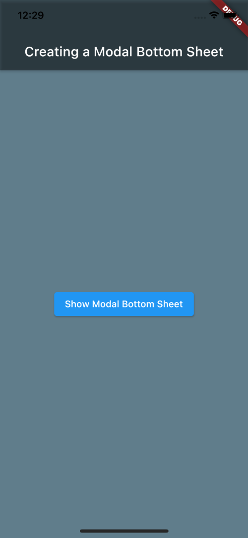
Run the app on any simulator of your choice. Here’s what our Flutter app looks like running on an iPhone 12 mini simulator:
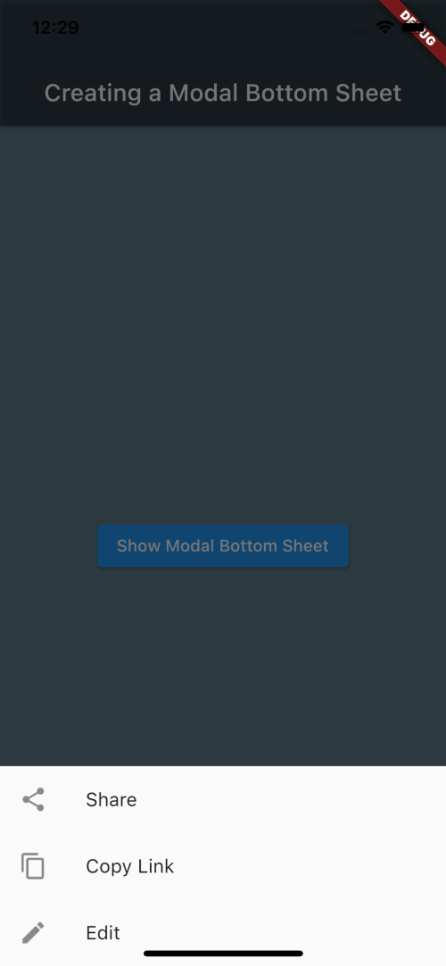
Clicking the button should bring up the hidden menu:
Here’s the complete code for this demo:
import 'package:flutter/material.dart';

void main() {
  runApp(MyApp());
}

class MyApp extends StatefulWidget {
  const MyApp({Key? key}) : super(key: key);

  @override
  _MyAppState createState() => _MyAppState();
}

class _MyAppState extends State<MyApp> {
  @override
  Widget build(BuildContext context) {
    return MaterialApp(
      title: 'Modal Bottom Sheet Demo',
      home: Scaffold(
        backgroundColor: Colors.blueGrey,
        appBar: AppBar(
          title: const Text('Creating a Modal Bottom Sheet'),
          backgroundColor: Colors.black38,
        ),
        body: Builder(
          builder: (context) {
            return Center(
              child: ElevatedButton(
                child: Text('Show Modal Bottom Sheet'),
                onPressed: () {
                  showModalBottomSheet(
                    context: context,
                    builder: (context) {
                      return Wrap(
                        children: [
                          ListTile(
                            leading: Icon(Icons.share),
                            title: Text('Share'),
                          ),
                          ListTile(
                            leading: Icon(Icons.copy),
                            title: Text('Copy Link'),
                          ),
                          ListTile(
                            leading: Icon(Icons.edit),
                            title: Text('Edit'),
                          ),
                        ],
                      );
                    },
                  );
                },
              ),
            );
          },
        ),
      ),
    );
  }
}
Flutter comes with customizable widgets that you can use to build cross platform apps for Android, iOS, and the web. With the showModalBottomSheet widget, you can create modal bottom sheets that enhance the user experience for those accessing your app on a mobile device.
You can learn more about Flutter by browsing through our collection of Flutter articles and tutorials.
Install LogRocket via npm or script tag. LogRocket.init() must be called client-side, not
server-side
$ npm i --save logrocket

// Code:

import LogRocket from 'logrocket';
LogRocket.init('app/id');
// Add to your HTML:

<script src="https://cdn.lr-ingest.com/LogRocket.min.js"></script>
<script>window.LogRocket && window.LogRocket.init('app/id');</script>

Why the future of DX might come from the web platform itself, not more tools or frameworks.

A hands-on test of Claude Code Review across real PRs, breaking down what it flagged, what slipped through, and how the pipeline actually performs in practice.

CSS art once made frontend feel playful and accessible. Here’s why it faded as the web became more practical and prestige-driven.

Learn how inline props break React.memo, trigger unnecessary re-renders, and hurt React performance — plus how to fix them.
Hey there, want to help make our blog better?
Join LogRocket’s Content Advisory Board. You’ll help inform the type of content we create and get access to exclusive meetups, social accreditation, and swag.
Sign up now

 Learn more →
