Adhering to Material Design Guidelines, Flutter offers different kinds of buttons for various use cases. Out of these, FloatingActionButton (FAB) is especially important because of its unique properties and the rules to use it.
In this tutorial, we’ll introduce you to these rules and show you how to use and customize the FloatingActionButton widget in Flutter.
Here’s what we’ll cover:
The Replay is a weekly newsletter for dev and engineering leaders.
Delivered once a week, it's your curated guide to the most important conversations around frontend dev, emerging AI tools, and the state of modern software.
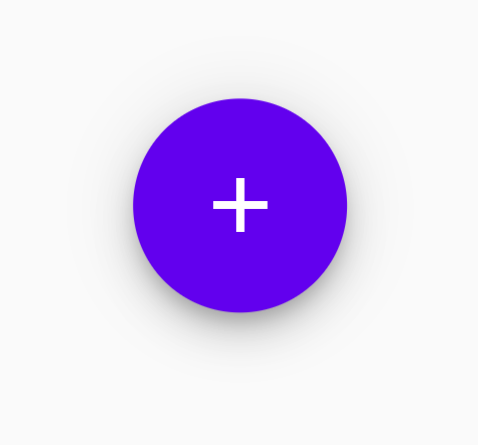
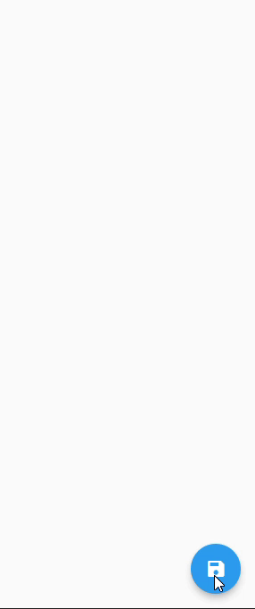
Each component in Flutter is called a widget, and FloatingActionButton is no exception. As the name suggests, this widget floats on top of other widgets on the screen.
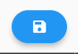
Usually, the FloatingActionButton widget is placed in the bottom-right corner of the screen and is circular in shape. It also has an elevation to give that floating effect. Best of all, all of these properties are customizable.
Here’s what a typical FloatingActionButton in Flutter looks like:
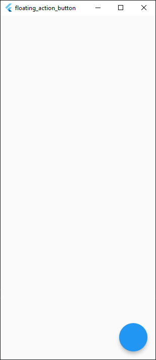
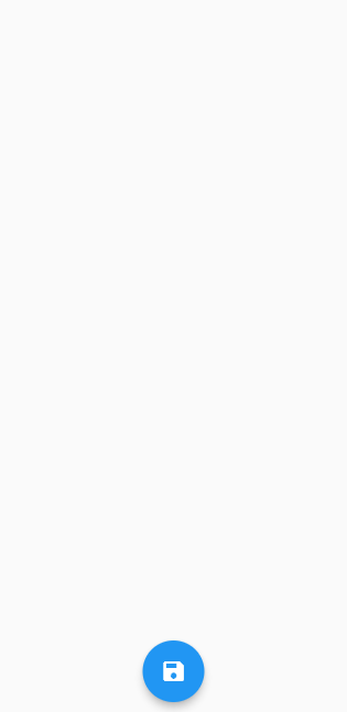
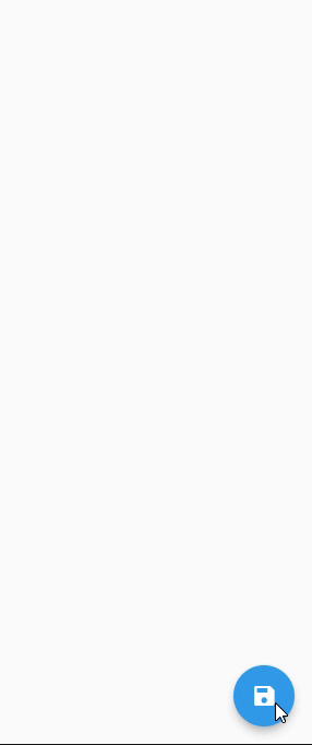
To use FloatingActionButton in Flutter, use Scaffold‘s floatingActionButton property:
Scaffold(
  floatingActionButton: FloatingActionButton(),
),
This will add FAB at its default position on the screen:

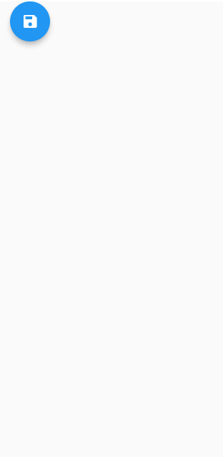
You can also create an extended FAB by using FloatingActionButton.extended():
Scaffold(
  floatingActionButton: FloatingActionButton(
    label: Text('Action'),
  ),
),
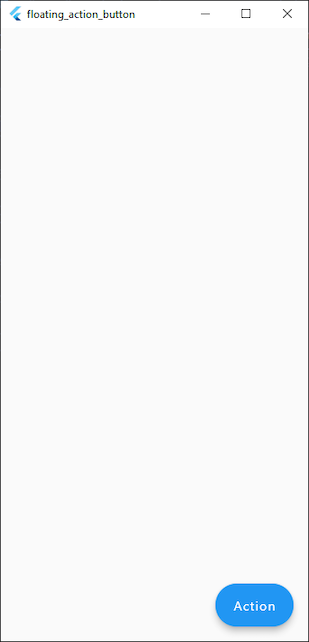
Here we have a default FAB on the screen.
Before we dive deeper and explore the customization options, let’s make sure we understand the rules and principles to keep in mind when using FAB. These best practices are important to keep your app consistent with Material Design.
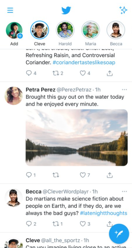
FAB takes a prominent place in the UI. Hence, it should perform the primary action on the screen.
The action should be the most commonly used and important action on that screen. For example, composing a tweet is the primary action in Twitter’s feed page:

Minor actions, such as adjusting volume, copying text, and opening a drawer, should not be performed using FAB. These actions can always be performed with widgets that are hidden or subtly placed in the UI.
You should only use FAB for constructive actions and avoid using it for destructive actions. Actions such as adding to cart, sharing a picture, and writing an email are considered constructive actions. Destructive actions include archiving, deleting, navigating to previous page, etc.
Floating action button should be relevant to the context of the screen; the icon and action should both make sense.
Taking an example from the Twitter app again, the icon clearly indicates what the button does — that is, it creates a new tweet.
How could this be done in the wrong way? One example would be setting the button to open a profile page, which is clearly not the most important action in the context of the screen.
In most cases, there should be no more than one floating action button on the screen. This makes sense because the role of FAB is to perform the most important action and having multiple FABs reduces its importance.
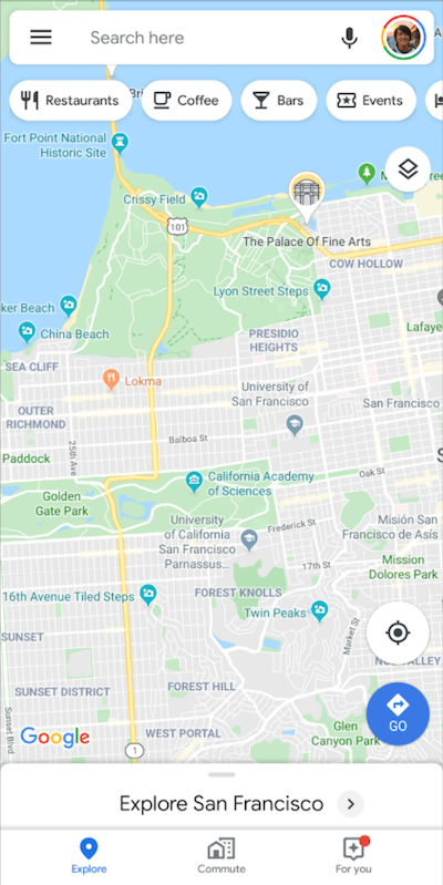
However, there is an exception to this rule: if the screen has two distinct and highly important actions, it may make sense to use two FABs. A good example of this is the Google Maps app:
Here, choosing a destination and centering at current location are both equally important actions that should be readily available on the screen.
By default, only the FAB’s icon should be displayed on the screen; including text, to some degree, defeats the purpose of using the FAB widget.
However, in the case of extended FAB, this rule is inverted. With an extended FAB, you may display only the label or icon and label both. By contrast, displaying only the icon in an extended floating action button is not allowed.
Now that you understand the important principles and best practices for creating a floating action button, let’s explore the customization options Flutter’s FloatingActionButton widget has to offer.
You can customize the color of the FloatingActionButton. Change FAB’s background color to Red like this:
FloatingActionButton(
	backgroundColor: Colors.red,
),

The foregroundColor property is used to change the color of a child — in this case, the icon’s color. Let’s change it to pink:
FloatingActionButton(
	foregroundColor: Colors.pink,
),
When you tap on the FAB, there’s an animation in which a color originates from the tapped position and covers the entire button area. This is called the splash color.
Let’s change the splash color of our FloatingActionButton to purple:
FloatingActionButton(
	splashColor: Colors.purple,
),
There’s also a color change when mouse cursor is hovered over the button. This produces nice feedback before the button is actually tapped.
To change this color to orange, set the hoverColor property as follows:
FloatingActionButton(
  hoverColor: Colors.orange,
),
Lastly, there’s an option to change the focus color. Basically, when the button is focused using FocusNode, the color can be changed to indicate that the button is now in focus.
To understand exactly how this happens, you’ll need to review the concept of focus in Flutter, which is beyond the scope of this article.
For now, we can see the color change by setting autoFocus parameter to true. This will focus the FAB automatically and we can see the color change to green:
FloatingActionButton(
	focusColor: Colors.green,
	autoFocus: true,
),
Elevation is basically the position of button in Z-axis. The shadow is adjusted according to the elevation, which creates the illusion that the button is floating.
The default elevation of our FAB is set to 6, so let’s increase the elevation by changing it to 12:
FloatingActionButton(
	elevation: 12,
),

If FAB’s onPressed property is set to null, the button is marked as disabled. We can customize disabled elevation specifically.
Let’s set it to 0:
FloatingActionButton(
	onPressed: null,
	disabledElevation: 0,
),
Just like focusColor, here we have focusElevation to gain some extra control over the feedback the user sees when the button is focused.
Let’s set it as 5 for this example. Don’t forget to set autoFocus to true to test it immediately.
FloatingActionButton(
	autoFocus: true,
	focusElevation: 5,
),
Highlight elevation is the elevation of the button when tapped, just like splash color. We’ll set it to 50 to see a real difference in elevation:
FloatingActionButton(
	higlightElevation: 50,
),
Finally, we have hover elevation. This represents the elevation when the FAB is hovered over with the mouse cursor. Once again, we’ll keep it at 50:
FloatingActionButton(
	hoverElevation: 50,
),

The default bottom right position of FAB might not fit your app’s design and you may want to place it at the center instead. To achieve that, we change Scaffold’s floatingActionButtonLocation property, like this:
Scaffold(
	floatingActionButtonLocation: FloatingActionButtonLocation.centerFloat,
),
Or how about placing it at the top left?
Scaffold(
	floatingActionButtonLocation: FloatingActionButtonLocation.startTop,
),
But since FAB is a widget, we are not restricted by Scaffold xin order to position it. We can place it anywhere in the layout, just like any other widget. Here’s an example:
Let’s quickly walk through the miscellaneous properties of the FloatingActionButton widget.
First, there’s mini. Setting mini to true renders a mini version of FAB:
FloatingActionButton(
	mini: true,
),
mouseCursor enables you to change the cursor type when it’s hovered over the button.
FloatingActionButton(
  mouseCursor: MaterialStateMouseCursor.textable,
),
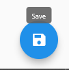
toolTip enables you to provide additional accessibility to the user. What if, for example, the user does not understand what the button icon means? You can create a tooltip that says something — for instance, “Save” — and it’ll appear whenever button is hovered or long-pressed:
FloatingActionButton(
	tooltip: 'Save',
),
You can customize the button’s shape using the shape parameter. For example, you can make it rectangular like this:
FloatingActionButton(
	shape: RoundedRectangleBorder(),
),
FloatingActionButton uses hero animation for page transitions. The button essentially morphs into a new widget when transitioning, and it looks really cool. Let’s see it in action, shall we?
First, create a new page to navigate to. We’ll call it SecondPage:
class SecondPage extends StatelessWidget {
  const SecondPage({Key? key}) : super(key: key);

  @override
  Widget build(BuildContext context) {
    return Scaffold(
      appBar: AppBar(),
    );
  }
}
Next, create a Hero widget at the center of the page:
return Scaffold(
  body: Center(
    child: Hero(tag: 'uniqueTag', child: Icon(Icons.save)),
  ),
);
The tag property enables us to connect two widgets by providing unique tags, so the framework is not confused as to which widget to morph to. For this example, we’ll use the same “Save” **icon as the child.
Now provide the same tag to FAB in the first page:
FloatingActionButton(
  heroTag: 'uniqueTag',
),
The FAB now knows that it has to animate to that specific icon widget.
Since the FAB can animate to only one widget, you cannot create multiple Hero widgets with the same tag. Each widget should have a unique tag.
Finally, we’ll have the FAB navigate to SecondPage when it’s pressed. To do that, use Navigator.push() in the FAB’s onPressed property:
FloatingActionButton(
        heroTag: 'uniqueTag',
        onPressed: () {
          Navigator.push(
            context,
            MaterialPageRoute(
              builder: (context) => SecondPage(),
            ));
        }
),
Here’s what the transition looks like:
Let’s try animating another floating action button and see what that looks like.
Create a FAB in the second page. This time, we can have an extended FloatingActionButton:
FloatingActionButton.extended(
  heroTag: 'uniqueTag',
  label: Row(
    children: [Icon(Icons.save), Text('Save')],
  ),
),
Now navigating to second page should look like this:
Let’s try one last transition with FAB’s position across multiple pages.
Just like second page, create a third and forth page with FABs of different colors and icons. For each FAB, keep a different position using the floatingActionButtonLocation property. Make sure you provide the same heroTag to all of them. Now, see the magic!
Pretty cool, right?
Having completed this tutorial, you should now understand:
With this knowledge, I hope you’ll be able to implement FAB in your Flutter apps and make them even more beautiful and functional. Thanks for reading!
Install LogRocket via npm or script tag. LogRocket.init() must be called client-side, not
server-side
$ npm i --save logrocket

// Code:

import LogRocket from 'logrocket';
LogRocket.init('app/id');
// Add to your HTML:

<script src="https://cdn.lr-ingest.com/LogRocket.min.js"></script>
<script>window.LogRocket && window.LogRocket.init('app/id');</script>
Local AI proxy tutorial for detecting, masking, and rehydrating PII before prompts reach cloud LLMs.

Learn how Graph RAG uses connected knowledge structures to improve retrieval beyond simple text similarity.
Learn how sibling-index() enables clean, JavaScript-free stagger animations using native CSS.
useEffect breaks AI streaming responses in ReactSee why useEffect breaks AI streaming in React, and how moving stream state outside React fixes flicker and stale updates.
Hey there, want to help make our blog better?
Join LogRocket’s Content Advisory Board. You’ll help inform the type of content we create and get access to exclusive meetups, social accreditation, and swag.
Sign up now

 Learn more →
