
All frontend apps use some kind of design system to help users accomplish tasks easier. They may use a custom design system that is developed internally or an established design system such as Material Design or Cupertino (iOS).

Material design is developed by Google and can be used to develop Android, iOS, web, and desktop apps.
Cupertino is developed by Apple. It is based on Apple’s Human Interface Guidelines, which implement the current iOS design language.
The Flutter SDK comes with both Material and Cupertino widget libraries to develop an app that looks and feels native for either platform.
You can still build an app just using the Material widgets library. However, if you want to build an app that looks like the standard iOS style, you should strongly consider using the Cupertino library.
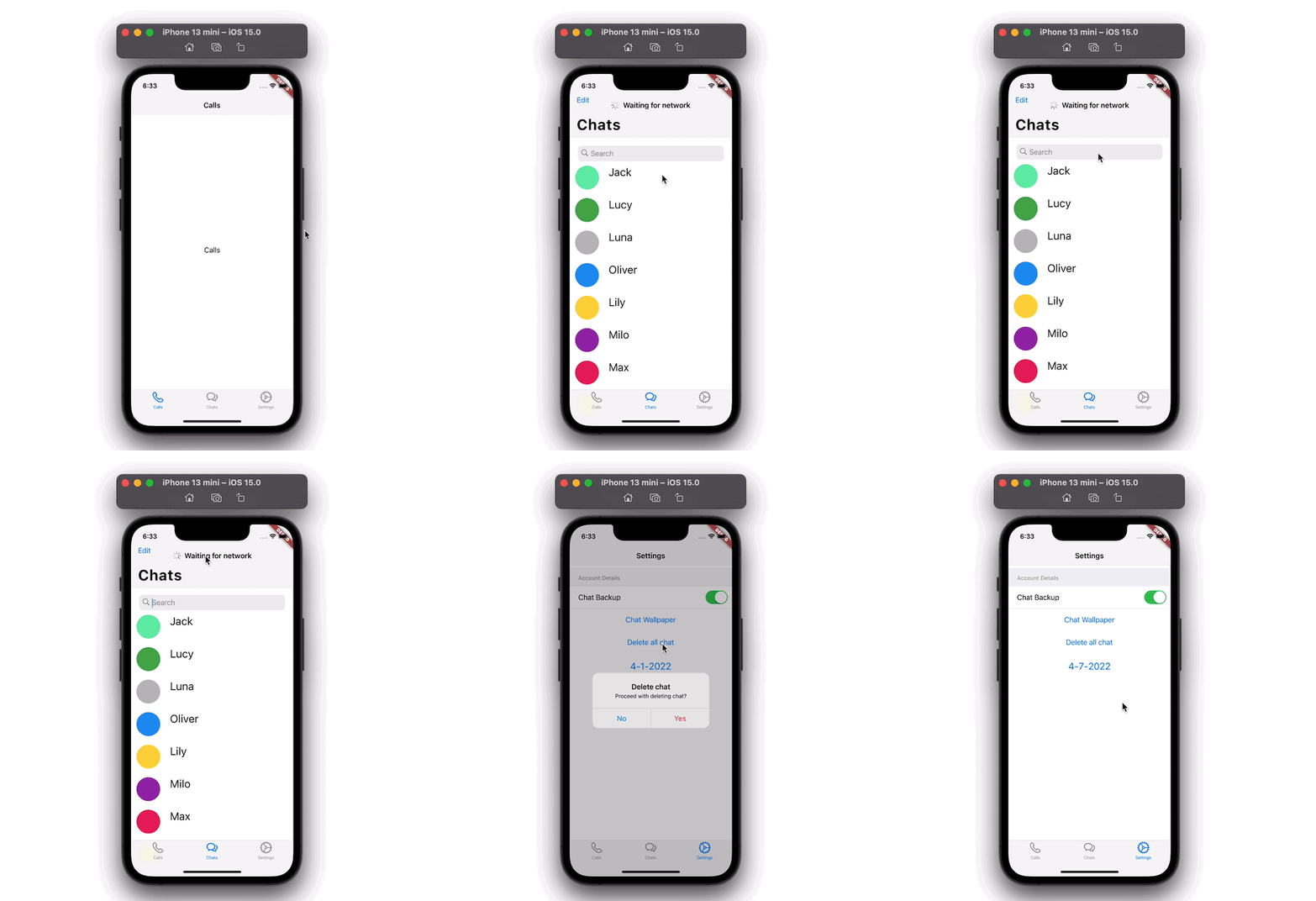
In this tutorial, we are going to build a simple app that will have three tabs at the bottom; Calls, Chats, and Settings.
On the Calls tab, we’ll add simple Navigation bar; the Chat tab will show a list of members and allow end-users to search for any member; and on the Settings tab, we’ll use various Cupertino-styled widgets to build the settings page.
Here’s what the final app will look like:
In this tutorial, we’ll cover:
NavigationBar that hides on Scrolling ListActionSheetAlertDialogCupertinoDatePickerThe Replay is a weekly newsletter for dev and engineering leaders.
Delivered once a week, it's your curated guide to the most important conversations around frontend dev, emerging AI tools, and the state of modern software.
Let’s start by creating a simple page that shows the page title at the top and a “Hello” message in the center. To build such a page, you have to delete all the content of the newly created project and replace it with the following code:
import 'package:flutter/cupertino.dart';
import 'package:flutter/material.dart';
import 'package:flutter/services.dart';

import 'simple_page.dart';

void main() {
  WidgetsFlutterBinding.ensureInitialized();
  SystemChrome.setPreferredOrientations([
    DeviceOrientation.portraitUp,
    DeviceOrientation.portraitDown,
  ]).then((value) => runApp(MyApp()));
  runApp(const MyApp());
}

class MyApp extends StatelessWidget {
  const MyApp({Key? key}) : super(key: key);

  // This widget is the root of your application.
  @override
  Widget build(BuildContext context) {
    // 1 <-- SEE HERE
    return CupertinoApp(
      // 2 <-- SEE HERE
      theme: CupertinoThemeData(brightness: Brightness.light),
      home: CupertinoSimpleHomePage(),
    );
  }
}

class CupertinoSimpleHomePage extends StatefulWidget {
  const CupertinoSimpleHomePage({Key? key}) : super(key: key);

  @override
  _CupertinoSimpleHomePageState createState() =>
      _CupertinoSimpleHomePageState();
}

class _CupertinoSimpleHomePageState extends State<CupertinoSimpleHomePage> {
  @override
  Widget build(BuildContext context) {
    // 3 <-- SEE HERE
    return const CupertinoPageScaffold(
      // 4 <-- SEE HERE
      navigationBar: CupertinoNavigationBar(
        middle: Text('Chat App'),
      ),
      child: Center(
        child: Text('Hi'),
      ),
    );
  }
}
CupertinoApp: The CupertinoApp widget allows you to add widgets that are mostly used to build an iOS styled appCupertinoThemeData: Using this widget, you can specify the styling of your appCupertinoPageScaffold: The CupertinoPageScaffold helps in building the page’s layout, such as adding the navigation barCupertinoNavigationBar: This widget creates a navigation bar that looks like the native iOS style.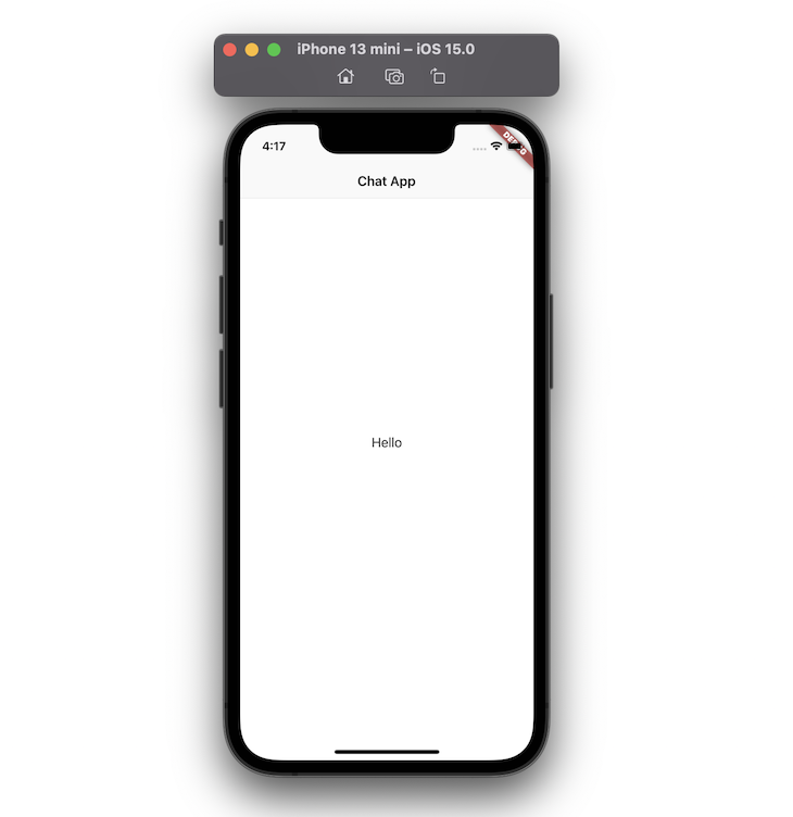
The tabs are used to support the primary navigation of the app. Let’s add three tabs at the bottom, each with a different name and icon. To create tabs, we have to replace CupertinoPageScaffold with CupertinoTabScaffold.
The advantage of using the CupertinoTabScaffold widget is that it allows you to add the tab bar at the bottom of the page, and additionally provides the ability to maintain pages in multiple stacks.
// 1 <-- SEE HERE
return CupertinoTabScaffold(
  // 2 <-- SEE HERE
  tabBar: CupertinoTabBar(
    currentIndex: 1,
    items: const <BottomNavigationBarItem>[
      // 3 <-- SEE HERE
      BottomNavigationBarItem(
          icon: Icon(CupertinoIcons.phone), label: 'Calls'),
      BottomNavigationBarItem(
          icon: Icon(CupertinoIcons.chat_bubble_2), label: 'Chats'),
      BottomNavigationBarItem(
          icon: Icon(CupertinoIcons.settings), label: 'Settings'),
    ],
  ),
  tabBuilder: (context, index) {
    late final CupertinoTabView returnValue;
    switch (index) {
      case 0:
        // 4 <-- SEE HERE
        returnValue = CupertinoTabView(builder: (context) {
          return const CupertinoPageScaffold(
              navigationBar: CupertinoNavigationBar(
                middle: Text('Calls'),
              ),
              child: Center(child: Text('Calls')));
        });
        break;
      case 1:
        returnValue = CupertinoTabView(
          builder: (context) {
            return CupertinoChatPage();
          },
        );
        break;
      case 2:
        returnValue = CupertinoTabView(
          builder: (context) {
            return CupertinoSettingsPage();
          },
        );
        break;
    }
    return returnValue;
  },
);
CupertinoTabScaffold: The CupertinoTabScaffold widget contains parameters such as tabBar and tabBuilder that allow you to create the tab bar items and the tab bar viewCupertinoTabBar: The CupertinoTabBar widget adds the tab bar at the bottom of the screen. It shows multiple items using the widget called BottomNavigationBarItem. The currentIndex property allows you to control the active tab when the app startsBottomNavigationBarItem: This widget lays out an item to display on the tab bar. It contains helpful parameters such as icon, label, and background color to build an itemCupertinoTabView: The CupertinoTabView widget is responsible for inflating the content for the selected tab. Each CupertinoTabView has its own navigation stack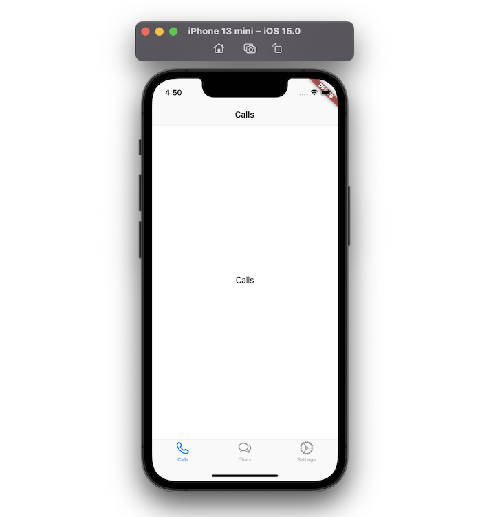
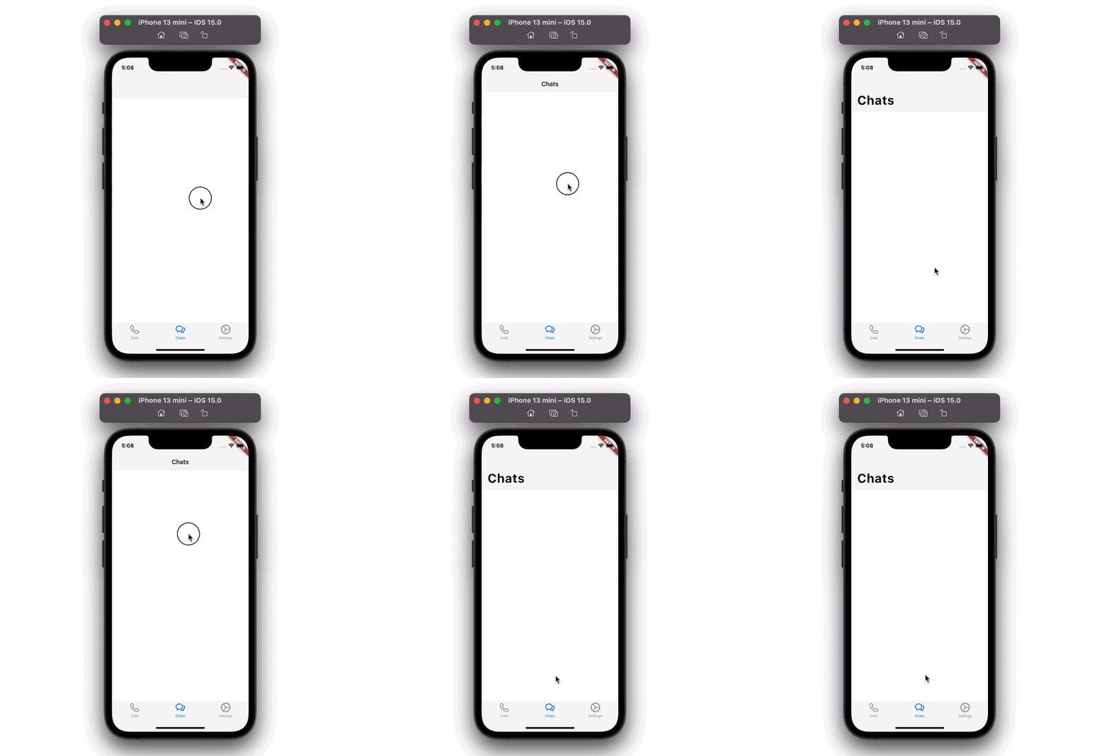
NavigationBar that hides when scrollingIn the previous steps, we have built a basic setup upon which we can begin to add more widgets.
In the current example, the basic navigation bar always stays on top when scrolling down the list. We can improve the user experience by hiding the navbar when the user starts scrolling.
Step 1: Inside the CupertinoTabView, return the CustomScrollView
Step 2: Inside the CustomScrollView, add the CupertinoSliverNavigationBar widget. This widget hides the navigation bar when scrolling
Step 3: Inside the CupertinoSliverNavigationBar, add the largeTitle parameter to display the navigation title
CupertinoTabView(
  builder: (context) {
    return CustomScrollView(
      slivers: <Widget>[
        CupertinoSliverNavigationBar(
          largeTitle: Text('Chats'),
        ),
      ],
    );
  },
);
To show the loading indicator, you can use the CupertinoActivityIndicator widget. This widget shows an iOS-style activity indicator that spins in a clockwise direction. Let’s use the CupertinoActivityIndicator with the Text widget to display the “Waiting for network” indication.
Step 1: Inside the CupertinoSliverNavigationBar, add the middle parameter and assign the Row widget
Step 2: Inside the Row widget, add the CupertinoActivityIndicator
Step 3: Add one more widget (i.e. the Text widget)
CupertinoSliverNavigationBar(
  largeTitle: Text('Chats'),
  leading: Text(
    'Edit',
    style: TextStyle(color: CupertinoColors.link),
  ),
  middle: Row(
    mainAxisSize: MainAxisSize.min,
    children: const [
      CupertinoActivityIndicator(),
      SizedBox(width: 8),
      Text('Waiting for network')
    ],
  ),
)
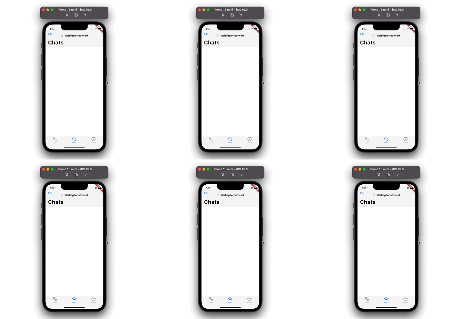
Let’s fill the Chat tab with some users and implement the search functionality.
For this, we will:
users model classCupertinoSearchTextField widgetStep 1: Create a list of users.
const List<User> users = const <User>[
  const User('Jack', Colors.greenAccent),
  const User('Lucy', Colors.green),
  const User('Luna', Colors.black26),
  const User('Oliver', Colors.blue),
  const User('Lily', Colors.amberAccent),
  const User('Milo', Colors.purple),
  const User('Max', Colors.pink),
  const User('Kitty', Colors.yellowAccent),
  const User('Simba', Colors.red),
  const User('Zoe', Colors.blueAccent),
  const User('Jasper', Colors.deepOrange),
  const User('Stella', Colors.cyan),
  const User('Lola', Colors.lightBlue),
  const User('Halsey', Colors.deepPurpleAccent),
  const User('Taylor', Colors.indigoAccent),
];
Step 2: Copy all users into filteredUsers.
List<User> _filteredUsers = users;
Step 3: Add the SliverGrid widget and use filteredUsers to display a list of users in any scrollable view.
SliverGrid(
  gridDelegate: SliverGridDelegateWithFixedCrossAxisCount(
    crossAxisCount: 1,
    childAspectRatio: 5,
  ),
  delegate: SliverChildBuilderDelegate(
    (BuildContext context, int index) {
      return UserTile(_filteredUsers[index]);
    },
    childCount: _filteredUsers.length,
  ),
)
Step 4: Below the CupertinoSliverNavigationBar, add the SliverToBoxAdapter widget with FractionallySizedBox and ClipRect.
Step 5: Add the CupertinoSearchTextField widget as a child. The CupertinoSearchTextField widget is similar to a normal Textfield widget, but additionally mimics the look and behavior of the iOS style.
SliverToBoxAdapter(
  child: FractionallySizedBox(
    widthFactor: 0.9,
    child: ClipRect(
        child: Padding(
      padding: const EdgeInsets.only(top: 16),
      child: CupertinoSearchTextField(
        controller: _controller,
        onChanged: (value) {
          _updateUserList(value);
        },
        onSubmitted: (value) {
          _updateUserList(value);
        },
        onSuffixTap: () {
          _updateUserList('');
        },
      ),
    )),
  ),
)
Step 6: Add the _updateUsersList() method to find the users that match the search term.
void _updateUserList(String value) {
  debugPrint('$value');

  if (value.length > 0) {
    _filteredUsers = _filteredUsers
        .where((element) =>
            element.name.toLowerCase().contains(value.toLowerCase()))
        .toList();
  } else {
    _controller.text = '';
    _filteredUsers = users;
  }

  setState(() {});
}
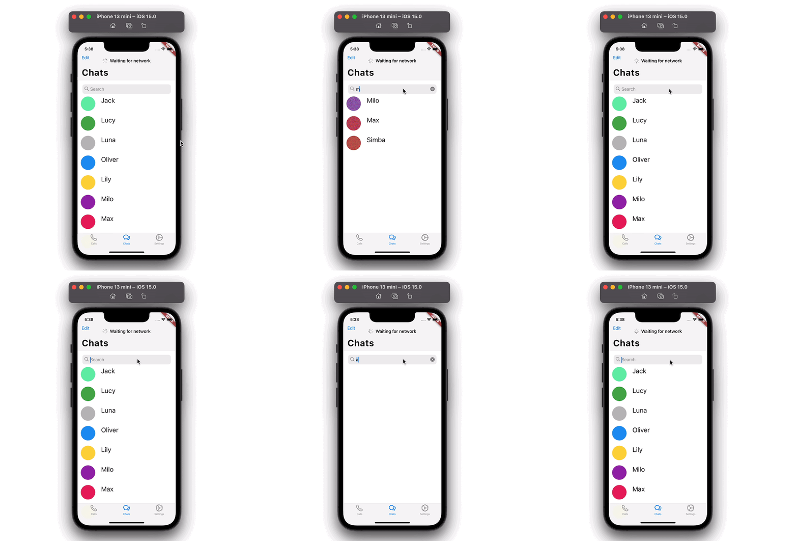
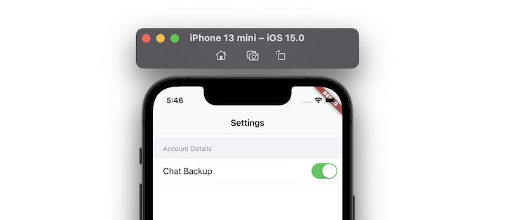
Using the CupertinoSwitch widget, you can create the iOS style switch in your app. Let’s add the CupertinoSwitch widget inside the Settings tab.
CupertinoFormSection(
  header: Text('Account Details'),
  children: [
    CupertinoFormRow(
      prefix: Text('Chat Backup'),
      child: CupertinoSwitch(
        value: chatBackup,
        onChanged: (value) {
          setState(() {
            chatBackup = !chatBackup;
          });
        },
      ),
    ),
  ],
),
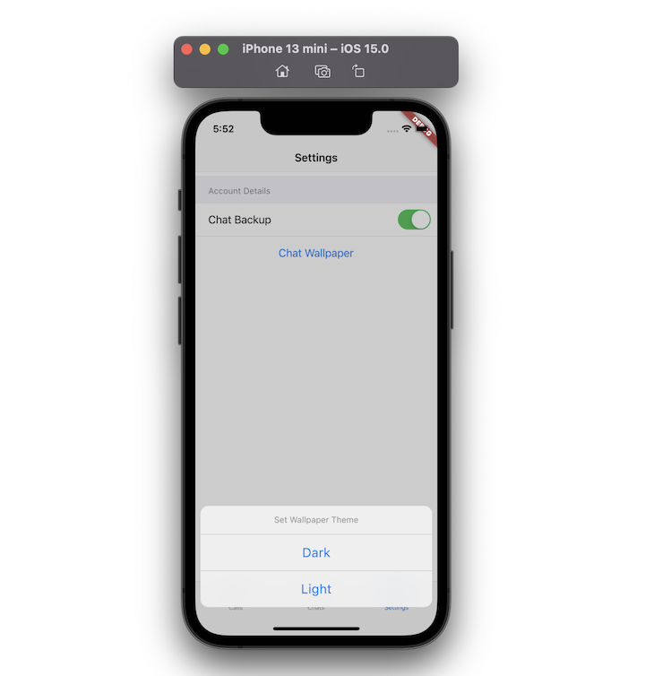
ActionSheetTo show an ActionSheet, you can use the CupertinoActionSheet widget. This widget is used to allow users to make a choice between multiple items.
Step 1: Add the CupertinoButton widget.
Step 2: Inside the onPressed method, call the showCupertinoModalPopup.
Step 3: Inside the builder of showCupertinoModalPopup, return CupertinoActionSheet.
Step 4: Inside CupertinoActionSheet, return some actions using the CupertinoActionSheetAction widget.
Center(
  child: CupertinoButton(
    onPressed: () {
      showCupertinoModalPopup<void>(
        context: context,
        builder: (BuildContext context) => CupertinoActionSheet(
          title: const Text('Set Wallpaper Theme'),
          actions: <CupertinoActionSheetAction>[
            CupertinoActionSheetAction(
              child: const Text('Dark'),
              onPressed: () {
                Navigator.pop(context);
              },
            ),
            CupertinoActionSheetAction(
              child: const Text('Light'),
              onPressed: () {
                Navigator.pop(context);
              },
            )
          ],
        ),
      );
    },
    child: const Text('Chat Wallpaper'),
  ),
)
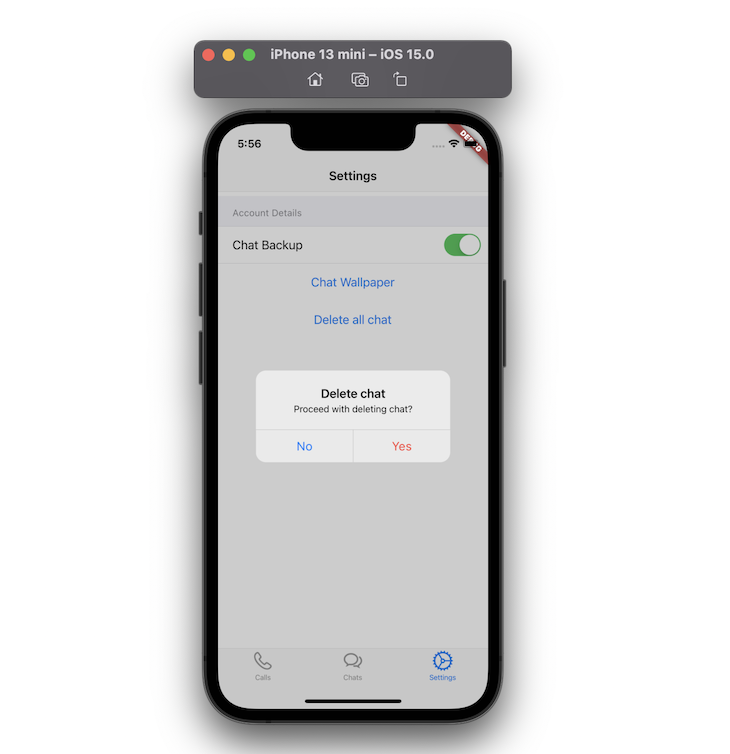
AlertDialogTo show an AlertDialog, you can use the CupertinoAlertDialog widget. The CupertinoAlertDialog widget is used to confirm the user’s action — when deleting an account, for example.
Step 1: Add the CupertinoButton widget.
Step 2: Inside the onPressed method, call showCupertinoDialog.
Step 3: Inside the builder of showCupertinoDialog return CupertinoAlertDialog
Step 4: Inside CupertinoAlertDialog, return some actions using the CupertinoDialogAction widget
Center(
  child: CupertinoButton(
    onPressed: () {
      showCupertinoDialog<void>(
        context: context,
        builder: (BuildContext context) => CupertinoAlertDialog(
          title: const Text('Delete chat'),
          content: const Text('Proceed with deleting chat?'),
          actions: <CupertinoDialogAction>[
            CupertinoDialogAction(
              child: const Text('No'),
              onPressed: () {
                Navigator.pop(context);
              },
            ),
            CupertinoDialogAction(
              child: const Text('Yes'),
              isDestructiveAction: true,
              onPressed: () {
                // Do something destructive.
              },
            )
          ],
        ),
      );
    },
    child: const Text('Delete all chat'),
  ),
)
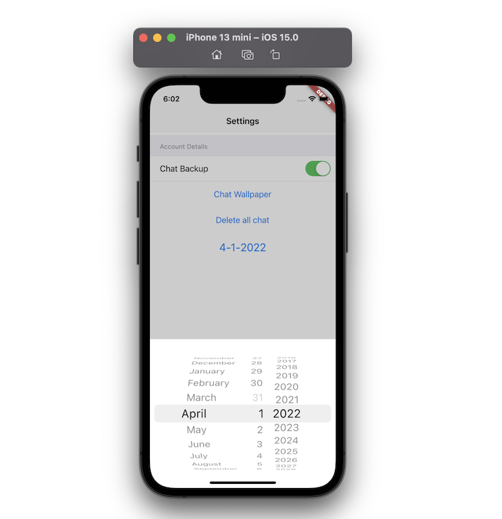
CupertinoDatePickerThe CupertinoDatePicker widget allows users to pick a date in the standard iOS style.
Step 1: Add the CupertinoButton widget.
Step 2: Inside the onPressed method, call _showDialog.
Step 3: Return the CupertinoDatePicker widget with some helpful parameters, such as initialDateTime, mode, and use24hFormat.
Step 4: Add the onDateTimeChanged property and rebuild the widget with a new date.
Center(
  child: CupertinoButton(
    // Display a CupertinoDatePicker in date picker mode.
    onPressed: () => _showDialog(
      CupertinoDatePicker(
        backgroundColor: CupertinoColors.white,
        initialDateTime: date,
        mode: CupertinoDatePickerMode.date,
        use24hFormat: true,
        // This is called when the user changes the date.
        onDateTimeChanged: (DateTime newDate) {
          setState(() => date = newDate);
        },
      ),
    ),
    // In this example, the date value is formatted manually. You can use intl package
    // to format the value based on user's locale settings.
    child: Text(
      '${date.month}-${date.day}-${date.year}',
      style: const TextStyle(
        fontSize: 22.0,
      ),
    ),
  ),
)
You can find the full source code here.
In this tutorial, we walked through how to build an iOS app that looks and feels native with practical examples.
We used the Cupertino widgets library to build all the visual UI elements such as Switch, ActionSheet, AlertDialog, NavigationBar, and DateTimePicker.
We started with creating a simple page and then saw how you can add search functionality to the app. Later we explored various Cupertino widgets to build the Settings page.
I hope you found this tutorial helpful — happy coding!
Install LogRocket via npm or script tag. LogRocket.init() must be called client-side, not
server-side
$ npm i --save logrocket

// Code:

import LogRocket from 'logrocket';
LogRocket.init('app/id');
// Add to your HTML:

<script src="https://cdn.lr-ingest.com/LogRocket.min.js"></script>
<script>window.LogRocket && window.LogRocket.init('app/id');</script>

useEffect breaks AI streaming responses in ReactSee why useEffect breaks AI streaming in React, and how moving stream state outside React fixes flicker and stale updates.

A real-world debugging session using Claude to solve a tricky Next.js UI bug, exploring how AI helps, where it struggles, and what actually fixed the issue.

CSS wasn’t built for dynamic UIs. Pretext flips the model by measuring text before rendering, enabling accurate layouts, faster performance, and better control in React apps.

Why do real-time frontends break at scale? Learn how event-driven patterns reduce drift, race conditions, and inconsistent UI state.
Hey there, want to help make our blog better?
Join LogRocket’s Content Advisory Board. You’ll help inform the type of content we create and get access to exclusive meetups, social accreditation, and swag.
Sign up now