Web UI development has evolved tremendously over time. Tools like SASS, Bootstrap, and Tailwind help make web design more efficient and accessible, offering everything from advanced preprocessing to responsive layouts and utility-first styling.

Most recently, the developer community has embraced a new trend: headless UI components. Headless UI components represent a major advancement in web design that emphasizes greater flexibility and efficiency.
In this article, we’ll look at how web UI design patterns have evolved, from the early days of BEM to CSS-in-JS and utility class libraries to the growing popularity of headless UI components. We’ll also consider how these advancements are revolutionizing web design.
The Replay is a weekly newsletter for dev and engineering leaders.
Delivered once a week, it's your curated guide to the most important conversations around frontend dev, emerging AI tools, and the state of modern software.
When Tim Berners-Lee introduced the first version of HTML, he set the stage for the World Wide Web. However, it was the advent of CSS in 1996 that truly revolutionized the web, transforming basic pages into vibrant, engaging experiences.
Since then, the developer community has constantly developed new approaches and tools to make the styling process more streamlined and intuitive. The BEM methodology and preprocessors like SASS stand out as early solutions worth mentioning.
As web UI development progressed, other solutions emerged. In particular, CSS-in-JS libraries and CSS component frameworks have significantly influenced how we approach styling.
CSS-in-JS is a UI development paradigm that mixes CSS and JavaScript functionality within the same file. It was popularized alongside JavaScript frameworks such as React and Vue. Some widely used CSS-in-JS libraries include styled-components and Emotion.
This method primarily uses JavaScript template literals or objects for scoped styling, which isolates styles from each component and improves modularity and maintainability. It also allows for dynamic styling by letting you modify CSS attributes based on component states or props.
Here’s an example of using styled-components to style a button element:
//Styled button with styled-components

import styled from 'styled-components';

const StyledButton = styled.button`
     background-color: ${props => props.primary ? 'blue' : 'white'};
     color: ${props => props.primary ? 'white' : 'blue'};
     padding: 10px 20 px;
     border: none;
     border-radius: 5px;
     cursor: pointer;
     &:hover {
          background-color: ${props => props.primary ? 'darkblue' : 'lightgray'};
     }
`;

function App() {
     Return <StyledButton primary>Click Me</StyledButton>;
}
One significant challenge with CSS-in-JS is server-side rendering (SSR). Styles generated client-side can conflict with server-rendered markup, leading to flickering or delays in styling during initial page loads.
Traditional frameworks like Emotion and styled-components also face compatibility issues with React Server Components (RSCs), which rely on SSR.
However, emerging libraries such as Panda CSS are providing novel solutions to the SSR difficulties often associated with classic CSS-in-JS frameworks. Panda CSS is a particularly unique solution in that it generates static CSS during development rather than runtime.
This build-time CSS generation ensures that styles are ready for deployment, reducing client-side processing and improving initial load speeds. Panda CSS is also compatible with the SSR technique of RSCs.
CSS component libraries are another major influence on modern web UI development. They let you easily add pre-designed components like buttons, forms, dropdowns, and image carousels to HTML elements by applying their class names.
These libraries also follow accessibility and design standards, ensuring consistency across browsers and reducing your workload. Additionally, many of them integrate smoothly with popular JavaScript frameworks, like React-Bootstrap for React and Vue Bootstrap for Vue.js, simplifying their use in JavaScript projects.
Despite these various benefits, one significant disadvantage of CSS component libraries is their design constraints. They require you to conform to their preset design schemes, making it difficult to create a unique look and feel for your apps.
Tailwind CSS overcomes some of these restrictions by taking a novel approach. Unlike standard CSS frameworks that provide utility classes for components, Tailwind CSS allows you to apply styling directly through class names:
<-----Button with TailwindCSS----->
<button class="bg-blue-500 hover:bg-blue-700 text-white font-bold py-2 px-4 rounded">
     Click me
</button>
This strategy gives you additional control and lets you alter the design of your web applications to suit your tastes. However, creating complex components from scratch with Tailwind CSS might also be tough.
While Tailwind allows significant freedom in style, ensuring accessibility and consistency across browsers can be challenging. For instance, implementing a dropdown or a carousel component with Tailwind would require more work to achieve keyboard navigation and cross-browser compatibility.
These challenges highlight the need for a solution that combines the flexibility of direct styling with the ease of use of predesigned components. In response to this need, the headless UI pattern emerged to bridge this gap between customizability and functionality.
Headless UI components aim to decouple component logic and functionality from their visual representation. These components are “headless” in that they don’t come with a specified style. Instead, you can apply your own design while leveraging their built-in interaction and accessibility features.
A typical implementation with a headless UI library might look like this:
import { Popover } from '@headlessui/react'

function MyPopover() {
  return (
    <Popover className="relative">
      <Popover.Button>Hover Popover</Popover.Button>

      <Popover.Panel className="absolute z-10">
        <div className="grid grid-cols-2">
          <a href="/">Home</a>
          <a href="/about">About</a>
          <a href="/blog">Blog</a>
        </div>
      </Popover.Panel>
    </Popover>
  )
}
The code above shows how to simply create a headless popover UI component with minimum markup. As you can see, you don’t have to do any extra work regarding accessibility because it’s built-in.
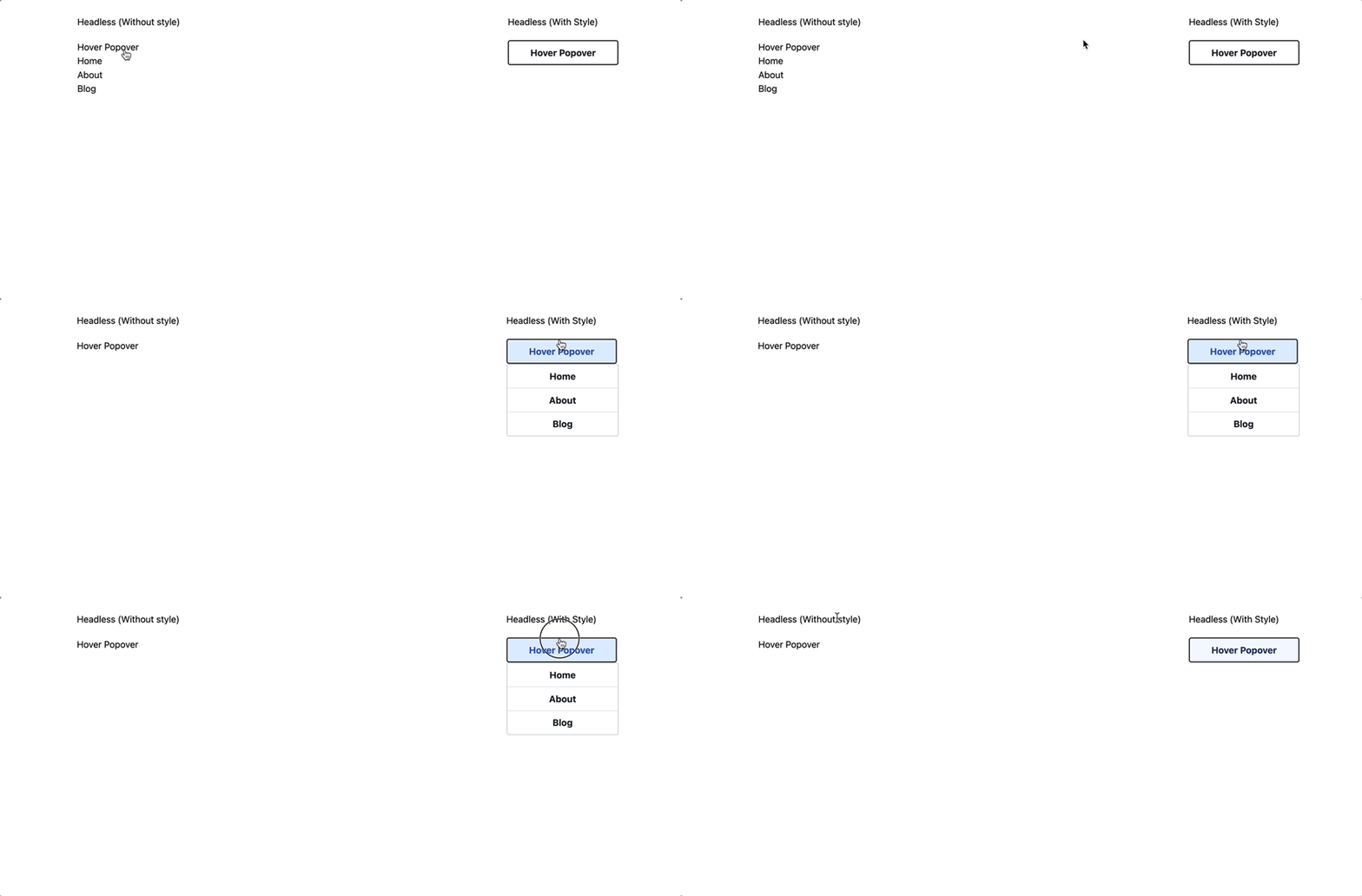
The image below demonstrates headless UI components further:

The left side displays an unstyled headless popover while the right side displays the same component styled with Tailwind CSS classes. This showcases the shift from basic to visually appealing components with simple class modifications.
Headless UI libraries offer a range of functional UI components like dropdowns, modals, and sliders that easily integrate into applications. These components also include extensive accessibility and interactivity features, such as keyboard navigation, focus management, and screen reader support.
Throughout the years, several libraries have been at the forefront of promoting the headless UI approach. Some of the top libraries currently leading this trend include:
There are also many headless UI libraries designed for specific platforms, such as Tamagui and NativeWind for React and React Native applications.
Web UI development is rapidly evolving, with headless UI components gradually becoming the new norm. Even well-known CSS component libraries are recognizing the practical benefits of this approach.
MUI, for example, has begun to add headless UI components to its ecosystem. Other libraries such as Bootstrap are likely to follow suit in the near future.
All of this makes sense given the numerous advantages that the headless UI approach provides. Headless UI libraries allow for selective component imports, which results in reduced bundle sizes and better performance.
In addition, when working with headless UI components, developers have complete creative flexibility to build unique, brand-consistent designs. Furthermore, critical aspects like accessibility and interactivity are pre-integrated, which speeds up development efforts.
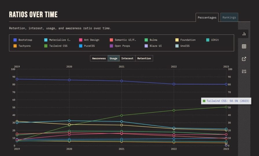
Interestingly, according to the 2023 State of CSS survey, interest in Tailwind CSS is rising to the top of the list among other CSS libraries. This indicates a growing demand for utility-first CSS libraries that offer more control over styling:

Tailwind’s rise is particularly relevant in the context of headless UI. Developers who prefer Tailwind’s utility-first approach can now combine it with headless UI components to create unique, custom-designed applications.
In other words, you can leverage Tailwind’s styling flexibility while benefiting from the pre-built functionality and accessibility of headless UI components!
However, it’s important to note that CSS-in-JS libraries are not fading into obsolescence. On the contrary, there is ongoing development in this area.
For instance, the interest in libraries like Panda CSS is growing, indicating a continued preference for CSS-in-JS solutions in certain segments of the web development community:

The current trend suggests a balancing act in web UI development.
On the one hand, headless UI components are gaining popularity due to their ability to provide greater control over web application styling and functionality. CSS-in-JS libraries, on the other hand, continue to evolve and find a place, particularly in applications that prefer a deep integration of styles and component logic.
In this article, we explored the evolution of web UI development, focusing on the transition from CSS-in-JS to the emerging trend of headless UI libraries. This shift in web development reflects a growing emphasis on flexibility, performance, and customizability.
It’s exciting to see that the developer community is dedicated to championing this cause with innovative solutions. It will be interesting to see how the CSS landscape continues to evolve over time.
Install LogRocket via npm or script tag. LogRocket.init() must be called client-side, not
server-side
$ npm i --save logrocket

// Code:

import LogRocket from 'logrocket';
LogRocket.init('app/id');
// Add to your HTML:

<script src="https://cdn.lr-ingest.com/LogRocket.min.js"></script>
<script>window.LogRocket && window.LogRocket.init('app/id');</script>

useEffect breaks AI streaming responses in ReactSee why useEffect breaks AI streaming in React, and how moving stream state outside React fixes flicker and stale updates.

A real-world debugging session using Claude to solve a tricky Next.js UI bug, exploring how AI helps, where it struggles, and what actually fixed the issue.

CSS wasn’t built for dynamic UIs. Pretext flips the model by measuring text before rendering, enabling accurate layouts, faster performance, and better control in React apps.

Why do real-time frontends break at scale? Learn how event-driven patterns reduce drift, race conditions, and inconsistent UI state.
Hey there, want to help make our blog better?
Join LogRocket’s Content Advisory Board. You’ll help inform the type of content we create and get access to exclusive meetups, social accreditation, and swag.
Sign up now