Motion One is a new library that allows you to quickly and effortlessly add small-yet-amazingly-smooth, powerful animations to your website. You can add them to any element and control them with ease.

This post will give you a quick overview of Motion One’s features. The reason it’s so performant despite its small size is that it’s built upon the Web Animations API, which is a native language that animates DOM elements. Motion One simply provides an easy way of implementing this through its self-explanatory code.
Motion One animations are also fully responsive, and it supports SVGs and CSS transforms, transitions, and animations, in addition to some DSLs for making simple animations even simpler. Finally, it’s also got easing (both pre-defined and custom).
In this article, we’ll cover all of the basics to get started with Motion One. Here’s what we’ll go through:
animate() APITo follow along, I’ve made a GitHub repository for this tutorial. If you ever get lost, do give it a peek.
The Replay is a weekly newsletter for dev and engineering leaders.
Delivered once a week, it's your curated guide to the most important conversations around frontend dev, emerging AI tools, and the state of modern software.
Here is some detailed information on the bundle size of Motion One from BundlePhobia.
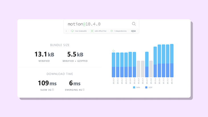
The core function in Motion One is the animate() API, which is only 3.8kB in size. The developer Matt Perry intends to reduce it to 1.8kB with further improvements and version upgrades!
Comparing it to other animation libraries in the market, Motion One is merely half the size of Anime.js and one-seventh the size of GSAP.
Another cool feature of Motion One is that it can function without the main JavaScript thread. That means the animation still executes during heavy application renders.
animate() APIBefore starting, go ahead and install the library using:
npm install motion
With that done, let’s take a deeper look into one of the core functions of Motion One. The animate() API provides an easy way of animating an element on the DOM from its current orientation or position.
One of the core functions of Motion One is the animate() function, which takes in three parameters:
Let’s look at all of these in more detail.
The first argument is the id or the class of the element on the DOM that will be animated.
import { animate } from "motion";

function Trigger ( ) {
  animate(".box", { x: 100} )
}
The second argument specifies how the element should behave during the animation, such as moving 100px across the DOM or rotating 45 degrees.
import { animate } from "motion";

function Trigger ( ) {
  animate(".box", { x: 100, rotate: 45 } );
}
The final argument is Options, which can be used to control various aspects of the animation such as delay, duration, number of times to repeat, and so on.
import { animate } from "motion";

function Trigger ( ) {
  animate('.click', { transform: 'rotate(45deg)' }, { duration: 0.5 })
}
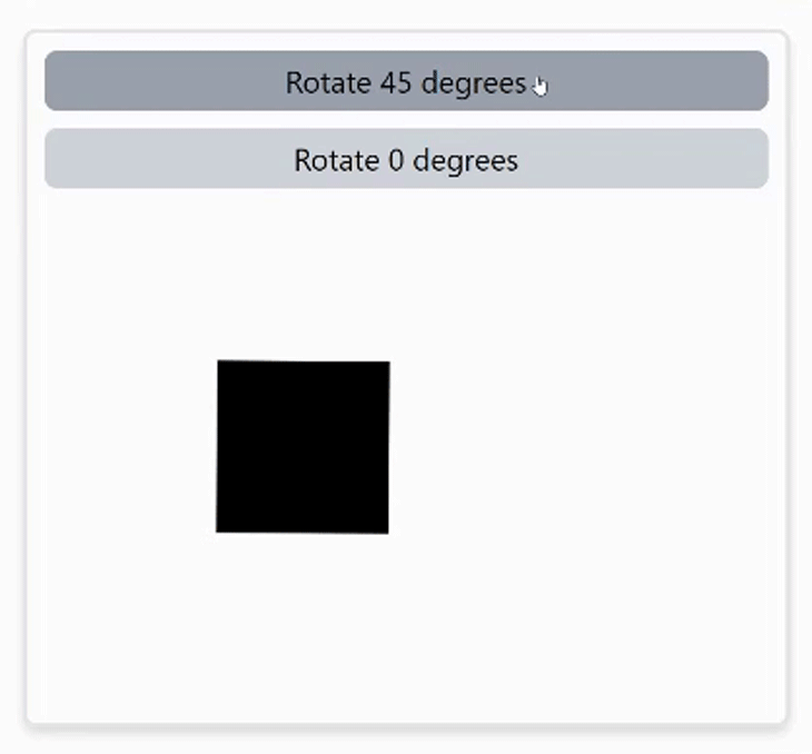
The animate() function can be triggered using a onClick event bound to a button.
<button
  className="rounded-md bg-gray-300 hover:bg-gray-400 p-1 text-sm"
  onClick={() =>
    animate('.click', { transform: 'rotate(45deg)' }, { duration: 0.5 })
  }
>
  Rotate 45 degrees
</button>

// element to be animated
<div className="click"></div>
Why not incorporate everything we’ve learned thus far and create an interactive animation?
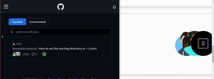
In this tutorial, we’ll take this animation as inspiration from GitHub’s contributors list. The main goal of recreating this animation is to move the avatar images to the left over the horizontal axis as the mouse hovers over it.
I’ll use Tailwind CSS in this tutorial to speed up the development process, but the concept remains the same with vanilla CSS as well.
First of all, we need three <image> elements for this animation, each surrounded by a <div> tag.
<div
  onMouseOver={onHover}
  onMouseOut={onHoverOff}
>
  <div>
    <Image
      className="rounded-full"
      alt="one"
      src="/images/avataaars.png"
      width="60"
      height="60"
    />
  </div>
    <div>
      <Image
        className=" rounded-full"
        alt="two"
        src="/images/new.jpg"
        width="60"
        height="60"
       />
  </div>
    <div>
     <Image
      className="rounded-full"
      alt="three"
      src="/images/logo.png"
      width="60"
      height="60"
     />
  </div>
</div>
We’ll make the parent <div> relative and the child elements absolute, then increase the z-index of each child to align the photos one on top of the other.
<div className="relative">
  <div className="absolute z-0"><Image {...attributes} /></div>
  <div className="absolute z-10"><Image {...attributes} /></div>
  <div className="absolute z-20"><Image {...attributes} /></div>
</div>
Next, position each child element such that all of the images are aligned over a row.
<div className="relative">
  <div className="absolute z-0 right-10"><Image {...attributes} /></div>
  <div className="absolute z-10 right-5"><Image {...attributes} /></div>
  <div className="absolute z-20 right-0"><Image {...attributes} /></div>
</div>
Add two events to the parent <div> tag, onMouseOver and onMouseOut, respectively. All that’s required now is to move the images to a specific spot so that they’re equally spaced apart.
Create a handler function for each event: when the mouse is over the element, and when the mouse leaves the area.
function onHover () {
  // code goes here
}

function onHoverExit () {
  // code goes here
}
We want the images to disperse across three different positions in the X-axis when the mouse pointer hovers over them.
function onHover() {
  animate('.one', { x: -70 }, { duration: 0.2 });
  animate('.two', { x: -40 }, { duration: 0.2 });
  animate('.three', { x: -10 }, { duration: 0.2 });
}
The minus sign here moves the image to the left. Similarly, in the following occurrence, we want it to return to its former location.
function onHoverOff() {
  animate('.one', { x: 0 }, { duration: 0.2 });
  animate('.two', { x: 0 }, { duration: 0.2 });
  animate('.three', { x: 0 }, { duration: 0.2 });
}
That’s just how it is! Isn’t it amazing how easily this one was pulled off? Let’s cover some more fundamentals.
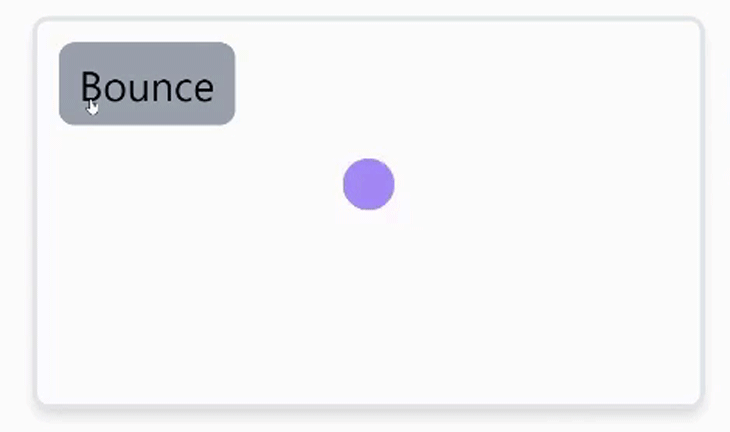
stagger functionWhen the animated element needs to be moved over the DOM multiple times covering different coordinates, such as when a loading indicator bounces, keyframes can be used. The values can be provided in the form of an array, as shown below.
function bounceHandler() {
   animate(
     '.bounce',
     { y: [-30, 120, 50, 120] },
    { duration: 1, direction: 'alternate' }
   );
}
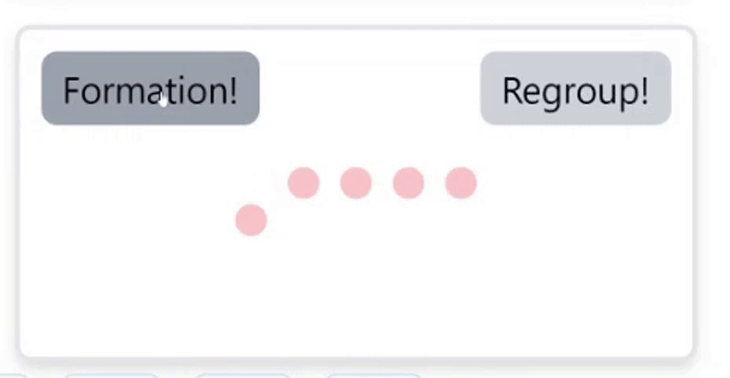
The stagger is another cool function. When animating multiple elements, this can be used to apply a delay to each element with the same class or id.
<div className="flex justify-center">
  <div className="pawn"></div>
  <div className="pawn"></div>
  <div className="pawn"></div>
  <div className="pawn"></div>
  <div className="pawn"></div>
</div>
If you bind the individual element with the animate() function, like so:
// onClick trigger
function moveUsingStagger() {
  animate('.pawn', { y: 50 }, { delay: stagger(0.1) });
}
This is what you might expect to see:
To see these used in a more challenging example, let’s make a music waveform, something like the one below:
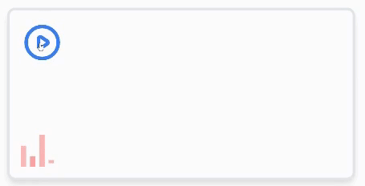
Groovy, isn’t? First, we need a button, and four bars for the waveform.
<div>
  // button trigger to animate waveform
  <button onClick={play} >
    <PlayIcon />
  </button

  // waveform
  <div className="flex overflow-hidden">
    <span className="w-1 h-4" />
    <span className="w-1 h-2" />
    <span className="w-1 h-6" />
    <span className="w-1 h-2" />
  </div>
</div>
As a reminder, you can always view the full code in the GitHub repo I created for this post.
Then we’ll move on to the animation section. Add an onClick event to the button and assign it to a function. Then, point to each <span /> and call the animate() function. Remember to give each of the child elements a distinct name. Unlike the other animations, we’ll be animating each <span /> differently here.
function playWaveform ( ) {
  // some code here
  const animation1 = animate(
      '#bar1',
      {
        transform: [
          'scaleY(1.0) translateY(0rem)',
          'scaleY(1.5) translateY(-0.082rem)',
          'scaleY(1.0) translateY(0rem)',
        ],
      },
      {
        duration: 1.0,
        repeat: Infinity,
        easing: 'ease-in-out',
      }
    );
    const animation2 = animate(
      '#bar2',
      {
        transform: [
          'scaleY(1.0) translateY(0rem)',
          'scaleY(3) translateY(-0.083rem)',
          'scaleY(1.0) translateY(0rem)',
        ],
      },
      {
        delay: 0.2,
        duration: 1.5,
        repeat: Infinity,
        easing: 'ease-in-out',
      }
    );
    const animation3 = animate(
      '#bar3',
      {
        transform: [
          'scaleY(1.0)  translateY(0rem)',
          'scaleY(0.8) translateY(0.37rem)',
          'scaleY(1.0)  translateY(0rem)',
        ],
      },
      {
        delay: 0.3,
        duration: 1.5,
        repeat: Infinity,
        easing: 'ease-in-out',
      }
    );
    const animation4 = animate(
      '#bar4',
      {
        transform: [
          'scaleY(0.3)  translateY(0rem)',
          'scaleY(2.0) translateY(-0.05rem)',
          'scaleY(0.3)  translateY(0rem)',
        ],
      },
      {
        delay: 0.3,
        duration: 1.5,
        repeat: Infinity,
        easing: 'ease-in-out',
      }
    );

  // some more code here ( wait for it )
}
As you may have noticed, I have assigned a reference constant to each animate() function. This is for a specific reason, which we’ll get to in a moment.
For the time being, let’s just get a sense of what the animate() API does. First, we pass in two keyframes to the transform property:
ScaleY: resizes the element verticallyTranslateY: moves the position of the selected element along the y-axisAs a result, as you may have noticed, I added an overflow-hidden property to the parent element to conceal the overflow caused by both properties. Following that, the repeat property has been set to infinity, which causes the same animation to be repeated indefinitely.
Adding the delay property to the last three child elements distinguishes them from one another, and results in the feeling that each bar animates independently of the others.
The easing property controls how quickly the animation plays out. In this example, we’ve set it to ease-in-out, which means the animation starts slowly, picks up speed in the middle, then slows down again towards the conclusion.
The animate() function returns something called controls. We can use controls to control the playback of the animation. Controls are returned every time the animate() function is called, and this can be accessed by instantiating the animate() function to a variable.
Looking at the last example again, we may want to animate the waveform only when the music plays. This is where controls can be pretty useful.
To get hold of the controls, reference the animate function.
const animation1 = animate("#bar1", ...options )
Following that, to control the animation, use the pause() or play() methods on a given boolean condition.
// if music is playing
animation1.play( );

// if the music stops playing
animation1.pause( );
Let’s return to our previous animation now! To control the playback, we could use a state that toggles between boolean conditions.
import { useState } from "react";

// component
function MusicWaveform () {
  const [ isPlaying, setIsPlaying ] = useState(false);

  // toggles between state
  function switchModeHandler() {
    setIsPlaying((prevState) => !prevState);
  }

  // animation code goes here
  function playWaveform() {
    switchModeHandler();
    // animate functions for each bar ...
  }
  // JSX code
}

export default MusicWaveform;
>
Now when the button is clicked, the playWaveform function is triggered and the state gets toggled. All that’s left is to play the waveform when the button is triggered.
function playWaveform() {
  switchModeHandler();
  // useState
  // animate functions for each bar
  if (isPlaying) {
    animation1.pause();
    animation2.pause();
    animation3.pause();
    animation4.pause();
  } else {
    animation1.play();
    animation2.play();
    animation3.play();
    animation4.play();
  }
}
That’s all there is to it! You should be able to see the bars dancing!
Motion One is a fully-featured animation library for the web. It’s built on the Web Animations API, which is a web standard that allows Web Animations to even run without the main JavaScript thread (and therefore remains smooth).
Motion One is really lightweight and has everything you need to build great animations. You can find out more about Motion One by visiting https://motion.dev.
There’s no doubt that frontends are getting more complex. As you add new JavaScript libraries and other dependencies to your app, you’ll need more visibility to ensure your users don’t run into unknown issues.
LogRocket is a frontend application monitoring solution that lets you replay JavaScript errors as if they happened in your own browser so you can react to bugs more effectively.
LogRocket works perfectly with any app, regardless of framework, and has plugins to log additional context from Redux, Vuex, and @ngrx/store. Instead of guessing why problems happen, you can aggregate and report on what state your application was in when an issue occurred. LogRocket also monitors your app’s performance, reporting metrics like client CPU load, client memory usage, and more.
Build confidently — start monitoring for free.
When should you move API logic out of Next.js? Learn when Route Handlers stop scaling and how ElysiaJS helps.

Explore how Dokploy streamlines app deployment with Docker, automated builds, and simpler infrastructure compared to traditional CI/CD workflows.
A side-by-side look at Astro and Next.js for content-heavy sites, breaking down performance, JavaScript payload, and when each framework actually makes sense.
AI-generated tests can speed up React testing, but they also create hidden risks. Here’s what broke in a real app.re
Hey there, want to help make our blog better?
Join LogRocket’s Content Advisory Board. You’ll help inform the type of content we create and get access to exclusive meetups, social accreditation, and swag.
Sign up now

 Learn more →
