Accessibility is one of the most overlooked topics in web development. But as developers, if we want our websites to be used by all, then we must consider making them accessible to all — including those who don’t understand your language.

Internationalization (i18n) can help us handle text in multiple languages, including character encodings, scripts, and the direction of display. The ability to change the direction of display is crucial when translating a left-to-right (LTR) written language like English to a right-to-left (RTL) written language such as Arabic or Hebrew.
In this article, we’re going to take a look at how to change the direction of HTML text elements using the dir attribute and take a deep dive into using the CSS :dir pseudo-class to style text elements based on their direction.
:dir pseudo-class for i18n?While LTR writing systems are more common, there are many modern RTL writing systems for languages like Arabic, Hebrew, Persian, Sindhi, Urdu, Azerbaijani, Uighur, and many others. Supporting RTL text directions is crucial for modern applications with a global user base.
You can use the HTML dir attribute to specify the directionality of text appropriately for each language — for example, if you wanted to localize a React app for an Arabic audience. However, you will need the CSS :dir pseudo-class to optimize and adapt UI styles based on the computed direction.
The :dir pseudo-class simplifies the process of styling for different text directions. Whether your goal is to ensure a consistent UX or to create custom, direction-aware styles, it will be easier to make your application more inclusive and accessible for users who speak different languages.
dir attributeThe HTML dir attribute indicates the directionality of a text or a text-related element. There are three possible values for it — rtl, ltr, and auto. If you don’t specify a value, it will default to ltr.
Here’s an example of how to use the dir attribute to style HTML text elements:
<body>
  <h1>Hello World</h1> <!-- ltr is used by default -->
  <h1 dir='auto'>مرحبا بالعالم</h1>
  <h1 dir='rtl'>שלום עולם</h1>
</body>
Here’s the result:

Setting the dir attribute to auto allows the browser to intelligently determine the directionality of a text based on its content. The dir attribute is supported in all modern browsers.
:dir pseudo-classRecall that a pseudo-class is a keyword that is attached to a CSS attribute selector to help declare a style based on that selector’s state. For example, you can use the :hover pseudo-class to specify the style of an element when the user hovers over that element.
A similar concept applies to the :dir pseudo-class. More specifically, you can use :dir to specify the style of a selected element based on the element’s direction, whether it’s left-to-right or right-to-left.
The :dir pseudo-class is followed by a value — ltr or rtl — that specifies the direction. Here’s an example using :dir to style the background color of the text based on its direction:
h1:dir(ltr) {
  background: red;
}

h1:dir(rtl) {
  background: blue;
}
Here’s the result:
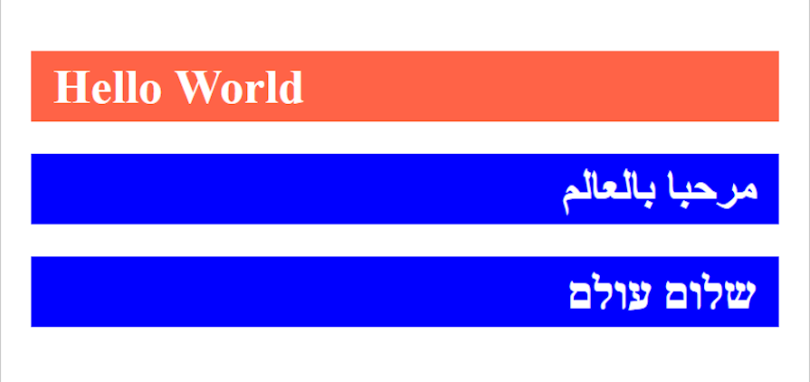
Keep in mind that the :dir pseudo-class isn’t fully supported by all browsers yet. Firefox fully supports it, and it will be supported on Chrome 120, so I recommend testing it on Firefox in the meantime.
:dir pseudo-classSo far we’ve looked at what the :dir pseudo-class is and how we can use it. Now, let’s take a look at an example of how useful it can be in your efforts to internationalize your web pages.
The example we saw earlier applies different backgrounds to the h1 element based on its directionality. Another way to use the :dir pseudo-class is to generally apply a style to all elements whose direction is rtl or ltr:
:dir(ltr) {
  padding-left: 40px;
}

:dir(rtl) {
  padding-right: 40px;
}
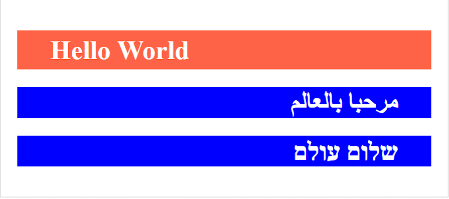
Notice how each declaration in the example above has different directions for the padding.
The goal is to push the element 40px away from the wall of the container depending on the directionality of the element. If the text is read from LTR, this 40px padding is placed on the left, and vice versa:
Assuming this was a header or a well-styled nav, without optimizing your well-styled nav to fit into the different directionality, it would end up being an awful design for one direction and remain well-styled for the other. For example:

As you can see above, while the LTR nav is well-spaced and looks nice, the spacing for the RTL nav is much messier. The Shop now button is far too close to the Shop 6 menu item, while the shop name is much too far away from the rest of the nav.
There are several other cases where text directionality can affect UI styles like this, including table styles, grid layout, spacing in text, icon placement, indentation, and many others. Let’s look at another example — this time, we’ll look at icon placement.
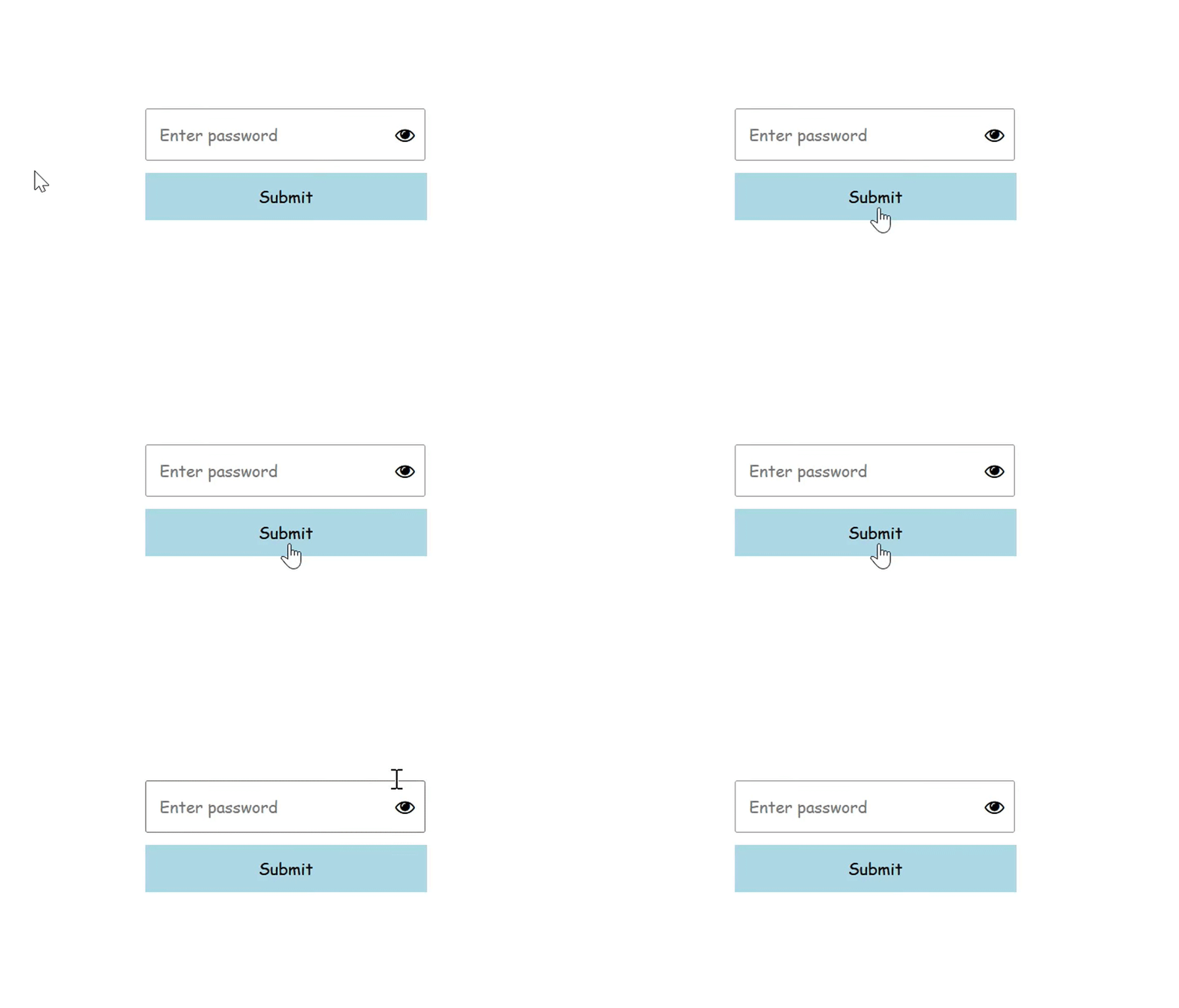
A common use case of icons on inputs is when users are given the option to view the password they’re entering by clicking an icon that looks like an eye. Usually, the eye icon is fixed at the right of the input, but when the text directionality changes, the style will break:
<html>
<head>
  <link rel="stylesheet" href="https://cdnjs.cloudflare.com/ajax/libs/font-awesome/4.7.0/css/font-awesome.min.css">
  <style>
    .password {
      position: relative;
    }

    input {
      padding: 10px;
      width: 205px;
    }

    i {
      position: absolute;
      right: 10px;
      top: 50%;
      transform: translateY(-50%)
    }
  </style>
</head>
  <body>
    <div class='password'>
      <input type="password" placeholder='Enter password'>
      <i class="fa fa-eye"></i>
    </div>
  </body>
</html>
Here’s how this example would look with LTR vs. RTL text:
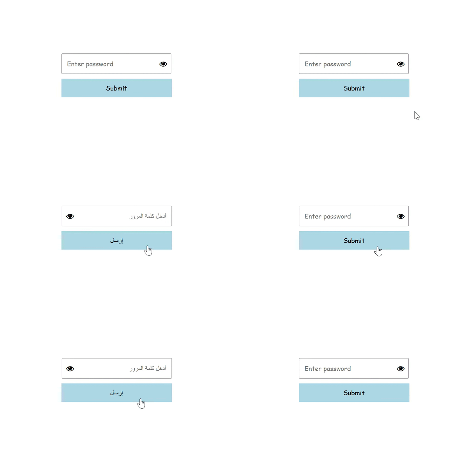
But with the dir pseudo-class, we can update the direction of the eye icon based on the directionality of the element:
i:dir(ltr) {
  right: 10px;
}

i:dir(rtl) {
  left: 10px;
}
See how much better it looks:
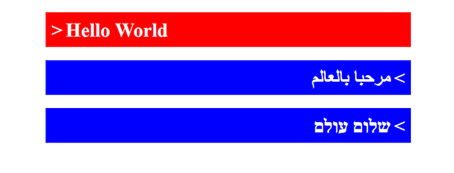
Another example is a directionality indicator, which indicates the directionality of an element with some visual cue, such as an icon:
<style>
  h1:dir(ltr)::before {
    content: '>';
    padding-right: 5px;
  }

  h1:dir(rtl)::before {
    content: '>';
    padding-left: 5px;
  }
</style>
<body>
  <h1>Hello World</h1> <!-- ltr is default -->
  <h1 dir='auto'>مرحبا بالعالم</h1>
  <h1 dir='rtl'>שלום עולם</h1>
</body>
Check out the result below:
dir attribute vs. the :dir pseudo-classAs we discussed, the currently popular way of styling elements based on their directionality is by using the HTML dir attribute selector. But moving on, you may want to consider using the CSS :dir pseudo-class instead. Let’s explore why.
The dir attribute selector selects elements where the dir attribute is explicitly used. In the case of the example below, the value of the attribute must explicitly be rtl for the style above to be applied to the element:
h1[dir='rtl'] {
  padding-right: 40px;
}
This method may lead to more style declarations you have to manage. For instance, in this case, if you wanted to style an element with the default ltr directionality — which is often not declared — you would most likely be forced to use the :not pseudo-class to achieve this:
h1:not([dir='rtl']) {
  padding-left: 40px;
}
Setting the value of the dir attribute to auto can complicate things further. You could avoid setting your element’s directionality to auto, but if someone else changes or applies it, your styles could break — and you wouldn’t want that to happen.
That’s where the :dir pseudo-class can provide a better solution. Unlike the HTML attribute selector, which matches styles to elements based on the specified dir attribute, the CSS :dir pseudo-class allows you to style any element based on its actual directionality as computed by the browser.
Let’s update our example above to use the :dir pseudo-class instead. In a nutshell:
/* using dir attribute selector */
h1[dir='rtl'] {
  padding-right: 40px;
}

h1:not([dir='rtl']) {
  padding-left: 40px;
}

// using the :dir pseudo-class
h1:dir(ltr) {
  padding-left: 40px;
}

h1:dir(rtl) {
  padding-right: 40px;
}
In the example above, we have two pairs of rules. The first pair of rules targets all h1 elements whose dir attribute is specified rtl. It also selects all h1 elements whose dir attribute is not specified as rtl, including elements with no dir attribute at all.
The second pair of rules uses the :dir pseudo-class to select all h1 elements whose computed direction is left to right, as well as those whose computed direction is right to left.
If we want the ability to select an element based on the direction computed by the browser, the :dir pseudo-class is a flexible and precise tool for responsive, direction-aware styling.
One thing you should consider while creating direction-aware styles is to avoid using one-direction spacing. For example, a padding-left or margin-left property applied to an element will break when the element is switched to the opposite direction, as we saw in the header example above.
Keeping this in mind, make sure you apply spacing to both sides — left and right — of an element in cases where it can be applied. That way, no matter the direction of the display, the element should still look fine.
Now to wrap things up, you might be wondering, “Why should I switch things up when the :dir pseudo-class is not fully supported in all browsers?” Well, the short answer is that you shouldn’t.
At the time of this writing, the :dir pseudo-class is not yet fully supported and won’t work on most browsers. So there is probably no point in using a feature to improve accessibility for everyone when it may work for some and not for others.
So then in such cases, while you wait for the :dir pseudo-class to be fully supported, you could make use of the dir attribute selector for the time being. But bear in mind that you may change it as it scales and as support for the :dir pseudo-class increases.
No matter which direction-aware styling method you decide to use, I hope this article has helped in showing how you can improve your app’s style to reflect the displayed language and its direction. Thanks for reading, and happy hacking.
As web frontends get increasingly complex, resource-greedy features demand more and more from the browser. If you’re interested in monitoring and tracking client-side CPU usage, memory usage, and more for all of your users in production, try LogRocket.

LogRocket lets you replay user sessions, eliminating guesswork around why bugs happen by showing exactly what users experienced. It captures console logs, errors, network requests, and pixel-perfect DOM recordings — compatible with all frameworks.
LogRocket's Galileo AI watches sessions for you, instantly identifying and explaining user struggles with automated monitoring of your entire product experience.
Modernize how you debug web and mobile apps — start monitoring for free.
Hey there, want to help make our blog better?
Join LogRocket’s Content Advisory Board. You’ll help inform the type of content we create and get access to exclusive meetups, social accreditation, and swag.
Sign up now
A breakdown of the wrapper and container CSS classes, how they’re used in real-world code, and when it makes sense to use one over the other.

This guide walks you through creating a web UI for an AI agent that browses, clicks, and extracts info from websites powered by Stagehand and Gemini.

This guide explores how to use Anthropic’s Claude 4 models, including Opus 4 and Sonnet 4, to build AI-powered applications.

Which AI frontend dev tool reigns supreme in July 2025? Check out our power rankings and use our interactive comparison tool to find out.