Documentation is an integral part of the software development lifecycle. Without documentation, a project can’t reach its maximum potential. But writing and maintaining documentation is a tedious and painstaking task. That’s where Docusaurus comes in.

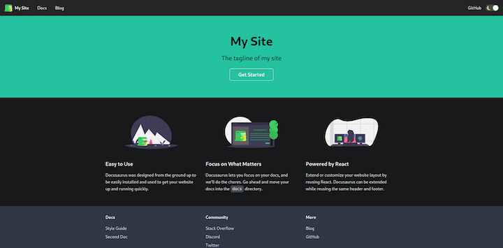
Put simply, Docusaurus helps you create and maintain static documentation websites. It generates a static React.js website using MDX and has support for blogs, versioning, and custom pages. MDX is a markdown variant that enables you to use JSX inside markdown. Docsaurus also supports both dark and light themes by default.
In this tutorial, we’ll demonstrate how to get the most out of Docusaurus v2.

The Replay is a weekly newsletter for dev and engineering leaders.
Delivered once a week, it's your curated guide to the most important conversations around frontend dev, emerging AI tools, and the state of modern software.
To install and use Docusaurus, you’ll need Node.js and npm.
@docusaurus/init is the easiest way to scaffold a Docusaurus website. You can execute the init command in any directory.
npx @docusaurus/init@next init my-website classic
This command will create a site named my-website in the current directory using the classic template. Docusaurus provides various templates.
Start the project by running npm start in the project directory. You can now see project running on http://localhost:3000.
├── babel.config.js
├── blog
│   ├── 2019-05-28-hola.md
│   ├── 2019-05-29-hello-world.md
│   └── 2019-05-30-welcome.md
├── docs
│   ├── doc1.md
│   ├── doc2.md
│   ├── doc3.md
│   └── mdx.md
├── docusaurus.config.js
├── package.json
├── README.md
├── sidebars.js
├── src
│   ├── css
│   │   └── custom.css
│   └── pages
│       ├── index.js
│       └── styles.module.css
├── static
│   └── img
│       ├── favicon.ico
│       ├── logo.svg
│       ├── undraw_docusaurus_mountain.svg
│       ├── undraw_docusaurus_react.svg
│       └── undraw_docusaurus_tree.svg
└── yarn.lock
All the settings related to Docusaurus plugin presets and themes reside in docusaurus.config.js. sidebars.js contains all the entries for sidebars.
The scaffold project has a few scripts already present in the package.json file. These scripts are used to manage the Docusaurus project. We’ll use two of these scripts:
npm start starts the dev server on localhost:3000. It detects changes to the project and reloadsnpm run build creates an optimized production build for the project. It creates a build folder to hold a compiled projectDocusaurus is highly customizable. Components such as navbar, footer, and title are customizable in docusaurus.config.js.
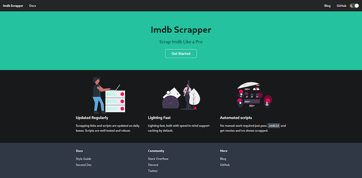
title and faviconYou can customize the title, tagline, and favicon components by changing corresponding keys in docusaurus.config.js.
  title: 'Imdb Scrapper', // title of website
  tagline: 'Scrap Imdb Like a Pro', // used in meta data
  url: 'http://localhost:3000/', // url where websited is hosted
  baseUrl: '/', // path where website is available
  favicon: 'img/favicon.ico', // path to favicon with respect to static dir
  organizationName: 'anshulrgoyal', // github user name
  projectName: 'imdb-scrapper',// project name i.e repo name of project
organiztionName and projectName are optional.
Now you can test changes by starting the project using the npm start command.
Go to http://localhost:3000 to see the changes.

src/pages/index.js is the homepage for the website. It exports a React component that is rendered between navbar and footer.
You can create your component in index.js. preset-classic also includes a CSS framework built by the Docusaurus team called Infima.
import React from "react";
import clsx from "clsx";
import Layout from "@theme/Layout"; // it is a sudo import, theme will be injected at build time
import Link from "@docusaurus/Link"; // docusaurus exports react-router
import useDocusaurusContext from "@docusaurus/useDocusaurusContext"; // get metadata about page
import useBaseUrl from "@docusaurus/useBaseUrl"; // gives link after concating website url and path
import styles from "./styles.module.css";
const features = [
  {
    title: <>Updated Regularly</>,
    imageUrl: "img/updated.svg", // path to image with respect to staic dir
    description: (
      <>
        Scrapping links and scripts are updated on daily bases. Scripts are well
        tested and robust.
      </>
    ),
  },
  {
    title: <>Lighting Fast</>,
    imageUrl: "img/fast.svg", // path to image with respect to staic dir
    description: (
      <>Lighting fast, built with speed in mind support caching by default.</>
    ),
  },
  {
    title: <>Automated scripts</>,
    imageUrl: "img/automated.svg", // path to image with respect to staic dir
    description: (
      <>
        No manual work required just pass imdbId and get movies
        and tvs shows scrapped.
      </>
    ),
  },
];
// Feature component
function Feature({ imageUrl, title, description }) {
  const imgUrl = useBaseUrl(imageUrl);
  return (
    <div className={clsx("col col--4", styles.feature)}>
      {imgUrl && (
        <div className="text--center">
          <img className={styles.featureImage} src={imgUrl} alt={title} />
        </div>
      )}
      <h3>{title}</h3>
      <p>{description}</p>
    </div>
  );
}
function Home() {
  const context = useDocusaurusContext();
  const { siteConfig = {} } = context;
  return (
    <Layout
      title={`Hello from ${siteConfig.title}`}
      description="Description will go into a meta tag in <head />"
    >
      <header className={clsx("hero hero--primary", styles.heroBanner)}>
        <div className="container">
          <h1 className="hero__title">{siteConfig.title}</h1>
          <p className="hero__subtitle">{siteConfig.tagline}</p>
          <div className={styles.buttons}>
            <Link
              className={clsx(
                "button button--outline button--secondary button--lg",
                styles.getStarted
              )}
              to={useBaseUrl("docs/")}
            >
              Get Started
            </Link>
          </div>
        </div>
      </header>
      <main>
        {features && features.length > 0 && (
          <section className={styles.features}>
            <div className="container">
              <div className="row">
                {features.map((props, idx) => (
                  <Feature key={idx} {...props} />
                ))}
              </div>
            </div>
          </section>
        )}
      </main>
    </Layout>
  );
}
export default Home;
navbarnavbar is a part of preset-classic, not @docusaurus/core.
Configuration to the theme is passed as the themeConfig object in docusaurus.config.js. The navbar key in themeConfig holds the config for the navbar.
themeConfig: {
    navbar: {
      title: "Imdb Scrapper", // title
      logo: {
        alt: "My Site Logo",
        src: "img/logo.svg", // path with respect to static dir
      },
   }
}
You can add a logo by providing src and alt. If the logo is not provided, it won’t be displayed.
Docusaurus supports hyperlinks to other pages on the same domain by providing a path or to another domain by providing a URL.
navbar: {
      title: "Imdb Scrapper",
      links: [
        {
          to: "docs/", // path to page
          activeBasePath: "docs", // active it url matches regex
          label: "Docs",
          position: "left",
        },
        { to: "blog", label: "Blog", position: "right" },
        {
          href: "https://github.com/anshulrgoyal/imdb-scrapper", // to other domain
          label: "GitHub",
          position: "right",
        },
      ],
If to is passed to links, react-router will be used. If href is passed, anchor tag is used.
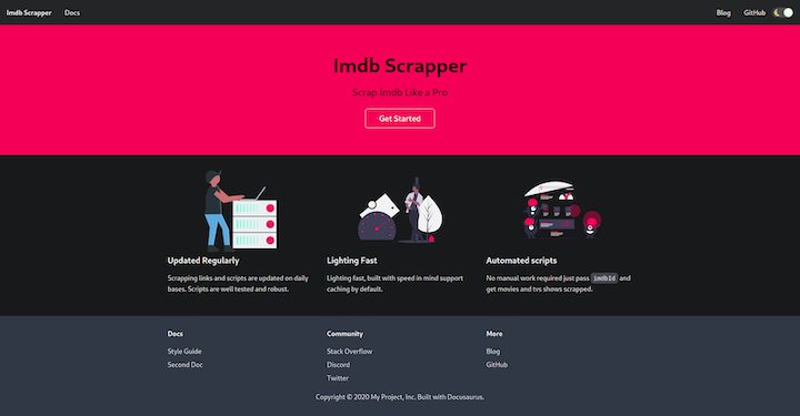
Infima supports CSS variables for customizing the color scheme.
Edit src/css/custom.css to change the color scheme.
:root {
--ifm-color-primary: #f50057;
--ifm-color-primary-dark: #dd004e;
--ifm-color-primary-darker: #d0004a;
--ifm-color-primary-darkest: #ab003d;
--ifm-color-primary-light: #ff0f64;
--ifm-color-primary-lighter: #ff1b6c;
--ifm-color-primary-lightest: #ff4084;
}
This will change the color scheme for Infima defaults to match the SVG images.
footerSimilar to navbar, you can customize the footer component using footer in themeConfig, which is in docusaurus.config.js.
To add a logo, simply provide the path to an image in the logo object.
footer: {
  logo: {
    alt: 'Some logo',
    src: 'img/oss_logo.png', // with respect to static dir
    href: 'url',
  },
},
You can add copyright text to the copyright key on the footer object.
footer: {
      copyright: `Copyright © ${new Date().getFullYear()} Anshul Goyal, Inc. Built with Docusaurus.`,
    },
Add links to the footer by providing URLs in links.
footer:{
  links:[
        {
          title: "Docs", //heading for links
          items: [
            {
              label: "Style Guide",
              to: "docs/",
            },
            {
              label: "Second Doc",
              to: "docs/doc2/",
            },
          ],
        },
        {
          title: "Community", // heading for links
          items: [
            {
              label: "Stack Overflow",
              href: "https://stackoverflow.com/questions/tagged/imdb-scrapper",
            },
          ],
        },
        {
          title: "More",
          items: [
            {
              label: "Blog",
              to: "blog",
            },
            {
              label: "GitHub",
              href: "https://github.com/anshulrgoyal/imdb-scrapper",
            },
          ],
        },
      ],
}

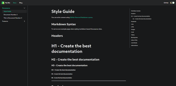
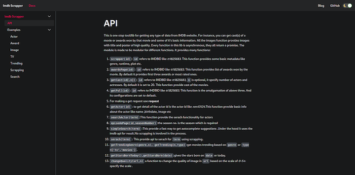
All the documentation is added to the docs folder. You can change it in the docusaurus.config.js file.
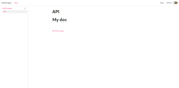
Create the api.md file in the docs folder. Docusaurus will render it automatically and create a table of contents for the .md file.
---
id: api
title: API
---
# My doc
id is used to reference this document in Docusaurus and /docs/{id} is the path to access documentation. title is the page title for documentation and sidebar_label is the label in the sidebar.
Now it’s time to add our api to the sidebar. Edit sidebars.js to create a new entry.
module.exports = {
  sidebar: {
    "Imdb Scrapper": ["api"],
  },
};
docs/
└── api.md
The sidebar is created recursively — i.e., it can have any level of nesting.
To see an example, create another category in the IMDB Scrapper category called Examples with many items.
docs/
├── api.md
└── examples
    ├── actors.md
    ├── award.md
    ├── image.md
    ├── scraping.md
    ├── search.md
    ├── trending.md
    └── tv.md
You can also create nested documents. For example, actors.md will have /docs/examples/actors as the URL path and the id to refer will be examples/actors.
module.exports = {
  sidebar: {
    "Imdb Scrapper": ["api",{
      Examples:[ // nested sidebar with example as sub catogery
        "examples/actor", // items
        "examples/award",
        "examples/image",
        "examples/tv",
        "examples/trending",
        "examples/scraping",
        "examples/search"
      ]
    }],
  },
};
If you try to access /docs/, you’ll get a 404. To solve this, we need to update the setting of preset-classic to use /docs/api as our home doc or entry point to docs.
 presets: [
    [
      "@docusaurus/preset-classic",
      {
        docs: {
          // It is recommended to set document id as docs home page (`docs/` path).
          homePageId: "api", // documents entry point
          sidebarPath: require.resolve("./sidebars.js")
        },
        blog: {
          showReadingTime: true,
        },
        theme: {
          customCss: require.resolve("./src/css/custom.css"),
        },
      },
    ],
  ],
Docusaurus supports versioning. During development, there are many changes in every version. If your product supports different versions, it’s difficult to maintain documentation for each.
Let’s add a script in package.json for versioning.
"version": "docusaurus doc:version"
Now we can use npm run version <version> command for creating command.
.
├── babel.config.js
├── blog
│   ├── 2019-05-28-hola.md
│   ├── 2019-05-29-hello-world.md
│   └── 2019-05-30-welcome.md
├── docs
│   ├── api.md
│   └── examples
│       ├── actors.md
│       ├── award.md
│       ├── image.md
│       ├── scraping.md
│       ├── search.md
│       ├── trending.md
│       └── tv.md
├── docusaurus.config.js
├── package.json
├── README.md
├── sidebars.js
├── src
│   ├── css
│   │   └── custom.css
│   └── pages
│       ├── index.js
│       └── styles.module.css
├── static
│   └── img
│       ├── automated.svg
│       ├── fast.svg
│       └── updated.svg
├── versioned_docs
│   └── version-1.1.0
│       ├── api.md
│       └── examples
│           ├── actors.md
│           ├── award.md
│           ├── image.md
│           ├── scraping.md
│           ├── search.md
│           ├── trending.md
│           └── tv.md
├── versioned_sidebars
│   └── version-1.1.0-sidebars.json
└── versions.json
This will copy all the documents from docs/ to versioned_docs. sidebars.js is copied to versioned_sidebars.
Now there are three versions:
next — All the documents in the /doc folder. This version is available as docs/next/{id}latest (1.1.0) — All the documents in the versioned_docs/version-1.1.0 folder are versioned latest. This version is available as docs/{id}old — All the documents in any other folder will be versioned old. This version is available as /docs/{version}/{id}versions.json holds all the versions for documentation.
[
  "1.1.0"
]
Docusaurus creates a snapshot of documentation for each version and saves it.
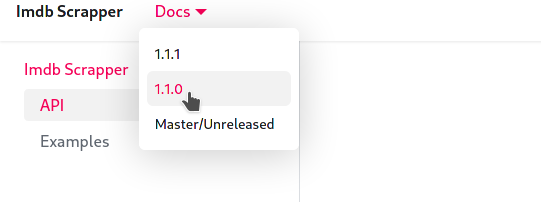
Now, add a link to each version in the navbar for easy access. Import versions.json in docusaurus.config.js.
const versions = require("./versions.json");
You can provide items to convert a link to a dropdown.
items: [
        {
          to: "docs/",
          activeBasePath: "docs",
          label: "Docs",
          position: "left",
          items: [ // adding items will create a dropdown
            {
              label: versions[0],
              to: "docs/",
              activeBaseRegex: `docs/(?!${versions.join("|")}|next)`,
            },
            ...versions.slice(1).map((version) => ({
              label: version,
              to: `docs/${version}/`,
            })),
            {
              label: "Master/Unreleased",
              to: "docs/next/",
              activeBaseRegex: `docs/next/(?!support|team|resources)`,
            },
          ],
        },
]
Docusaurus has a nice feature that informs the user that the documentation belongs to an older version.
Create a new version of 1.1.1 to see it in action.
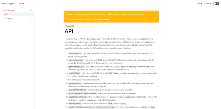
Docusaurus automatically adds a banner notifying the user that the documentation is old. The new version is automatically added to the navbar.
If you check versioned_docs, you can see both versions there.
.
├── babel.config.js
├── blog
│   ├── 2019-05-28-hola.md
│   ├── 2019-05-29-hello-world.md
│   └── 2019-05-30-welcome.md
├── docs // next or upcoming version
│   ├── api.md
│   └── examples
│       ├── actors.md
│       ├── award.md
│       ├── image.md
│       ├── scraping.md
│       ├── search.md
│       ├── trending.md
│       └── tv.md
├── docusaurus.config.js
├── package.json
├── README.md
├── sidebars.js // next or upcoming version
├── src
│   ├── css
│   │   └── custom.css
│   └── pages
│       ├── index.js
│       └── styles.module.css
├── static
│   └── img
│       ├── automated.svg
│       ├── fast.svg
│       └── updated.svg
├── versioned_docs
│   ├── version-1.1.0 // old version
│   │   ├── api.md
│   │   └── examples
│   │       ├── actors.md
│   │       ├── award.md
│   │       ├── image.md
│   │       ├── scraping.md
│   │       ├── search.md
│   │       ├── trending.md
│   │       └── tv.md
│   └── version-1.1.1 // latest version
│       ├── api.md
│       └── examples
│           ├── actors.md
│           ├── award.md
│           ├── image.md
│           ├── scraping.md
│           ├── search.md
│           ├── trending.md
│           └── tv.md
├── versioned_sidebars
│   ├── version-1.1.0-sidebars.json // old version
│   └── version-1.1.1-sidebars.json // latest version
└── versions.json
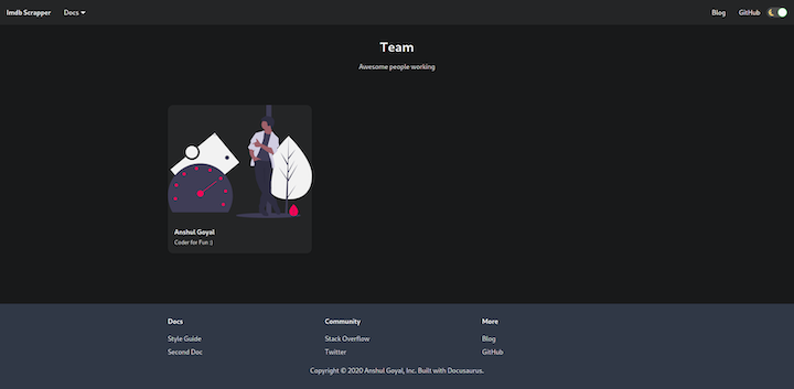
Docusaurus enables you to build custom pages by creating files in src/pages. If a file exports a React component, it will be rendered between the navbar and footer. If you create a new page src/pages/team, it will be available at /team.
// file: ./src/pages/team.js
import React, { useEffect } from "react";
import Layout from "@theme/Layout";
import clsx from "clsx";
import styles from "./styles.module.css";
const TITLE = "Team";
const DESCRIPTION = "Awesome people working";

function Team() {
  return (
    <Layout title={TITLE} description={DESCRIPTION}>
      <main className="container margin-vert--lg">
        <div className="text--center margin-bottom--xl">
          <h1>{TITLE}</h1>
          <p>{DESCRIPTION}</p>
        </div>
        <div className="row">
          <div className="col col--4 margin-bottom--lg">
            <div className={clsx("card", styles.showcaseUser)}>
              <div className="card__image">
                <img src="/img/fast.svg" />
              </div>
              <div className="card__body">
                <div className="avatar">
                  <div className="avatar__intro margin-left--none">
                    <h4 className="avatar__name">Anshul Goyal</h4>
                    <small className="avatar__subtitle">Coder for Fun :)</small>
                  </div>
                </div>
              </div>
            </div>
          </div>
        </div>
      </main>
    </Layout>
  );
}
export default Team;
If you check /team, you can see the team page.
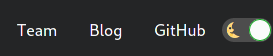
Add a link to /team in the navbar.
 {
          to: "team",
          label: "Team",
          position: "right",
          activeBaseRegex:`team`
        },
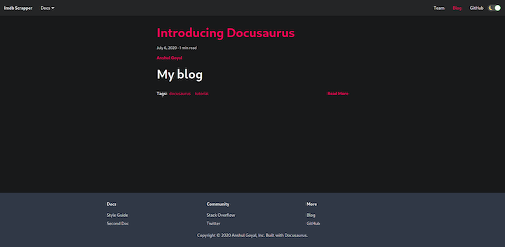
Finally, Docusaurus enables you to create and manage blogs.
Create a blog by adding a markdown file in the blog folder. The file name should follow this pattern: {date}-{name}.md.
// file: ./blog/2020-07-06-my-blog

---
id: intro
title: Introducing Docusaurus // title for blog
author: Anshul Goyal // author name
tags: [docusaurus,tutorial] // tags for blog
---
# My blog
<!--truncate--> marks the summary of the blog. The content between --- and <!--truncate--> is included in the summary.
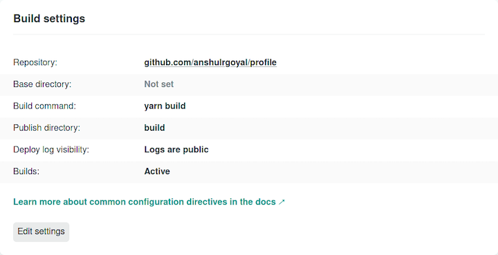
Deploying the Docusaurus website is simple. Just run npm run build and serve the build directory.
To demonstrate, let’s deploy Docusaurus to Netlify. Just connect your repo to Netlify and update the settings.
Now you know the basics of Docusaurus and have all the tools you need to create an excellent documentation website. We walked through how to create basic documentation, manage different versions, build custom pages, customize the default website, and create blogs.
Docusaurus is highly customizable and supports a wide range of integrations. The tool also supports myriad themes, search features, and image optimization tools.
Happy documenting!
There’s no doubt that frontends are getting more complex. As you add new JavaScript libraries and other dependencies to your app, you’ll need more visibility to ensure your users don’t run into unknown issues.
LogRocket is a frontend application monitoring solution that lets you replay JavaScript errors as if they happened in your own browser so you can react to bugs more effectively.
LogRocket works perfectly with any app, regardless of framework, and has plugins to log additional context from Redux, Vuex, and @ngrx/store. Instead of guessing why problems happen, you can aggregate and report on what state your application was in when an issue occurred. LogRocket also monitors your app’s performance, reporting metrics like client CPU load, client memory usage, and more.
Build confidently — start monitoring for free.

Write agent-friendly API documentation with OpenAPI, clear schemas, workflow guidance, and llms.txt for safer AI automation.

Local AI proxy tutorial for detecting, masking, and rehydrating PII before prompts reach cloud LLMs.

Learn how Graph RAG uses connected knowledge structures to improve retrieval beyond simple text similarity.

Learn how sibling-index() enables clean, JavaScript-free stagger animations using native CSS.
Hey there, want to help make our blog better?
Join LogRocket’s Content Advisory Board. You’ll help inform the type of content we create and get access to exclusive meetups, social accreditation, and swag.
Sign up now

 Learn more →
