Editor’s note: This article was last updated on 6 July 2022 to include information on the most recent versions of Vue and D3.

For the past two years, we’ve seen a lot of data visualizations answering questions about COVID-19. These visualizations have helped us all to be safer by giving us vital information about case numbers in specific locations.
Data visualization help us understand numbers better. Instead of performing complex calculations, visuals help the human brain perceive the information faster. Plus, they are much more fun to look at and play with than a spreadsheet full of numbers.
To demonstrate, in this article we’re going to use D3.js and Vue.js to create a line chart, so you can see how useful D3 and Vue can be when building data visualizations.
D3 is an open-source JavaScript library for creating interactive data visualizations in a web browser. D3 can be used to manipulate DOM objects and HTML, SVG, or Canvas elements to visualize data. D3.js can control how data is displayed and lets us add interactivity.
There are numerous JS libraries used today for data visualization. Some libraries are used to create 3D visuals like three.js and Babylon.js, and others that are multipurpose, like HighCharts and Recharts.
However, D3 is one of the most robust and extensive JavaScript data visualization libraries available. With over 102k stars on GitHub, D3 is the leading JavaScript library for data visualization.
According to the official documentation:
D3 helps you bring data to life using HTML, SVG, and CSS. D3’s emphasis on web standards gives you the full capabilities of modern browsers without tying yourself to a proprietary framework, combining powerful visualization components and a data-driven approach to DOM manipulation.
There are hundreds of examples to look at and learn from. From a simple bar chart to a more complex chord diagram visualizing debts between countries, you can make anything come alive with D3.
Apart from being a powerful tool for creating visuals, D3 also has a huge open source community. If you have an idea for a graphic, there is a chance somebody somewhere has created something similar and has written about it. Or if you’re stuck at creating a tooltip or an animation, there’s a good chance StackOverflow will have an answer for you. The bottom line is that you’re never alone.
We begin by running the command below in our terminal to create a new Vue application:
npm init vue@latest
Next, navigate into the project directory and install the necessary dependencies:
cd vue-project
npm install
We will be working with D3, so we can install it like so:
npm i d3
Now that we understand what D3 is, let us learn how to use it by creating the line chart.
The first thing to do is define the HTML template where we will render the chart. For this article, we will use an SVG:
<template>
  <div>
    <h2>Vue.js and D3 Line Chart</h2>
    <svg></svg>
  </div>
</template>
Next, we define the data that we want to display on the chart. We will use a dummy data for this demo, but in a real application, we would most likely use live data, such as the number of users that singed up to an application, the amount of rainfall in a month, or the quarterly profits of a business:
<script>
  const data = [
    { date: "24-Apr-07", amount: 93.24 },
    { date: "25-Apr-07", amount: 95.35 },
    { date: "26-Apr-07", amount: 98.84 },
    { date: "27-Apr-07", amount: 99.92 },
    { date: "30-Apr-07", amount: 99.8 },
    { date: "1-May-07", amount: 99.47 },
    { date: "2-May-07", amount: 100.39 },
    { date: "3-May-07", amount: 100.4 },
    { date: "4-May-07", amount: 100.81 },
    { date: "7-May-07", amount: 103.92 },
    { date: "8-May-07", amount: 105.06 },
    { date: "9-May-07", amount: 106.88 },
    { date: "10-May-07", amount: 107.34 },
  ];
<script/>
The data here is an array of objects, with each object having date and key.
Let’s get started on our example chart
First, select the element where we will mount the chart:
<script>
  import * as d3 from 'd3'

  data = [//the chart data we defined earlier]

  mounted(){
    const width = 800;
    const height = 500;
    const svg = d3.select("svg").attr("width", width).attr("height", height);
    const g = svg.append("g");
  }
<script/>
In the code above, we imported d3 from the D3 library and defined the width and height for the chart. Then, we selected the SVG element we defined earlier using the d3.select() method, and stored it as a constant called svg. This method will select the first element that matches in the DOM (from top to bottom).
Next, we used D3’s attr() method to add the width and height attributes to the svg, then appended g, the SVG group element, to the svg. The SVG <g> element is a container used to group other SVG elements.
Our next step is to parse the dates from string data to JavaScript date objects.
Currently, the dates in our data arrays are in a string format. We need to convert them into a JavaScript date object that represents a single point in time. D3 has a d3-time-format module that contains several methods for parsing and formatting dates:
const parseTime = d3.timeParse("%d-%b-%y");
We want to plot the dates on the x-axis and the amount on the y-axis.
D3 has a d3-scale module that we will use to convert the data values into pixels. A scale is a function that converts values between two domains. D3 scales are used to transform data values into visual variables.
D3 scales need two pieces of information: domain and range. Simply put, the domain is the input we give, and the range is the output we want:
const x = d3
      .scaleTime()
      .domain(
        d3.extent(data, function (d) {
          return parseTime(d.date);
        })
      )
      .rangeRound([0, width]);

const y = d3
      .scaleLinear()
      .domain(
        d3.extent(data, function (d) {
          return d.amount;
        })
      )
      .rangeRound([height, 0]);
Here, we do the following:
We used the d3.scaleTime() scale on the x-axis because we are working with date objects, and this is the scale that knows how to handle date objects. Then, we used the d3.scaleLinear() scale on the y-axis, because the values on the y-axis are numbers that increase linearly.
D3 provides a d3-shape module that we can use to create complex shapes such as symbols, lines, and arcs. We are creating a line chart, so we will be use the d3.line() method.
The d3.line() method creates a shape that follows a sequence of points:
const line = d3.line()
  .x(function (d) {
    return x(parseTime(d.date));
  })
  .y(function (d) {
    return y(d.amount);
  });
Here, we define the x-axis and y-axis attributes of the line by passing in anonymous functions and returning the date object and the amount that corresponds to each date.
Now, we need to attach the x and y axes to the chart like so:
 g.append("g")
      .attr("transform", "translate(0," + height + ")")
      .call(d3.axisBottom(x));

    g.append("g")
      .call(d3.axisLeft(y))
      .append("text")
      .attr("fill", "#000")
      .attr("transform", "rotate(-90)")
      .attr("y", 6)
      .attr("dy", "0.71em")
      .attr("text-anchor", "end")
      .text("Price ($)");
For the x-axis, we call d3.axisBottom() because we need to align it at the bottom of the canvas. For the y-axis, we call d3.axisLeft() because we want to align it to the left of the canvas.
Finally, we append a path to the chart. This path will actually draw the line chart according to the values of the data:
g.append("path")
      .datum(data)
      .attr("fill", "none")
      .attr("stroke", "steelblue")
      .attr("stroke-width", 1.5)
      .attr("d", line);
Here, we do the following:
data array using the datum methodd which gives instruction to the SVG path about where to connect the points of the pathWith this, we see the line chart appear in the browser.
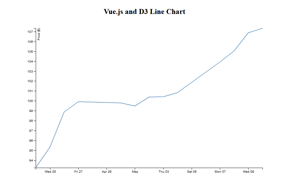
Here is the final code for the line chart:
<template>
  <div>
    <h2>Vue.js and D3 Line Chart</h2>
    <svg></svg>
  </div>
</template>
<script>
import * as d3 from "d3";
export default {
  data() {
    return {};
  },
  mounted() {
    const width = 800;
    const height = 500;
    const data = [];

    const svg = d3.select("svg").attr("width", width).attr("height", height);
    const g = svg.append("g");

    //2. Parse the dates
    const parseTime = d3.timeParse("%d-%b-%y");

    //3. Creating the Chart Axes
    const x = d3
      .scaleTime()
      .domain(
        d3.extent(data, function (d) {
          return parseTime(d.date);
        })
      )
      .rangeRound([0, width]);

    const y = d3
      .scaleLinear()
      .domain(
        d3.extent(data, function (d) {
          return d.amount;
        })
      )
      .rangeRound([height, 0]);

    //4. Creating a Line
    const line = d3
      .line()
      .x(function (d) {
        return x(parseTime(d.date));
      })
      .y(function (d) {
        return y(d.amount);
      });

    //5. Appending the Axes to the Chart
    g.append("g")
      .attr("transform", "translate(0," + height + ")")
      .call(d3.axisBottom(x));

    g.append("g")
      .call(d3.axisLeft(y))
      .append("text")
      .attr("fill", "#000")
      .attr("transform", "rotate(-90)")
      .attr("y", 6)
      .attr("dy", "0.71em")
      .attr("text-anchor", "end")
      .text("Price ($)");

    //6. Appending a path to the Chart
    g.append("path")
      .datum(data)
      .attr("fill", "none")
      .attr("stroke", "steelblue")
      .attr("stroke-width", 1.5)
      .attr("d", line);
  },
};
</script>
D3 is a vast library, and even though we covered a lot, this was just the basics. We can create different kinds of charts using D3. Go through platforms like Observable to see some examples and gain inspiration.
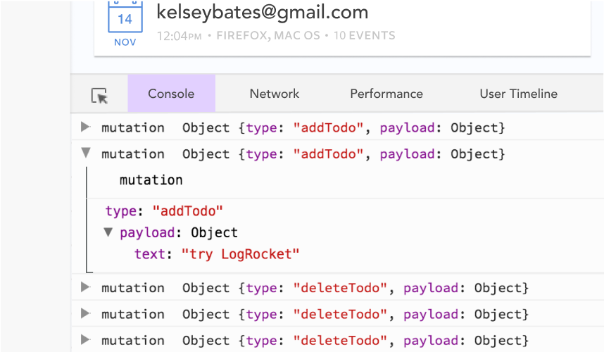
Debugging Vue.js applications can be difficult, especially when users experience issues that are difficult to reproduce. If you’re interested in monitoring and tracking Vue mutations and actions for all of your users in production, try LogRocket.
LogRocket lets you replay user sessions, eliminating guesswork by showing exactly what users experienced. It captures console logs, errors, network requests, and pixel-perfect DOM recordings — compatible with all frameworks.
With Galileo AI, you can instantly identify and explain user struggles with automated monitoring of your entire product experience.
Modernize how you debug your Vue apps — start monitoring for free.

Learn how to build smooth staggered animations in CSS using modern features like sibling-index(), complete with practical examples, fallbacks, and accessibility tips.

Compare the top AI development tools and models of July 2026. View updated rankings, feature breakdowns, and find the best fit for you.

Learn how to detect unused and ghost dependencies in JavaScript projects using Knip, a project-level linter that keeps your dependency graph accurate.

Learn how Storybook MCP enables AI agents to understand your component library, generate accurate UI, and validate code using documentation, stories, and automated tests.
Would you be interested in joining LogRocket's developer community?
Join LogRocket’s Content Advisory Board. You’ll help inform the type of content we create and get access to exclusive meetups, social accreditation, and swag.
Sign up now