If you’ve worked with Tailwind CSS, chances are you’ve used daisyUI. As one of the most popular Tailwind component libraries, it’s valued for its sensible defaults, wide component set, and flexibility that feels native to Tailwind.

Now, with the release of Tailwind CSS 4, the ecosystem is evolving — and daisyUI is keeping pace. Version 5 is more than an update: it’s a complete rewrite built to be smaller, faster, and more customizable.
In this guide, we’ll take a hands-on look at what’s new in daisyUI 5. You’ll see how to migrate a component from v4 to v5, apply the new theming engine, and experiment with fresh components and modifiers along the way.
The Replay is a weekly newsletter for dev and engineering leaders.
Delivered once a week, it's your curated guide to the most important conversations around frontend dev, emerging AI tools, and the state of modern software.
Before diving into the new components and themes, it’s worth noting that most of the real changes in daisyUI 5 happen under the hood. The library has been completely re-engineered to run faster, stay lighter, and play nicely with modern web standards.
Performance got a serious upgrade in daisyUI 5. Here are the numbers that matter:
node_modules directory, faster npm install times, and a significantly smaller security attack surface.full.css, is now daisyui.css and has been reduced from 137 kB (compressed) to a tiny 34 kB. This makes using the CDN file directly in production a genuinely viable and efficient option, especially for projects without a build step.These performance gains were made possible by embracing modern CSS features and the power of Tailwind CSS 4.
color-mix() for opacity: Thanks to Tailwind 4, daisyUI no longer relies on hacks to handle color opacity. It now uses the native color-mix() function, which is both more efficient and enables clearer, more flexible color variables (we’ll explore these in the theming section).The best way to see what’s new in daisyUI 5 is to upgrade a real component. In this section, we’ll start with a simple UI element built in daisyUI 4 and walk through the process of bringing it over to v5. Along the way, we’ll look at changes in configuration, class names, and theme variables.
First, let’s create a minimal starting environment. This ensures we’re all on the same page before the migration begins.
mkdir daisyui-migration-guide
cd daisyui-migration-guide
npm init -y
tailwind.config.js with the following:
// tailwind.config.js
/* @type {import('tailwindcss').Config} */
module.exports = {
content: ["./.html"],
theme: {
extend: {},
},
plugins: [require("daisyui")],
}
input.css and add the Tailwind directives:
/* input.css */
@tailwind base;
@tailwind components;
@tailwind utilities;
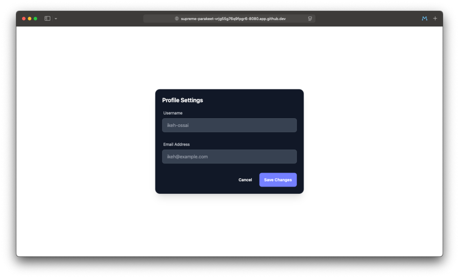
index.html file. This is where our component will live.Now, let’s add our simple component to index.html. It’s a card containing a title, two input fields and two button elements wrapped in a form-control.
Add this HTML inside the <body> tag of your index.html file:
<div class="card w-full max-w-lg text-white shadow-xl card-compact bg-gray-900">
  <div class="card-body">
    <h2 class="card-title text-white">Profile Settings</h2>

    <div class="form-control w-full">
      <label class="label">
        <span class="label-text text-gray-300">Username</span>
      </label>
      <input
        type="text"
        placeholder="ikeh-ossai"
        class="input input-bordered w-full bg-gray-700 border-gray-600 text-white placeholder-gray-400"
      />
    </div>

    <div class="form-control w-full mt-4">
      <label class="label">
        <span class="label-text text-gray-300">Email Address</span>
      </label>
      <input
        type="email"
        placeholder="[email protected]"
        class="input input-bordered w-full bg-gray-700 border-gray-600 text-white placeholder-gray-400"
      />
    </div>

    <div class="card-actions justify-end mt-6">
      <button class="btn btn-ghost">Cancel</button>
      <button class="btn btn-primary">Save Changes</button>
    </div>
  </div>
</div>
To see our component, run the Tailwind CLI to build the CSS:
npx tailwindcss -i ./input.css -o ./dist/output.css --watch
Now, open index.html. You will see a larger, more professional-looking dark settings panel centered on the white background.
With our starting point established, let’s begin the migration.
First, stop theTailwind watcher (Ctrl+C), and run the following command to upgrade your packages, which now includes the standalone CLI for Tailwind v4.
npm install -D tailwindcss@latest @tailwindcss/cli@latest daisyui@latest
The biggest configuration change in daisyUI 5 is that it’s now configured directly in your CSS file, not tailwind.config.js.
Previously in daisyUI 4, your tailwind.config.js looked like this, using a JavaScript require:
// tailwind.config.js
module.exports = {
  // ...
  plugins: [require("daisyui")],
}
Now, in daisyUI 5, remove the plugins array from your tailwind.config.js. It can now be simplified or even be an empty file if you have no other configurations.
// tailwind.config.js
/** @type {import('tailwindcss').Config} */
module.exports = {
  content: ["./*.html"],
  theme: {
    extend: {},
  },
  // The plugins array is now empty
  plugins: [],
}
Add the daisyUI plugin directly to your input.css file.
/* input.css */
@import "tailwindcss";
@plugin "daisyui"; /* <-- Add this line */

@tailwind base;
@tailwind components;
@tailwind utilities;
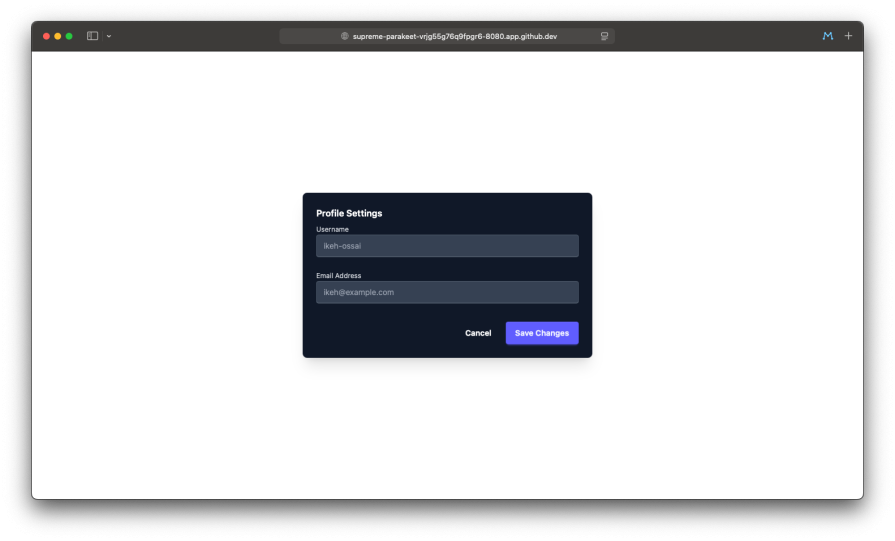
Re-run the build command. Your component will still look largely the same, but it’s now running on the new version. The next step is to update the daisyUI-specific class names to match the new conventions
Let’s upgrade our component’s styling by updating the class names.
card-compact is now card-sm: The sizing modifiers have been standardized for better consistency.form-control is removed: The generic form-control wrapper has been replaced by the new, more semantic fieldset and label components, which improve accessibility.Here is the updated HTML for index.html. We’ll keep the hardcoded Tailwind color classes for now.
<div class="card w-full max-w-lg text-white shadow-xl card-sm bg-gray-900">
  <div class="card-body">
    <h2 class="card-title text-white">Profile Settings</h2>

    <fieldset class="form-control w-full">
      <label class="label">
        <span class="label-text text-gray-300">Username</span>
      </label>
      <input
        type="text"
        placeholder="ikeh-ossai"
        class="input input-bordered w-full bg-gray-700 border-gray-600 text-white placeholder-gray-400"
      />
    </fieldset>

    <fieldset class="form-control w-full mt-4">
      <label class="label">
        <span class="label-text text-gray-300">Email Address</span>
      </label>
      <input
        type="email"
        placeholder="[email protected]"
        class="input input-bordered w-full bg-gray-700 border-gray-600 text-white placeholder-gray-400"
      />
    </fieldset>

    <div class="card-actions justify-end mt-6">
      <button class="btn btn-ghost">Cancel</button>
      <button class="btn btn-primary">Save Changes</button>
    </div>
  </div>
</div>
Your component should now be visually identical to its original appearance.
Let’s imagine our daisyUI 4 project had a custom theme defined in tailwind.config.js.
With daisyUI 4, the theme config used variable names like --p for primary and --b1 for base-100.
// tailwind.config.js (old)
module.exports = {
  // ...
  plugins: [require("daisyui")],
  daisyui: {
    themes: [
      {
        mytheme: {
          /* custom definitions */
        },
      },
    ],
  },
}
Now, with daisyUI 5, custom themes are also defined in your CSS file using the new @plugin "daisyui/theme" syntax and readable variable names.
First, update your tailwind.config.js to reference your theme name:
// tailwind.config.js (new)
/** @type {import('tailwindcss').Config} */
module.exports = {
  content: ["./*.html"],
  theme: {
    extend: {},
  },
  plugins: [],
}
Now, define the theme in your input.css. The following code uses the new CSS variables plus the oklch function to define the colors from a color palette:
/* input.css */
@import "tailwindcss";
@plugin "daisyui";
/* Define your new custom theme */
@plugin "daisyui/theme" {
  name: "mytheme";
  default: false;
  prefersdark: false;
  color-scheme: "light";
  --color-primary: oklch(84.19% 0.16 88.33);
  --color-primary-content: oklch(29.23% 0.03 27.42);

  --color-base-100: oklch(56.78% 0.13 162.24);
  --color-base-200: oklch(95.8% 0.02 46.22);
  --color-base-300: oklch(96.88% 0.02 46.21);
  --color-base-content: oklch(100% 0 0);
  --color-accent: oklch(62.13% 0.28 17.56);
  --color-neutral: oklch(62.13% 0.28 17.56);
}

@tailwind base;
@tailwind components;
@tailwind utilities;
This new approach is not only cleaner but also makes your color variables far more explicit and easier to debug directly in the browser’s developer tools.
Now that the theme is defined, you can remove the hardcoded color classes from the HTML and add data-theme="mytheme" to the <html> tag. The component will look like:
Now that our component is migrated and using a custom theme, we can explore the most exciting part of daisyUI 5: the powerful new theming engine. It goes far beyond just colors, giving you deep control over the entire design system.
The easiest way to start is with the all-new Theme Generator. This is an official visual tool that lets you create, preview, and export complete themes in real-time. You can generate a palette from a single color, fine-tune every variable, and see how your changes affect all the components at once. It’s an indispensable tool for quickly creating a custom design system foundation.
More customization by adjusting size and shape
Let’s use our migrated settings panel to customize some non-color aspects. daisyUI 5 exposes new CSS variables to control things like border radius and border widths.
We can edit our @plugin "daisyui/theme" block in input.css to make our inputs and buttons more rounded and give the inputs a thicker border.
/* input.css */
@plugin "daisyui/theme" {
  name: "mytheme";
  color-scheme: "light";

  /* ... your color variables ... */
  --color-primary: oklch(84.19% 0.16 88.33);
  --color-base-100: oklch(56.78% 0.13 162.24);
  /* ... etc ... */

  /* Add new variables for shape and size */
  --radius-field: 0.5rem; /* Controls radius for inputs, buttons, etc. */
  --border: 2px;       /* Controls the base border width */
}
After saving, the inputs and buttons in our settings panel will now have a more pronounced, rounded look with a thicker border on the inputs.
daisyUI 5 also introduces two new global “effect” variables that can add a subtle, premium feel to your components.
--depth: Adds a soft, 3D-like depth effect to elements like buttons.--noise: Applies a subtle, textured noise pattern to component backgrounds.Let’s enable them in our theme:
/* input.css */
@plugin "daisyui/theme" {
  name: "mytheme",
  color-scheme: "light";

  /* ... your color and shape variables ... */
  --radius-field: 0.5rem;
  --border: 2px;

  /* Add the new effect variables */
  --depth: 1;   /* Enable the depth effect (0 is off, 1 is on) */
  --noise: 0.1; /* Add a 10% noise overlay */
}
With these changes, your components will now have a subtle visual texture and a clean depth effect, making the design feel more tactile and refined.
Now that we have a fully migrated and themed component, let’s enhance its functionality and design by incorporating some of the brand-new components and style modifiers introduced in daisyUI 5.
Our “Profile Settings” card is a good start, but we can make it more functional. We’ll transform it into a more complete user settings panel by adding a validation message, a list of user preferences, and updating the button styles.
daisyUI 5 introduces several new components. Let’s integrate two of them: Validator and List.
Validator for Form feedback:Validator component is a simple wrapper that allows you to show success or error states on your form fields. Let’s add it to our “Username” field to show a success message.Wrap the fieldset for the username in a div with the validator and success classes, and add a span with the hint class for the message.Username is available
List for user preferences:List component is perfect for displaying vertical rows of information. Let’s add a list to our panel for managing user preferences.Add the following HTML just before the card-actions div. It includes a list with two list-row items, one of which contains a toggle.
New modifiers: soft and dash
daisyUI 5 adds new style modifiers for many components, including buttons. Let’s apply the new **btn-soft** and **btn-dash** styles to our action buttons for a different look.
Update the card-actions div in your HTML:
<div class="card-actions justify-end mt-6">
  <button class="btn btn-ghost btn-dash">Cancel</button>
  <button class="btn btn-primary btn-soft">Save Changes</button>
</div>
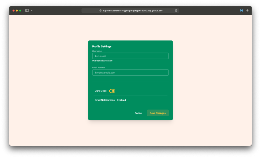
With these additions, our simple settings panel is now more functional and visually diverse, showcasing the new tools available in daisyUI 5.
We’ve walked through the most impactful changes in daisyUI 5, from its re-engineered core to its enhanced design system. By migrating an existing component, we’ve seen firsthand how this update is more than just a collection of new features; it’s a fundamental modernization of the entire library.
The key benefits are clear, daisyUI 5 is significantly faster and lighter thanks to its zero-dependency architecture and adoption of modern CSS. It’s far more customizable, with a powerful and intuitive new theming engine that gives developers deep control over their design system. Most importantly, it’s perfectly aligned with Tailwind CSS 4, ensuring its place as a forward-looking tool in the modern web development landscape.
For the massive community of daisyUI users, this version is an essential upgrade that brings tangible performance and workflow improvements. For any developer in the Tailwind ecosystem, daisyUI 5 solidifies its position as the most powerful, flexible, and well-designed component library available today.

Build a CRUD REST API with Node.js, Express, and PostgreSQL, then modernize it with ES modules, async/await, built-in Express middleware, and safer config handling.

Discover what’s new in The Replay, LogRocket’s newsletter for dev and engineering leaders, in the March 25th issue.

Discover a practical framework for redesigning your senior developer hiring process to screen for real diagnostic skill.

I tested the Speculation Rules API in a real project to see if it actually improves navigation speed. Here’s what worked, what didn’t, and where it’s worth using.
Hey there, want to help make our blog better?
Join LogRocket’s Content Advisory Board. You’ll help inform the type of content we create and get access to exclusive meetups, social accreditation, and swag.
Sign up now

 Learn more →
