There are countless UI libraries and kits for React that we can use to build our application’s user interface. Some of these libraries provide built-in components with prewritten rendering and behaviors that aren’t easy to customize at lower levels.

In this article, you will learn how to create a compositional API by extending React Aria’s built-in components to create your own custom components. To follow along with this tutorial, I will assume you can create a React app using Vite and have a basic understanding of React Aria components.
You can find the full code for the demo project on GitHub.
The Replay is a weekly newsletter for dev and engineering leaders.
Delivered once a week, it's your curated guide to the most important conversations around frontend dev, emerging AI tools, and the state of modern software.
React Aria is a library of React Hooks that provides accessible UI primitives for creating design systems. It was developed by Adobe to provide common UI components with accessibility and behavior using ARIA (Accessible Rich Internet Applications) patterns.
React Aria supports multiple input modes that ensure inclusive interaction experiences for users using mice, touch, keyboards, and screen readers to navigate through components.
React Aria’s built-in components are designed around composition, which makes them reusable when creating larger composite component patterns. When you need more control over the components with React Aria, it’s easy to drop down to the lower-level Hook-based API to create a custom composable API.
React Aria’s Hook-based API allows you to create compositional components with complete customization options, including the ability to change the DOM structure, access the internal state, and override event handlers to control the rendering and behavior of the component.
When React Aria’s built-in components don’t fully meet your application’s requirements, extending their behaviors using a Hook-based API allows you to tailor them to your specific needs. This is particularly important when your application’s UI requires unique structures or interactions that you can’t achieve with the default built-in components.
Here are some reasons you may want to extend the React Aria Component API:
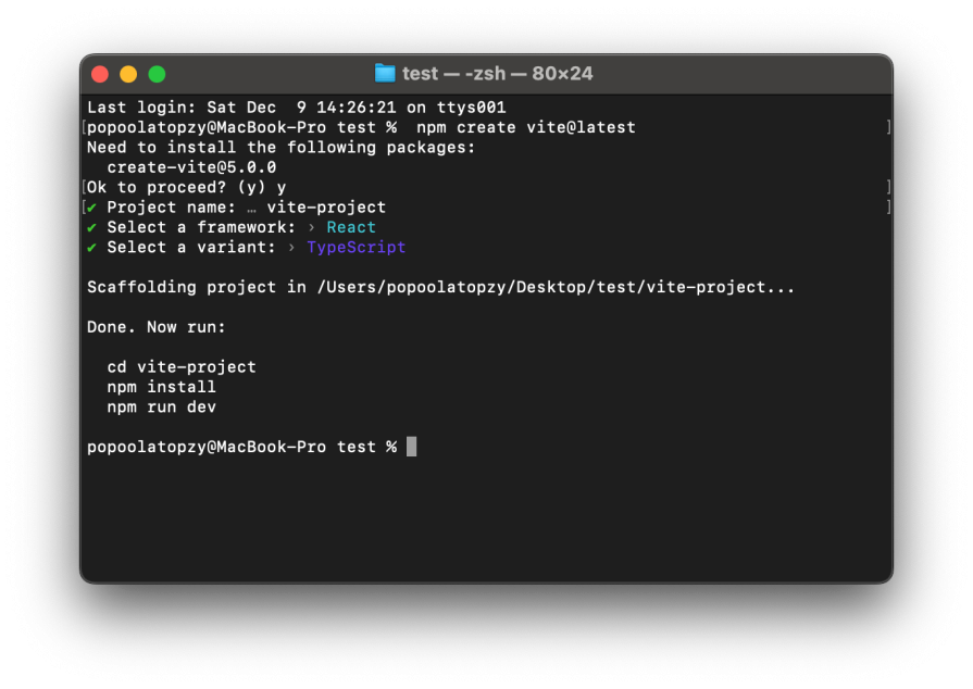
To get started, let’s create a new React app using the Vite CLI. To do this, run the command below in your terminal:
npm create vite@latest
Next, you will be prompted to configure the project. Use the project configuration shown below:

Now we need to install the React Aria Components library into the project. Go ahead and do that using the command below:
npm install react-aria-components
After installing, open the project folder in your code editor, navigate to the src folder, and create a Components folder to store the component files.
Now let’s explore building a custom React Aria compositional API with customized rendering and behavior using contexts, slots, and consume contexts.
Every React Aria component has a corresponding context you can use to create a custom compositional API. For instance, we can create a custom ButtonGroup component marked as disabled using the isDisabled prop. This prop is then passed to all child buttons through the ButtonContext provider.
Let’s create a ButtonGroup component with customized rendering behavior for the child button components using context. Inside the Components folder, create a ButtonGroupAPI.tsx file and add the following code to it:
// ButtonGroupAPI.tsx

import { ReactNode } from 'react';
import { ButtonContext, Button } from 'react-aria-components';

interface ButtonGroupProps {
  children: ReactNode;
  isDisabled?: boolean;
}

export function ButtonGroup({ children, isDisabled }: ButtonGroupProps): JSX.Element {
  return (
    <div style={{ display: 'flex', gap: 8, marginLeft:10 }}>
      <ButtonContext.Provider value={{ isDisabled }}>
        {children}
      </ButtonContext.Provider>
    </div>
  );
}
In the code above, we import ButtonContext and Button from react-aria-components, which provides us with the customization options needed to create customized components.
Next, we define the ButtonGroupProps interface. This interface is used to define the props and their data types that are passed to the ButtonGroup component as an object.
The ButtonGroup functional component takes two props, children and isDisabled, which have been defined in the ButtonGroupProps interface. These props are then passed to the child button component via ButtonContext.Provider.
To utilize this component, open the App.tsx file and add the following code to it:
import { ButtonGroup } from './Components/ButtonGroupAPI';
import { Button } from 'react-aria-components';
function App() {
  return (
    <>
      <ButtonGroup isDisabled={true}>
        <Button>Edit</Button>
        <Button>Delete</Button>
        <Button>Save</Button>
      </ButtonGroup>
      <br />
      <ButtonGroup isDisabled={false}>
        <Button >Back</Button>
        <Button >Share</Button>
        <Button>Bookmark</Button>
      </ButtonGroup>
    </>
  );
}
export default App;
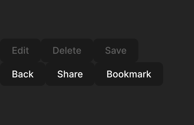
In the code above, we import the ButtonGroup component from the ButtonGroupAPI and wrap the button components into it. Every button wrapped inside the ButtonGroup component receives the isDisabled property, as shown in the image below:

When there are multiple instances of the same component, the slots prop can be used to identify each instance along with its actions. A slot is a name given to child components as a prop within a parent component to receive separate behaviors and styles.
For example, we can use slots to identify which button the user presses and customize the action associated with the corresponding button.
Let’s create a ButtonAction component that uses slots to identify which of its child button components is pressed and customize their behaviors. Open the ButtonGroupAPI.tsx file and add the following code to create the ButtonAction component:
// . . .
interface ButtonActionProps {
  children: ReactNode;
}
export function ButtonAction({ children }: ButtonActionProps) {
  return (
    <ButtonContext.Provider
      value={{
        slots: {
          Edit: {
            onPress: () => (alert("Edit button pressed")),
          },
          Delete: {
            onPress: () => alert("Delete button pressed"),
          },
          Save: {
            onPress: () => alert("Save button pressed"),
          },
          Back: {
            onPress: () => alert("Back button pressed"),
          },
          Share: {
            onPress: () => alert("Share button pressed"),
          },
          Bookmark: {
            onPress: () => alert("Bookmark button pressed"),
          },
        }
      }}
    >
      {children}
    </ButtonContext.Provider>
  );
}
From the code above, we define the slot instances as an object with six button actions: Edit, Delete, Save, Back, Share, and Bookmark. The slot object is then passed as the value prop to the ButtonContext.Provider, allowing its child button components to access and utilize the corresponding slot property.
Next, to use this component, open the App.tsx file and add the ButtonAction component using the code below:
import { ButtonAction } from './Components/ButtonGroupAPI';
import { Button } from 'react-aria-components';
function App() {
  return (
    <>
      <ButtonAction>
        <Button slot="Back">Back</Button>
        <Button slot="Share">Share</Button>
        <Button slot="Bookmark">Bookmark</Button>
      </ButtonAction>
    </>
  );
}

export default App;
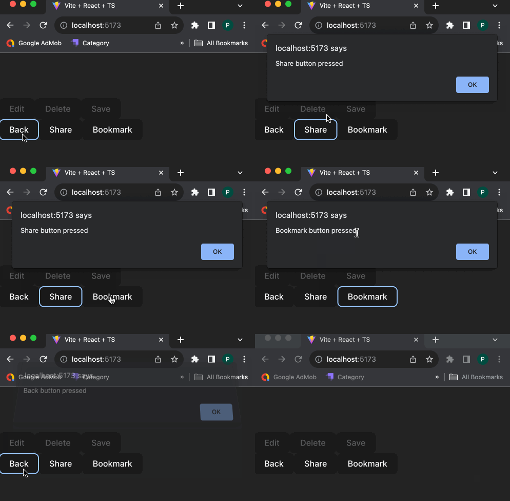
In the code above, we import ButtonAction from the ButtonGroupAPI component and wrap the button components within it. Each button takes its corresponding slot props that are triggered when the button is pressed, as shown in the image below:

We can also create a customized component that is compatible with React Aria’s built-in components using consume contexts. Consume contexts allow us to replace a built-in component used as part of a larger pattern with a custom implementation.
Let’s create a custom MyCustomLabel component that is compatible with React Aria’s built-in components using LabelContext. To do so, open the ButtonGroupAPI.tsx file and add the following component function:
// ButtonGroupAPI.tsx

import React,{ ReactNode } from 'react';
import { ButtonContext } from 'react-aria-components';
import { LabelProps,LabelContext, useContextProps } from 'react-aria-components';

//...

export function MyCustomLabel(props: LabelProps, ref: React.ForwardedRef<HTMLLabelElement>) {
  [props, ref] = useContextProps(props, ref, LabelContext);

  return <label  {...props} ref={ref}style={{}} />;
}
In the code above, we import LabelProps, LabelContext, and useContextProps from react-aria-components. Then, we create the MyCustomLabel component, which takes props and ref properties that are part of the built-in label properties.
Now we can utilize the MyCustomLabel component in place of the built-in label component. To use it, head back over to the App.tsx file, import MyCustomLabel, and add the following code to it:
<TextField>
  <MyCustomLabel>Enter Username</MyCustomLabel>
  <Input />
</TextField>
When customizing a group component, like the Calendar component, we can use the corresponding StateContext to manipulate and exchange state within its child components. For instance, CalendarStateContext allows us to access and manipulate the state of the calendar within its child components.
Let’s create a CalendarValue component that returns the selected date in a Calendar component using CalendarStateContext. To do that, open the App.tsx file and add the following code:
import { CalendarStateContext } from 'react-aria-components';
import { useDateFormatter } from 'react-aria';
import { getLocalTimeZone } from '@internationalized/date';
//...
export function CalendarValue() {
  let state = React.useContext(CalendarStateContext)!;
  let date = state.value?.toDate(getLocalTimeZone());
  let formatted = date ? useDateFormatter().format(date) : 'None';
  return <small>Selected date: {formatted}</small>;
}
In the code above, we create a CalendarValue component that utilizes the CalendarStateContext to retrieve the selected date from a Calendar component and then converts the selected date to the local time zone format using a date formatter.
To use the component, wrap it inside the Calendar component. Open the App.tsx file and add the following code:
     <Calendar aria-label="Appointment date">
       <header>
         <Button slot="previous">◀</Button>
         <Heading />
         <Button slot="next">▶</Button>
       </header>
       <CalendarGrid>{(date) => <CalendarCell date={date} />}</CalendarGrid>
       <CalendarValue />
     </Calendar>
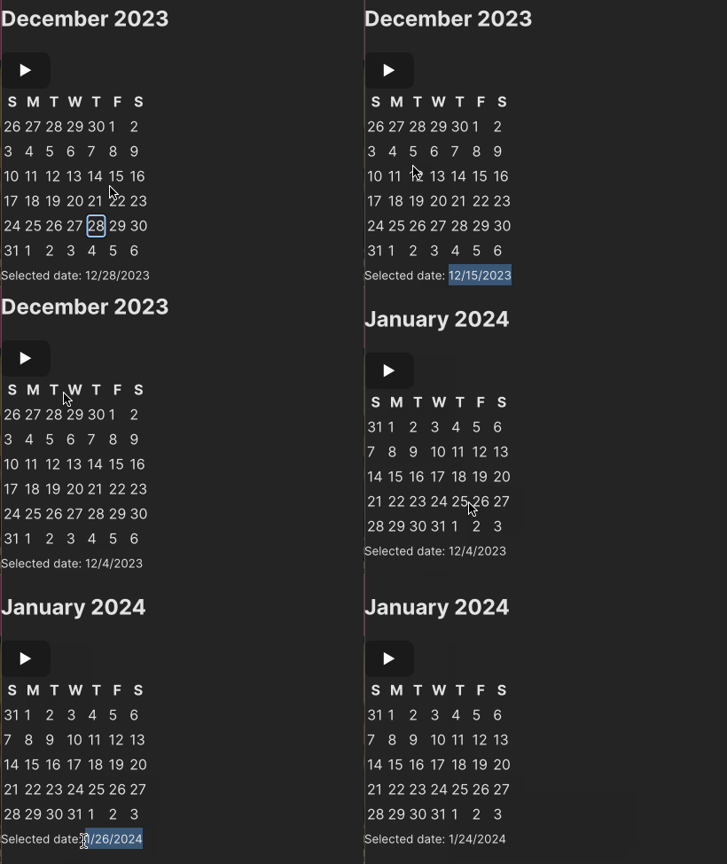
We import CalendarValue and wrap it in the CalendarGroup component. When the user selects a date, the selected date is displayed in the CalendarValue component, as shown in the image below:

In this article, we learned how to create a customized compositional API by extending React Aria’s built-in components. This approach allows us to create components with the desired rendering and behaviors that align with the application requirements.
React Aria Components is a library of unstyled components built using a flexible and composable API, which can be used to create your new patterns. You can visit the React Aria documentation to learn more about the advanced customization options for React Aria Components, and again, you can find the full code for this tutorial on my GitHub.
Install LogRocket via npm or script tag. LogRocket.init() must be called client-side, not
server-side
$ npm i --save logrocket

// Code:

import LogRocket from 'logrocket';
LogRocket.init('app/id');
// Add to your HTML:

<script src="https://cdn.lr-ingest.com/LogRocket.min.js"></script>
<script>window.LogRocket && window.LogRocket.init('app/id');</script>

AI companies are buying developer tools as coding agents turn runtimes, package managers, and linters into strategic infrastructure.

Learn how AI-assisted development governance uses rules, agents, hooks, and protocols to help AI coding tools produce safer, more consistent code.

A step-by-step guide to building your first MCP server using Node.js, covering core concepts, tool design, and upgrading from file storage to MySQL.

Using security headers in your Next.js apps is a highly effective way to secure websites from common security threats.
Hey there, want to help make our blog better?
Join LogRocket’s Content Advisory Board. You’ll help inform the type of content we create and get access to exclusive meetups, social accreditation, and swag.
Sign up now