While CSS may be easy to write, it can quickly become challenging to maintain, particularly as the complexity of our websites and components increases. One of the best ways to decrease frustration with CSS is to create a structure within the code, which ensures that our CSS remains maintainable and scalable.

CSS methodologies are guidelines for writing modular, reusable, and scalable CSS. Over the years, methodologies such as Atomic CSS, BEM, OOCSS, SMACSS, and SUIT CSS have been developed to enable us to write scalable CSS.
One of the newer entries to this list of methodologies is CUBE CSS, and in this article, we will learn how it helps developers write scalable and maintainable CSS. We will also compare CUBE CSS with BEM, one of the most popular CSS methodologies.
CUBE CSS was created by Andy Bell, and it is a CSS methodology geared towards simplicity, pragmatism, and consistency.
CUBE stands for “Composition Utility Block Exception” and is a tool-agnostic methodology.
The core of CUBE CSS’ methodology is that most of the work is already done for us with global and high-level styles. At this point, colors, typography, and any other global styles have been defined.
After defining the global styles, we use the rest of CUBE CSS’ methodology to provide contextual styles that deviate from the global styles.
CUBE CSS follows a top-down approach to styling elements and moves from global styles to low-level and specific styles
In essence, CUBE CSS is a progressive-enhancement system/methodology for styling elements.
Now, let’s look at the different layers of CUBE CSS and understand how they work.
The composition layer deals with how the page flows and how the different elements on the page connect and interact with each other.
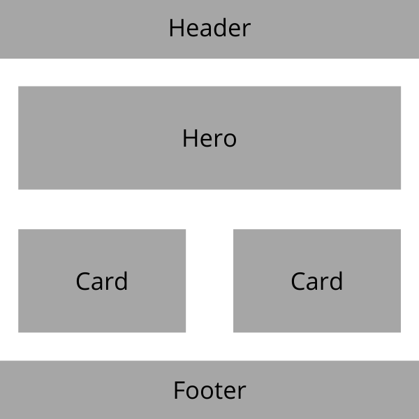
The composition layer handles the creation of flexible layouts that support as many content variants as possible; it acts as a skeleton for the other elements on a page. It does not care what content goes into the page, because its sole responsibility is the layout of the content and not the content itself.
Take the layout below. The composition layer is responsible for creating this skeleton.

Later on, we can fill that layout with any content of our choice.
This layer is responsible for:
It should not:
A utility class is a class that only does one thing, but does it very well. It is a single-responsibility class.
Utility classes are typically scoped to a single CSS property. They enable us to keep our CSS stylesheets DRY and scalable.
Examples of utilities are:
btn-cta-secondary {
  background-color: red
}

margin-x-auto {
  margin-left: auto;
  margin-right: auto;
}
The btn-cta-secondary utility class changes the background color of a button to red. The margin-x-auto utility class sets an element’s horizontal margin to auto.
The block layer is where styles for specific components such as cards, avatars, and buttons are set up.
An example of a block is styles created for a team card element.

The HTML for the card component is as follows:
<div class="person">
  <img class="person-image radius" src="img-src" />

  <div class="person-details">
    <span class="person-name font-sans weight-bold"
      >Isabella Santos Melo</span>
    <span>Creative director</span>
  </div>

</div>
Here is the corresponding CSS:
.person {
  height: 51rem;
}

.person-image {
  filter: grayscale(1);
  width: 100%;
  height: 100%;
  object-fit: cover;
}

.radius {
  border-radius: 0.25rem;
}

img {
  max-width: 100%;
  display: block;
}

.person-details {
  position: absolute;
  bottom: 0.5rem;
  left: -0.25rem;
  width: calc(100% - 0.5rem);
  padding: 0.8rem;
  background: #ff7f5c;
}

.person-name {
  display: block;
  font-size: 1.77rem;
}

.weight-bold {
  font-weight: 900;
}

.font-sans {
  font-family: "Segoe UI", Roboto, "Helvetica Neue", sans-serif;
}
Here, person, person-image, person-details, and person-name are blocks, while radius, font-sans, and weight-bold are utility classes.
Two things to note about blocks:
First, Andy recommends that blocks should not grow larger than a handful of rules and should not be more than 80 to 100 lines.
Second, blocks should not solve more than one contextual problem. This means, for example, if we have a card block within an avatar inside it, the card block should not style itself and the Avatar. Instead, we would have to create two separate blocks; one for the card and another for the avatar.
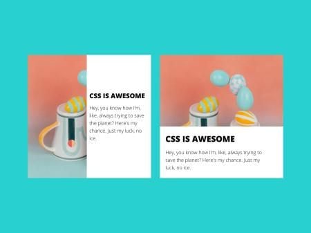
Exceptions are tiny variations to block elements, and are used for handling state changes to elements.
For example, this card component whose children switch from left to right or top to bottom at different screen sizes.
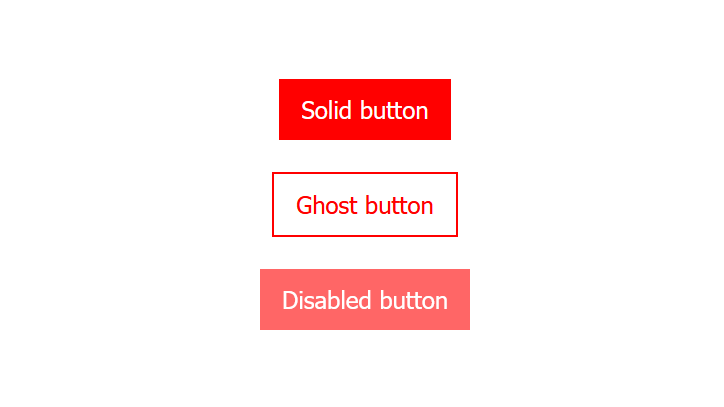
Another example is a button with solid, ghost, and disabled variants. The button should have a white text color and a red background color by default.
The ghost variant will have a red text color, a red border, and a white background color.
The disabled button will be similar to the solid one. However, the differences are that the disabled one will have a lower opacity.
Here, we define the HTML for the solid, ghost, and disabled buttons. CUBE CSS uses data attributes to target style variations, so we add the data-variant attribute to the buttons:
<body>
  <button class="button">Solid button</button>
  <button class="button" data-variant="ghost">Ghost button</button>
  <button class="button" data-variant="disabled">Disabled button</button>
</body>
Data attributes are used because they can easily be translated between the three pillars of the web, HTML, CSS, and JavaScript. Also, they do not interfere with assistive technologies such as screen readers, motion trackers, or speech input software.
In the CSS, we set the base styles that all buttons will have, regardless of their variant. Then we target the ghost and disabled variants and define their styles:
.button {
  font-size: 1.4rem;
  border: none;
  outline: none;
  padding: 1rem;
  color: white;
  background-color: red;
}

.button[data-variant="ghost"] {
  color: red;
  border: 2px solid red;
  background-color: white;
}

.button[data-variant="disabled"] {
  opacity: 0.6;
  cursor: not-allowed;
}
Tracking the multiple classes in the HTML can become difficult. How do we remember which class is a composition, block, or utility?
CUBE CSS has a grouping mechanism we can use to group our classes based on their purpose. This makes them easier to track and also boosts developer experience and productivity.
We can group classes using square brackets like so:
<article
  class="\[ card \] [ section box ] [ bg-base color-primary ]"
  data-state="reversed"
></article>
We can also group them using pipes:
<article
  class="card | section box | bg-base color-primary"
  data-state="reversed"
></article>
As long as we remain consistent, we are free to use square brackets or pipes.
Several CSS methodologies have been developed to help us structure our styles better, with BEM (block, element, modifier) being one of those methodologies.
A major difference between BEM and CUBE CSS is how they handle exceptions. BEM handles exceptions with modifiers, while CUBE CSS handles exceptions by targeting data attributes.
Oftentimes, we need to change the styles of elements based on their current state. For example, we may want to change the style of an accordion based on its opened and closed states.
In BEM, we would set up a modifier class, say, is-active, to modify the accordion:
//modifier added to accordion
<div class="accordion--is-open"></div>
In CUBE CSS, we would create an is-open data attribute and target the attribute in our CSS:
//data attribute added to accordion

<div data-variant="is-open"></div>
Unlike CUBE CSS, BEM does not have utility classes baked into it. A benefit of using utility classes is that they help us avoid rule duplications in our stylesheet, and keep our code dry.
This is useful if, for example, we have multiple elements and components that need the flex property applied to them.
With BEM, we would apply the flex rules, and we would have to repeat those styles in every other element that requires them:
.element {
  display: flex;
  flex-dirction: row;
  wrap: wrap
}
However, with CUBE CSS, we attach those style declarations to a class (say, flex), and apply that class where needed:
.flex {
  display: flex;
  flex-dirction: row;
  wrap: wrap
}
Besides keeping our code DRY, this approach also makes it easier for us to update our styles when needed, because the style declarations are attached to one class and not multiple.
Here are links to some websites that were built using the CUBE CSS methodology:
As projects increase in scale and complexity, they can become more challenging to maintain. Therefore, it is important to follow a clearly defined set of conventions when writing CSS.
With CUBE CSS, we can write CSS in a way that has minimal repetition, is highly scalable, and is more understandable. In this article, we have learned about CUBE CSS and its principles. We have also studied how CUBE CSS compares with other CSS methodologies.
As web frontends get increasingly complex, resource-greedy features demand more and more from the browser. If you’re interested in monitoring and tracking client-side CPU usage, memory usage, and more for all of your users in production, try LogRocket.

LogRocket lets you replay user sessions, eliminating guesswork around why bugs happen by showing exactly what users experienced. It captures console logs, errors, network requests, and pixel-perfect DOM recordings — compatible with all frameworks.
LogRocket's Galileo AI watches sessions for you, instantly identifying and explaining user struggles with automated monitoring of your entire product experience.
Modernize how you debug web and mobile apps — start monitoring for free.
Hey there, want to help make our blog better?
Join LogRocket’s Content Advisory Board. You’ll help inform the type of content we create and get access to exclusive meetups, social accreditation, and swag.
Sign up now
A breakdown of the wrapper and container CSS classes, how they’re used in real-world code, and when it makes sense to use one over the other.

This guide walks you through creating a web UI for an AI agent that browses, clicks, and extracts info from websites powered by Stagehand and Gemini.

This guide explores how to use Anthropic’s Claude 4 models, including Opus 4 and Sonnet 4, to build AI-powered applications.

Which AI frontend dev tool reigns supreme in July 2025? Check out our power rankings and use our interactive comparison tool to find out.
2 Replies to "Introducing CUBE CSS: An alternative CSS methodology"
Great info, I use BEM and I’m in love with it, but now I’m going to try cube 🙂
That’s awesome. I hope you enjoy using it.