
Editor’s Note: This article was updated in September 2021 with relevant information.
The role of web animation goes well beyond that of being a mere piece of decoration. You can use it to guide web visitors’ attention, organize information and make it easier to digest, make loading content feel snappier and more entertaining, and more.
Using CSS transitions in your frontend developer’s toolkit, you’ll be able to add flair and improve user experience on the web in as little as a line of code. Here, you’ll learn when CSS transitions make a good choice for your project and how you can implement them to spruce up your website. At the end of this article, you’ll have created a morphing animation on a toggle button using CSS transitions.
Let’s begin!
The Replay is a weekly newsletter for dev and engineering leaders.
Delivered once a week, it's your curated guide to the most important conversations around frontend dev, emerging AI tools, and the state of modern software.
You can add smooth motion effects with CSS alone, no JavaScript necessary, either with CSS transitions or CSS keyframe animations. They’re both efficient in terms of performance, especially if you animate opacity and transform properties, which browsers are very good at optimizing.
Transitions let you change the value of a property from its initial state to a final state in response to an event, e.g., mouseenter, mouseout, click, etc. This means that, if your animation has only these two states, CSS transitions will be the best and simplest tool at your disposal. Common use cases for transitions include sliding an off-canvas sidebar in and out on hover or mouse click, changing link or button colors on hover, fading a dialog in or out in response to a button click, and the like.
One more advantage of using transitions is graceful degradation: if an error occurs or a browser doesn’t support them, the worst that can happen is that the element will change its state abruptly rather than gradually.
If you plan on creating animations, which have more than a start and an end state, and you’d like to have more control over what happens in all the in-between states, then CSS keyframes will be a better fit for your project.
Use cases for keyframe animations include loaders, which start playing as soon as the page loads and continue playing for an indefinite period of time until the requested page resource is ready to be displayed on the screen.
transition-propertyYou can create transitions with the shorthand transition property in the form of:
transition: property duration transition-timing-function delay;
Writing a transition as shorthand looks like this:
.box {
 transition: background-color 0.5s ease-in 0.3s;
}
Or, you can write a transition using the individual properties, like so:
.box {
transition-property: background-color;
transition-duration: 0.5s;
transition-timing-function: ease-in;
transition-delay: 0.3s;
}
transition-property
The transition-property is the name of the CSS property you wish to apply the transition to. This could be any of the CSS animatable properties like color, height, width, etc. In our case, we want to apply it to background-color. Not all CSS properties can be transitioned, but several can be, in particular, those that are expressed by numerical values.
To create an animation, you need an initial state and a final state. Animatable properties are interpolated — meaning that the numbers between the initial state and the final state can be calculated — to create the values needed to create the animation over the specified duration. You can’t apply a transition to a property if the value is auto.
Let’s look at an example. Say we want to transition the background color of an element from white (start state) to black (end state) when a user hovers over it. We would write something like this:
.box {
  width:200px;
  height: 200px;
  background-color: #fff;
  transition: background-color .5s;
}
.box:hover{
  background-color: #000;
}
You can transition more than one property in the same declaration by using a comma-separated list. Say we want to change the size of a box. We need to change the values of the width and height.
.box {
  width: 400px;
  height: 400px;
  transition: width 1s ease-in, height 1s ease-in;
}

.box:hover {
  width: 500px;
  height: 500px;
}
If you plan on transitioning a few properties, you can consider using the keyword all. This will apply the transition to all of the animatable properties specified for the selected element. It only makes sense to do this when you are applying the same transition-duration and transition-timing function for all of the properties.
In our example, we are doing exactly this. The transition-duration is 1s, and the transition-timing-function is ease-in. So, we can shorten it to:
.box {
  width: 400px;
  height: 400px;
  transition: all 1s ease-in;
}

.box:hover {
  width: 500px;
  height: 500px;
}
transition-duration property in CSSThe transition-duration property expresses the time it takes to transition a CSS property from the initial value to the final value. You can express values in seconds (1s) or milliseconds (1000ms).
transition-timing-function to specify speed curve of transitionsTransition-timing-function specifies the speed curve of the transition effect. This property is crucial if you want the transition to appear natural and smooth. The speed curve is defined using an <easing-function>, a mathematical function that describes the rate at which a numerical value changes over time. To keep things simple, there are predefined keywords you can use e.g., transition-timing-function: linear;.
The easing functions are as following:
Ease: this is the default value. It starts slow, then speeds up, then slows down, and finally ends very slowly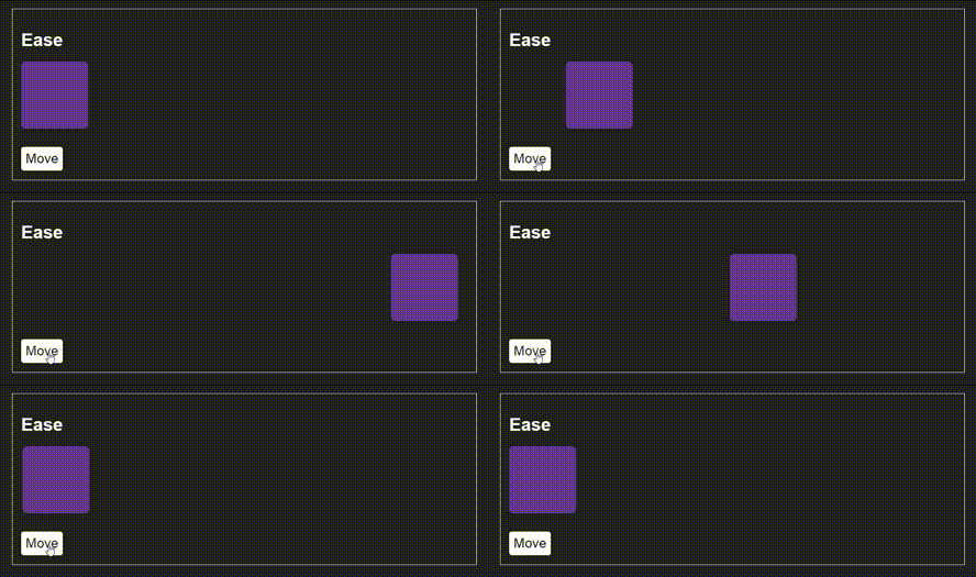
Linear: the rate of change remains constant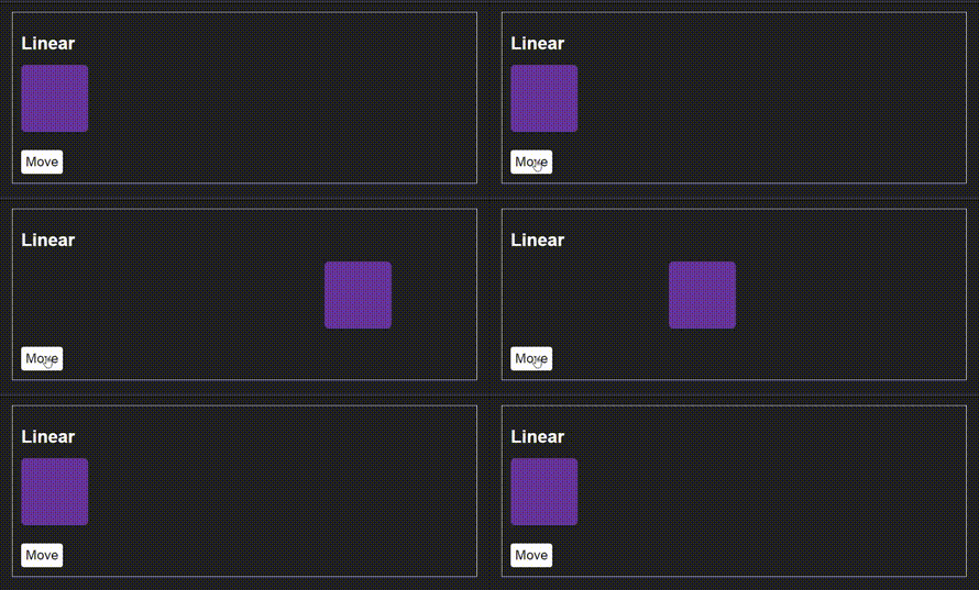
Ease-in: it starts slow, then picks up speed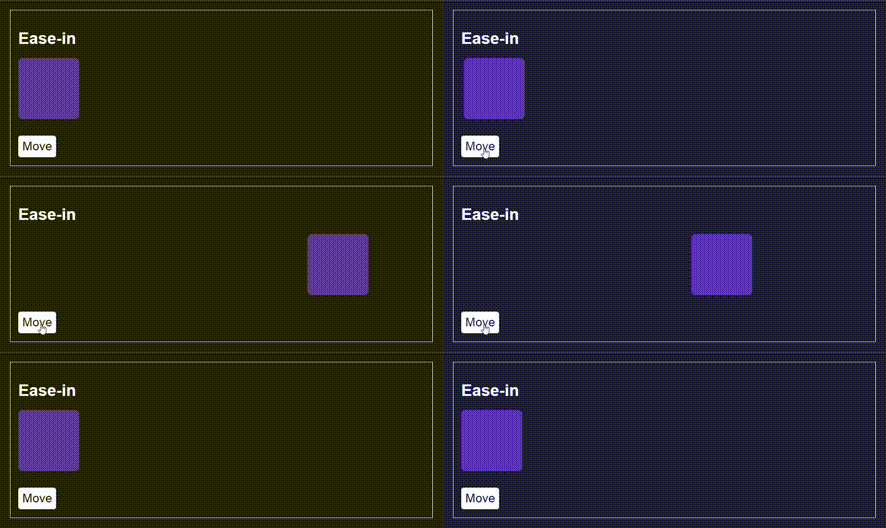
Ease-out: it starts fast, then slows down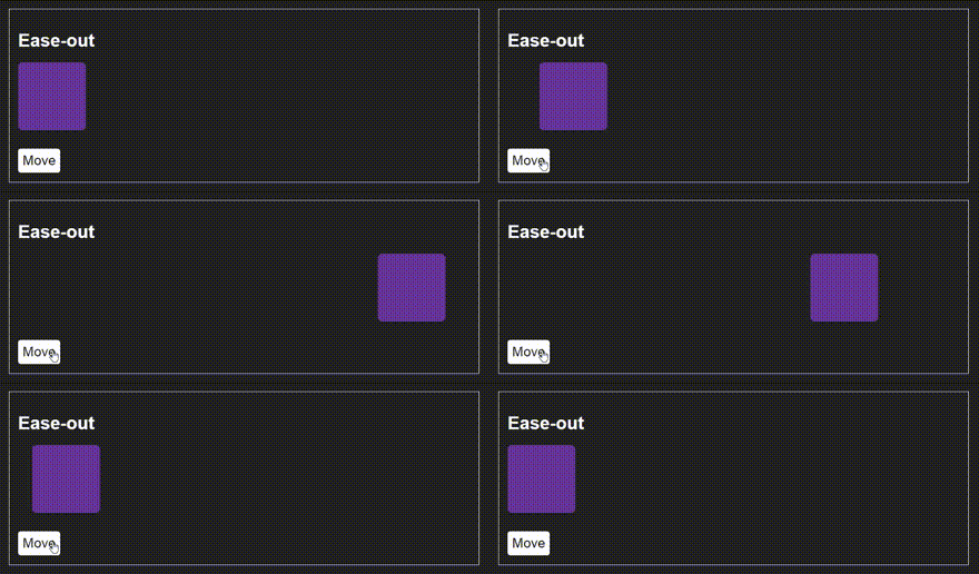
Ease-in-out: it starts slow, it’s faster in the middle, and slows down towards the end. It’s similar to ease, but not as slow at the end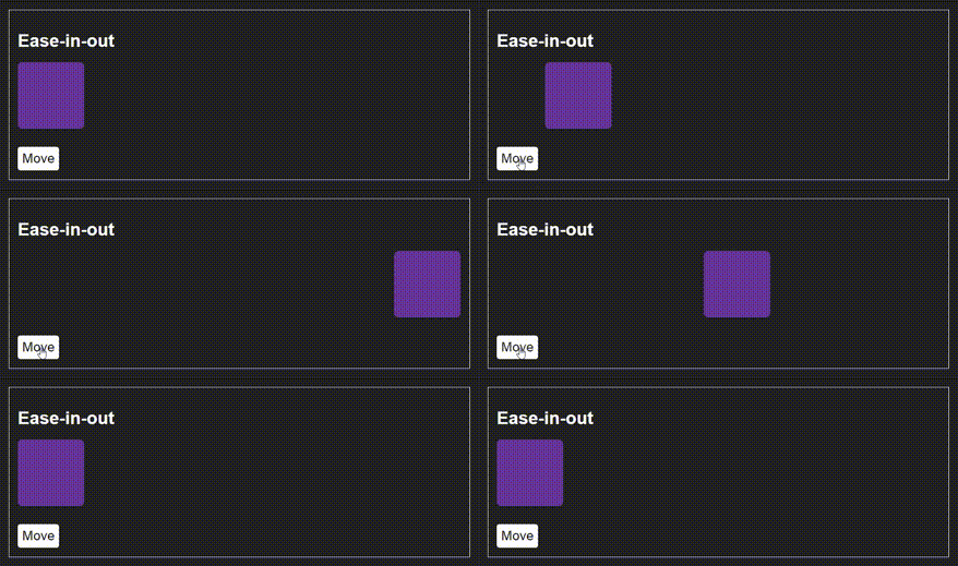
Alternatively, you can create your custom easing function through cubic-bezier(p1, p2, p3, p4), where the values of the points p1 and p3 must be in the range of 0 to 1, e.g., transition-timing-function: cubic-bezier(.29, 1.01, 1, -0.68); . You can use a tool like cubic-bezier.com to help you visualize what different values look like to get the effect you are after.
transition-delay propertyThe transition-delay property expresses the time you want to wait before starting the duration. You can express this value either in seconds or in milliseconds, just like the duration property.
In this tutorial, you’ll be using the shorthand property. Remember that the duration is the only required value, all other properties have defaults. The transition-property defaults to all, the transition-timing-function to ease, and the transition-delay to 0s . If you add two values for both duration and delay, the browser interprets the first one as transition-duration and the second one as transition-delay, so the order in which you add these values is super important.
Now it’s time to see some CSS transitions in action. Let’s get into coding mode! The goal will be to morph the icon on a toggle button from its hamburger shape into an X shape.
Here’s what the result will look like:
 Here is a codepen with the example:
See the Pen
Hamburger menu hover by Rob (@robjoeol)
on CodePen.
The HTML includes a simple button and a span element. The icon is made of the span, together with two pseudo-elements before and after the span, which appropriately styled look like a hamburger icon. Here’s the relevant HTML code:
<button class="hamburger__toggle">
  <span class="hamburger__icon"></span>
</button>
Now the CSS. Here are the default styles to render the hamburger icon (just the relevant rules):
/* give the span element and related pseudo-elements the appearance of white lines */
.hamburger__icon,
.hamburger__icon::before,
.hamburger__icon::after {
  position: absolute;
  width: 30px;
  height: 2px;
  border-radius: 4px;
  background-color: white;
}

/* center the span element in the middle of its containing button */
.hamburger__icon {
  top: calc(50% - 2px);
  left: calc(50% - 15px);
}

/* position the two pseudo-elements to the very left*/
.hamburger__icon::before,
.hamburger__icon::after {
  content: "";
  left: 0;
}
/* this is the top dash of the hamburger */
.hamburger__icon::before {
  bottom: 8px;
}
/* this is the bottom dash of the hamburger */
.hamburger__icon::after {
  top: 8px;
}
The snippet above creates the three lines typical of the hamburger icon appearance.
Next, it’s time for the hover styles. When users hover over the button, the span and the pseudo-elements will be rotated (using the CSS transform rotate() function) and their background color, position, height, and width will change to take up the shape of a typical close icon.
Here’s the code:
/* HOVER STYLES ON THE BUTTON */

/* rotate middle dash of hamburger */
.hamburger__toggle:hover .hamburger__icon {
  height: 5px;
  width: 54px;
  left: 5px;
  top: calc(50% - 2px);
  transform: rotate(-45deg);
  background-color: red;
}

/* rotate bottom dash of hamburger counter clockwise */
.hamburger__toggle:hover .hamburger__icon::after {
  width: 54px;
  height: 5px;
  top: -1px;
  transform: rotate(-270deg);
  background-color: red;
}

/* hide the top dash by scaling it to 0 */
.hamburger__toggle:hover .hamburger__icon::before {
  transform: scale(0);
}
If you hover on the button now, you’ll see the hamburger icon immediately morph into a close icon. Adding CSS transitions will achieve the gradual morphing effect we’re after.
We apply transitions to the elements that change state, this is the span and the following pseudo-element.
/* TRANSITION */

.hamburger__icon, .hamburger__icon::after {
  transition: all 0.3s linear;
}
In a single line of code, you’ve told the browser to apply a transition to all the animatable properties on the element over a period of 0.3 seconds without any variation in the rate of change (using the linear timing function). If you want to see what is happening more clearly, change the duration to 2s to see a more gradual transition.
Instead of using the keyword all, you could list each CSS property name. For example:
.hamburger__toggle:hover .hamburger__icon {
    transition: height 0.3s linear,
              width 0.3s linear,
              left 0.3s linear,
              top 0.3s linear,
              transform 0.3s linear,
              background-color 0.3s linear;
}
Spelling out each single property is only necessary if there are variations in the properties, such as different durations or timing functions. But you may want to list the individual properties like this for a transition to avoid animating some of the properties in a declaration block. However, generally doing them one-by-one like this can be verbose, repetitive, and error-prone. Take it on a case-by-case basis.
When transitioning elements, you’re not limited to hover events. You can tie your transitions to a CSS class and use JavaScript to trigger the animation by toggling the class.
Here’s the same morphing effect as above, but executed on a button click.
The first step is to replace all instances of hover styles you wrote earlier with a class name of your choice. I called my class toggled. Here’s the relevant snippet:
/* rotate middle dash of hamburger */
.toggled .hamburger__icon {
  height: 5px;
  width: 54px;
  left: 5px;
  top: calc(50% - 2px);
  transform: rotate(-45deg);
  background-color: red;
}

/* rotate bottom dash of hamburger counter clockwise */
.toggled .hamburger__icon::after {
  width: 54px;
  height: 5px;
  top: -1px;
  transform: rotate(-270deg);
  background-color: red;
}

/* hide the top dash by scaling it to 0 */
.toggled .hamburger__icon::before {
  transform: scale(0);
}
With the code above, each time the toggled class is added to the button, the icon morphs into a close icon. By the same token, when the toggled class is removed, the icon morphs back into a hamburger icon.
The JavaScript code has the single task of toggling the .toggled class on button click:
const button = document.querySelector(".hamburger__toggle");
button.addEventListener( "click", () => button.classList.toggle("toggled") );
And that’s all you need. Here’s the complete example:
See the Pen
Hamburger menu click by Rob (@robjoeol)
on CodePen.
The previous example applied a transition to static DOM elements, which are defined in the HTML source. However, if you want to create an element with JavaScript, you are in a different territory. If you create a new element, give it a class that has a transition property declared in CSS, and then append it to the DOM. There is no transition!
How come? Well, the browser executes all of our JavaScript code in one go. Only when the JavaScript function is completed (technically the “call stack” is empty), the browser begins to recalculate the style of our DOM elements.
Let’s look at an example to demonstrate. Let’s say that when you click a button on the page, a newly created box slides in from the top.
See the Pen
Dynamic element (transition not applied) by Rob (@robjoeol)
on CodePen.
We have the following CSS which positioned a “box” outside of the window, and offers a “slide-in” class to bring position in view at the top of the page:
.box{
  position:absolute;
  top:0;
  left:0;
  background-color: yellow;
  width:100%;
  transform: translateY(-100%);
}

.slide-in{
  transform: translateY(0);
  transition: transform .5s;
}
What is different this time is that, instead of having the box already present in your HTML document, you create it on the fly with JavaScript. The JavaScript code looks something like this:
const button = document.querySelector(".showButton");

button.addEventListener('click', () => {
  // create the box element with a class of .box
  const box = document.createElement("div");
  box.textContent = 'Hello! I am box!';
  box.classList.add("box");
  box.classList.add("slide-in");

  // append the new element box to the DOM
  document.querySelector("body").appendChild(box);

});
How do we resolve this?
Now, there is an elegant solution through the Web Animations API (WAAPI). This API allows developers to use a similar syntax to CSS animations and CSS transitions in JavaScript. It is also one of the most performant ways to animate on the web, letting the browser make its own internal optimizations without hacks, coercion, or needing to use Window.requestAnimationFrame() (the go-to of the past).
We can turn out the slide-in class to a keyframes object and use the Element.animate() to execute it. Because we have a simple transition on transform, we just create a keyframe object with a transform property and value similar to the CSS. e.g., { transform: ‘translateY(0)’}.
The animate() method has the following syntax animate(keyframes, options). The parameters are:
0. We set this to 500none. We set this to “forward” so that the effect is permanentnormal, which is fine1. This is fine for usSo, the code for the animation (transition) is as follows:
  box.animate(
  { transform: 'translateY(0)'},
  {
    duration: 500,
    fill: 'forwards'
  });
Short and sweet!
Check out the example:
See the Pen
Dynamic element (transition applied) by Rob (@robjoeol)
on CodePen.
To dive deeper into CSS transitions, I’ve listed a few useful articles you can check out:
transition-timing-functionIn this introduction to CSS transitions, I’ve discussed when it’s appropriate to use transitions over CSS keyframe animations and how you can use transitions to morph a hamburger icon on a toggle button, both on hover and on click using JavaScript. And finally, I’ve shown you how you can perform animations on dynamic elements with Web Animations API in JavaScript. There is nothing stopping you now from creating cool transitions.
As web frontends get increasingly complex, resource-greedy features demand more and more from the browser. If you’re interested in monitoring and tracking client-side CPU usage, memory usage, and more for all of your users in production, try LogRocket. https://logrocket.com/signup/
LogRocket is like a DVR for web apps, recording everything that happens in your web app or site. Instead of guessing why problems happen, you can aggregate and report on key frontend performance metrics, replay user sessions along with application state, log network requests, and automatically surface all errors.
Modernize how you debug web apps — Start monitoring for free.

A step-by-step guide to building your first MCP server using Node.js, covering core concepts, tool design, and upgrading from file storage to MySQL.

Using security headers in your Next.js apps is a highly effective way to secure websites from common security threats.

A deep dive into May 2026’s AI model and tool rankings. We break down performance, usability, pricing, and real-world capabilities across 50+ features to help you pick the right tools for your development workflow.

A practical guide to Agent Browser CLI. Learn how AI agents navigate, snapshot, and interact with web pages using stable references, enabling efficient automation and exploratory testing.
Hey there, want to help make our blog better?
Join LogRocket’s Content Advisory Board. You’ll help inform the type of content we create and get access to exclusive meetups, social accreditation, and swag.
Sign up now