if() function: Conditional styling will never be the same
CSS has long been criticized for its lack of conditional logic. While we’ve developed clever workarounds using media queries, custom property toggles, and container queries, these solutions often feel verbose and indirect. The CSS Working Group has approved the if() function for development, a feature that promises to bring true conditional styling directly to our stylesheets.

In the past, when we needed conditional styles, we relied on approaches like:
calc() and clamp()The if() function replaces these patterns by providing a better declarative way to apply different values based on specific conditions. Instead of writing separate rule blocks or complex calculations, we can express conditional logic inline within our property declarations:
| Attribute | Traditional CSS (@media blocks) |
if() Function |
|---|---|---|
| Syntax | @media (condition) { .selector { property: value; } } |
property: if(condition: value; else: fallback); |
| Code Organization | Fragmented – Logic scattered across multiple @media blocks |
Centralized – All conditional logic in one place |
| Maintainability | Changes require updating multiple rule blocks | Single point of change per property |
| Learning Curve | Familiar pattern for developers | New syntax requires learning conditional patterns |
| Browser Support | Universal – Supported in modern browsers | Chrome, Edge, Opera, WebView Android (where CSS if() function is supported) |
Let’s explore how this function works and when you might choose it over existing CSS conditional techniques.
if() syntaxThe if() function follows a structure that might feel familiar if you’ve worked with conditional statements in programming languages, but it’s designed specifically for CSS’s declarative nature. Let’s break down how it works step by step.
if()The fundamental syntax follows this pattern:
property: if(condition-1: value-1; condition-2: value-2; else: fallback);
Notice several important details here. The function starts with if followed immediately by an opening parenthesis with no space between them. Each condition-value pair is separated by a semicolon, not a comma, which distinguishes it from other CSS functions. The else clause acts as your fallback value when none of the conditions match.
Here’s a simple example to illustrate the basic concept:
/* Apply different button sizes based on input method */
button {
  width: if(media(any-pointer: fine): 30px; else: 44px);
}
This rule says, “If the device has a fine pointer (like a mouse), make the button 30px wide; otherwise, make it 44px wide for touch interfaces.”
The if() function supports three types of queries, each serving different conditional scenarios. Think of these as different “question types” you can ask about the current styling context.
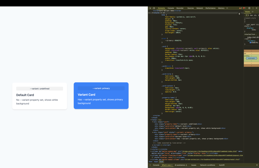
style() queriesThese check for custom property values or computed styles on the current element:
.card {
  background: if(style(--variant): var(--primary); else: white);
}
This checks if the element has a --variant custom property set to any value. If it does, use the primary color; otherwise, use white:
media() queriesThese work like traditional media queries, but inline:
.sidebar {
  width: if(media(min-width: 768px): 300px; else: 100%);
}
This replaces what would traditionally require a separate media query block.
supports() queriesThese test for CSS feature support:
.grid-container {
  display: if(supports(display: grid): grid; else: flex);
}
This provides a fallback for browsers that don’t support CSS Grid.
if() functionThe if() function has specific syntax requirements that differ from other CSS functions. First, there’s no space between if and the opening parenthesis. This is different from functions like calc() where spaces are more flexible:
/* Correct */
width: if(media(min-width: 768px): 300px; else: 100px);

/* Incorrect */
width: if (media(min-width: 768px): 300px; else: 100px);
Second, semicolons separate each condition-value pair, not commas:
/* Correct */
color: if(
  style(--theme: dark): white;
  style(--theme: light): black;
  else: gray
);

/* Incorrect */
color: if(
  style(--theme: dark): white,
  style(--theme: light): black,
  else: gray
);
These syntax rules exist because the if() function needs to parse multiple condition-value pairs within a single function call. The semicolon delimiter helps the CSS parser distinguish between the end of one condition and the beginning of another, especially when dealing with complex values that might contain commas themselves.
if() vs. current CSS approachesTo truly understand the if() function, we need to examine how it compares to previously existing conditional styling techniques. Think of this as comparing different tools in your CSS toolkit; each has its place, but some are simply more efficient for specific tasks.
if() vs. media queriesMedia queries have been our primary tool for responsive design, but they require us to separate our conditional logic from the properties they affect. This separation can make it harder to see the complete picture of how a component behaves across different conditions.
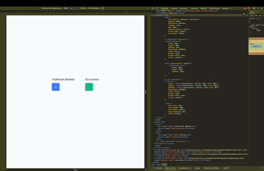
Consider this traditional approach for creating touch-friendly buttons:
/* Traditional media query approach */
button {
  width: 30px;
  height: 30px;
  padding: 8px;
}

@media (any-pointer: coarse) {
  button {
    width: 44px;
    height: 44px;
    padding: 12px;
  }
}
This works, but notice how the button’s responsive behavior is split across two separate rule blocks. If you want to understand how this button adapts to different input methods, you need to mentally combine these rules.
Here’s the same logic using the if() function:
/* if() approach - all logic in one place */
button {
  width: if(media(any-pointer: coarse): 44px; else: 30px);
  height: if(media(any-pointer: coarse): 44px; else: 30px);
  padding: if(media(any-pointer: coarse): 12px; else: 8px);
}
The if() approach keeps all the responsive logic inline with each property. This makes it immediately clear how each property responds to different conditions. You can see at a glance that this button grows larger on touch devices across all its dimensions:
However, this isn’t always better than media queries. When you have many properties that need to change together, a media query block can be more readable and efficient. The key is understanding when each approach serves your code better.
if() vs. container style queriesContainer-style queries let us apply styles based on the computed styles of a parent container. This is powerful for component-based design, but it operates differently from the if() function in terms of where the logic lives.
Consider a card component that changes appearance based on its container’s theme:
/* Container style query approach */
.theme-container {
  --theme: dark;
}

@container style(--theme: dark) {
  .card {
    background: #333;
    color: white;
  }
}

@container style(--theme: light) {
  .card {
    background: white;
    color: black;
  }
}
This approach requires the logic to be defined at the container level, and the styles are applied through cascade and inheritance. The container “broadcasts” its theme state to its descendants.
With the if() function, the logic moves directly to the element itself:
/* if() approach - self-contained logic */
.card {
  background: if(
    style(--theme: dark): #333;
    style(--theme: light): white;
    else: #f5f5f5
  );
  color: if(
    style(--theme: dark): white;
    style(--theme: light): black;
    else: #666
  );
}
This approach makes the card’s theming behavior self-contained. The card doesn’t need to know about its container’s query logic; it just checks for the presence of theme-related custom properties on itself:
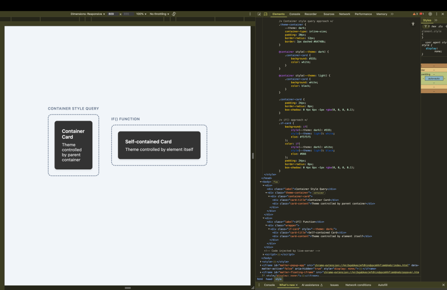
The difference is subtle but important. Container queries work well when you want to establish context for multiple child elements. The if() function works well when you want each element to be responsible for its own conditional behavior.
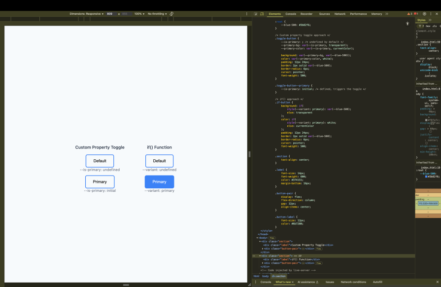
if() vs. custom property togglesCustom property toggles represent some of the most creative problem-solving in modern CSS. They use the fact that custom properties can be undefined to create boolean-like behavior through calc() and other functions.
Here’s a typical custom property toggle pattern:
/* Custom property toggle approach */
.button {
  --is-primary: ; /* undefined by default */
  --primary-bg: var(--is-primary, transparent);
  --primary-color: var(--is-primary, currentColor);

  background: var(--primary-bg, var(--blue-500));
  color: var(--primary-color, white);
}

.button--primary {
  --is-primary: initial; /* defined, triggers the toggle */
}
This technique works by exploiting CSS’s fallback behavior. When --is-primary is undefined, the fallback values are used. When it’s defined (even as initial), the primary values apply.
While clever, this approach has several drawbacks. The logic is indirect and can be hard to follow, especially for developers unfamiliar with the technique. It also doesn’t read naturally because you have to understand the “toggle” concept to grasp what’s happening.
The if() function makes this same logic explicit and readable:
/* if() approach - clear conditional logic */
.button {
  background: if(
    style(--variant: primary): var(--blue-500);
    else: transparent
  );
  color: if(
    style(--variant: primary): white;
    else: currentColor
  );
}
This version clearly states its intent: “if the variant is primary, use these colors; otherwise, use these defaults.”, making the conditional logic explicit and self-documenting:
Understanding these comparisons helps you choose the right tool for each situation. Sometimes you’ll want the cascade behavior of container queries, sometimes the broad scope of media queries, and sometimes the explicit logic of the if()function. The key is recognizing which approach best serves your specific use case and maintenance goals.
Now that we understand the syntax and advantages of the if() function, let’s see how it works in practice.
Design systems often need to support multiple themes while maintaining consistency across components. The traditional approach requires either duplicate CSS rules or complex custom property cascades. The if() function transforms this challenge into an elegant solution that keeps theme logic centralized yet flexible.
Consider a design system that supports three themes: ocean, forest, and default. Instead of creating separate CSS files or complex variable mappings, we can define our theme colors conditionally:
/* Components with theme-aware styling using if() */
.card {
  background: if(
    style(--theme: ocean): #f0f8ff;
    style(--theme: forest): #f5fffa;
    else: #ffffff
  );
  border: 2px solid if(
    style(--theme: ocean): #0077be;
    style(--theme: forest): #228b22;
    else: #333333
  );
  color: if(
    style(--theme: ocean): #0077be;
    style(--theme: forest): #228b22;
    else: #333333
  );
}

.button {
  background: if(
    style(--theme: ocean): #0077be;
    style(--theme: forest): #228b22;
    else: #333333
  );
  color: if(
    style(--theme: ocean): #f0f8ff;
    style(--theme: forest): #f5fffa;
    else: #ffffff
  );
  border: none;
  padding: 12px 24px;
  border-radius: 6px;
}
To activate a theme, you simply set the custom property on any container:
.ocean-theme { --theme: ocean; }
.forest-theme { --theme: forest; }
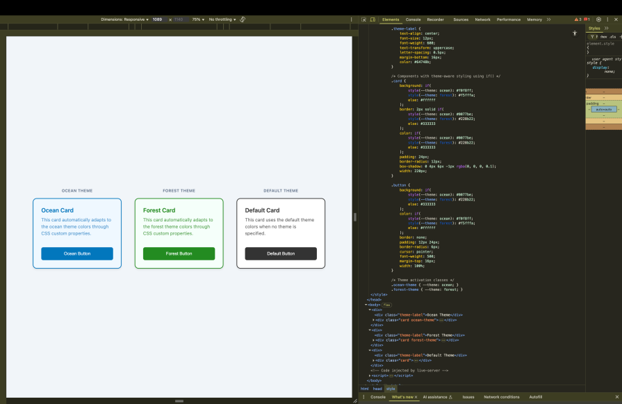
This approach creates a powerful cascade effect. When you set --theme: ocean on a container, all descendant elements automatically receive ocean-themed colors through the CSS custom property system. The if() function evaluates once per element, checking for the theme property and applying the appropriate color values.
The beauty of this pattern lies in its composability. You can override specific theme aspects at any level by setting different custom properties, and the if() function will respond accordingly.
While media queries excel at layout changes based on viewport size, the if() function shines when creating components that adapt to different interaction contexts. This goes beyond traditional responsive design to create truly adaptive interfaces.
Let’s build a navigation component that adapts not just to screen size, but also to the user’s input method and device capabilities:
/* Adaptive navigation that responds to multiple contexts */
.nav-item {
  /* Base dimensions adapt to interaction method */
  min-height: if(
    media(any-pointer: coarse): 44px;    /* Touch-friendly minimum */
    media(any-pointer: fine): 32px;      /* Mouse-optimized */
    else: 36px                           /* Safe fallback */
  );

  /* Padding scales with available space and input method */
  padding: if(
    media(any-pointer: coarse) and media(min-width: 768px): 16px 24px;
    media(any-pointer: coarse): 12px 16px;
    media(min-width: 768px): 8px 16px;
    else: 6px 12px
  );

  /* Font size considers both screen space and readability needs */
  font-size: if(
    media(min-width: 1024px): 16px;
    media(min-width: 768px): 15px;
    media(any-pointer: coarse): 16px;    /* Larger for touch readability */
    else: 14px
  );
}

/* Hover states that respect user preferences */
.nav-item:hover {
  background: if(
    media(hover: hover): var(--primary-light);  /* Only on hover-capable devices */
    else: transparent
  );
}
This navigation component demonstrates progressive enhancement through conditional styling. It considers the user’s input method (touch vs. mouse), available screen space, and device capabilities to provide the most appropriate experience:
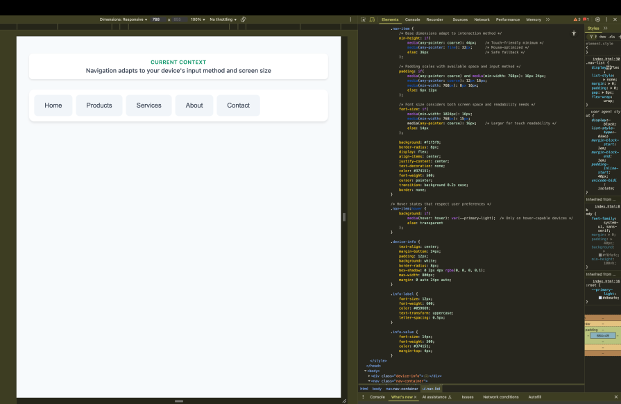
Notice how the conditions build upon each other. The component first checks for touch input and adjusts sizing accordingly, then refines those decisions based on available screen space. This creates a nuanced responsive system that goes beyond simple breakpoints to consider the actual user context.
Modern applications often need to communicate state changes through visual styling. The if() function excels at creating these state-driven interfaces by checking for data attributes or custom properties that represent application state.
Let’s create a form input component that provides rich visual feedback based on validation state:
/* State-aware form input with comprehensive visual feedback */
.form-input {
  /* Base styling remains consistent */
  padding: 12px 16px;
  border-radius: 6px;
  font-size: 16px;
  transition: all 0.2s ease;

  /* Border color reflects validation state */
  border: 2px solid if(
    style(--state: error): #dc3545;
    style(--state: success): #28a745;
    style(--state: warning): #ffc107;
    style(--state: focus): #007bff;
    else: #dee2e6
  );

  /* Background color provides subtle state indication */
  background: if(
    style(--state: error): #fff5f5;
    style(--state: success): #f0fff4;
    style(--state: warning): #fffbf0;
    else: #ffffff
  );

  /* Icon color coordinates with state */
  --icon-color: if(
    style(--state: error): #dc3545;
    style(--state: success): #28a745;
    style(--state: warning): #ffc107;
    else: #6c757d
  );
}

/* State-specific icons that appear conditionally */
.form-input::after {
  content: if(
    style(--state: error): "❌";
    style(--state: success): "✅";
    style(--state: warning): "⚠️";
    else: ""
  );
  color: var(--icon-color);
  margin-left: 8px;
}

/* Loading state with animated styling */
.form-input {
  /* Animated border for loading state */
  border-style: if(
    style(--state: loading): dashed;
    else: solid
  );

  /* Opacity reduction during loading */
  opacity: if(
    style(--state: loading): 0.7;
    else: 1
  );
}
To control these states, you would set the custom property through JavaScript:
// JavaScript state management
const input = document.querySelector('.form-input');

// Set error state
input.style.setProperty('--state', 'error');

// Set success state
input.style.setProperty('--state', 'success');

// Clear state
input.style.removeProperty('--state');
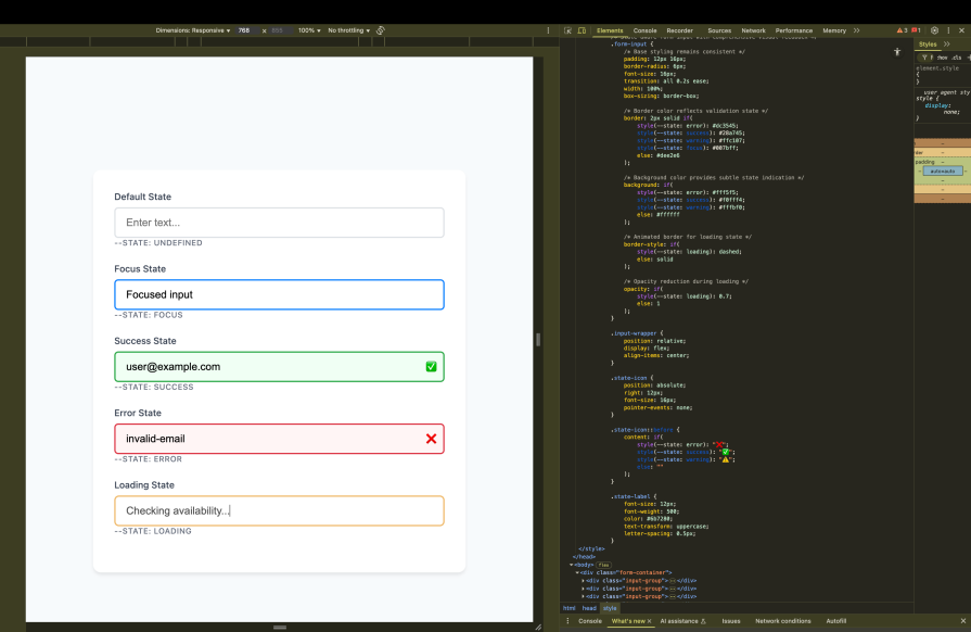
This pattern creates a clear separation between state logic (managed by JavaScript) and visual presentation (handled by CSS). The if() function serves as the bridge between these concerns, translating state values into appropriate visual styles.
Now that we’ve seen the foundational patterns, let’s explore how the if() function truly shines when we push its capabilities further. We’re going to combine concepts and create more sophisticated conditional logic that would be nearly impossible with traditional CSS approaches.
if() functionsThe real capabilities of the if() function emerge when we nest conditions within other conditions. This creates decision trees that can handle multiple layers of logic, much like you might write in a programming language, but with CSS’s declarative syntax.
Let’s extend our form input component from the previous section to handle more complex scenarios. Imagine we need inputs that adapt not only to validation states but also to user preferences and device capabilities simultaneously:
/* Advanced nested if() for comprehensive input adaptation */
.form-input {
  /* Complex sizing logic that considers multiple factors */
  font-size: if(
    /* First, check if user prefers large text */
    media(prefers-reduced-motion: no-preference) and style(--size: large): if(
      /* Within large preference, consider device type */
      media(any-pointer: coarse): 20px;    /* Large touch-friendly */
      else: 18px                           /* Large but not touch */
    );

    /* If not large preference, check for accessibility needs */
    media(prefers-reduced-motion: reduce): if(
      /* Reduced motion users might need different sizing */
      media(any-pointer: coarse): 18px;    /* Conservative touch size */
      else: 16px                           /* Standard desktop */
    );

    /* Default case handles standard preferences */
    else: if(
      media(any-pointer: coarse): 17px;    /* Standard touch size */
      else: 15px                           /* Standard desktop */
    )
  );

  /* Padding that adapts to both state and context */
  padding: if(
    /* Error state needs extra space for visual emphasis */
    style(--state: error): if(
      media(any-pointer: coarse): 16px 20px;  /* More space for touch */
      else: 12px 16px                         /* Standard desktop spacing */
    );

    /* Success state can be more compact */
    style(--state: success): if(
      media(any-pointer: coarse): 14px 18px;
      else: 10px 14px
    );

    /* Default state uses baseline spacing */
    else: if(
      media(any-pointer: coarse): 12px 16px;
      else: 8px 12px
    )
  );
}
The nested structure creates a hierarchy of decisions. The outer if() function handles the primary condition (user preference or state), while the inner if() functions handle secondary conditions (device capabilities).
This creates a decision tree that can handle complex scenarios while remaining readable:
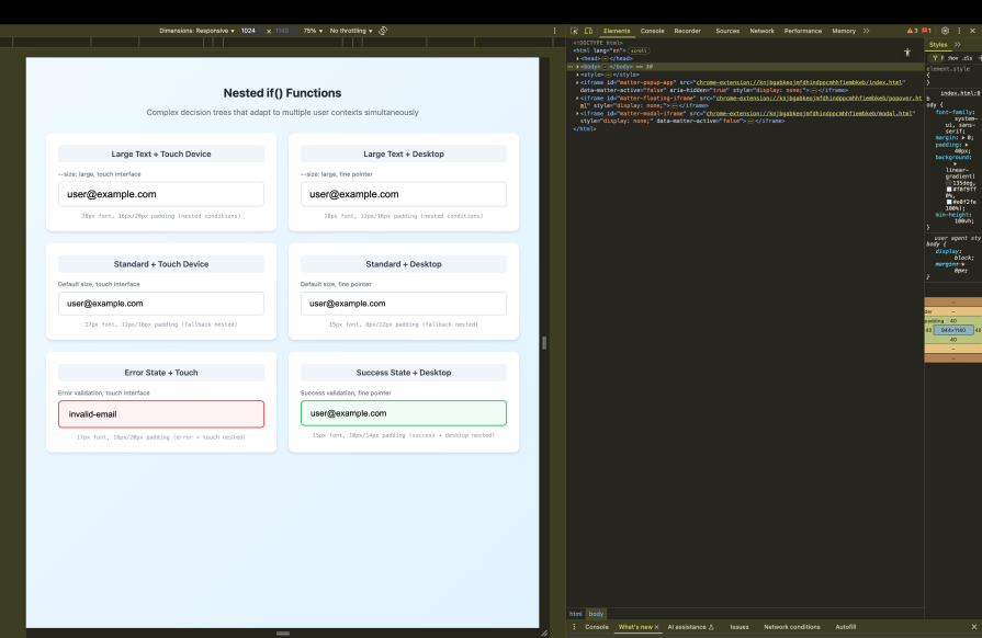
The key insight here is that nested if() functions let you create conditional logic that mirrors real-world decision-making. Just as you might think, “if the user prefers large text, then consider whether they’re on a touch device,” the CSS can express the same logical structure.
calc()Another powerful combination in advanced CSS is pairing the if() function with calc() for dynamic calculations. This becomes especially potent when working with CSS custom properties that are registered with @property, which allows them to participate in calculations and animations.
Let’s extend our navigation component to include dynamic spacing calculations based on available screen real estate and content density:
/* Register custom properties for calculation participation */
@property --nav-items {
  syntax: '<number>';
  initial-value: 4;
  inherits: true;
}

@property --available-width {
  syntax: '<length>';
  initial-value: 100vw;
  inherits: false;
}

/* Advanced navigation with calculated spacing */
.nav-container {
  /* Calculate optimal spacing based on content and screen size */
  --spacing-multiplier: if(
    media(min-width: 1200px): 1.5;        /* Generous spacing on large screens */
    media(min-width: 768px): 1.2;         /* Moderate spacing on medium screens */
    media(any-pointer: coarse): 1.3;      /* Extra touch-friendly spacing */
    else: 1.0                             /* Compact spacing fallback */
  );

  /* Dynamic gap calculation that responds to conditions */
  gap: calc(
    /* Base spacing unit */
    16px *
    /* Conditional multiplier */
    var(--spacing-multiplier) *
    /* Responsive factor based on available space */
    if(
      media(min-width: 1200px): 1;
      media(min-width: 768px): 0.8;
      else: 0.6
    )
  );
}

.nav-item {
  /* Calculate flexible width based on number of items and conditions */
  flex-basis: calc(
    /* Available width divided by number of items */
    (var(--available-width) / var(--nav-items)) *
    /* Adjustment factor based on screen size and interaction method */
    if(
      media(min-width: 1200px) and media(any-pointer: fine): 0.9;  /* Smaller on large desktop */
      media(min-width: 768px): 0.95;                               /* Slightly smaller on tablets */
      media(any-pointer: coarse): 1.0;                             /* Full width on touch */
      else: 0.85                                                   /* Compact on small screens */
    )
  );
}
This pattern demonstrates how conditional logic can drive mathematical calculations. The if() function provides the conditional values, while calc() performs the dynamic calculations. Together, they create layouts that automatically optimize themselves based on context:
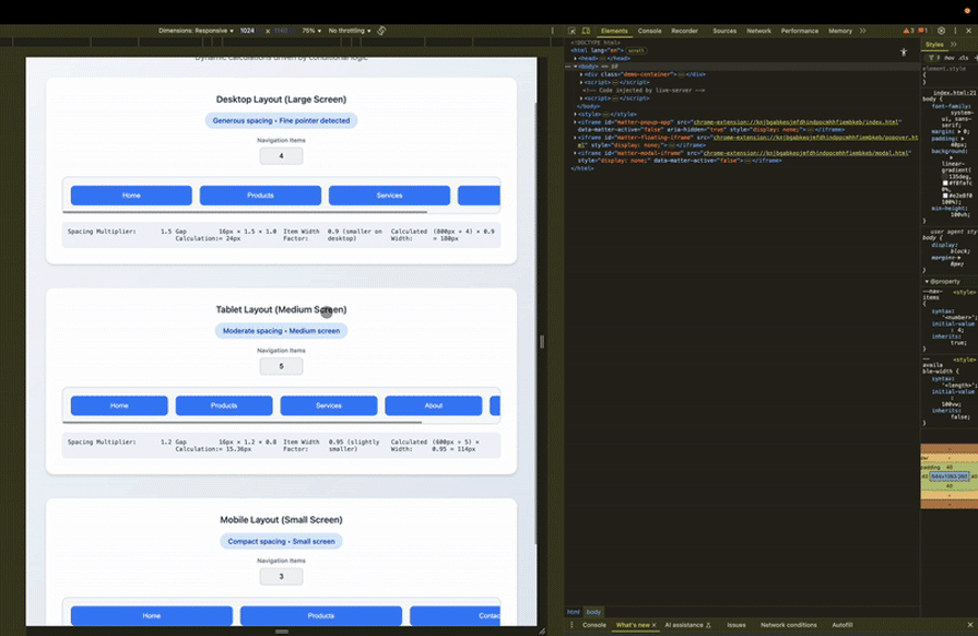
The power of this approach becomes clear when you realize that changing the --nav-items custom property instantly recalculates all the spacing and sizing across all breakpoints and interaction contexts. This creates truly adaptive layouts that respond to both content changes and environmental factors.
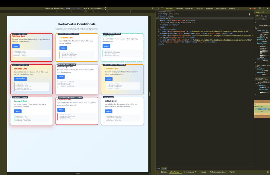
Perhaps the most elegant advanced technique is using if() functions within shorthand properties to conditionally modify specific aspects of complex values. This allows for surgical precision in your styling, where you can conditionally change just the parts that need to adapt while keeping everything else consistent.
Let’s enhance our card component from the theming section to demonstrate this technique:
/* Advanced card with conditional shorthand modifications */
.card {
  /* Border with conditional width and style, consistent color */
  border: if(
    style(--emphasis: high): 4px solid #dc2626;    /* Thick RED border for emphasis */
    style(--emphasis: medium): 3px solid #f59e0b;  /* Medium ORANGE border */
    style(--emphasis: low): 2px dashed #10b981;    /* Dashed GREEN border */
    else: 1px solid #6b7280                        /* Standard GRAY border */
  );

  /* Box shadow with conditional blur and spread */
  box-shadow:
    0
    if(style(--elevation: high): 12px; else: 4px)    /* Conditional offset */
    if(style(--elevation: high): 32px; else: 12px)   /* Conditional blur */
    if(style(--elevation: high): 8px; else: 2px)     /* Conditional spread */
    if(style(--elevation: high): rgba(220, 38, 38, 0.3); else: rgba(0, 0, 0, 0.1));

  /* Padding with conditional horizontal and vertical values */
  padding:
    if(style(--content: dense): 8px; else: 24px)     /* Conditional vertical */
    if(style(--content: dense): 12px; else: 32px);   /* Conditional horizontal */

  /* Background with conditional gradient direction */
  background: linear-gradient(
    if(style(--direction: vertical): to bottom; else: to right),
    if(style(--gradient: subtle): #fef3c7; else: #ffffff),
    if(style(--gradient: subtle): #dbeafe; else: #ffffff)
  );
}

/* Button within card that inherits and extends conditional logic */
.card .button {
  /* Transform that considers both card and button state */
  transform:
    scale(if(style(--state: active): 1.05; else: 1.0))
    translateY(if(
      style(--elevation: high): -2px;     /* Lift more on high elevation cards */
      style(--state: active): -1px;      /* Slight lift on active state */
      else: 0px
    ));
}
This technique shows how if() functions can be embedded within complex property values to create highly nuanced conditional styling. Each aspect of the shorthand property can respond independently to different conditions, creating sophisticated adaptive behaviors:
These advanced techniques transform the if() function from a simple conditional statement into a powerful tool for creating intelligent, adaptive interfaces. The key is understanding that you’re not just applying different styles, but rather creating a system that can reason about context and respond appropriately to changing conditions.
The CSS if() function represents a next-level approach in how we do conditional styling, moving from workarounds and separate rule blocks to inline, explicit logic.
Choose if() when you need property-level conditional behavior, say for theming systems, component states, or responsive properties that benefit from keeping their logic inline. Stick with media queries for comprehensive layout changes and container queries when you need to coordinate multiple child elements.
The real application of the if() function lies in creating more intelligent, self-contained components that can adapt to context without external coordination. Our examples of nested conditions, integration with calc(), and partial value conditionals demonstrate how CSS can evolve from static styling to dynamic, context-aware systems that respond thoughtfully to user needs, device capabilities, and application state.
Would you be interested in joining LogRocket's developer community?
Join LogRocket’s Content Advisory Board. You’ll help inform the type of content we create and get access to exclusive meetups, social accreditation, and swag.
Sign up now
Follow this step-by-step guide to building a full-stack recipe application with TanStack Start, the new full-stack React framework.

Query strings are often overlooked as a way to manage app state, but they can make your React apps more shareable, persistent, and simple. This guide walks through the tools, trade-offs, and best practices for using query strings effectively.

Explore the key features of TypeScript 5.9, including the redesigned tsc –init command, the new import defer syntax, expandable hovers, and significant performance improvements.

Better Auth is an open-source, TypeScript-first auth library with adapters, schema generation, and a plugin system. Here’s how it works and how it stacks up to Clerk, NextAuth, and Auth0.

 Learn more →
