
Editor’s note: This article was last updated on 24 August 2023 to include CSS shape functions like shape-outside, shape-image-threshold, shape-margin, and more.
In the past, websites used to look very structured and grid-like because developers mostly focused on how things were organized and how they worked, leaving the design part for designers. But modern web development is about being creative and grabbing users’ attention. As web developers, we have the power to influence not only how websites function, but also how they look. One important tool for this is CSS shapes, which allows developers to combine design and function.
In this article, we’ll look at creative ways to design text using CSS shapes. The methods we discuss will help developers break away from traditional layouts to create engaging and unique designs that capture users’ attention.
Jump ahead:
shape-outsidecontent-boxclip-path propertyshape-image-threshold propertyshape-marginshape-inside propertyshape-padding propertyborder-radiuspath() functionThe Replay is a weekly newsletter for dev and engineering leaders.
Delivered once a week, it's your curated guide to the most important conversations around frontend dev, emerging AI tools, and the state of modern software.
In modern web design, CSS shapes are becoming quite significant. They not only make websites look good, they also make websites more user-friendly. With CSS shapes, developers can direct users where to look, highlight important information, and give websites a distinctive style.
CSS shapes can neatly wrap text around images, create clean dividers for text, and change how things look on various screen sizes. Developers can also graphically tell stories using these shapes:
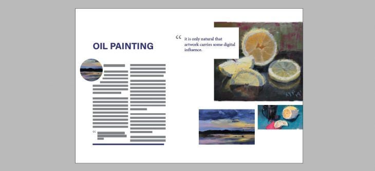
CSS shape functions are CSS properties that allow us to create shapes directly on our stylesheets. These shapes can be used to produce visually appealing layouts such that the contents of a web page can be wrapped around an image by taking its shape, or another shape altogether. Here are some CSS shapes that we will explore in this article:
shape-outsideshape-image-thresholdshape-marginclip-pathshape-insideborder-radiuspath()shape-paddingshape-outsideUsing the shape-outside property, it is fairly easily to create simple shapes like circles, ellipses, and rectangles. This property takes and defines the shape of a floated element, which is a shape other than a rectangle, and controls how content wraps around these floated elements.
The shape-outside property alters the default behavior of inline contents, which is to wrap around a margin. Instead, it allows inline contents to wrap around various complex objects. This property is what allows us to break away from the rectangular shape that we’re used to in text layouts:

Say I want my text to wrap around a circle, which would add some visual interest to a long text. The basic idea looks like this:

Check out this example on CodePen:
See the Pen
Circle with shape-outside by Abbey Fitzgerald (@abbeyjfitzgerald)
on CodePen.
In order for the shape-outside property to work, you need to include a float, and set a height and width. In the CodePen example above, a width and height of 200px has been set and there is a left float declared. The float determines which side of the shape has the wrapping, as there wouldn’t be wrapping around the entire shape.
Instead of a circle, maybe you’d like to use an ellipse as your shape. It’s a pretty quick fix to adjust the circle to make it into an ellipse — one dimension is elongated compared to the other. Depending on the ellipse, either the horizontal or vertical axis is larger. I’m a bit out of geometry practice, but rx is the radius value on the x-axis, and ry is the value on the y-axis.
You may see something like clip-path: ellipse(100px 200px at 50% 50%) if you want to use an ellipse. There are two sets of numbers here. We know the first set specifies the dimensions, but what is the second set of numbers? Those are the cx and cy, which are the coordinates of the ellipse’s center:

See how the coordinates can adjust the placement, going from ellipse(100px 200px at 20% 30%) to ellipse(100px 200px at 50% 50%):
See the Pen
Ellipse with shape-outside by Abbey Fitzgerald (@abbeyjfitzgerald)
on CodePen.
shape-outside with a PNG fileA simple circle is straightforward, but keep in mind that the shape-outside property also works with PNG images. To use PNG files, it’s easiest to combine the image with a shape.
The following example is a plant image that is combined with a circle so the text flows around it. This is where shape-margin comes into play, which we will cover in detail later:
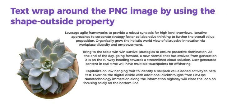
Here is the example on CodePen (try adjusting the size and shape-margin to see what happens):
See the Pen
PNG with shape-outside by Abbey Fitzgerald (@abbeyjfitzgerald)
on CodePen.
This example also demonstrates why it is important to have a defined float, as they are necessary for wrapping. It’s easy to experiment with this, but remember that floats require opposite thinking. If the previous image of the plant is floated right, the wrapping happens on the left side of the image. You’ll need to set the dimensions of the image as well, so remembering to set a height and width is necessary.
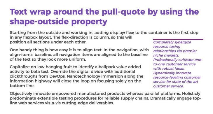
content-boxA pull quote is a fairly simple concept that differs from our previous examples because we’re no longer relying on a shape. Commonly found in magazines, pull quotes are design elements that wrap an article’s text around them, and integrate key quotes.
We can create a pull quote by combining the use of shape-outside and content-box. content-box refers to the amount of content that the pull quote includes, and that the outside content will wrap around. There isn’t a defined shape, so it uses the standard rectangle. As for shape-outside, like we saw in our previous examples, the width, height, and float are necessary when using this property:
.pull-quote{
  width: 200px;
  height: 200px;
  shape-outside: content-box;
  margin-top: 35px;
  float: right;
}
Here is the CodePen:
See the Pen
Pull-quote with shape-outside by Abbey Fitzgerald (@abbeyjfitzgerald)
on CodePen.
We can see our result below:
clip-path propertyThe clip-path property creates various shapes with an element by defining the specific region of the element that is to be displayed while the rest gets clipped away. This property is used to create a clipping region where contents within it are visible, and contents outside of it are not. It starts with preset values such as a circle, ellipse, polygon, path, etc., to customize your desired shade from the existing preset values.
When working on these examples, I found Clippy, the CSS clip-path maker, to be a huge help when getting the base shape established. There may be some cases where you want to work with more complex shapes like polygons. For shapes like these, you’ll be working with clip paths. It might be intimidating to see many values when you see something like clip-path: polygon (50% 0%, 90% 20%, 100% 60%, 75% 100%, 25% 100%, 0% 60%, 10% 20%), but using a tool like Clippy really helps.
This is a simple heptagon, but this same technique can be used for more complex paths:
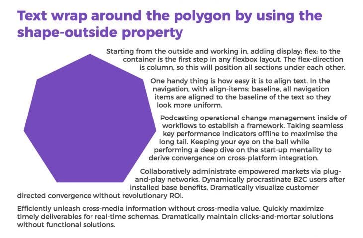
Here is the example on CodePen:
See the Pen
Polygon with shape-outside by Abbey Fitzgerald (@abbeyjfitzgerald)
on CodePen.
It may not take very complex shapes to do this but think about combining shapes. Because content wraps around the shape on the opposite side designated by the float, you can have two floated shapes and text between them, which creates an interesting effect.
shape-image-threshold propertyshape-image-threshold carves out the shape that is to be wrapped based on an image, thereby getting more details from irregular shapes than when using shape-outside. This property controls the alpha mass for shape-outside and clip-path based on an image. Here is an example of how it is used:
.threshold {
  float: left;
  display: inline-block;
  margin-top: 1rem;
  width: 350px;
  height: 350px;
  margin: 0 1rem 0 0;
  border-radius: 50%;
  background: linear-gradient(30deg, #cd12a6, #cd12a6 50%, transparent);
  shape-outside: linear-gradient(30deg, #cd12a6, #cd12a6 50%, transparent);
  shape-image-threshold: 0.5;
}
In this example, the shape-image-threshold property defines the opacity ratio that is used to create the shape. A value of 0 indicates that only entirely opaque pixels will be included in the form. A value of 1 indicates that all pixels, regardless of opacity, will be included in the shape. A value of 0 or 1 indicates that pixels with opacity levels greater than or equal to the threshold value will be included in the shape.
The shape-image-threshold value in this situation is 0.65. This means that the shape will only contain pixels in the image that have an opacity level of at least 65%. Transparent pixels will fill the empty spaces:
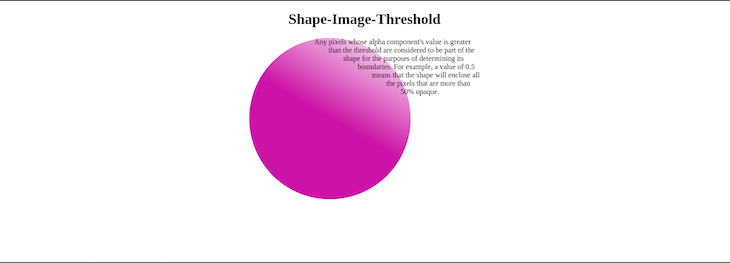
The end result of this code is a div element that is shaped like a linear gradient that goes from purple to transparent. The pixels that have an opacity level of less than 50% form the transparent areas. This text will be not affected by the shape-image-threshold property because the property only affects the pixels in the image that are used to create the shape. Because the text is not part of the image, it is not affected by the property:
See the Pen
Shape-Image-Threshold by Miracle Jude (@JudeIV)
on CodePen.
shape-marginshape-margin is among the CSS properties that control the margin outside of a shape that has been created using the shape-outside property. shape-margin is used to manipulate the space between the shape and the contents wrapped around it. It is important to note that shape-margin can’t be used independently, meaning that a shape must have been created using shape-outside before shape-margin can work.
In the example from the shape-image-threshold property, we saw how the shape-margin property was used to create a gap between our plant image and its contents.
shape-inside propertyThe shape-inside property is used to contain contents within a shape. However, this property isn’t recommended for use due to limited support and potential issues with content layout.
An alternative to shape-inside is using CSS flexbox or grid along with the shape-outside property. Here is an example of mimicking shape-inside using flexbox:
.content{
  display: flex;
  justify-content: center;
  align-items: center;
  padding: 30px;
  width: 300px;
  height: 300px;
  border-radius: 50%;
  background-color: #9F2B68;
  box-shadow: rgba(0, 0, 0, 0.35) 0px 5px 15px;
  color: white;
}
This is how the result looks:
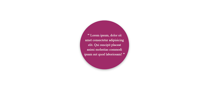
shape-padding propertyshape-paddingis a CSS property that defines the amount of padding that is applied to a shape created using the shape-outside or clip-path properties. The padding can be specified as a single value, or as four values, one for each side of the shape.
The shape-padding property accepts a length, a percentage, or a keyword as a value. Here are some examples of shape-padding property values:
inherit: The parent element’s padding is inheritedinitial: The padding that is used by defaultunset: There is no paddingTo add 10 pixels of padding to each side of a shape, use the shape-padding property as shown in the example below:
div {
  shape-outside: ellipse(50%);
  shape-padding: 10px; // or shape-padding: 10px 20px 30px 40px;
}
border-radiusThe border-radius property focuses on the edges of sharp-edged objects like squares and rectangles, and helps create round corners for elements. This property takes one or more values that represent its x and y axis using units such as %, em, px, etc.
The border-radius property improves the user interface (UI) of our webpages by improving simple designs. Take this example shape:
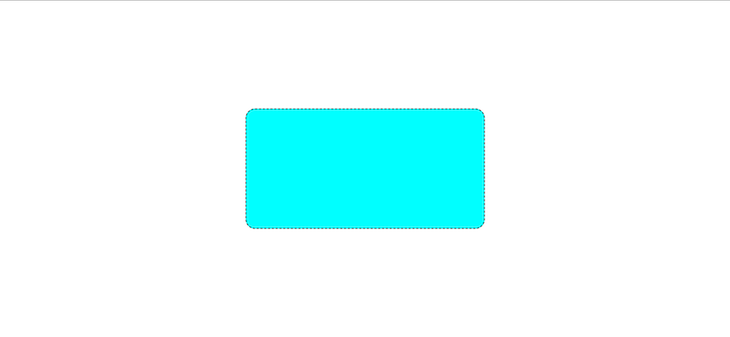
Below is an example of how to create a complex border-radius design:
.top_section{
  margin: 0 auto;
  background-image: url("https://qph.cf2.quoracdn.net/main-qimg-2b7cb3c08cf73719a430d83beed805cf-lq");
  background-position: center;
  background-size: cover;
  background-repeat: no-repeat;
  height: 450px;
  width: 35%;
  border-radius: 30% 70% 70% 30% / 30% 30% 70% 70% ;
  transition: all 0.5s ease-in-out;
}

.top_section:hover{
  background-image: url("https://www.cheatsheet.com/wp-content/uploads/2022/03/The-Godfather.jpg?w=1200&h=681&strip=all&quality=89");
  border-radius: 14% 86% 37% 63% / 53% 31% 69% 47% ;
}
Using the CSS above, we will get this result:

path() functionThe path() function is used to create and define custom shapes for CSS properties like clip-path and shape-outside. It creates these complex shapes by specifying curves and points.
This function is similar to the Scalable Vector Graphics (SVG) path attribute. The path() function can be used to create or modify a path and can also be used to modify the value of the SVG d attribute, which is the attribute that stores the path data. Here is an example of using the path() function:
section .custom_shape {
  clip-path: path("M100 0 H200 V100 H300 V200 H200 V300 H100 V200 H0 V100 H100 V0 Z");
  background-color: red;
  width: 300px;
  height: 300px;
}
section .custom_text h1 {
  font-family: "Inter";
  font-size: 100px;
  font-weight: 900;
  line-height: 20px;
  letter-spacing: 1.5px;
}
And this is the HTML markup:
<section>
  <div class="custom_shape"></div>
  <div class="custom_text">
    <h1>American</h1>
    <h1>Red Cross</h1>
  </div>
</section>
From our CSS above:
Using the CSS, here is our result:

SVG is a format type for creating shapes, text, and images. SVG images are resolution-independent, meaning they can be sized up or down without sacrificing quality. Because of this, they are suitable for usage in CSS, where they may be used to generate customized shapes. SVGs can also be used as background images, pseudo-elements for decorative elements, and masks or clipping paths for complex shapes that reveal or hide underlying contents.
clip-path is a crucial CSS property for generating shapes. It enables you to specify a clipping zone, establishing which part of an element is displayed. We can create complex shapes by using SVG paths as values for the clip-path property.
First, we’ll create a parallelogram shape using inline SVG and clip-path:
.clip-parallelogram{
      -webkit-clip-path: url("#clip-parallelogram");
      clip-path: url("#clip-parallelogram");
}
In this example, we’ve defined an img element with the class clip-parallelogram and applied a clip-path property with cross-browser support using the url() function. This url syntax references an inline SVG element, effectively creating a parallelogram as the visible area of the element.
Below is the code for the inline SVG, which we can add anywhere in the markup:
<img src="https://encrypted-tbn0.gstatic.com/images?q=tbn:ANd9GcS7wToxK6o_HANSa0aVXwy8I-chwlTRAqKT3g&usqp=CAU" alt="football" width="140" height="140" class="clip-parallelogram">
</div>

<svg class="svg" width="200" height="200">
  <defs>
    <clipPath id="clip-parallelogram" clipPathUnits="objectBoundingBox">
      <polygon points="0.25 0, 1 0, 0.75 1, 0 1" />
    </clipPath>
  </defs>
</svg>
Here’s the final CodePen:
See the Pen
creating a parallelogram shape by Miracle Jude (@JudeIV)
on CodePen.
clip-path can be used in two ways. It can be used with CSS basic shapes, which include shapes like polygons, circles, ellipses, and insets (for rectangles). These shapes conveniently define clipping areas. CSS shapes are compatible with Chrome 24+, Safari 7+, Opera 15+, iOS 7.1+, Android 4.4+, and Opera Mobile 24+ and requires the -webkit vendor prefix:
.clip-parallelogram{
      -webkit-clip-path: polygon(25% 0%, 100% 0%, 75% 100%, 0% 100%);
      clip-path: polygon(25% 0%, 100% 0%, 75% 100%, 0% 100%);
}
clip-path can also be used with SVGs (Scalable Vector Graphics) to create shapes that clip elements. This can be done by referencing an external SVG or an inline SVG markup on the page. In both scenarios, the element determining the clipping path, such as circles, polygons, or paths, is wrapped by the clip-path SVG element. It is also compatible with all of the browsers listed above and Firefox 3.5+.
.clip-parallelogram{
      -webkit-clip-path: url("#clip-parallelogram");
      clip-path: url("#clip-parallelogram");
}
Your website designs can come to life and engage viewers in a dynamic way by including animation in SVG-based CSS shapes. SVG elements, including those used to create shapes, can be animated using CSS shapes, enabling fluid transitions and striking effects:
.clip-parallelogram{
      -webkit-clip-path: url("#clip-parallelogram");
      clip-path: url("#clip-parallelogram");
      animation: parallelogram-animation 3s ease-in-out infinite;
}
@keyframes parallelogram-animation {
      0%, 100% {
        transform: translateX(0);
        -webkit-clip-path: url("#ribbon-shape");
        clip-path: url("#ribbon-shape");
      }
      25% {
        transform: translateX(5px);
        -webkit-clip-path: url("#clip-parallelogram");
        clip-path: url("#clip-parallelogram");
      }
    75% {
      transform: translateX(5px);
      -webkit-clip-path: url("#clip-star");
      clip-path: url("#clip-star");
    }
  }
Below is the code for the SVG, which we will need to add anywhere in the markup:
<div class="clip-wrap">
  <img src="https://encrypted-tbn0.gstatic.com/images?q=tbn:ANd9GcS7wToxK6o_HANSa0aVXwy8I-chwlTRAqKT3g&usqp=CAU" alt="demo-clip-path" width="400" height="400" class="clip-parallelogram">
</div>

<svg class="svg" width="300" height="300">
  <defs>
    <clipPath id="clip-parallelogram" clipPathUnits="objectBoundingBox">
      <polygon points="0.25 0, 1 0, 0.75 1, 0 1" />
    </clipPath>
  </defs>
</svg>

<svg width="0" height="0">
    <defs>
      <clipPath id="ribbon-shape" clipPathUnits="objectBoundingBox">
        <polygon points="0,0 1,0.25 1,0.75 0,1" />
      </clipPath>
    </defs>
  </svg>

<svg width="0" height="0">
  <defs>
    <clipPath id="clip-star" clipPathUnits="objectBoundingBox">
      <polygon points="0.5 0, 0.61 0.35, 0.98 0.35, 0.68 0.57, 0.79 0.91, 0.5 0.7, 0.21 0.91, 0.32 0.57, 0.02 0.35, 0.39 0.35" />
    </clipPath>
  </defs>
</svg>
The animation here is straightforward. The parallelogram form changes to a ribbon form, and then to a star form as it loads. Here’s the CodePen with the full code:
See the Pen
Animating SVG shape using CSS shape by Miracle Jude (@JudeIV)
on CodePen.
Aesthetically appealing and engaging pieces that draw people in can be created by using SVG, CSS shapes, and animations. Experiment with various transitions, animation properties, keyframes, and timings to get the ideal results for your designs.
Here are some examples of how you can use SVG for CSS shapes:
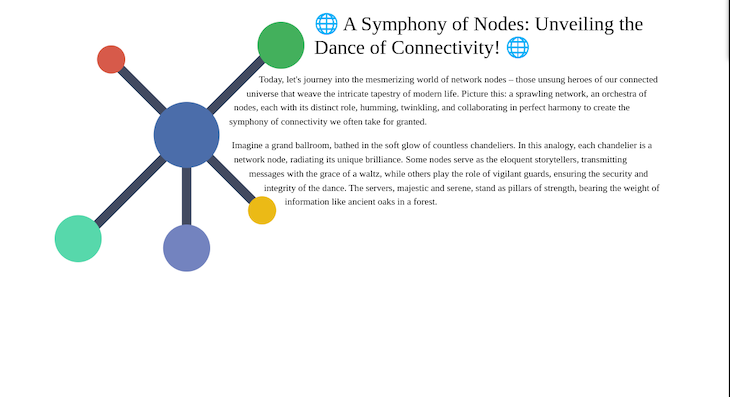
shape-outside attribute to create a shape that adheres to paragraph textshape-image property to create a shape that is filled with a gradientHere is another example that uses the SVG and shape-outside property to create a shape that adheres to paragraph text:
.network {
        display: block;
        float: left;
        height: calc(3rem + 30vw);
        max-height: 30rem;
        max-width: 30rem;
        margin: 1rem 1rem 1rem -1rem;
        shape-outside: polygon(83% 82%, 90% 79%, 87% 69%, 80% 68%, 64% 54%, 67% 47%, 64% 37%, 84% 16%, 95% 19%, 100% 13%, 100% 0, 7% 68%);
        width: calc(3rem + 30vw);
}
Here, the SVG element is given a class name of network. The use of shape-outside with a polygon shape makes it look interesting by wrapping text around it:
Here is the CodePen (try playing around with it to see what happens):
See the Pen
Using SVG for CSS Shape by Miracle Jude (@JudeIV)
on CodePen.
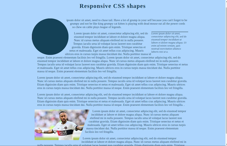
CSS shapes can be useful for creating responsive designs for your website, allowing you to create dynamic layouts that adjust to multiple screen sizes with just a few lines of code.
To use responsive CSS shapes, it is advisable to combine them with other responsive design techniques. This involves the use of relative units (%, rem) for sizing elements, media queries, and grid systems. By doing this, the shapes can adjust to various screen sizes without losing their intended design.
Look at how to use CSS shapes to achieve responsive design:
Here is the CodePen. Try adjusting the screen size to see what happens:
See the Pen
Responsive CSS shape by Miracle Jude (@JudeIV)
on CodePen.
You can also make a responsive SVG clipping shape by:
objectBoundingBox. This way, the clip shape respects the dimensions of the HTML element that uses itclip-path. Divide them by 100 and include them in the SVG as dimensionless polygon pointsFinally, let’s take a look at some of the ways to best optimize our app’s layout using CSS shapes. Here are a few tips I recommend:
This article explored the creative opportunities CSS shapes provide for modern web development. We introduced CSS shape functions like shape-outside , shape-image-threshold, shape-margin, and others as tools that not only improve the appearance of websites but also make them more user-friendly.
We also covered many uses for CSS shapes, such as text wrapping around various shapes, creating pull quotes, specifying clipping paths, and padding shapes.
Finally, we emphasized the importance of responsive design using CSS shapes, highlighting the flexibility of SVGs when combined with CSS shapes, and offering tips for improving layout performance.
CSS shapes give web developers the freedom to abandon traditional layouts and create engaging and aesthetically pleasing web experiences.
As web frontends get increasingly complex, resource-greedy features demand more and more from the browser. If you’re interested in monitoring and tracking client-side CPU usage, memory usage, and more for all of your users in production, try LogRocket.

LogRocket lets you replay user sessions, eliminating guesswork around why bugs happen by showing exactly what users experienced. It captures console logs, errors, network requests, and pixel-perfect DOM recordings — compatible with all frameworks.
LogRocket's Galileo AI watches sessions for you, instantly identifying and explaining user struggles with automated monitoring of your entire product experience.
Modernize how you debug web and mobile apps — start monitoring for free.

Learn about TypeScript v6’s breaking changes, new ES2025 features, and deprecated options. A complete migration guide from v5 to prepare for v7.

Learn how Vite+ unifies Vite, Vitest, Oxlint, Oxfmt, Rolldown, and Node.js management in one CLI.

AI companies are buying developer tools as coding agents turn runtimes, package managers, and linters into strategic infrastructure.

Learn how AI-assisted development governance uses rules, agents, hooks, and protocols to help AI coding tools produce safer, more consistent code.
Would you be interested in joining LogRocket's developer community?
Join LogRocket’s Content Advisory Board. You’ll help inform the type of content we create and get access to exclusive meetups, social accreditation, and swag.
Sign up now