In this post, we will learn how to create triangles in CSS. First, let’s go over some things about CSS.
CSS isn’t a design tool. However, it provides declarative syntax that makes styling a document or a collection of documents very simple.
CSS makes our page very nice and stylish to present. A document contains elements, and each of the elements have their default styling from the OS. CSS gives us the power to style the elements to our taste:
<button>Click</button>
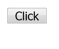
This is a simple button with the basic styling of the OS. We can add our own styling via CSS:
button {
    margin: 0;
    padding: 6px 12px;
    background-color: orangered;
    color: white;
    border: 1px solid #b93605;
    border-radius: 2px;
}
Our styling will override the default styling of the button element. We use CSS properties to set our styles.
The margin: 0 removes the margins of the button.
The padding pads the content area of the button: 6 pixels top and bottom, and 12 pixels left and right.
The background-color property sets the background color of the button to a more orange color.
The text color is set to white by the color property rule.
The border of the button is made more defined by setting the border rule: border: 1px solid #b93605;.
The button is given a bit of a curvy shape by using the border-radius with a 2 pixels unit.
Our button will appear more stylish and appealing:

As you can see, we used the element selector to style the button. We have different selectors we can use to select and style elements in CSS.
class selectorsid selectorsCSS can be added to a web document via inline CSS, inside style tags, HTTP linking using the link tag, and stylesheets.
The CSS styling is inserted in the style attribute of the element.
<html>
    <body>
        <button style="margin: 0;padding: 6px 12px;background-color: orangered;">Click</button>
    </body>
</html>
This is inline CSS.
style tagsThis inserts CSS inside the style tags in the HTML page.
<html>
    <style>
        button {
            margin: 0;
            padding: 6px 12px;
            background-color: orangered;
        }
    </style>

    <body>
        <button>Click</button>
    </body>
</html>
link tag/stylesheetsThe CSS rulesets are in a stylesheet file with a .css file extension, and then the file path is inserted in the href attribute in the link tag.
/* main.css */

button {
    margin: 0;
    padding: 6px 12px;
    background-color: orangered;
}
<html>
    <link href="./main.css" rel="stylesheet">
    <body>
        <button>Click</button>
    </body>
</html>
CSS has been used to build games, create amazing artwork, and even used to re-create popular artwork by Michelangelo.
These works are done with CSS tricks. Here, we will learn a trick for creating triangles using CSS. We will create different types of triangles and also see where we can apply them in real-world usage.
The trick is to use borders, width, and height to create the triangles. I’ll show you how it’s done.
Let’s start with a simple div.
<style>
    div {
        background: orangered;
        width: 400px;
        height: 150px;
    }
</style>
<body>
    <div></div>
</body>

The height and width are 150px and 300px, respectively.
If we set borders on the div like this:
div {
    ...
    border: 10px solid black;
}

This will make the borders of the div 10px thick, and with the color set to black.
If we make the border thicker:
div {
    border: 88px solid black;
}

Notice that the border area and the content area of the div form a diagonal, and they get more pronounced when the border gets bigger. To notice make this more noticeable, let’s make the borders have unique colors.
div {
    ...
    border-top-color: blue;
    border-right-color: yellow;
    border-bottom-color: green;
    border-left-color: palevioletred;
}

See? It’s like the border area edges are coming to meet. What happens if they meet?
They would form a triangle!
To make them meet, we would make the width and height 0px:
div {
    background: orangered;
    color: white;
    width: 300px;
    height: 150px;

    border: 88px solid black;
    border-top-color: blue;
    border-right-color: yellow;
    border-bottom-color: green;
    border-left-color: palevioletred;
}

Now, we have border triangles. The border for each side of the element forms a triangle.
To make a normal triangle — a triangle pointing upwards — we will have to make the top, right, and left borders transparent. We also have to remove the background color:
div {
    color: white;
    width: 0px;
    height: 0px;
    border: 88px solid black;
    border-top-color: transparent;
    border-right-color: transparent;
    border-bottom-color: green;
    border-left-color: transparent;
}

This can be done to make a triangle pointing left:
div {
    color: white;
    width: 0px;
    height: 0px;
    border: 88px solid black;
    border-top-color: transparent;
    border-right-color: yellow;
    border-bottom-color: transparent;
    border-left-color: transparent;
}
All borders are transparent except the right border set with the color yellow to show a left-triangle.

We apply the same on right-downward pointing triangles:
div {
    color: white;
    width: 0px;
    height: 0px;
    border: 88px solid black;
    border-top-color: transparent;
    border-right-color: transparent;
    border-bottom-color: transparent;
    border-left-color: palevioletred;
}

Here’s a triangle pointing down:
div {
    color: white;
    width: 0px;
    height: 0px;
    border: 88px solid black;
    border-top-color: blue;
    border-right-color: transparent;
    border-bottom-color: transparent;
    border-left-color: transparent;
}

I find this useful when making a chat widget.
A chat widget is a standalone software on websites used for real-time communication. It provides a way for your customers/users to communicate with the admin of a website. The communication is usually via typed text.
The chat widgets have a way to tell both communicants which messages are to whom, who typed a messaged, and also what time it was sent. These identifications are done through the use of arrows (left or right arrows).
Put direction arrows on chat boxes to indicate who is talking:

See the code:
<style>
    .chat {
        width: 150px;
        padding: 3px 10px;
        border-radius: 3px;
        position: relative;
        margin-bottom: 2px;
    }

    .chat-left {
        color: white;
        background: orangered;
    }

    .chat-right {
        color: black;
        background: grey;
        text-align: right;
    }

    .chat-left::before, .chat-right::after {
        content: "";
        color: white;
        width: 0px;
        height: 0px;
        border: 4px solid transparent;

        position: absolute;
        top: 5px;
    }

    .chat-left::before {
        border-top-color: transparent;
        border-right-color: orangered;
        border-bottom-color: transparent;
        border-left-color: transparent;
        left: -7px;
    }

    .chat-right::after {
        border-top-color: transparent;
        border-right-color: transparent;
        border-bottom-color: transparent;
        border-left-color: gray;
        right: -7px;
    }

</style>

<div class="chat chat-left">
    Hello, I'm Chidume Nnamdi
</div>
<div class="chat chat-left">
    How are you doing?
</div>
<div class="chat chat-right">
    How are you doing?
</div>
We used the ::before and ::after pseudoselectors to draw the triangles. As you can see, their width and height are 0px. For the left arrow in .chat-left::before, we set all borders to transparent, except the right border. For the right arrow in the .chat-right::after, we set all borders to transparent except the left border.
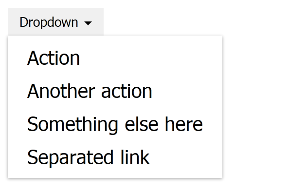
Arrows are also used in dropdowns to indicate which element has the dropdown. or where the dropdown dropped down from.
See the HTML:
<body>
    <span>
    <button class="dropdown">
        <a class="dropdown-toggle" data-toggle="dropdown" aria-expanded="false">
            Dropdown <span class="caret"></span>
        </a>
        <ul class="dropdown-menu">
            <li><a>Action</a></li>
            <li><a>Another action</a></li>
            <li><a>Something else here</a></li>
            <li class="divider"></li>
            <li><a>Separated link</a></li>
        </ul>
    </button>
    </span>
</body>
The span.caret element will be a triangle pointing downwards.
Let’s style it:
.caret {
    display: inline-block;
    width: 0;
    height: 0;
    margin-left: 2px;
    vertical-align: middle;
    border-top: 4px solid;
    border-right: 4px solid transparent;
    border-left: 4px solid transparent;
}
We made the width and height to be 0, so we could have only the borders shown and joined together. Then, to make a downward-pointing triangle, we made the bottom, right, and left borders transparent and the top border a solid black color.
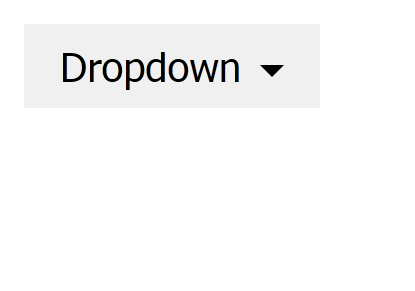
We have our triangle indicating where our dropdown will appear.
Here’s the rest of the CSS code:
button {
    margin: 0;
    padding: 6px 12px;
    border: 0;
}

.dropdown {
    position: relative;
    text-decoration: none;
}

.dropdown-menu {
    position: absolute;
    z-index: 1000;
    background: white;
    color: black;
    list-style: none;
    margin: 0;
    padding: 5px 0;
    border-color: rgba(255, 255, 255, 0.9);
    box-shadow: 0 1px 3px 0 rgba(0, 0, 0, 0.33);
    top: 100%;
    left: 0;
    min-width: 100px;
}

.dropdown li a {
    padding: 5px 20px;
    font-size: 20px;
    display: block;
    color: black;
    text-decoration: none;
    white-space: nowrap;
    text-align: left;
}

.dropdown li a:active {
    background: #ddd;
}

.dropdown li a:hover {
    background: #ddd;
}
That’s the trick. Borders, width, and height are manipulated to create triangles in CSS!
If you have any questions regarding this or anything I should add, correct or remove, feel free to comment, email, or DM me.
As web frontends get increasingly complex, resource-greedy features demand more and more from the browser. If you’re interested in monitoring and tracking client-side CPU usage, memory usage, and more for all of your users in production, try LogRocket.

LogRocket lets you replay user sessions, eliminating guesswork around why bugs happen by showing exactly what users experienced. It captures console logs, errors, network requests, and pixel-perfect DOM recordings — compatible with all frameworks.
LogRocket's Galileo AI watches sessions for you, instantly identifying and explaining user struggles with automated monitoring of your entire product experience.
Modernize how you debug web and mobile apps — start monitoring for free.
Would you be interested in joining LogRocket's developer community?
Join LogRocket’s Content Advisory Board. You’ll help inform the type of content we create and get access to exclusive meetups, social accreditation, and swag.
Sign up now
A breakdown of the wrapper and container CSS classes, how they’re used in real-world code, and when it makes sense to use one over the other.

This guide walks you through creating a web UI for an AI agent that browses, clicks, and extracts info from websites powered by Stagehand and Gemini.

This guide explores how to use Anthropic’s Claude 4 models, including Opus 4 and Sonnet 4, to build AI-powered applications.

Which AI frontend dev tool reigns supreme in July 2025? Check out our power rankings and use our interactive comparison tool to find out.