A common challenge for web developers is collecting detailed user data without overwhelming the UI with long, complicated forms. Particularly with SPAs becoming more widely used, best practice for moving users through a process now requires breaking forms into small, digestible steps that won’t render a new page.

In this tutorial, we’ll demonstrate how you can enhance your UX with React Stepzilla, a multi-step wizard component designed for sequential data collection. With Stepzilla, you can render different types of React components, like data forms and HTML-to-text. To follow along with this React styling tutorial, you’ll need:
Let’s get started!
The Replay is a weekly newsletter for dev and engineering leaders.
Delivered once a week, it's your curated guide to the most important conversations around frontend dev, emerging AI tools, and the state of modern software.
First, we’ll initialize a new React app and install Stepzilla by running the code below. If you’re using a Mac, navigate into your working directory via the terminal; for Windows users, access your directory via the command prompt:
npx create-react-app stepzilla-app
To start your app, run the command below:
cd stepzilla-app && npm start
Your app should look similar to the screenshot below:
Next, we’ll install the React Stepzilla component by running the command below:
npm install --save react-stepzilla
Let’s write the logic for a multi-step form with three steps, About, Terms, and ConsentForm components. In the root directory of your project, create a new folder called components; inside, create a new file called multiStep.js.
Now, create a folder called steps. Navigate into it and create the following four files, About.js, Terms.js, ConsentForm.js and steps.js. Let’s write the code to populate these three steps.
Add the following code to About.js:
import react from 'react';

const About = () => {
    return (
        <div>
            <p>
                This simply dummy text of the printing and typesetting
                industry. Lorem Ipsum has been the industry's standard dummy
                text ever since the 1500s, when an unknown printer took a
                galley of type and scrambled it to make a type specimen book.
                It has survived not only five centuries, but also the leap into
                electronic typesetting, remaining essentially unchanged.
                It was popularised in the 1960s with the release of
                Letraset sheets containing Lorem Ipsum passages, and more
                recently with desktop publishing
            </p>
        </div>
    )
}
export default About;
Text sourced from https://www.lipsum.com
Add the code below to Terms.js:
import react from 'react';
const Terms = () => {
return (
<div>
<p>
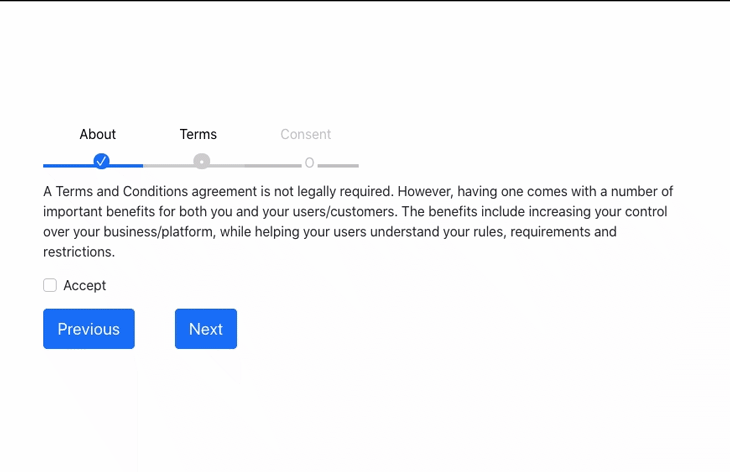
A Terms and Conditions agreement is not legally required. However, having one
comes with a number of important benefits for both you and your users/customers.
The benefits include increasing your control over your business/platform,
while helping your users understand your rules, requirements and restrictions.
</p>
<div class="form-group form-check">
<input type="checkbox" class="form-check-input" id="exampleCheck1" />
<label class="form-check-label" for="exampleCheck1">Accept</label>
</div>
</div>
)
}
export default Terms;
Add the code below to ConsentForm.js:
import react from 'react';
const ConsentForm = () => {
    return (
        <div>
            <form>
                <div className="form-group">
                    <label htmlFor="exampleInputEmail1">Email address</label>
                    <input type="email" className="form-control" id="exampleInputEmail1" aria-describedby="emailHelp" />
                    <small id="emailHelp" className="form-text text-muted">We'll never share your email with anyone else.</small>
                </div>
                <div className="form-group">
                    <label htmlFor="exampleInputPassword1">Password</label>
                    <input type="password" className="form-control" id="exampleInputPassword1" />
                </div>
                <div className="form-group form-check">
                    <input type="checkbox" className="form-check-input" id="exampleCheck1" />
                    <label className="form-check-label" htmlFor="exampleCheck1">Check me out</label>
                </div>
            </form>
        </div>
    )
}
export default ConsentForm;
Now, we’ll create a constant called steps, which will hold the steps we created above. Add the code below to steps.js:
import About from './About';
import Terms from './Terms';
import ConsentForm from './ConsentForm';
export {About, Terms, ConsentForm};
Next, we’ll pass the steps constant to Stepzilla as the value for its steps option. In steps.js, add the following code:
import react from 'react';
import { About, Terms, ConsentForm } from './steps/steps';
import StepZilla from "react-stepzilla";
const steps =
    [
        { name: 'About', component: <About /> },
        { name: 'Terms', component: <Terms /> },
        { name: 'Consent', component: <ConsentForm /> },
    ]
const MultiSteps = () => {
    return (
        <div className='step-progress'>
            <StepZilla steps={steps} />
        </div>
    );
}
export default MultiSteps;
To display the multi-step component, open App.js and replace the existing code with the code below:
import MultiSteps from './components/MultiStep';
import './App.css';
function App() {
  return (
    <div className="App">
      <div className="stepsWrapper">
      <MultiSteps />
      </div>
    </div>
  );
}
export default App;
In the code above, we import the MultiSteps component into App.js. Now, your React app should look like the gif below:

To enhance our UI, let’s add some custom styling to our project. Because Stepzilla uses Bootstrap for styling, we’ll place the Bootstrap CDN at the header section of index.html in the public folder of our project:
<!-- CSS only -->
<link href="https://cdn.jsdelivr.net/npm/[email protected]/dist/css/bootstrap.min.css" rel="stylesheet" integrity="sha384-KyZXEAg3QhqLMpG8r+8fhAXLRk2vvoC2f3B09zVXn8CA5QIVfZOJ3BCsw2P0p/We" crossorigin="anonymous">
Let’s add some custom styling to handle multi-step navigation, buttons, ol list color, padding, and margins. Replace the code in App.css with the code below:
.App {
  margin-top: 10%;
}
.stepsWrapper{
  width: 60%;
  margin: 0 auto;
}
ol.progtrckr {
  list-style-type: none;
  padding: 0;
}
ol.progtrckr li {
  display: inline-block;
  text-align: center;
  line-height: 4.5rem;
  cursor: pointer;
}
ol.progtrckr li span {
  padding: 0 1.5rem;
}
@media (max-width: 650px) {
  .progtrckr li span {
    display: none;
  }
}
.progtrckr em {
  display: none;
  font-weight: 700;
  padding-left: 1rem;
}
@media (max-width: 650px) {
  .progtrckr em {
    display: inline;
  }
}
ol.progtrckr li.progtrckr-todo {
  color: silver;
  border-bottom: 4px solid silver;
}
ol.progtrckr li.progtrckr-doing {
  color: black;
  border-bottom: 4px solid #CCCCCC;
}
ol.progtrckr li.progtrckr-done {
  color: black;
  border-bottom: 4px solid #0d6efd;
}
ol.progtrckr li:after {
  content: "\00a0\00a0";
}
ol.progtrckr li:before {
  position: relative;
  bottom: -3.7rem;
  float: left;
  left: 50%;
}
ol.progtrckr li.progtrckr-todo:before {
  content: "\039F";
  color: silver;
  background-color: white;
  width: 1.2em;
  line-height: 1.4em;
}
ol.progtrckr li.progtrckr-todo:hover:before {
  color: #ff4500;
}
ol.progtrckr li.progtrckr-doing:before {
  content: "\2022";
  color: white;
  background-color: #CCCCCC;
  width: 1.2em;
  line-height: 1.2em;
  border-radius: 1.2em;
}
ol.progtrckr li.progtrckr-doing:hover:before {
  color: #ff4500;
}
ol.progtrckr li.progtrckr-done:before {
  content: "\2713";
  color: white;
  background-color: #0d6efd;
  width: 1.2em;
  line-height: 1.2em;
  border-radius: 1.2em;
}
ol.progtrckr li.progtrckr-done:hover:before {
  color: #333;
}
The Stepzilla package is shipped with support for step validation using the isValidated utility function, which is available in both the class-based and Hooks component.
Let’s add basic validation to our ConsentForm component by updating Terms.js with the code below:
import React from 'react';
class Terms extends React.Component {
    constructor(props) {
        super(props);
        this.state = {
            terms: this.props.terms,
        };
        this._validateOnDemand = true; // this flag enables onBlur validation as user fills forms
        this.validationCheck = this.validationCheck.bind(this);
        this.isValidated = this.isValidated.bind(this);
    }
    isValidated() {
        const userInput = this._grabUserInput(); // grab user entered vals
        const validateNewInput = this._validateData(userInput); // run the new input against the validator
        let isDataValid = false;
        // if full validation passes then save to store and pass as valid
        if (Object.keys(validateNewInput).every((k) => { return validateNewInput[k] === true })) {
            if (this.props.getStore().terms != userInput.terms) { // only update store of something changed
                this.props.updateStore({
                    ...userInput,
                    savedToCloud: false // use this to notify step4 that some changes took place and prompt the user to save again
                });  // Update store here (this is just an example, in reality you will do it via redux or flux)
            }
            isDataValid = true;
        }
        else {
            // if anything fails then update the UI validation state but NOT the UI Data State
            this.setState(Object.assign(userInput, validateNewInput, this._validationErrors(validateNewInput)));
        }
        return isDataValid;
    }
    validationCheck() {
        if (!this._validateOnDemand)
            return;
        const userInput = this._grabUserInput(); // grab user entered vals
        const validateNewInput = this._validateData(userInput); // run the new input against the validator
        this.setState(Object.assign(userInput, validateNewInput, this._validationErrors(validateNewInput)));
    }
    _validateData(data) {
        return {
            termsVal: (data.terms != false), // required: anything besides N/A
        }
    }
    _validationErrors(val) {
        const errMsgs = {
            termValMsg: val.termVal ? '' : 'Accept terms to continue',
        }
        return errMsgs;
    }
    _grabUserInput() {
        return {
            terms: this.refs.terms.value,
        };
    }
    render() {
        // explicit class assigning based on validation
        let notValidClasses = {};
        if (typeof this.state.termVal == 'undefined' || this.state.term) {
            notValidClasses.termCls = 'no-error col-md-8';
        }
        else {
            notValidClasses.termCls = 'invalid-feedback col-md-8';
            notValidClasses.termValGrpCls = 'val-err-tooltip';
        }
        return (
            <div className="step step3">
                <div className="row">
                    <form id="Form" className="form-horizontal">
                        <p>
                            A Terms and Conditions agreement is not legally required. However, having one
                            comes with a number of important benefits for both you and your users/customers.
                            The benefits include increasing your control over your business/platform,
                            while helping your users understand your rules, requirements and restrictions.
                        </p>
                        <div className="form-group form-check mb-3">
                            <input type="checkbox" ref="terms" class="form-check-input" id="exampleCheck1" />
                            <label class="form-check-label" for="exampleCheck1" onBlur={this.validationCheck} defaultValue={this.state.terms}>Accept</label>
                            <div className={notValidClasses.termValGrpCls}>{this.state.termValMsg}</div>
                        </div>
                    </form>
                </div>
            </div>
        )
    }
}
export default Terms;
Now, your app should look similar to the screenshot below:
React Stepzilla is a powerful wizard that makes it simple to build multi-step components in React. When we simplify complex forms by breaking them down into smaller steps that render on a single page, we drastically improve our UX by decluttering our UI and decreasing load times.
In this tutorial, we became familiar with React Stepzilla by creating an app that takes our users through three steps. Stepzilla is easy to use and customizable to suit your individual project’s needs. I hope you enjoyed this tutorial!
Install LogRocket via npm or script tag. LogRocket.init() must be called client-side, not
server-side
$ npm i --save logrocket

// Code:

import LogRocket from 'logrocket';
LogRocket.init('app/id');
// Add to your HTML:

<script src="https://cdn.lr-ingest.com/LogRocket.min.js"></script>
<script>window.LogRocket && window.LogRocket.init('app/id');</script>

When should you move API logic out of Next.js? Learn when Route Handlers stop scaling and how ElysiaJS helps.

Explore how Dokploy streamlines app deployment with Docker, automated builds, and simpler infrastructure compared to traditional CI/CD workflows.

A side-by-side look at Astro and Next.js for content-heavy sites, breaking down performance, JavaScript payload, and when each framework actually makes sense.

AI-generated tests can speed up React testing, but they also create hidden risks. Here’s what broke in a real app.re
Hey there, want to help make our blog better?
Join LogRocket’s Content Advisory Board. You’ll help inform the type of content we create and get access to exclusive meetups, social accreditation, and swag.
Sign up now

