It’s almost inevitable that a frontend developer will have to work with charts. From using it to show analytics of data on your dashboards to using it for simple information on websites, you’ll most likely come across scenarios where you need to display data in a visually-pleasing format.

Chart.js is a JavaScript library that helps developers create simple and flexible charts.
In this short tutorial, I’ll show you how to create chart components for your Vue apps using the Chart.js library.
We’ll be creating a chart component that can render bar and line charts.
Note: Before we begin, be sure to have Node.js, Vue, and the Vue CLI installed on your machine. You can install Node.js from here and follow the instructions for installing the Vue CLI.
First, let’s create a new Vue project:
vue create vue-chart
You can select the presets or choose any of the options that suit you.
The next step will be to add Charts.js to the project:
cd vue-chart
npm install chart.js --save
To run the project, use this command:
npm run serve
After this is done, delete the default HelloWorld.vue component inside src/components, and also everything that has to do with it in your App.vue component.
The Replay is a weekly newsletter for dev and engineering leaders.
Delivered once a week, it's your curated guide to the most important conversations around frontend dev, emerging AI tools, and the state of modern software.
To start creating a chart, let’s create a component inside our components folder. We can name the component “Chart.vue”.
All you need in your template to use Chart.js is the canvas element.
<template>
   <div>
     <canvas></canvas>
   </div>
</template>
Import Chart.js into your component by putting this in your script tag:
import Chart from "chart.js";
Next, we’ll create the constructor method for our charts. What this function does is get the canvas element from our template, then create a new instance of the chart class. It then passes the canvas element as the first argument, and an object as the second argument. We’ll come to that object in a minute.
chartConstructor(chartType, chartData, chartOptions) {
    const chartElement = document.querySelector("canvas");
    const chart = new Chart(chartElement, {
    type: chartType,
    data: chartData,
    options: chartOptions,
  });
},
You’ll notice that the object we’re passing as a second argument has 3 properties: type, data, and options, whose values are parameters of the function.
In Chart.js, the 3 major properties you’ll need in the object are what I listed above.
Type is simply a string that tells what kind of chart you want to create. Examples include “line”, “doughnut”, “bar”, etc.
Data is an object that takes on two properties, or labels, which are an array of the labels for your chart values.
The other is datasets, which is an array that takes in objects for each dataset. You can check some of the properties it can take in the documentation.
Here’s an example of what the data object could look like for a line chart:
data: {
    labels: ["Jan1", "Jan2", "Jan3", "Jan4", "Jan5", "Jan6", "Jan7"],
    datasets: [
      {
        label: "This week",
        data:  [12, 19, 10, 17, 6, 3, 7],
        backgroundColor: "rgba(224, 248, 255, 0.4)",
        borderColor: "#5cddff",
        lineTension: 0,
        pointBackgroundColor: "#5cddff",
      },
      {
        label: "Last week",
        data:  [10, 25, 3, 25, 17, 4, 9],
        backgroundColor: "rgba(241, 225, 197, 0.4)",
        borderColor: "#ffc764",
        lineTension: 0,
        pointBackgroundColor: "#ffc764",
      },
    ],
  },
Options is used to set configurations for your charts like animation, layouts, legends, etc.
In our component, we will create props that the component will receive data and pass it to our chart constructor.
props:{
  chartType:String,
  chartData:Object,
  chartOptions:Object
},
Let’s call our chart constructor when our component mounts and give its arguments the data from the props:
mounted(){
  let {chartType,chartData,chartOptions} = this;
  this.chartConstructor(chartType, chartData, chartOptions);
}
With this, our chart component is done. We can import it anywhere and pass the necessary data to the props, and our chart will come to life.
Here’s a full example of a line chart.
We import our chart component and declare it with the props, like this:
<template>
  <div class="chart">
    <Chart
    :chartData="chartData"
    :chartOptions="chartOptions"
    :chartType="chartType" />
  </div>
</template>
Inside our data, we give the chartData it’s value:
chartType: "line",
Our chartData looks this way:
chartData: {
        labels:
          ["Jan1", "Jan2", "Jan3", "Jan4", "Jan5", "Jan6",  "Jan7"],
        datasets: [
          {
            label: "This week",
            data: [12, 19, 10, 17, 6, 3, 7],
            backgroundColor: "rgba(224, 248, 255, 0.4)",
            borderColor: "#5cddff",
            lineTension: 0,
            pointBackgroundColor: "#5cddff",
          },
          {
            label: "Last week",
            data: [10, 25, 3, 25, 17, 4, 9],
            backgroundColor: "rgba(241, 225, 197, 0.4)",
            borderColor: "#ffc764",
            lineTension: 0,
            pointBackgroundColor: "#ffc764",
          },
        ],
      },
In a real application, data in our datasets object is probably going to be coming from an API.
And, finally, our chartOptions:
chartOptions: {
        scales: {
          xAxes: [
            {
              stacked: true,
              gridLines: { display: false },
            },
          ],
          yAxes: [
            {
              ticks: {
                stepSize: 1,
                callback: function(value, index, values) {
                  if (value % Math.round(values[0] / 6) == 0) {
                    return value;
                  } else if (value === 0) {
                    return value;
                  }
                },
              },
              // stacked: true
            },
          ],
        },
        maintainAspectRatio: false,
        legend: {
          labels: {
            boxWidth: 10,
          },
          position: "top",
        },
        animation: {
          duration: 2000,
          easing: "easeInOutQuart",
        },
      },
Note: the values you see here are just my preference, feel free to experiment and try other things.
What we have built is a simple chart component. You can add more to it to make it more flexible and complex, which may give you the ability to take in more values.
I hope this helps you add amazing charts to your projects.
To view everything and see other examples in detail, you can go through this repo.
Debugging Vue.js applications can be difficult, especially when users experience issues that are difficult to reproduce. If you’re interested in monitoring and tracking Vue mutations and actions for all of your users in production, try LogRocket.
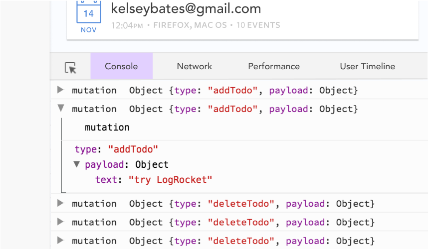
LogRocket lets you replay user sessions, eliminating guesswork by showing exactly what users experienced. It captures console logs, errors, network requests, and pixel-perfect DOM recordings — compatible with all frameworks.
With Galileo AI, you can instantly identify and explain user struggles with automated monitoring of your entire product experience.
Modernize how you debug your Vue apps — start monitoring for free.
When should you move API logic out of Next.js? Learn when Route Handlers stop scaling and how ElysiaJS helps.

Explore how Dokploy streamlines app deployment with Docker, automated builds, and simpler infrastructure compared to traditional CI/CD workflows.
A side-by-side look at Astro and Next.js for content-heavy sites, breaking down performance, JavaScript payload, and when each framework actually makes sense.

AI-generated tests can speed up React testing, but they also create hidden risks. Here’s what broke in a real app.re
Would you be interested in joining LogRocket's developer community?
Join LogRocket’s Content Advisory Board. You’ll help inform the type of content we create and get access to exclusive meetups, social accreditation, and swag.
Sign up now