In web development, it’s important to consider the application’s interface, which impacts accessibility for end users. Users will be accessing your application using different devices with varying screen resolutions, so you need to consider responsiveness before deployment. To develop a responsive interface in Vue, we can use a grid system like Vuetify.
Vuetify is a popular UI component library for Vue that offers developers a variety of pre-built components and styling options. With the Vuetify grid system, we can easily build web applications that are both responsive and visually appealing on all devices. In this tutorial, we’ll learn how to create a responsive application interface using the Vuetify grid system. Let’s get started!
Jump ahead:
To create a new Vue project with Vuetify, you can scaffold it using Vuetify’s built-in tool. This will automatically import all the necessary Vuetify components needed for your application. To get started, simply open your terminal and run the command below:
npm create vuetify
I’ll use the following options in this tutorial to demonstrate the configuration process:
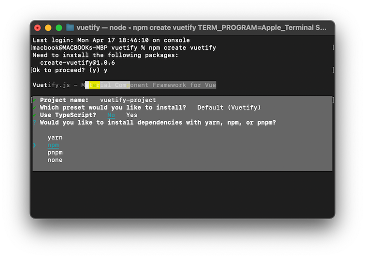
After the scaffolding process is complete, you can start the Vue development server using the following commands:
cd vuetify-project
npm dev
To add Vuetify to an existing project, you must manually import all the necessary components. First, navigate to the project folder and install Vuetify using the command below:
npm install vuetify@^3.1.14
Once the installation is complete, we’ll add Vuetify to the application’s main.js file. Open main.js and add the following configuration code:
import { createApp } from 'vue'
import App from './App.vue'
// Vuetify
import 'vuetify/styles'
import { createVuetify } from 'vuetify'
import * as components from 'vuetify/components'
import * as directives from 'vuetify/directives'
const vuetify = createVuetify({
  components,
  directives,
})
createApp(App).use(vuetify).mount('#app')
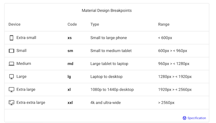
The Vuetify grid system is designed with five breakpoints, namely xs, sm, md, lg, and xl, which can target specific screen sizes or orientations. The grid layout can change to optimize the display for that particular breakpoint size. The image below shows the major grid breakpoints’ corresponding width ranges for different devices:
The Vuetify grid provides different components that you can use to customize the application. In the following section, we’ll review common Vuetify grid components and examples of how to use them in our application.
v-containerThe v-container component is the outermost container in the Vuetify grid system. It has a responsive and fluid layout that adjusts automatically to the screen space and wraps other sub-components:
<template>
   <v-container>
     <!-- Sub components go here -->
   </v-container>
</template>
v-rowThe v-row component is used to group v-col components side-by-side. It has customizable behavior through props like align-content, which aligns the columns vertically, and justify, which aligns the columns horizontally:
<template>
  <v-container>
    <v-row>
      <!-- Sub components here -->
    </v-row>
  </v-container>
</template>
v-colWe can use the v-col component to define individual columns within a v-row. There are several props that allow for the customization of each column, like align-self, which determines the vertical alignment of the column within the row. On the other hand, order determines the sequence in which the columns should appear:
<template>
  <v-container>
    <v-row>
      <v-col cols="12" md="6">Column 1</v-col>
      <v-col cols="12" md="3">Column 2</v-col>
      <v-col cols="12" md="3">Column 3</v-col>
    </v-row>
  </v-container>
</template>
align propWe can use the align prop to specify how child elements will align vertically within their parent container. You can use the align prop to place items at the top, center, or bottom using classes like .align-top, .align-center, or .align-bottom on the parent component.
The code below demonstrates how to use the .align-start prop to place the item at the top of the parent:
 <v-container class="bg-primary mb-6">
   <v-row align="start" style="height: 150px">
     <v-col v-for="n in 4" :key="n">
       <v-sheet class="pa-2 ma-2"> .align-start </v-sheet>
     </v-col>
   </v-row>
 </v-container>
The image below shows the output of using the align-start prop to place the item at the top of the parent element:

We can also change the item position from the top of the parent container to the center or bottom by replacing the align attribute with center or end, respectively.
We may want to place items within a single parent element at different vertical positions. We can do so using the align-self attribute, which takes the item position value, as shown in the code below:
 <v-container class="bg-success">
   <v-row style="height: 150px">
     <v-col align-self="start">
       <v-sheet class="pa-2 ma-2"> .align-self-start </v-sheet>
     </v-col>
     <v-col align-self="center">
       <v-sheet class="pa-2 ma-2"> .align-self-center </v-sheet>
     </v-col>
     <v-col align-self="end">
       <v-sheet class="pa-2 ma-2"> .align-self-end </v-sheet>
     </v-col>
     <v-col align-self="start">
       <v-sheet class="pa-2 ma-2"> .align-self-start </v-sheet>
     </v-col>
   </v-row>
 </v-container>
The code above uses the align-self prop, resulting in a grid layout, as shown in the image below:

justify propWe can use the justify prop to align the content of grid columns within a row horizontally. It can align items to the parent container’s left, center, or right section, as seen in the code below:
 <v-container class="bg-primary">
   <v-row justify="center">
     <v-col cols="4">
       <v-sheet class="pa-2 ma-2"> .justify-center </v-sheet>
     </v-col>
   </v-row>

   <v-row justify="space-between">
     <v-col v-for="k in 2" :key="k" cols="4">
       <v-sheet class="pa-2 ma-2"> .justify-space-between </v-sheet>
     </v-col>
   </v-row>
   <v-row justify="space-around">
     <v-col v-for="k in 2" :key="k" cols="4">
       <v-sheet class="pa-2 ma-2"> .justify-space-around </v-sheet>
     </v-col>
   </v-row>
 </v-container>
We set the justify prop of the first grid row to the center, which will center its child items in the middle of the container. In the second row, we set the justify prop to space-between, which will keep the first and last items at the start and end of the row with equal spacing between each item.
Finally, in the last row, we set the justify prop to space-around, giving the child items equal space around each item, including the first and last items. The image below shows the output of the code:

In the previous examples, you may have noticed that the grid columns were the same size. However, it’s possible to create a custom grid with varying column sizes by adding the cols attribute to the v-col component and specifying the desired size of each column using the code below:
<v-container class="bg-warning">
<v-row >
<v-col cols="2">
<v-sheet class="pa-2 ma-2"> .v-col-2 </v-sheet>
</v-col>
<v-col cols="7">
<v-sheet class="pa-2 ma-2"> .v-col-7 </v-sheet>
</v-col>
</v-row>
</v-container>
Below is the output:

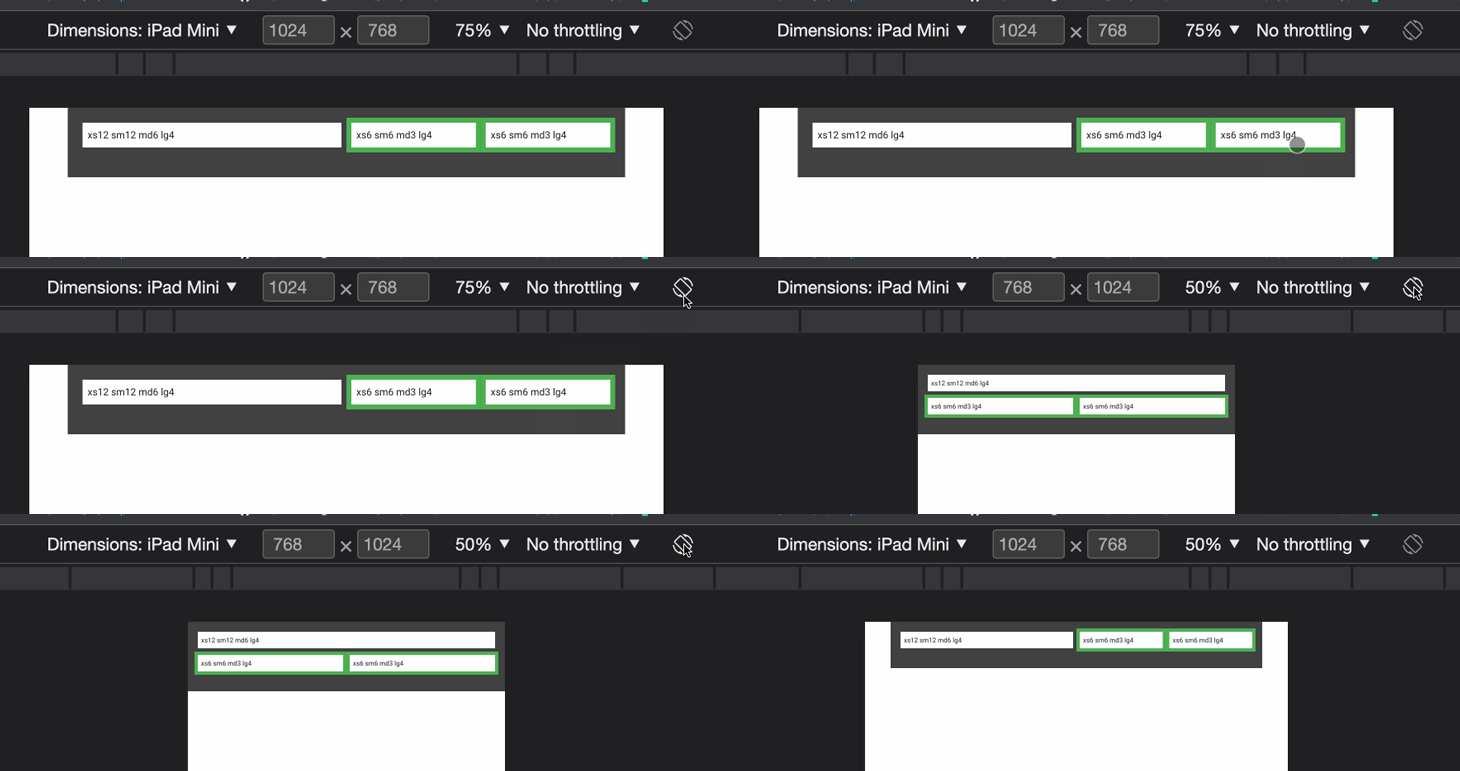
The image above shows that the grid maintains its size consistently across different devices. To specify the size of each grid on various devices, like phones, tablets, and desktops, we can use the v-col component’s props by passing the corresponding device breakpoints, xs, sm, md, etc.
The code below illustrates how to create grids that occupy the entire parent container when viewed on a desktop device and wrap to a new line when viewed on a mobile device:
<v-container class="bg-surface-variant">
<v-row class="mb-6" no-gutters>
<v-col xs="12" sm="12" md="6" lg="4">
<v-sheet class="pa-2 ma-2"> xs12 sm12 md6 lg4 </v-sheet>
</v-col>
<v-col class="bg-success" xs="6" sm="6" md="3" lg="4">
<v-sheet class="pa-2 ma-2"> xs6 sm6 md3 lg4 </v-sheet>
</v-col>
<v-col class="lg-12 bg-success" xs="6" sm="6" md="3" lg="4">
<v-sheet class="pa-2 ma-2"> xs6 sm6 md3 lg4 </v-sheet>
</v-col>
</v-row>
</v-container>
The code above will generate a responsive grid, as shown in the image below:
The no-gutters property eliminates the gutters, or the space between columns, from a v-row component. By default, a v-row has a gutter width of 16px on each side of the column. However, if the no-gutters property is added to a v-row, the gutter space will be removed, and the columns will be placed adjacent. This can be useful for creating a layout with no space between columns.
Let’s create two rows and add the no-gutters property to one of the rows using the code below:
<template>
 <center><h1>Without Gutters</h1></center>
 <v-container class="bg-primary">
   <v-row no-gutters>
     <v-col cols="12">
       <v-sheet class="pa-2 bg-success"> .v-col-12 </v-sheet>
     </v-col>
     <v-col cols="6">
       <v-sheet class="pa-2 bg-warning"> .v-col-6 </v-sheet>
     </v-col>
     <v-col cols="6">
       <v-sheet class="pa-2"> .v-col-6 </v-sheet>
     </v-col>
   </v-row>
 </v-container>
 <center><h1>With Gutters</h1></center>
 <v-container class="bg-warning">
   <v-row>
     <v-col cols="12">
       <v-sheet class="pa-2 bg-success"> .v-col-12 </v-sheet>
     </v-col>
     <v-col cols="6">
       <v-sheet class="pa-2 bg-primary"> .v-col-6 </v-sheet>
     </v-col>
     <v-col cols="6">
       <v-sheet class="pa-2"> .v-col-6 </v-sheet>
     </v-col>
   </v-row>
 </v-container>
</template>
We can see that in the first row, there is no space between columns, while in the second row, there is space between columns, as shown in the code output below:

The Vuetify grid is an excellent library for developing responsive Vue applications, allowing developers to create standalone websites. In this tutorial, we learned about the Vuetify grid system and how we can use it to create a dynamic and responsive website.
You can check their official documentation to learn more about the Vuetify grid system.
Debugging Vue.js applications can be difficult, especially when users experience issues that are difficult to reproduce. If you’re interested in monitoring and tracking Vue mutations and actions for all of your users in production, try LogRocket.
LogRocket lets you replay user sessions, eliminating guesswork by showing exactly what users experienced. It captures console logs, errors, network requests, and pixel-perfect DOM recordings — compatible with all frameworks.
With Galileo AI, you can instantly identify and explain user struggles with automated monitoring of your entire product experience.
Modernize how you debug your Vue apps — start monitoring for free.
Would you be interested in joining LogRocket's developer community?
Join LogRocket’s Content Advisory Board. You’ll help inform the type of content we create and get access to exclusive meetups, social accreditation, and swag.
Sign up now
Not sure if low-code is right for your next project? This guide breaks down when to use it, when to avoid it, and how to make the right call.

Compare Firebase Studio, Lovable, and Replit for AI-powered app building. Find the best tool for your project needs.
Discover how to use Gemini CLI, Google’s new open-source AI agent that brings Gemini directly to your terminal.

This article explores several proven patterns for writing safer, cleaner, and more readable code in React and TypeScript.