Editor’s note: This post was updated on 24 March 2022 to include information on creating a drag-and-drop component using react-dropzone and comparing it to the HTML Drag and Drop API.

In this tutorial, we’ll walk through how to create a drag-and-drop component for uploading images using react-dropzone. Our drag-and-drop component will include a regular image click and select functionality.
We’ll demonstrate the following:
react-dropzone uses React hooks to create HTML5-compliant React components for handling the dragging and dropping of files. react-dropzone provides the added functionality of restricting file types and also customizing the dropzone. With react-dropzone, we no longer have to rely on the HTML Drag and Drop API. In order to showcase the simplicity of react-dropzone, we’ll also demonstrate the same tutorial using the HTML Drag and Drop API.
To follow along with the code for the react-dropzone version of this project, go to GitHub.
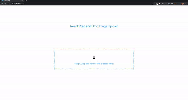
The final result will look like this:
react-dropzone.The Replay is a weekly newsletter for dev and engineering leaders.
Delivered once a week, it's your curated guide to the most important conversations around frontend dev, emerging AI tools, and the state of modern software.
This tutorial assumes that you have Node.js installed on your machine. Open your terminal, navigate to the directory where you want to add your project and type the following:
npx create-react-app react-dropzone
Next, we’ll install react-dropzone into our application, as follows:
// with npm
npm install --save react-dropzone

// with yarn
yarn add react-dropzone
react-dropzonereact-dropzone provides some ready-made code snippets. To create a drag-and-drop component with react-dropzone, all we need to do is copy and paste the snippets in our App.js file:
import React, {useEffect, useState} from 'react';
import {useDropzone} from 'react-dropzone';

function App(props) {
  const [files, setFiles] = useState([]);
  const {getRootProps, getInputProps} = useDropzone({
    accept: 'image/*',
    onDrop: acceptedFiles => {
      setFiles(acceptedFiles.map(file => Object.assign(file, {
        preview: URL.createObjectURL(file)
      })));
    }
  });

  const thumbs = files.map(file => (
    <div style={thumb} key={file.name}>
      <div style={thumbInner}>
        <img
          src={file.preview}
          style={img}
        />
      </div>
    </div>
  ));

  useEffect(() => {
    // Make sure to revoke the data uris to avoid memory leaks
    files.forEach(file => URL.revokeObjectURL(file.preview));
  }, [files]);

  return (
    <section className="container">
      <div {...getRootProps({className: 'dropzone'})}>
        <input {...getInputProps()} />
        <p>Drag 'n' drop some files here, or click to select files</p>
      </div>
      <aside style={thumbsContainer}>
        {thumbs}
      </aside>
    </section>
  );
}

export default App
The above code renders an image preview after dragging and dropping.
In the previous section, we demonstrated how easy it is to create a drag-and-drop component with react-dropzone. However, we did not address the issue of persisting images. When we run npm start to see our application in the browser, the application initially appears to run smoothly. However, we see that if we drag a second image the first image does not persist on the page.
In order to persist the dragged images, we will overhaul our previous code.
In our App.js file, let’s clear everything out and then paste in the code below:
import React, { useCallback, useState } from 'react';


function App() {
  const [images, setImages] = useState([]);
  const onDrop = useCallback((acceptedFiles) => {
    acceptedFiles.map((file, index) => {
      const reader = new FileReader();
      reader.onload = function (e) {
        setImages((prevState) => [
          ...prevState,
          { id: index, src: e.target.result },
        ]);
      };
      reader.readAsDataURL(file);
      return file;
    });
  }, []);
  return (
    <div className="App">

    </div>
  );
}
export default App;
In the code above, we initialize an image state which we set to an empty array, then using the onDrop() callback hook and we loop through our files if they are acceptable and if they are, we initialize a browser FileReader API and add the image to the state.
Next, we’ll create a DropBox component and then pass the onDrop which we will get from the App.js file as a prop.
import { useDropzone } from 'react-dropzone';
import styled from 'styled-components';
const getColor = (props) => {
if (props.isDragAccept) {
return '#00e676';
}
if (props.isDragReject) {
return '#ff1744';
}
if (props.isFocused) {
return '#2196f3';
}
return '#eeeeee';
};
const Container = styled.div`
flex: 1;
display: flex;
flex-direction: column;
align-items: center;
padding: 40px;
border-width: 2px;
border-radius: 10px;
border-color: ${(props) => getColor(props)};
border-style: dashed;
background-color: #fafafa;
color: black;
font-weight: bold;
font-size: 1.4rem;
outline: none;
transition: border 0.24s ease-in-out;
`;
function DropBox({ onDrop }) {
const {
getRootProps,
getInputProps,
acceptedFiles,
open,
isDragAccept,
isFocused,
isDragReject,
} = useDropzone({
accept: 'image/*',
onDrop,
noClick: true,
noKeyboard: true,
});
const lists = acceptedFiles.map((list) => (
<li key={list.path}>
{list.path} - {list.size} bytes
</li>
));
return (
<>
{' '}
<section className="dropbox">
<Container
className="dropbox"
{...getRootProps({ isDragAccept, isFocused, isDragReject })}
>
<input {...getInputProps()} />
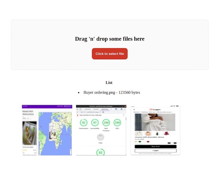
<p>Drag 'n' drop some files here</p>
<button type="button" className="btn" onClick={open}>
Click to select file
</button>
</Container>
</section>
<aside>
<h4>List</h4>
<p>{lists}</p>
</aside>
</>
);
}
export default DropBox;
In the DropBox component, we import useDropZone from react-dropzone and then we use it as a hook in which we destructured out *getRootProps*, *open*, *getInputProps*, *acceptedFiles* props.
The getRootProps is used to get the props that are required for drag-and-drop functionality and use it on any element.
The open prop is passed to the button to enable it to open the file directory to allow uploads.
The getInputProps is also used to create the drag-and-drop zone. However, it must be applied to an input tag and it must have the spread operator to add the content returned from getInputProps as separate items to the input tag.
The acceptedFiles props is used to check whether the files are accepted. We also mapped through it to render the file type and size in a list.
The noClick and noKeyboard set to true is to avoid opening the file manager by clicking on the DropBox or by pressing the enter and space keys
We also installed styled components which we will use in styling the DropBox component.
Next, create an Image.jsx file for each image and paste in the code below:
import React from "react";
function Image({ image }) {
  return (
    <div>
      <img alt='' src={image.src} />
    </div>
  );
}
export default Image;
Next, we create a ShowImage.jsx file to show the image in a list and also persist when we drag and drop another. Copy the following code into the ShowImage.jsx file:
import Image from './Image';
const ShowImage = ({ images }) => {
  const show = (image) => {
    return <Image image={image} />;
  };
  return <div className="container">{images.map(show)}</div>;
};
export default ShowImage;
In the code above, we are importing the Image component and using it as a wrapper to pass in the images which we will be getting as props from the App.js file
Next, we import the DropBox and ShowImage files into the App.js file, pass in the images into the ShowImage component, and also pass onDrop in to the DropBox component.
import React, { useCallback, useState } from 'react';
import ShowImage from './ShowImage';
import DropBox from './DropBox';
function App() {
  // State, browser FileReader and iterating

  return (
    <div className="App">
      <DropBox onDrop={onDrop} />
      <ShowImage images={images} />
    </div>
  );
}
export default App;
Now, let’s add some styling. We’ll copy and paste the following styles below into our index.css file:
body {
  text-align: center;
}
.dropbox {
  text-align: center;
  padding: 20px;
  width: 90%;
  margin: auto;
  margin-top: 50px;
}
.container {
  display: flex;
  flex-wrap: wrap;
  width: 80%;
  margin: 20px auto;
  padding: 20px;
}
.container img {
  height: 200px;
  width: 200px;
  margin-right: 15px;
}
.btn {
  padding: 15px;
  background-color: #de1a1a;
  color: white;
  font-weight: bold;
  border-radius: 10px;
  border: none;
  cursor: pointer;
}
.btn:hover{
  background-color: #945c5c;
}
There are a lot of free image services, such as Cloudinary, but for this project, we’ll use imgbb. Create an account and then obtain an API key.
In the DropBox.js file, we’ll create a button to handle the upload of our files to imgbb. Then, we’ll create an onClick method and pass in an updateFiles function that will be in charge of uploading the images when the button is clicked.
<button className="upload-btn" onClick={() => uploadFiles()}>Upload Images</button>
The uploadFiles function:
const uploadFiles = () => {
};
Next, we’ll create a state and set it to an empty array:
const [imageSent, setImageSent] = useState([]);
In the getInputProps() inside the input tag, we pass in an onChange method pointing to a handleFile function
  <input
       {...getInputProps({
        onChange: handleFile,
    })}
  />
The handleFile function
const handleFile = (e) => {
    setImageSent(e.target.files[0]);
  };
Because it is an input tag for a file, we can access the event.target.files and then call setImageSent and update the state.
In order to make a request with the imgbb API, a key and image properties are required. The key is the API key we obtained earlier and the image is the file to be uploaded.
To set these properties, we’ll use the FormData interface. This tool provides a way to easily construct key/value pairs to represent form fields and their values, which can then be easily sent.
Create a new FormData inside the uploadFiles functon and append a key with the name image and value imageSent. Then, append another key named key. The value should be your API key.
We’ll use Axios to handle our POST request, but this can also be done with fetch:
  const uploadFiles = () => {
    const formData = new FormData();
    console.log(imageSent);
    formData.append('image', imageSent);
    formData.append('key', 'Your Api key goes here');
    Axios.post('https://api.imgbb.com/1/upload', formData).then((response) => {
      console.log(response);
    });
  };
That’s it! We’ve created our drag-and-drop image uploader with react-dropzone!
As a basis for comparison, let’s take a look at the same tutorial using the HTML Drag and Drop API.
To create a Dropzone component, we would create a folder called Dropzone inside the src folder and add two files: Dropzone.js and Dropzone.css.
Then, we’d add an arrow function called Dropzone inside the Dropzone.js file and set the export function as default. We’d set the parent element to empty tags.
import React from 'react';

const Dropzone = () => {
    return (
        <>
        </>
    )
}
export default Dropzone;
Next, we’d import the Dropzone component into the App.js file:
import Dropzone from "./Dropzone/Dropzone";
We’d add the component as a child of the div element with class name content:
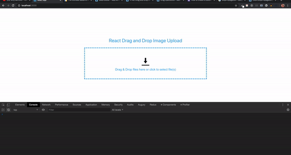
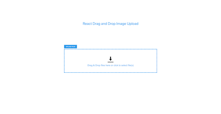
return (
<div>
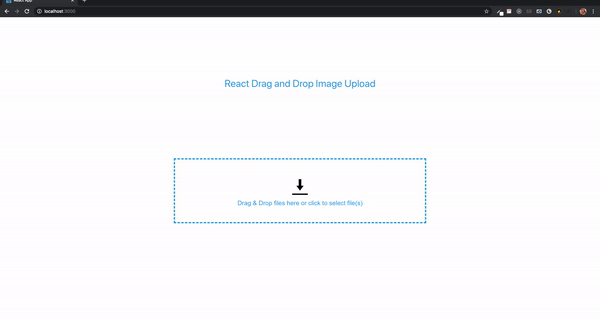
<p className="title">React Drag and Drop Image Upload</p>
<div className="content">
<Dropzone />
</div>
</div>
);
Now back to the Dropzone component. We’d add a div element with class name container. then, inside the container component, we’d add a div with class name drop-container.
<div className="container">
    <div className="drop-container">
    </div>
</div>
Next, we’d add this CSS style into the Dropzone.css and import the file inside the component:
.container {
    transform: translateY(-100%);
}

.container p {
    color: red;
    text-align: center;
}

.drop-container {
    display: flex;
    align-items: center;
    justify-content: center;
    margin: 0;
    width: 800px;
    height: 200px;
    border: 4px dashed #4aa1f3;
}
Then, inside the div with class name drop-container, we’d add the following elements:
<div className="drop-message">
    <div className="upload-icon"></div>
    Drag & Drop files here or click to upload
</div>
.upload-icon {
    width: 50px;
    height: 50px;
    background: url(../images/upload.png) no-repeat center center;
    background-size: 100%;
    text-align: center;
    margin: 0 auto;
    padding-top: 30px;
}

.drop-message {
    text-align: center;
    color: #4aa1f3;
    font-family: Arial;
    font-size: 20px;
}
HTML Drag-and-Drop uses the DOM event model and drag events inherited from mouse events.
A drag operation begins when a user selects an item from the OS, drags the item to a droppable element, then releases the dragged item. During drag operations, several events are fired. Some events might fire multiple times.
The drag-and-drop API defines eight events: four events for the draggable element and four events for the droppable element. For this illustrative example, we’d only need the four events for the droppable element. Each drag event type has an associated event handler. The events are:
dragenter — A dragged item enters a valid drop target (ondragenter)
dragleave — A dragged item leaves a valid drop target (ondragleave)
dragover — A dragged item is dragged over a valid drop target every few hundred milliseconds (ondragover)
drop — an item is dropped on a valid drop target (ondrop)
So far, we’ve specified the drop region for our files, but there’s no valid region in which to drop them. When a file is dragged into a browser from the OS, the browser will attempt to open and display it by default. If we wanted to allow a drop, we’d need to prevent the default handling of the event handlers.
On the div element with class name drop-container, we’d add four event methods.
onDragOver={dragOver}
onDragEnter={dragEnter}
onDragLeave={dragLeave}
onDrop={fileDrop}
In the below code, we’d have the event handler methods listed on the left and the methods to handle event handlers listed on the right. The div element would look as follows:
<div className="drop-container"
    onDragOver={dragOver}
    onDragEnter={dragEnter}
    onDragLeave={dragLeave}
    onDrop={fileDrop}
>
    ...
</div>
We’d define the methods for handling the events:
const dragOver = (e) => {
    e.preventDefault();
}

const dragEnter = (e) => {
    e.preventDefault();
}

const dragLeave = (e) => {
    e.preventDefault();
}

const fileDrop = (e) => {
    e.preventDefault();
    const files = e.dataTransfer.files;
    console.log(files);
}
The e.dataTransfer is a Data Transfer object that holds the data that is being dragged during a drag-and-drop operation. It may hold one or more data items. e.dataTransfer.files contains the dragged local files as a FileList.
Next, we’d need to handle the files from the FileList by validating the file type, checking the file size, and displaying the file name.
In this example, we’re only adding image files. That’s because the storage platform that we’ll use later to store the uploaded files only allows mostly image files. Let’s look at validating the files.
First, we’d create a method called handleFiles and add it to fileDrop with files as a parameter.
const handleFiles = (files) => {
}
Next, we’d add to fileDrop
const fileDrop = (e) => {
    e.preventDefault();
    const files = e.dataTransfer.files;
    if (files.length) {
        handleFiles(files);
    }
}
We’d create a new method called validateFile with a parameter called file. The method will return a Boolean value.
const validateFile = (file) => {
    const validTypes = ['image/jpeg', 'image/jpg', 'image/png', 'image/gif', 'image/x-icon'];
    if (validTypes.indexOf(file.type) === -1) {
        return false;
    }
    return true;
}
Here we have an array with the file types. You can add or remove any type. The file parameter from the FileList contains a type property. When using JavaScript’s indexOf method, if the type is not found in the array, it returns -1; otherwise, it returns the index of the value in the array. It returns false if the type is not found and true if it is found.
Now, we’d use the validateFile method inside handleFiles. The FileList is an array, and we’d loop through the array:
for(let i = 0; i < files.length; i++) {
    if (validateFile(files[i])) {
        // add to an array so we can display the name of file
    } else {
        // add a new property called invalid
        // add to the same array so we can display the name of the file
        // set error message
    }
}
Then, we’d import the useState hook from react:
import React, { useState } from 'react';
Next, we’d add two state variables inside the Dropzone function:
const [selectedFiles, setSelectedFiles] = useState([]);
const [errorMessage, setErrorMessage] = useState('');
selectedFiles has a type of array while errorMessage has a type of string.


// add a new property called invalid
files\[i\]['invalid'] = true;
Now, we’d update the selectedFiles array with the new object containing an invalid property:
// add to the same array so we can display the name of the file
setSelectedFiles(prevArray => [...prevArray, files[i]]);
Here we’d use a callback inside the setSelectedFiles method in order to get a quick update to the array:
We’d add the error message.
// set error message
setErrorMessage('File type not permitted');
Before we can try this out, we’d need to add a div to display the files inside the selectedFiles array. Next, we’d add the following after the div with class name drop-container.
<div className="file-display-container">
    <div className="file-status-bar">
        <div>
            <div className="file-type-logo"></div>
            <div className="file-type">png</div>
            <span className="file-name">test-file.png</span>
            <span className="file-size">(20.5 KB)</span> {<span className='file-error-message'>(File type not permitted)</span>}
        </div>
        <div className="file-remove">X</div>
    </div>
</div>
Now, we’d add these styles to the CSS file for Dropzone:
.file-display-container {
    position: fixed;
    width: 805px;
}

.file-status-bar{
    width: 100%;
    vertical-align:top;
    margin-top: 10px;
    margin-bottom: 20px;
    position: relative;
    line-height: 50px;
    height: 50px;
}

.file-status-bar > div {
    overflow: hidden;
}

.file-type {
    display: inline-block!important;
    position: absolute;
    font-size: 12px;
    font-weight: 700;
    line-height: 13px;
    margin-top: 25px;
    padding: 0 4px;
    border-radius: 2px;
    box-shadow: 1px 1px 2px #abc;
    color: #fff;
    background: #0080c8;
    text-transform: uppercase;
}

.file-name {
    display: inline-block;
    vertical-align:top;
    margin-left: 50px;
    color: #4aa1f3;
}

.file-error {
    display: inline-block;
    vertical-align: top;
    margin-left: 50px;
    color: #9aa9bb;
}

.file-error-message {
    color: red;
}

.file-type-logo {
    width: 50px;
    height: 50px;
    background: url(../images/generic.png) no-repeat center center;
    background-size: 100%;
    position: absolute;
}

.file-size {
    display:inline-block;
    vertical-align:top;
    color:#30693D;
    margin-left:10px;
    margin-right:5px;
    margin-left: 10px;
    color: #444242;
    font-weight: 700;
    font-size: 14px;
}

.file-remove  {
    position: absolute;
    top: 20px;
    right: 10px;
    line-height: 15px;
    cursor: pointer;
    color: red;
    margin-right: -10px;
}
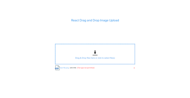
We can see how the files will be displayed. The file type would be extracted and displayed, as Ould the file name and size. The error message would only be displayed for invalid files.
Now that we have placeholders for the files that will be displayed on the page, we could use the selectedFiles array inside the template.
First, we’d create a method called fileSize. This would take in a size parameter. The file object from FileList contains a size property.
const fileSize = (size) => {
    if (size === 0) return '0 Bytes';
    const k = 1024;
    const sizes = ['Bytes', 'KB', 'MB', 'GB', 'TB'];
    const i = Math.floor(Math.log(size) / Math.log(k));
    return parseFloat((size / Math.pow(k, i)).toFixed(2)) + ' ' + sizes[i];
}
In the above code, we return the string 0 Bytes if the file size is zero. 1kB is equivalent to 1024 bytes. We can calculate the natural log of the size by dividing by the natural log of bytes value. Math.floor returns an integer. The return value of the function is the size divided by the value of k to the power of i with the sizes value appended.
Next, we’d add a method for getting the file type from the file name:
const fileType = (fileName) => {
    return fileName.substring(fileName.lastIndexOf('.') + 1, fileName.length) || fileName;
}
The substring() method extracts the characters from a string between two specified indices and returns the new substring. The substring() method returns the characters after the . in the file name.
<div className="file-display-container">
    {
        selectedFiles.map((data, i) =>
            <div className="file-status-bar" key={i}>
                <div>
                    <div className="file-type-logo"></div>
                    <div className="file-type">{fileType(data.name)}</div>
                    <span className={`file-name ${data.invalid ? 'file-error' : ''}`}>{data.name}</span>
                    <span className="file-size">({fileSize(data.size)})</span> {data.invalid && <span className='file-error-message'>({errorMessage})</span>}
                </div>
                <div className="file-remove">X</div>
            </div>
        )
    }
</div>
Now, we’d loop through the selectedFiles array. We’ll use the fileType method by passing the file name.
<span className={`file-name ${data.invalid ? 'file-error' : ''}`}>{data.name}</span>
Next, we’d check whether the object contains the invalid property added, which would indicate an invalid file. We’d add the class name file-error.
<span className="file-size">({fileSize(data.size)})</span> {data.invalid && <span className='file-error-message'>({errorMessage})</span>}
We’d display the file size by using the fileSize method. The error message would be displayed next to it if it is an invalid file.
Adding valid files is simple. Inside the if part of the handleFiles method, we’d add the following:
setSelectedFiles(prevArray => [...prevArray, files[i]]);
We could even drag and drop multiple files at the same time.
One drawback of the selectedFiles array is that a particular file can be added multiple times. We don’t want this behavior.

To remove duplicates from the selectedFiles array, we’d add a new useState variable inside the component.
const [validFiles, setValidFiles] = useState([]);
Next, we’d import the useEffect hook:
import React, { ..., useEffect } from 'react';
Now, we’d use the JavaScript reduce, find, and concat methods to remove duplicates and add the individual values into the new array validFiles:
useEffect(() => {
    let filteredArray = selectedFiles.reduce((file, current) => {
        const x = file.find(item => item.name === current.name);
        if (!x) {
            return file.concat([current]);
        } else {
            return file;
        }
    }, []);
    setValidFiles([...filteredArray]);

}, [selectedFiles]);
The result of filteredArray would be used to update the validFiles array. Next, we’d replace the selectedFiles in the HTML map to validFiles:
<div className="file-display-container">
    {
        validFiles.map((data, i) =>
            ...
        )
    }
</div>
Now, we’d check to ensure that a particular file can be added only once.
Before uploading the images, users should have the option of removing images from the list. We already have a button for removing an item from the list.
To create this functionality, we’d first add a method called removeFile with the file name as a parameter on the div element with class name: file-remove.
<div className="file-remove" onClick={() => removeFile(data.name)}>X</div>
Next, we’d need to remove the selected file from the validFiles and selectedFilesarrays. We’d use the JavaScript findIndex method to find the index of the file. Then, we’d use the splice method to remove the item from the arrays and update it with the setValidFiles and setSelectedFiles methods.
const removeFile = (name) => {
    // find the index of the item
    // remove the item from array

    const validFileIndex = validFiles.findIndex(e => e.name === name);
    validFiles.splice(validFileIndex, 1);
    // update validFiles array
    setValidFiles([...validFiles]);
    const selectedFileIndex = selectedFiles.findIndex(e => e.name === name);
    selectedFiles.splice(selectedFileIndex, 1);
    // update selectedFiles array
    setSelectedFiles([...selectedFiles]);
}
We could add a simple modal to preview an image before all images are uploaded. The preview would only be for valid files. We could remove invalid files by clicking on their file name. First, we’d add the modal divs after the div with class name container.
<div className="modal">
    <div className="overlay"></div>
    <span className="close">X</span>
    <div className="modal-image"></div>
</div>
The div element with class name modal-image will display the image. Next, we’d add the CSS styles. By default, the modal display is set to none. It will only be displayed when an image name is clicked.
.modal{
    z-index: 999;
    display: none;
    overflow: hidden;
}

.modal .overlay{
    width: 100%;
    height: 100vh;
    background: rgba(0,0,0,.66);
    position: absolute;
    top: 0;
    left: 0;
}

.modal .modal-image{
    position: absolute;
    top: 50%;
    left: 50%;
    transform: translate(-50%,-50%);
    overflow: hidden;
    object-fit: cover;
    width: 100%;
    height: 300px;
    background-size: contain;
    background-repeat: no-repeat;
    background-position: center;
}

.close {
    position: absolute;
    top: 15px;
    right: 35px;
    color: #f1f1f1;
    font-size: 40px;
    font-weight: bold;
    transition: 0.3s;
}
Next, we’d add the below code on the div inside the element with class name: file-status-bar.
onClick={!data.invalid ? () => openImageModal(data) : () => removeFile(data.name)}
<div className="file-display-container">
    {
        validFiles.map((data, i) =>
            <div className="file-status-bar" key={i}>
                <div onClick={!data.invalid ? () => openImageModal(data) : () => removeFile(data.name)}>
                    ...
                </div>
            </div>
        )
    }
</div>
The openImageModal would display valid files while invalid files are removed when clicked on. Next, we’d add the method openImageModal:
const openImageModal = (file) => {

}
Now, we’d import the useRef Hook from React. The ref will allow us to display the modal, show the image, and close the modal.
import React, { ..., useRef } from 'react';
Next, we’d add the following refs variables:
const modalImageRef = useRef();
const modalRef = useRef();
On the modal elements, we’d add the respective refs.
<div className="modal" ref={modalRef}>
    <div className="overlay"></div>
    <span className="close">X</span>
    <div className="modal-image" ref={modalImageRef}></div>
</div>
modalRef is used to display and hide the modal element and its contents
modalImageRef displays the image
We’d need to read the content of the file passed as a parameter into the openImageModal. Now, we’ll add the FileReader constructor.
const reader = new FileReader();
The FileReader object enables web applications to asynchronously read the contents of files (or raw data buffers) stored on the user’s computer using File or Blob objects to specify the file or data to read.
Next, we’d set the display of the modal to block using the modalRef.
const reader = new FileReader();
modalRef.current.style.display = "block";
We’d need a way to read the content of the file using readAsDataURL and add an event handler to be triggered once the reading operation is complete.
const reader = new FileReader();
modalRef.current.style.display = "block";
reader.readAsDataURL(file);
reader.onload = function(e) {
    modalImageRef.current.style.backgroundImage = `url(${e.target.result})`;
}
The e.target.result attribute contains a data: URL representing the file’s data. We’d set that as the background image of the div with ref modalImageRef.
In the CSS style for modal-image, we’ve already set the width, height, and some background properties.
Next, we’d add an onClick method on the span element with class name close.
<span className="close" onClick={(() => closeModal())}>X</span>
We’d create a method closeModal. When this method is called, the modal display is set to none and the image background is set to none so as to reset.
const closeModal = () => {
    modalRef.current.style.display = "none";
    modalImageRef.current.style.backgroundImage = 'none';
}
In order to provide the ability to upload images, we’d need to create a display upload button and build the functionality to allow users to click to select particular files.
First, we’d add an upload button. The button will only be displayed if all files are valid. If there is at least one invalid file, a message would be displayed instead.
First, we’d add a button with class name file-upload-btn as the first element inside the container div.
<button className="file-upload-btn">Upload Files</button>
.file-upload-btn {
    color: white;
    text-transform: uppercase;
    outline: none;
    background-color: #4aa1f3;
    font-weight: bold;
    padding: 8px 15px;
    margin-bottom: 5px;
}
To hide and display the upload button, we’d add a new useState variable to hold all invalid files. If the array length is zero, the button would be displayed; otherwise, the button would be hidden.
const [unsupportedFiles, setUnsupportedFiles] = useState([]);
We’d use the setUnsupportedFiles the same way we used setSelectedFiles. First, we’d add the following inside the else portion of the handleFiles and removeFile methods:
const handleFiles = (files) => {
    for(let i = 0; i < files.length; i++) {
        if (validateFile(files[i])) {
            ...
        } else {
            ...
            ...
            ...
            setUnsupportedFiles(prevArray => [...prevArray, files[i]]);
        }
    }
}
With the below code, we’d specify that each invalid file dropped by the user would be added to the array.
const removeFile = (name) => {
    // find the index of the item
    // remove the item from array

    ...
    ...
    const unsupportedFileIndex = unsupportedFiles.findIndex(e => e.name === name);
    if (unsupportedFileIndex !== -1) {
        unsupportedFiles.splice(unsupportedFileIndex, 1);
        // update unsupportedFiles array
        setUnsupportedFiles([...unsupportedFiles]);
    }
}
If the index of the element is found, the item would be spliced and unsupportedFiles would be updated.
Now, we’d replace the upload button with these two lines:
{unsupportedFiles.length === 0 && validFiles.length ? <button className="file-upload-btn" onClick={() => uploadFiles()}>Upload Files</button> : ''}
{unsupportedFiles.length ? <p>Please remove all unsupported files.</p> : ''}
unsupportedFiles length is zero and validFiles array has at least one value. if these conditions are met, the button is displayed; otherwise, the button would be hidden.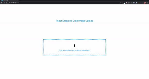
Before we add the upload functionality, we’d need to provide users with the ability to click to select images. A hidden input field is added with type file, an onChange event method, and a ref property. An onClick method would be added to the drop-container so that when any part of the container is clicked, it would trigger the hidden input field by using its ref.
First, we’d add an onClick to drop-container:
onClick={fileInputClicked}
Next, we’d add an input field after the drop-message element:
<input
    ref={fileInputRef}
    className="file-input"
    type="file"
    multiple
    onChange={filesSelected}
/>
const fileInputRef = useRef();
.file-input {
    display: none;
}
Now, we’d add a method called fileInputClicked with fileInputRef.current.clicked:
const fileInputClicked = () => {
    fileInputRef.current.click();
}
Next, we’d add another method for the filesSelected. The selected files can be obtained from fileInputRef.current.files. We just need to pass it into the handleFilesmethod.
const filesSelected = () => {
    if (fileInputRef.current.files.length) {
        handleFiles(fileInputRef.current.files);
    }
}
With these methods, we’d be able to select multiple files.
For the purpose of this demo, we’d use a free service called imgbb to add the upload functionality to our Dropzone component. First, we’d create an account and then obtain an API key from https://api.imgbb.com/.
Now, we’d add a method called uploadFiles to the upload button:
<button className="file-upload-btn" onClick={() => uploadFiles()}>Upload Files</button>
Next, we’d add the uploadFiles method:
const uploadFiles = () => {
}
A modal with a progress bar would be displayed when the upload button is clicked. Next, we’d add these upload modal elements:
<div className="upload-modal" ref={uploadModalRef}>
    <div className="overlay"></div>
    <div className="close" onClick={(() => closeUploadModal())}>X</div>
    <div className="progress-container">
        <span ref={uploadRef}></span>
        <div className="progress">
            <div className="progress-bar" ref={progressRef}></div>
        </div>
    </div>
</div>
.upload-modal {
    z-index: 999;
    display: none;
    overflow: hidden;
}

.upload-modal .overlay{
    width: 100%;
    height: 100vh;
    background: rgba(0,0,0,.66);
    position: absolute;
    top: 0;
    left: 0;
}

.progress-container {
    background: white;
    width: 500px;
    height: 300px;
    position: absolute;
    top: 50%;
    left: 50%;
    transform: translate(-50%,-50%);
    overflow: hidden;
}

.progress-container span {
    display: flex;
    justify-content: center;
    padding-top: 20px;
    font-size: 20px;
}

.progress {
    width: 90%;
    position: absolute;
    top: 50%;
    left: 50%;
    transform: translate(-50%,-50%);
    background-color: #efefef;
    height: 20px;
    border-radius: 5px;
}

.progress-bar {
    position: absolute;
    background-color: #4aa1f3;
    height: 20px;
    border-radius: 5px;
    text-align: center;
    color: white;
    font-weight: bold;
}

.error {
    color: red;
}
The modal has elements with refs. We’d add the ref variables as well as the closeUploadModal method:
const uploadModalRef = useRef();
const uploadRef = useRef();
const progressRef = useRef();
uploadModalRef displays and hides the upload modal
uploadRef shows messages
progressRef updates the progress bar
Inside the closeUploadModal method, set the display of uploadModalRef to none.
const closeUploadModal = () => {
    uploadModalRef.current.style.display = 'none';
}
In the uploadFiles method, we’d first set the display of uploadModalRef to block. Also, we’d add the string File(s) Uploading... to uploadRef innerHTML.
const uploadFiles = () => {
    uploadModalRef.current.style.display = 'block';
    uploadRef.current.innerHTML = 'File(s) Uploading...';
}
Since we already have the valid files inside the validFiles array, all we need to do is loop through the array, set the right properties using FormData, and then make the request.
const uploadFiles = () => {
    uploadModalRef.current.style.display = 'block';
    uploadRef.current.innerHTML = 'File(s) Uploading...';
    for (let i = 0; i < validFiles.length; i++) {
    }
}
According to the imgbb API documentation, a key and image properties are required in order to make the request. The key is the API key we obtained and the image is the file to be uploaded. We could convert to a binary file, base64 data, or a URL for an image.
To set these properties, we’d use the FormData interface. This tool provides a way to easily construct key/value pairs to represent form fields and their values, which can then be sent.
First, we’d create a new FormData inside the for loop and append a key with the name image and value validFiles[i]. Then, we’d append another key named key. The value would be our API key.
const uploadFiles = () => {
    uploadModalRef.current.style.display = 'block';
    uploadRef.current.innerHTML = 'File(s) Uploading...';
    for (let i = 0; i < validFiles.length; i++) {
        const formData = new FormData();
        formData.append('image', validFiles[i]);
        formData.append('key', 'add your API key here');
    }
}
To make the request, we’d use Axios because it has a method we could use to get the upload progress. From this, the progress bar value could be calculated and displayed.
We’d run the following installation command:
npm install axios
Once installed, we’d import inside the Dropzone component:
import axios from 'axios';
A postrequest would be required to upload the file(s) to imgbb:
const uploadFiles = () => {
    uploadModalRef.current.style.display = 'block';
    uploadRef.current.innerHTML = 'File(s) Uploading...';
    for (let i = 0; i < validFiles.length; i++) {
        const formData = new FormData();
        formData.append('image', validFiles[i]);
        formData.append('key', 'add your API key here');
        axios.post('https://api.imgbb.com/1/upload', formData, {})
        .catch(() => {
            // If error, display a message on the upload modal
            uploadRef.current.innerHTML = `<span class="error">Error Uploading File(s)</span>`;
            // set progress bar background color to red
            progressRef.current.style.backgroundColor = 'red';
        });
    }
}
Axios post takes three parameters: the URL, data, and last object is where the event for the upload progress is calculated. You can learn more about the Axios request configuration on GitHub. We’re interested in the onUploadProgressmethod, which facilitates the handling of progress events for uploads.
In this guide, we walked through how to create a drag-and-drop image uploader with react-dropzone. We demonstrated the simplicity of this method compared to using the HTML Drag and Drop API. By reviewing the react-dropzone official documentation and making a few tweaks to our code, we can extend our application to accept other file types like PDF, ZIP, etc., depending on the storage service.

A step-by-step guide to building your first MCP server using Node.js, covering core concepts, tool design, and upgrading from file storage to MySQL.

Using security headers in your Next.js apps is a highly effective way to secure websites from common security threats.

A deep dive into May 2026’s AI model and tool rankings. We break down performance, usability, pricing, and real-world capabilities across 50+ features to help you pick the right tools for your development workflow.

A practical guide to Agent Browser CLI. Learn how AI agents navigate, snapshot, and interact with web pages using stable references, enabling efficient automation and exploratory testing.
Would you be interested in joining LogRocket's developer community?
Join LogRocket’s Content Advisory Board. You’ll help inform the type of content we create and get access to exclusive meetups, social accreditation, and swag.
Sign up now

 Learn more →
