
The Replay is a weekly newsletter for dev and engineering leaders.
Delivered once a week, it's your curated guide to the most important conversations around frontend dev, emerging AI tools, and the state of modern software.
Have you ever filled and submitted a form in a mobile application, and you see an animated or graphical pop-up indicating that your request is processing? And then, another pop-up appears, informing you that the request was either successful or not?

This is a common example of using graphical decorators to communicate to users about the status of their actions. In Flutter, these decorators are called progress indicators.
In this article, you will learn how to implement Flutter’s inbuilt progress indicators in asynchronous applications. We will dive into every indicator to understand how they work and how you can customize them. Then, we will build two applications that display progress indicators to users when making download and external API requests.
For this demonstration, I’ll be using Android Studio for my development environment.
An asynchronous application is composed of a task or a set of tasks that are placed in motion while the rest of the program carries on a previous task until it is completed.
Ideally, you’ll have already decided whether or not to apply asynchronous executions in your program because you’ll know what kind of system you’re trying to build. A helpful tip for determining this is to identify the specific tasks that should be executed independently and those that are dependent on the completion of other processes.
As the name implies, progress indicators help communicate the status of a user’s request. Examples of actions that require progress indicators include:
Flutter has an abstract ProgressIndicator class, from which its concrete progress indicator widgets — LinearProgressIndicator and CircularProgressIndicator — are subclasses.
We will be taking a look at three of the progress indicators available in Flutter. At the time I’m writing this article, there are two inbuilt indicators in Flutter, and the rest are external dependencies that have to be installed in your Flutter project.
This is the first of Flutter’s inbuilt progress indicators, which is a subclass of the ProgressIndicator abstract class. It is used to communicate the progress of a task in a horizontal bar.
This is the second of Flutter’s inbuilt progress indicators, and it is also a subclass of the ProgressIndicator abstract class. The CircularProgressIndicator() spins to communicate that a task is being processed.
Generally, the duration of these indicators can either be determinate or indeterminate.
A determinate progress indicator serves to communicate the fraction or percentage of the task that has been completed and the fraction yet to be executed.
The value of the indicator changes with every bit of progress made in the execution of the task. Each progress indicator has a value attribute that accepts a double data type between 0.0 and 1.0 to set the start and endpoints of the indicator.
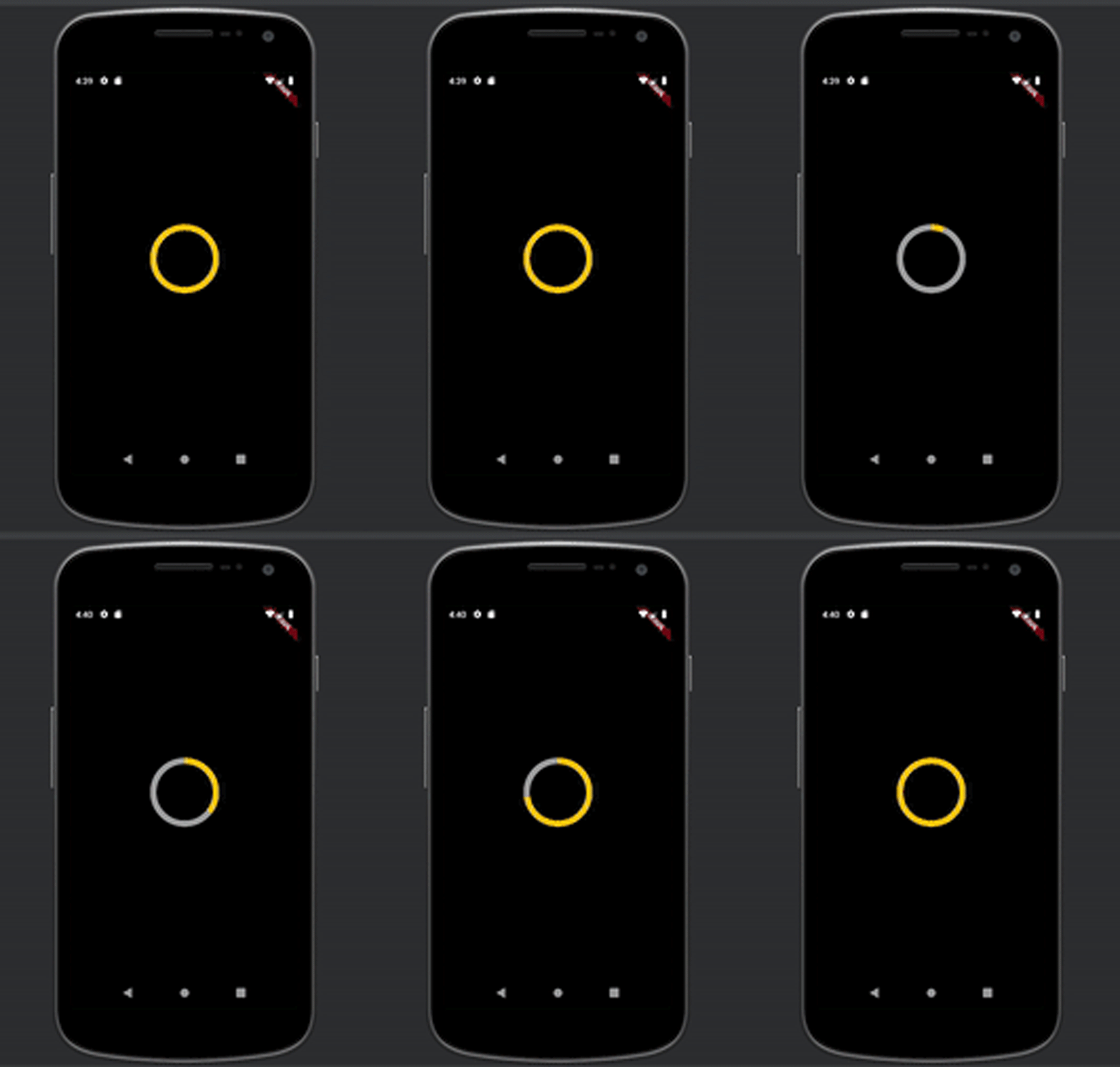
The image above is a determinate circular progress indicator built using the following code piece:
    dart

class DeterminateIndicator extends StatefulWidget {


      @override
      _DeterminateIndicatorState createState() => _DeterminateIndicatorState();
    }

    class _DeterminateIndicatorState extends State<DeterminateIndicator > {


      @override
      Widget build(BuildContext context) {

        return Scaffold(
          backgroundColor: Colors.black,
          body: Center(
            child: Padding(
              padding: const EdgeInsets.all(10.0),
              child: TweenAnimationBuilder(
                tween: Tween(begin: 0.0, end: 1.0),
                duration: Duration(seconds: 3),
                builder: (context, value, _) {
                  return SizedBox(
                    width: 100,
                    height: 100,
                    child: CircularProgressIndicator(
                      value: value as double,
                      backgroundColor: Colors.grey,
                      color: Colors.amber,
                      strokeWidth: 10,
                    ),
                  );
                }
              ),
            )
            )
          );

      }

    }
The indicator spins for three seconds, as defined in the duration of the TweenAnimationBuilder() widget.
An indeterminate progress indicator serves to communicate the progress of a task with no definite duration. In other words, this indicator is used when we do not know how long the task will take before completion.
An indicator can be made indeterminate by setting its value attribute to null.
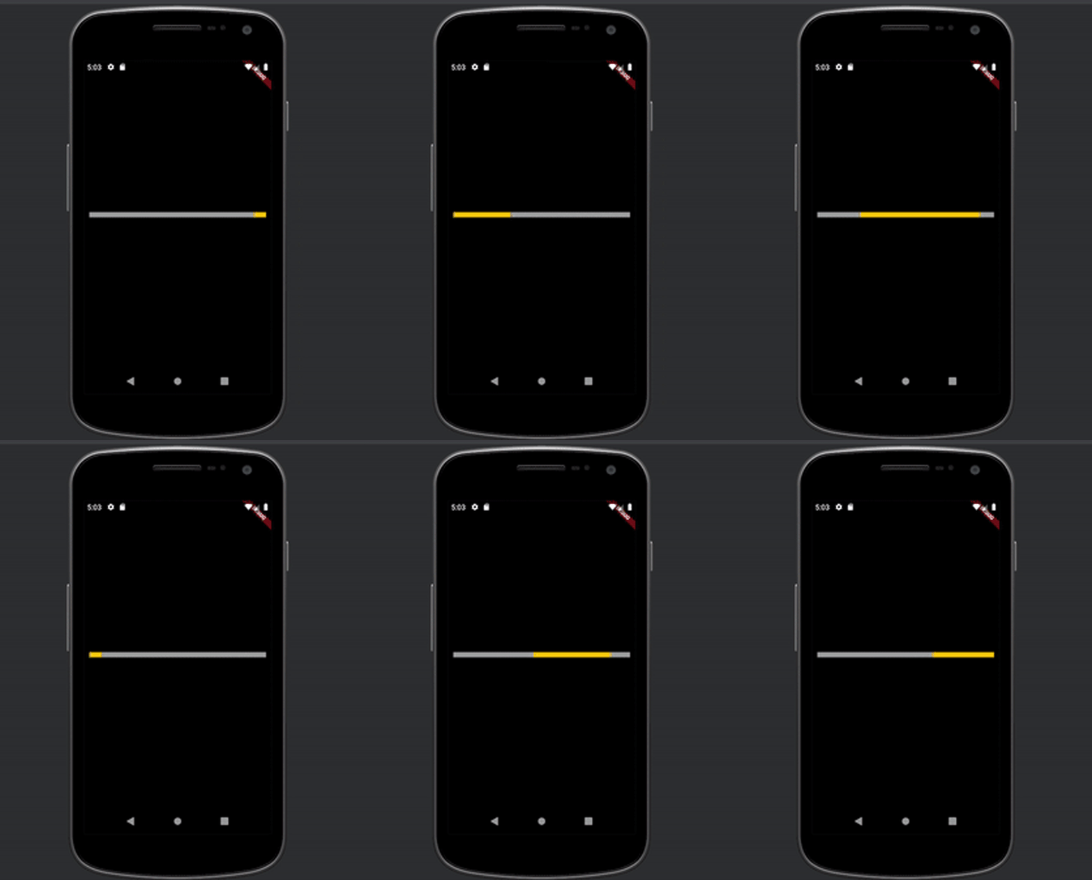
The image above is an indeterminate linear progress indicator built using the following code piece:
    dart

    class IndeterminateIndicator extends StatefulWidget {

      @override
      _IndeterminateIndicatorState createState() => _IndeterminateIndicatorState();
    }

    class _IndeterminateIndicatorState extends State<IndeterminateIndicator > {

      @override
      Widget build(BuildContext context) {

        return Scaffold(
          backgroundColor: Colors.black,
          body: Center(
            child: Padding(
              padding: const EdgeInsets.all(10.0),
              child: SizedBox(
                     child: LinearProgressIndicator(
                      backgroundColor: Colors.grey,
                      color: Colors.amber,
                      minHeight: 10,
                    ),
              ),
            )
            )
          );

      }

    }
flutter_spinkit is an external package that comprises a collection of animated indicators that can be instantiated in your application.
To install this package in your project, add the dependency below in your pubspec.yaml file:
dependencies:
  flutter_spinkit: ^5.1.0
Alternatively, you can simply run the following command in your terminal:
console

$ flutter pub add flutter_spinkit
Below is a preview of some of the indicators available in this package.

You can always refer to the flutter_spinkit documentation to select from other available options that may better suit the theme of your application.
When applying a progress indicator in your application, the first thing you want to consider is whether or not you can obtain the endpoint of the task or measure its progress. This enables you to decide if you should select a determinate or indeterminate progress indicator.
For example, instances where you can measure the progress of a task, and therefore apply determinate progress indicators, include:
However, when you cannot measure the task’s progress, indeterminate indicators are your best bet. Examples of such instances include:
The indicators provided by the flutter_spinkit package are typically categorized as loading indicators. Hence, it is most suitably used when you need an indeterminate progress indicator.
Let us proceed to demonstrate how a determinate indicator works. We’ll achieve this by building an application that downloads a file from the internet at the click of a button.
You will communicate the progress of the download through the circular progress indicator. The size of the file we are downloading is obtainable, so we’ll measure its progress by counting how many bytes have been downloaded.
The dependencies that are required for this demonstration are:
dart

class DeterminateIndicator extends StatefulWidget {

  @override
  _DeterminateIndicatorState createState() => _DeterminateIndicatorState();
}

class _DeterminateIndicatorState extends State<DeterminateIndicator> {

  File? imageFile;
  double downloadProgress = 0;

  Future downloadImage() async {
    final url =      'https://images.unsplash.com/photo-1593134257782-e89567b7718a?ixid=MnwxMjA3fDB8MHxwaG90by1wYWdlfHx8fGVufDB8fHx8&ixlib=rb-1.2.1&auto=format&fit=crop&w=375&q=80';

    final request = Request('GET', Uri.parse(url));
    final response = await Client().send(request);
    final contentLength = response.contentLength;
    final fileDirectory = await getApplicationDocumentsDirectory();
    final filePath = '${fileDirectory.path}/image.jfif';

    imageFile = File(filePath);
    final bytes = <int>[];
    response.stream.listen(
          (streamedBytes) {
        bytes.addAll(streamedBytes);

        setState(() {
          downloadProgress = bytes.length / contentLength!;
        });
      },
      onDone: () async {
        setState(() {
          downloadProgress = 1;
        });
      },
      cancelOnError: true,
    );
  }

  @override
  Widget build(BuildContext context) {
    return Scaffold(
      backgroundColor: Colors.black,
      appBar: AppBar(
        title: Text('Determinate progress indicator'),
        centerTitle: true,
      ),
      body: Container(
        alignment: Alignment.center,
        padding: EdgeInsets.all(16),
        child: Column(
          mainAxisAlignment: MainAxisAlignment.center,
          children: [
            downloadProgress == 1 ? Container(
              width: 250,
                height: 250,
                child: Image.file(imageFile!)
            ) : Text('Download in progress'),
            SizedBox(height: 30),

            SizedBox(
              width: 100,
              height: 100,
              child: Stack(
                fit: StackFit.expand,
                children: [
                  CircularProgressIndicator(
                    value: downloadProgress,
                    valueColor: AlwaysStoppedAnimation(Colors.blueAccent),
                    strokeWidth: 10,
                    backgroundColor: Colors.white,
                  ),
                  Center(
                      child: downloadProgress == 1
                          ?
                      Text(
                        'Done',
                        style: TextStyle(
                            color: Colors.white,
                            fontWeight: FontWeight.bold,
                            fontSize: 20
                        ),
                      )
                          :
                      Text(
                        '${(downloadProgress * 100).toStringAsFixed(0)}%',
                        style: TextStyle(
                          fontWeight: FontWeight.bold,
                          color: Colors.white,
                          fontSize: 24,
                        ),
                      )
                  ),
                ],
              ),
            ),

            const SizedBox(height: 32),
            Container(
              width: 200,
              height: 40,
              child: RaisedButton(
                onPressed: downloadImage,
                color: Theme
                    .of(context)
                    .primaryColor,
                child: Row(
                    children: <Widget>[
                      Text(
                        'Download image',
                        style: TextStyle(
                            color: Colors.white,
                            fontSize: 16
                        ),
                      ),
                      SizedBox(width: 10),
                      Icon(
                        Icons.download,
                        color: Colors.white,
                      )
                    ]
                ),
              ),
            )
          ],
        ),
      ),
    );
  }

}
In the code above, we sent an HTTP request to the URL of the image. You can replace the URL with an image URL of your choice. The content of the response from the HTTP request was read as bytes.
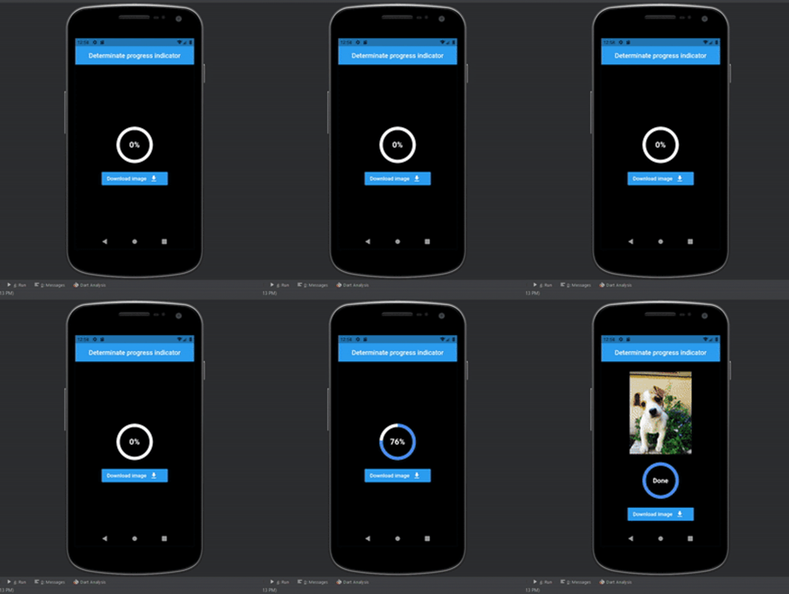
Each streamed byte from the response was measured using the downloadProgress variable, and the widget was rebuilt for every change in its value.
Finally, we displayed the downloaded image on the screen once the download process was complete, and defined the value of downloadProgress as being equal to 1. Below, you can see the final result in our sample app.
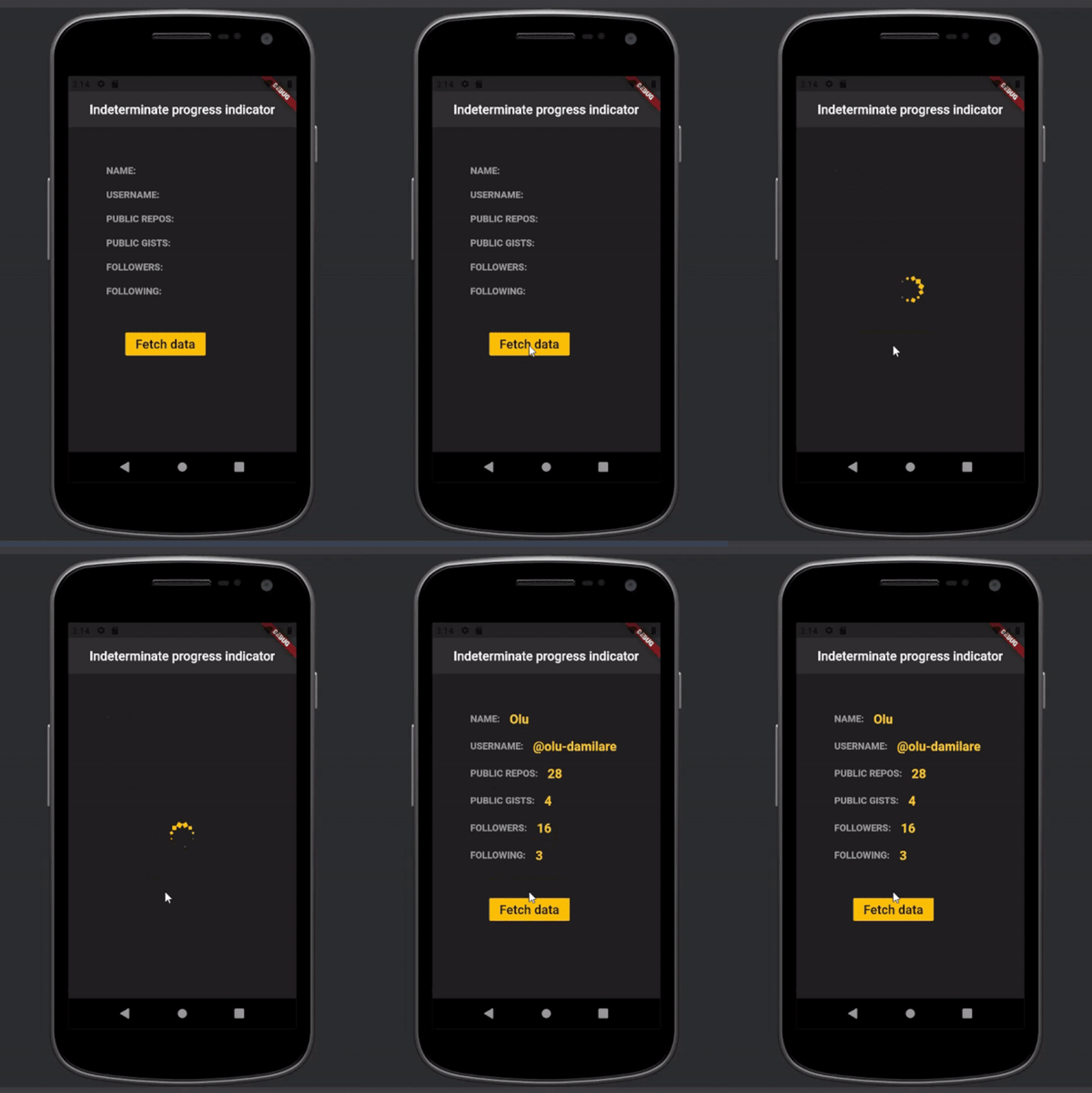
For this demo section, we’ll build a simple application that makes an HTTP request to a GitHub Rest API: https://api.github.com/users/olu-damilare. Then, we will proceed to render some of the data obtained from this request on the screen.
Since we do not know how long this request may take, we must implement an indeterminate progress indicator to communicate that the request is currently processing.
The external dependencies required to build this application are:
dart
class IndeterminateIndicator extends StatefulWidget {

  @override
  _IndeterminateIndicatorState createState() => _IndeterminateIndicatorState();
}

class _IndeterminateIndicatorState extends State<IndeterminateIndicator> {

  String? name;
  String? username;
  String? publicRepos;
  String? publicGists;
  String? followers;
  String? following;
  bool isLoading = false;

  Future<void> fetchData() async{
    setState(() {
      isLoading = true;
    });

    try {
      Response response = await get(
          Uri.parse('https://api.github.com/users/olu-damilare'));
      Map data = jsonDecode(response.body);

      setState(() {
        name = data['name'];
        username = data['login'];
        publicRepos = data['public_repos'].toString();
        publicGists = data['public_gists'].toString();
        followers = data['followers'].toString();
        following = data['following'].toString();
        isLoading = false;
      });

    }catch(e){
      print('caught error: $e');
    }
  }

  @override
  Widget build(BuildContext context) {
    return Scaffold(
        backgroundColor: Colors.grey[900],
        appBar: AppBar(
        title: Text('Indeterminate progress indicator'),
        backgroundColor: Colors.grey[850],
        centerTitle: true,
        elevation: 0.0,
    ),
        body: isLoading ?
        Center(
            child: SizedBox(
              height: 200,
              width: 200,
              child: SpinKitCircle(
                itemBuilder: (BuildContext context, int index) {
                  return DecoratedBox(
                    decoration: BoxDecoration(
                      color: Colors.amber,
                    ),
                  );
                },
              ),
            )
        )
        :
        Padding(
        padding: EdgeInsets.all(60),
        child: Column(
          crossAxisAlignment: CrossAxisAlignment.start,
          children: <Widget>[

          Row(
            children: [
              buildParam('NAME:'),
              SizedBox(width: 15.0),
              name == null ? Text('') : buildData(name!),
            ],
          ),
          SizedBox(height: 20.0),
            Row(
              children: [
                buildParam('USERNAME:'),
                SizedBox(width: 15.0),
                name == null ? Text('') : buildData('@${username}'),
              ],
            ),
            SizedBox(height: 20.0),
            Row(
              children: [
                buildParam('PUBLIC REPOS:'),
                SizedBox(width: 15.0),
                name == null ? Text('') : buildData(publicRepos!),
              ],
            ),

          SizedBox(height: 20.0),
            Row(
              children: [
                buildParam('PUBLIC GISTS:'),
                SizedBox(width: 15.0),
                name == null ? Text('') : buildData(publicGists!),
              ],
            ),
            SizedBox(height: 20.0),
            Row(
              children: [
                buildParam('FOLLOWERS:'),
                SizedBox(width: 15.0),
                name == null ? Text('') : buildData(followers!),
              ],
            ),

            SizedBox(height: 20.0),
            Row(
              children: [
                buildParam('FOLLOWING:'),
                SizedBox(width: 15.0),
                name == null ? Text('') : buildData(following!),
              ],
            ),

            Padding(
              padding: const EdgeInsets.only(top: 50.0, left: 30),
              child: RaisedButton(
                color: Colors.amber,
                onPressed: fetchData,
                child: Text(
                    'Fetch data',
                  style: TextStyle(
                    fontWeight: FontWeight.bold,
                    fontSize: 20
                  ),
                ),
              ),
            )
          ]
          ),
          ),
          );
      }

      Widget buildParam(String param){
        return Text(
          param,
          style: TextStyle(
            fontSize: 15.0,
            fontWeight: FontWeight.bold,
            color: Colors.grey,
          ),
        );
      }

      Widget buildData(String data){
        return Text(
          data,
          style: TextStyle(
            fontSize: 20.0,
            fontWeight: FontWeight.bold,
            color: Colors.amber[400],
          ),
        );
      }
}
The user experience contributed to your application by a progress indicator is priceless. You don’t want to leave your users wondering if there’s a glitch in your application each time they perform an action and there is no appropriate indication about the status of their request.
Appropriately choosing indicators also influences your application’s user experience, and I hope I’ve been able to guide you on choosing and implementing the right progress indicators for your asynchronous Flutter applications.
Install LogRocket via npm or script tag. LogRocket.init() must be called client-side, not
server-side
$ npm i --save logrocket

// Code:

import LogRocket from 'logrocket';
LogRocket.init('app/id');
// Add to your HTML:

<script src="https://cdn.lr-ingest.com/LogRocket.min.js"></script>
<script>window.LogRocket && window.LogRocket.init('app/id');</script>

CSS wasn’t built for dynamic UIs. Pretext flips the model by measuring text before rendering, enabling accurate layouts, faster performance, and better control in React apps.

Why do real-time frontends break at scale? Learn how event-driven patterns reduce drift, race conditions, and inconsistent UI state.
Test out Auth.js, Clerk, WorkOS, and Better Auth in Next.js 16 to see which auth library fits your app in 2026.

When should you move API logic out of Next.js? Learn when Route Handlers stop scaling and how ElysiaJS helps.
Would you be interested in joining LogRocket's developer community?
Join LogRocket’s Content Advisory Board. You’ll help inform the type of content we create and get access to exclusive meetups, social accreditation, and swag.
Sign up now