Ever found yourself wanting to build an application containing a selectable container and you want to add some pizazz to it by giving the container a different color so it can appear disabled before it is clicked?

Then, this is the tutorial for you, as the implementation of this feature is not available using the container widget. Join me as I show you how to build a selectable container using Flutter.
To proceed, I would suggest that you have a strong understanding of Flutter, as we will make use of widgets a beginner may not know.
At the end of the article, the reader should understand the primary use of the GestureDetector widget and how to build a selectable container in Flutter.
Let’s get started!
For this project, we will build a simple application in which the background changes to the color selected when you select a container. With the GestureDetector widget, we will be able to turn this feature on and off using the onTap method.
To avoid confusion, we will split our codes into three different dart files; “main.dart”, “gridcontainer.dart”, and “gridview_itemview.dart”.
We will start with the main.dart file. The default code in this file is a simple counter app that increments by clicking the Add button.
We do not need that application; thus, we will delete everything within that file other than the material.dart package and the main function. We will create a stateless widget with the name MyApp, and within it, we will override the build function while giving it a BuildContext class as a parameter.
What this class does is handle the location of every widget in the widget tree. We will also return a MaterialApp where we will set the title and the home (we will give it the value of the stateful widget in the gridcontainer.dart file).
Here is what the main.dart file looks like:
import 'package:flutter/material.dart';
import 'gridcontainer.dart';
void main() => runApp(const MyApp());
class MyApp extends StatelessWidget {
 const MyApp({Key? key}) : super(key: key);
 static const String _title = 'Flutter Code Sample';
 @override
 Widget build(BuildContext context) {
  return const MaterialApp(
   debugShowCheckedModeBanner: false,
   title: _title,
   home: GridContainer(),
  );
 }
}
Before heading to the gridcontainer.dart file, we will add some code to this file. First off, we will add a new stateless widget with the name GridViewItemView to our code, followed by some constructor variables above the build function.
 class GridViewItemView extends StatelessWidget {
 const GridViewItemView({ Key? key }) : super(key: key);
 @override
 Widget build(BuildContext context) {
  return Container(

  );
 }
}
The constructors will be a string with the name title (title of our container), color with the name color (color of our container), and VoidCallback set to onTap.
 final String? title;
 final color? color;
 final VoidCallback? onTap;
After adding the constructor, we will add our formal parameters to our GridViewItemView. Now, we will change our container to the GestureDetector widget (it allows us to add the onTap property).
Next, we will add a child property which we will give the value Center, and within this child property, we will create another child property and assign it Row. In our Row, we want to set the mainAxisAlignment to the center, add our text, and style the text. Finally, we will have our BuildContext class as:
Widget build(BuildContext context) {
  return GestureDetector(
   onTap: onTap,
   child: Container(
    color: color,
    child: Center(
      child: Row(
     mainAxisAlignment: MainAxisAlignment.center,
     children: [
      Text(
       title.toString(),
       style: const TextStyle(color: Colors.white, fontSize: 20),
      ),
     ],
    )),
   ),
  );
 }
We want to add the GridViewItemView to our gridcontainer.dart file.
We will begin by initializing our stateful widget with the name GridContainer to our code.
import 'package:flutter/material.dart';

class GridContainer extends StatefulWidget {
 const GridContainer({ Key? key }) : super(key: key);
 @override
 State<GridContainer> createState() => _GridContainerState();
}
class _GridContainerState extends State<GridContainer> {
 @override
 Widget build(BuildContext context) {
  return Scaffold(

  );
 }
}
Rather than using the container widget, we will use the scaffold widget in its place. Next, we will add the appBar property and GridView widget (GridView.count() allows GridView to specify the number of rows and columns) to the body of our scaffold.
Next, we will specify the following GridView.count properties: crossAxisCount, mainAxisSpacing, and crossAxisSpacing.
Widget build(BuildContext context) {
 return Scaffold(
  appBar: AppBar(
   title: const Text('Selectable Container'),
  ),
  body: GridView.count(
   crossAxisCount: 3,
   padding: const EdgeInsets.only(top: 16, left: 16, right: 16),
   mainAxisSpacing: 16,
   crossAxisSpacing: 16,
 );
}
Now, we want to give a color to the container we created. To do this, we will create four variables; red, purple, orange (for the containers), and background (we will set its opacity to differentiate between the grid and the background).
const red = Color.fromARGB(255, 255, 17, 0);
const purple = Colors.purple;
const orange = Colors.deepOrange;
const background = Colors.white;
Back in our scaffold widget, we will add our children, followed by three GestureDetector widgets, each containing a child widget GridViewItemView. These child widgets will also contain a title and a color property (the name and the const we created earlier).
children: <Widget>[
 GestureDetector(
  child: const GridViewItemView(
   title: 'red',
   color: red,
  )),
 GestureDetector(
  child: GridViewItemView(
   title: 'Orange',
   color: orange,
  )),
 GestureDetector(
  child: GridViewItemView(
   title: 'purple',
   color: purple,
  )),
],
Here is what the application’s interface looks like at the moment:
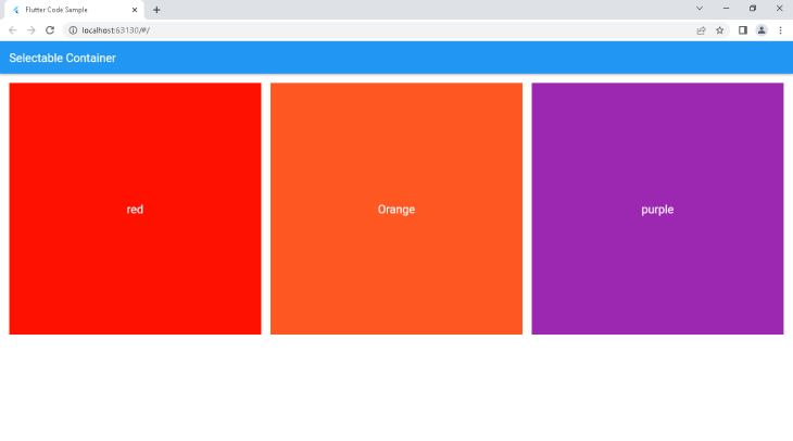
Our application at the moment displays only the containers at the moment. In this next section, we will implement some functionalities which will allow us to change the background color and select one container at a time.
In this section, we will implement two functionalities:
onTap property)Earlier, we created four variables, with three belonging to the containers and the last for the background.
Similarly, we will create three new variables for our containers and name them; inactivered, inactivepurple, and inactiveorange.
Then, we will assign colors to them (similar colors but a darker shade), which will be in effect once their corresponding container is inactive.
const inactivered = Color.fromARGB(255, 160, 13, 3);
const inactivepurple = Color.fromARGB(255, 74, 18, 83);
const inactiveorange = Color.fromARGB(255, 165, 56, 22);
To put this feature in full effect, we will create a number of if statements, but before proceeding, we will use Dart enums to define our named constants.
To do this, we will create our enum using the enum keyword and call it Colour. Then, we will assign the values; red, orange, and purple. Here is how it looks:
enum Colour {
 red,
 orange,
 purple,
}
(Note: We will call these values in a method we will create later)
Now, we want all the containers to start with the inactive color, and when we tap the container, it should change to the active color.
To do this, we will go into our state widget and create four variables of type “color” with the name; redColour, orangeColour, purpleColour, mainbackground.
Next, we will set the variables to the inactivered, inactiveorange, inactivepurple, and background, respectively.
We then set the first three variables as the starting value for the container color in our child widget (change the color from the previous value assigned to it).
Color redColour = inactivered;
Color orangeColour = inactiveorange;
Color purpleColour = inactivepurple;
Color mainbackground = background;
(Note: Our state widget is mutable, i.e., its properties can change and mutate, meaning the properties for this class do not have to be final)
Finally, to make our container change on tap, we will create a updatecolour method with an input Colour selectedcolour which will specify the color selected.
Next, we will use an if statement to check if the selectedcolour is red. After this, we will use an if statement to check if the redColour is equal to the inactivered. If true, we will change it to the active color (red) and set the other colors (orangeColour, purpleColour) to their inactive colors (inactivepurple, inactiveorange).
Else, if it is in the active card color, we will change it to the inactive card color. Follow the same steps for the other containers, and we can move to the next stage.
void updatecolour(Colour selectedcolour) {
 if (selectedcolour == Colour.red) {
  if (redColour == inactivered) {
   redColour = red;
   orangeColour = inactiveorange;
   purpleColour = inactivepurple;
  } else {
   redColour = inactivered;
  }
 }
 if (selectedcolour == Colour.orange) {
  if (orangeColour == inactiveorange) {
   orangeColour = orange;
   redColour = inactivered;
   purpleColour = inactivepurple;
  } else {
   orangeColour = inactiveorange;
  }
 }
 if (selectedcolour == Colour.purple) {
  if (purpleColour == inactivepurple) {
   redColour = inactivered;
   orangeColour = inactiveorange;
   purpleColour = purple;
  } else {
   purpleColour = inactivepurple;
  }
 }
}
After creating the if statements, we will head to our GestureDetector widget and create an onTap property. In this property, we will use a setState to update the state of our Colour property. Now, we will call the method above and set its corresponding selectedcolour.
// red
onTap: () {
 setState(() {
  updatecolour(Colour.red);
 });
}
// orange
onTap: () {
 setState(() {
  updatecolour(Colour.orange);
 });
}
// purple
onTap: () {
 setState(() {
  updatecolour(Colour.purple);
 });
}
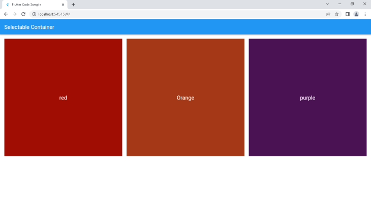
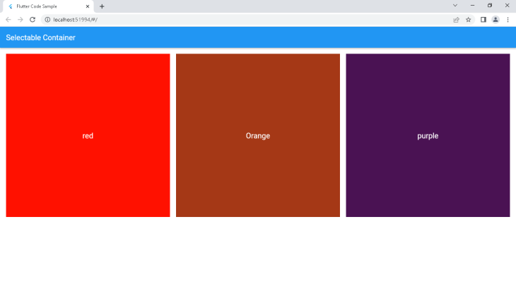
Here is how the application looks at the moment:
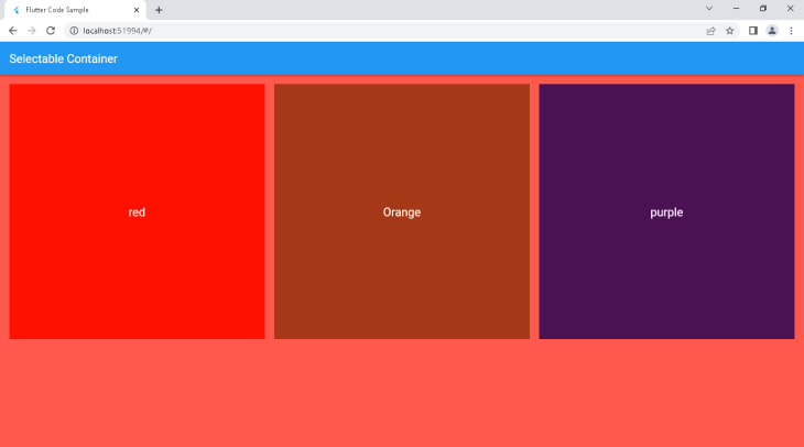
This section contains the application’s final piece, and implementing the features here is fairly easy. In our setState, we will add the conditional if statement to check if redColour is equal to the active color (red).
If true, the mainbackground will change to the active color, and if false, it will change to the background color. Implement this same logic for the other two containers, and we should have our result as below:
if (redColour == red) {
 mainbackground = red;
} else {
 mainbackground = background;
}
Here is the full code for the gridview_itemview.dart file:
import 'package:flutter/material.dart';
class GridViewItemView extends StatelessWidget {
 const GridViewItemView(
   {Key? key,
   this.title,
   this.color,
   this.onTap,})
   : super(key: key);
 final String? title;
 final Color? color;
 final VoidCallback? onTap;
 @override
 Widget build(BuildContext context) {
  return GestureDetector(
   onTap: onTap,
   child: Container(
    color: color,
    child: Center(
      child: Row(
     mainAxisAlignment: MainAxisAlignment.center,
     children: [
      Text(
       title.toString(),
       style: const TextStyle(color: Colors.white, fontSize: 20),
      ),
     ],
    )),
   ),
  );
 }
}
Here is the full code for the gridcontainer.dart file:
import 'package:flutter/material.dart';
import 'package:testproject/gridview_itemview.dart';
const red = Color.fromARGB(255, 255, 17, 0);
const inactivered = Color.fromARGB(255, 160, 13, 3);
const purple = Colors.purple;
const inactivepurple = Color.fromARGB(255, 74, 18, 83);
const orange = Colors.deepOrange;
const inactiveorange = Color.fromARGB(255, 165, 56, 22);
const background = Colors.white;
enum Colour {
 red,
 orange,
 purple,
}
class GridContainer extends StatefulWidget {
 const GridContainer({Key? key}) : super(key: key);
 @override
 State<GridContainer> createState() => _GridContainerState();
}
class _GridContainerState extends State<GridContainer> {
 Color redColour = inactivered;
 Color orangeColour = inactiveorange;
 Color purpleColour = inactivepurple;
 Color mainbackground = background;
 void updatecolour(Colour selectedcolour) {
  if (selectedcolour == Colour.red) {
   if (redColour == inactivered) {
    redColour = red;
    orangeColour = inactiveorange;
    purpleColour = inactivepurple;
   } else {
    redColour = inactivered;
   }
  }
  if (selectedcolour == Colour.orange) {
   if (orangeColour == inactiveorange) {
    orangeColour = orange;
    redColour = inactivered;
    purpleColour = inactivepurple;
   } else {
    orangeColour = inactiveorange;
   }
  }
  if (selectedcolour == Colour.purple) {
   if (purpleColour == inactivepurple) {
    redColour = inactivered;
    orangeColour = inactiveorange;
    purpleColour = purple;
   } else {
    purpleColour = inactivepurple;
   }
  }
 }
 @override
 Widget build(BuildContext context) {
  return Scaffold(
   backgroundColor: mainbackground.withOpacity(0.7),
   appBar: AppBar(
    title: const Text('Selectable Container'),
   ),
   body: GridView.count(
    crossAxisCount: 3,
    padding: const EdgeInsets.only(top: 16, left: 16, right: 16),
    mainAxisSpacing: 16,
    crossAxisSpacing: 16,
    children: <Widget>[
     GestureDetector(
       onTap: () {
        setState(() {
         updatecolour(Colour.red);
         if (redColour == red) {
          mainbackground = red;
         } else {
          mainbackground = background;
         }
        });
       },
       child: GridViewItemView(
        title: 'red',
        color: redColour,
       )),
     GestureDetector(
      onTap: () {
       setState(() {
        updatecolour(Colour.orange);
        if (orangeColour == orange) {
         mainbackground = orange;
        } else {
         mainbackground = background;
        }
       });
      },
      child: GridViewItemView(
       title: 'Orange',
       color: orangeColour,
      ),
     ),
     GestureDetector(
      onTap: () {
       setState(() {
        updatecolour(Colour.purple);
        if (purpleColour == purple) {
         mainbackground = purple;
        } else {
         mainbackground = background;
        }
       });
      },
      child: GridViewItemView(
       title: 'purple',
       color: purpleColour,
      ),
     ),
    ],
   ),
  );
 }
}
We have ended the tutorial, and I hope you now have learned how to use GestureDetector in building selectable containers in Flutter. Thanks for following through, and happy coding!
Install LogRocket via npm or script tag. LogRocket.init() must be called client-side, not
server-side
$ npm i --save logrocket

// Code:

import LogRocket from 'logrocket';
LogRocket.init('app/id');
// Add to your HTML:

<script src="https://cdn.lr-ingest.com/LogRocket.min.js"></script>
<script>window.LogRocket && window.LogRocket.init('app/id');</script>
Hey there, want to help make our blog better?
Join LogRocket’s Content Advisory Board. You’ll help inform the type of content we create and get access to exclusive meetups, social accreditation, and swag.
Sign up now
Discover how to use Gemini CLI, Google’s new open-source AI agent that brings Gemini directly to your terminal.

This article explores several proven patterns for writing safer, cleaner, and more readable code in React and TypeScript.

A breakdown of the wrapper and container CSS classes, how they’re used in real-world code, and when it makes sense to use one over the other.

This guide walks you through creating a web UI for an AI agent that browses, clicks, and extracts info from websites powered by Stagehand and Gemini.

 Learn more →
