Building a website from scratch is not always the most suitable option, due to time and resource constraints. It also makes less sense to build sites from scratch when there already exist so many that have been coded by other developers. This is where templates and libraries come in handy. These tools allow you to simplify your work while still producing great projects.

Using templates is beneficial because the templates have already been tested and debugged by other developers, which will increase the quality of your code. Templates are also made with flexibility in mind. They can be used and changed by other developers without causing complications. In addition to code, templates provide developers with customization options that fit the needs of their projects.
In this article, we’ll explore one such template for web applications: Materio. Materio is a Next.js and React admin template based on MUI. In this article, we’ll cover the following:
Materio is an admin template based on Material UI. Its UI is developer-friendly, rich with features, and highly customizable. It is available in JavaScript and TypeScript versions, and comes with features like:
Materio offers a free and premium tier. The free version is basic but works for most of applications that require an admin panel. The premium version provides more features, including a greater variety of charts, cards, layouts, and other components. Learn what each tier has to offer here.
To install Materio, select the Materio template from the ThemeSelection website. There, you can choose between downloading the free or pro version. For this demo, we’ll use the free demo. You will need to sign in to the ThemeSelection site to download content from their website.
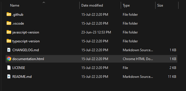
The downloaded file will be a .zip file, which will look like the following:
Open the version of the directory that best suits you. In the directory, you can install the project dependencies with your favorite package manager. Materio recommends that developers use Yarn:
yarn install
After installing the dependencies, you can run the template with the following command:
yarn run dev
This will start the Next.js application at localhost:3000. Here is the landing page of the admin panel:

In the src/views directory, you will find different components to customize your Next.js application, such as cards, dashboards, form layouts, tables, and more. Let’s customize one of the components to display dynamic data. We’re going to customize the StatisticsCard component to display GitHub repository stats.
First, let’s fetch data in the index.js page. We need to import useState and useEffect from React:
import { useState, useEffect } from 'react'
Then, in the Dashboard component, create a useEffect Hook. We are fetching the data in this hook:
useEffect(() => {
  const fetchAndSetData = async () => {
    const res = await fetch(
      "https://api.github.com/repos/surajondev/awesome-web3.0", // replace URL with GH repo that you want stats for
    );
    const datajson = await res.json();
    setData(datajson);
  };
  fetchAndSetData();
}, []);
Now, we will set the data, which is defined with the useEffect Hook above:
const [data, setData] = useState()
After this, we need to set some props for StatisticsCard:
<StatisticsCard
  stars={data.stargazers_count}
  forks={data.forks_count}
  issues={data.open_issues}
/>;
In the src/pages/dashboard directory, you will see the StatisticsCard.js file, where you will find the salesData array, which stores the data. You can change the name of the array to better reflect the data; I have changed it to data. With a few changes to the properties, we can customize the data array to better suit how we want to display our GitHub repo data:
const data = [
  {
    stats: '0',
    title: 'Stars',
    color: 'primary',
    icon: <TrendingUp sx={{ fontSize: '1.75rem' }} />
  },
  {
    stats: '0',
    title: 'Forks',
    color: 'success',
    icon: <AccountOutline sx={{ fontSize: '1.75rem' }} />
  },
  {
    stats: '0',
    color: 'warning',
    title: 'Issues',
    icon: <CellphoneLink sx={{ fontSize: '1.75rem' }} />
  }
]
Now, we need to change this data according to the props. Here are stars, forks, and issues as props. We are assigning these values to the data array:
const StatisticsCard = ({ stars, forks, issues }) => {     // extracting the props
  data[0].stats = stars
  data[1].stats = forks
  data[2].stats = issues
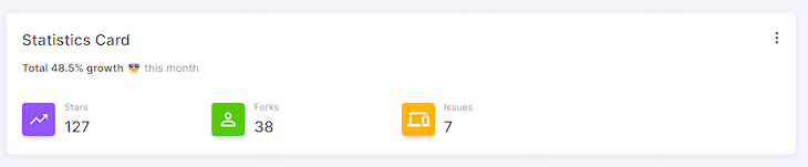
After changing the data, we can easily see the changes in the dashboard:
The Materio template uses the MUI component library, which allows you to change the theme for your components in the following ways:
In the following sections, we will review how to customize our app’s color palette and typography.
In the src/@core/theme directory, you will find the theme configuration for all the components we mentioned earlier. There, you will find the palette directory, which has the index.js file that contains information related to the color palette.
In the index.js file, you will find the return section, which contains all the colors. Here, you can make changes to reflect your desired color palette. We’ll change some colors to reflect a different theme.
We can change the main colors to a light or dark theme at the top of the file:
// for customizing the main colors
const lightColor = '128, 0, 128' // colors in RGB
const darkColor = '231, 227, 252' // colors in RGB
const mainColor = mode === 'light' ? lightColor : darkColor
After that, you can change the primaryGradient function that returns primary gradient colors:
// for customizing gradient
const primaryGradient = () => {
    if (themeColor === 'primary') {
      return '#800080'
    } else if (themeColor === 'secondary') {
      return '#FF5733'
    } else if (themeColor === 'success') {
      return '#00FF00'
    } else if (themeColor === 'error') {
      return '#FF0000'
    } else if (themeColor === 'warning') {
      return '#FFA500'
    } else {
      return '#007FFF'
    }
  }
Then, in the return section, you will find color variants such as primary, secondary, success, etc. Each variant has three main properties: light, dark, and main. The main color will be applied as default. With the change in theme, light and dark colors will be applied:
primary: {
  light: '#800080',
  main: '#800080',
  dark: '#804BDF',
  contrastText: '#FFF'
},
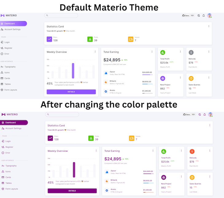
The image below demonstrates a comparison of the Materio theme before and after customizing the color palette:
Next, we can change the project’s typography. In the theme directory, you will find the typography directory. When you open the index.js file, you will be presented with the fourteen typography variations that are available in Materio. Here are a few of them:
    h1: {
      fontWeight: 500,
      letterSpacing: '-1.5px',
      color: theme.palette.text.primary
    },
    h2: {
      fontWeight: 500,
      letterSpacing: '-0.5px',
      color: theme.palette.text.primary
    },
    h3: {
      fontWeight: 500,
      letterSpacing: 0,
      color: theme.palette.text.primary
    },
You can customize each of the variations to your style — you just have to provide the CSS properties with their value. Here, you can add the font family, too. Let’s customize the h1 tag:
h1: {
  fontWeight: 700,
  letterSpacing: '2px',
  fontFamily: 'Inter',
  lineHeight: '10px',
  color: theme.palette.text.primary
},
You can also extend the typography by adding more variants:
inputErrorText: {
  fontFamily: 'Inter',
  fontSize: '14px',
  fontStyle: 'normal',
  fontWeight: '400',
  lineHeight: 'normal',
  color: 'red'
}
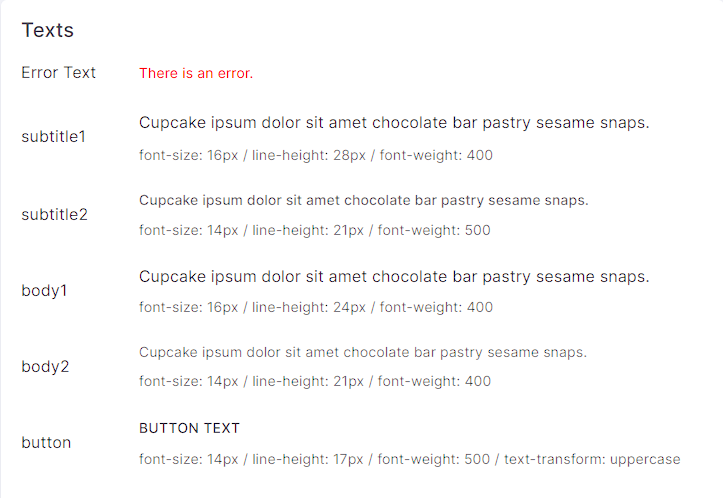
Now, when you need to add the variant in a component, you can use the syntax below:
import Typography from '@mui/material/Typography' // importing Typography from MUI
// use variant tag to add the name of the typography variant
<Typography variant='inputErrorText'>
    There is an error.
</Typography>
After successful integration, you can view it on the webpage:
This is how you can successfully customize typography in the Materio UI. Because all the themes are based on MUI, having basic knowledge about this framework will help you when customizing. Otherwise, you can easily learn while working, because MUI is intuitive to learn.
Materio offers a plethora of features, including vertical and horizontal menus, niche dashboards, form layouts, different card layouts, search components, tables, charts, and more. In this tutorial, we learned how easy it is to install Materio, how to populate a component with custom data, and how to style our app using MUI.
For more control and customization, consider using Materio to provide authentication and login pages to your project’s admin panel.
In addition to Materio, there are many other Next.js starter templates to experiment with. Play around with the different options to see which one is best for your project.
Thanks for reading!
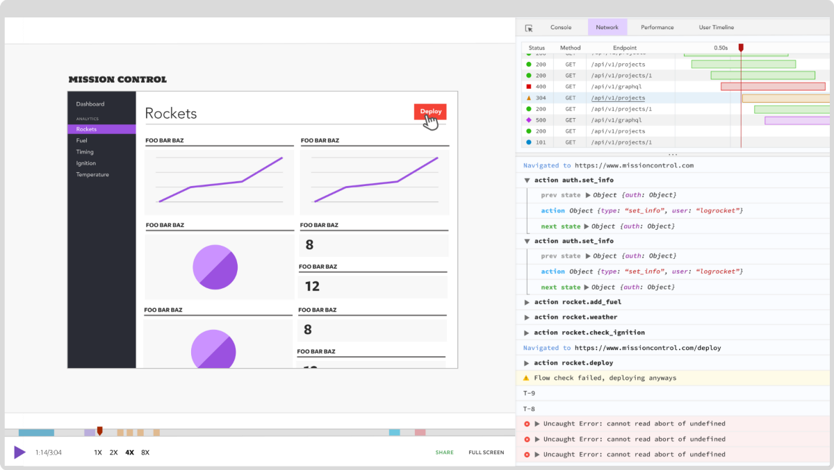
Debugging Next applications can be difficult, especially when users experience issues that are difficult to reproduce. If you’re interested in monitoring and tracking state, automatically surfacing JavaScript errors, and tracking slow network requests and component load time, try LogRocket.
LogRocket captures console logs, errors, network requests, and pixel-perfect DOM recordings from user sessions and lets you replay them as users saw it, eliminating guesswork around why bugs happen — compatible with all frameworks.
LogRocket's Galileo AI watches sessions for you, instantly identifying and explaining user struggles with automated monitoring of your entire product experience.
The LogRocket Redux middleware package adds an extra layer of visibility into your user sessions. LogRocket logs all actions and state from your Redux stores.
Modernize how you debug your Next.js apps — start monitoring for free.

Learn how to use Fallow to analyze AI-generated code, detect dead code, duplicate logic, and complexity issues, and integrate automated code quality checks into your AI-assisted development workflow.

Learn how to protect full-stack projects from NPM supply chain attacks with a practical security checklist.

Explore 15 essential MCP servers for web developers to enhance AI workflows with tools, data, and automation.

Learn how contrast-color() automatically picks accessible text colors using native CSS, without JavaScript.
Would you be interested in joining LogRocket's developer community?
Join LogRocket’s Content Advisory Board. You’ll help inform the type of content we create and get access to exclusive meetups, social accreditation, and swag.
Sign up now

