
In this article, we will be exploring the process of building a website in Astro using components from three of the most popular frameworks: React, Svelte, and Vue.js.

Each of these frameworks has its strengths and weaknesses, and in this article, we will provide a step-by-step guide to building a website using each of them together. This means that I can take the best of each community and put it into the project!
Jump ahead:
CategoryChartThe Replay is a weekly newsletter for dev and engineering leaders.
Delivered once a week, it's your curated guide to the most important conversations around frontend dev, emerging AI tools, and the state of modern software.
For this demo, we are going to use the following libraries to build the dashboard:
I also installed Tailwind CSS to create most of the layout for the page, with the prefix option of tw- (this is to prevent clashing classes between Tailwind and Vuetify).
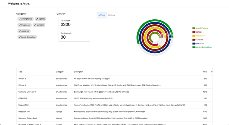
Our end goal is to build the following dashboard:
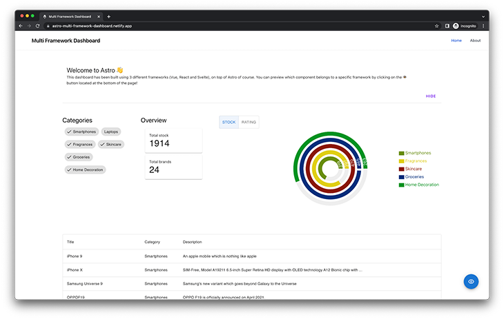
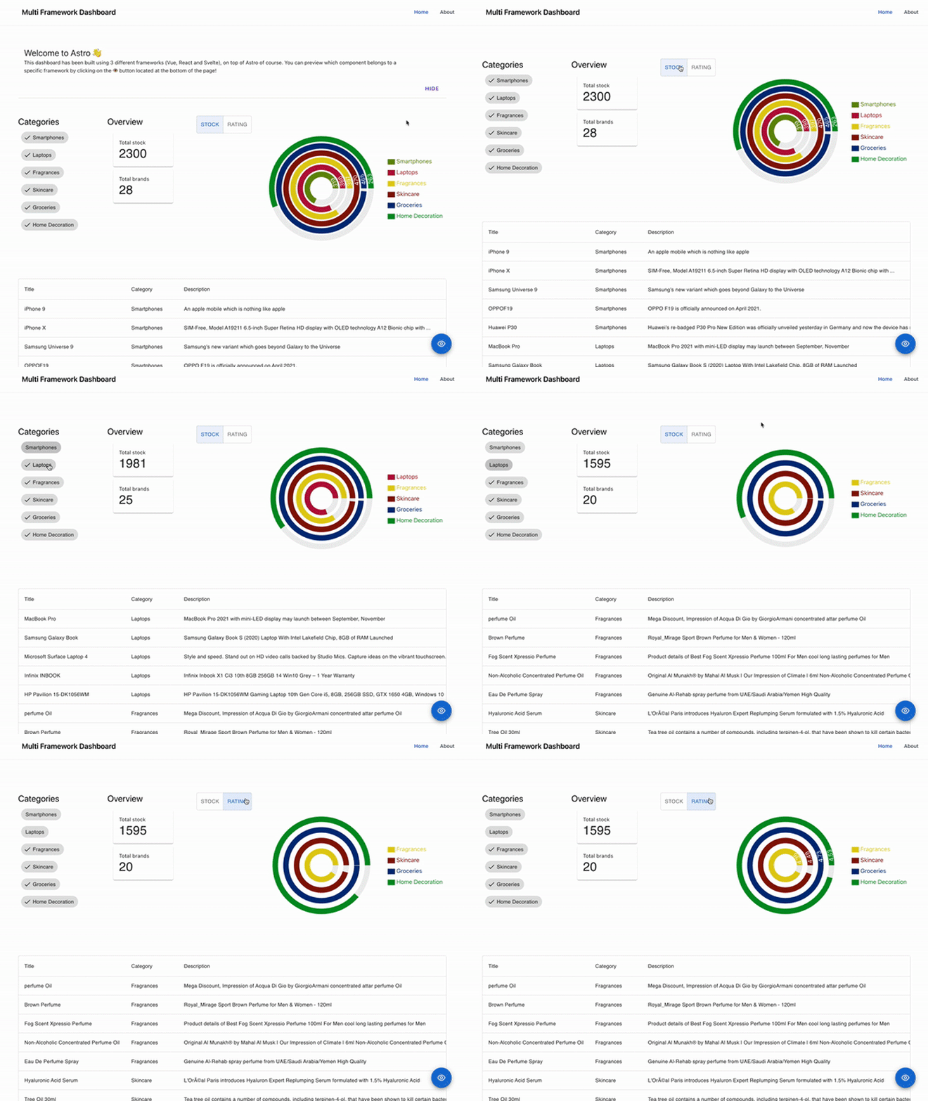
Something important to highlight is that all of our components are connected, and an interaction in one can trigger a change in the other. This is possible by using nanostores (we are going to cover it later in the article).
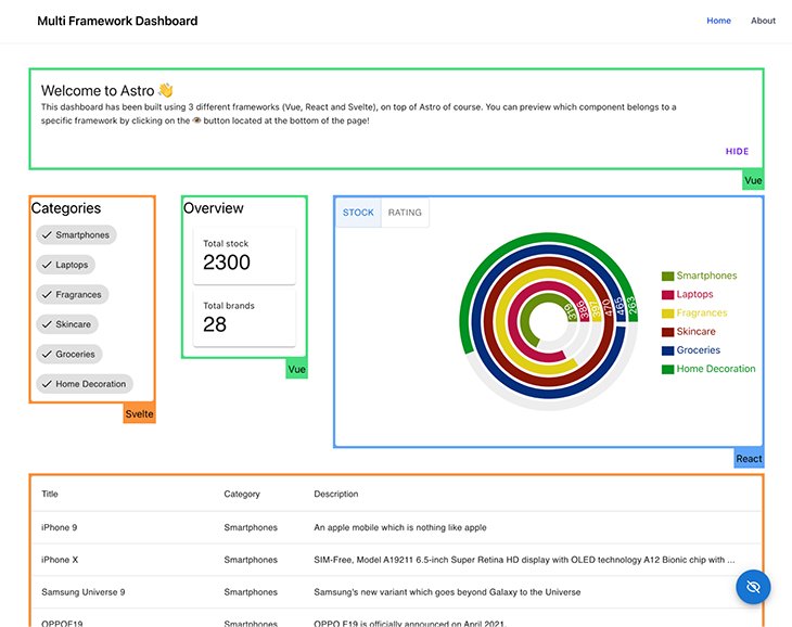
Finally, for demo purposes, I built a framework highlighter to visually display the UI framework (React, Vue, or Svelte) responsible for rendering a component. This function can be activated by clicking the blue eye icon at the bottom of the page.
You can also check out the deployed application here.
Building a multi-framework application using Astro can be a powerful and efficient way to create complex and versatile software. By combining the strengths of different frameworks, developers can create a more robust and flexible application that can adapt to changing requirements and meet the diverse needs of users. Using Astro, developers can easily integrate multiple frameworks, allowing them to take advantage of the best features of each one and create a truly exceptional application.
In addition to its ability to combine multiple frameworks, Astro is also great for migrations. As software systems and requirements evolve, it may become necessary to migrate to a new framework or set of frameworks. With Astro, this process can be streamlined and made more efficient, allowing developers to quickly and easily move their applications to new frameworks without significant downtime or disruptions. This can save time, effort, and resources, making Astro a valuable tool for anyone looking to migrate their application to new frameworks.
The easiest way to create a new project with Astro is by using their CLI, create-astro, which comes with maybe one of the friendliest coding assistants ever: Houston!
# create a new project with npm
> yarn create astro

╭─────╮  Houston:
│ ◠ ◡ ◠  Let's make the web weird!
╰─────╯

 astro   v1.6.15 Launch sequence initiated.

✔ Where would you like to create your new project? … astro-dashboard
✔ How would you like to setup your new project? › a few best practices (recommended)
✔ Template copied!
✔ Would you like to install yarn dependencies? (recommended) … yes
✔ Packages installed!
✔ Would you like to initialize a new git repository? (optional) … yes
✔ Git repository created!
✔ How would you like to setup TypeScript? › Strict
✔ TypeScript settings applied!

  next   Liftoff confirmed. Explore your project!

         Enter your project directory using cd ./astro-dashboard
         Run yarn dev to start the dev server. CTRL+C to stop.
         Add frameworks like react or tailwind using astro add.

         Stuck? Join us at https://astro.build/chat

╭─────╮  Houston:
│ ◠ ◡ ◠  Good luck out there, astronaut!
╰─────╯
After that, you should end up with a folder that has a structure similar to this:
/astro-dashboard
├── README.md
├── astro.config.mjs
├── output.txt
├── package.json
├── public
|  └── favicon.svg
├── node_modules # sub folders ignored to keep the directory tree short
├── src
|  ├── components
|  |  └── Card.astro
|  ├── env.d.ts
|  ├── layouts
|  |  └── Layout.astro
|  └── pages
|     └── index.astro
├── tsconfig.json
└── yarn.lock
Let’s start our development server by running:
> yarn dev

yarn run v1.22.19
$ astro dev
  🚀  astro  v1.6.15 started in 57ms

  ┃ Local    http://127.0.0.1:3000/
  ┃ Network  use --host to expose
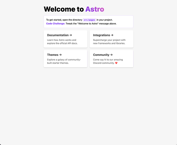
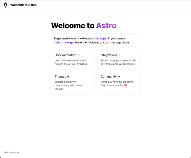
After opening the localhost URL, you should see the following screen in your browser:
The official Astro documentation has a summary of all their official integrations, covering the topics of UI frameworks, SSR adapters, and others, such as Tailwind.
The Astro team made it simple for everybody and includes the command astro add in all new projects, which we can use to install any of the official integrations. We simply need to execute:
> yarn astro add react vue svelte tailwind

✔ Resolving packages...

  Astro will run the following command:
  If you skip this step, you can always run it yourself later

╭─────────────────────────────────────────────────────────────────────────────────────────────────────╮
│ yarn add @astrojs/react @astrojs/svelte @astrojs/tailwind @astrojs/vue @types/react-dom@^18.0.6     │
│ @types/react@^18.0.21 react-dom@^18.0.0 react@^18.0.0 svelte@^3.46.4 tailwindcss@^3.0.24            │
│ vue@^3.2.30                                                                                         │
╰─────────────────────────────────────────────────────────────────────────────────────────────────────╯

✔ Continue? … yes
✔ Installing dependencies...

  Astro will generate a minimal ./tailwind.config.cjs file.

✔ Continue? … yes

  Astro will make the following changes to your config file:

 ╭ astro.config.mjs ───────────────────────────────────────╮
 │ import { defineConfig } from 'astro/config';            │
 │                                                         │
 │ // https://astro.build/config                           │
 │ import react from "@astrojs/react";                     │
 │ import vue from "@astrojs/vue";                         │
 │ import svelte from "@astrojs/svelte";                   │
 │ import tailwind from "@astrojs/tailwind";               │
 │                                                         │
 │ // https://astro.build/config                           │
 │ export default defineConfig({                           │
 │   integrations: [react(), vue(), svelte(), tailwind()]  │
 │ });                                                     │
 ╰─────────────────────────────────────────────────────────╯

✔ Continue? … yes

   success  Added the following integrations to your project:
  - @astrojs/react
  - @astrojs/vue
  - @astrojs/svelte
  - @astrojs/tailwind

  Astro will make the following changes to your tsconfig.json:

 ╭ tsconfig.json ──────────────────────────╮
 │ {                                       │
 │   "extends": "astro/tsconfigs/strict",  │
 │   "compilerOptions": {                  │
 │     "jsx": "react-jsx",                 │
 │     "jsxImportSource": "react"          │
 │   }                                     │
 │ }                                       │
 ╰─────────────────────────────────────────╯

✔ Continue? … yes

   success  Successfully updated TypeScript settings
As you can see, Astro took over all the manual tasks of installing the integrations, adding them to our Astro configuration file, and even updating our tsconfig.json to make React work nicely with Typescript. Great job, Houston!
Let’s start by setting up our Layout for the page, which consists of a Header, a Footer, and a container for our page content. To avoid several changes when we introduce vuetify, it’s better to change the prefix inside our tailwind.config.cjs file, like so:
# tailwind.config.cjs
/** @type {import('tailwindcss').Config} */
module.exports = {
  content: ['./src/**/*.{astro,html,js,jsx,md,mdx,svelte,ts,tsx,vue}'],
  theme: {
    extend: {},
  },
  plugins: [],
+  prefix: 'tw-',
};
Let’s apply the modification to our Layout:
// src/layouts/Layout.astro
---
type Props = {
  title: string;
};

const { title } = Astro.props;
---

<!DOCTYPE html>
<html lang="en">
  <head>
    <meta charset="UTF-8" />
    <meta name="viewport" content="width=device-width" />
    <link rel="icon" type="image/svg+xml" href="/favicon.svg" />
    <meta name="generator" content={Astro.generator} />
    <title>{title}</title>
  </head>
  <body>
    <div class="tw-flex tw-h-screen tw-overflow-hidden">
      <main
        class="tw-relative tw-bg-white tw-flex tw-flex-col tw-flex-1 tw-overflow-y-auto tw-overflow-x-hidden"
      >
        <!-- Header -->
        <nav class="tw-bg-white tw-shadow-sm tw-px-2 sm:tw-px-4 tw-py-2.5">
          <div
            class="container tw-flex tw-flex-wrap tw-justify-between tw-items-center tw-mx-auto"
          >
            <a href="/" class="tw-flex tw-items-center">
              <img
                src="/favicon.svg"
                class="tw-mr-3 tw-h-6 sm:tw-h-9"
                alt="Astro Logo"
              />
              <span
                class="tw-self-center tw-text-xl tw-font-semibold tw-whitespace-nowrap"
                >{title}
              </span>
            </a>
          </div>
        </nav>

        <!-- Content container -->
        <div class="tw-container tw-mx-auto tw-my-10 tw-flex-grow">
          <slot />
        </div>

        <!-- Footer -->
        <footer
          class="tw-p-4 tw-bg-white tw-rounded-lg tw-shadow md:tw-flex md:tw-items-center md:tw-justify-between md:tw-p-6"
        >
          <span class="tw-text-sm tw-text-gray-500 sm:tw-text-center">
            Built with
            <a href="https://astro.build/" class="hover:tw-underline">Astro</a>
          </span>
        </footer>
      </main>
    </div>
  </body>
</html>
Without making any changes to our initial page (src/pages/index.astro) and applying these changes, you should see the following screen:
For this demo, I decided to use the Products list endpoint from https://dummyjson.com/, which provides several public REST APIs that we can use to simulate getting data from our servers. When we call the API, the output has the following structure:
{
  "products": [
    {
      "id": 1,
      "title": "iPhone 9",
      "description": "An apple mobile which is nothing like apple",
      "price": 549,
      "discountPercentage": 12.96,
      "rating": 4.69,
      "stock": 94,
      "brand": "Apple",
      "category": "smartphones",
      "thumbnail": "...",
      "images": ["...", "...", "..."]
    },
    {...},
    {...},
    {...}
    // 30 items
  ],

  "total": 100,
  "skip": 0,
  "limit": 30
}
Given that we are working on a TypeScript project, it’s always recommended to type our API responses. For that, we can use the following type for this response:
// src/types.ts
export type Product = {
  id: number;
  title: string;
  description: string;
  price: number;
  discountPercentage: number;
  rating: number;
  stock: number;
  brand: string;
  category: string;
  thumbnail: string;
};
To fetch data using Astro, we can use the fetch function to call the endpoint before rendering our component, with the added benefit that we don’t need to handle loading states in our application. This way of loading data is similar to how data is loaded on static sites, where the endpoints are called on at build time.
At the same time, Astro also supports server-side rendering. It’s always important to understand what kind of application is better to implement given your needs.
Since our data source can be considered static — the list of products doesn’t change over time — running our queries is the best fit to improve the performance and UX of the application. Let’s make the following modification to our initial page:
// src/pages/index.astro
---
import Layout from '../layouts/Layout.astro';
import Card from '../components/Card.astro';
+ import type { Product } from '../types';

// fetch data
+ const products: Product[] = await fetch('https://dummyjson.com/products')
+   .then((res) => res.json())
+   .then((res) => res.products);
---

<Layout title="Welcome to Astro.">
  <main>
    <h1>Welcome to <span class="text-gradient">Astro</span></h1>
...
Time to render our data! Let’s revisit the goal of this article: we want to use multiple UI frameworks in the same project. Remember, we already installed all the UI integrations into the project, so the only part missing is adding our components. Let’s go one by one, starting with Svelte!
As I mentioned at the beginning of this article, we’re using Svelte Material UI. To install it in our project, we have to first add it to our dependencies:
> yarn add svelte-material-ui
After that, we have to import the necessary CSS file for the components. The best place for those is in our Layout component because it will be used inside every screen in our application.
// src/layouts/Layout.astro
---
+ import 'svelte-material-ui/bare.css';

type Props = {
  title: string;
};

const { title } = Astro.props;
---

<!DOCTYPE html>
...
When dealing with npm dependencies in Astro, which is built on top of Vite, that are not previously compiled (converted into JavaScript), we have to specify Vite to the property ssr.noExternal in our Astro configuration, inside the vite attribute. If you want to read more about Externals, please refer to the official documentation.
// astro.config.mjs
import { defineConfig } from 'astro/config';

// https://astro.build/config
import react from '@astrojs/react';
import vue from '@astrojs/vue';
import svelte from '@astrojs/svelte';
import tailwind from '@astrojs/tailwind';

// https://astro.build/config
export default defineConfig({
  integrations: [react(), vue(), svelte(), tailwind()],
+  vite: {
+    ssr: {
+      noExternal: ['@smui/**/*'],
+    },
+  },
});
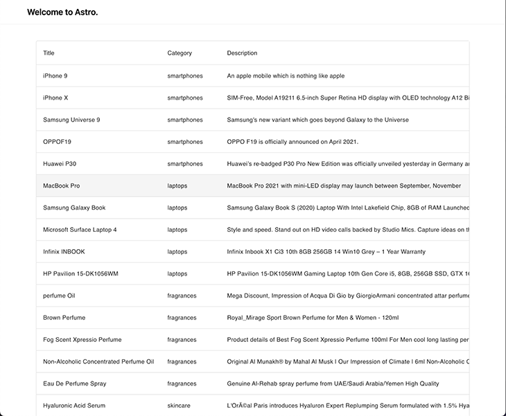
Next, let’s build our first Svelte component to show a list of products inside a table, which is going to be called ProductTable. Luckily, smui provides a Table component called Data Table. Below is the full code of the component:
// src/components/ProductTable.svelte
<script lang="ts">
  import DataTable, { Head, Body, Row, Cell } from '@smui/data-table';
  import type { Product } from 'types';

  export let products: Product[];
</script>

<DataTable style="width: 100%;">
  <Head>
    <Row>
      <Cell style="width: 100%;">Title</Cell>
      <Cell>Category</Cell>
      <Cell>Description</Cell>
      <Cell>Price</Cell>
      <Cell>Stock</Cell>
    </Row>
  </Head>
  <Body>
    {#each products as item (item.id)}
      <Row>
        <Cell>{item.title}</Cell>
        <Cell>{item.category}</Cell>
        <Cell>{item.description}</Cell>
        <Cell numeric>{item.price}</Cell>
        <Cell numeric>{item.stock}</Cell>
      </Row>
    {/each}
  </Body>
</DataTable>
Now, let’s render it inside our main page. I got rid of the Card components that were rendered in the template project.
// src/page/index.astro
---
import Layout from '../layouts/Layout.astro';
import ProductTable from '../components/ProductTable.svelte';

import type { Product } from '../types';

// fetch data
const products: Product[] = await fetch('https://dummyjson.com/products')
  .then((res) => res.json())
  .then((res) => res.products);
---

<Layout title="Welcome to Astro.">
  <ProductTable products={products} />
</Layout>
Our application should look like this:
One key feature of this dashboard is the ability to see all the existing categories and mark them as visible or hidden. To build this component, we are going to use the component Chips from smui. This is a possible implementation of the component:
// src/component/CategoryTags.astro
<script lang="ts">
  import Chip, { Set, Text } from '@smui/chips';
  import type { Product } from '../types';

  export let products: Product[];

  let categories = products
    .map((product) => product.category)
    .filter((val, i, arr) => arr.indexOf(val) === i);

  let selected = Array.from(categories);
</script>

<h1>Categories</h1>

<Set chips={categories} let:chip filter bind:selected>
  <Chip {chip} touch>
    <Text>{chip}</Text>
  </Chip>
</Set>
Given that this component is interactive, we need to specify a client directive from Astro to load the JavaScript alongside it — otherwise, nothing will happen when clicking the categories. Let’s add the component to our main page with the client:load directive.
// src/pages/index.astro
---
import Layout from '../layouts/Layout.astro';
import ProductTable from '../components/ProductTable.svelte';
+ import CategoryTags from '../components/CategoryTags.svelte';

import type { Product } from '../types';

// fetch data
const products: Product[] = await fetch('https://dummyjson.com/products')
  .then((res) => res.json())
  .then((res) => res.products);
---

<Layout title="Welcome to Astro.">
+  <CategoryTags products={products} client:load />
  <ProductTable products={products} client:load />
</Layout>
The application is looking now quite similar to our dashboard!
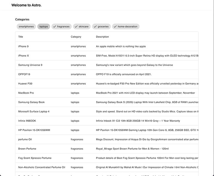
nanostoresHave you spotted any bugs in the previous screen? The categories that are supposed to be hidden are still visible in our table. The reason for that is that we aren’t communicating data between our ProductTable and the CategoryTags. Time to talk about state management!
How do we share information between my components, given that each library has different ways of achieving that? We have a few different options:
Provider / Consumer patternActions --> State --> View in a similar style to Reduxreadable, writable, and derived containers for storing dataAll of these are valid ways of fixing the state management issue, but it’s clear that we need to find a common solution that works for all the UI libraries. This is where nanostores comes into play! The description they provide on their GitHub page is simply perfect:
A tiny state manager for React, React Native, Preact, Vue, Svelte, and vanilla JS. It uses many atomic stores and direct manipulation.
The API is simple as:
import { atom } from 'nanostores';

// definition of state for primitive values
export const counter = atom(0);

// read and write state
counter.set(counter.get() + 1);

// definition of state for objects
export const car = map({
  brand: 'Tesla',
  km: 0,
});

// update property inside object
car.setKey('km', car.get().km + 1000);
nanostores provides many APIs to have more control over state updates and notifications, so I highly recommend checking their documentation in case you want to dig deeper.
Nevertheless, an important part to cover is the integration with the different UI libraries. For each framework, they provide a separate package that will follows the package’s coding standard:
@nanostores/react): provides a useStore() Hook to get the store’s value and re-render the component on store’s changes@nanostores/vue): provides a useStore() composable function to get the store’s value and re-render the component on store’s changesnanostores implements Svelte’s store contract; we just need to put $ before the store variable to get the value and subscribe for changesTo add nanostores into our project, we just need to install the main nanostores dependency and the integrations that we need (in our case, one each for vue and react).
> yarn add nanostores @nanostores/react @nanostores/vue
It’s also recommended to store our store in a shared location where all the components can access it. For our categories scenario, we need a simple array of strings where we can add or remove the categories to hide them.
// src/state.ts
import { atom } from 'nanostores';

export const hiddenCategories = atom<string[]>([]);
Let’s connect our two “isolated” components. The CategoryTags component has to be able to read and write from hiddenCategories.
// src/components/CategoryTags.svelte
<script lang="ts">
  import Chip, { Set, Text } from '@smui/chips';
  import type { Product } from '../types';
+  import { hiddenCategories } from '../state';

  export let products: Product[];

  let categories = products
    .map((product) => product.category)
    .filter((val, i, arr) => arr.indexOf(val) === i);

  let selected = Array.from(categories);

+  function updateSelection() {
+    hiddenCategories.set(
+      categories.filter((category) => !selected.includes(category)),
+    );
+  }
</script>

<h1>Categories</h1>

<Set
  chips={categories}
  let:chip
  filter
  bind:selected
+  on:click={updateSelection}
>
  <Chip {chip} touch>
    <Text>{chip}</Text>
  </Chip>
</Set>
Our ProductTable has only to read from hiddenCategories, and with that, filter out the product that belongs to the categories in our state.
// src/components/ProductTable.svelte
<script lang="ts">
  import DataTable, { Head, Body, Row, Cell } from '@smui/data-table';
  import type { Product } from '../types';
+  import { hiddenCategories } from '../state';

  export let products: Product[];
</script>

<DataTable style="width: 100%;">
  <Head>
    <Row>
      <Cell style="width: 100%;">Title</Cell>
      <Cell>Category</Cell>
      <Cell>Description</Cell>
      <Cell>Price</Cell>
      <Cell>Stock</Cell>
    </Row>
  </Head>
  <Body>
+    {#each products.filter((product) => !$hiddenCategories.includes(product.category)) as item (item.id)}
      <Row>
        <Cell>{item.title}</Cell>
        <Cell>{item.category}</Cell>
        <Cell>{item.description}</Cell>
        <Cell numeric>{item.price}</Cell>
        <Cell numeric>{item.stock}</Cell>
      </Row>
    {/each}
  </Body>
</DataTable>
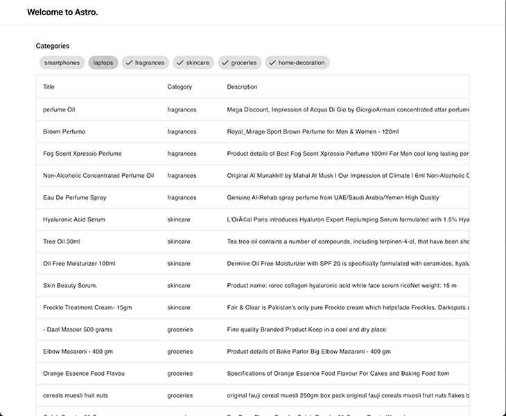
After removing the Smartphones and Laptops categories from the CategoryTags, we can see they don’t exist any more in the ProductTable:
For Vue, I decided to use the most popular component framework option in the ecosystem: Vuetify. The installation can be a bit tricky for alternative projects (like this one!), so I hope to make it as clear as possible. Let’s start by installing the necessary dependencies (be aware that only the latest version, v3, is compatible with Vite):
> yarn add vuetify@^3.0.5
Similar to what we did for smui, we need to import the component library styles inside our Layout:
---
import 'svelte-material-ui/bare.css';
+ import 'vuetify/styles';

type Props = {
  title: string;
};

const { title } = Astro.props;
---

<!DOCTYPE html>
<html lang="en">
  <head>
...
Next, we need to hook vuetify into our vue application. This was impossible in Astro just a few versions ago, until the introduction of the _app file inside the pages folder, which grants access to the App instance of vue.
//src/pages/_app.ts
import type { App } from 'vue';
import { createVuetify } from 'vuetify';
import * as components from 'vuetify/components';
import * as directives from 'vuetify/directives';

export default (app: App) => {
  const vuetify = createVuetify({
    ssr: true,
    components,
    directives,
  });

  app.use(vuetify);
};
A couple of modifications in our astro.config.mjs file: We need to mark the dependency as noExternal and link the Astro Vue integration with the entry point that we’ve just defined.
// astro.config.mjs
import { defineConfig } from 'astro/config';

// https://astro.build/config
import react from '@astrojs/react';
import vue from '@astrojs/vue';
import svelte from '@astrojs/svelte';
import tailwind from '@astrojs/tailwind';

// https://astro.build/config
export default defineConfig({
  integrations: [
    react(),
+    vue({ appEntrypoint: '/src/pages/_app' }),
    svelte(),
    tailwind(),
  ],
  vite: {
    ssr: {
+      noExternal: ['@smui/**/*', 'vuetify'],
    },
  },
});
Now, we can implement our Summary component, which is going to give us a glance at the Total Stock and Total brands categories and the selected products inside them. This sounds perfect for the v-card component!
// src/components/Overview.vue
<script setup lang="ts">
import type { Product } from 'types';
import { hiddenCategories } from '../state';
import { useStore } from '@nanostores/vue';

type Props = {
  products: Product[];
};

const { products } = defineProps<Props>();
const $hiddenCategories = useStore(hiddenCategories);
</script>

<template>
  <h1>Overview</h1>

  <v-container>
    <v-row dense>
      <v-col cols="12">
        <v-card>
          <v-card-text>
            <div>Total stock</div>
            <p class="text-h4 text--primary">
              <!-- Calculating stock with the value from store -->
              {{
                products
                  .filter(
                    (product) => !$hiddenCategories.includes(product.category),
                  )
                  .reduce((acc, curr) => acc + curr.stock, 0)
              }}
            </p>
          </v-card-text>
        </v-card>
      </v-col>

      <v-col cols="12">
        <v-card>
          <v-card-text>
            <div>Total brands</div>
            <p class="text-h4 text--primary">
              <!-- Calculating brand amount with the value from store -->
              {{
                products
                  .filter(
                    (product) => !$hiddenCategories.includes(product.category),
                  )
                  .filter((product, i, array) => array.indexOf(product) === i)
                  .length
              }}
            </p>
          </v-card-text>
        </v-card>
      </v-col>
    </v-row>
  </v-container>
</template>
Don’t forget to add it to the main page as well!
// src/pages/index.astro
---
import Layout from '../layouts/Layout.astro';
import type { Product } from '../types';

import ProductTable from '../components/ProductTable.svelte';
import CategoryTags from '../components/CategoryTags.svelte';
import Overview from '../components/Overview.vue';

// fetch data
const products: Product[] = await fetch('https://dummyjson.com/products')
  .then((res) => res.json())
  .then((res) => res.products);
---

<Layout title="Welcome to Astro.">
  <CategoryTags products={products} client:load />
+ <Overview products={products} client:load />
  <ProductTable products={products} client:load />
</Layout>
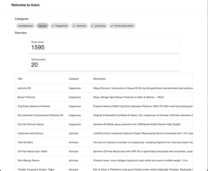
Here’s what our dashboard looks like now:
CategoryChartThis is the last integration of this article, and maybe the most fun! A dashboard cannot be considered complete unless we show a chart or diagram to visually display information. For this part of the demo, we’ll use mui for the components and recharts for the graphs.
The installation is quite straightforward, and maybe the easiest in the whole tutorial:
# installation for mui
> yarn add @mui/material @emotion/react @emotion/styled

# installation for recharts
> yarn add recharts
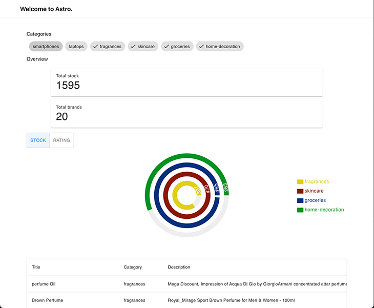
We want to allow the user to visually see the stock amount and rating for the visible category, so they can understand how is the proportion balanced. This is the perfect scenario for a RadialBarChart in recharts. Then, to toggle which value to visualize (either stocks or rating) we can use ToggleButton from mui. This is a possible implementation of it:
// src/components/CategoryChart.tsx
import { useStore } from '@nanostores/react';
import React, { useMemo } from 'react';
import {
  RadialBarChart,
  RadialBar,
  Legend,
  ResponsiveContainer,
} from 'recharts';
import type { Product } from '../types';
import { hiddenCategories } from '../state';
import randomColor from 'randomcolor';
import ToggleButtonGroup from '@mui/material/ToggleButtonGroup';
import ToggleButton from '@mui/material/ToggleButton';

const style = {
  top: '50%',
  right: 0,
  transform: 'translate(0, -50%)',
  lineHeight: '30px',
};

type Props = {
  products: Product[];
};

type View = 'stock' | 'rating';

const groupByCategory = (products: Product[]) => {
  return products.reduce((acc, curr) => {
    const existingCategory = acc[curr.category];

    acc[curr.category] = existingCategory
      ? existingCategory.concat(curr)
      : [curr];
    return acc;
  }, {} as Record<string, Product[]>);
};

const CategoryChart = ({ products }: Props) => {
  const [view, setView] = React.useState<View>('stock');
  const disabledCategories = useStore(hiddenCategories);

  const data = useMemo(() => {
    const visibleCategories = products
      .map((product) => product.category)
      .filter((product) => !disabledCategories.includes(product))
      .filter((val, i, arr) => arr.indexOf(val) === i);

    const groupedByCategory = groupByCategory(products);

    return visibleCategories.map((category) => {
      const productsInCategory = groupedByCategory[category];
      const avg =
        productsInCategory.reduce((acc, curr) => acc + curr.rating, 0) /
        products.length;

      return {
        name: category,
        stock: productsInCategory.reduce((acc, curr) => acc + curr.stock, 0),
        rating: Math.round(avg * 100) / 100,
        fill: randomColor({ seed: category, luminosity: 'dark' }),
      };
    });
  }, [products, disabledCategories]);

  return (
    <div style={{ width: '100%', height: 400, position: 'relative' }}>
      <ResponsiveContainer width="100%" height="100%">
        <RadialBarChart
          cx="50%"
          cy="50%"
          innerRadius="20%"
          outerRadius="80%"
          barSize={15}
          data={data}
        >
          <RadialBar
            minAngle={15}
            label={{ position: 'insideStart', fill: '#fff' }}
            background
            dataKey={view}
          />

          <Legend
            iconSize={20}
            layout="vertical"
            verticalAlign="middle"
            wrapperStyle={style}
          />
        </RadialBarChart>
      </ResponsiveContainer>

      <ToggleButtonGroup
        style={{ position: 'absolute', top: 0 }}
        color="primary"
        value={view}
        exclusive
        onChange={(_, val) => val && setView(val)}
      >
        <ToggleButton value="stock">Stock</ToggleButton>
        <ToggleButton value="rating">Rating</ToggleButton>
      </ToggleButtonGroup>
    </div>
  );
};

export default CategoryChart;
Let’s add it to our page and check how it integrates into our dashboard!
// src/pages/index.astro
---
import Layout from '../layouts/Layout.astro';
import type { Product } from '../types';

import ProductTable from '../components/ProductTable.svelte';
import CategoryTags from '../components/CategoryTags.svelte';
import Overview from '../components/Overview.vue';
import CategoryChart from '../components/CategoryChart';

// fetch data
const products: Product[] = await fetch('https://dummyjson.com/products')
  .then((res) => res.json())
  .then((res) => res.products);
---

<Layout title="Welcome to Astro.">
  <CategoryTags products={products} client:load />
+  <Overview products={products} client:load />
  <CategoryChart products={products} client:load />
  <ProductTable products={products} client:load />
</Layout>
Now that we have all our components fully coded and integrated, we need to take care of the application’s responsiveness. This is where Tailwind can make our life easier, and in a couple of lines, we have fantastic results!
//src/pages/index.astro
---
import Layout from '../layouts/Layout.astro';
import type { Product } from '../types';

import ProductTable from '../components/ProductTable.svelte';
import CategoryTags from '../components/CategoryTags.svelte';
import Overview from '../components/Overview.vue';
import CategoryChart from '../components/CategoryChart';

// fetch data
const products: Product[] = await fetch('https://dummyjson.com/products')
  .then((res) => res.json())
  .then((res) => res.products);
---

<Layout title="Welcome to Astro.">
+  <div class="tw-grid tw-gap-4 tw-grid-cols-3 lg:tw-grid-cols-5 md:tw-gap-10">
+    <div class="tw-col-span-1">
      <CategoryTags client:load products={products} />
+    </div>

+    <div class="tw-col-span-1">
      <Overview client:load products={products} />
+    </div>

+    <div class="tw-col-span-3">
      <CategoryChart client:only="react" products={products} />
+    </div>

+    <div class="tw-col-span-full">
      <ProductTable client:load products={products} />
+    </div>
  </div>
</Layout>
Now that we have all our components fully coded and integrated, we need to take care of the application’s responsiveness. This is where Tailwind can make our life easier, and in a couple of lines, we have fantastic results!
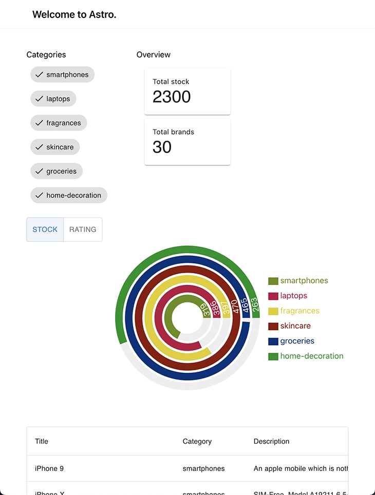
Let’s go for a mobile-first approach. The Categories tag and overview are rendered in one row; below it, we have the chart, and at the bottom (with some scrolling required) is the Product table.
This image illustrates the tablet view of our website, offering a balance between the desktop and mobile versions for a convenient browsing experience on a larger screen.
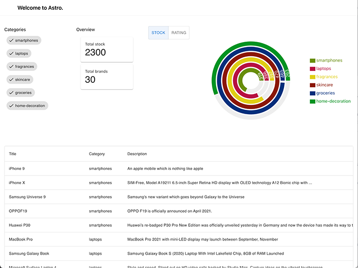
Finally, we have the desktop view of our website, with a wide layout and padding added on the sides to center the content horizontally.
In a previous article, we discussed the architecture behind Astro which makes it possible to build this kind of application. I highly recommend checking out that article in case you are not familiar with Astro’s implementation of islands architecture.
Astro is a useful tool that can help us build complex and versatile software by allowing us to combine multiple frameworks. As our software systems and requirements evolve, Astro can assist us in easily and efficiently migrating our applications to new frameworks, saving us time, effort, and resources.
On top of that, it also helps us optimize our applications by ensuring that we are not using more JavaScript than necessary. This helps keep our application lightweight and performant, which can improve user experience and the overall functionality of the application. This feature of Astro makes it valuable when building efficient and high-performing applications that meet the needs of our users.
Thanks for reading, and let’s keep building stuff together! 👷♂️
There’s no doubt that frontends are getting more complex. As you add new JavaScript libraries and other dependencies to your app, you’ll need more visibility to ensure your users don’t run into unknown issues.
LogRocket is a frontend application monitoring solution that lets you replay JavaScript errors as if they happened in your own browser so you can react to bugs more effectively.
LogRocket works perfectly with any app, regardless of framework, and has plugins to log additional context from Redux, Vuex, and @ngrx/store. Instead of guessing why problems happen, you can aggregate and report on what state your application was in when an issue occurred. LogRocket also monitors your app’s performance, reporting metrics like client CPU load, client memory usage, and more.
Build confidently — start monitoring for free.

A step-by-step guide to building your first MCP server using Node.js, covering core concepts, tool design, and upgrading from file storage to MySQL.

Using security headers in your Next.js apps is a highly effective way to secure websites from common security threats.

A deep dive into May 2026’s AI model and tool rankings. We break down performance, usability, pricing, and real-world capabilities across 50+ features to help you pick the right tools for your development workflow.

A practical guide to Agent Browser CLI. Learn how AI agents navigate, snapshot, and interact with web pages using stable references, enabling efficient automation and exploratory testing.
Would you be interested in joining LogRocket's developer community?
Join LogRocket’s Content Advisory Board. You’ll help inform the type of content we create and get access to exclusive meetups, social accreditation, and swag.
Sign up now