
The introduction of Lock Screen widgets in iOS 16 allows you to make valuable, glanceable information from your app accessible to users on their iPhone’s Lock Screen. Powered by the WidgetKit framework that you may already be using to build home screen widgets, Lock Screen widgets provide a very convenient way for users to quickly and easily access important information.
Imagine getting a reminder for your next meeting, tracking your workout progress, or receiving real-time traffic updates at a glance. How convenient and impressive! On iPhone 14 Pro and Pro Max, the convenience of glanceable information is further enhanced by the ability to view widgets on the dimmed Lock Screen.
In this article, we’ll explore the features of Lock Screen widgets and discuss how to leverage your existing WidgetKit knowledge for working with Lock Screen widgets. In the tutorial portion of this post, we’ll demonstrate how to add rectangular, inline, and circular Lock Screen widgets to Tradinza, a simple stock tracking app, to display real-time stock price and activity information. We’ll also show how to customize the background of the widget and how to hide private information.
To learn more about using Live Activities in iOS 16.1+ to provide real-time updates on an iPhone’s Lock Screen, see this article.
OK, let’s create some glanceable Lock Screen widgets for your apps!
Jump ahead:
WidgetFamily
The Replay is a weekly newsletter for dev and engineering leaders.
Delivered once a week, it's your curated guide to the most important conversations around frontend dev, emerging AI tools, and the state of modern software.
WidgetFamilyIn WidgetKit, Apple provides an enumeration that defines a widget’s size and shape. iOS 14 has three cases: systemSmall , systemMedium, and systemLarge. In iPadOS 15, Apple has added systemExtraLarge to create widgets for the larger screen.
accessoryRectangularExtending upon the WidgetFamily enum, the WidgetKit team has added three more cases for iOS and iPadOS 16: accessoryRectangular, accessoryInline, and accessoryCircular.
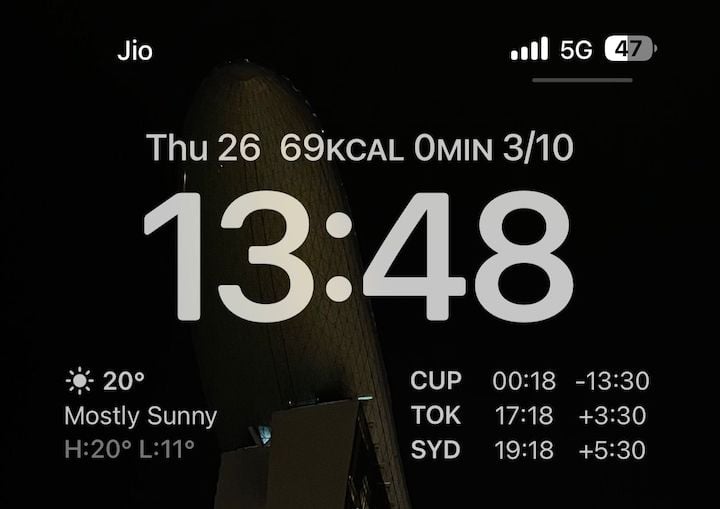
The first use case, accessoryRectangular, displays multiple lines of text or small graphs and charts. Some examples include the next calendar event with time and location or the top three to-dos from a user’s reminders.
Here are two rectangular widgets side by side showing weather data next to the current time in different locations:
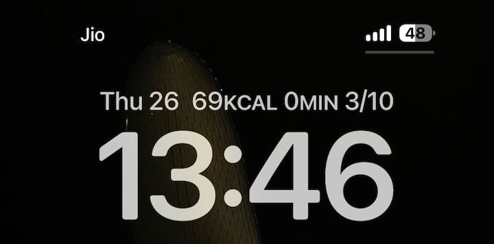
accessoryInlineThe second case, accessoryInline, provides a single row of text and an optional image. For some inspiration, this could be used to display the current weather as a symbol or the number of unread emails.
Here’s an example showing fitness data in a single line:
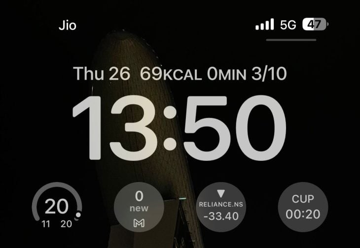
accessoryCircularFinally, accessoryCircular displays data (e.g., simple metrics, gauges, and progress views) in a circular format. Some examples are a fitness widget that displays three concentric rings for exercise, move, and stand or a weather widget that shows the current, minimum, and maximum temperature in a progress view.
Here are four circular widgets side by side displaying current weather, new emails in the Gmail app, the status of a targeted stock, and the time in Cupertino:
The process for building Lock Screen widgets is similar to that for creating home screen widgets — you start by creating a structure conforming to the Widget protocol. From there, you can either create a static widget or a dynamic widget:
struct TradinzaLockScreenWidgets: Widget {
  private let kind: String = "com.rudrankriyam.tradinzalockscreenwidgets"

  var body: some WidgetConfiguration {
    StaticConfiguration(kind: kind, provider: TradinzaTimelineProvider()) { entry in
      CurrentLiveTradeView(entry: entry)
    }
    .configurationDisplayName("Current live trade")
    .description("View the currently running live trade.")
    .supportedFamilies([.accessoryCircular, .accessoryInline, .accessoryRectangular])
  }
}
The important thing to note here is the addition of new families of the accessory types for Lock Screen widgets:
.supportedFamilies([.accessoryCircular, .accessoryInline, .accessoryRectangular])
As each widget size comes with its own set of constraints, it’s wise to create a separate layout design for each case. For example, the circular case is perfect for showing the amount of profit or loss as a circular progress bar with 0 in the center, while the rectangular case is useful when more detail needs to be provided.
Widgets define their content using a SwiftUI view. To switch between different widget family types, you can take advantage of the environment value widgetFamily:
struct CurrentLiveTradeView: View {
  @Environment(\.widgetFamily) var family
  let entry: SimpleEntry

  var body: some View {
    switch family {
      case .accessoryCircular: CurrentLiveTradeCircularView(entry: entry)
      case .accessoryInline: CurrentLiveTradeInlineView(entry: entry)
      case .accessoryRectangular: CurrentLiveTradeRectangularView(entry: entry)
      default: EmptyView()
    }
  }
}
You can provide the custom view for each of the three cases or you can only create just one or two, based on your needs.
Rectangular widgets afford you with the ability to fill the Lock Screen with the most information — up to half the space available on the Lock Screen under the time. For example, in the previous accessoryRectangular section, you can see there are two rectangular widgets included on the Lock Screen.
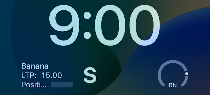
For our sample app, we’ll create a rectangular widget that displays the name of a stock, its current price, its current position, and if it is a buy/sell (we’ll denote this with the letters B and S, respectively):
struct CurrentLiveTradeRectangularView: View {
  var entry: TradinzaTimelineProvider.Entry

  var body: some View {
    HStack {
      VStack(alignment: .leading, spacing: 0) {
        Text(entry.stock.name)
          .bold()

        Text("LTP: ") + Text(String(format: "%.2f", entry.currentPrice))
          .monospacedDigit()

        HStack(spacing: 4) {
          Text("Position: ")

          Text(String(format: "%.2f", entry.position))
            .monospacedDigit()
            .redacted(reason: .privacy)
        }
      }

      Spacer()

      Text("S")
        .bold()
        .font(.title)
    }
  }
}
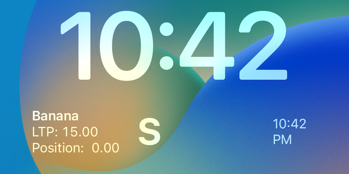
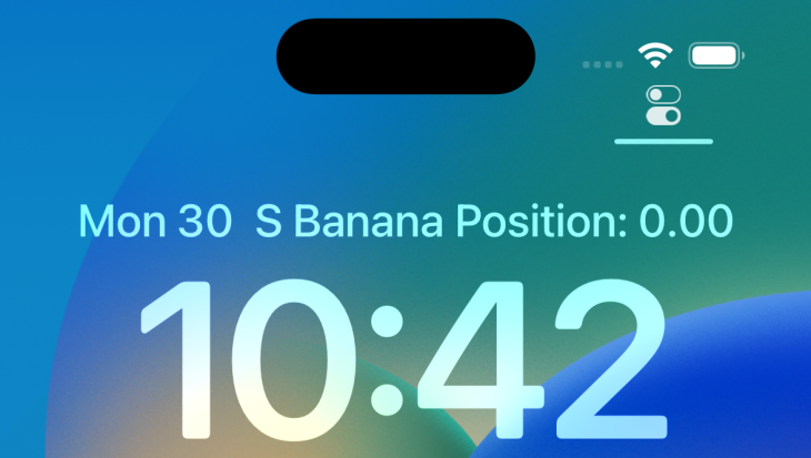
Inline widgets offer less space than rectangular widgets. These narrow, horizontal widgets are positioned above the time on the Lock Screen. They are best suited for small pieces of information that can be displayed in a compact, inline format, such as the weather forecast or the current date.
In our Tradinza app, we’ll create inline widgets to show the name of the stock and its current position:
struct CurrentLiveTradeInlineView: View {
  var entry: TradinzaTimelineProvider.Entry

  var body: some View {
      Text("*S* ").bold() + Text(entry.stock.name).bold() + Text(" Position: ") + Text(String(format: "%.2f", entry.position))
        .monospacedDigit()
  }
}
Circular widgets have the smallest amount of screen real estate compared to inline and rectangular widgets. They display progress views, gauges, or simple metrics in a circular format.
In our sample app, we’ll display the stock’s symbol and its current position:
struct CurrentLiveTradeCircularView: View {
  var entry: TradinzaTimelineProvider.Entry

  var body: some View {
    VStack {
      Text(entry.stock.symbol).bold()

      Text(String(format: "%.2f", entry.position))
        .monospacedDigit()
    }
  }
}
If we add the widget to the lower right side of the Lock Screen, alongside the other two widgets, it will look like this:
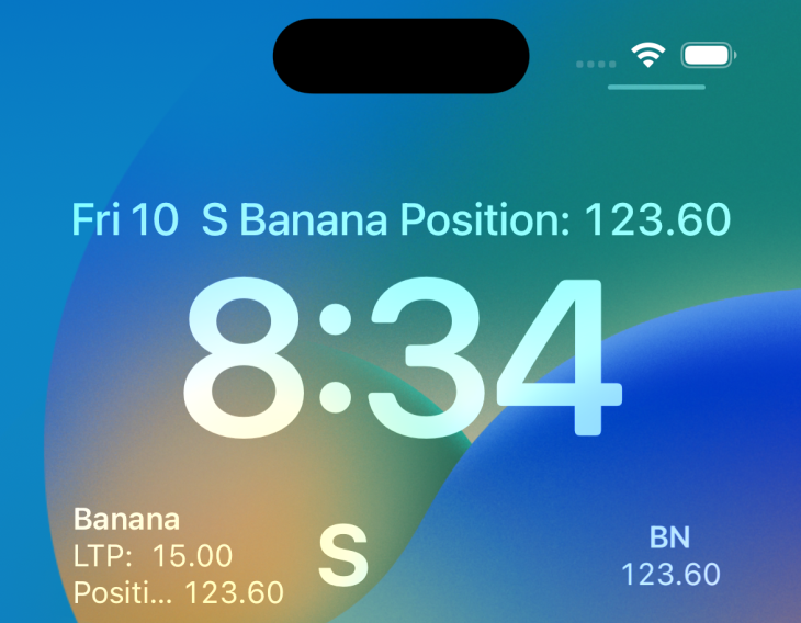
You’ll notice that the circular background of the widget in the above example is not visible. That is because the default background is an empty view (we’ll talk about this more a little later in the article).
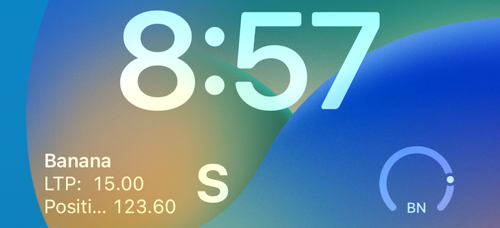
To look at another use case, we can use the Gauge to display values in a circular widget. For example, we could set a daily earning goal and then create a widget that shows the current position as the percentage of that value.
With the below code, we create a circular Lock Screen widget using Gauge and a daily limit of $200:
struct CurrentLiveTradeCircularView: View {
  var entry: TradinzaTimelineProvider.Entry

  var body: some View {
    Gauge(value: entry.position, in: -200...200) {
      Text(verbatim: entry.stock.symbol)
    }
    .gaugeStyle(.accessoryCircular)
  }
}
Here, the widget has been added to the Lock Screen; it displays a positive position of $123.60:
By default, the background is an empty view for the widgets. However, to ensure that a Lock Screen widget looks great on any wallpaper, you can add the AccessoryWidgetBackground adaptive background view that provides a standard appearance based on the widget’s environment. It would be best if you put it inside a ZStack as the first view:
ZStack {
  AccessoryWidgetBackground()

  // Other views
}
For example, you can wrap the circular view and add a bit amount of padding for the live trading view:
ZStack {
  AccessoryWidgetBackground()

  CurrentLiveTradeCircularView(entry: entry)
    .padding(4)
}
Running it on the Lock Screen will update the UI like this:

N.B., the AccessoryWidgetBackground is not available for the accessoryInline family, it will display an empty view; be sure to only use it for accessoryCircular and accessoryRectangular widget cases
Lock Screen widgets are easily accessible from the Lock Screen, but there may be cases where you want to prevent confidential or private information from displaying in the always-on display of the iPhone 14 Pro or Pro Max.
For example, while the phone is locked you may wish to hide a Gmail inline widget displaying the number of unread messages or hide the placeholder for a fitness app’s progress rings.
You can hide private or confidential information by adding the privacySensitive modifier to a particular view, like so:
VStack {
  Text(mail.unreadMessages)
    .privacySensitive()
}
Here, we’re hiding the stock position when the screen in locked:
When adding content to Lock Screen widgets, the thumb rule is to provide the smallest, most concise data possible. However, sometimes you may still need to adjust the view.
For example, content that looks perfect on the mammoth 6.7” display of the iPhone Pro Max may truncate on the iPhone SE. In such cases, you can provide an optional view for smaller screens so that the data will not truncate. This is especially important when you are working with the inline widget family type.
One option is to use the sizeThatFits(:) modifier to scale the text so that it fits within the available space.
Another strategy is to use the new ViewThatFits view that prioritizes the view from top to bottom:
struct CurrentLiveTradeInlineView: View {
  var entry: TradinzaTimelineProvider.Entry

  var body: some View {
    ViewThatFits {
      // Trade view with the full description on bigger screens.
      Text(entry.stock.name).bold() + Text(" Position: ") + Text(String(format: "%.2f", entry.position))
        .monospacedDigit()

      // Only the symbol is available to make it shorter.
      Text("*S* ").bold() + Text("P: ") + Text(String(format: "%.2f", entry.position))
        .monospacedDigit()
    }
  }
}
Lock Screen widgets for iOS 16 enhance the user experience by offering new and convenient ways for users to interact with your app. By providing direct access to the app functionality from the Lock Screen itself, users can easily and quickly view and engage with content without unlocking their device. This saves them time and increases overall efficiency.
By adding Lock Screen widgets to your app, you can stand out from the competition and increase user engagement and retention rates!
Install LogRocket via npm or script tag. LogRocket.init() must be called client-side, not
server-side
$ npm i --save logrocket

// Code:

import LogRocket from 'logrocket';
LogRocket.init('app/id');
// Add to your HTML:

<script src="https://cdn.lr-ingest.com/LogRocket.min.js"></script>
<script>window.LogRocket && window.LogRocket.init('app/id');</script>

Learn how Vite+ unifies Vite, Vitest, Oxlint, Oxfmt, Rolldown, and Node.js management in one CLI.

AI companies are buying developer tools as coding agents turn runtimes, package managers, and linters into strategic infrastructure.

Learn how AI-assisted development governance uses rules, agents, hooks, and protocols to help AI coding tools produce safer, more consistent code.

A step-by-step guide to building your first MCP server using Node.js, covering core concepts, tool design, and upgrading from file storage to MySQL.
Hey there, want to help make our blog better?
Join LogRocket’s Content Advisory Board. You’ll help inform the type of content we create and get access to exclusive meetups, social accreditation, and swag.
Sign up now