The Replay is a weekly newsletter for dev and engineering leaders.
Delivered once a week, it's your curated guide to the most important conversations around frontend dev, emerging AI tools, and the state of modern software.
Every developer should be concerned about reusability and separation of concerns in code since they help preserve formality across our project and separate the business logic from the app infrastructure.

Web components take this one step further by allowing us to create reusable components that are isolated from the rest of the code.
This article will walk you through the process of creating universal web components with Svelte. Universal in the sense that the component is not limited to your Svelte application alone, but can also be reused in any JavaScript application (Vue, React, etc.). We’ll also go through some of the major drawbacks of using Svelte to create web components.
First, let’s learn more about web components.
Web components allow us to create reusable, custom HTML elements with encapsulated styling and functionalities.
Assume we have an extensive HTML code to create a navbar:
<style>
/* CSS code for our navbar */
</style>
<navbar>
<!-- Some long code for our navbar -->
</navbar>
With web components, we can define a custom element (e.g., <custom-navbar />) along with the markup above and reuse it anywhere in our application without the styling applied to this component clashing with the rest of our application. This is possible with the shadow DOM.
Shadow DOM is a smaller, self-contained DOM that is rendered separately from the main DOM, allowing us to isolate both styling and markup behavior to just a single component. Shadow DOM essentially allows us to keep component features private so that they can be styled and scripted without interfering with the rest of our application’s appearance.
Now that we know more about web components, we can begin building them for our Svelte application.
To follow along with this tutorial, these prerequisites are required:
For our tutorial, we will work on creating two components:
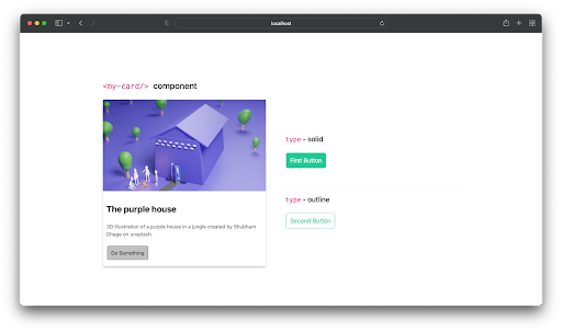
<my-card />type that allows us to choose between a solid and an outlined button. The custom name for our button component will be <cool-button />, which will also be accessible outside of SvelteWe’ll also look at how to bundle these components together and export them as a single file, as well as how to generate a separate file for each component.
The following is a final preview of how our components would look when they are instantiated (depending on the props provided):

We’ll begin by creating a new Svelte application and installing the necessary packages:
npx degit sveltejs/template web-component-tut
cd web-component-tut
npm install
Once our new Svelte app has been created, run the following command to launch our new app in the browser:
npm run dev
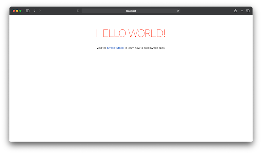
The command above will launch our new Svelte application at http://localhost:8080 (or any other available port, if 8080 is already in use), and when we visit the URL, we should see the welcome page shown below:

The process of generating a universal web component with Svelte is similar to how you would create a regular Svelte component, except with a few modifications.
To create the card as a Svelte component, for example, we’ll need to first create a file src/Card.svelte and define the component props, styling, and markup like below:
<script>
  // component props
  // Camel case not supported for props, see drawback section.
  export let card_title, card_desc, card_img;
</script>

<main>
  <div class="card-container">
    <div class="card">
      <img src={card_img} alt="My product" />
      <div class="card-body">
        <div class="row">
          <div class="card-title">
            <h2>{card_title}</h2>
          </div>
        </div>
        <p>
          {card_desc}
        </p>
        <button>Do Something</button>
      </div>
    </div>
  </div>
</main>

<style>
 .card {
    max-width: 350px;
    border-radius: 5px;
    box-shadow: 0 4px 6px 0 #00000033;
    padding: 0 0 10px 0;
  }

  .card img {
    width: 100%;
    height: auto;
  }

  .card-body {
    padding: 5px 10px;
  }

  .card-body p {
    color: #575757;
    margin-bottom: 20px;
    font-size: 14px;
  }
</style>
And, generally, we’ll be able to import it into other Svelte components and render it as follows:
<script>
  import Card from "./Card.svelte";
</script>

<main>
  <Card
    card_title="My Card Title"
    card_desc="Lorem ipsum dolor…"
    card_img="path/to/my-image.png"
  />

</main>
The same process applies to our button component. We start by creating a /src/Button.svelte file, with the code for our styled button:
<script>
  // Component props
  export let type = "solid";
</script>

<button class={type == "solid" ? "btn-solid" : "btn-outline"}>
  <slot />
</button>

<style>
  button {
    padding: 10px;
    color: #fff;
    font-size: 17px;
    border-radius: 5px;
    border: 1px solid #ccc;
    cursor: pointer;
  }
  .btn-solid {
    background: #20c997;
    border-color: #4cae4c;
  }
  .btn-outline {
    color: #20c997;
    background: transparent;
    border-color: #20c997;
  }
</style>
And we can also reuse in other Svelte components like below:
import Button from "./Button.svelte";

<Button type="outline">Click me</Button>
Converting these custom Svelte components to a universal component that can be used across other frameworks and libraries is a pretty straightforward process.
To begin, we’ll need to add an entry in the Svelte config file that allows us to generate custom elements. To do so, open up rollup.config.js and, under plugins export, add an entry for customElement, under compilerOptions, setting its value to true so that your rollup config file looks like this:
...
 plugins: [
    svelte({
      compilerOptions: {
        dev: !production,
        customElement: true,
...
After you’ve made the necessary changes to the config file, we’ll need to give our tag a unique name. Open the Card.svelte file we created earlier and add the following code to the file’s first line:
<svelte:options tag="my-card" />
The value of the tag attribute above represents the custom tag for our component.
We’ll need to follow the same process for our button component. Open up Button.svelte and add the following line to the beginning of this file:
<svelte:options tag="cool-button" />
The final step is to import our custom components in the Svelte main.js file so that they are generated at build time. To do this, open /src/main.js and replace it with the following code:
import Button from "./Button.svelte";
import Card from "./Card.svelte";
At this point, we have completed all of the steps required to create our custom element. The next step is to generate the bundle file, which will allow us to use this component in any other web application.
Run the following command from your CLI/terminal to generate the bundle file:
npm run build
This will generate two files, build.js and build.map.js, inside the /build folder in the root directory of our project. build.js is the bundled JavaScript code needed to render our component, and build.map.js is the source map for build.js.
You can ensure that everything went smoothly by copying the bundle.js file to a new folder and creating a new index.html file with the following code:
<!DOCTYPE html>
<html>
  <head>
    <title>My website</title>
    <script src="./build.js"></script>
  </head>

  <body>
    <div class="container">
      <div class="row">
        <div class="col">
          <my-card
            card_title="Red Person"
            card_desc=" Lorem ipsum dolor sit, amet consectetur.."
            card_img="https://bit.ly/34B3zHX"
          >
          </my-card>
          <!-- Image credit - Shubham Dhage on unsplash.com -->
        </div>
        <div class="col">
          <div class="border-bottom py-5">
            <cool-button> Solid Cool Button </cool-button>
            <cool-button type="outline"> Outlined Cool Button </cool-button>
          </div>
        </div>
      </div>
    </div>
  </body>
</html>
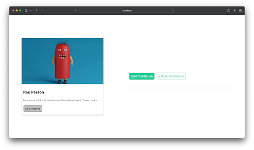
The code above is simply a standard HTML page that includes our component, and when we execute it, we should see our components displayed on the page as shown below:

In some cases, we do not want all of our components to be generated in a single build file. Sometimes we want to generate them individually. And this is very much feasible by modifying the rollup.config.js input and output exports to meet these requirements.
Our input exports will be an array of component paths, and the output will be a build directory rather than a single build file:
export default {
  input: ["src/Card.svelte", "./src/Button.svelte"],
  output: {
    format: "iife",
    dir: "public/build/",
  },
...
And if we run npm run build again, our component files will be generated for us separately as Button.js and Card.js in the public/build folder.
We can then link them individually in a markup to render our components like below:
<script src="Button.js" type="module"></script>
<cool-button type="outline">Click Me</cool-button>

<!-- another-page.html -->
<script src="Card.js" type="module"></script>
<my-card card_title="..."></my-card>
We’ve just learned how to create web components with Svelte, and while the process is inarguably an easy one, there are some drawbacks attached to using Svelte for web components, and some of them are mentioned below.
If we have a Header.svelte file that we want to export as <my-header /> and this component relies on another Nav.svelte file that we did not want to export, this drawback requires that we also tag our Nav.svelte file even though we do not want to export it:
// Nav.svelte
<svelte:options tag="my-nav">
<!-- Code for navbar -->
It would throw an error otherwise. There is also a fix for this as described here, but it would be great if issues like this were fixed out of the box.
customElement API, which is used in the background to create web components, is not currently supported by all browsers. Polyfill can be used as a fix for this, and the webcomponents official polyfill is a great place to get startedIn this article, we learned how to use Svelte to create a universal card and button component, generate the bundle file, split them, and even reuse this component in a separate HTML page.
If you’re interested in learning more about web components and the Svelte framework, check out the resources below:
Install LogRocket via npm or script tag. LogRocket.init() must be called client-side, not
server-side
$ npm i --save logrocket

// Code:

import LogRocket from 'logrocket';
LogRocket.init('app/id');
// Add to your HTML:

<script src="https://cdn.lr-ingest.com/LogRocket.min.js"></script>
<script>window.LogRocket && window.LogRocket.init('app/id');</script>

useEffect breaks AI streaming responses in ReactSee why useEffect breaks AI streaming in React, and how moving stream state outside React fixes flicker and stale updates.

A real-world debugging session using Claude to solve a tricky Next.js UI bug, exploring how AI helps, where it struggles, and what actually fixed the issue.

CSS wasn’t built for dynamic UIs. Pretext flips the model by measuring text before rendering, enabling accurate layouts, faster performance, and better control in React apps.

Why do real-time frontends break at scale? Learn how event-driven patterns reduce drift, race conditions, and inconsistent UI state.
Would you be interested in joining LogRocket's developer community?
Join LogRocket’s Content Advisory Board. You’ll help inform the type of content we create and get access to exclusive meetups, social accreditation, and swag.
Sign up now