
One of the features of modern web development is being able to display specific pages or parts of a page based on the screen size of the user’s device. This is otherwise known as responsive web design.

Responsive web design allows us to ensure that the user gets the best version of the web page regardless of their device, platform, screen size, and screen orientation.
In this article, we’ll learn how to build responsive components in React using the @artsy/fresnel package.
The Replay is a weekly newsletter for dev and engineering leaders.
Delivered once a week, it's your curated guide to the most important conversations around frontend dev, emerging AI tools, and the state of modern software.
@artsy/fresnel is an SSR approach to responsive components in React.
By using the <Media /> component, you can specify what the component shows at a particular breakpoint, between a range of breakpoints. The <Media /> component accepts props that help you determine the responsiveness of your apps. Some of them are:
This property displays components only if the current viewport matches the specific breakpoint set.
<Media at="sm" />
This property displays components only when the current viewport is less than the specific breakpoint set.
<Media lessThan="md" />
This property displays components only when the current viewport is greater than the specific breakpoint set.
<Media greaterThan="lg" />
This property displays components only when the current viewport is greater than or equal to the specific breakpoint set.
<Media greaterThanOrEqual="md" />
This property displays components when the current viewport matches the range of breakpoints specified.
<Media between={['md', 'lg']} />
To see how the artsy/fresnel package works, we’ll add it to a Gatsby site and then use it to build responsive components. The Gatsby site will be a magazine that displays a list of articles.
To create a Gatsby site, you’ll need to install the Gatsby CLI. The Gatsby CLI tool lets you quickly create new Gatsby-powered sites and run commands for developing Gatsby sites. It can be installed globally by running the command below:
yarn global add gatsby-cli
Once that’s done, the next step would be to create a Gatsby site. As mentioned above, we’ll be using the Gatsby CLI tool to create your first Gatsby site and we’ll be grabbing one of the starter projects to start with – the Gatsby default starter:
gatsby new artsy-fresnel-example
Once the command above is done, you should have a new directory called artsy-fresnel-example with all the files needed like this:
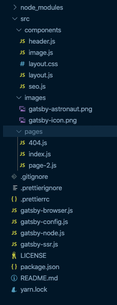
Before moving on to the meat of this article, let’s move things around and reorganize the components in the artsy-fresnel-example directory.
We’ll be using the grouping by features or routes method which is essentially to put CSS, JS, and tests together inside folders grouped by feature or components.
This means that for every component in src/components, we’ll have a corresponding folder for it e.g the header.js file will now be in a folder called Header and renamed to index.js. Do the same for the rest of the components. Your directory should be similar to the one below:

Make sure to update the paths of the various file imports as needed.
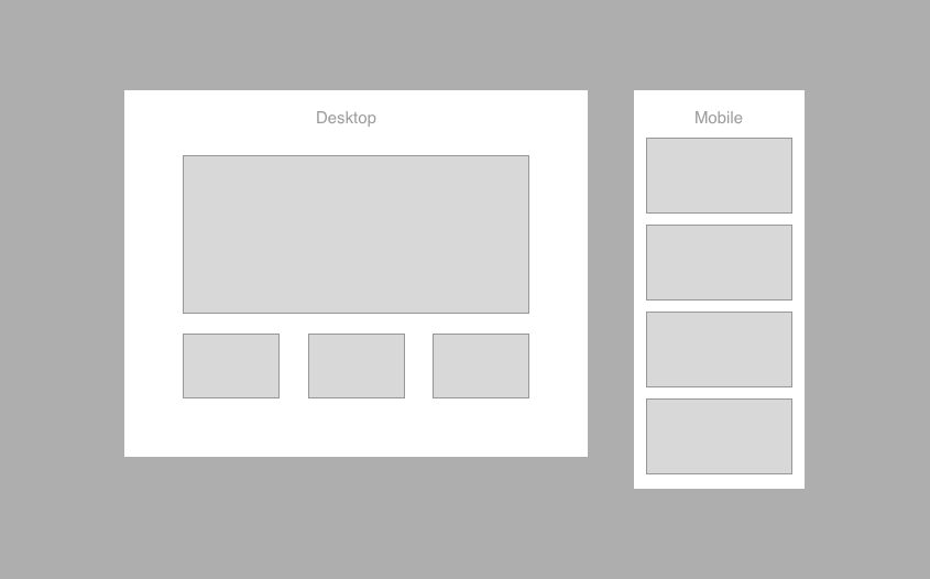
So, to give an overview of what we’re trying to build here, we’ll be building a magazine page that displays exactly four articles. The first article will be a featured article and the remaining three will be underneath it in a row of three. That’s the desktop view.
For the mobile view, all the articles will be listed in one column, no featured article. To help visualize what was described above, take a look at the image below.
Let’s create a new directory called Articles in the src/components directory, after that, create two files in the new directory – index.js and styles.js.
We’re creating a styles.js file because we’ll be using styled-components to style our components, so go ahead and install the package with the command below:
yarn add styled-components
Next, open the src/components/Articles/index.js file and add this code into the file:
// src/components/Articles/index.js
import React from "react"

const articles = []

const Articles = () => {
  return <p>Articles</p>
}

export default Articles
The index.js file is the component that’s responsible for showing the articles and therefore we’ll need a data source for the articles. You can grab the content of the code snippet below and use it to replace the const articles = [] line of code:
const articles = [
  {
    id: "1",
    date: "01-01-2020",
    headline: "Lorem ipsum dolor sit amet apem edit",
    category: "Lifestyle",
    snippet:
      "Cras a erat a quam efficitur vestibulum. Nulla in nisl semper, condimentum ex quis, semper elit.",
    image:
      "https://images.unsplash.com/photo-1579541707963-368970b955b7?ixlib=rb-1.2.1&ixid=eyJhcHBfaWQiOjEyMDd9&auto=format&fit=crop&w=1050&q=80",
  },
  {
    id: "2",
    date: "02-01-2020",
    headline: "Lorem ipsum dolor sit amet apem edit",
    category: "Lifestyle",
    snippet:
      "Cras a erat a quam efficitur vestibulum. Nulla in nisl semper, condimentum ex quis, semper elit.",
    image:
      "https://images.unsplash.com/photo-1579571076332-acc4483d3eb8?ixlib=rb-1.2.1&ixid=eyJhcHBfaWQiOjEyMDd9&auto=format&fit=crop&w=1023&q=80",
  },
  {
    id: "3",
    date: "03-01-2020",
    headline: "Lorem ipsum dolor sit amet apem edit",
    category: "Lifestyle",
    snippet:
      "Cras a erat a quam efficitur vestibulum. Nulla in nisl semper, condimentum ex quis, semper elit.",
    image:
      "https://images.unsplash.com/photo-1579617881900-fe2590bc8384?ixlib=rb-1.2.1&ixid=eyJhcHBfaWQiOjEyMDd9&auto=format&fit=crop&w=1050&q=80",
  },
  {
    id: "4",
    date: "04-01-2020",
    headline: "Lorem ipsum dolor sit amet apem edit",
    category: "Lifestyle",
    snippet:
      "Cras a erat a quam efficitur vestibulum. Nulla in nisl semper, condimentum ex quis, semper elit.",
    image:
      "https://images.unsplash.com/photo-1579626349272-8ecb1eba0421?ixlib=rb-1.2.1&ixid=eyJhcHBfaWQiOjEyMDd9&auto=format&fit=crop&w=1050&q=80",
  },
]
Next, open up the styles.js file and add the code below:
// src/components/Articles/styles.js

import styled from "styled-components"

export const Articles = styled.div`
  display: grid;
  grid-template-columns: repeat(auto-fill, minmax(235px, 1fr));
  gap: 1rem;
  margin-top: 2rem;
  @media (min-width: 720px) {
    grid-template-columns: repeat(3, minmax(235px, 1fr));
  }
`
export const Card = styled.div`
  padding-right: 0;
  border-right: none;
  img {
    margin-bottom: 0;
  }
  &:last-child {
    border-right: none;
  }
  @media (min-width: 720px) {
    border-right: 1px solid rgb(226, 226, 226);
    padding-right: 1rem;
  }
`
export const Headline = styled.p`
  font-weight: 600;
  color: #121212;
  font-size: 0.95rem;
`
export const FooterText = styled.p`
  color: #999999;
  font-size: 0.8rem;
`
The code above helps build the row of articles that will be displayed on the article page. All we have to do is use them in the index.js file:
// src/components/Articles/index.js

import React from "react"

import * as Styles from "./styles"

const articles = [...] // articles from https://gist.github.com/yomete/53be226f779d4d1ebd3ed85b8fa5672a

const Articles = () => {

  const featuredArticle = articles.slice(0, 1)
  const desktopArticleGrids = articles.slice(1, 4)
  const mobileArticleGrids = articles.slice(0, 4)

  return (
    <Styles.Articles>
      {desktopArticleGrids.map(article => (
        <Styles.Card>
          <img src={article.image}></img>
          <Styles.Headline>{article.headline}</Styles.Headline>
          <Styles.FooterText>
            {article.category} {article.date}
          </Styles.FooterText>
        </Styles.Card>
      ))}
    </Styles.Articles>
  )
}
export default Articles
In the code block above, we’re assigning the source of articles to a const variable called articles. We’re then using the content of articles to create the data we need for:
featuredArticle . In this case, it’s the first article in the arraydesktopArticleGrids. It’s the last three articles in an array of four articlesmobileArticleGridsNext, let’s use the Articles component on the homepage of the Gatsby site. Navigate to the src/pages/index.js file and edit it with the code block below:
import React from "react"

import Articles from "../components/Articles/index"
import Layout from "../components/Layout/index"
import SEO from "../components/SEO/index"

const IndexPage = () => (
  <Layout>
    <Articles />
    <SEO title="Home" />
  </Layout>
)

export default IndexPage
We can check the Gatsby site now to see if the list of articles shows up. You can do that by running this command:
yarn start
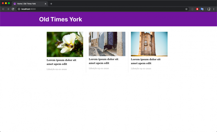
At this point, we’ve got the article row sorted out, let’s build the component for the featured articles next.
Create a new directory called FeaturedArticle in the src/components directory, after that, create two files in the new directory – index.js and styles.js:
// src/components/FeaturedArticle/index.js

import React from "react"
import * as Styles from "./styles"

const FeaturedArticle = ({ article }) => {
  return (
    <Styles.FeaturedArticleWrapper>
      <Styles.ArticleDetails>
        <Styles.Headline>{article.headline}</Styles.Headline>
        <Styles.Snippet>{article.snippet}</Styles.Snippet>
        <Styles.Date>{article.date}</Styles.Date>
      </Styles.ArticleDetails>
      <Styles.ImageWrapper>
        <img src={article.image}></img>
      </Styles.ImageWrapper>
    </Styles.FeaturedArticleWrapper>
  )
}
export default FeaturedArticle
FeaturedArticle is a functional component that accepts article as a property and the article object is then used to provide the info needed to build the component.
Next, open up the styles.js file and edit with the code block below:
// src/components/FeaturedArticle/styles.js
import styled from "styled-components"

export const FeaturedArticleWrapper = styled.div`
  display: flex;
  border-top: 1px solid #121212;
  border-bottom: 1px solid #121212;
  padding: 18px 0;
`
export const ImageWrapper = styled.div`
  img {
    margin-bottom: 0;
  }
`
export const Headline = styled.p`
  font-weight: 600;
`
export const Snippet = styled.p`
  color: #555555;
`
export const Date = styled.p`
  color: #999999;
`
export const ArticleDetails = styled.div`
  display: flex;
  flex-direction: column;
`
In the code above, we’re adding the styles needed to build the featured article component.
Next, we’ll use the <FeaturedArticle /> component in the Article component. Open up the src/components/Articles/index.js file and edit with the code block below:
// src/components/Articles/index.js
import React from "react"

import FeaturedArticle from "../FeaturedArticle/index"
import * as Styles from "./styles"

const articles = [...] // articles from https://gist.github.com/yomete/53be226f779d4d1ebd3ed85b8fa5672a

const Articles = () => {

  const featuredArticle = articles.slice(0, 1)
  const desktopArticleGrids = articles.slice(1, 4)
  const mobileArticleGrids = articles.slice(0, 4)

  return (
    <>
      <FeaturedArticle article={featuredArticle[0]} />

      <Styles.Articles>
        {desktopArticleGrids.map(article => (
          <Styles.Card>
            <img src={article.image}></img>
            <Styles.Headline>{article.headline}</Styles.Headline>
            <Styles.FooterText>
              {article.category} {article.date}
            </Styles.FooterText>
          </Styles.Card>
        ))}
      </Styles.Articles>
    </>
  )
}

export default Articles
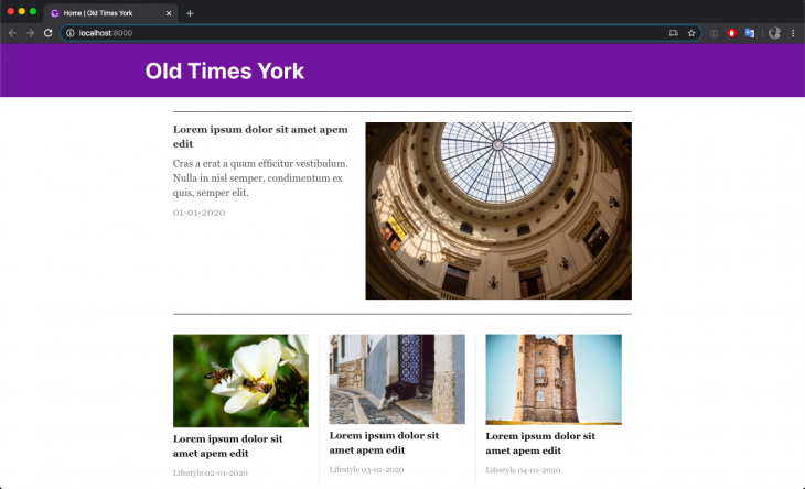
In the code block above, the FeaturedArticle component is imported and then used in Articles component. We’re also passing it the first item in the array of articles, this will then be used to populate the featured article component.
You can now check the Gatsby site and it should look similar to the image below:
To install the artsy/fresnel package, run the command below in the terminal:
yarn add @artsy/fresnel
To start making use of the artsy-fresnel package, we need to do some setup.
First, we need to inject @artsy/fresnel styles into the head of the site’s index.html. This isn’t a file that is readily available in a Gatsby setup. You’ll need to create a html.js file in the src folder and Gatsby knows to use it as a customized index.html file. Create the html.js file and edit with the code block below:
import React from "react"
import PropTypes from "prop-types"
import { mediaStyles } from "./Media"
export default function HTML(props) {
  return (
    <html {...props.htmlAttributes}>
      <head>
        <title>Old Times York</title>
        <meta charSet="utf-8" />
        <meta httpEquiv="x-ua-compatible" content="ie=edge" />
        <meta
          name="viewport"
          content="width=device-width, initial-scale=1, shrink-to-fit=no"
        />
        {/* Inject @artsy/fresnel styles in to the head */}
        <style>{mediaStyles}</style>
        {props.headComponents}
      </head>
      <body {...props.bodyAttributes}>
        {props.preBodyComponents}
        <noscript key="noscript" id="gatsby-noscript">
          This app works best with JavaScript enabled.
        </noscript>
        <div
          key={`body`}
          id="___gatsby"
          dangerouslySetInnerHTML={{ __html: props.body }}
        />
        {props.postBodyComponents}
      </body>
    </html>
  )
}
HTML.propTypes = {
  htmlAttributes: PropTypes.object,
  headComponents: PropTypes.array,
  bodyAttributes: PropTypes.object,
  preBodyComponents: PropTypes.array,
  body: PropTypes.string,
  postBodyComponents: PropTypes.array,
}
The code block above is the custom html.js that Gatsby recommends with a few additions. mediaStyles is imported from a Media.js file that we’ll be creating next and it’s content is injected into the head of the html.js file.
The next thing to do is configure @artsy/fresnel in a file that can be used throughout the app. Create a src/Media.js file and edit with the code below:
// src/Media.js
import { createMedia } from "@artsy/fresnel"
const QueryBreakpoints = createMedia({
  breakpoints: {
    sm: 0,
    md: 768,
    lg: 1024,
    xl: 1192,
  },
})
// Generate CSS to be injected into the head
export const mediaStyles = QueryBreakpoints.createMediaStyle()
export const { Media, MediaContextProvider } = QueryBreakpoints
In the file above, we define the breakpoints needed for your design to produce the set of media components you can use throughout your application.
The way the @artsy/fresnel package works is that all breakpoints are rendered by the server and each Media component is wrapped by plain CSS that will only show that breakpoint if it matches the user’s current browser size. Which is why we needed to define the breakpoints above.
The next thing to do is wrap the Gatsby app around MediaContextProvider. The MediaContextProvider component influences how Media components will be rendered.
In a Gatsby app, this can be done using the wrapRootElement API. The wrapRootElement allows a plugin to wrap the root element. This is useful to set up any provider components that will wrap your application, in this case, the MediaContextProvider.
The place to do that would be inside the gatsby-browser.js and gatsby-ssr.js files. Open each file and add the respective code below:
// gatsby-browser.js
import * as React from "react"
import { MediaContextProvider } from "./src/Media"

export const wrapRootElement = ({ element }) => (
  {element}
)
// gatsby-ssr.js
import * as React from "react"
import { MediaContextProvider } from "./src/Media"

export const wrapRootElement = ({ element }) => (
  {element}
)
We are repeating the code above in two files because if you use either of the wrapRootElement or wrapPageElement APIs, you need to add it in both gatsby-ssr.js and gatsby-browser.js files so that pages generated through SSR with Node.js are the same after being hydrated with browser JavaScript.
That’s all the setup we need, we can now begin to start using the <Media /> components in our app. Navigate to the src/components/Articles/index.js file and edit with the code below:
import React from "react"

import { Media } from "../../Media"
import FeaturedArticle from "../FeaturedArticle/index"
import * as Styles from "./styles"

const articles = [...] // articles from https://gist.github.com/yomete/53be226f779d4d1ebd3ed85b8fa5672a

const Articles = () => {
  const featuredArticle = articles.slice(0, 1)
  const desktopArticleGrids = articles.slice(1, 4)
  const mobileArticleGrids = articles.slice(0, 4)
  return (
    <>
      <Media lessThan="md">
        <Styles.Articles>
          {mobileArticleGrids.map(article => (
            <Styles.Card>
              <img src={article.image}></img>
              <Styles.Headline>{article.headline}</Styles.Headline>
              <Styles.FooterText>
                {article.category} {article.date}
              </Styles.FooterText>
            </Styles.Card>
          ))}
        </Styles.Articles>
      </Media>
      <Media greaterThanOrEqual="md">
        <FeaturedArticle article={featuredArticle[0]} />
        <Styles.Articles>
          {desktopArticleGrids.map(article => (
            <Styles.Card>
              <img src={article.image}></img>
              <Styles.Headline>{article.headline}</Styles.Headline>
              <Styles.FooterText>
                {article.category} {article.date}
              </Styles.FooterText>
            </Styles.Card>
          ))}
        </Styles.Articles>
      </Media>
    </>
  )
}
export default Articles
In the code block above, we’re utilizing the lessThan property to display all articles at once in a list with no featured article, as long as the current screen size is less than the breakpoint set at md.
The greaterThanOrEqual prop is used to show the featured article first, and then a row of articles below it, as long as the current screen size is greater than the breakpoint set at md .
Now if you resize your browser accordingly, you should get the results you’re hoping for, a React app with responsive components.
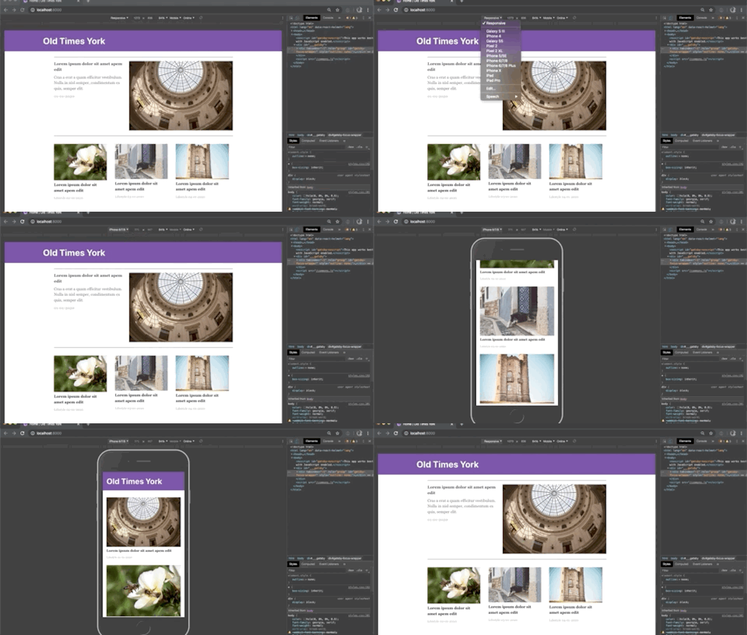
We can even make the src/components/Articles/index.js file even better by creating a mini component for displaying the row of articles. As it is now, the code block for showing the row is being repeated twice both in the <Media /> component for md screens and greater than md screens.
Let’s follow the DRY principle and create a component for it:
import React from "react"
import { Media } from "../../Media"
import FeaturedArticle from "../FeaturedArticle/index"
import * as Styles from "./styles"

const articles = [...] // articles from https://gist.github.com/yomete/53be226f779d4d1ebd3ed85b8fa5672a

const ArticleGrid = ({ articles }) => (
  <Styles.Articles>
    {articles.map(article => (
      <Styles.Card>
        <img src={article.image}></img>
        <Styles.Headline>{article.headline}</Styles.Headline>
        <Styles.FooterText>
          {article.category} {article.date}
        </Styles.FooterText>
      </Styles.Card>
    ))}
  </Styles.Articles>
)

const Articles = () => {
  const featuredArticle = articles.slice(0, 1)
  const desktopArticleGrids = articles.slice(1, 4)
  const mobileArticleGrids = articles.slice(0, 4)
  return (
    <>

      <Media lessThan="md">
        <ArticleGrid articles={mobileArticleGrids} />
      </Media>

      <Media greaterThanOrEqual="md">
        <FeaturedArticle article={featuredArticle[0]} />
        <ArticleGrid articles={desktopArticleGrids} />
      </Media>

    </>
  )
}

export default Articles
Let’s run the yarn start command again just to ensure that everything still works as expected. Your page should look like the one below.
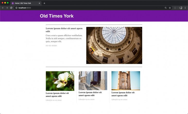
In this article, you’ve seen how to build responsive React components using the @artsy/fresnel library. You also saw some of the advantages that @artsy/fresnel package has over other libraries.
What are some of the responsive components libraries you’ve worked with?
The entire code for the example built above can be seen on GitHub.
Install LogRocket via npm or script tag. LogRocket.init() must be called client-side, not
server-side
$ npm i --save logrocket

// Code:

import LogRocket from 'logrocket';
LogRocket.init('app/id');
// Add to your HTML:

<script src="https://cdn.lr-ingest.com/LogRocket.min.js"></script>
<script>window.LogRocket && window.LogRocket.init('app/id');</script>

Build a CRUD REST API with Node.js, Express, and PostgreSQL, then modernize it with ES modules, async/await, built-in Express middleware, and safer config handling.

Discover what’s new in The Replay, LogRocket’s newsletter for dev and engineering leaders, in the March 25th issue.

Discover a practical framework for redesigning your senior developer hiring process to screen for real diagnostic skill.

I tested the Speculation Rules API in a real project to see if it actually improves navigation speed. Here’s what worked, what didn’t, and where it’s worth using.
Would you be interested in joining LogRocket's developer community?
Join LogRocket’s Content Advisory Board. You’ll help inform the type of content we create and get access to exclusive meetups, social accreditation, and swag.
Sign up now