Dashboards are essential tools for modern corporations and administrators. They provide insightful data that can help monitor an enterprise’s quantitative performance and metrics.

In an ecosystem saturated with high-level libraries for building dashboard applications, one might think it impossible to settle for a low-level library. But the fact is, most high-level libraries tend to be slow when compared to low-level libraries that offer raw performance.
In this article, we’ll introduce Tremor, a low-level library for building dashboards in React, and demonstrate how to create an interactive dashboard application in React using Tremor.
Jump ahead:
To follow along with this tutorial, you’ll need to have fundamental knowledge of React and the following:
Tremor is an open-source, low-level library for building dashboards in React. The library is component-based and offers several components, such as cards, texts, and charts, that are used to set up dashboards or analytic interfaces.
Tremor uses Tailwind under the hood; its components are flexible and beautifully styled out of the box. However, the library also allows the use of native CSS and Tailwind as optional add-ons for handling minor layout factors.
Although Tremor is a low-level library, its components are pretty much high-level. Dashboard layouts can be rapidly assembled by prototyping and arranging components in the proper order, with less need for precise calibration.
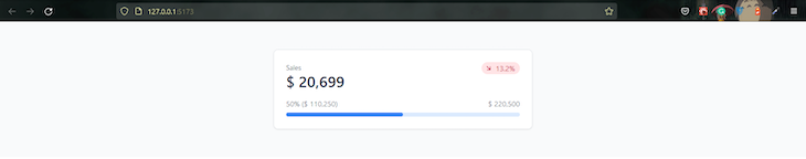
Take the code below, for example:
<Card maxWidth="max-w-lg">
  <Flex alignItems="items-start">
    <Block>
      <Text>Sales</Text>
      <Metric>$ 20,699</Metric>
    </Block>
    <BadgeDelta deltaType="moderateDecrease" text="13.2%" />
  </Flex>
  <Flex marginTop="mt-4">
    <Text truncate={true}>50% ($ 110,250)</Text>
    <Text> $ 220,500 </Text>
  </Flex>
  <ProgressBar percentageValue={50} marginTop="mt-2" />
</Card>
When rendered to the browser, it’ll translate to the performance indicator card in the image below:
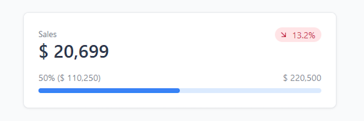
All we did was import each component and arrange them in a personalized order to create a beautiful performance indicator card.
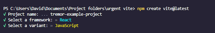
To get started, we’ll set up a React project using Vite, and install Tremor, Heroicons, and Tailwind as dependencies.
First, open your command line tool and cd into a preferred folder. Next, run the following code to initialize Vite’s CLI installation prompt:
npm create vite@latest
The command will prompt you to choose a framework and your preferences for the project. Select from the options to proceed:
Once the installation is complete, cd into the tremor-example-project folder and run the following commands to install Tremor, Heroicons, and Tailwind.
npm i [email protected] @tremor/react
That’s it for the project setup. Next, we’ll look at how to set up a Tailwind environment in our project.
The first step is to create a Tailwind and PostCSS config file in the project’s root folder. Tailwind provides a CLI tool that does this automatically:
npx tailwindcss init -p
This command will create tailwind.config.js and postcss.config.cjs files in the root folder of your project.
Open the tailwind.config.js file and add the following code within the content array value:
"./index.html", "./src/**/*.{js,ts,jsx,tsx}"
These are the paths to all the template files in our project.
After adding the paths, the content within the tailwind.config.js file should look similar to the one below:
/** @type {import('tailwindcss').Config} */
module.exports = {
  content: ["./index.html", "./src/**/*.{js,ts,jsx,tsx}"],
  theme: {
    extend: {},
  },
  plugins: [],
};
Next, navigate to the src folder, open the index.css file, and replace the CSS code inside with Tailwind’s directives:
@tailwind base;
@tailwind components;
@tailwind utilities;
Now we can use Tailwind utility classes in our project.
To start the development server, run the following commands to install Vite’s dependencies and start the server:
npm install
Then:
npm run dev
The latter will start the development server and automatically preview the app on your default browser. If it doesn’t, open your browser and navigate to http://localhost:5173.
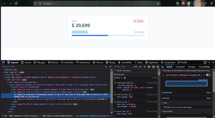
Even after installing Tailwind, if you try to use any of Tremor’s components, they’ll render without styling.
<Card maxWidth="max-w-lg">
  <Flex alignItems="items-start">
    <Block>
      <Text>Sales</Text>
      <Metric>$ 20,699</Metric>
    </Block>
    <BadgeDelta deltaType="moderateDecrease" text="13.2%" />
  </Flex>
  <Flex marginTop="mt-4">
    <Text truncate={true}>50% ($ 110,250)</Text>
    <Text> $ 220,500 </Text>
  </Flex>
  <ProgressBar percentageValue={50} marginTop="mt-2" />
</Card>
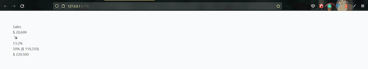
This is because Tremor’s Tailwind package is set up internally, so to use it in our app, we have to import the CSS file, where the directives are, inside either the App.js *or *main.jsx file.
To do this, go to the App.jsx or main.jsx file and add the following code path:
import "@tremor/react/dist/esm/tremor.css";
If you save your progress and return to the browser, the component should render as expected.
In this section, we’ll take an in-depth look at Tremor’s building blocks and how they work.
Components are the building blocks of Tremor. They are pre-styled elements that visualize data using a set of configurable properties. Each component contains several properties that are used to configure its internal functionality and visual composition.
Here’s a sample anatomy of Tremor’s AreaChart component:
<AreaChart
  data={[{}]}
  categories={[]}
  dataKey=""
  colors={["blue"]}
  valueFormatter={undefined}
  startEndOnly={false}
  showXAxis={true}
  showYAxis={true}
  yAxisWidth="w-14"
  showTooltip={true}
  showLegend={true}
  showGridLines={true}
  showAnimation={true}
  height="h-80"
  marginTop="mt-0"
  />
The data, categories, and dataKey props parse and control the data to be visualized, while the rest configures the visual composition of the component.
Unlike the AreaChart component, most Tremor components accept data as children props. Take the code below, for example:
<Text>Sales</Text>
The text between the Text tags will be passed to the component’s children prop:
function Text({ children }) {
  return (
    <p className="tr-shrink-0 tr-mt-0 tr-text-left tr-text-gray-500 tr-text-sm tr-font-normal">
      {children}
    </p>
  );
}
The utility classes on the div are for the underlying Tailwind package. You can view the utility classes on each component by inspecting the rendered element in your browser’s dev tool.
Visit the documentation to learn more about Tremor’s components.
Now that we understand how Tremor works, let’s build our first dashboard.
Tremor provides example layouts that are called page shell blocks. These shell blocks are boilerplates that allow us to quickly wrap visualizations and metrics into visually compelling dashboard interfaces without worrying about layout constraints, such as responsiveness.
Visit Tremor’s shell page to view the list of available shell blocks.
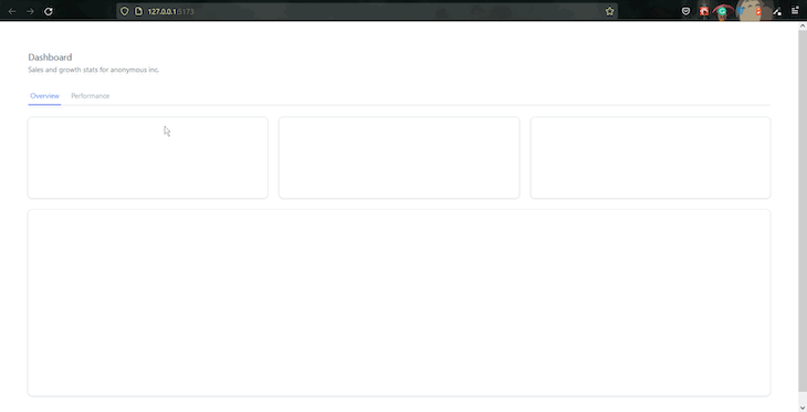
For this tutorial, we’ll use the shell block shown in the image below:
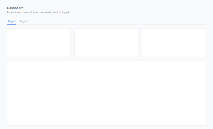
This layout has two tabs: the first contains three-column performance indicator cards and a big container. The second tab contains only a big container.
As a first step, create a components sub-folder inside the src folder and add an example.jsx file.
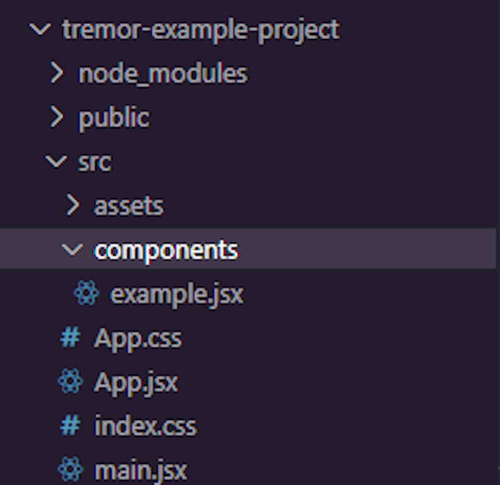
Next, add the following code to the example.jsx file:
import {
  Card,
  Title,
  Text,
  Tab,
  TabList,
  ColGrid,
  Block,
} from '@tremor/react';

import { useState } from 'react';

export default function Example() {
const [selectedView, setSelectedView] = useState(1);
return (
<main>
    <Title>Dashboard</Title>
    <Text>Sales and growth stats for anonymous inc.</Text>
    <TabList defaultValue={ 1 } handleSelect={ (value) => setSelectedView(value) } marginTop="mt-6">
        <Tab value={ 1 } text="Page 1" />
        <Tab value={ 2 } text="Page 2" />
    </TabList>

    { selectedView === 1 ? (
        <>
            <ColGrid numColsMd={ 2 } numColsLg={ 3 } gapX="gap-x-6" gapY="gap-y-6" marginTop="mt-6">
                <Card>
                    { /* Placeholder to set height */ }
                    <div className="h-28" />
                </Card>
                <Card>
                    { /* Placeholder to set height */ }
                    <div className="h-28" />
                </Card>
                <Card>
                    { /* Placeholder to set height */ }
                    <div className="h-28" />
                </Card>
            </ColGrid>

            <Block marginTop="mt-6">
                <Card>
                    <div className="h-80" />
                </Card>
            </Block>
        </>
    ) : (
        <Block marginTop="mt-6">
            <Card>
                <div className="h-96" />
            </Card>
        </Block>
    ) }
</main>
  );
}
The structure of this shell is pretty straightforward; the only thing that stands out is the dynamically rendered section of the code.
{ selectedView === 1 ? (
  <>
      <ColGrid numColsMd={ 2 } numColsLg={ 3 } gapX="gap-x-6" gapY="gap-y-6" marginTop="mt-6">
          <Card>
              { /* Placeholder to set height */ }
              <div className="h-28" />
          </Card>
          <Card>
              { /* Placeholder to set height */ }
              <div className="h-28" />
          </Card>
          <Card>
              { /* Placeholder to set height */ }
              <div className="h-28" />
          </Card>
      </ColGrid>

      <Block marginTop="mt-6">
          <Card>
              <div className="h-80" />
          </Card>
      </Block>
  </>
) : (
  <Block marginTop="mt-6">
      <Card>
          <div className="h-96" />
      </Card>
  </Block>
) }
The selectedView state variable controls this section. If its value is 1, it’ll display the first tab section. Otherwise, it’ll show the second tab section.
The TabList component sets the state’s value. It wraps two Tab components, whose values are 1 and 2, respectively.
<TabList
  defaultValue={1}
  handleSelect={(value) => setSelectedView(value)}
  marginTop="mt-6"
>
  <Tab value={1} text="Overview" />
  <Tab value={2} text="Performance" />
</TabList>;
There are two functional props on the TabList component: defaultValue and handleSelect.
The defaultValue prop sets the component’s default value, which in this case is 1. The handleSelect prop gets the component’s current value and passes it to the state using the setSelectedView function.
handleSelect={(value) => setSelectedView(value)}
So on initial load, the TabList component will set the state to its default value: 1. Thus, the first tab section is displayed on the dashboard.
When the second tab is selected, the TabList component’s value becomes 2, thus triggering the conditional statement to display the second tab section on the dashboard.
To finish off, go back to the App.jsx file, and import the example.jsx file like so:
import Example from  "./components/example";

function App() {
  return (
    <div className="p-14 bg-[#F9FAFB]">
      <Example />
    </div>
  );
}

export default App;
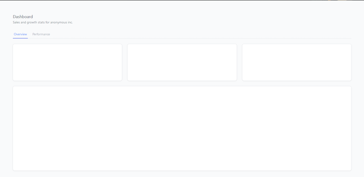
If you save your progress and view the page shell on your browser, you’ll get a sense of how all this works.
Now that that’s out of the way, next, we’ll populate our dashboard’s cards and containers with data.
To populate our dashboard, we’ll need a data source from which we can fetch information. It could be from either a REST or a GraphQL API. Tremor works out-of-the-box with most data providers, but for simplicity, this tutorial will use hard-coded data from a given array of objects.
But first, let’s break our page shell into bite-sized components to make the code as DRY as possible.
First, create Cards.jsx, firstContainer.jsx, and secondContainer.jsx files inside the components sub-folder.
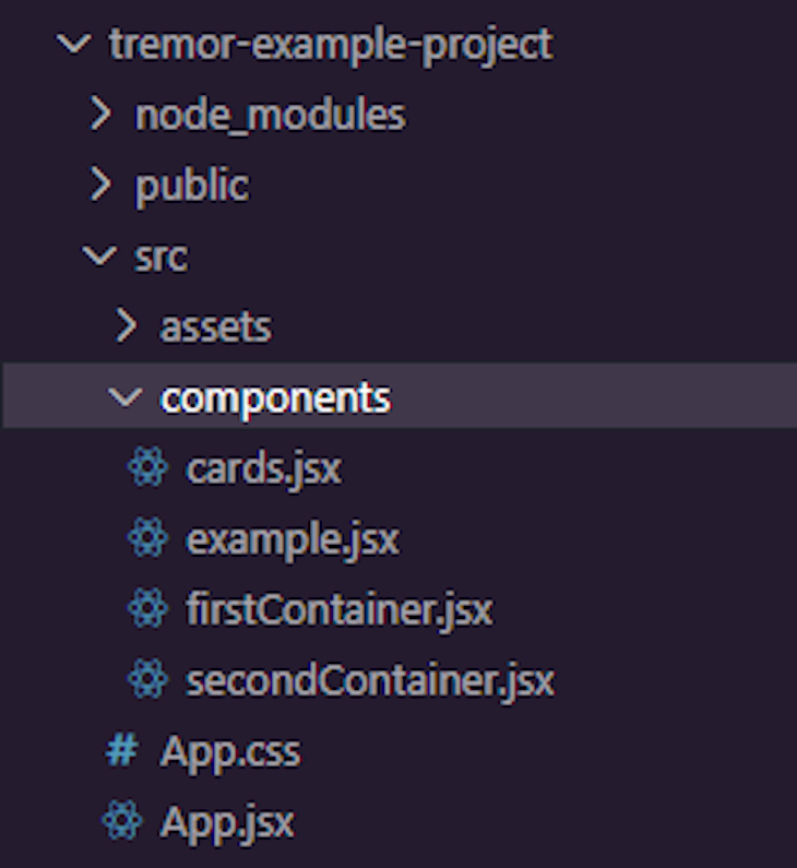
Next, move the cards and both big containers’ code blocks inside the Cards.jsx, firstContainer.jsx, and secondContainer.jsx files, respectively.
The Cards.jsx file looks like this:
//src/cards.jsx

import React from "react";
import { Block, Card, ColGrid } from "@tremor/react";

export default function Cards() {
  return (
  <ColGrid numColsMd={ 2 } numColsLg={ 3 } gapX="gap-x-6" gapY="gap-y-6" marginTop="mt-6">
            <Card>
              { /* Placeholder to set height */ }
              <div className="h-28" />
            </Card>
            <Card>
               { /* Placeholder to set height */ }
               <div className="h-28" />
            </Card>
            <Card>
               { /* Placeholder to set height */ }
               <div className="h-28" />
            </Card>
         </ColGrid>

         <Block marginTop="mt-6">
            <Card>
               <div className="h-80" />
            </Card>
         </Block>
  );
}
While firstContainer.jsx looks like this:
//src/firstContainer.jsx

import React from "react";
import { Block, Card } from "@tremor/react";

export default function FirstContainer() {
  return (
      <Block marginTop="mt-6">
        <Card>
          <div className="h-80" />
        </Card>
      </Block>
  );
}
And secondContainer.jsx looks like this:
//src/secondContainer.jsx

import React from "react";
import { Block, Card } from "@tremor/react";

export default function SecondContainer() {
  return (
      <Block marginTop="mt-6">
        <Card>
          <div className="h-80" />
        </Card>
      </Block>
  );
}
Lastly, import all three components inside the example.jsx file and add them to their respective positions.
import Cards from "./cards";
import FirstContainer from "./firstContainer";
import SecondContainer from "./secondContainer";

export default function Example() {

    ...

      {selectedView === 1 ? (
        <>
          <Cards />
          <FirstContainer />
        </>
      ) : (
        <SecondContainer />
      )}
    </main>
  );
}
If you did everything right, you shouldn’t see any differences on your page shell when you save your progress.
To populate our cards, go into the Cards.jsx file and add the following code at the top of the component’s function:
const data = [
  {
    title: "Sales",
    metric: "$ 12,699",
    progress: 15.9,
    target: "$ 80,000",
    delta: "13.2%",
    deltaType: "moderateIncrease",
  },
  {
    title: "Profit",
    metric: "$ 45,564",
    progress: 36.5,
    target: "$ 125,000",
    delta: "23.9%",
    deltaType: "increase",
  },
  {
    title: "Customers",
    metric: "1,072",
    progress: 53.6,
    target: "2,000",
    delta: "10.1%",
    deltaType: "moderateDecrease",
  },
];
This is hard-coded data we got from Tremor’s documentation. It is an array of objects we can loop through and use as our card’s data.
In cases where there are multiple cards in a page shell, as in our case, we can use the map array method to loop through the data with just one card composition.
To do this, remove two card compositions from the Cards component and wrap the last one with the map method like so:
{data.map((item) => (
<Card>
    <div className="h-28" />
  </Card>;
))}
Next, import the following components inside the Cards component:
import {
  BadgeDelta,
  Block,
  Card,
  ColGrid,
  Flex,
  Metric,
  ProgressBar,
  Text,
} from "@tremor/react";
Then, add the following code to the card:
<Card key={item.title}>
  <Flex alignItems="items-start">
    <Block truncate={true}>
      <Text>{item.title}</Text>
      <Metric truncate={true}>{item.metric}</Metric>
    </Block>
    <BadgeDelta deltaType={item.deltaType} text={item.delta} />
  </Flex>
  <Flex marginTop="mt-4" spaceX="space-x-2">
    <Text truncate={true}>{`${item.progress}% (${item.metric})`}</Text>
    <Text>{item.target}</Text>
  </Flex>
  <ProgressBar percentageValue={item.progress} marginTop="mt-2" />
</Card>
The code inside the card composition is divided into three sections. The first section has a Flex component with two nested components: Block and BadgeDelta.
<Flex alignItems="items-start">
  <Block truncate={true}>
    <Text>{item.title}</Text>
    <Metric truncate={true}>{item.metric}</Metric>
  </Block>
  <BadgeDelta deltaType={item.deltaType} text={item.delta} />
</Flex>
Inside the Block component are two nested components: a Text and a Metric component. We used the Text and Metric components to render the title and metric properties from our data.
On the other hand, the BadgeDelta component is used to render the delta property. We also passed the deltaType property’s value to the deltaType prop to set the component’s type.
<BadgeDelta deltaType={item.deltaType} text={item.delta} />
Note: The Flex component is a container that enables flex context for all its children. In this case, it’ll place the Block and BadgeDelta components side-by-side on the horizontal axis.
The second section of the card also has a Flex component with two Text components nested within it.
<Flex marginTop="mt-4" spaceX="space-x-2">
  <Text truncate={true}>{`${item.progress}% (${item.metric})`}</Text>
  <Text>{item.target}</Text>
</Flex>
We used both Text components to render the progress and target properties, indicating the progress and target values of the progress bar.
The ProgressBar component is the last element in the card composition. We used it to visualize the progress property in the data array by passing the property’s value to the percentageValue prop.
<ProgressBar percentageValue={item.progress} marginTop="mt-2" />
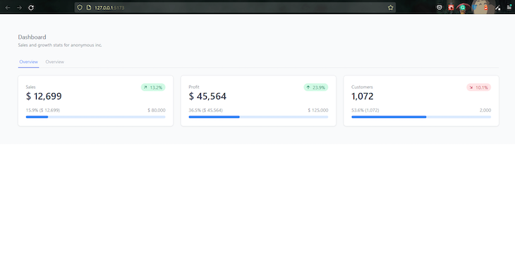
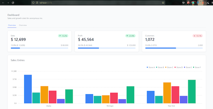
Now, save your progress and go back to the browser. Your cards should render just like in the image below:
Next, we’ll populate the two big containers with Tremor’s Bar Chart and Line Chart components.
Tremor offers three chart components: LineChart, BarChart, and AreaChart. Each component uniquely visualizes quantitative data.
In this section, we’ll use the BarChart and LineChart components to populate the first and second big containers on our dashboard.
To begin with, go to the firstContainer.jsx file and import the following components from Tremor:
import { Block, Card, Title, BarChart} from "@tremor/react";
Next, add the following code inside the component:
const data = [
  {
    state: "Alaska",
    "Store A": 890,
    "Store B": 338,
    "Store C": 538,
    "Store D": 396,
    "Store E": 138,
    "Store F": 436,
  },
  {
    state: "Michigan",
    "Store A": 289,
    "Store B": 233,
    "Store C": 253,
    "Store D": 333,
    "Store E": 133,
    "Store F": 533,
  },
  {
    state: "New York",
    "Store A": 389,
    "Store B": 233,
    "Store C": 653,
    "Store D": 533,
    "Store E": 233,
    "Store F": 733,
  },
];

const dataFormatter = (number) => {
  return "$ " + Intl.NumberFormat("us").format(number).toString();
};

export default function FirstContainer() {
  return (
    <div>
      <Block marginTop="mt-6">
        <Card>
          <Title>Sales: Entries</Title>
          <BarChart
            data={data}
            dataKey="state"
            categories={[
              "Store A",
              "Store B",
              "Store C",
              "Store D",
              "Store E",
              "Store F",
            ]}
            colors={["blue", "teal", "amber", "rose", "indigo", "emerald"]}
            valueFormatter={dataFormatter}
            marginTop="mt-6"
            yAxisWidth="w-12"
          />
        </Card>
      </Block>
    </div>
  );
}
Here, we added an array of objects with several state groups. Each group contains several store categories with numeric values.
To visualize the stats of every store in each state, we first create a dataFormatter function to control the text formatting for the values on the chart‘s y-axis. We convert the values into a string and prepend the $ sign to them.
const dataFormatter = (number) => {
return "$ " + Intl.NumberFormat("us").format(number).toString();
};
Next, we added Title and BarChart components to the container’s card. We use the Title component to display the chart’s title and the BarChart component to render the chart.
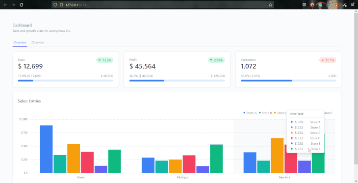
On the BarChart component, we passed the data array to the data prop, the state property to the dataKey prop, and an array of the available stores to the categories prop.
<BarChart
  data={chartdata2}
  dataKey="state"
  categories={[
    "Store A",
    "Store B",
    "Store C",
    "Store D",
    "Store E",
    "Store F",
  ]}
  colors={["blue", "teal", "amber", "rose", "indigo", "emerald"]}
  valueFormatter={dataFormatter}
  marginTop="mt-6"
  yAxisWidth="w-12"
/>
The colors prop sets the individual colors of each store. The color is set in the order it is arranged. Lastly, we passed the dataFormatter function to the valueFormatter prop.
That’s it for the first container. Save your progress and return to the browser. You should see a bar chart with different groups rendered below the performance indicator cards.
For the second container, we’ll use a LineChart component. Tremor’s chart components share similar anatomies, so our workflow will be identical to the previous section’s.
First, go to the secondContainer.jsx file and import the following components:
import {
Block,
Card,
Toggle,
ToggleItem,
Text,
LineChart,
Title,
} from “@tremor/react”;
Next, add the following code inside the component:
const data = [
  {
    date: "2021-01-01",
    Sales: 900.73,
    Profit: 173,
    Customers: 73,
  },
  {
    date: "2021-01-02",
    Sales: 300.74,
    Profit: 174.6,
    Customers: 74,
  },
  {
    date: "2021-03-13",
    Sales: 882,
    Profit: 682,
    Customers: 582,
  },
  {
    date: "2021-05-07",
    Sales: 582,
    Profit: 382,
    Customers: 662,
  },
  {
    date: "2021-07-10",
    Sales: 752,
    Profit: 942,
    Customers: 282,
  },
];

const dollarFormatter = (value) =>
  `$ ${Intl.NumberFormat("us").format(value).toString()}`;

const numberFormatter = (value) =>
  `${Intl.NumberFormat("us").format(value).toString()}`;

export default function SecondContainer() {
  const [selectedKpi, setSelectedKpi] = React.useState("Sales");

  const formatters = {
    Sales: dollarFormatter,
    Profit: dollarFormatter,
    Customers: numberFormatter,
  };

  return (
    <Block marginTop="mt-6">
      <Card>
        <div className="md:flex justify-between">
          <Block>
            <Title> Performance History </Title>
            <Text> Daily increase or decrease per domain </Text>
          </Block>
          <div className="mt-6 md:mt-0">
            <Toggle
              color="zinc"
              defaultValue={selectedKpi}
              handleSelect={(value) => setSelectedKpi(value)}
            >
              <ToggleItem value="Sales" text="Sales" />
              <ToggleItem value="Profit" text="Profit" />
              <ToggleItem value="Customers" text="Customers" />
            </Toggle>
          </div>
        </div>
        <LineChart
          data={data}
          dataKey="date"
          categories={[selectedKpi]}
          colors={["blue"]}
          valueFormatter={formatters[selectedKpi]}
          marginTop="mt-6"
          yAxisWidth="w-10"
        />
      </Card>
    </Block>
  );
}
The only differences between this code and the code in the previous section are the formatters object, the selectedKpi state, and the Toggle component.
Inside the formatters object, we created three keys for each category in the data and passed the dollarFormatter and numberFormatter functions to them as values.
const formatters = {
    Sales: dollarFormatter,
    Profit: dollarFormatter,
    Customers: numberFormatter,
  };
The formatters object will let us dynamically set a text formatter for the LineChart component based on the value of the selectedKpi state.
The Toggle component behaves exactly like the TabList component. It encloses three ToggleItem components, whose values are sales, Profit, and Customers.
<Toggle
    color="zinc"
    defaultValue={selectedKpi}
    handleSelect={(value) => setSelectedKpi(value)}
  >
    <ToggleItem value="Sales" text="Sales" />
    <ToggleItem value="Profit" text="Profit" />
    <ToggleItem value="Customers" text="Customers" />
</Toggle>
Here, we use the handleSelect prop to set the value of the active ToggleItem component to the state. Then we pass the current value of the selectedKpi state to the Toggle component’s defaultValue prop.
Unlike the bar chart composition we created in the previous section, we want the LineChart component to render individual data for each category.
So, instead of passing all three categories to the categories prop at once, we pass it the selectedKpi state and render the current value.
  <LineChart
    data={data}
    dataKey="date"
    categories={[selectedKpi]}
    colors={["blue"]}
    valueFormatter={formatters[selectedKpi]}
    marginTop="mt-6"
    yAxisWidth="w-10"
  />
Since the Toggle component sets the state’s value, the active ToggleItem will determine the category rendered at a time.
We did something similar for the valueFormatter prop:
valueFormatter={formatters[selectedKpi]}
We’re using the state’s value to access a corresponding property from the formatters object with the square bracket syntax.
For example, if the customers toggle item is selected, its value, which is also a 'Customers' string, will be passed to the square bracket syntax on the valueFormatter prop via the state.
The syntax will then access the formatters object and pass the Customers property to the valueFormatter in return.
There you go! We have a fully functional dashboard with a dynamically rendered analytic interface. Save your code and return to the browser to get a good look at what we’ve been able to put together with Tremor in no time.
In this article, we introduced Tremor and looked at the building blocks and how its components work under the hood. We also looked at how to incorporate different block compositions to create a page shell boilerplate and a fully interactive dashboard.
At the time of this writing, Tremor is still in beta, which means there may be breaking changes in future updates. Nevertheless, Tremor is ready for production. Visit Tremor’s documentation to learn how to create a more complex dashboard.
Install LogRocket via npm or script tag. LogRocket.init() must be called client-side, not
server-side
$ npm i --save logrocket

// Code:

import LogRocket from 'logrocket';
LogRocket.init('app/id');
// Add to your HTML:

<script src="https://cdn.lr-ingest.com/LogRocket.min.js"></script>
<script>window.LogRocket && window.LogRocket.init('app/id');</script>

Learn how to build smooth staggered animations in CSS using modern features like sibling-index(), complete with practical examples, fallbacks, and accessibility tips.

Compare the top AI development tools and models of July 2026. View updated rankings, feature breakdowns, and find the best fit for you.

Learn how to detect unused and ghost dependencies in JavaScript projects using Knip, a project-level linter that keeps your dependency graph accurate.

Learn how Storybook MCP enables AI agents to understand your component library, generate accurate UI, and validate code using documentation, stories, and automated tests.
Would you be interested in joining LogRocket's developer community?
Join LogRocket’s Content Advisory Board. You’ll help inform the type of content we create and get access to exclusive meetups, social accreditation, and swag.
Sign up now

 Learn more →
