Editor’s note: This article was last reviewed and updated on 23 October 2024.

React has become a top choice for building web applications. It enables us to easily build reusable UI components. Creating your own React component consists of the following steps:
Components folder, then add a new .js or .jsx file for your component (e.g., MyComponent.jsx)export default to make it accessible to other files in the projectApp.js, and add it to your JSX to display it on the screenIncorporating TypeScript alongside React brings type safety to your codebase, enhancing both code quality and developer productivity.
Creating a component library, a collection of pre-built, reusable UI elements, enables efficient development by providing a shared set of components that can be used across multiple projects. When built with React and TypeScript, a library gains flexibility and scalability, while avoiding common pitfalls thanks to the added type safety.
In this article, we’ll guide you through building a custom React component library with TypeScript, covering essential steps such as:
This approach will help you create a maintainable, reusable library that can evolve alongside your projects.
Before we start, let’s ensure our development environment is set up for success. Here are the prerequisites:
node -v
npm -v
We can use create-react-app with the TypeScript template to initiate a new React project. create-react-app is a command-line tool that sets up a new React application with a predefined project structure and build configurations.
Open a terminal and run the following command to create a new React app with the TypeScript template:
// create a new React project with the TypeScript template
npx create-react-app smart-ui --template typescript
The above command initializes a new React application by creating a new project structure, setting up essential configurations, and installing dependencies for a smooth development experience.
When designing the architecture of our component library, it is essential to consider these best practices:
Following the above design practices, we will use a nested folder structure for better organization. As shown below, we group different components into different directories. In each component directory, we use separate files for the component’s logic, styling, and testing concerns:
src/
  ├── components/
      ├── Button/
          ├── Button.tsx
          ├── Button.css
          ├── Button.test.ts
          └── ...
      ├── Header/
          ├── Header.tsx
          ├── Header.css
          ├── Header.test.ts
          └── ...
      └── ...
We must adopt consistent naming conventions for our component library. The key is to choose clear and descriptive names that reflect the component’s purpose. Below are some guidelines to follow:
Now, let’s create our first component library: smart-ui. We will also add a new SmartRating component in the library.
In the previous section, we used create-react-app to create a skeleton of a React application. It is a good starter for a regular React app, but many of the artifacts are not necessary for a React component library.
We can clean the previously generated project assets or create a new component library from scratch. In the article, we will start from scratch.
Firstly, we create a new folder and a package.json file by running the following command:
// create a new folder
mkdir smart-ui

// init a package.json
cd smart-ui
npm init
Running the npm init command will prompt you to answer several questions. Accept the default for all questions and a basic package.json will be generated.
Next, we run the following command to install the dependencies for React and TypeScript:
npm i react typescript @types/react tslib --save-dev
After the command is completed, these dependencies are added to the package.json file.
To configure the TypeScript options, we need to create a tsconfig.json file. We can initialize it with the following command from the project’s root directory:
npx tsc -init
The newly generated tsconfig.json file contains a set of default options for TypeScript. We will need to replace the file contents with the following settings:
{
  "compilerOptions": {
    "target": "es5",
    "lib": ["dom", "dom.iterable", "esnext"],
    "allowJs": true,
    "skipLibCheck": true,
    "esModuleInterop": true,
    "allowSyntheticDefaultImports": true,
    "strict": true,
    "forceConsistentCasingInFileNames": true,
    "noFallthroughCasesInSwitch": true,
    "module": "esnext",
    "moduleResolution": "node",
    "resolveJsonModule": true,
    "isolatedModules": true,
    "noEmit": true,
    "jsx": "react-jsx"
  },
  "include": ["src"]
}
Some important settings are:
"target": "es5": Specifies that the TypeScript compiler will generate code compatible with ECMAScript 5"lib": ["dom", "dom.iterable", "esnext"]: Includes necessary libraries, such as the Document Object Model (DOM)"skipLibCheck": true: Skips type checking of declaration files (.d.ts), potentially speeding up compilation in large projects with numerous external dependencies"module": "esnext": Indicates that the module system for code compiling is ES6 and above"jsx": "react-jsx": Specifies the syntax for JSX (React’s JavaScript XML). "react-jsx" indicates that TypeScript should use React’s JSX syntax"Include": ["src"]: Specifies that TypeScript should include files from the src directoryNow, we can create the project skeleton by adding the following folders:
mkdir src
cd src
mkdir components
cd components
mkdir smartrating
SmartRating componentAfter the folder structure is created, we can add the files for the new SmartRating component:
SmartRating.tsxSmartRating.cssSmartRating.types.tsIn SmartRating.types.ts, we declare a TypeScript interface named SmartRatingProps representing the properties accepted by the component:
SmartRating.css includes the styling for the component:
body {
    padding: 100px;
    font-size: large;
    text-align: left;
  }

span {
    margin-left: 10px;
    background-color: transparent;
    border: none;
    outline: none;
    cursor: pointer;
    :hover {
      color: grey;
    }
  }

  .star{
    font-size: large;
  }
  .starActive {
    color: red;
  }
  .starInactive {
    color: #ccc;
  }

  .rating-secondary {
    background-color: black;
    color: white;
    padding:6px;
  }
SmartRating.tsx is the SmartRating component file. Here are its contents:
import React, { useState } from "react";
import "./SmartRating.css";
import { SmartRatingProps } from "./SmartRating.types";

const SmartRating: React.FC<SmartRatingProps> = (props) => {
  const stars = Array.from({ length: 5 }, (_, i) => i + 1);
  const [rating, setRating] = useState(0);
  return (
    <div className={`star-rating rating-${props.theme}`}>
      <h1>{props.title}</h1>
      {stars.map((star, index) => {
        const starCss = star <= rating ? "starActive" : "starInactive";
        return (
          <button
            disabled={props.disabled}
            data-testid={`${props.testIdPrefix}-${index}`}
            key={star}
            className={`${starCss}`}
            onClick={() => setRating(star)}
          >
            <span className="star">★</span>
          </button>
        );
      })}
    </div>
  );
};

export default SmartRating;
The above code defines a React component called SmartRating that takes properties specified in SmartRatingProps. It renders a star rating UI, allowing users to click on stars to set a rating. The component structure includes a title, a disabled state, and a theme specified by the SmartRatingProps.
index.tsNext, we need to create the index.ts files. The index.ts file consolidates exports, providing a centralized entry point for the component library. It also simplifies imports for the consumer.
We create an index.ts file at each level of folders to make the library export easier. For example, in components/index.ts, we can add a new export to index.ts when a new component is added, without needing to change src/index.ts:
// src/components/smartrating/index.ts
export {default} from './SmartRating';
// src/components/index.ts
export * from './smartrating';
// src/index.ts
export * from './components';
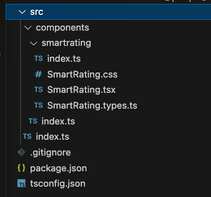
The project structure looks like the one below:
We’ll use Rollup to simplify the process of bundling and packaging our React component library. Rollup is a JavaScript module bundler that packages and optimizes code for production.
Rollup is particularly good at tree-shaking to remove unused code, making it well-suited for libraries where minimizing the bundle size is critical. It also offers flexibility in generating different output formats (CommonJS, ES module, UMD, etc.), allowing library authors to cater to various project setups and environments.
To enhance functionality, Rollup uses plugins to handle tasks like transpilation, minification, and resolving external dependencies. We need to install Rollup and its plugins to configure our library using the following command:
npm install rollup @rollup/plugin-node-resolve @rollup/plugin-commonjs @rollup/plugin-typescript rollup-plugin-peer-deps-external @rollup/plugin-terser rollup-plugin-dts --save-dev
To customize Rollup’s bundling and processing behavior for our project, create a rollup.config.js file at the root of the library project:
// rollup.config.js
import resolve from "@rollup/plugin-node-resolve";
import commonjs from "@rollup/plugin-commonjs";
import typescript from "@rollup/plugin-typescript";
import dts from "rollup-plugin-dts";
import terser from "@rollup/plugin-terser";
import peerDepsExternal from "rollup-plugin-peer-deps-external";

const packageJson = require("./package.json");

export default [
  {
    input: "src/index.ts",
    output: [
      {
        file: packageJson.main,
        format: "cjs",
        sourcemap: true,
      },
      {
        file: packageJson.module,
        format: "esm",
        sourcemap: true,
      },
    ],
    plugins: [
      peerDepsExternal(),
      resolve(),
      commonjs(),
      typescript({ tsconfig: "./tsconfig.json" }),
      terser(),
    ],
    external: ["react", "react-dom"],
  },
  {
    input: "src/index.ts",
    output: [{ file: "dist/types.d.ts", format: "es" }],
    plugins: [dts.default()],
  },
];
The above configuration file defines two bundles for a TypeScript library.
The first bundle, specified by the first object in the array, targets CommonJS (cjs) and ECMAScript Module (ESM) formats, creating separate files specified by the main and module entries in the package.json. It includes plugins for handling external dependencies, resolving modules, transpiling TypeScript, and minifying the output with terser.
The second bundle, specified by the second object in the array, generates a type declaration file (types.d.ts) using the dts plugin, providing TypeScript type information for the library.
Another change to set up Rollup is to add the following entries to the package.json file:
…
 "main": "dist/cjs/index.js",
 "module": "dist/esm/index.js",
 "types": "dist/index.d.ts",
 …
 "scripts": {
    "rollup": "rollup -c --bundleConfigAsCjs",
    ...
 }
Here is the explanation of the additional settings:
"main": "dist/cjs/index.js": Specifies the CommonJS entry point for the library, typically used by Node.js environments"module": "dist/esm/index.js": Indicates the ECMAScript Module entry point for modern JavaScript environments, providing an optimized library version for bundlers that support ES modules"types": "dist/index.d.ts": Points to the TypeScript type declaration file, providing type information for the library"scripts": {"rollup": "rollup -c --bundleConfigAsCjs", ...}: Defines a script command that runs the Rollup bundler using a configuration file (-c) and an additional flag (--bundleConfigAsCjs) suggesting bundling for CommonJS. This script is used for generating the CommonJS bundle of the libraryIn our library, we’ll use a CSS file to separate the styles away from the component file by default.
Rollup doesn’t know how to process the CSS file. To enable Rollup to handle CSS files, we need to add the plugin named rollup-plugin-postcss. Run the following command to install it:
npm install rollup-plugin-postcss --save-dev
We also need to change the Rollup configuration for CSS support in rollup.config.js:
Now, we can build the library using the Rollup script command:
npm run rollup
After running the above command, we should see a new dist directory created in the root directory. The new directory contains the generated library artifacts.
When creating the SmartRating component, TypeScript is crucial in ensuring component type safety. For example, we define the rating component props as shown below:
// SmartRating.types.ts
export interface SmartRatingProps {
    testIdPrefix: string;
    title?: string;
    theme: "primary" | "secondary";
    disabled?: boolean;
    size?: "small" | "medium" | "large";
  }

// SmartRating.tsx
const SmartRating: React.FC<SmartRatingProps> = (props) => {...}
We define the TypeScript interface SmartRatingProps. This interface specifies the expected shape of the component’s props, ensuring clarity and enforcing specific types.
The SmartRating.tsx file uses the defined interface in the React.FC (Functional Component) declaration. TypeScript ensures that the provided props parameter adheres to the defined SmartRatingProps interface, preventing potential runtime errors related to incorrect prop types.
For example, if we remove an existing props (i.e., theme) and forget to update the component file, the TypeScript compiler will throw the following error at compile time:
>Property 'theme' does not exist on type 'SmartRatingProps'.ts(2339)
TypeScript enforces strict typing for props, ensuring only the specified types are allowed. With the help of union types, we can define specific values for certain props, providing a clear set of options. For example, theme must be either primary or secondary. If we have a typo, the TypeScript compiler will catch it and throw the error immediately.
The SmartRatingProps interface also serves as documentation, making it clear to developers what props the component expects and their respective types. When we use IDEs with TypeScript support (i.e., VS Code), the IDE tools provide autocompletion and IntelliSense for props, enhancing the developer experience and reducing the chance of typos.
Now, the core functionality of our library is ready. It is time to add Storybook to visualize our new component to ensure it works as intended. Storybook is a development environment for UI components, allowing isolated and interactive development, testing, and documentation.
Setting up Storybook is straightforward. Run the following command in the project root directory:
npx sb init
The above command will prompt us to select a project builder; we can accept the default Vite option.
After completing the command, it configures Storybook with default settings and creates necessary files and folders (e.g., .storybook directory) for Storybook integration. It also generates a stories directory within the src directory, containing pre-built templates that serve as examples for creating our own stories.
Additionally, we also observe new dependencies and script commands in package.json:
  // package.json
   "storybook": "storybook dev -p 6006",
   "build-storybook": "storybook build"
SmartRating componentStorybook is successfully configured. Now, it’s time to create our first story.
Create a new file in the smartrating folder named SmartRating.stories.tsx:
// smartRating.stories.tsx
import { StoryFn, Meta } from "@storybook/react";
import SmartRating from "./SmartRating";

export default {
  title: "ReactComponentLibrary/Rating",
  component: SmartRating,
} as Meta<typeof SmartRating>;

const Template: StoryFn<typeof SmartRating> = (args) => <SmartRating {...args} />;

export const RatingTest = Template.bind({});
RatingTest.args = {
  title: "Default theme",
  theme: "primary",
  testIdPrefix: "rating",
};

export const RatingSecondary = Template.bind({});
RatingSecondary.args = {
  title: "Secondary theme",
  theme: "secondary",
  testIdPrefix: "rating",
};
In this story, we define two stories: RatingTest and RatingSecondary. They showcase the component in different scenarios, helping visualize and test its behavior within the Storybook environment.
To test the stories, run the following command:
npm run storybook
Running the command will open a new browser tab with the component rendered in the Storybook UI as below:

We can switch between our two stories to observe the different looks and behavior of our components. Here, we just touch the surface of Storybook’s features. For a deeper exploration, check out “Storybook adoption guide: Overview, examples, and alternatives.”
Adding tests to our component library ensures that components behave as expected, helping catch regressions and ensuring ongoing functionality as the library evolves.
Jest, combined with the React Testing Library, offers a powerful testing solution for React components. To start, install the following dependencies:
// install Jest and testing-library
npm install @testing-library/react jest @types/jest jest-environment-jsdom --save-dev

// install babel and its related plugins
npm install @babel/core @babel/preset-env @babel/preset-react @babel/preset-typescript babel-jest --save-dev

// install identity-obj-proxy
npm install identity-obj-proxy -save-dev
The above commands install the React Testing Library, Jest, Babel, and its Jest dependencies for transpiling and testing React components with TypeScript. We also install identity-obj-proxy, which allows Jest to treat all types of imports (CSS, LESS, and SCSS) as generic objects. Specifically, we can configure it for CSS files to prevent any errors in testing.
Next, we need to add configuration files for Jest and Babel. Create the jest.config.js and babel.config.js in the root project directory with the following contents:
// jest.config.js
module.exports = {
  testEnvironment: "jsdom",
  moduleNameMapper: {
    ".(css|less|scss)$": "identity-obj-proxy",
  },
};

// babel.config.js
module.exports = {
    presets: [
      "@babel/preset-env",
      "@babel/preset-react",
      "@babel/preset-typescript",
    ],
 };
In jest.config.js, we set the Jest test environment to jsdom for simulating a browser environment for testing. Then, we set the moduleNameMapper property for CSS, LESS, and SCSS file imports in tests, allowing them to be mocked without actual styling.
In babel.config.js, we configure Babel presets for transpiling JavaScript, React, and TypeScript code in the project, ensuring compatibility and proper compilation during testing.
Now, we can create a test file named SmartRating.test.tsx in the smartrating directory:
import React from "react";
import { render, screen, waitFor } from "@testing-library/react";
import userEvent from "@testing-library/user-event";
import SmartRating from "./SmartRating";

describe("SmartRating", () => {
  test("renders the Rating component", () => {
    render(<SmartRating title="default" theme="primary" testIdPrefix="rating" />);

    expect(screen.getByRole("heading").innerHTML).toEqual("default");
    expect(screen.getAllByRole("button", { hidden: true }).length).toEqual(5);
  });

  test("click the 5 star rating", async () => {
    const stars = [0, 1, 2, 3, 4];
    render(<SmartRating title="default" theme="primary" testIdPrefix="rating" />);

    stars.forEach(async (star) => {
      const element = screen.getByTestId("rating-" + star);
      userEvent.click(element);
      await waitFor(() => expect(element.className).toBe("starActive"));
    });
  });
});
This test uses the React Testing Library and user-event to test the SmartRating component. There are two tests:
SmartRating component asynchronously, then it verifies that clicking each star activates it by checking the change in the star’s CSS class to starActiveThe last step is to add the following script command in package.json:
// package.json
 "scripts": {
   "test": "jest",
   …
}
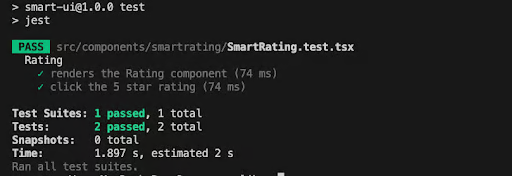
We can run the test with this command:
npm run test
We should see the two green ticks for the tests:
Dependencies are declarations of external packages or libraries essential for the project’s functionality, and effective dependency management is vital when constructing a component library.
Besides the typical dependencies, there are other types of dependencies including:
We currently have all the dependencies under the devDependencies in package.json. To manage the dependencies better, we want to move the following dependencies into peerDependencies:
// package.json
  "peerDependencies": {
    "react": "^18.2.0",
    "react-dom": "^18.2.0"
  }
Moving react and react-dom to peer dependencies in our library is beneficial because it allows consumers of the library to use their version of React. This flexibility prevents version conflicts, fostering a more seamless integration experience.
index.ts filesIn our component library, we use multiple index.ts files in different levels of directories. They serve specific purposes, making our library exporting easier to organize:
index.ts file can serve as the main entry point, re-exporting components or modules from various directories. This consolidates the library’s public APIindex.ts files within the component directory to export components or modules, providing a clean and organized entry pointindex.ts file, aggregating and exporting components within that directory. This modular structure aids in navigationBy organizing code with multiple index.ts files, the component library becomes more modular and maintainable, simplifying both development and integration for consumers.
Finally, we are ready to publish our component library as an npm package. Publishing the library allows it to be shared between the different development teams or the wider development communities.
Before we start the publishing process, we need to update the library version in package.json following the SemVer convention.
Semantic Versioning (SemVer) is a versioning convention for software that uses three numbers (major, minor, patch) to communicate the nature of changes:
Here, we set the package version to be 1.0.0. In future publishing, we will update the version according to the SemVer convention:
{
  "name": "smart-ui",
  "version": "1.0.0",
  ...
}
We begin the publishing process by logging in to npm:
npm login
The command will prompt us to enter the username, password, and email. After logging in to npm, we can run the following command to publish our library:
npm publish --access public
This command publishes the package to the npm registry with public access, making it available for installation by anyone.
We can use the following command to verify that our library has been published successfully:
npm view smart-ui
Congratulations! Our new React component library is published and available for download.
Building, packaging, and publishing a React component library with TypeScript offers valuable benefits: enhanced reusability, improved type safety, and a foundation for consistent UI development across projects. However, challenges like managing versioning, handling dependencies, and conducting thorough testing require careful planning.
Consider creating your own custom React component library to streamline the development for teams and ensure UI scaling across projects. Please feel free to share your thoughts or leave a comment below. You can find the example source code on GitHub.
Install LogRocket via npm or script tag. LogRocket.init() must be called client-side, not
server-side
$ npm i --save logrocket

// Code:

import LogRocket from 'logrocket';
LogRocket.init('app/id');
// Add to your HTML:

<script src="https://cdn.lr-ingest.com/LogRocket.min.js"></script>
<script>window.LogRocket && window.LogRocket.init('app/id');</script>

Learn how to build smooth staggered animations in CSS using modern features like sibling-index(), complete with practical examples, fallbacks, and accessibility tips.

Compare the top AI development tools and models of July 2026. View updated rankings, feature breakdowns, and find the best fit for you.

Learn how to detect unused and ghost dependencies in JavaScript projects using Knip, a project-level linter that keeps your dependency graph accurate.

Learn how Storybook MCP enables AI agents to understand your component library, generate accurate UI, and validate code using documentation, stories, and automated tests.
Hey there, want to help make our blog better?
Join LogRocket’s Content Advisory Board. You’ll help inform the type of content we create and get access to exclusive meetups, social accreditation, and swag.
Sign up now

 Learn more →
