Gathering data and displaying it via charts is increasingly common in mobile apps. A popular example is a stock investment app that displays lots of charts, like prices for a stock and portfolio distribution pie charts. And today, we are going to learn how to build beautiful charts for these situations using the FL Chart package in Flutter. FL Chart provides widgets for creating highly customizable line, bar, pie, scatter, and radar charts.

This tutorial uses fabricated data to keep things simple and make it easier to understand the package implementation; you can easily replace it with data from your APIs.
The Replay is a weekly newsletter for dev and engineering leaders.
Delivered once a week, it's your curated guide to the most important conversations around frontend dev, emerging AI tools, and the state of modern software.
Let’s do a quick check of things we need before jumping right ahead:
That’s pretty much it!
In this tutorial, we’ll use a pre-developed example app to demonstrate various charts and the chart package’s features. To follow along, download or clone the example app from GitHub.
Enter the following command to install dependencies:
flutter pub get
Next, run your app with flutter run to make sure that everything works fine. Once you run the app, you will see three charts, as shown in the following preview:
Let’s take a look at how to create and customize these charts.
Line charts are one of the most useful charts when it comes to data representation. We’ll create a line chart to display the annual price data for a company’s stock. We’ll use the LineChart widget to create the line chart — that’s how obvious it is.
The LineChart widget takes LineChartData as the key parameter with swapAnimationDuration and swapAnimationCurve as optional parameters that can be used to control the implicit animation during a state change:
LineChart(
  LineChartData(
    // control how the chart looks
  ),
  swapAnimationDuration: Duration(milliseconds: 150), // Optional
  swapAnimationCurve: Curves.linear, // Optional
);
Now, let’s add a basic line to the chart to get started. Here’s the source code of the line_chart_widget.dart file:
import 'package:fl_chart/fl_chart.dart';
import 'package:flutter/material.dart';

import 'package:flutter_chart_demo/data/price_point.dart';

class LineChartWidget extends StatelessWidget {
  final List<PricePoint> points;

  const LineChartWidget(this.points, {Key? key})
      : super(key: key);

  @override
  Widget build(BuildContext context) {
    return AspectRatio(
      aspectRatio: 2,
      child: LineChart(
        LineChartData(
            lineBarsData: [
              LineChartBarData(
                spots: points.map((point) => FlSpot(point.x, point.y)).toList(),
                isCurved: false,
                // dotData: FlDotData(
                //   show: false,
                // ),
              ),
            ],
          ),
      ),
    );
  }
}
LineChatData contains all the information on how the line chart will look. We’ve used the lineBarsData property that takes a list of LineChartBarData to draw one or more lines on the graph. We ensured the line will not be curved by setting isCurved to false.
The above example will look something like this:
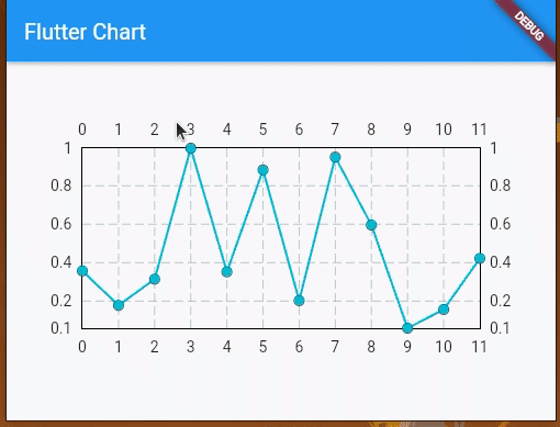
LineChartBarData is used to define how the individual lines will look. It takes a list of spots that are similar to the plot points for a line graph. By default, these points will be represented with filled circle markers, but we can control their appearance by using dotData.
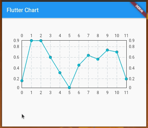
Try removing the above source code’s commented code lines; you’ll see the line chart without markers, as shown below:
Let’s take a look at the code:
return AspectRatio(
  aspectRatio: 2,
  child: LineChart(
    LineChartData(
        lineBarsData: [
          LineChartBarData(
            spots: points.map((point) => FlSpot(point.x, point.y)).toList(),
            isCurved: false,
            dotData: FlDotData(
              show: false,
            ),
          ),
        ],
      ),
  ),
);
N.B., it is necessary to wrap the *LineChart* widget with either a *SizedBox* or *AspectRatio* for it to actually show up on the screen. Prefer using *AspectRatio* so that the graph is not skewed on different screen sizes
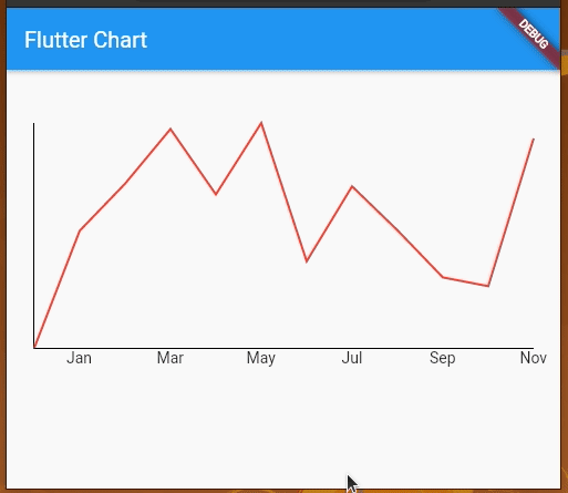
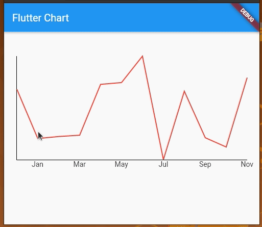
Now, let’s add some horizontal labels, clear the unnecessary clutter from this graph, and make it a bit cleaner, as shown in the following preview:
The code for the sample looks like this:
import 'package:fl_chart/fl_chart.dart';
import 'package:flutter/material.dart';

import 'package:flutter_chart_demo/data/price_point.dart';

class LineChartWidget extends StatelessWidget {
  final List<PricePoint> points;

  const LineChartWidget(this.points, {Key? key})
      : super(key: key);

  @override
  Widget build(BuildContext context) {
    return AspectRatio(
      aspectRatio: 2,
      child: LineChart(
        LineChartData(
            lineBarsData: [
              LineChartBarData(
                spots: points.map((point) => FlSpot(point.x, point.y)).toList(),
                isCurved: false,
                dotData: FlDotData(
                  show: false,
                ),
                color: Colors.red
              ),
            ],
            borderData: FlBorderData(
                border: const Border(bottom: BorderSide(), left: BorderSide())),
            gridData: FlGridData(show: false),
            titlesData: FlTitlesData(
              bottomTitles: AxisTitles(sideTitles: _bottomTitles),
              leftTitles: AxisTitles(sideTitles: SideTitles(showTitles: false)),
              topTitles: AxisTitles(sideTitles: SideTitles(showTitles: false)),
              rightTitles: AxisTitles(sideTitles: SideTitles(showTitles: false)),
            ),
          ),
      ),
    );
  }

  SideTitles get _bottomTitles => SideTitles(
    showTitles: true,
    getTitlesWidget: (value, meta) {
      String text = '';
      switch (value.toInt()) {
        case 1:
          text = 'Jan';
          break;
        case 3:
          text = 'Mar';
          break;
        case 5:
          text = 'May';
          break;
        case 7:
          text = 'Jul';
          break;
        case 9:
          text = 'Sep';
          break;
        case 11:
          text = 'Nov';
          break;
      }

      return Text(text);
    },
  );
}
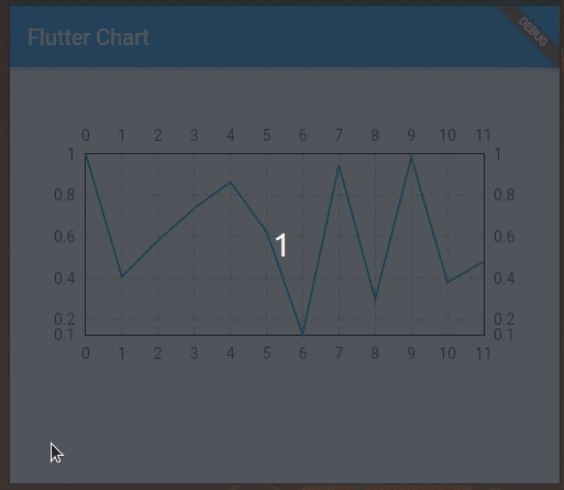
We can also add touch events on the line chart and get a callback for the touch event to perform further operations. By default, LineChartData displays a tooltip with the y value touching a location on the line chart. However, we can modify the tooltip to display whatever text we want and we can also style it differently.
We’re using LineTouchData which provides a bunch of properties like touchCallback, touchTooltipData, and even getTouchedSpotIndicator to modify the appearance of the touch indicator and tooltip.
We can use touchTooltipData to customize the default tooltip and getTouchedSpotIndicator to customize the touch event feedback in the rendered chart area.
Check out the following preview:
We can implement the above chart by adding the following parameter data to the LineChartData widget.
lineTouchData: LineTouchData(
    enabled: true,
    touchCallback:
        (FlTouchEvent event, LineTouchResponse? touchResponse) {
      // TODO : Utilize touch event here to perform any operation
    },
    touchTooltipData: LineTouchTooltipData(
      tooltipBgColor: Colors.blue,
      tooltipRoundedRadius: 20.0,
      showOnTopOfTheChartBoxArea: true,
      fitInsideHorizontally: true,
      tooltipMargin: 0,
      getTooltipItems: (touchedSpots) {
        return touchedSpots.map(
          (LineBarSpot touchedSpot) {
            const textStyle = TextStyle(
              fontSize: 10,
              fontWeight: FontWeight.w700,
              color: Colors.white,
            );
            return LineTooltipItem(
              points[touchedSpot.spotIndex].y.toStringAsFixed(2),
              textStyle,
            );
          },
        ).toList();
      },
    ),
    getTouchedSpotIndicator:
        (LineChartBarData barData, List<int> indicators) {
      return indicators.map(
        (int index) {
          final line = FlLine(
              color: Colors.grey,
              strokeWidth: 1,
              dashArray: [2, 4]);
          return TouchedSpotIndicatorData(
            line,
            FlDotData(show: false),
          );
        },
      ).toList();
    },
    getTouchLineEnd: (_, __) => double.infinity
  ),
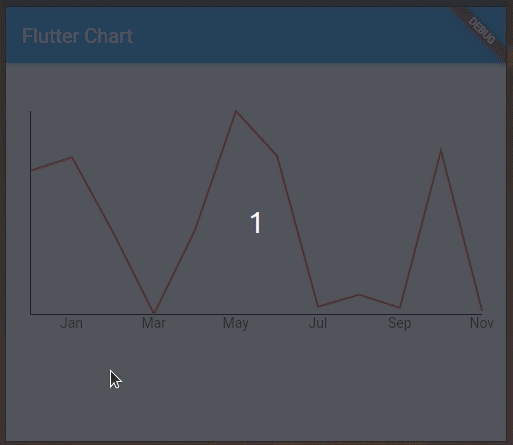
Here we customized the tooltip, but the library determines when to show a particular tooltip. For example, we need to tap and hold to get a tooltip for a line edge. This library is so flexible that it lets you handle when to show a particular tooltip.
We can toggle tooltips as follows:
import 'package:fl_chart/fl_chart.dart';
import 'package:flutter/material.dart';

import 'package:flutter_chart_demo/data/price_point.dart';

class LineChartWidget extends StatefulWidget {
  const LineChartWidget({Key? key, required this.points}) : super(key: key);

  final List<PricePoint> points;

  @override
  State<LineChartWidget> createState() => _LineChartWidgetState(points: this.points);
}

class _LineChartWidgetState extends State<LineChartWidget> {
  final List<PricePoint> points;
  late int showingTooltipSpot;

  _LineChartWidgetState({required this.points});

  @override
  void initState() {
    showingTooltipSpot = -1;
    super.initState();
  }

  @override
  Widget build(BuildContext context) {
    final _lineBarsData = [
      LineChartBarData(
        spots: points.map((point) => FlSpot(point.x, point.y)).toList(),
        isCurved: false,
        dotData: FlDotData(
          show: false,
        ),
        color: Colors.red
      ),
    ];
    return AspectRatio(
      aspectRatio: 2,
      child: LineChart(
        LineChartData(
            lineBarsData: _lineBarsData,
            borderData: FlBorderData(
                border: const Border(bottom: BorderSide(), left: BorderSide())),
            gridData: FlGridData(show: false),
            titlesData: FlTitlesData(
              bottomTitles: AxisTitles(sideTitles: _bottomTitles),
              leftTitles: AxisTitles(sideTitles: SideTitles(showTitles: false)),
              topTitles: AxisTitles(sideTitles: SideTitles(showTitles: false)),
              rightTitles: AxisTitles(sideTitles: SideTitles(showTitles: false)),
            ),
            showingTooltipIndicators: showingTooltipSpot != -1 ? [ShowingTooltipIndicators([
                LineBarSpot(_lineBarsData[0], showingTooltipSpot,
                    _lineBarsData[0].spots[showingTooltipSpot]),
              ])] : [],
            lineTouchData: LineTouchData(
                enabled: true,
                touchTooltipData: LineTouchTooltipData(
                  tooltipBgColor: Colors.blue,
                  tooltipRoundedRadius: 20.0,
                  fitInsideHorizontally: true,
                  tooltipMargin: 0,
                  getTooltipItems: (touchedSpots) {
                    return touchedSpots.map(
                      (LineBarSpot touchedSpot) {
                        const textStyle = TextStyle(
                          fontSize: 10,
                          fontWeight: FontWeight.w700,
                          color: Colors.white,
                        );
                        return LineTooltipItem(
                          points[touchedSpot.spotIndex].y.toStringAsFixed(2),
                          textStyle,
                        );
                      },
                    ).toList();
                  },
                ),
                handleBuiltInTouches: false,
                touchCallback: (event, response) {
                  if (response?.lineBarSpots != null && event is FlTapUpEvent) {
                    setState(() {
                      final spotIndex = response?.lineBarSpots?[0].spotIndex ?? -1;
                      if(spotIndex == showingTooltipSpot) {
                        showingTooltipSpot = -1;
                      }
                      else {
                        showingTooltipSpot = spotIndex;
                      }
                    });
                  }
                },
              ),
          ),
      ),
    );
  }

  SideTitles get _bottomTitles => SideTitles(
    showTitles: true,
    getTitlesWidget: (value, meta) {
      String text = '';
      switch (value.toInt()) {
        case 1:
          text = 'Jan';
          break;
        case 3:
          text = 'Mar';
          break;
        case 5:
          text = 'May';
          break;
        case 7:
          text = 'Jul';
          break;
        case 9:
          text = 'Sep';
          break;
        case 11:
          text = 'Nov';
          break;
      }

      return Text(text);
    },
  );
}
Next, we need to use the named parameter points from main.dart :
//....
children: <Widget>[
  LineChartWidget(points: pricePoints),
//....
Here we implemented toggleable tooltips with the following modifications to the previous example code:
LineChartWidget stateful to hold information about the tooltip that is visible currentlyhandleBuiltInTouches to falseshowingTooltipSpot by implementing a function for touchCallbackshowingTooltipIndicatorsRun the above code, to see toggleable tooltips as shown below:
Similarly, we can implement toggleable tooltips for any supported chart type.
Wasn’t that simple? Now let’s move on to the next most popular chart – the pie chart.
Now that we’re a bit familiar with the classes and properties used for a line chart, it should be fairly simple to understand the bar chart; the properties and class name suffixes are very similar.
Let’s create a bar chart using the same data set generator used for the line chart.
Look at the source code in the bar_chart_widget.dart file:
import 'package:fl_chart/fl_chart.dart';
import 'package:flutter/material.dart';

import 'package:flutter_chart_demo/data/price_point.dart';

class BarChartWidget extends StatefulWidget {
  const BarChartWidget({Key? key, required this.points}) : super(key: key);

  final List<PricePoint> points;

  @override
  State<BarChartWidget> createState() => _BarChartWidgetState(points: this.points);
}

class _BarChartWidgetState extends State<BarChartWidget> {
  final List<PricePoint> points;

  _BarChartWidgetState({required this.points});

  @override
  Widget build(BuildContext context) {
    return AspectRatio(
      aspectRatio: 2,
      child: BarChart(
        BarChartData(
            barGroups: _chartGroups(),
            borderData: FlBorderData(
                border: const Border(bottom: BorderSide(), left: BorderSide())),
            gridData: FlGridData(show: false),
            titlesData: FlTitlesData(
              bottomTitles: AxisTitles(sideTitles: _bottomTitles),
              leftTitles: AxisTitles(sideTitles: SideTitles(showTitles: false)),
              topTitles: AxisTitles(sideTitles: SideTitles(showTitles: false)),
              rightTitles: AxisTitles(sideTitles: SideTitles(showTitles: false)),
            ),
          ),
      ),
    );
  }

  List<BarChartGroupData> _chartGroups() {
    return points.map((point) =>
      BarChartGroupData(
        x: point.x.toInt(),
        barRods: [
          BarChartRodData(
            toY: point.y
          )
        ]
      )

    ).toList();
  }

  SideTitles get _bottomTitles => SideTitles(
    showTitles: true,
    getTitlesWidget: (value, meta) {
      String text = '';
      switch (value.toInt()) {
        case 0:
          text = 'Jan';
          break;
        case 2:
          text = 'Mar';
          break;
        case 4:
          text = 'May';
          break;
        case 6:
          text = 'Jul';
          break;
        case 8:
          text = 'Sep';
          break;
        case 10:
          text = 'Nov';
          break;
      }

      return Text(text);
    },
  );
}
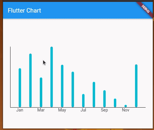
Here we created a bar chart by providing a list of BarChartGroupData instances via the barGroups parameter. Similar to line chart titles, the above code uses the titlesData parameter. We made this widget stateful since we will extend this widget source to update chart data dynamically.
Once you run the above code, you’ll see the bar chart, as shown in the following preview:
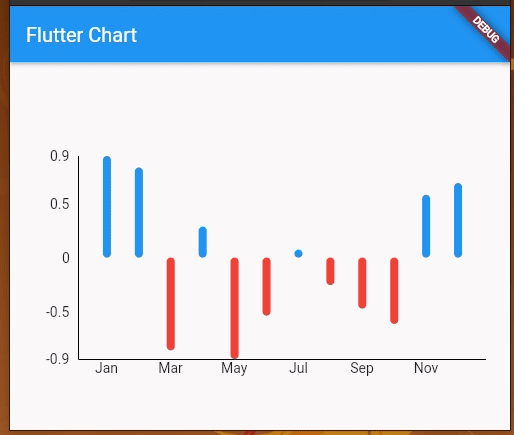
In some scenarios, it’s necessary to depict negative bar chart segments. Let’s update the above code to include negative y values too!
First, update the _chartGroups method as follows to include negative y values:
List<BarChartGroupData> _chartGroups() {
  return points.map((point) {
    final double y = (Random().nextBool() ? 1 : -1) * point.y;
    return BarChartGroupData(
      x: point.x.toInt(),
      barRods: [
        BarChartRodData(
          toY: y,
          color: y > 0 ? Colors.blue : Colors.red,
        )
      ]
    );
  }
  ).toList();
}
Make sure to import Dart math package too:
import 'dart:math';
Comment out the following line from the titlesData setup to display labels on the left side of the chart:
leftTitles: AxisTitles(sideTitles: SideTitles(showTitles: false)),
You will get a multicolored bar chart with both positive and negative y values:
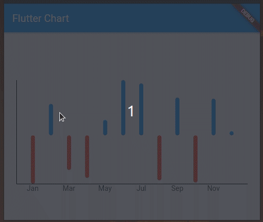
Here, the chart renders positive bars in blue and negative value bars in red. You can include negative values in line charts as well.
In Flutter, we typically make stateful widgets if we need to perform dynamic updates. But, how do we update chart data?
We can indeed make stateful chart widgets and update chart datasets dynamically with the setState method. Then, the FL Chart library will render updated graphical elements like any other Flutter widget.
Let’s update the previous bar chart periodically with different chart data. In the previous bar chart, we generated a random sign (+ or -) with Random().nextBool() within the build method, so that y values are updated during each widget render. So, we can simply call setState(() {}) to update the chart.
Add the following method implementation to BarChartWidget:
@override
initState() {
  Timer.periodic(const Duration(seconds: 1), (timer) {
    setState((){});
  });
  super.initState();
}
Also, be sure to import the async package:
import 'dart:async';
Once you run the project you’ll see periodically updated data on the bar chart:
Similarly, it’s possible to update any chart data source with setState and a stateful widget. Also, you can implement depict live data on charts with Dart timers, as I demonstrated in the above example.
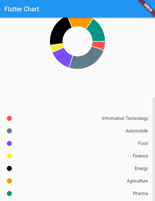
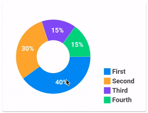
Let’s create a pie chart to display sector distribution for a user’s portfolio, where each sector is represented using a different color code.
Here’s a look at the pie_chart_widget.dart file:
import 'package:fl_chart/fl_chart.dart';
import 'package:flutter/material.dart';
import 'package:flutter_chart_demo/data/sector.dart';

class PieChartWidget extends StatelessWidget {
  final List<Sector> sectors;

  const PieChartWidget(this.sectors, {Key? key}) : super(key: key);

  @override
  Widget build(BuildContext context) {
    return AspectRatio(
        aspectRatio: 1.0,
        child: PieChart(PieChartData(
          sections: _chartSections(sectors),
          centerSpaceRadius: 48.0,
        )));
  }

  List<PieChartSectionData> _chartSections(List<Sector> sectors) {
    final List<PieChartSectionData> list = [];
    for (var sector in sectors) {
      const double radius = 40.0;
      final data = PieChartSectionData(
        color: sector.color,
        value: sector.value,
        radius: radius,
        title: '',
      );
      list.add(data);
    }
    return list;
  }
}
We have used a PieChart widget to create the pie chart; this widget takes PieChartData as an argument to define how the pie chart would look.
To make the pie chart hollow from the center, we have set centerSpaceRadius to 48.0. sections property takes a list of PieChartSectionData to define how each section in the pie chart will look. PieChartSectionData provides control over the values and representation of individual sections of the pie.
If no value for the title is provided for PieChartSectionData, then it displays the section value by default. So don’t forget to add an empty string for the title if you do not wish to display anything over the pie chart.
Apart from the most commonly used graph options that we discussed above, this powerful library also provides you with some really interesting graph types that are worth exploring. Let’s take a quick look at them as well.

ScatterChart allows us to plot several points anywhere on the graph by specifying the x and y coordinates along with a radius and color. The most amazing aspect of this chart is the animations that we can play with while transitioning from one state to another.
You can browse sample scatter chart implementations from the official documentation.
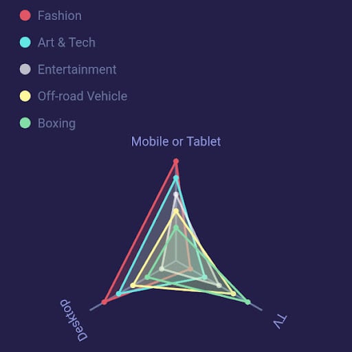
RadarChart allows us to create a two-dimensional graphical representation from a set of three or more data points. We can use RadarDataSet which takes a list of R``adarEntries as dataEntries to draw multiple radar charts in the same graphical space.
You can browse sample radar chart implementations from the official documentation.
One thing that makes this package stand apart from other chart libraries is the beautiful animations and the control that you can have over animations for each of the charts.
When we change the chart’s state, it animates to the new state internally (using implicit animations). We can control the animation duration and curve using optional swapAnimationDuration and swapAnimationCurveproperties, respectively. We can also change the chart state based on user interactions by leveraging the <FooChart>TouchData class. This class is available for all chart options and can be really helpful in creating beautiful user interactions like the ones displayed below.
Bar chart touch interactions
Pie chart touch interactions
This article demonstrated how to draw the most widely used charts using the FL Chart package in Flutter. But, FL Chart is way more powerful than this and supports more complex charts like scatter charts and radar charts, as well as animations. If you wish to explore it further, check out the Flutter package here.
Thanks for sticking around, happy coding!
Install LogRocket via npm or script tag. LogRocket.init() must be called client-side, not
server-side
$ npm i --save logrocket

// Code:

import LogRocket from 'logrocket';
LogRocket.init('app/id');
// Add to your HTML:

<script src="https://cdn.lr-ingest.com/LogRocket.min.js"></script>
<script>window.LogRocket && window.LogRocket.init('app/id');</script>

useEffect breaks AI streaming responses in ReactSee why useEffect breaks AI streaming in React, and how moving stream state outside React fixes flicker and stale updates.

A real-world debugging session using Claude to solve a tricky Next.js UI bug, exploring how AI helps, where it struggles, and what actually fixed the issue.
CSS wasn’t built for dynamic UIs. Pretext flips the model by measuring text before rendering, enabling accurate layouts, faster performance, and better control in React apps.

Why do real-time frontends break at scale? Learn how event-driven patterns reduce drift, race conditions, and inconsistent UI state.
Hey there, want to help make our blog better?
Join LogRocket’s Content Advisory Board. You’ll help inform the type of content we create and get access to exclusive meetups, social accreditation, and swag.
Sign up now

 Learn more →
