Have you ever imagined an environment where the atmosphere appears both abstract and natural? Or have you ever wanted to change the mood of a scene by adding some soothing effects? If so, this article is for you.

Realistic clouds greatly enhance the realism of outdoor scenes. Cloud creation, hyperrealism, and cloud likeness are all part of the difficult task of creating realistic clouds.
In this article, you will learn how to create realistic clouds using CSS and SVG from scratch.
The Replay is a weekly newsletter for dev and engineering leaders.
Delivered once a week, it's your curated guide to the most important conversations around frontend dev, emerging AI tools, and the state of modern software.
To understand this tutorial, you will need:
Realistic clouds mean constantly-changing clouds that appear lifelike onscreen. They should look and behave just like real clouds.
Have you ever had an issue with a logo’s image resolution, causing it to be distorted when displayed?
Because users will view your logo on various screen sizes, the issue is linked to responsive design; this should be optimized regardless of screen size. That’s where SVGs come into play.
SVG is a standard graphics file format for rendering two-dimensional images on the internet. For further information, go to this link.
SVGs have unique superpowers that allow you to automatically optimize any picture for any screen size without distortion. Using SVG properties simplifies the use of element rendering because it produces the same results on all screen sizes with no distortion.
SVGs are useful for making clouds due to their many elements. Certain elements (such as the <filter> element) can be manipulated to mimic the organic look of clouds.
SVGs work by defining multiple aspects of an image. Let’s create a simple HTML template that will have some adjustable SVG properties:
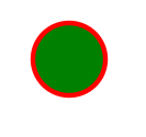
<svg width="100" height="100">
   <circle cx="50" cy="50" r="40" stroke="red" stroke-width="4" fill="green" />
</svg>
As you can see from the example above, the SVG tag provides specific properties that aid in creating the desired shape.
cx works with a shape’s x-axis, so any movement along the x-axis is controlled by it. In SVG, the cx is used to set the horizontal position of a circle or ellipse. Similarly, cy is in charge of any movement along the y-axis.
The radius of a circle is defined by the r attribute. It is always used in connection with the SVG element <circle>.
The thickness of an object is determined by stroke. It demonstrates the shape’s rigidity.
stroke-width specifies the thickness of the stroke. It’s a line that’s drawn around components outside of the borders to make them “spark.” In CSS, it’s identical to border-outline.
The color of an SVG shape’s fill determines the color of the shape’s surface. fill is a fundamental SVG property that you may apply to any SVG shape.
The rendering area of the SVG viewport has a vertical length defined by height and a horizontal length defined by width.
Below is an example of our output. By manipulating these adjustable SVG properties, we can make something like the circle below, or a floating, fluffy cloud.
To create a realistic cloud, we will use CSS box-shadow and the CSS and SVG filter properties. Let’s look at what these two terms mean.
box-shadow?box-shadow is a CSS property that allows you to add one or more shadows to an HTML element. It accepts two to five values, depending on the user’s use case:
box-shadow: <offsetX> <offsetY> <blurRadius> <color> <spreadRadius>;
offsetX and offsetY specify the position of the shadow on the horizontal and vertical axes, respectively.
blurRadius specifies the amount of blur, and describes how sharp or blurry the shadow is.
spreadRadius deals with two values. The positive value increases the size of the shadow, while the negative value decreases it.
We will use the box-shadow property to create the shadowy, blurred edges of clouds.
filter property and <filter> element?The filter property adds visual or graphical effects to an HTML element. These are commonly used to adjust images, borders, or backgrounds.
To define filters, SVG employs the <filter> element. The <filter> element uses the id attribute to identify it uniquely. Filters are defined within <def> elements and then referenced by their ids by graphics elements. <filter> is used to add custom filter effects, but they are never rendered; instead, the properties are used by the element to which they are connected.
In this cloud generator application, we will use the CSS filter property in conjunction with the SVG <filter> element. This will give the clouds the correct texture and layers to make them look realistic.
Because we will be using React, we need to generate a starter template using Create React App.
Open your terminal and type the following command:
yarn create react-app realistic-cloud-generator
This will create a folder called realistic-cloud-generator and generate a starter template.
After a successful installation, open the project in your preferred text editor. Your folder structure should look like this below.
Let’s do some cleanup inside the project that was created above because there are some unnecessary files that we won’t be using.
Open the src folder and delete setupTests.js, reportWebVitals.js, logo.svg, App.css and App.test.js from the project. This is just to reduce the project file size since we won’t be using them.
Open App.js and replace the code with this:
function App() {
  return (
    <>
      Hello!!!!
    </>
  );
}

export default App;
The code above simply removes the previous content from the template so that we can work in a clean environment.
Another thing to note is that our application is broken because we deleted some files that are linked inside index.js. Let’s fix that by updating the file with the code below:
import React from "react";
import ReactDOM from "react-dom";
import "./index.css";
import App from "./App";

ReactDOM.render(
 <React.StrictMode>
   <App />
 </React.StrictMode>,

 document.getElementById("root")

);
Now that we’ve finished cleaning up, we can start planning out how we want our codebase to look. Create a file inside the parent src folder called Home.jsx, then copy and paste in the code below:
import React, { useState } from "react";
import Cloud from "./components/Cloud";

const Home = () => {
  const [range, setRange] = useState(50);

  return (
    <div>
      <Cloud range={range} />

      <div className="selector">
        <input
          type="range"
          min={1}
          max={100}
          value={range}
          onChange={(e) => setRange(e.target.value)}
        />

        <p className="rangeInput">{range}</p>
      </div>
    </div>
  );
};

export default Home;
In the code above, a useState hook was created to manage the selection of numbers within a certain range.
The Cloud.jsx component was called to render to the browser, and it received the state that was supplied as a prop called range in the Cloud.jsx component code.
It has an input tag with the range type and min and max properties. These values define the start and end of the input range.
Create another folder inside the parent src folder called components, then create a file inside the components folder called Cloud.jsx.
Inside the Cloud.jsx file, copy and paste the code below:
import React from "react";
import "./Cloud.css";

const Cloud = ({ range }) => {
  return (
    <>
      <div className="cloud" id="cloud-main"></div>
      <div className="cloud" id="cloud-before"></div>
      <div className="cloud" id="cloud-center"></div>
      <div className="cloud" id="cloud-after"></div>
      <svg width="0" height="0">
        {/* Top Layer */}
        <filter id="filter-main">
          <feTurbulence
            type="fractalNoise"
            baseFrequency="0.011"
            numOctaves="5"
            seed={100 + range * 6}
          />
          <feDisplacementMap in="SourceGraphic" scale={80 + range * 3} />
        </filter>
        <filter id="filter-before">
          <feTurbulence
            type="fractalNoise"
            baseFrequency="0.011"
            numOctaves="3"
            seed={100 + range * 6}
          />
          <feDisplacementMap in="SourceGraphic" scale={80 + range * 3} />
        </filter>
        <filter id="filter-center">
          <feTurbulence
            type="fractalNoise"
            baseFrequency="0.011"
            numOctaves="3"
            seed={100 + range * 6}
          />
          <feDisplacementMap in="SourceGraphic" scale={80 + range * 3} />
        </filter>
        <filter id="filter-after">
          <feTurbulence
            type="fractalNoise"
            baseFrequency="0.009"
            numOctaves="4"
            seed={100 + range * 6}
          />
          <feDisplacementMap in="SourceGraphic" scale={20 + range * 3} />
        </filter>
      </svg>
    </>
  );
};

export default Cloud;
The code above imports cloud.css to add the custom style to the component. Then, we call the range props that were passed as props from the parent component. We also have four div blocks that serve as cloud layers, and we have an SVG element that contains the filters for each div.
Each filter includes FeTurbulence and FaDisplacementMap. FeTurbulence is an SVG filter that generates an image using the Perlin turbulence function. It allows artificial textures such as clouds or marble to be combined on the element associated with it. It primarily requires four properties: type, baseFrequency, numOctaves, and seeds.
The FadisplacementMap parameter is primarily used for scaling. It specifies how much you want to distort an image. The greater the scale, the greater the distortion effect.
NumOctaves determines the number of frequencies for the noise functions on FeTurbulence.
BaseFrequency determines the base frequency for the noise functions, and seed is the starting number of a random number generator for the FeTurbulence filter. It is linked with range props from the Home.jsx file.
The seed attribute has a lot going on under the hood, but for our purposes, we’ll just focus on one thing: each value given produces a different cloud shape. This is accomplished by employing the Perlin Noise function, which uses the value supplied as a starting point for its random generator; failure to include this attribute results in a value of zero.
FaDisplacementMap is used to dimensionally displace image content by using a displacement map. It takes two inputs to produce one result. The in parameter specifies the picture content to be displaced. The content to which displacement effect is applied is reserved in the in attribute.
Our application does not look nice because it has not been styled. Let’s add another file called Cloud.css to the components folder.
To make the value dynamic, which will allow us to create different cloud variants, we will pass the range value into the displacementMap scale value and the seed of the feTurbulence, which changes based on the number we get from the range.
The scale specifies the scale factor that will be applied to a displacementMap.
Inside the Cloud.css file, copy and paste the code below:
* {
  box-sizing: border-box;
  margin: 0;
  padding: 0;
}

body {
  width: 100vw;
  height: 100vh;
  background: linear-gradient(0deg, #62a0d8 0%, #2178d1 50%, #085cb3 100%);
  padding: 1%;
  overflow: hidden;
}

.cloud {
  width: 600px;
  height: 100px;
  border-radius: 50%;
  position: absolute;
  top: -100px;
  left: -100px;
  -webkit-animation: move ease-in 35s infinite;
          animation: move ease-in 35s infinite;
}

@-webkit-keyframes move {
  0% {
    left: -100px;
  }

  50% {
    left: 500px;
  }

  100% {
    left: -100px;
  }
}

@keyframes move {
  0% {
    left: -100px;
  }

  50% {
    left: 500px;
  }

  100% {
    left: -100px;
  }
}

#cloud-main {
  top: 90px;
  height: 100px;
  -webkit-filter: url(#filter-main);
          filter: url(#filter-main);
  box-shadow: 200px 170px 19px 40px rgba(255, 255, 255, 0.9);
}
#cloud-before {
  top: 90px;
  height: 30px;
  width: 500px;
  -webkit-filter: url(#filter-before);
          filter: url(#filter-before);
  box-shadow: 200px 200px 10px 40px rgba(215, 215, 215, 0.3);
}

#cloud-center {
  top: 80px;
  width: 580px;
  height: 35px;
  -webkit-filter: url(#filter-center);
          filter: url(#filter-center);
  box-shadow: 210px 250px 28px 30px rgba(66, 105, 146, 0.2);
}

#cloud-after {
  top: 70px;
  width: 550px;
  height: 35px;
  left: -60px;
  -webkit-filter: url(#filter-after);
          filter: url(#filter-after);
  box-shadow: 210px 272px 30px 0px rgba(0, 0, 0, 0.4);
}

.selector {
  position: absolute;
  bottom: 0;
  left: 0;
  right: 0;
  background: rgba(255, 255, 255, 0.1);
  padding: 2rem 6rem;
  display: flex;
  align-items: center;
  justify-content: center;
}

.selector input {
  width: 100%;
  height: 2rem;
  accent-color: #fff;
  outline: none;
  border: none;
}

.selector .rangeInput {
  background: #fff;
  padding: 0.4rem 0.5rem;
  border-radius: 0.2rem;
  display: flex;
  align-items: center;
  justify-content: center;
  font-size: 1rem;
  font-weight: 500;
  color: #000;
  margin-left: 1rem;
}
Because we have applied the essential styles, our application will now look more appealing.
To apply respective rules to each element, we retrieve the classNames and ID selectors that were given to it.
In the code above, The term keyframe refers to a frame that is used to animate an object.
The filter url() function is used to filter content. A graphical effect that changes the appearance of an input image is represented by the CSS data type, which is used by the filter and backdrop-filter attributes. It also accepts a reference to an SVG <filter> element, which will be applied to the element using the CSS filter property.
You can also use the CSS url() function to link to a resource like an image, a web font, or a filter.
Yay, we’re almost done! A reference to the App.js file that we created earlier in our project folder must be made for our application to be rendered in the browser.
In your App.js file, copy and paste the code below:
import Home from "./Home";

const App = () => {
  return (
    <div className="App">
      <Home />
    </div>
  );
};

export default App;
Let’s put it to the test now that we’ve generated all of the necessary components. Type this command below:
yarn start
This will launch a development server that will be rendered in the browser of your choice.
Yippee! Here’s what we came up with:
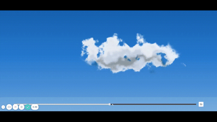
In this article, we made a cloud generator application with minimal effort by exploring the realm of SVG using React.
We saw the effect of displacementMap, turbulence, scale, and seed, which can be used with the range props to change the input dynamically and create realistic moving clouds.
The source code of the cloud application built in this tutorial is available on GitHub for you to explore.
Install LogRocket via npm or script tag. LogRocket.init() must be called client-side, not
server-side
$ npm i --save logrocket

// Code:

import LogRocket from 'logrocket';
LogRocket.init('app/id');
// Add to your HTML:

<script src="https://cdn.lr-ingest.com/LogRocket.min.js"></script>
<script>window.LogRocket && window.LogRocket.init('app/id');</script>

useEffect breaks AI streaming responses in ReactSee why useEffect breaks AI streaming in React, and how moving stream state outside React fixes flicker and stale updates.

A real-world debugging session using Claude to solve a tricky Next.js UI bug, exploring how AI helps, where it struggles, and what actually fixed the issue.

CSS wasn’t built for dynamic UIs. Pretext flips the model by measuring text before rendering, enabling accurate layouts, faster performance, and better control in React apps.

Why do real-time frontends break at scale? Learn how event-driven patterns reduce drift, race conditions, and inconsistent UI state.
Would you be interested in joining LogRocket's developer community?
Join LogRocket’s Content Advisory Board. You’ll help inform the type of content we create and get access to exclusive meetups, social accreditation, and swag.
Sign up now

 Learn more →
