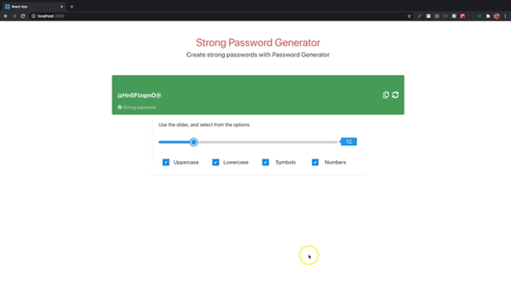
In this guide, we’ll walk through how to create a password generator app with React. The app will enable users to create strong passwords with various combinations of characters, including uppercase and lowercase letters, symbols, and numbers. It’ll also have an indicator to help gauge the strength of the user’s chosen password.

As part of the tutorial, you’ll learn how to create reusable components in React. We’ll create the following components.
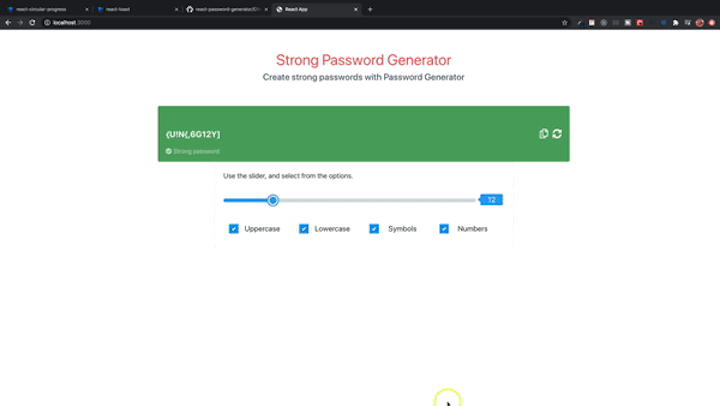
The final result should look like this:
The Replay is a weekly newsletter for dev and engineering leaders.
Delivered once a week, it's your curated guide to the most important conversations around frontend dev, emerging AI tools, and the state of modern software.
Before we start, we need to create a React application. We’ll use create-react-app with npx. I’ll assume you have Node.js installed on your computer.
Open a command prompt or terminal, navigate to the directory where you want to add your project, and type the following.
npx create-react-app password-generator
create-react-app creates a src directory. This is the directory that contains the entry component (App.js) and where other components will be created. You can open the project with an IDE of your choice.
Open a terminal inside the project and run:
yarn add bootstrap
Add the following to index.css.
import 'bootstrap/dist/css/bootstrap.min.css';
Add the following to the head section of index.html inside the public folder.
<link rel="stylesheet" href="https://cdnjs.cloudflare.com/ajax/libs/font-awesome/5.12.1/css/all.min.css" />
Create two new folders called components and utils inside the src directory. The components folder contains all the required components. The utils folder contains a helper file.
In the components folder, add the following files and folders.
Main.jsheader -> Header.js and Header.cssdisplay -> Display.js and Display.cssCopy and paste the code below into the Header.js file.
import React from 'react';
import './Header.css';
const Header = () => {
    return (
        <div className="row">
            <div className="col-md-12 header">
                <h1 className="h1">Strong Password Generator</h1>
                <div className="col-md-12">
                    <h4>
                        Create strong passwords with Password Generator
                    </h4>
                </div>
            </div>
        </div>
    )
}
export default Header;
Add CSS style Header.css file. You can get the code from GitHub.
The header component contains the text to be displayed on the page. The display component will consist of a password display and buttons to copy and reload a new password.
Add a function to Display.js.
import React from 'react';
import './Display.css';
const Display = () => {
    return (
        <>
            <div className="row">
                <div className="col-12 password-display-container">
                    <div>
                        <div className="password-display">
                            <input type="text" className="password-display-input" readOnly />
                        </div>
                        <div className="password-description">

                        </div>
                    </div>
                    <div className="password-display-icons">

                    </div>
                </div>
            </div>
        </>
    )
}
export default Display;
Add the CSS style file, Display.css.
The header and display components need to be added to Main.js. The main component is then added to App.js.
import React from 'react';
import Header from './header/Header';
import Display from './display/Display';
const Main = () => {
    return (
        <>
            <Header />
            <Display />
        </>
    )
}
export default Main;
Open the App component and replace its content with the following.
import React from 'react';
import './App.css';
import Main from './components/Main';
const App = () => {
  return (
    <div className="container">
      <Main />
    </div>
  );
}
export default App;
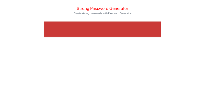
The app should look like the image below.
Inside the utils folder, create a file called Helper.js. The helper file will consist of all functions that will be used to create the passwords.
A user will have the option to create passwords with a combination of uppercase letters, lowercase letters, numbers, and special characters. The password generation will be random.
Add the following to the helper file.
let characters = '';
let passwordLength = 0;
All password options selected by the user are concatenated to the characters variable. The user selects the passwordLength.
const setUpperCase = isUpperCase => {
    if (isUpperCase) {
        characters += 'ABCDEFGHIJKLMNOPQRSTUVWXYZ';
    }
    return '';
}
const setLowerCase = isLowerCase => {
    if (isLowerCase) {
        characters += 'abcdefghijklmnopqrstuvwxyz';
    }
    return '';
}
const setSymbols = isSymbol => {
    if (isSymbol) {
        characters += '!@#$%^&*()<>,.?/[]{}-=_+|/';
    }
    return '';
}
const setNumber = isNumeric => {
    if (isNumeric) {
        characters += '0123456789';
    }
    return '';
}
If the parameters are not set, the methods return an empty string.
Next, we need to add a method that returns a random integer. The integer selects a random number of characters from the characters variable.
characters = 'ABCDEFGHIJKLMNOPQRSTUVWXYZabcdefghijklmnopqrstuvwxyz!@#$%^&*()<>,.?/[]{}-=_+|/0123456789';
const getRandomInteger = (min, max) => {
    return Math.floor(Math.random() * (max - min + 1)) + min;
}
The method takes a minimum and maximum value and returns a random integer based on the parameters passed.
const passwordCharacters = () => {
    let password = '';
    if (characters.length) {
        for (let i = 0; i < passwordLength; i++) {
            password += characters[getRandomInteger(0, characters.length - 1)];
        }
        characters = '';
        passwordLength = 0;
        return password;
    }
}
The passwordCharacters method selects random characters from the characters variable. The passwordLength is set with a setPasswordLength method. If character length is greater than zero, it loops with the password length. At each iteration, a random character is selected and concatenated to the password variable. At the end of the loop, the characters and passwordLength variables are reset and the password characters are returned.
The methods created so far are only used inside the helper file. The next set of methods will be exported and used in our components.
export const setPasswordLength = length => {
    passwordLength = length;
    return passwordLength;
}
This method is used to set the password length. The user specifies the length of the password using a slider.
export const generatePassword = (passwordProps, pwdLength) => {
    const { uppercase, lowercase, symbols, numbers } = passwordProps;
    setPasswordLength(pwdLength);
    setUpperCase(uppercase);
    setLowerCase(lowercase);
    setSymbols(symbols);
    setNumber(numbers);
    const password = passwordCharacters();
    return password;
}
This is the method that generates the password with different characters. The parameters inside the methods for uppercase, lowercase, symbols, and numbers are booleans. The boolean parameters are set via checkboxes. The characters value is set before the passwordCharacters method is called.
Now that we have the helper methods, we can create our components. Before we can use the helper methods we just created, we need to create some components.
Inside the components directory, create a folder called container. This folder will contain components such as slider, tooltip, checkbox, and button.
Create a folder called button inside the container directory. Add a file Button.js. We’re using a functional component in the Button.js file.
import React from 'react'
import PropTypes from 'prop-types'
const Button = props => {
    const { label, className, iconClass, handleClick } = props;
    return (
        <>
            <button
                className={className}
                label={label}
                onClick={handleClick}
            >
                <i className={iconClass}></i> {label}
            </button>
        </>
    )
}
Button.propTypes = {
    label: PropTypes.string,
    className: PropTypes.string,
    iconClass: PropTypes.string,
    handleClick: PropTypes.func
}
export default Button;
The Button method takes a props object that consists of a label, className, iconClass, and handleClick method. The propTypes is a validation to make sure the right props are passed to the button. The component is a reusable button component.
The display component displays a random password. The component also has a container component, which consists of a slider and checkboxes. The reload and copy password buttons are also added to this component.
The input field is read-only, which enables us to add the copy password functionality.
Import the React useState and useRef hooks. Also, add a state variable called password inside the Display function and a passwordRef variable.
import React, { useState, useRef } from 'react';
const [password, setPassword] = useState('');
const passwordRef = useRef(null);
We need to set the ref on the input field and use the password variable as its value.
<input
    ref={passwordRef}
    type="text"
    value={password}
    className="password-display-input"
    readOnly
/>
The password is displayed inside the read-only input field.
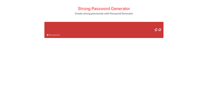
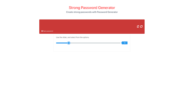
Next, we need a method to display the password description. If the password is within a certain length, we display a message and set a background color to the password display container.
Add a new variable:
let pwdDescription = '';
This will hold the description of:
Add the following method to the component.
const setBackgroundColor = password => {
    if (password && password.length === 1 && password.length <= 5) {
        pwdDescription = 'Bad password';
        return '#cb473e';
    } else if (password && password.length >= 6 && password.length <= 10) {
        pwdDescription = 'Weak password';
        return '#f07d58';
    } else if (password && password.length > 10) {
        pwdDescription = 'Strong password';
        return '#55a95d';
    } else {
        pwdDescription = 'Bad password';
        return '#cb473e';
    }
}
The method is straightforward. If the password length is between one and five characters, the password description is Bad password and the method returns a red color. If it’s between six and 10, it shows Weak password and the method returns a yellow color. If it’s greater than 10, the description is Strong password and the method returns a green color. The default message is Bad password with a background color of red. You can set whatever length you want for the passwords as well as their descriptions.
Add style={{ backgroundColor: setBackgroundColor(password) }} as a property on the div with className password-display-container. Recall that the setBackgroundColor method returns the colors based on the length of the password.
<div className="row">
    <div className="col-12 password-display-container" style={{ backgroundColor: setBackgroundColor(password) }}>
        <div style={{ width: '100%' }}>
            <div className="password-display">
                <input
                    ref={passwordRef}
                    type="text"
                    value={password}
                    className="password-display-input"
                    readOnly
                />
            </div>
            <div className="password-description">

            </div>
        </div>
        <div className="password-display-icons">

        </div>
    </div>
</div>
To display the description, add the following inside the className password-description.
{
    password && password.length > 10 ?
    <>
        <i className="fas fa-check-circle"></i> { pwdDescription }
    </> :
    <>
        <i className="fas fa-exclamation-circle"></i> { pwdDescription }
    </>
}
If the password length is greater than 10, the app displays a circle check icon and its description. Otherwise, it displays a different icon and description.
Let’s add the copy and reload password buttons. We’ll use the button component we’ve already created.
The Button component requires some props. Import the Button component from the container folder.
import Button from '../container/button/Button';
Next, create two methods to be used on the button click: copyClipBoard and generateNewPassword.
const generateNewPassword = () => {
}

const copyClipBoard = () => {

}
Inside the div with className password-display-icons, add the button components.
<Button
    className="copy-btn"
    iconClass="far fa-copy"
    handleClick={copyClipBoard}
/>

<Button
    className="generate-btn"
    iconClass="fas fa-sync-alt"
    handleClick={generateNewPassword}
/>
The Button component takes in the props className, iconClass, and handleClick. The password string that’s displayed in the input is copied when the copyClipBoard is called.
The generateNewPassword changes the password when clicked.
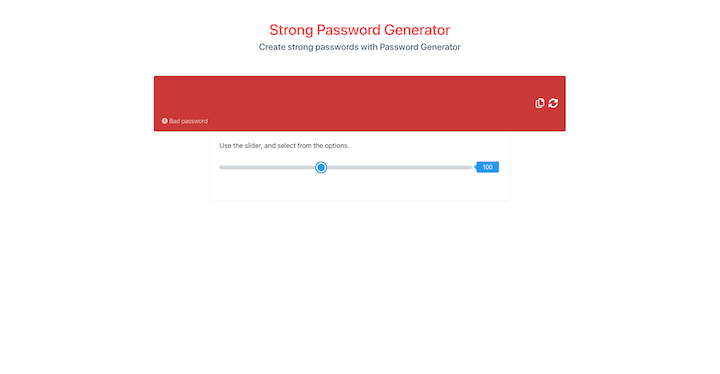
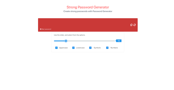
Let’s create a container, checkbox, and slider component. We’ll need these components inside the display components.
The user toggles the slider component to set the length of a password. The slider will have a minimum and maximum value.
Create a folder inside the container director called slider and add two files: Slider.js and Slider.css.
The component is a functional one.
import React from 'react';
import PropTypes from 'prop-types';
import './Slider.css';
const Slider = () => {
    return (
        <div className="slider-container">
            <div className="slider">
                <input
                    className="range-slider"
                    type="range"
                    step={step}
                    min={min}
                    max={max}
                    value={value}
                />
                <span className="range-slider-value">100</span>
            </div>
        </div>
    )
}

Slider.propTypes = {
    step: PropTypes.number.isRequired,
    min: PropTypes.number.isRequired,
    max: PropTypes.number.isRequired,
    defaultLength: PropTypes.number.isRequired,
    value: PropTypes.number.isRequired,
    onChangeValue: PropTypes.func.isRequired,
}

export default Slider;
Add the Slider.css file.
The slider component returns a div with a className of Slider-container, which contains a div with an input of type range and a span that displays the slider value. The styles will override some HTML5 slider styles. The component consists of some props for type-checking. All the props passed into the slider component are required. A linear gradient will be added to the input of type range.
Inside the container folder, create two files: Container.js and Container.css. We need to set up this component before we can use the slider. The Container component is added to the display component.
Add Container.css.
import React from 'react';
import './Container.css';
const Container = () => {
    return (
        <div className="password-settings">
            <h3 className="h3">Use the slider, and select from the options.</h3>
            <div className="row">
                <div className="col-md-12">
                    <div className="form-group">

                    </div>
                </div>
                <div className="col-md-12">
                    <div className="row checkbox-container">

                    </div>
                </div>
            </div>
        </div>
    )
}
export { Container };
The slider and checkbox components will be added to the container component. Import the slider component.
import Slider from './slider/Slider';
Next, add the Slider component inside the div with the form-group class.
<Slider
    min={0}
    max={50}
    step={1}
    defaultLength={10}
    value={20}
    onChangeValue={onChangeSlider}
/>
Define the onChangeSlider method that gets the value from the slider when the slider knob is moved.
const onChangeSlider = event => {}
Right now, the slider prop values are static. The values will be changed later.
Let’s add the Container component to the Display component.
import { Container } from '../container/Container';
Add the container component after the div with a className of row.
<>
    <div className="row">
        ...
    </div>
    <Container  />
</>
The range input has a white background. We’ll add the CSS linear-gradient property to the input to change the background color as the slider knob is moved.
The current position of the knob is determined by the value prop passed to the component. Add the useState and useRef hooks to the Slider component and then add the required variables.
import React, { useState, useRef } from 'react';
const rangeRef = useRef();
let [range, setRange] = useState();
On the range input, add a ref property. This will enable us get the required properties from the input.
<input
    ref={rangeRef}
    ...
/>
Create two new variables to be the default colors of the range input. You can use whatever colors you want.
const activeRangeColor = '#4aa1f3';
const rangeBackground = '#d7dcdf';
Next, create a method called handleChange. This is the onChange method of the input.
const handleChange = maxNum => event => {

}
The handleChange method takes a parameter called maxNum (which stands for the maximum value of the range) and an event. Recall that the slider props has a property called onChangeValue. This is a method from the parent component of the slider. Whenever the handleChange is called, the onChangeValue prop is called and it takes the event.
const handleChange = maxNum => event => {
    onChangeValue(e);
}
Add the method to the range input.
<input
    ...
    onChange={handleChange(max)}
/>
Add the following after the handleChange method.
if (range !== defaultLength || !range) {
    range = defaultLength;
}
const progress = (range / max) * 100 + '%';
When the page is loaded, we don’t want to place the slider knob at position zero. That’s why the range is set equal to the default length. The next step is to calculate the progress using the range value and max prop multiplied by 100. Then we concatenate a string percent symbol. This percentage is used to calculate the CSS linear-gradient.
After the progress percent calculation, add the following.
const styleInput = {
    background: `linear-gradient(90deg, ${activeRangeColor} 0% ${progress}, ${rangeBackground} ${progress} 100%)`
}
This is for the default linear-gradient when the page is loaded. The CSS linear-gradient takes the direction of the gradient in degrees, the main color (in this case, rangeBackground), the gradient color (activeRangeColor), and progress percentage. Add the styleInput as an inline style on the range input.
<input
    ...
    style={styleInput}
/>
<span className="range-slider-value">{range}</span>
Inside the handleChange method, add the following lines.
const value = event.target.value;
setRange(value);
const progress = (value / maxNum) * 100 + '%';
const newBackgroundStyle = `linear-gradient(90deg, ${activeRangeColor} 0% ${progress}, ${rangeBackground} ${progress} 100%)`;
rangeRef.current.style.background = newBackgroundStyle;
We first set the range value using the useState method, setRange. Then, we calculate the progress percentage and the linear-gradient. The useRef hook is used to set the CSS background style of the range input. Recall that we added ref={rangeRef} on the input. We use this to get the current object of the input and then the background from the style object.
If you look at the slider in the browser, you’ll notice that the knob and linear-gradient are not at the same point. That’s because we have not set the onChangeSlider functionality inside the Container component.
In the container component, add the useState hook and some variables.
import React, { useState } from 'react';
const [rangeValue, setRangeValue] = useState(12);
const [minMaxValue, setMinMaxValue] = useState({
    min: 1,
    max: 60
});
const { min, max } = minMaxValue;
Change the props in the slider component.
<Slider
    min={parseInt(min, 10)}
    max={parseInt(max, 10)}
    step={1}
    defaultLength={parseInt(rangeValue, 10)}
    value={parseInt(rangeValue, 10)}
    onChangeValue={onChangeSlider}
/>
The parseInt converts the strings to integer. The rangeValue is set inside the onChangeSlider method.
setRangeValue(event.target.value);
inside the onChangeSlider method. As the slider is moved, the rangeValue is set with the setRangeValue useState method.
You can move the slider knob to see the linear-gradient move as well.
Let’s add a checkbox component. Create a checkbox folder inside the container directory and add CheckBox.js and CheckBox.css.
Add CheckBox.css, then add the code below to the CheckBox.js component.
import React from 'react';
import PropTypes from 'prop-types';
import './CheckBox.css';
const CheckBox = props => {
    const { label, value, checked, name, onChange, disabled } = props;
    return (
        <>
            <div className="col-md-3">
                <label className="container">
                    <h1>{label}</h1>
                    <input
                        type="checkbox"
                        name={name}
                        checked={checked}
                        value={value}
                        onChange={onChange}
                        disabled={disabled}
                        className="checkbox-input"
                    />
                    <span className="checkmark"
                        style={{ opacity: disabled ? '0.7' : '' }}
                    ></span>
                </label>
            </div>
        </>
    )
}
CheckBox.propTypes = {
    label: PropTypes.string.isRequired,
    value: PropTypes.bool.isRequired,
    checked: PropTypes.bool.isRequired,
    name: PropTypes.string.isRequired,
    disabled: PropTypes.bool.isRequired,
    onChange: PropTypes.func.isRequired,
}
export default CheckBox;
This component takes in some props. The input type is a checkbox, which can be used multiple times inside the container component.
Since we need checkboxes for adding uppercase and lowercase letters, symbols, and numbers to a password, it would not make sense to add the checkboxes separately for each of these inside the container component. Doing so would make the HTML unnecessarily huge. Instead, we’ll add the different checkbox properties into an array of objects and then loop through the array in the HTML template. This way, we only use one checkbox component.
const CHECKBOX_LIST = [
    {
        id: 0,
        name: 'uppercase',
        label: 'Uppercase',
        isChecked: true
    },
    {
        id: 1,
        name: 'lowercase',
        label: 'Lowercase',
        isChecked: true
    },
    {
        id: 2,
        name: 'symbols',
        label: 'Symbols',
        isChecked: true
    },
    {
        id: 3,
        name: 'numbers',
        label: 'Numbers',
        isChecked: true
    },
];
Add the CHECKBOX_LIST at the top inside the container component. Import the checkbox component.
import CheckBox from './checkbox/CheckBox';
Next, add the CheckBox component to the div with className checkbox-container.
<div className="row checkbox-container">
    {
        CHECKBOX_LIST.map(checkbox =>
            <CheckBox
                key={checkbox.id}
                name={checkbox.name}
                checked={checkbox.isChecked}
                label={checkbox.label}
                value={checkbox.isChecked}
                onChange={onChangeCheckBox}
                disabled={
                    checked && checkbox.isChecked && checkedName === checkbox.name
                }
            />
        )
    }
</div>
Instead of having four separate checkbox components, map through the CHECKBOX_LIST and then pass the respective properties to the checkbox.
Before you can see the checkboxes on the page, we need to add some useState properties and the onChangeCheckBox method.
const [checkbox, setCheckBox] = useState({
    uppercase: true,
    lowercase: true,
    symbols: true,
    numbers: true
});
const [checked, setChecked] = useState(false);
const [checkedName, setCheckedName] = useState('');
The checkbox object has boolean properties whose values are true by default. That means all checkboxes are checked by default when the user comes to the page.
Destructure the properties from the checkbox object.
const { uppercase, lowercase, symbols, numbers } = checkbox;
Next, add the onChangeCheckBox method.
const onChangeCheckBox = e => {
}
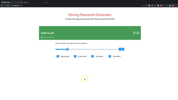
Your page should look like this:
We have the components that we need. Let us now start working on adding the methods for getting the passwords in the container and display components.
Inside the Display component, we’re going to add some props to the Container component. The changes made by the slider and checkboxes will be reflected inside the display component. As the user moves the slider, the password is changed in the display component. Also, if a checkbox is checked or unchecked, the password changes.
The slider and checkbox components are both inside the container component, so we need to pass methods from the display component to the container component.
Add the useState properties to the display component
const [rangeValue, setRange] = useState();
const [passwordProps, setPasswordProps] = useState();
Both properties will be set inside the container component, which is why they’re passed as props. The setPassword property is also set in the container component.
<Container
    setPassword={setPassword}
    setRange={setRange}
    setPasswordProps={setPasswordProps}
/>
Still inside the Display component, import the generatePassword method from the helper file.
import { generatePassword } from '../../utils/Helper';
This method is added to the reload button. Add it to the generateNewPassword method.
const generateNewPassword = () => {
    const pwd = rangeValue > 3 ? generatePassword(passwordProps, rangeValue) : generatePassword(passwordProps, 3);
    setPassword(pwd);
}
The first line generates a password if the range value is greater than three. Otherwise, it generates a password with a character of three. This simply means the password the user generates cannot be less than three.
If you click the reload button, you’ll get an error because the passwordProps has not been set.
Inside the Container component, pass a props parameter to the method and then destructure the properties passed to the component from inside the display.
const { setPassword, setRange, setPasswordProps } = props;
Import the generatePassword and setPasswordLength methods and add a method called passwordGenerated.
import { generatePassword, setPasswordLength } from '../../utils/Helper';
const passwordGenerated = (checkbox, rangeValue) => {
    const pwd = rangeValue > 3 ? generatePassword(checkbox, rangeValue) : generatePassword(checkbox, 3);
    setPassword(pwd);
    setPasswordProps(checkbox);
}
The setPassword and setPasswordProps are coming from the Display component. In the onChangeSlider method, add:
setPasswordLength(event.target.value);
setRange(event.target.value);
passwordGenerated(checkbox, event.target.value);
The values for the methods are set when the slider is moved.
const onChangeSlider = event => {
    setRangeValue(event.target.value);
    setPasswordLength(event.target.value);
    setRange(event.target.value);
    passwordGenerated(checkbox, event.target.value);
}
We’ve added a lot, but the password is not displayed. For the password to display and also be changed, we need methods such as passwordGenerated, setPasswordLength, setRange, and setRangeValue to be called whenever the slider or checkbox changes. We can add the methods to the useEffect hook. Whenever one of its dependencies changes, the hook will be called.
Add useEffect to the React import. Add the useEffect hook with the methods listed above.
useEffect(() => {
    setPasswordLength(rangeValue);
    setRange(rangeValue);
    setRangeValue(rangeValue);
    passwordGenerated(checkbox, rangeValue);
    // eslint-disable-next-line
}, [uppercase, lowercase, symbols, numbers]);
If the rangeValue or another dependency changes, the hook will be called. The line // eslint-disable-next-line is used to disable the warning message given by the hook.
There are some dependencies we don’t really need to be in the array. If you want, you can try adding all the dependencies to see what happens; in many cases, your app will run into an infinite loop. That’s why you have to be careful not to go crazy with dependencies. Only add dependencies that you really need in the array. Otherwise, just disable the warnings.
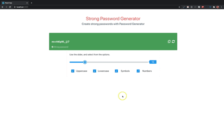
Now you can save and see how the app looks. Only the slider and reload buttons work for now. The display background color changes as you move the slider.
Notice the minimum character length you can set is three. The default value is 12. Right now, the passwords you’re generating has all characters because the checkboxes cannot be unchecked. The default is true for all checkboxes.
To make the checkboxes work, we need to get the checked value from onChangeCheckBox and then update the checked property of the selected checkbox inside the CHECKBOX_LIST. We’re going to map through the CHECKBOX_LIST array.
Add the following to the onChangeCheckBox method.
let { name, checked } = event.target;
CHECKBOX_LIST.map(checkbox => {
    if (checkbox.name === name) {
        checkbox.isChecked = checked;
        setCheckBox(prevState => ({ ...prevState, [name]: checkbox.isChecked }));
        setPasswordLength(rangeValue);
        setRangeValue(rangeValue);
    }
    return '';
});
First, destructure the name and checked properties from the event target. Then, map through the CHECKBOX_LIST array and, if the object name matches the name of the event target, set the respective properties.
setCheckBox(prevState => ({ ...prevState, [name]: checkbox.isChecked }));
Use the spread operator on the previous state of the checkbox object properties and then update each property accordingly.
As you can see, the checkboxes work. But if you uncheck all boxes, you’ll get a warning in the browser console. We need to have at least one checkbox left so the user can’t uncheck all boxes.
Count the number of boxes that are checked. If you have only one box checked, disable all the checkboxes and enable them all when at least two boxes are checked.
Add the method:
const checkBoxCount = () => {
    const checkedCount = Object.keys(checkbox).filter(key => checkbox[key]);
    const disabled = checkedCount.length === 1;
    const name = checkedCount[0];
    if (disabled) {
        setChecked(disabled);
        setCheckedName(name);
    } else {
        setChecked(false);
        setCheckedName('');
    }
}
Filter the checkbox object and check the properties that are false. The checkedCount returns an array of the checkbox properties. If the length is one, disable all the checkboxes. Recall that we already passed a disabled property to the CheckBox component. Add the method to the useEffect hook. Now you can test the checkboxes on the browser.
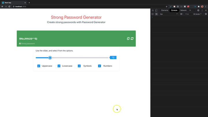
Now we want to add the clipboard functionality. On the Display component, we already have a placeholder button for copying the password. Once the user generates a password, they can click the copy button and the password will be copied to the clipboard.
Browsers interact with the system clipboard in one of two ways: the Document.execCommand() method and the Clipboard API.
You can use the Document.execCommand() method by specifying the desired command like copy, cut, and paste. We are going to use the Document.execCommand() to copy the password from the clipboard.
Inside the helper file, add the following method.
export const copyToClipBoard = elementRef => {
    elementRef.select();
    document.execCommand('copy');
}
The method is called copyToClipBoard (you can name it whatever you choose). It takes in a parameter, which is a reference to the element to be copied from — in our case, the read-only text input.
First, call the select method that selects all text in an <input> element and includes a text field. Next,we call the document.execCommand with the copy command. If you want to cut the text, you can pass in cut. That’s all you need to copy text from a text field.
Add the method copyToClipBoard to the helper imports inside the Display component.
import { generatePassword, copyToClipBoard } from '../../utils/Helper';
Inside the copyClipBoard method, add:
copyToClipBoard(passwordRef.current);
The method takes in a reference to the input element. The copyClipBoard now becomes:
const copyClipBoard = () => {
    copyToClipBoard(passwordRef.current);
}
If you test the functionality, you’ll notice there is no indication that the password was copied unless you paste it somewhere. Let’s add an indicator in the form of a tooltip.
Add a new component inside the container directory called Tooltip.js with a Tooltip.css file both inside a tooltip folder.
Add Tooltip.css.
For the component, add the following.
import React from 'react';
import PropTypes from 'prop-types';
import './Tooltip.css';
const Tooltip = props => {
    const { message, position, displayTooltip } = props;
    return (
        <>
            {
                displayTooltip ?
                <div className={`tooltip-bubble tooltip-${position}`}>
                    <div className="tooltip-message">{message}</div>
                </div> : ''
            }
        </>
    )
}
Tooltip.propTypes = {
    message: PropTypes.string.isRequired,
    position: PropTypes.string.isRequired,
    displayTooltip: PropTypes.bool.isRequired,
}
export default Tooltip;
The component takes in some props, such as message, position, and displayTooltip. displayTooltip is a boolean that displays or hides the tooltip. All props are required.
Now that we have the tooltip component, let’s use it inside the Display component. Once the copy button is clicked, the tooltip is displayed and, after some seconds, hidden.
Import the tooltip component.
import Tooltip from '../container/tooltip/Tooltip';
Add a useState boolean property to set the value of the tooltip’s displayTooltip property.
const [tooltip, setTooltip] = useState(false);
Add the following Tooltip component after the second Button component.
<div className="password-display-icons">
    <Button
        className="copy-btn"
        iconClass="far fa-copy"
        handleClick={copyClipBoard}
    />
    <Button
        className="generate-btn"
        iconClass="fas fa-sync-alt"
        handleClick={generateNewPassword}
    />
    <Tooltip
        message="Copied"
        position="left"
        displayTooltip={tooltip}
    />
</div>
The component takes in the message, position, and useState tooltip boolean property.
Now we need to set the useState tooltip property. Add the following to the copyClipBoard method.
setTooltip(true);
setTimeout(() => {
    setTooltip(false);
}, 2000);
When the method is called, the tooltip’s displayTooltip is set to true. After two seconds, it’s set to false, thereby hiding the tooltip.
const copyClipBoard = () => {
    copyToClipBoard(passwordRef.current);
    setTooltip(true);
    setTimeout(() => {
        setTooltip(false);
    }, 2000);
}
Now there’s an indicator that lets you know the password has been copied from the clipboard.
You can find the complete source code on GitHub.
We’ve walked through how to add various functionalities to your app for generating random passwords. We created checkbox, button, slider, and tooltip components. You should now be able to create reusable components in React for your other projects.
As a next step, you might consider extending the application by adding some functionality to enable users to choose whether to generate a PIN or a password.
Install LogRocket via npm or script tag. LogRocket.init() must be called client-side, not
server-side
$ npm i --save logrocket

// Code:

import LogRocket from 'logrocket';
LogRocket.init('app/id');
// Add to your HTML:

<script src="https://cdn.lr-ingest.com/LogRocket.min.js"></script>
<script>window.LogRocket && window.LogRocket.init('app/id');</script>

Write agent-friendly API documentation with OpenAPI, clear schemas, workflow guidance, and llms.txt for safer AI automation.

Local AI proxy tutorial for detecting, masking, and rehydrating PII before prompts reach cloud LLMs.

Learn how Graph RAG uses connected knowledge structures to improve retrieval beyond simple text similarity.

Learn how sibling-index() enables clean, JavaScript-free stagger animations using native CSS.
Would you be interested in joining LogRocket's developer community?
Join LogRocket’s Content Advisory Board. You’ll help inform the type of content we create and get access to exclusive meetups, social accreditation, and swag.
Sign up now

 Learn more →
