Editor’s note: This article was last updated on 20 October 2022 to include information on compressing CSS files and lazy loading in CSS.

CSS sits at the presentation layer of website design. If done right, it adds beauty for your users and the right feel to the HTML markup underneath. If not, it can cause a bad user experience and do a number on your website’s speed and performance.
Irrespective of the nature of your website, and regardless of whether it performs well on a variety of web browsers, it has to load quickly. If it’s not fast, your users will leave and go elsewhere.
If you happen to sell services or goods on your website, this means reduced sales because there are plenty of options available on the web, and you’ve given the user a clear indication to go look elsewhere. They may even discourage others from using your website in the future, which could result in reduced page views.
In this article, you’ll learn how to avoid some common CSS coding decisions that will bog down your website. By the end, you’ll be able to speed up your website and improve the UX.
We’ll cover these eight CSS topics to improve your code and increase the performance of your website:
@import statementThe Replay is a weekly newsletter for dev and engineering leaders.
Delivered once a week, it's your curated guide to the most important conversations around frontend dev, emerging AI tools, and the state of modern software.
Simply put, CSS affects site rendering. CSS is a part of the critical rendering path of a site, i.e., the minimum amount of information a website needs to render its first pixel. This means that while the CSS is parsing, it’ll block all other resources from loading, including HTML and CSS functionality.
In fact, you probably won’t see a single pixel of a site nor be able to interact with the page while the CSS is parsing, so it’s important that you optimize your CSS for maximum performance. You can do this by following the next eight steps.
CSS has a wide, flexible array of coding options you can use to target HTML elements for styling. Over the years, experts have advised developers to write simple selectors to reduce the load on the browser and keep the code clean and simple.
This next code block demonstrates what simplicity is all about:
.hero-image {
        width: 70%
}
However, CSS does not stop you from writing the following:
main > div.blog-section + article > * {
        /* Code here */
}
In this example, behind the scenes, the browser will parse the selector from right to left, starting with the universal selector (*) and reading across to the main selector. This is more work for the browser than usual. Even though we’re talking about a difference of milliseconds to parse this selector, those milliseconds add up when this selector method occurs multiple times in your style sheet.
Moreover, the longer your selectors, the more bytes they add to the overall size of your style sheet.
Now that animation is available in native CSS, there’s no need to use JavaScript to add animations to your webpages. This makes adding animations to your website easier and, if done right, you can leverage them to create a better user experience.
When you overdo it with animations, however, you can distract the user from performing the task they are trying to achieve when they visit your website. Also, keep in mind that each animation you add takes time to parse, so excessive animation can slow down or halt the web browser.
Properties that cause the whole page to re-layout should not be animated. These properties are typically referred to as being “expensive” because they can create a significant load time on your website. Some of them are:
marginpaddingheightwidthThe reason for this is that when you change properties like margin and other dimensions of a single DOM element, it causes changes to all other elements.
Some other properties, such as opacity and transform, can be animated because they don’t affect the layout of other elements. This makes it possible for web browsers to offload those computations to the GPU to be even faster.
Other CSS properties are more commonly used but will still take longer to paint. Some of them include:
:nth-childbox-shadowborder-radiusposition: fixedWhen these appear in the hundreds in your style sheet, they will impact the performance of your website. Use them sparingly.
@import statementThe @import statement is mostly used to include assets, such as fonts, though it can include other CSS files.
CSS is render-blocking, which means that when you use the @import statement in your CSS file to fetch a font or other CSS file, the browser will fetch the asset before it continues processing the remaining CSS code:
/* styles.css */
/**
 * The browser would fetch base.css before
 * processing the remaining code in styles.css
 */
@import url("base.css");
When the asset is a font file, the browser will use the font available in the system while it waits for the other font to download. After it downloads, it’ll swap out the system font for the downloaded font. Therefore, your user could be reading your content in one font and suddenly the font changes. This is bad for user experience.
Here is an example of loading a font with the @import statement:
/**
 * Example of loading a font with the
 * @import statement.
 * The font is only available after it downloads.
*/
@import url('https://fonts.googleapis.com/css2?family=Roboto:wght@100&display=swap');
Instead, we recommend using the link tag in the head of your HTML to load your fonts:
<link rel="preload" as="font" href="https://fonts.googleapis.com/css?family=Open+Sans" crossorigin="anonymous">
Here, the rel="preload" and as="font" tell the browser to download the font as soon as possible. You can also take steps to ensure the font file you are preloading matches the ones in your CSS to prevent your user from downloading two versions of the same font and wasting their bandwidth.
In web design and development, size matters. Whether you’re dealing with an image, an HTML or JavaScript file, or other media assets, there’s one golden rule: always be compressing.
Reduce your CSS file size by minification. Images on your site should be optimized to reduce their load speed, which can mean using an online tool like TinyPNG — or, if you’re creating your own images, leveraging tools such as Save for Web in Photoshop.
Base64 images are among the options for embedding images on a webpage. Over the years, experts such as Harry Roberts have shown why base64 images are bad for performance for many reasons:
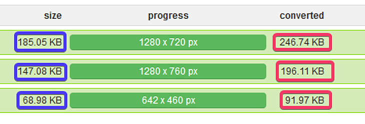
In the image below, observe the increase in each image’s size before and after conversion to base64:

See what happens when we add these three base64 images to a CSS file with only 14 lines of code:
/**
 * Base64 code truncated.
*/
@media screen and (min-width: 20em) {

    html {
            background-image:  url('data:image/png;base64,iVBO ...');
    }

    footer {
            background-image:  url('data:image/png;base64,iVBO ...');
    }

    .non-existence-class {
            background-image:  url('data:image/png;base64,iVBO ...');
    }

}
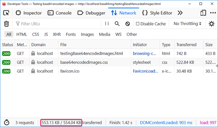
The file size increased to over 500KB. Not only is that massive, but the user’s browser will also spend time downloading this file whether or not the image is used:

Meanwhile, in the following code, the browser would download the image on demand based on the browser’s viewport:
html {
    padding: 2em;
    background-image: url("images/asnim_mobile.jpg");
}

@media screen and (min-width: 20em) {
    html {
            background-image: url("images/asnim_tablet.jpg");
    }
}

@media screen and (min-width: 48em) {
    html {
            background-image: url("images/asnim.jpg");
            background-size: cover;
    }
}
You can verify this by performing the following steps:
Uncompressed CSS files generally take twice as much time to load than compressed CSS files, so compressing your files should be an easy decision — especially if your site has many CSS files.
CSS compressors work by removing white spaces, line breaks, block delimiters, comments, etc. to reduce the size of the application file. They also find and fix any properties that overlap themselves, and look for chances to use CSS shorthand.
While compressing CSS files makes them more browser friendly, the one downside is that it decreases code readability.
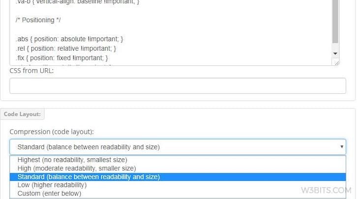
Some compressors also allow you to choose between balancing readability and size, so if you’re working with a team or you know others will read your code, you can still compress CSS while keeping your code readable:

While there are many CSS compressors in the market, you have to take time to find the right one for yourself. Take a look at this list to get started.
Lazy loading is a strategy used to improve the performance of websites by blocking the rendering of non-critical resources until they’re needed. Lazy loading CSS is a great way to decrease the critical rendering path of a page by splitting CSS and loading only the required code, while all others (e.g., images, animation, etc.) are loaded on demand.
The main targets for lazy loading are images and videos. The easiest way to lazy load images and videos is by adding the loading attribute to the <img> and <iframe> elements and setting it to lazy. This ensures that the images will only load when they come into the viewport:
<img src="myimage.jpg" loading="lazy" alt="..." />
<iframe src="content.html" loading="lazy"></iframe>
For videos, you can use the preload attribute to lazy load a video that doesn’t autoplay:
<video controls preload="none">
  <source src="Fluffydogs.mp4" type="video/mp4">
  A video about fluffy dogs
</video>
When you take the lessons learned in this article and apply them to your future web projects, know that you’ll be contributing to a better web! If you have a website that you feel needs a performance revamp, refactor your code using lessons learned in this article and let us know how it goes in the comments.
Browse some tips on additional CSS and general web performance updates you can make:
Happy coding!
As web frontends get increasingly complex, resource-greedy features demand more and more from the browser. If you’re interested in monitoring and tracking client-side CPU usage, memory usage, and more for all of your users in production, try LogRocket.

LogRocket lets you replay user sessions, eliminating guesswork around why bugs happen by showing exactly what users experienced. It captures console logs, errors, network requests, and pixel-perfect DOM recordings — compatible with all frameworks.
LogRocket's Galileo AI watches sessions for you, instantly identifying and explaining user struggles with automated monitoring of your entire product experience.
Modernize how you debug web and mobile apps — start monitoring for free.

Within roughly the same six-month window, Anthropic shipped Agent Teams for Claude Code, OpenAI published Swarm and the production-ready Agents […]

Compare the top AI development tools and models of March 2026. View updated rankings, feature breakdowns, and find the best fit for you.

Discover what’s new in The Replay, LogRocket’s newsletter for dev and engineering leaders, in the March 11th issue.

Buying AI tools isn’t enough. Engineering teams need AI literacy programs to unlock real productivity gains and avoid uneven adoption.
Hey there, want to help make our blog better?
Join LogRocket’s Content Advisory Board. You’ll help inform the type of content we create and get access to exclusive meetups, social accreditation, and swag.
Sign up now