
A normal error message works because the product knows what went wrong, like a file that’s too big or a wrong password, and good error prevention stops many of those mistakes early. AI rejections, though, are different because a fraud model can block a real payment without a clear reason and leave the user with nothing to fix.

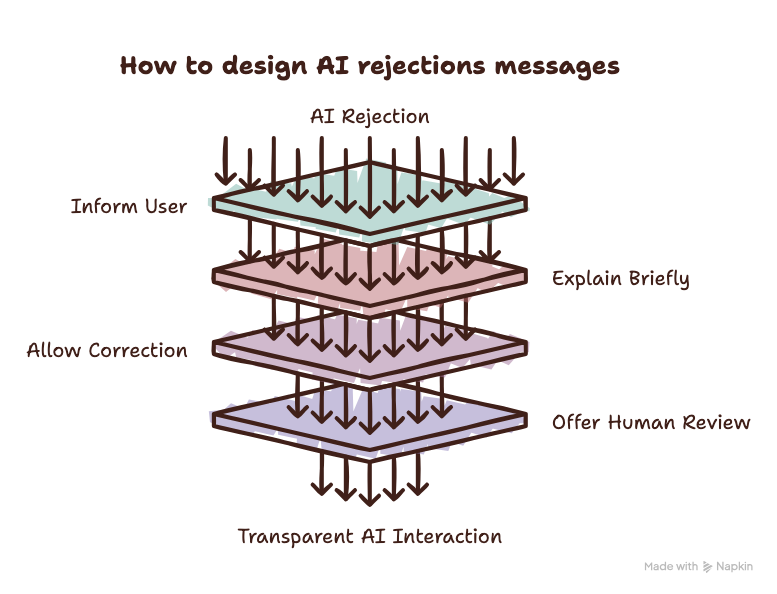
A good AI rejection does four things: lets the user know AI was involved, explains the outcome in plain language, lets users fix or add information, and offers a human review with clear next steps, timelines, and status updates. Together, these steps stop users from getting stuck in a loop of automated rejections.
Key Takeaways
Here’s how AI rejections compare with traditional errors:
| Traditional error | AI rejection | |
|---|---|---|
| Cause | One clear cause, like a file that’s too large or a wrong password | Many signals weighed together, often with no single cause |
| Who’s wrong | Usually the user’s input | Can be the system, even when it works as designed |
| Certainty | The product knows exactly what failed | The system guesses based on patterns |
| What the message can say | The exact problem and how to fix it | A plain-language reason, since some details can’t be shared for fraud or security reasons |
| Retrying | Fix the input, try again, and it usually works | The same information gets the same result |
| What the user needs | A clear fix | A way to add information, a human review, and an appeal |
| Legal rules | No AI-specific rules, though accessibility and consumer-protection rules apply | Transparency and human review rules can apply, for example under the GDPR |
AI systems can do things that traditional software cannot, but that also creates two problems when designing error messages for AI rejections.
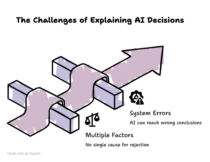
First, unlike typical software, where there is a direct link between the problem and the message shown to the user, AI can make a decision by weighing many pieces of information at once, which means there may be no single cause for the AI rejection. Take a payment blocked by a fraud detection model, for example. The system might look at criteria such as the location of the payment, the device being used, recent account activity, and many other signals to come to a decision. On its own, one of those signals isn’t enough to stop the payment, but together they make the payment look unusual and result in a rejection by the system. In such a scenario, a message such as “Your payment was blocked because of X” may not be true because there may be no single X.
Second, even when the system is working exactly as designed, it can still reach the wrong conclusion. It can also make a decision that makes sense based on the data it sees but is still wrong in the real world. For example, a fraud detection model might notice an unusual payment that falls outside the user’s normal activity. Then, based on its analysis of various signals, it makes a reasonable guess that the payment is fraudulent. However, people don’t always follow patterns, and the payment could still be real. In such a case, the usual instruction to “fix the error and try again” doesn’t make sense. There is nothing for the user to fix because the system is wrong, not the user.
In such cases, error messages should guide users through the decision and show them what they can do next. Trying to explain every part of the AI or offer a fix that might not exist can leave users without a clear next step. This raises a question: How should designers handle an AI rejection in practice? These four steps offer a simple framework for designing better AI rejections.
Companies are increasingly including AI as part of their services, and while that’s often a good thing for the company, not all users will see it that way. Moreover, AI transparency is becoming an essential legal responsibility that comes with using or including AI in certain activities. So, even if it’s challenging to explain to the user why the AI rejected their actions, some explanation is still necessary.
The CJEU established in its Dun & Bradstreet Austria ruling that explanations of automated decisions have to be easy to understand, and simply providing info about an algorithm isn’t enough. Rather than explaining the complexities of an AI model and how it works, simply start by letting users know that AI played a part in the outcome. That basic transparency goes a long way.
For example, for an automated fraud check, you could say something like this: “We could not approve this payment. An automated fraud check helped make this decision.”
Once the user is aware that AI has been involved, they need to know what to do next. This requires some basic understanding of how AI actually makes decisions.
While the complexity differs depending on the model, AI systems often use probability and statistics to make decisions. In practice, this means the model will take the aforementioned signals and give them a confidence score based on a predetermined algorithm. When the score is above a certain threshold, the system is confident enough to act on its own, for example by blocking a payment. Anything under that threshold is uncertain, so instead of deciding alone, the system asks for more information, adds an extra check, or sends the case to a person.
YouTube, for example, explains that its automated systems may make decisions when they have high confidence, while in many other cases they flag content for a trained human reviewer. Granted, explaining confidence scores and probability to users isn’t going to be very helpful. They need a basic answer they can understand and clear next steps. So that’s what you give them.
Uncertainty is part of every AI decision, but showing users a number like “72% likely to be fraud” usually raises more questions for the user than it answers. Google’s People + AI Guidebook explains that number-based confidence indicators assume users understand probability and suggests that showing users confidence scores shouldn’t be done at all if it doesn’t help them decide what to do.
Some simpler ways to show uncertainty include:
AI decision-making signals can often be grouped into various categories depending on the action taken. For example, in a payment failure scenario, some relevant categories would be payment activity, identity, account information, documents, or policy rules. Some discussion with the AI development team can shed light on these various categories.
Once this information is collected, simply letting the user know what category caused the issue is enough to point them in the right direction. For example, if a payment fails due to signals in the payment activity category, a message like “This payment was rejected due to issues with your recent payment activity” is more than enough explanation. What the user actually needs then is a way to fix the problem.
As mentioned earlier, AI rejections can lack a single solution or simply be wrong. However, sometimes it’s just a question of correcting existing information or providing additional details to come to a new decision, and that should always be the user’s first step. They might need to upload a missing document or confirm information about a payment. This depends on the category of the issue.
Regardless, this should be the first step in giving the user a chance to correct the error if a simple solution exists. Uber takes a similar approach when explaining account deactivations: its Review Center is designed to tell drivers what happened, why access was removed, and what options are available next. However, in cases where that simply doesn’t work and the issue persists, other steps have to be taken.
After asking the user to provide or correct information, make sure the next step doesn’t send them into a rejection loop. Fraud and risk models usually give the same answer to the same information, so if the user tries again with the same details, they’ll get the same result every time and get nowhere.
Stripe, for example, uses its machine learning fraud tool, Radar, to block high-risk payments before they ever reach the card issuer. The customer, however, only gets a generic_decline error, the same one used for an ordinary card decline, along with the next step of contacting their card issuer. But since the issuer never receives the original payment, the bank can’t help, and retrying with the same details just triggers the same block.
Moreover, forcing the user to do the same thing over and over again can create friction. So instead, it’s important to create a real second path for the user where a human reviewer can consider an appeal.
Especially in situations where the AI is simply wrong, a human reviewer can take an actual look at the situation, see the relevant information, consider anything new the user provides, disagree with the AI, and change the result. This not only gives users a genuine way of challenging AI decisions, but it also avoids rejection loops and makes it easier for users to accept the final outcome, especially in cases where the AI did in fact make the right decision.
A human review only helps if users can find it and understand it. An appeal that disappears into a support inbox where nothing happens feels like another rejection, so a good appeal flow explains the following to the user:
YouTube uses machine learning as part of its automated content-review systems to decide whether a video should receive limited or no ad revenue. The creator then sees a yellow icon and an impact summary in YouTube Studio explaining what the decision means for their earnings. From there, if they’re unhappy with the outcome, they can submit an appeal, which goes to a human expert who checks the video, title, and metadata against YouTube’s guidelines. Meanwhile, YouTube lets the user know that appeals can take up to 7 days, shows the appeal status next to the video, and sends an email once there’s a decision. This is a good example of an AI rejection in practice, especially one with real financial consequences and clear next steps.
However, YouTube falls short after that first review because only eligible videos get the option to appeal. Each decision also gets only one appeal. Once that appeal is complete, the reviewer’s decision is final and the video’s monetization status won’t change. Deleting and re-uploading the video doesn’t help either, and the user only receives an email with the monetization decision, not an explanation of why the reviewer agreed with the system. So a creator who thinks both the model and the reviewer got it wrong has no next step inside YouTube, which is the “What happens next” gap from the appeal checklist above.
Uber uses AI-powered identity checks and anomaly detection models to flag potential fraud or misuse of user accounts.
For example, drivers are asked to confirm their identity with a selfie from time to time, and unusual activity can lead to an account hold, an extra verification request, or a review by a person. When a driver loses access, the Review Center explains why and gives them a “Request Review” button and a way to upload supporting documents.
Uber also confirms that every appeal is evaluated by a real person. This is also a good example of AI rejections that can directly affect someone’s ability to earn an income.
However, Uber is also a cautionary tale for what happens when this user flow is done badly. In August 2026, the Dutch data protection authority fined Uber €825 million ($966 million) for deactivating driver accounts fully autonomously between 2018–2022 over suspected fraud or low ratings. The regulator’s explanation of the fine was that decisions with major consequences should be looked at by a human first.
Uber has since appealed the fine, claiming that permanent deactivations were not automated, but drivers lost their source of income while they were blocked, which showcases why AI rejections should be taken seriously.
YouTube and Uber show the four steps mostly working, so here’s a made-up example of what happens when none of them are in place. Picture Sam, who uses a banking app to pay their rent. The bank’s AI fraud system flags the payment because it’s larger than usual, going to a new account, and sent from a new phone. The app only shows “Transaction declined” and a “Try again” button.
Sam isn’t told that AI influenced the outcome, doesn’t know what went wrong, and can’t correct any information. So they try again, and every retry goes through the same system with the same information, which results in the same outcome. Sam is now in a rejection loop, so they call customer support, but the agent can only see that the payment was declined and has no way to override it. The rent is late, and Sam loses trust in the bank and risks homelessness because the AI blocked their rent payment. Granted, the end of this scenario is a bit dramatic, but the aim of this hypothetical flow is to show that AI can negatively impact someone’s life, and in some serious cases, someone could be locked out of an important service entirely.
To show how this scenario could be avoided, here’s the same moment with the four steps in place:
The fraud model makes the same call in both versions, but what changes is what the app tells Sam and what it lets them do next.
Rejection and appeal design isn’t just about good UX anymore. In some cases, designing clear explanations and including a human review option can also help meet legal requirements around transparency and user rights.
Here’s a short summary of the main EU rules as of November 2026 and what they mean for designers:
AI has begun to show up in more products every year, and AI rejections are becoming more common. However, the technology isn’t foolproof. The models behind these rejections will sometimes be wrong, and there often isn’t a single reason for a decision. As designers, we can’t change that, but we can control everything around the decision: whether users know AI was involved, whether the message gives them something they can act on, whether they can add information, and whether a person can step in when the system gets it wrong.
This isn’t just theoretical either. Some of the large platforms out there are already taking steps to handle AI rejections. YouTube and Uber both give users a visible way to challenge a decision, even though YouTube ends the conversation after one review. Moreover, the hypothetical fintech flow showcases how similar fraud decisions can feel fair or broken depending on what the user is shown next. And with fines like Uber’s and the EU AI Act’s rules phasing in, designing intuitive AI rejection flows with a clear route to human intervention is becoming a legal requirement as well as good UX.

LogRocket's Galileo AI watches sessions and understands user feedback for you, automating the most time-intensive parts of your job and giving you more time to focus on great design.
See how design choices, interactions, and issues affect your users — get a demo of LogRocket today.

A 2027 guide to 14 cognitive principles for UX designers, with examples for AI-assisted work, mobile navigation, and tasks users need to resume.

Nostalgia-driven aesthetics is a real thing. In this blog, I talk all about 90s website designs — from grunge-inspired typography to quirky GIFs and clashing colors — and what you can learn from them.

AI-generated prototypes can drift from the product you intended to build. Learn how to detect missing requirements, anchor prompts to your design system, and combine AI generation with careful review and manual refinement.

How four Figma AI plugins fit into a UX workflow, from ideation and wireframing to UX writing and design critique. Compare free limits, account requirements, and data handling.

 Learn more →