After more than five years in UX, I’d settled into a comfortable rhythm. I knew my process, my tools, and the kinds of problems I enjoyed solving. But comfort has a downside—it can make it difficult to tell whether you’re still growing.

So after a quick Google search, I signed up for the Daily UI challenge. Partly, I wanted to sharpen my visual design skills. Mostly, I wanted to reconnect with the hands-on side of design that I’d gradually moved away from over the years.
If you haven’t tried it before, the concept is simple. Once you subscribe, you receive a new UI prompt every weekday for 100 days. You interpret the prompt, design a solution, and, if you want, share it on Dribbble or X using the #dailyui hashtag.
I treated it as a personal challenge, so I didn’t publish my work anywhere (apart from this article). But as I worked through the prompts, I realized something had fundamentally changed since I first started designing interfaces.
Back then, the challenge was simply creating a good UI. Today, there’s another decision to make before you even open your design tool: how much of the process should AI handle?
The last time I regularly did UI challenges, everything was manual. I’d sketch ideas, iterate screen by screen, and make every design decision myself. Some of those decisions weren’t great, but they were intentional.
This time, AI could generate multiple concepts in seconds.
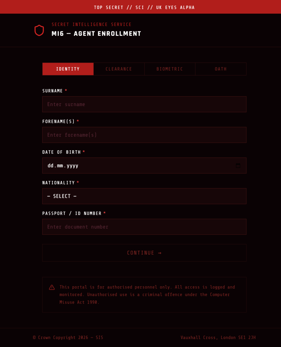
The very first Daily UI prompt asked participants to design a sign-up page, modal, form, or app screen. I decided to approach it in two ways: first, by designing the screen entirely from scratch, and then by creating another version with AI.
The manual version took me around 90 minutes before I was happy with it. The AI-assisted version took seconds to generate several viable directions.
That speed naturally raises a question many designers are asking today: if we’re all using the same AI tools, won’t everyone’s work start looking the same? This concern has become common enough that some designers describe it as the flattening of design—the idea that individual work may improve while overall creativity becomes increasingly homogeneous.
But when I browsed the #DailyUI tag on Dribbble, that wasn’t what I found. The submissions varied dramatically in typography, layout, color, illustration style, and visual personality. Even when participants were responding to the exact same prompt, the solutions rarely looked alike.
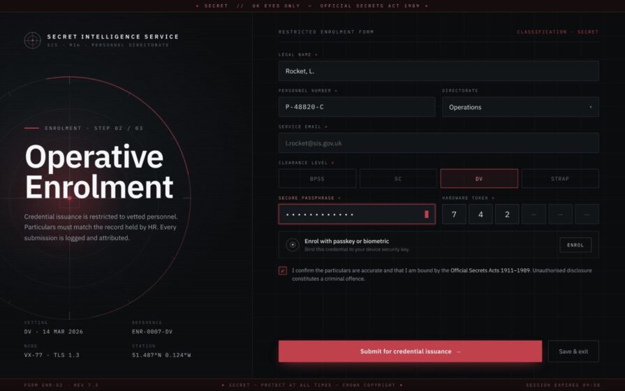
Now, I’m not suggesting every participant used AI. An experienced designer doesn’t need AI to build a sign-up page—they just need time. But AI undeniably sped up my own workflow. And that made me wonder:
If many of us are using the same tools, what actually makes one designer’s work stand out from another’s?
That question ended up becoming the biggest lesson I took away from the challenge.

The Daily UI prompts are intentionally broad. They tell you what to design, but they don’t tell you who you’re designing for, why it exists, or how it should feel. Those constraints are usually where creativity begins.
Challenge #008 asked participants to design a 404 page, so I decided to run a small experiment.
First, I gave AI the challenge prompt exactly as written: “Make me a 404 page.” The result was exactly what you’d expect—a generic, anonymous error page. Nothing about it was objectively bad, but nothing about it was memorable either. It had no personality because the AI had to guess everything the brief left unsaid.
For my second attempt, I invented a client.
Instead of asking for a generic 404 page, I described an Avengers Tower-inspired website. I asked for typography that felt heroic yet reassuring, along with copy that would make users smile after landing on an error page. Naturally, I couldn’t use Marvel’s logos or imagery, but giving the AI a clear creative direction produced a far stronger starting point. After a few rounds of refinement, I ended up with a design I was genuinely happy with.
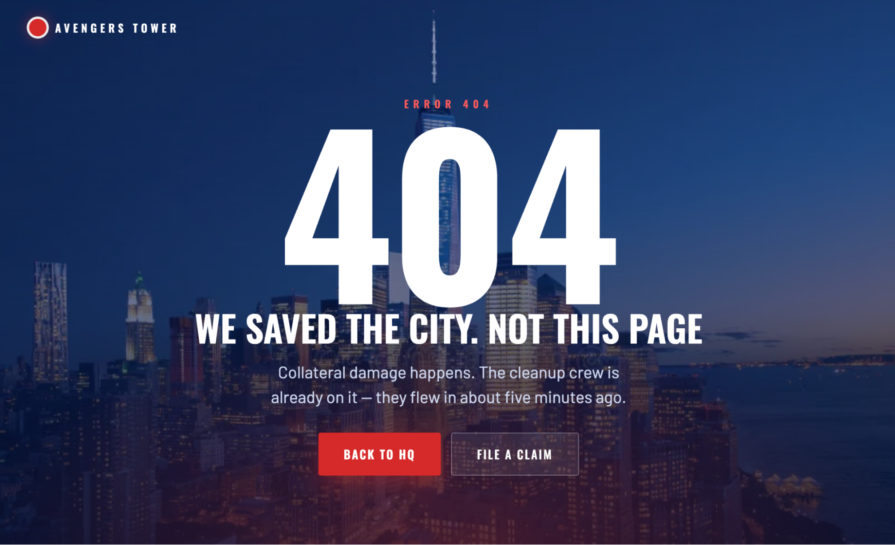
The exercise reinforced something I already knew from UX work: the prompt isn’t the important part—the brief is.
Whether you’re working with AI or designing entirely by hand, it’s worth taking a minute to define the problem before opening your design tool. Ask yourself two simple questions:
Once you answer those questions, decisions about layout, typography, color, imagery, and interaction become much easier. Experienced designers already know how those choices influence emotion and behavior. AI doesn’t. AI simply responds to whatever context you provide.
This lesson extends well beyond AI-assisted design. Whether you’re creating a single UI screen or designing an end-to-end product experience, better briefs almost always lead to better outcomes.
I deliberately alternated between designing manually and using AI throughout the challenge. That wasn’t because one approach was inherently better than the other—I simply wanted to experience both.
What became obvious very quickly was that the tool mattered far less than the judgment behind it.
Some designers see building everything manually as proof of craftsmanship. But long before AI, we were already speeding up our workflows with templates, UI kits, component libraries, and inspiration from sites like Dribbble. Very few professional designers have ever started every project from a completely blank canvas.
AI is simply the newest addition to that toolkit.
Like every tool before it, its first output shouldn’t be mistaken for the final solution. It’s a competent first draft generated by a system that doesn’t know your users, your brand, your business goals, or which of its ideas violate basic usability principles.
That’s still the designer’s job.
Regardless of whether I started with AI or a blank canvas, I found myself asking the same two questions before moving forward:
Is the visual hierarchy directing attention to the most important action?
During Challenge #014, I designed a countdown timer for boxing workouts. My first version looked polished, but it wasn’t immediately obvious what was actually counting down. The visual hierarchy needed work before the interface communicated its purpose clearly.
Would this still feel unique if I replaced the logo and colors?
Every brand has its own personality. In a design challenge, you’re responsible for creating that personality yourself. If swapping out the logo and changing a few colors leaves the design feeling essentially the same, you’ve probably built a generic countdown timer—not one that belongs to a distinct product.
That was exactly what happened with my fictional boxing app, Boxr.
The first version worked, but it could have belonged to almost any fitness app:
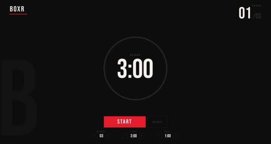
Refining the branding, interaction patterns, and visual language made the final design feel much more intentional:
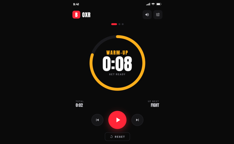
The more I worked through the challenges, the more I realized that AI wasn’t replacing design judgment—it was amplifying its importance. Anyone can generate a polished interface. The real skill lies in recognizing what should change, what should stay, and why.
One thing I didn’t do during the challenge was share my work.
At this point in my career, I figured I didn’t need the feedback. I knew why I had made every decision, where every button led, and what experience I wanted each screen to create.
Then, while writing this article, I realized I’d forgotten one of the most fundamental principles of UX: you’re not the user.
I understood every decision behind my Avengers-inspired 404 page because I designed it. Someone encountering it for the first time wouldn’t have that context. My job wasn’t to design for myself—it was to design for someone who had never seen the screen before.
That’s what feedback is really for.
It’s not about collecting likes or positive comments. It’s about discovering the gap between what you intended to communicate and what users actually understand. By keeping every design to myself, I skipped the one step that could have shown me whether my work made sense to anyone else.
A 404 page that only makes sense to its designer isn’t doing its job.
That said, not all feedback is equally valuable. A feed full of likes tells you people enjoyed looking at your design. It doesn’t tell you whether they could actually use it. If you’re participating in a challenge like Daily UI, ask for feedback that’s tied to usability rather than aesthetics. Questions like these tend to uncover far more useful insights:
Answers like these reveal whether your design communicates what you intended—not just whether it looks polished.
After a few weeks, I started noticing the same mistakes—not only in my own work, but also in discussions surrounding these challenges.
AI makes it incredibly easy to generate something that looks finished before you’ve done any real thinking.
I caught myself doing this more than once. Not every challenge needs an hour of research—a video player (Challenge #057), for example, doesn’t require a full UX audit—but these exercises are supposed to improve your design skills, not just your ability to generate attractive screens.
The fix is simple: spend a minute defining the brief before opening your design tool. That small investment forces you to think about the user and the problem before you think about the interface.
Like many designers, I enjoy refining details. Shadows, gradients, spacing, and typography can easily consume an afternoon.
But polish without purpose isn’t good design.
Take my TV app (Challenge #025). Before tweaking the visuals, I needed to justify the layout itself. Why was content arranged this way? How would someone navigate it from across the room?
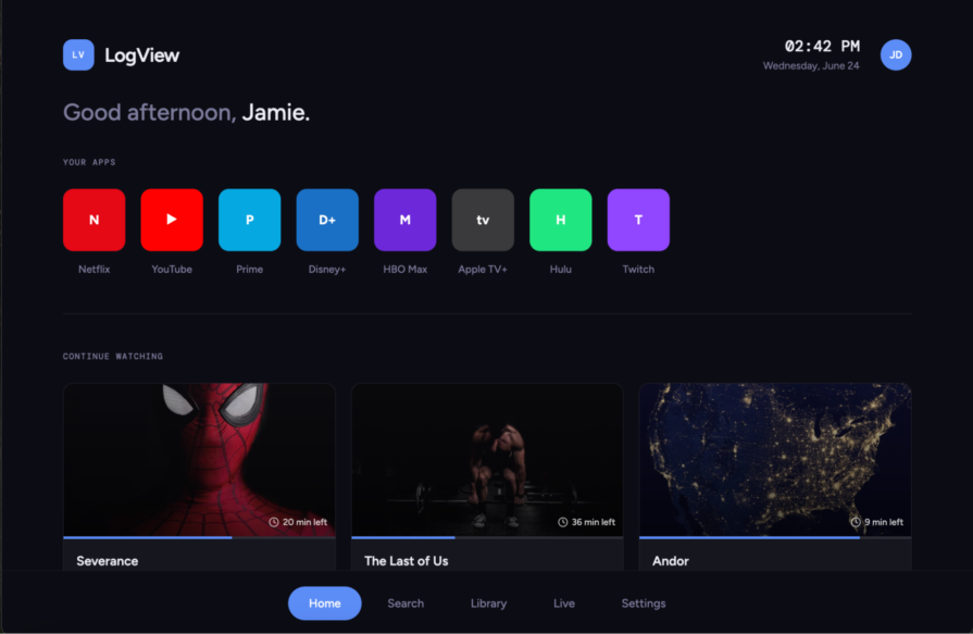
Answering those questions led me to research concepts like the 10-foot rule and overscan margins—topics I hadn’t explored before. That research ultimately improved the design far more than another round of visual polish ever could.
Daily UI prompts almost always focus on the ideal version of a screen.
Real products don’t.
Empty states, loading states, validation, error messages, accessibility, and recovery flows are often where the real UX work happens. AI rarely generates these unless you explicitly ask for them.
You don’t necessarily need to design every state during a one-screen challenge, but you should at least consider what those experiences would look like.
Even though I never published my work, I still found myself comparing it to other people’s designs on Dribbble.
I’d catch myself thinking:
“How do I make mine look better than that?”
That’s a dangerous mindset. The goal isn’t to win imaginary internet points. The goal is to become a better designer.
Once I stopped trying to impress other designers and started focusing on solving the prompt well, I enjoyed the challenge much more—and, ironically, my work improved. To keep myself focused, I started mentally running through the same checklist before every challenge.
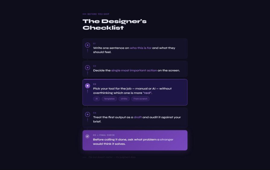
If you’re doing Daily UI purely for fun or to sharpen your skills, that’s enough. But if you’re looking for your first UX role or hoping to attract freelance clients, these exercises can become much more than isolated screens.
The key is to move beyond showcasing the final design and start documenting your thinking.
The most valuable outcome from this challenge wasn’t a single polished screen—it was the comparison between versions.
Take my 404 page, for example. Placing the first version beside the second tells a much more compelling story than either screen could on its own. One was generated from a generic prompt. The other was built around a clear brief with a defined audience, tone, and personality. That evolution demonstrates the design process far better than a finished mockup ever could.
Hiring managers and clients aren’t just looking for attractive interfaces. They want to understand how you think, how you make decisions, and how you improve your work over time.
That said, a single screen still isn’t a case study.
Take my Boxr countdown timer. If I wanted to include it in my portfolio, I’d need to explain much more than the visual design:
Those questions turn a UI exercise into UX work.
To get even more value from each challenge, try documenting your process after every design:
That last step is surprisingly powerful. It shows you’re able to evaluate your own work critically—one of the most valuable skills a designer can develop.
Daily UI worked well for me, but it isn’t the only option—and it won’t be the right fit for everyone.
Before signing up for any design challenge, think about what you’re actually trying to improve. If your goal is visual design, Daily UI is an excellent choice. That’s exactly why I picked it—I wanted to rebuild the interface design muscles I’d neglected over the past few years. But if you’re trying to improve UX writing, user research, service design, or end-to-end product thinking, designing one screen a day probably won’t help you practice those skills. Choose a challenge that matches the work you want to become better at.
Next, consider the pace.
A new prompt every weekday sounds manageable until life gets in the way. I certainly didn’t complete all 100 prompts, nor did I always finish them on schedule. That’s okay. The goal isn’t to maintain a perfect streak—it’s to build a sustainable practice. If a daily challenge feels overwhelming, look for weekly prompts or longer-form challenges that allow more time for research and iteration.
Finally, pay attention to the community.
One of the biggest benefits of these challenges isn’t the prompts themselves—it’s the opportunity to receive thoughtful feedback from other designers. Whether that’s through Dribbble, ADPList, or another design community, look for spaces where people offer constructive critique rather than simply handing out likes.
Even if you’re hesitant to share your work, getting comfortable receiving—and acting on—feedback is an essential part of becoming a better designer.
I joined the Daily UI challenge to reconnect with hands-on design and sharpen my UI skills. It did exactly that—but it also reminded me of something I hadn’t expected.
The tools weren’t the most important part.
AI can generate polished interfaces in seconds, but it can’t decide who you’re designing for, what tradeoffs matter, or whether an interface actually solves the right problem. Those decisions still belong to the designer.
In fact, I think AI has made design judgment even more valuable. When almost anyone can produce a good-looking screen, what separates great designers isn’t their ability to create pixels—it’s their ability to define the problem, make intentional decisions, evaluate tradeoffs, and refine ideas through feedback.
That’s what I ended up practicing the most.
The Daily UI challenge wasn’t just an exercise in creating interfaces. It was an exercise in thinking like a designer. And that’s a skill no tool can generate for you.
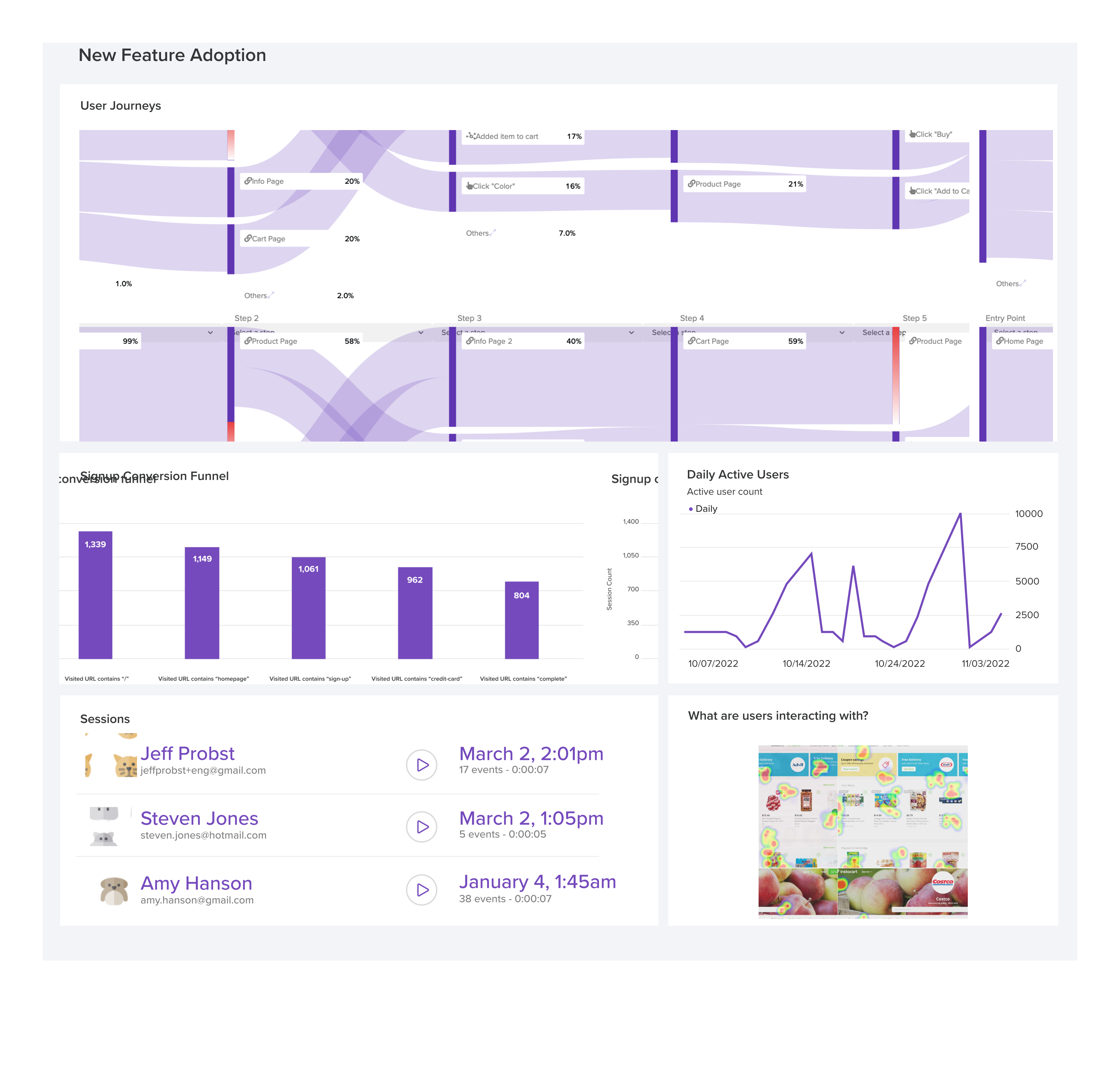
LogRocket's Galileo AI watches sessions and understands user feedback for you, automating the most time-intensive parts of your job and giving you more time to focus on great design.
See how design choices, interactions, and issues affect your users — get a demo of LogRocket today.

After years of designing and building digital products, I’m sharing 10 UX lessons that challenged my assumptions about minimalism, AI, familiarity, and more.

Brand archetypes can define your personality, but they don’t tell you what to say. The imagined speaker technique turns an abstract archetype into a real voice you can write through.
Finding the right UX research participants is hard, and AI has made verifying them even harder. Here’s how to recruit real users, screen for quality, and use synthetic participants without compromising your research.

Navigation menus aren’t always the fastest way forward. Explore how search, personalization, AI, and conversational interfaces are changing how users find what they need, and why traditional navigation still matters.


 Learn more →