Most UX designers are familiar with some version of the design process. Whether it’s the double diamond, design thinking, agile UX, or another framework, these models are meant to help designers move from an unclear problem to a finished product.
On paper, they usually follow the same broad pattern: research, analysis, ideation, and testing. When I was starting out, I loved that structure. I got especially familiar with the double diamond and followed it almost religiously. As someone who likes order, having a step-by-step process that promised to lead me toward the “right” design felt reassuring.
But the more projects I worked on, the harder it became to follow those steps exactly. What once felt like a helpful framework started to feel like a constraint. Over time, I stopped relying on the double diamond so heavily, and eventually, on rigid UX frameworks in general.
That doesn’t mean I abandoned research, analysis, ideation, or testing. I still use those fundamentals. I just stopped treating them as a fixed sequence that every project has to follow.
Design processes exist for a reason. When you’re working on a team, different people are responsible for different parts of the work. A shared process gives everyone a roadmap from the initial problem to final handoff. It helps teams avoid duplicated effort, stay aligned, take each phase seriously, and keep stakeholders informed along the way.
That structure is useful. The problem starts when the process becomes the focus of the work instead of a tool that supports it.
At some point, teams can become more concerned with where they are in the process than with whether they’re solving the right problem. Conversations start to revolve around questions like: What phase are we in? Have we done enough discovery? Should we create more personas?
Those questions aren’t inherently wrong. But they can become a distraction if they pull attention away from the real purpose of UX work: understanding and solving a user problem.
I don’t think this happens because teams are careless. More often, process becomes a substitute for things the team hasn’t fully built yet, such as alignment, confidence, or stakeholder trust. A structured process makes uncertainty feel more manageable. Moving to the next phase can feel like progress, even when the team is still unsure whether it understands the problem.
Stakeholders see a clear roadmap and feel reassured. Teammates can agree on the steps, even if they don’t fully agree on the direction. In that sense, a polished process can sometimes hide a weak product strategy. A team can follow the double diamond perfectly and still launch something that misses the mark if the work was never truly centered on the user.
The other problem is that real projects rarely give you ideal conditions. Different projects come with different constraints, and going through every step of a design process is not always realistic.
I learned this while working on a mobile banking app. My team was brought in to fix the home screen, which had become cluttered over time as more features were added. Users were struggling to navigate it, and the company needed the issue addressed before a major campaign launched.
We had three weeks.
In theory, the “proper” UX process would have included a full discovery phase, user research, personas, and journey mapping before we started designing. In reality, we didn’t have that kind of time. So we worked with what we had. I reviewed existing user data and support tickets to understand where people were getting stuck. At the same time, we reached out to as many users as possible and were able to interview four of them about where the experience became confusing.
Combined with analytics data, those interviews helped us identify three main issues. From there, we moved quickly into high-fidelity mockups. There were four of us on the team, and because the stakeholders already had an established design system, each of us created one possible direction. The mockups were not perfect, but they were concrete enough to test with the same users. Once we had their feedback, we sent the strongest changes to the developers.
None of those decisions were made with complete certainty. With only three weeks, we couldn’t explore every edge case or validate every assumption. So instead of looking for absolute proof, we looked for patterns strong enough to act on.
For example, analytics showed that about 35 percent of users were dropping off halfway through the quick transfer flow, after selecting a recipient but before completing the transfer. The flow itself wasn’t especially long, but that moment of uncertainty was enough to cause real hesitation. Session recordings and support tickets pointed to the same issue, and the user interviews confirmed it.
More discovery would have been ideal. More time almost always is. But the real question wasn’t, “Do we know everything?” It was, “Do we know enough to make a solid decision right now?”
Sometimes, that is the most realistic standard a team can work with. Those were some of the most stressful two and a half weeks of my life, but the project taught me three lessons I still carry into my design work.
In law, there’s a principle called proportionality. It means that even when authorities are pursuing a legitimate goal, they should use the least invasive measure needed to achieve it.
I think the same idea applies to design work.
Not every project needs a long discovery phase, detailed personas, or a full journey-mapping exercise. The process should fit the problem. Before deciding which UX activities to use, ask: What do we actually need to learn or validate to make a good decision?
From there, choose the lightest process that still gives you enough confidence to move forward. Cut the steps that don’t serve the project, but don’t cut corners where the risk is high.
That last part matters. Sometimes, a more formal process is exactly what the project needs. In enterprise products, regulated industries, or large launches involving multiple teams, structure can reduce risk and keep everyone aligned. The goal isn’t to make the process as small as possible. It’s to make it proportional.
The process should match the situation, not be heavier or lighter than it needs to be.
One useful thing about UX processes is that they’re often linear. First research, then analysis, then design, then testing. That structure makes work easier to track, especially on larger teams.
But real projects don’t always move in neat phases. When timelines are tight, some parts of the process have to happen in parallel.
If you can analyze existing data while recruiting users, do it. If you can sketch early concepts while still gathering research, do it. If you can start testing rough ideas before every question is answered, do it.
The point is not to rush through the work. It’s to keep the work moving while still learning. In fast-moving product environments, priorities can change faster than a formal process can keep up. A plan that made sense at the beginning of a project can become outdated within a few weeks.
Blending phases is not just about saving time. It helps the work stay relevant as the project changes.
Designers and developers can be a great team when communication starts early. Designers may understand the user problem, but developers understand what is technically feasible. A solution can look great in Figma and still be unrealistic to build within the timeline, budget, or system constraints.
That’s why I try to involve developers before the design feels final.
On the mobile banking app project, we walked the developers through all four design directions before testing them with users. Luckily, all four were feasible within the timeline. But if one had been too complex, we would have known early enough to adjust instead of discovering the issue at the handoff stage.
The same applies to PMs and stakeholders. When they are involved early, decisions about scope, priorities, and feasibility happen together. UX becomes part of an ongoing conversation rather than something designers present at the end and then have to defend.
That shift matters. Less time goes into justifying decisions, and more time goes into making better ones.
Those three lessons changed how I approach design work. Instead of trying to follow a process perfectly, I now focus on choosing the right amount of process for the problem in front of me.
At the start of any project, I try to understand what resources are already available. These are the things that can help shape the process before I decide what additional research or design work is needed.
For the mobile banking app project, we had access to the company’s design system, some legally shareable user data, and support tickets from the customer service team. Those resources immediately changed what our process needed to look like. We did not have to start from zero because we already had signals we could use.
Every company will have a different set of tools available. Some teams may have analytics access, previous user research, support tickets, product documentation, an established design system, or direct access to developers and PMs. Others may have legal, technical, or regulatory constraints that shape what is possible.
The first step is to figure out what you already have, what you can realistically access, and what those resources can tell you.
Next, I focus on alignment. Before trying to solve the problem, I want to understand what the team already knows, or thinks it knows.
This usually means asking questions like:
This is the part of the process where the client or internal team catches you up. You are not just collecting context; you are also learning how they define the problem. That distinction matters, because the way stakeholders describe the issue is not always the same as the way users experience it.
Once I know what the team already believes, I look for the gaps.
This is the user-centered part of the process. When there is not enough time for a full discovery phase, the most useful thing you can do is identify what you still need to learn directly from users. What are they struggling with? Where are they hesitating? What are they trying to accomplish? What part of the experience is unclear?
For the mobile banking app, we knew users were struggling with the home screen and transfer flow, but we did not know exactly where the confusion was happening or why it made them hesitate before completing a transaction.
So we listed what we did not know, wrote down a few assumptions from testing the app ourselves, and then used the available data to narrow the problem. When the data could not explain the full picture, we asked users directly.
That combination mattered. The data showed us where the problem was happening. The user conversations helped us understand why.
When you start prototyping depends on the timeline, scope, and risk of the project. But in general, I’ve found that it helps to start earlier than feels comfortable.
On the mobile banking app project, we began sketching possible layouts while we were still identifying the unknowns. Those early ideas were based on assumptions, so we did not treat them as final. But they gave us something concrete to react to, refine, and eventually test.
Once we had more information from users, those sketches became the foundation for mid-fidelity and then high-fidelity wireframes.
The goal is not to rush into design before understanding the problem. It is to let research and design inform each other. Early prototypes can expose gaps in your thinking, make abstract problems easier to discuss, and give users something specific to respond to.
Better information will always make the design stronger. But that does not mean design has to wait until every question is answered.
There is some irony in saying I no longer believe in rigid UX processes and then offering a process of my own. But the difference is that I do not treat this framework as fixed.
It changes depending on the project.
Some teams already have strong research, clean analytics, and clear stakeholder alignment. Others need more help defining the problem before any design work can begin. Some projects need a careful, formal process. Others need a lighter approach that helps the team make a solid decision quickly.
That is why reflection has become one of the most important parts of my workflow. After each project, I look at what worked, what slowed us down, what we missed, and what could be simplified next time.
Over time, that reflection has helped me build reusable tools: intake questions, resource checklists, prototype templates, and a habit of bringing developers into the conversation early. These things do not replace the design process. They make it easier to shape the right process for the project in front of me.
Using a design process is not a bad thing. At its best, it gives teams structure, keeps people aligned, and helps designers make more intentional decisions for users.
But the process is not the point. The point is solving the right problem for the end user.
In ideal conditions, a structured UX process can lead to thoughtful, well-tested outcomes. But real projects rarely happen in ideal conditions. Timelines shrink, priorities shift, stakeholders disagree, and teams often have to make decisions with incomplete information.
That is why designers need to treat the process as a tool, not a rulebook. Adapt it to the project’s needs. Blend phases when it helps the work move forward. Collaborate with developers, PMs, and stakeholders early enough for their input to shape the direction.
A good UX process should support better decisions. It should not get in the way of making them.

LogRocket's Galileo AI watches sessions and understands user feedback for you, automating the most time-intensive parts of your job and giving you more time to focus on great design.
See how design choices, interactions, and issues affect your users — get a demo of LogRocket today.
UX testing is not limited to layouts, copy, and visual design. Full-stack and server-side experiments help teams evaluate how backend logic, APIs, algorithms, and product flows affect the overall user experience.
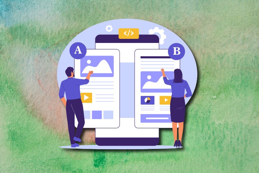
In A/B, A/B/n, or multivariate testing scenarios, using p-value with traditional null-hypothesis-based statistical analysis is so common, and most designers […]
Traditional A/B testing splits traffic evenly, but multi-armed bandits dynamically send more users to the better-performing version. Here’s how the method works, where it helps, and when UX teams should use it over classic A/B testing.
AI agent simulations promise faster, lower-risk UX testing by replacing real users with AI-simulated personas. Here’s how the method works, where it falls short, and when designers should rely on simulated users versus real user testing.


