Editor’s note: This article was last updated 15 November 2022 to reflect changes made in MUI v5, including removing the deprecated createMuiTheme function.

With over 82k stars and 2,600 contributors on GitHub at the time of writing, MUI is one of the most loved UI component libraries for React developers. With its diverse set of commonly used UI components, developers can quickly and easily build web interfaces, focusing on functionality instead of UI implementation.
MUI uses principles from the material design guide created by Google. In this article, we’ll explore MUI and review three different ways to add custom fonts to your MUI project. Let’s get started!
This article assumes that you use Create React App or any of the other React toolchains. If you’re setting up your own toolchain and build pipeline, be sure to include a plugin or loader for loading fonts.
To get started, install Create React App as follows:
/ with npm
npx create-react-app font-app
//with yarn
yarn create-react-app font-app
To use MUI in your application, install it via npm or yarn:
// with npm
npm install @mui/material @emotion/react @emotion/styled

// with yarn
yarn add @mui/material @emotion/react @emotion/styled
Then, we’ll add some UI components to work within our App.js folder:
import Button from '@mui/material/Button';
import Typography from '@mui/material/Typography';
import './App.css';
function App() {
return (
<div className="App">
<div>
<Typography variant="h2" gutterBottom>
Welcome to React
</Typography>
<Button variant="contained" color="secondary">Ready To Go</Button>
</div>
</div>
);
}
export default App;
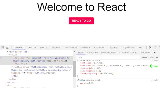
Using your browser’s inspector to inspect the button and header, you’ll see that the UI components are rendered using the default font family of Roboto. So, how do we change that?
We’ll go through three different ways to add any font of your choice to your MUI project.
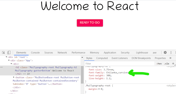
Head over to Google Fonts and select the font family of your choice; I’ll use the Chilanka Cursive font. Copy the CDN link and add it to the <head> of the public/index.html file as follows:
<link href="https://fonts.googleapis.com/css2?family=Chilanka&display=swap" rel="stylesheet">
To use the font, you’ll have to initialize it using CreateTheme, an API provided by MUI that generates a custom theme based on the options received, and ThemeProvider, a component used to inject custom themes into your application.
Add the code below to your App.js file:
import { createTheme, ThemeProvider } from '@mui/material';
const theme = createMuiTheme({
  typography: {
    fontFamily: [
      'Chilanka',
      'cursive',
    ].join(','),
  },});
Then, wrap your components with the default MUI ThemeProvider component, passing it theme props. The value of the theme props should be the name of your defined theme:
<ThemeProvider theme={theme}>
 <div className="App">
   <div>
     <Typography variant="h2" gutterBottom>
       Welcome to React
     </Typography>
     <Button variant="contained" color="secondary">Ready To Go</Button>
   </div>
 </div>
</ThemeProvider>
Inspecting the components now with the browser inspector tool, you’ll find that the font family has changed to Chilanka:
There are some benefits of self-hosting your fonts. It is significantly faster, and your fonts can load offline.
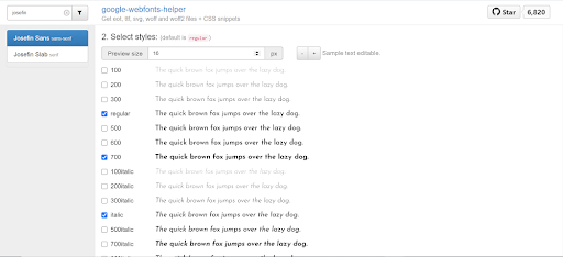
google-webfonts-helper is an amazing tool that makes self-hosting fonts hassle-free. It provides font files and font-face declarations based on the fonts, charsets, styles, and browser support you select.
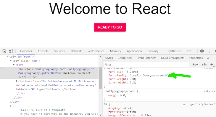
Simply search for any Google Font and select the desired font weights. I’ll use Josefin Sans:
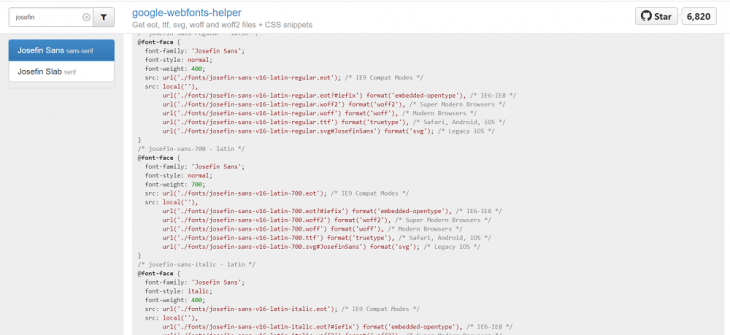
Copy the resulting font-face declarations into your src/index.css file. You can customize the font file location. The default assumes ../fonts/. We’ll use ./fonts because we’ll place the downloaded fonts in the src/fonts directory:
Finally, download your files. Unzip them and place them in your project in the appropriate location, src/fonts.
Like before, you’ll have to define the font family using CreateTheme and then wrap your components with the ThemeProvider component:
const theme = createTheme({
 typography: {
   fontFamily: [
     'Josefin Sans',
     'sans-serif',
   ].join(','),
},});
Inspecting now, you should see that the font family has changed to Josefin Sans:
Typefaces is a collection of npm packages for Google Fonts as well as some other open source typefaces created by Kyle Matthews. Just like other dependencies, you can add a font to a project by installing it with npm. Using Typefaces is my favorite method because all website and web app dependencies should be managed through npm whenever possible.
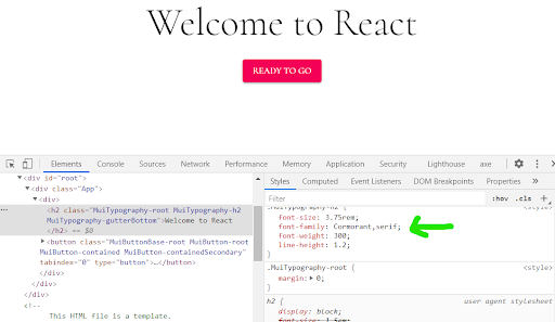
Simply search through the repo for a typeface and click on the font folder to find the correct npm installation command. I’ll go with Cormorant:
npm install typeface-cormorant
Then, import the package into your project’s entry file, src/index.js in our case:
import "typeface-cormorant";
Like before, you’ll have to define your font family using CreateTheme and wrap your components with the Themeprovider component:
const theme = createTheme({
  typography: {
    fontFamily: [
      'Cormorant',
      'serif',
    ].join(','),
},});
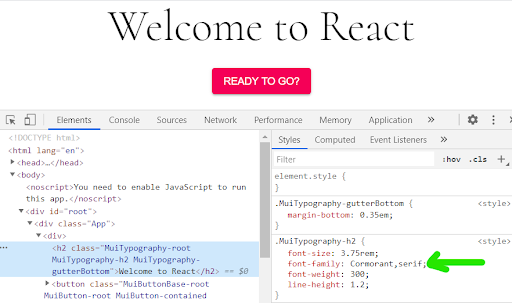
Inspecting now, you’ll see that the font family has changed to Cormorant:
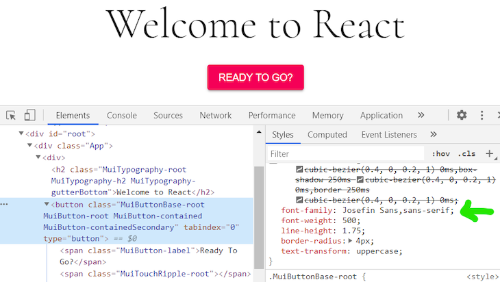
What if you want to define different fonts for our header and button. Say, a primary font and a secondary font?
You’ll simply define two theme constants and wrap the intended components with the Themeprovider component, each with a theme prop of the corresponding font.
For example, if you want to use the Cormorant font for the heading and Josefin Sans for the button, you’ll first define two themes for the two fonts, respectively:
const headingFont = createTheme({
  typography: {
    fontFamily: [
      'Cormorant',
      'serif',
    ].join(','),
},});

const buttonFont = createTheme({
  typography: {
    fontFamily: [
      'Josefin Sans',
      'sans-serif',
    ].join(','),
},});
Then, wrap the target components with a ThemeProvider component of the required font, like below:
function App() {
  return (

    <div className="App">
      <div>
        <ThemeProvider theme={headingFont}>
          <Typography variant="h2" gutterBottom>
            Welcome to React
          </Typography>
        </ThemeProvider>
        <ThemeProvider theme={buttonFont}>
          <Button variant="contained" color="secondary">
                         Ready To Go
          </Button>
        </ThemeProvider>

      </div>
    </div>
  );
}
Viola! You’ll see now that the heading is rendered with the Cormorant font and the button with the Josefin Sans font:
In this article, we covered three simple ways to add custom fonts to a MUI project, including the Google Fonts CDN, google-webfonts-helper, and npm. We also looked at how to define separate fonts for different components. Be sure to leave a comment if you have any questions, happy coding!
Install LogRocket via npm or script tag. LogRocket.init() must be called client-side, not
server-side
$ npm i --save logrocket

// Code:

import LogRocket from 'logrocket';
LogRocket.init('app/id');
// Add to your HTML:

<script src="https://cdn.lr-ingest.com/LogRocket.min.js"></script>
<script>window.LogRocket && window.LogRocket.init('app/id');</script>
Hey there, want to help make our blog better?
Join LogRocket’s Content Advisory Board. You’ll help inform the type of content we create and get access to exclusive meetups, social accreditation, and swag.
Sign up now
Learn how OpenAPI can automate API client generation to save time, reduce bugs, and streamline how your frontend app talks to backend APIs.

Discover how the Interface Segregation Principle (ISP) keeps your code lean, modular, and maintainable using real-world analogies and practical examples.

<selectedcontent> element improves dropdowns

Learn how to implement an advanced caching layer in a Node.js app using Valkey, a high-performance, Redis-compatible in-memory datastore.


3 Replies to "3 ways to add custom fonts to your MUI project"
What version of Material UI are you using in this blog post?
Version ^4.11.0
I am having trouble with google font and various weights. For example, Raleway font with bold (700), semibold (600) and regular 400. How do you define that or it should work out of the box?