

Editor’s note: This article was updated in October 2026 by Ikeh Akinyemi to reassess the library selections and their maintenance, revise Tailwind v4 setup guidance, and clarify framework support and free versus paid offerings. The comparison table and recommendations now provide more specific guidance by use case.

Tailwind CSS component libraries give you reusable interface elements built around Tailwind’s utility classes. Depending on the library, you can start with styled markup, install interactive React components, or use unstyled primitives and build the appearance yourself.
The choice affects how you customize components and maintain them after launch. This guide compares 13 options with free components, including libraries that sell additional templates or blocks. Each entry explains where the library fits and what work remains for your team.
Tailwind lets you apply styles in your markup using utilities for layout, spacing, color, and other CSS properties. Responsive variants help you adjust those styles at different breakpoints, while shared theme values keep components consistent.
In Tailwind v4, the @theme directive defines theme variables in CSS. Existing JavaScript configuration files can be loaded explicitly through the @config directive, although some legacy configuration options are unsupported.
Tailwind v4 also detects source files automatically and generates utilities from the classes it finds. You may need to register additional sources, particularly when components live in an external package. Custom CSS remains useful for styles that utilities do not express conveniently.
A component library saves you from assembling the same buttons, menus, and form layouts for every project. The important question is how much of that component’s styling and behavior you want the library to provide.
Start with your framework and the components your project needs. A collection of HTML snippets can work across several stacks, but interactive examples may still require JavaScript setup. React components need a React application, while Headless UI offers separate React and Vue packages.
Next, decide how you want to maintain the code:
Installation and Tailwind integration are separate considerations. For example, daisyUI installs through npm and registers as a Tailwind plugin. A registry component can add local source files while also installing runtime dependencies.
Check the free catalog before committing to a library. Component totals may include variants or paid blocks, and a Figma kit may have different terms from the code. For interactive components, test keyboard behavior and focus management in your own application.
The best fit depends on your framework and the amount of styling and behavior you want to implement yourself.
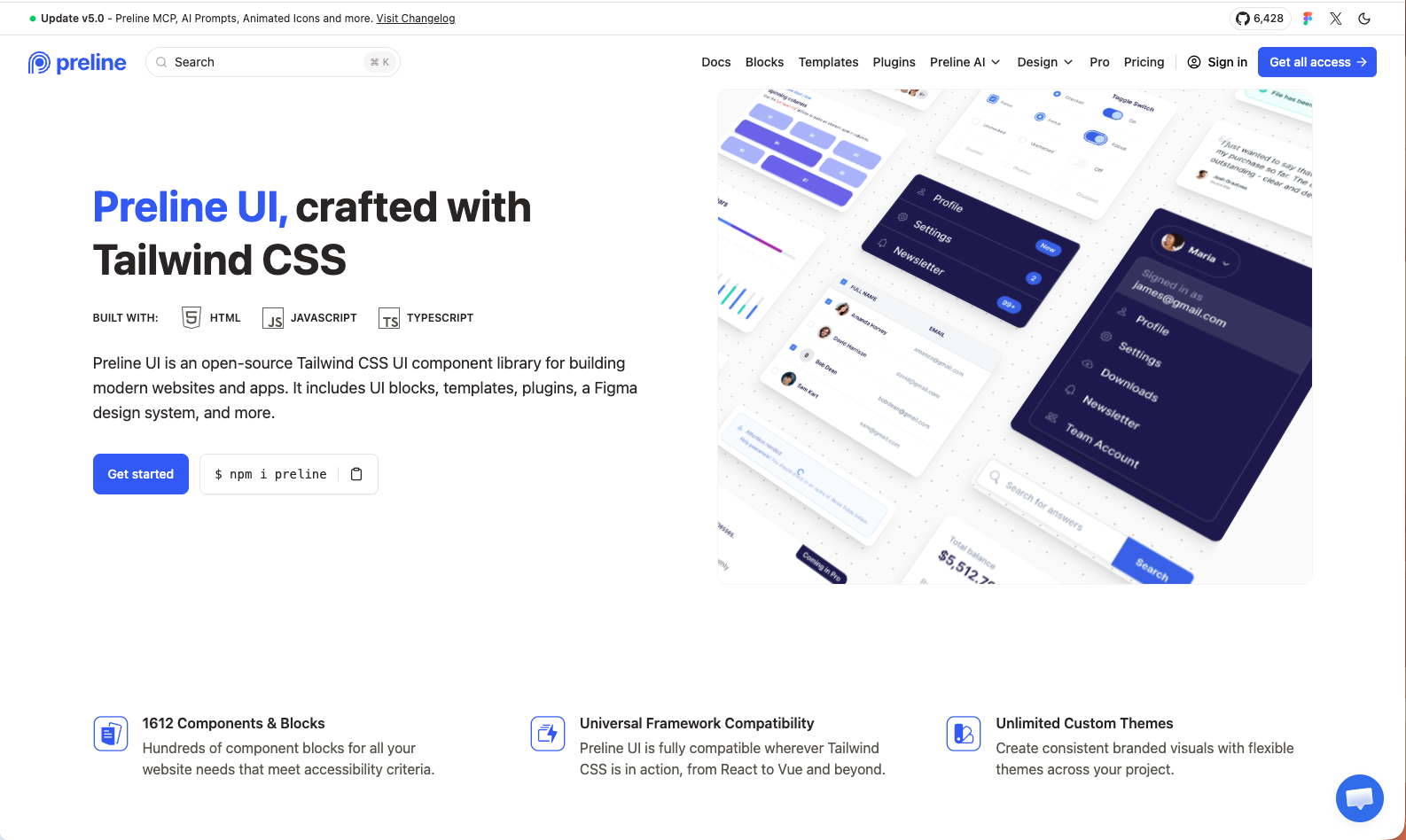
Preline UI combines Tailwind components with JavaScript plugins, page blocks, and templates. Its framework guides cover integrations such as React, Vue, and Laravel, and its TypeScript support helps when configuring interactive elements.
Preline is useful when a project needs both application screens and marketing pages from one catalog. It also offers a free Figma design system. Follow the framework-specific setup for its JavaScript plugins, especially when navigation changes the DOM after the initial page load.
The advertised 1,612 components and blocks span free and paid resources. Check the individual item’s availability before choosing it. Preline’s license page includes both MIT and Fair Use terms, which deserve attention if you plan to redistribute a UI kit or build a competing component product.
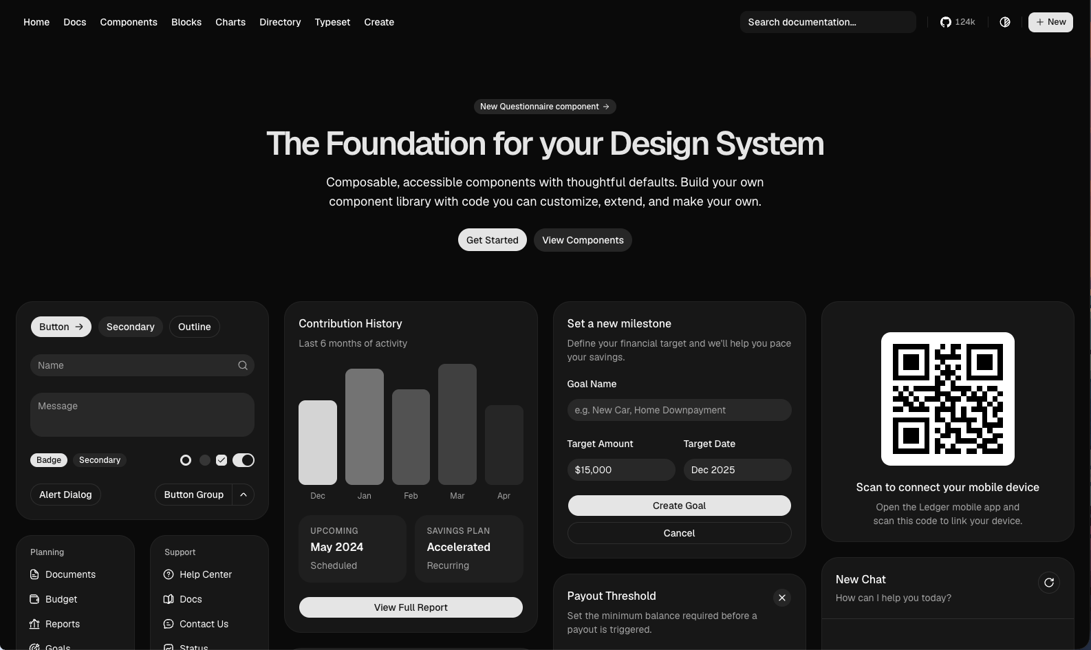
shadcn/ui uses a CLI to add component source to your React project. You can edit that source directly, including its Tailwind styles and behavior. The project supports Tailwind v4 and uses CSS variables for theming.
Its registry system also lets teams distribute their own components. The CLI can install from third-party or private registries, and the official MCP server gives compatible AI assistants access to registry components. Those integrations provide a documented way for coding tools to work with the library.
Choose shadcn/ui when your team wants to customize components in the application codebase. You will also need a process for reviewing upstream fixes and applying them to modified copies. The core project is MIT licensed; check the terms of third-party registries separately.
For implementation examples, see the shadcn/ui adoption guide and our guide to building shadcn components with AI.
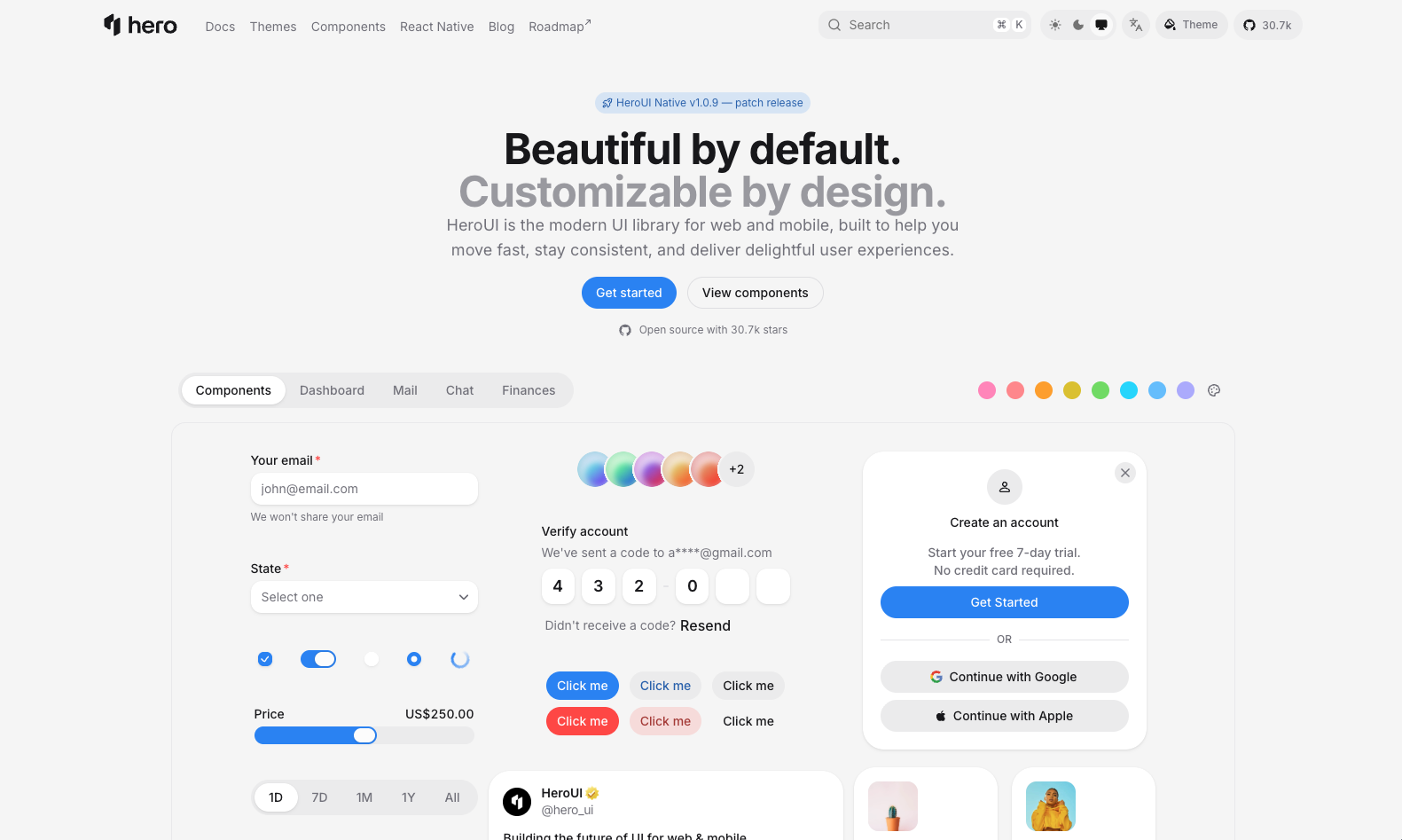
HeroUI, formerly NextUI, provides styled React components as an npm dependency. Its v3 web library combines React Aria Components with Tailwind v4, offering typed APIs and a theming system.
It suits React applications that need a consistent set of interactive components with styling already in place. Teams can customize the theme while managing library updates through package versions. React Aria supplies accessible interaction behavior, although the completed interface still needs testing.
HeroUI’s free library uses the Apache 2.0 license. Its separate Pro offering includes templates and other paid resources. Review the migration guide when upgrading an existing NextUI or HeroUI v2 application, since this entry describes v3.
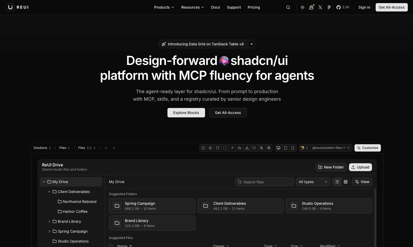
ReUI offers shadcn-compatible components for application interfaces, including forms and data-heavy screens. Components are added as editable source, and the catalog includes implementations built on Base UI.
It is worth considering when you already use shadcn/ui and need more application patterns than its core catalog provides. Check the dependencies and primitive library used by each component before adding it to an existing design system.
ReUI separates its free component offering from paid resources such as templates and premium assets. Treat the catalog’s size as a starting point for browsing, then confirm that the particular component or block you need is free.
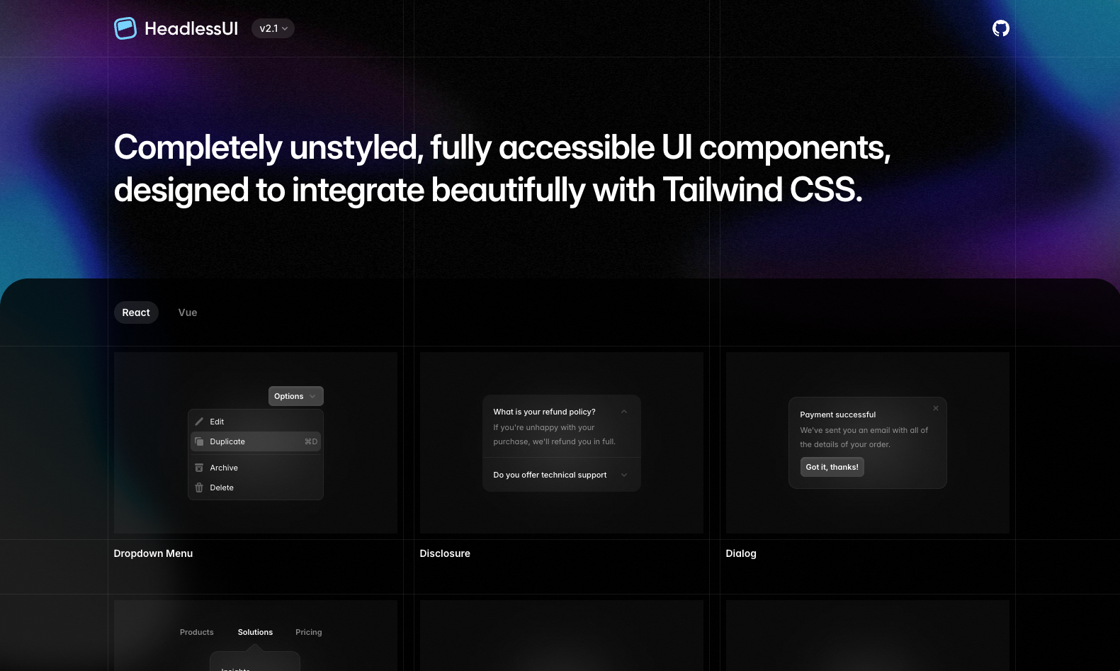
Headless UI provides unstyled interactive components from the Tailwind CSS team. Its React and Vue packages cover controls such as dialogs, menus, tabs, and comboboxes, with behavior including keyboard navigation and focus management.
Use it when a project has an established visual design and needs help implementing interactive controls. You supply the Tailwind classes and layout, which gives you control over the appearance but also leaves more styling work to your team.
Headless UI is MIT licensed. Check the documentation for your framework because the React and Vue packages have separate APIs and release histories. Accessible primitives provide a foundation; labels, contrast, and the way controls fit together remain application responsibilities.
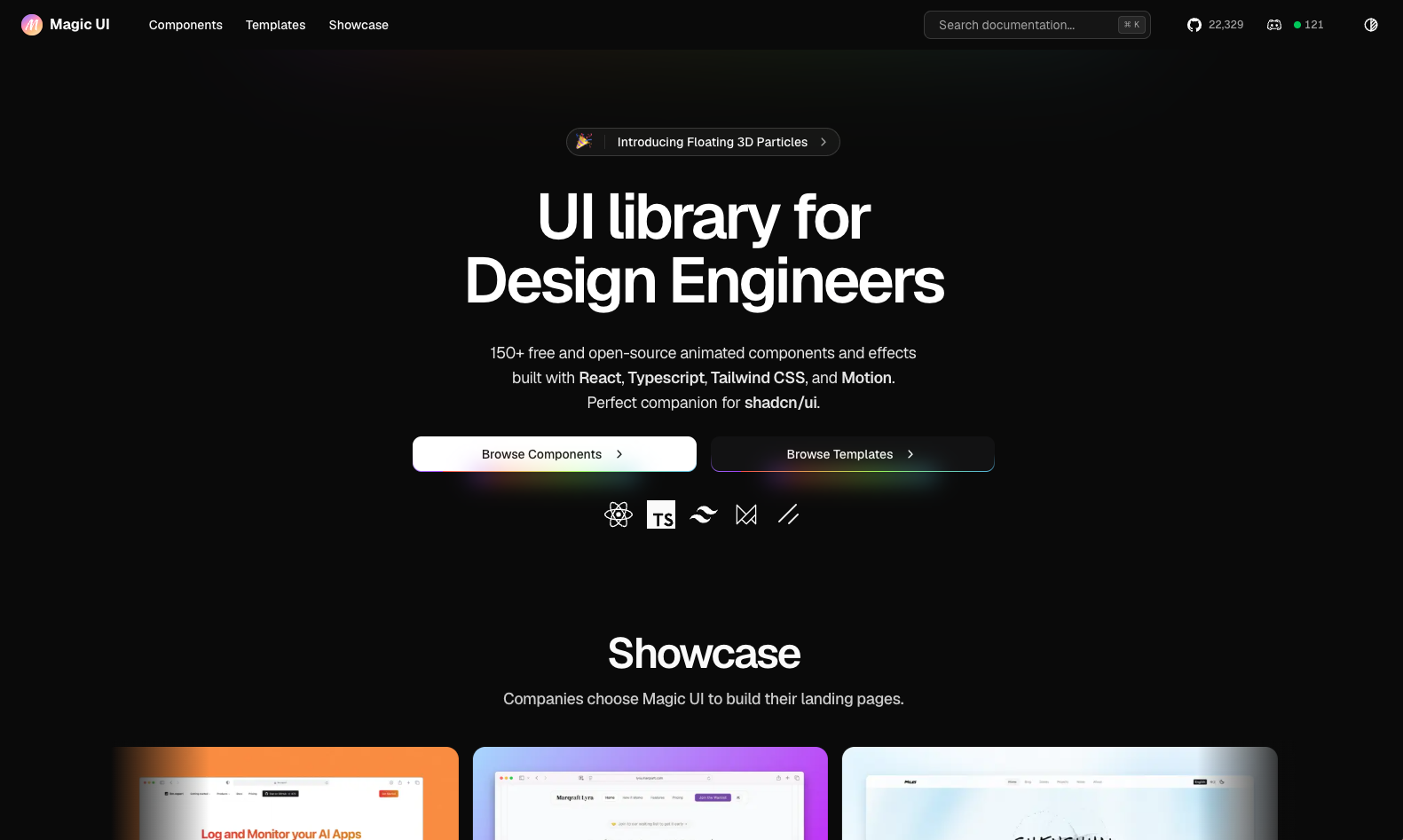
Magic UI supplies animated React components that can be added to a shadcn/ui project. Its catalog includes text effects, animated backgrounds, and elements such as marquees and shimmer buttons, built with Tailwind and Motion.
It fits marketing pages that need specific animated elements. You can install components through the shadcn CLI and adjust their source to match the site’s design.
The free components use the MIT license, while Magic UI Pro offers additional paid resources. Check each component’s dependencies and reduced-motion behavior before shipping it. Your team still needs to compose the page and assess how several effects perform together.
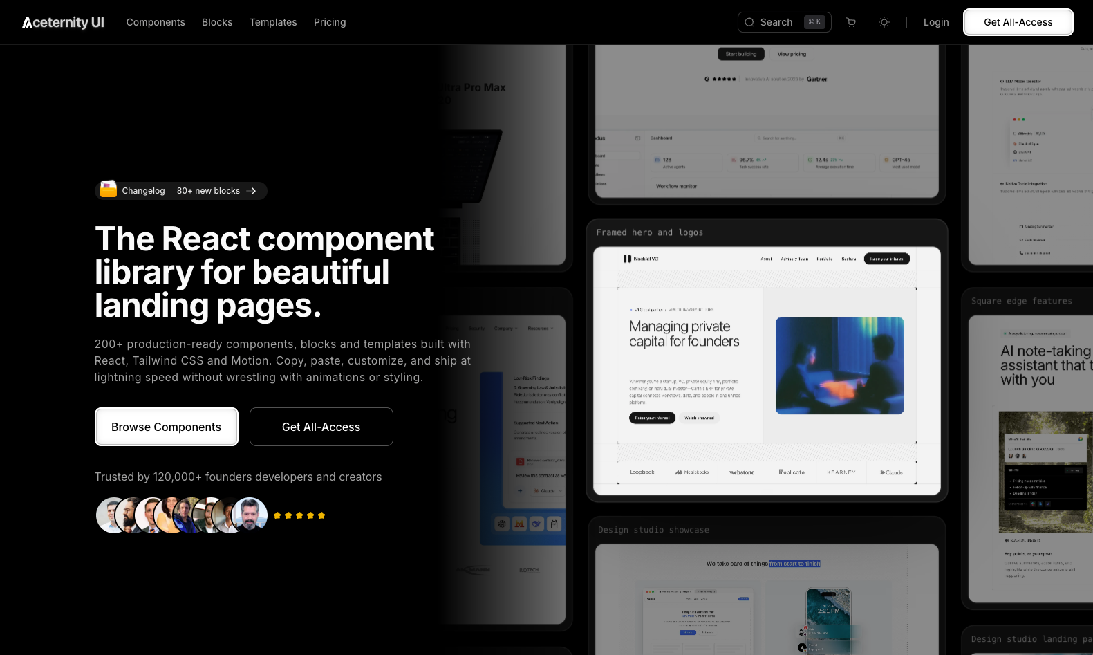
Aceternity UI focuses on visual effects such as 3D cards, spotlights, animated backgrounds, and scroll-driven interactions. Its React components use Tailwind and animation dependencies such as Motion, formerly Framer Motion.
It is a useful place to look when a particular hero treatment or interaction is central to a page’s design. Compare the relevant demos with Magic UI’s equivalents, then inspect the source and dependencies before choosing. Performance depends on the effect and how you use it.
Aceternity offers free components alongside paid templates and Pro resources. Confirm which tier contains the example you want, and allow time to adapt its layout and motion to your content.
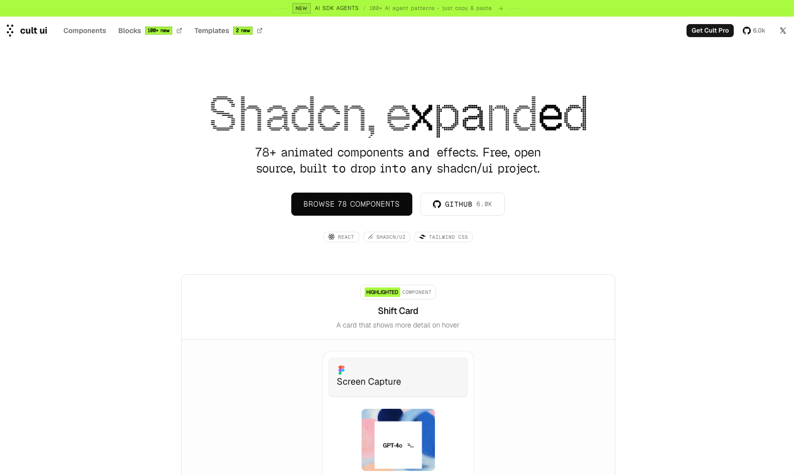
Cult UI offers animated components and effects for shadcn/ui projects. Examples include specialized buttons, cards, and tabs that can be copied into a React application and styled with Tailwind.
The free, MIT-licensed collection is useful when you need an interaction that a general component set does not cover. Review the implementation alongside your existing components so its focus behavior and motion remain consistent with the rest of the application.
Keep the free library separate from Cult’s commercial products. Its site lists 78-plus free components, while AI SDK Agents and Cult Pro provide separate catalogs of agent patterns, templates, and premium UI. The AI patterns should not be counted as free Cult UI components.
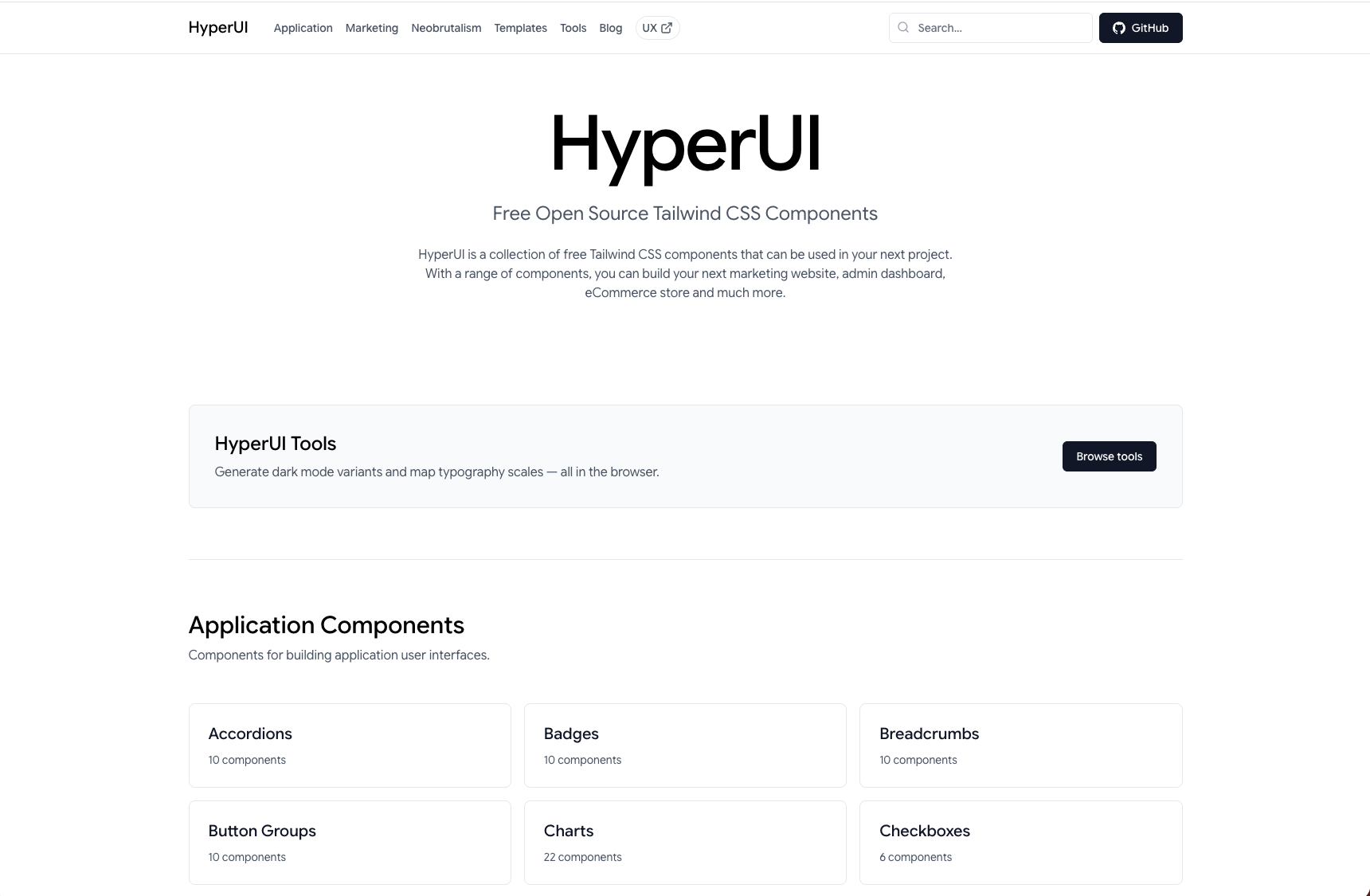
HyperUI is an MIT-licensed collection of Tailwind v4 markup for marketing pages, ecommerce, and application layouts. You copy an example into your project and adapt it to your content.
It is useful for static sections and prototypes where you want a starting layout without installing a component package. The markup can be adapted to different frameworks, though JSX and template syntax may require changes.
Inspect the behavior of interactive examples before using them. Any required scripts become part of your implementation, and copied markup needs the same accessibility checks as code written from scratch.
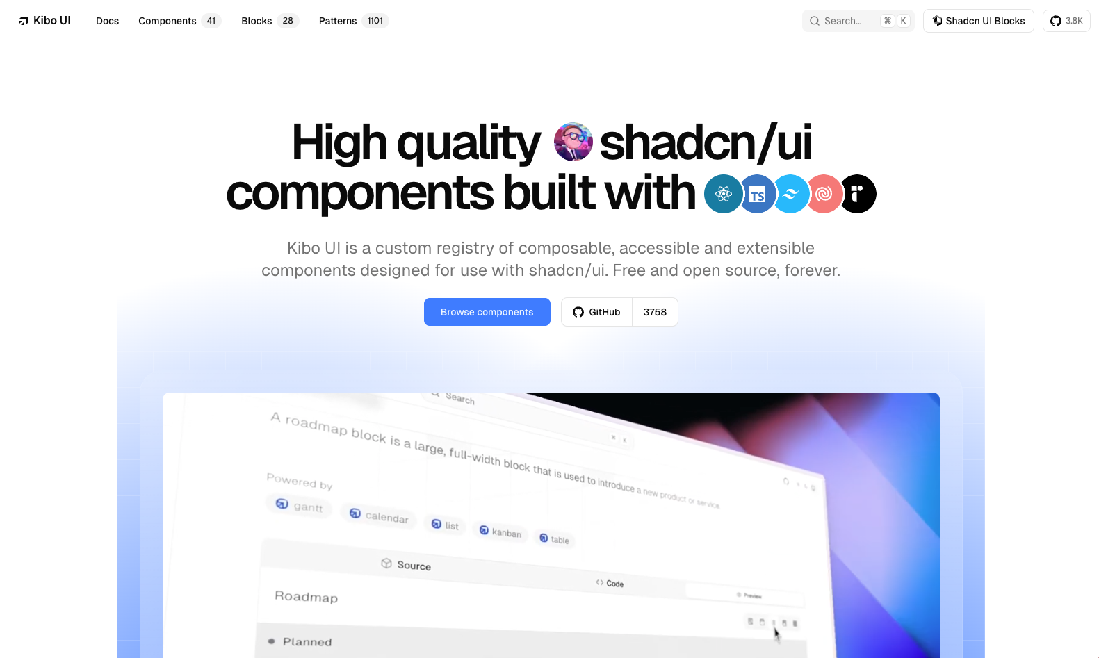
Kibo UI extends shadcn/ui with more complex React components, including Kanban boards, Gantt charts, calendars, and upload interfaces. Its registry installs editable source through the shadcn CLI.
Kibo is useful when an application already has basic controls and needs a more involved interface. Those components provide a UI foundation; application-specific permissions, persistence, and validation still need to be implemented.
There is overlap with ReUI, so compare the exact widget your project needs. Look at keyboard behavior, required dependencies, and the amount of adaptation needed for your data. Both collections leave your team responsible for maintaining the source it copies.
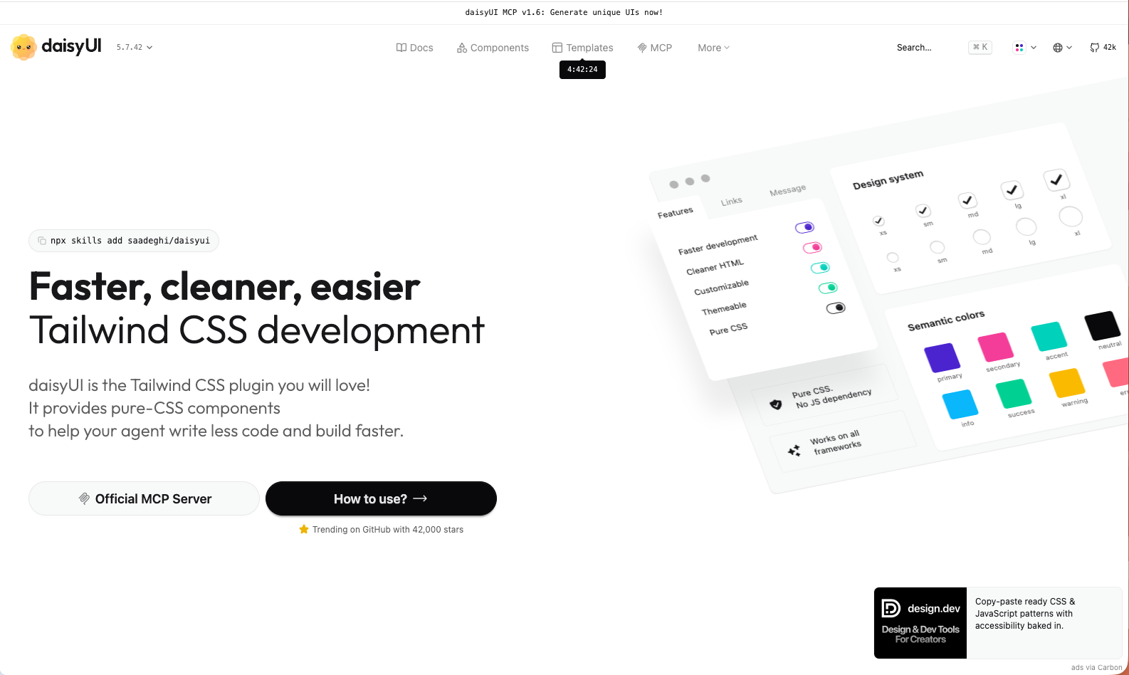
daisyUI adds semantic component classes to Tailwind. For example, class="btn btn-primary" supplies a button style that would otherwise require several utilities. You can customize the theme and apply additional utilities as needed.
daisyUI v5 is designed for Tailwind v4 and registers through @plugin "daisyui";. Its CSS-based approach works across frameworks without adding a JavaScript runtime. The theme catalog provides presets that can be selected with the data-theme attribute.
This makes daisyUI useful when repeated utility strings are making markup difficult to maintain. Interactive behavior depends on the component and markup you choose: some examples use native browser features, while others require application code. Test focus, keyboard interaction, and labeling in the finished interface.
The library is MIT licensed. For setup and migration details, see our daisyUI adoption guide, daisyUI v5 overview, and guide to reducing markup with daisyUI.
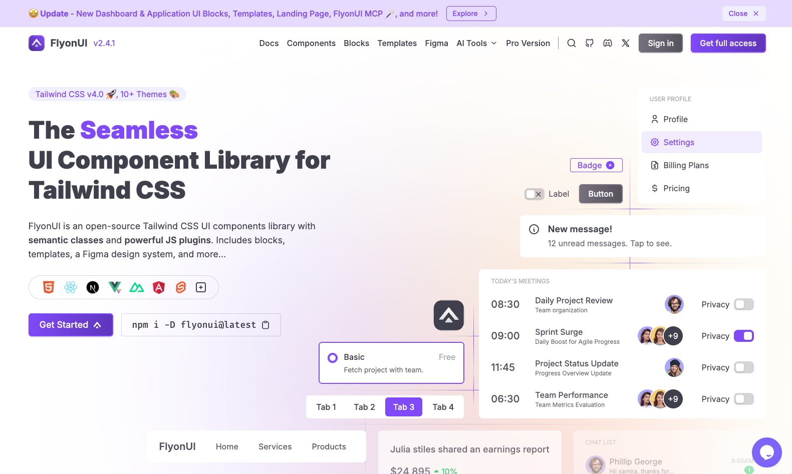
FlyonUI combines semantic component classes with JavaScript plugins for interactive controls. It installs through npm and integrates with Tailwind v4 as a plugin.
It suits projects that want concise markup along with supplied behavior for components such as dropdowns and overlays. Its framework guides cover using those plugins in different application stacks.
Check the integration instructions for initialization and cleanup, particularly when components mount after navigation. FlyonUI’s core is MIT licensed, with additional paid blocks and templates available separately. Its JavaScript support reduces the behavior you need to implement yourself, while adding integration work that a CSS-only approach would not require.
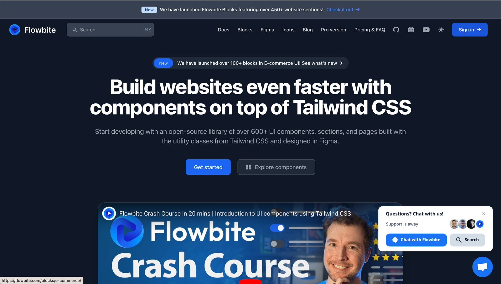
Flowbite provides Tailwind components with JavaScript for interactive elements such as modals and dropdowns. Its core library supports TypeScript and uses data attributes to connect markup to behavior.
The wider ecosystem includes framework-specific options such as Flowbite React, Vue, and Svelte, along with Angular integration resources. Check the package for your framework before committing, since component coverage and setup can differ.
Flowbite is worth considering for applications that need a range of conventional controls and a matching design resource. The core code is MIT licensed, and a free Figma edition is available. Flowbite Pro has separate terms and includes premium blocks, templates, and design resources, so its catalog should be evaluated separately from the free library.
Use this table to narrow the list by framework and maintenance model. The entries describe the free offering unless stated otherwise. Paid blocks and templates may use separate licenses.
| Library | Framework | How you add it | Tailwind integration | Free offering and paid extras | Useful for |
|---|---|---|---|---|---|
| Preline UI | HTML/JavaScript with framework guides | npm and copied markup | v4 setup with plugins and utilities | MIT and Fair Use terms; Pro resources separate | Application screens and marketing layouts |
| shadcn/ui | React | CLI installs editable source | v4 utilities and theme variables | MIT core; third-party registry terms vary | Customizing components in your own codebase |
| HeroUI | React | npm package | v3 library uses Tailwind v4 | Apache 2.0 core; Pro templates separate | Styled application components |
| ReUI | React | Registry or copied source | shadcn-compatible components | Free components; paid templates and assets | Extending a shadcn application |
| Headless UI | React, Vue | npm package | Unstyled behavior; supply your own utilities | MIT | Building a custom visual design |
| Magic UI | React | shadcn CLI or copied source | Tailwind styling with animation dependencies | MIT free components; Pro resources separate | Animated marketing elements |
| Aceternity UI | React | CLI or copied source | Tailwind styling with animation dependencies | Free components; paid templates and Pro resources | Specific visual effects and hero treatments |
| Cult UI | React | Copied source or registry | shadcn-compatible components | MIT free library; AI SDK Agents and Cult Pro separate | Specialized animated interactions |
| HyperUI | Adaptable HTML | Copy and paste | Tailwind v4 utility markup | MIT | Static layouts and prototypes |
| Kibo UI | React | shadcn CLI installs source | shadcn-based components | Free component registry | Complex application widgets |
| daisyUI | Framework-independent CSS | npm package | v5 registers as a Tailwind v4 plugin | MIT | Shorter markup and shared themes |
| FlyonUI | HTML/JavaScript with framework guides | npm package | Tailwind v4 plugin and JavaScript | MIT core; paid blocks and templates separate | Semantic classes with interactive behavior |
| Flowbite | HTML/JavaScript; framework packages available | npm and markup or framework components | Tailwind setup varies by package | MIT core; Pro resources separate | Conventional application controls |
Component counts are omitted because the catalogs count different things, including variants, blocks, and paid resources. Check the installation guide for the version and package you intend to use.
Tailwind Plus, formerly Tailwind UI, was Tailwind Labs’ commercial collection of components, templates, and the Catalyst React starter kit. On 9 September 2026, Tailwind Labs announced it was joining Shopify and closing Tailwind Plus and ui.sh to new customers. Existing customers retain access, and the team says its open-source projects will remain MIT licensed.
For a new project, evaluate the available free libraries and their commercial extensions. Check whether the price covers components, finished templates, or design files, and review the terms for the specific assets you plan to use. A project’s free code license does not necessarily apply to its paid catalog.
Choose a library around an interface you need to build. Implement one representative screen before adopting it across the application, including its keyboard interactions and responsive states.
For React teams that expect to edit component internals, shadcn/ui provides a starting point, with ReUI or Kibo worth checking for additional widgets. HeroUI offers styled components maintained through package updates. Outside React, HyperUI can supply markup, while daisyUI provides component classes and themes. The work left after installation should guide the decision as much as the demo’s appearance.
As web frontends get increasingly complex, resource-greedy features demand more and more from the browser. If you’re interested in monitoring and tracking client-side CPU usage, memory usage, and more for all of your users in production, try LogRocket.
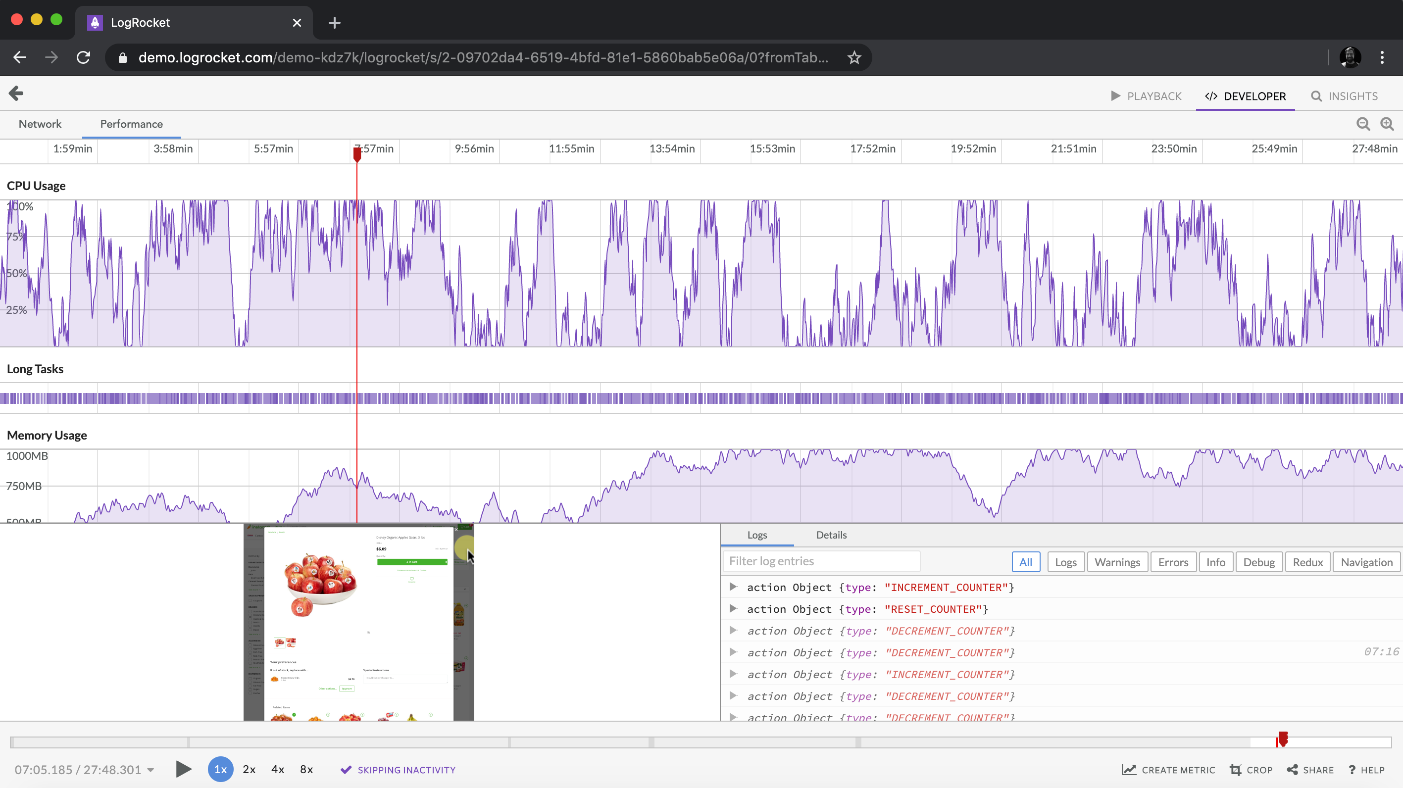
LogRocket lets you replay user sessions, eliminating guesswork around why bugs happen by showing exactly what users experienced. It captures console logs, errors, network requests, and pixel-perfect DOM recordings — compatible with all frameworks.
LogRocket's Galileo AI watches sessions for you, instantly identifying and explaining user struggles with automated monitoring of your entire product experience.
Modernize how you debug web and mobile apps — start monitoring for free.

Compare the top AI development tools and models of October 2026. View updated rankings, feature breakdowns, and find the best fit for you.

Can AI agents debug React bugs across browsers? I tested Chrome, Safari, and Firefox debugging MCPs on four bugs to compare their findings, workflows, and effectiveness.
React 19.3 and modern CSS make several common patterns unnecessary. Here are 10 features that let you delete old React code and simplify your apps.

Explore the top AI agent frameworks in 2026 and compare how they handle tools, memory, structured output, streaming, and step limits.
Hey there, want to help make our blog better?
Join LogRocket’s Content Advisory Board. You’ll help inform the type of content we create and get access to exclusive meetups, social accreditation, and swag.
Sign up now
 Learn more →