In this ever-changing era of evolving UI component kits for rapid frontend development, developers are presented with many options to choose from when developing our frontend application, no matter the size or scope of the project.
In this article, we’ll compare and analyze two UI component kits: Chakra UI and Bumbag UI. We’ll look at their differences, similarities, and features so you can decide which one to use on your next project. Let’s get started.
For this article, you’ll need a basic knowledge of JavaScript and of frontend development.
According to developer Segun Adebayo, “Chakra UI is a simple, modular, and accessible component library that gives you all the building blocks you need to build your React applications.”
Chakra UI started as a React-based components kit but has expanded to many other frontend frameworks like Vue, Nuxt, React-Native, and Angular.
Chakra UI offers many great features, such as:
Box and Stack components, which you can pass along propsLet’s learn how to start using Chakra UI for React. If you’re using Vue, you can learn how to set it up here.
First, install Chakra UI and its peer dependencies.
npm install @chakra-ui/core @emotion/core @emotion/styled emotion-theming
Always wrap your app with ThemeProvider from chakra-ul/core. I also recommend that you always add CSSReset component to reset browser styling.
import { ThemeProvider as ChakraProvider, CSSReset as CSSDefaults } from "@chakra-ui/core"

function App({ children }) {
  return (
    <ChakraProvider>
      <CSSDefaults />
      {children}
    </ChakraProvider>
  )
}
Now you can start using components like so:
import { Button } from "@chakra-ui/core"

function Example() {
  return <Button>Welcome to ⚡️Chakra!</Button>
}
We are going to use Chakra UI to create a contact form to allow users to contact us. Chakra UI is a great library for creating HTML forms, as it provides rich tools to easily develop forms.
We will start by importing the necessary components needed to create this form.
import React from 'react';
import { ThemeProvider, CSSReset, theme, Button, Input, Textarea, FormLabel, FormControl, Heading, IconButton, Flex, Box, } from '@chakra-ui/core';
After importing the components, we will initialize Chakra UI with the necessary color reset and other housing.
const App = () => {
  return (
    <ThemeProvider theme={theme}>
      <ColorModeProvider>
        <CSSReset />
        <ContactObj />
      </ColorModeProvider>
    </ThemeProvider>
  )
}
Next, we will create the ContactForm object that holds the form.
ContactObj componentconst ContactObj = () => {
return (
<Flex minHeight="100vh" width="full" align="center" justifyContent="center">
<Box
borderWidth={1}
px={4}
width="full"
maxWidth="1000px"
borderRadius={4}
textAlign="center"
boxShadow="lg"
>
<ThemeSelector />
<Box p={4}>
<ContactHeader />
<ContactForm />
</Box>
</Box>
</Flex>
)
}
The ContactObj makes use of Chakra UI’s Box component and includes the ContactHeader and ContactForm components to create the contact form.
ContactHeader componentconst ContactHeader = () => {
return (
<Box textAlign="center">
<Heading>Contact Us</Heading>
</Box>
)
}
The ContactHeader simply contains the header code for the contact form.
ContactForm componentconst ContactForm = () => {
return (
<Box my={8} textAlign="left">
<form>
<FormControl>
<FormLabel>Name</FormLabel>
<Input type="text" placeholder="Enter your name" />
</FormControl>
<FormControl>
<FormLabel>Email</FormLabel>
<Input type="email" placeholder="Enter your email" />
</FormControl>
<FormControl>
<FormLabel>Message</FormLabel>
<Textarea type="textarea" placeholder="Enter your message" />
</FormControl>
<Button variantColor="blue" type="submit" mt={4}>
Submit
</Button>
</form>
</Box>
)
}
The ContactForm contains the HTML form fields style with Chakra UI.
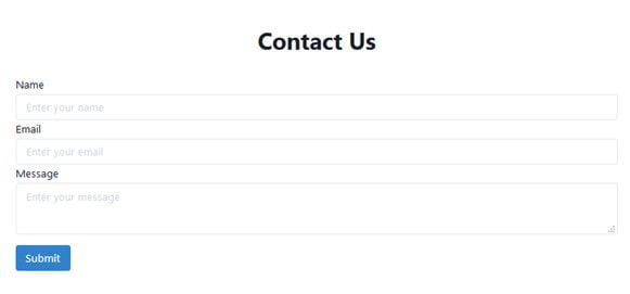
If you put everything up successfully, you will be presented with this contact page:

psuedoboxChakra is undoubtedly popular and has gained a lot of traction. When building projects that need the ability to switch themes and colors, then Chakra is the best option to use. It’s also constantly growing and improving the codebase, so more interesting components and flexibility will be added in the future.
Now let’s take a look at Bumbag.
“Bumbag is a friendly React UI Kit suitable for MVPs or large-scale applications,” says developer Jake Moxey.
Coding with Bumbag UI simply means that you’re coding with an intuitive API that is understood by designers.
Bumbag, formerly known as Fannypack, started in 2018 and has recently gained popularity because of the unique features it comes with in creating React component kits.
Bumbag UI has some interesting features, such as:
First, install Bumbag:
npm install bumbag
Once installed, wrap your application with BumbagProvider:
import { Provider as BumbagProvider } from 'bumbag';
const App = () => (
<BumbagProvider>
Hello world!
</BumbagProvider>
);
Now, you can start using the Bumbag components:
import { Button, Provider as BumbagRoot } from 'bumbag';
const App = () => (
<BumbagRoot>
<Button>
Welcome to Bumbag!
</Button>
</BumbagRoot>
);
Now, we’ll also build a contact form using Bumbag. First, import the necessary components:
import React from 'react';
import { Provider as BumbagProvider, defaultTheme, Button, Input, Textarea, Label, FieldWrapper, FieldStack, Flex, Box, } from 'bumbag';
To set up Bumbag, use the following:
const App = () => (
<BumbagProvider isStandalone theme={defaultTheme()}>
// ... your app
</BumbagProvider>
);
Now, set up contactObj:
const ContactObj = () => {
return (
<Flex minHeight="100vh" width="full" alignX="center" alignY="center">
<Box
borderWidth={1}
px={4}
width="full"
maxWidth="1000px"
borderRadius={4}
textAlign="center"
boxShadow="lg"
>
<ThemeSelector />
<Box p={4}>
<ContactHeader />
<ContactForm />
</Box>
</Box>
</Flex>
)
}
Next, you’ll you set up your header:
const ContactHeader = () => {
  return (
    <Box textAlign="center">
      <Heading>Contact Us</Heading>
    </Box>
  )
}
const ContactForm = () => {
return (
<Box my={8} textAlign="left">
<FieldStack>
<FieldWrapper label="Name" placeholder="Enter your name">
<Input />
</FieldWrapper>
<FieldWrapper type="email" label="Email" placeholder="Enter your email">
<Input/>
</FieldWrapper>
<FieldWrapper label="Message">
<Textarea placeholder="Enter your message"/>
</FieldWrapper>
<Button palette="primary">
Submit
</Button>
</FieldStack>
</Box>
)
}
Now you should now have a contact form.
If you’re looking at creating a quick minimum viable product (MVP) or large-scale application with support to many and multiple components, including date pickers, then Bumbag UI is a good choice.
Choosing a tech stack for a project depends on many factors, including team preference and point of view on the project at hand.
In this article, we learned about Chakra UI and Bumbag UI in detail, how their features are different, and how to get started with both of them.
Chakra and Bumbag are similar and can be used to accomplish the same tasks. So which one should you choose? Consider the following when it comes to choosing your tech stack:
From the above general perspectives, you should be able to choose a good components kit for your next project. Happy coding!
Install LogRocket via npm or script tag. LogRocket.init() must be called client-side, not
server-side
$ npm i --save logrocket

// Code:

import LogRocket from 'logrocket';
LogRocket.init('app/id');
// Add to your HTML:

<script src="https://cdn.lr-ingest.com/LogRocket.min.js"></script>
<script>window.LogRocket && window.LogRocket.init('app/id');</script>
Hey there, want to help make our blog better?
Join LogRocket’s Content Advisory Board. You’ll help inform the type of content we create and get access to exclusive meetups, social accreditation, and swag.
Sign up now
Discover how to use Gemini CLI, Google’s new open-source AI agent that brings Gemini directly to your terminal.

This article explores several proven patterns for writing safer, cleaner, and more readable code in React and TypeScript.
A breakdown of the wrapper and container CSS classes, how they’re used in real-world code, and when it makes sense to use one over the other.

This guide walks you through creating a web UI for an AI agent that browses, clicks, and extracts info from websites powered by Stagehand and Gemini.

 Learn more →

One Reply to "Why and when to use Chakra versus Bumbag"
While I realize this is a SEO page, it should be updated at the top to say Bumbag is no longer maintained.